

Click HERE to view the zine in its full glory!
Category: Gallery
Zine 03
I modified the zine quite a bit from what I showed previously, paying extra attention to leave a column untouched on some spreads, so that there would be more breathing space. I also did a few test prints to ensure that the zine copied the font size and layout of the IKEA magazine as closely as possible. (honestly hoping this doesn’t count as plagiarism)


Click HERE to view the zine in its full glory!
Although it seems easy to just copy the IKEA layout and language, there were still challenges that I faced while I was creating this zine. I think the greatest challenge that I faced in this project was choosing the names of furniture and coming up with a description that fits it well, to sell it to a targeted audience. It was also pretty challenging to try and emulate IKEA in the simple and direct way that they communicate to their customers, often with some sarcasm or pun involved. In terms of layout, I did face some issues with aligning the photos and words in a way where they can fit well together, not just on the page itself, but across the spread. It was also difficult to recreate my zine in a manner that had local IKEA flavour, while still maintaining the essence of IKEA itself.
Overall, this was a really fun project to work on and I thoroughly enjoyed the process of creating this zine – from imagining the users to thinking of the potential users and seeing the whole zine come together! I hope this zine gives them a little insight on the residents that possibly live in Sengkang and I hope that you will enjoy reading it as much I did preparing this zine 🙂
Que Sera Sera 07 – Final
These are the 4 final compositions that I have chosen for this project because I felt that each of them express the main essence of the occupation the best out of all my experimentations.
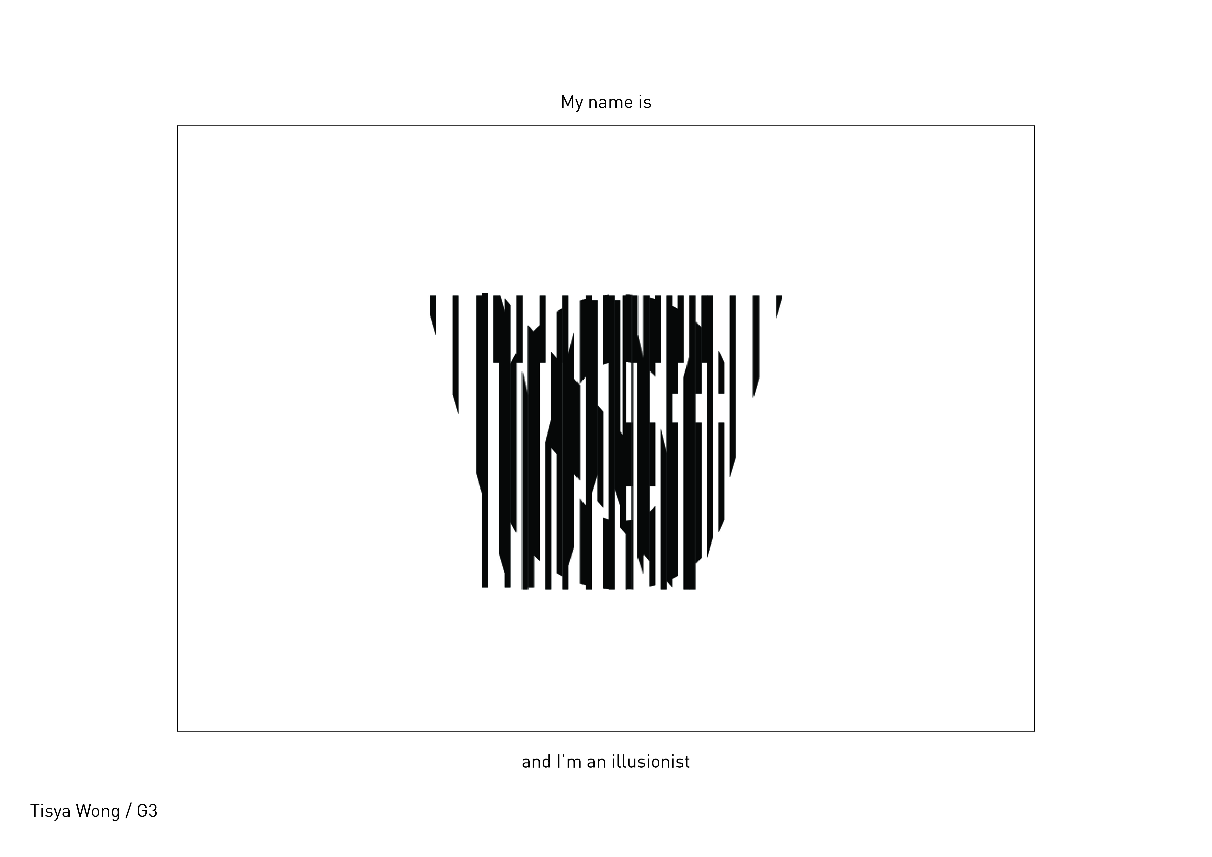
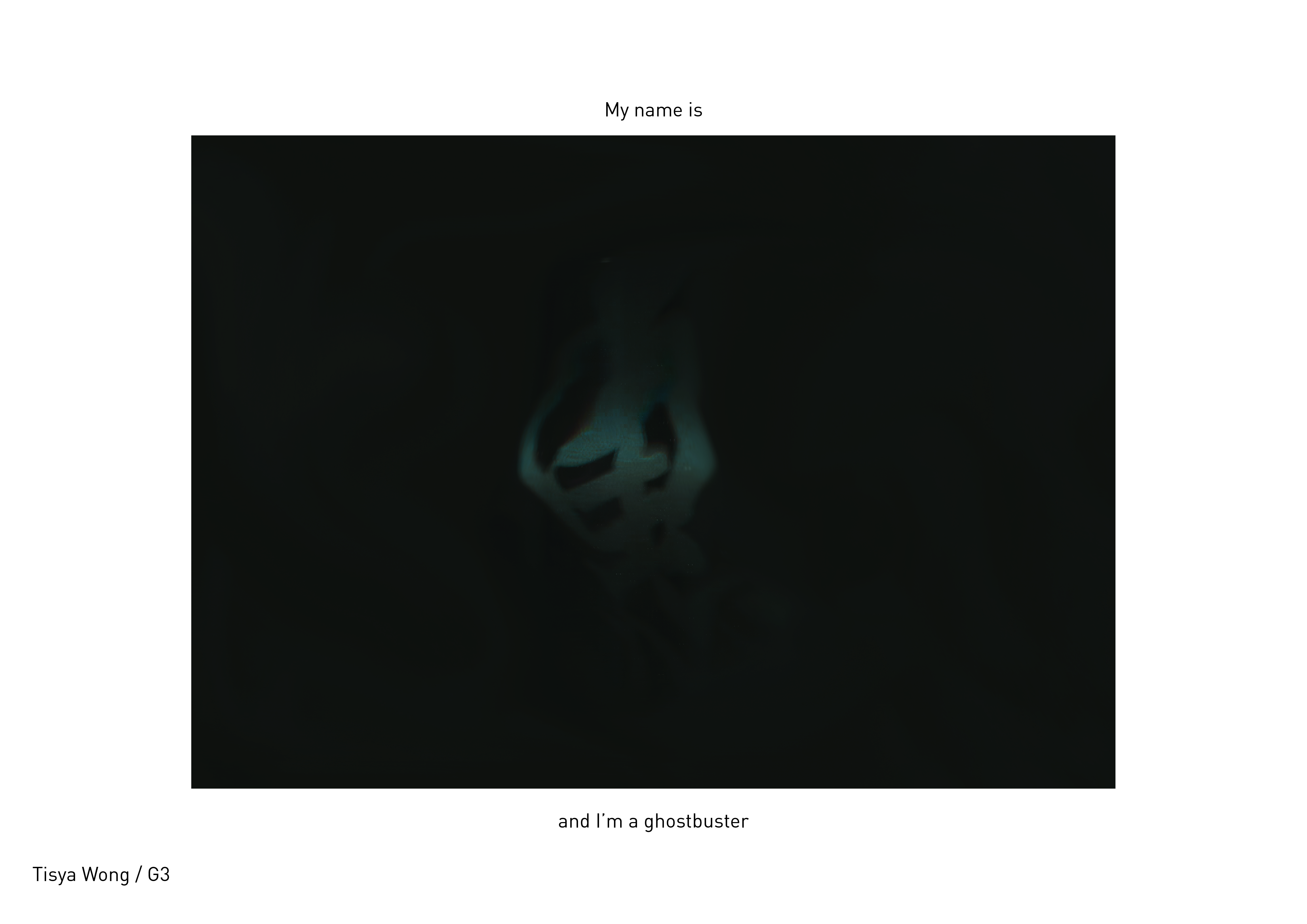
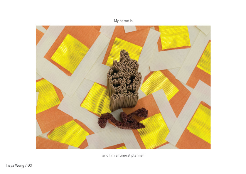
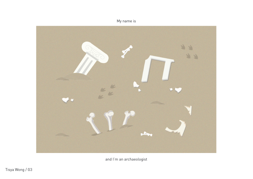
For this project, I tried to not restrict myself to 2D means, but rather try out various methods to achieve 2D results, because I personally feel that simply using a consistent medium across all the occupations does not push my learning and creative boundaries enough. Overall, the challenges I faced in this project was in choosing the jobs that had stronger visual elements/colours/textures that could help in enhancing the visual connection of my compositions and the occupation. I realised that the visual elements that are associated with the occupations are things that people can immediately relate to, which is really interesting! I also enjoyed how in some of my classmate’s compositions, the simple use of a line or texture could imply an object or space. #thepowerofsemiotics