GHOSTBUSTER PROCESS
Chloe Reibold
http://www.chloereibold.com/#/experimentaltype/
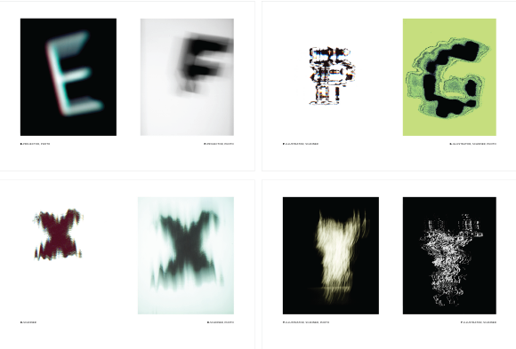
I have been having the idea to try scanography on type for quite a while and I finally found a reason to use it! I chanced upon Chloe Reibold’s website while researching on experimental typography and I really love the effects that she created with the movement that evokes a different kind of feeling in the type. While sharing this with Kim, we somehow reached the idea of Ghostbusters, which I found really interesting, since the movement of the letters would create a blur/ghostly effect.
I wanted to experiment with the effects of scanography using the letters of my name to create a ghostly effect, since the most important element of a ghostbuster is the presence of the ghost itself.
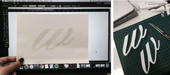
I started off by tracing the font on screen and then cutting it on white foam, because the last time i tried it on paper it was really flimsy and didn’t turn out well because it was harder to control:
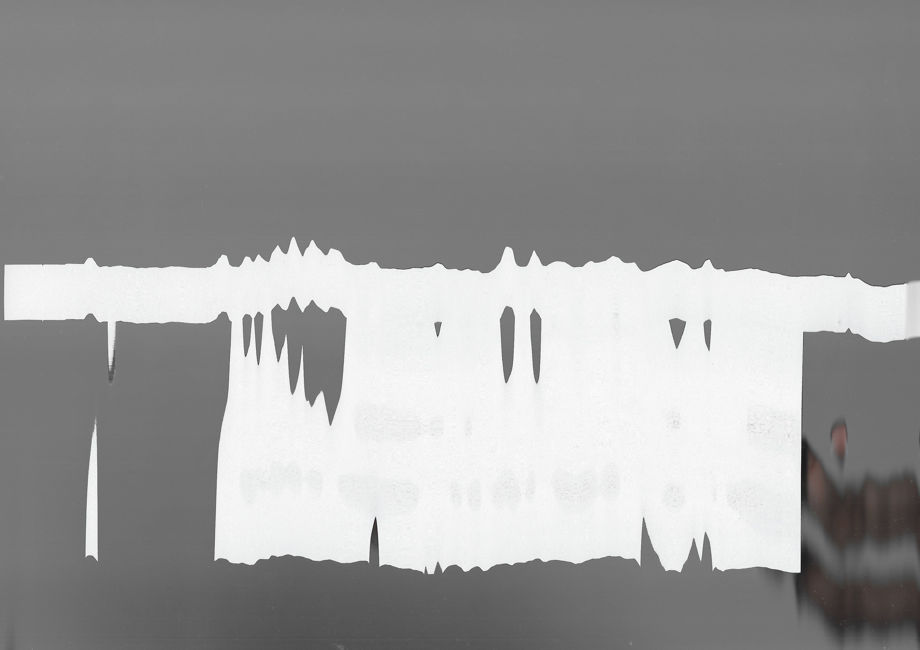
That scan was done at home under bright lighting, hence the background turned out grey. I used a different scanner (the one in 2D lab), and I loved the “eerie” texture it gave the scan, and most importantly, the dark background, to bring focus to the main subject.
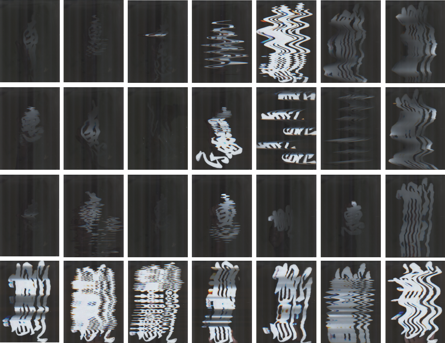
I used my Chinese character, to test out if the scanning would work and I actually like the added value that comes with using a Chinese character since Chinese culture is known to be more superstitious / pantang.
Instinctively, I first tried out the different draggy effects that I could get by changing the movement of my name at different intervals according to the light of the scanner. This resulted in a whiter and clearer image of the letter. Later I tried lifting the letter while scanning, and I really liked the darker tone that it produced. I combined the movement and distance at different intervals and managed to get some really ghostly effects. I thought of trying out the initials from my english name as well just to see how it would turn out:
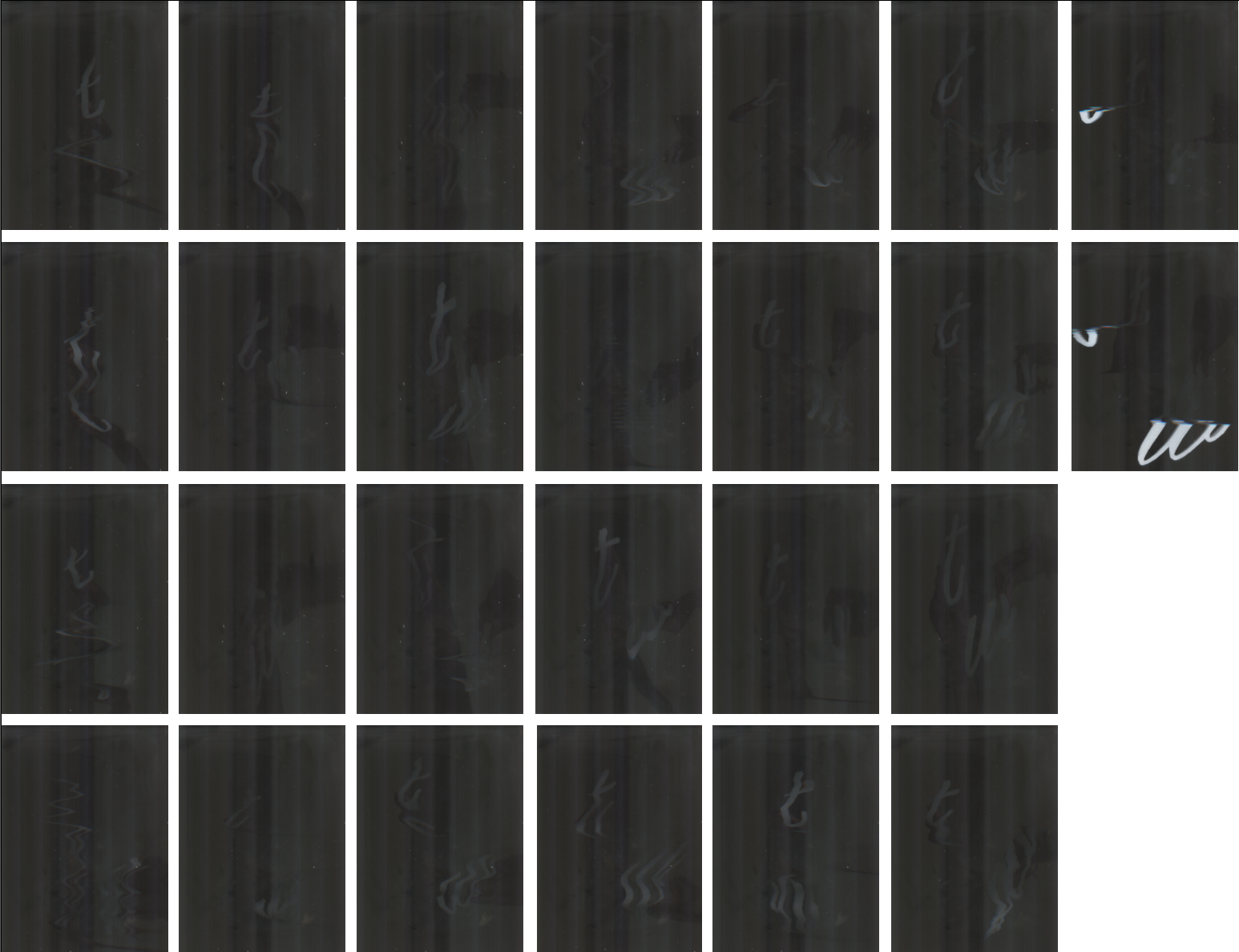
After many tries, I found it difficult to create a nice composition with the letters. because the width of the letters were thin and the effect doesn’t come out as nicely as the Chinese character, which has more volume. It also became increasingly challenging to make out the letters with heavy modification.
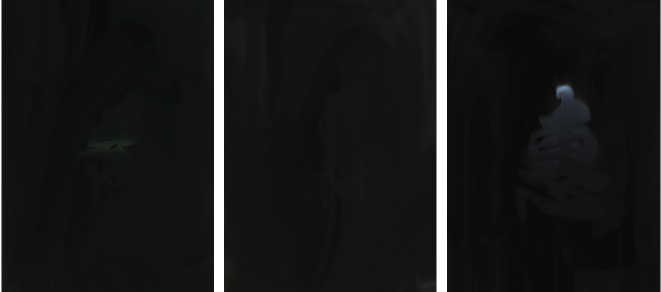
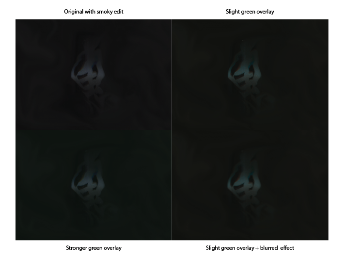
I settled for the scanning of my Chinese character, selected a few images that I was most satisfied with and edited the image on Photoshop to make it look more “ghostly”. To look at the smoky effect of the following images, please brighten your screen to the maximum level:

