———————————– WEEK 1 —————————————
This week our task is to generate some ideas for this project. And below are the ideas I prepared for this assignment.
Me:
Pear / Bird / Pink glass / Hamster / Squirrel / Robert
Situation:
Hall / Daiso Store / When I’m angry / On flight /
Here are my ideas:
1.Bird + Hall = I hang my wings on the wall and sit in front of my laptop.
Because I’m a in-door person, so in this one I want to show that even I have the ability to go out (or fly away) I would still choose to stay in my room.
2. Pear + Someone shouting at me = i cut a piece of pear and eat it.
Well, this is not so positive. I got the idea of “self-digest”. Usually when I feel angry or pressure I’m tend to keep the emotion inside and digest it, and it also hit about automutilation because in face this habit is harmful to ourselves.
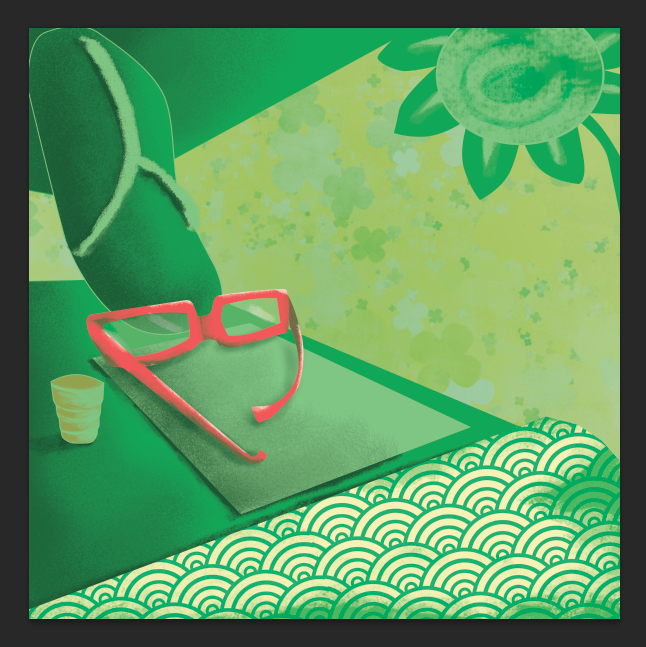
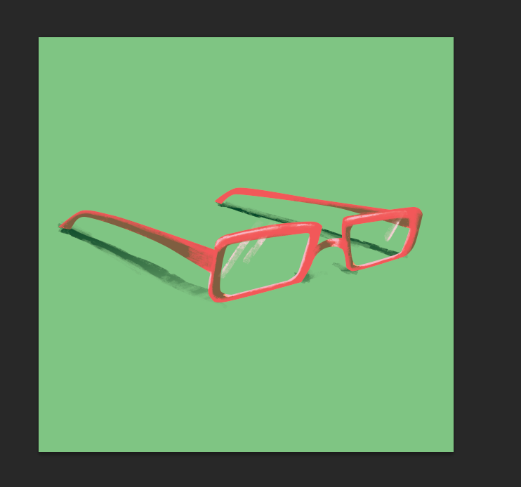
3. Pink glasses + Daiso = The symbol “$2” shows on the glasses.
This is because I really like shop in Daiso!
———————————– WEEK 2 —————————————
After the consultation, the biggest problem for me now is the idea not out of except enough. So I modify some of my ideas and come up with the 4th one as well.
1. Pear + Someone shouting at me = i cut a piece of pear and eat it.
2. Bird + Hall = I become a twitter bird (icon).
3. Pink glasses + Daiso = The pink is enjoy a holiday made by items that are sold in Daiso.
4. Robot + Travel with friends = Become multi-function.
And I draw the thumbnails for each panel. Also I make 2 mini panels to test out the paper cut style.


———————————– WEEK 3 —————————————
After the discussion with Shirley and my classmates, I improve my sketches and start to work on the first panel.
This one in the 3rd picture if I’m using magazine collage style, I will make the pear bigger so it’s easier to see in the picture.

For this one Shirley suggested that can change the window shape to round corner which looks like the mobile app logo. I think this idea is really cool.


And the first row I’m working on is the Pear one and using magazine collage style.
Luckily i have many comic books (and some are FREE!!) in hall so finding material actually not so difficult for me.

And comic book has a lot colors inside, which made it easier to do the color collage.

The test one looks like this, I think it’s quite successful, the pear stands out from the blue background.

And this week I also work on the digital painting row.
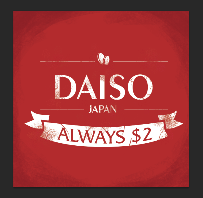
The texture make the whole image looks quite retro so I redesign the logo for Daiso to fit the retro looking.
——————————–WEEK 4 & 5 ——————————
This two week I work on the 4th row and the paper cut one.