The theme of our first assignment is “self-portrait”, which also can be “a reflection of an exploration of oneself”. So in my understanding, the self-portrait is not just to show people how you look like, but also reflect your inner world – how is the world/something looks like in your eyes. So below is my artwork for this project.
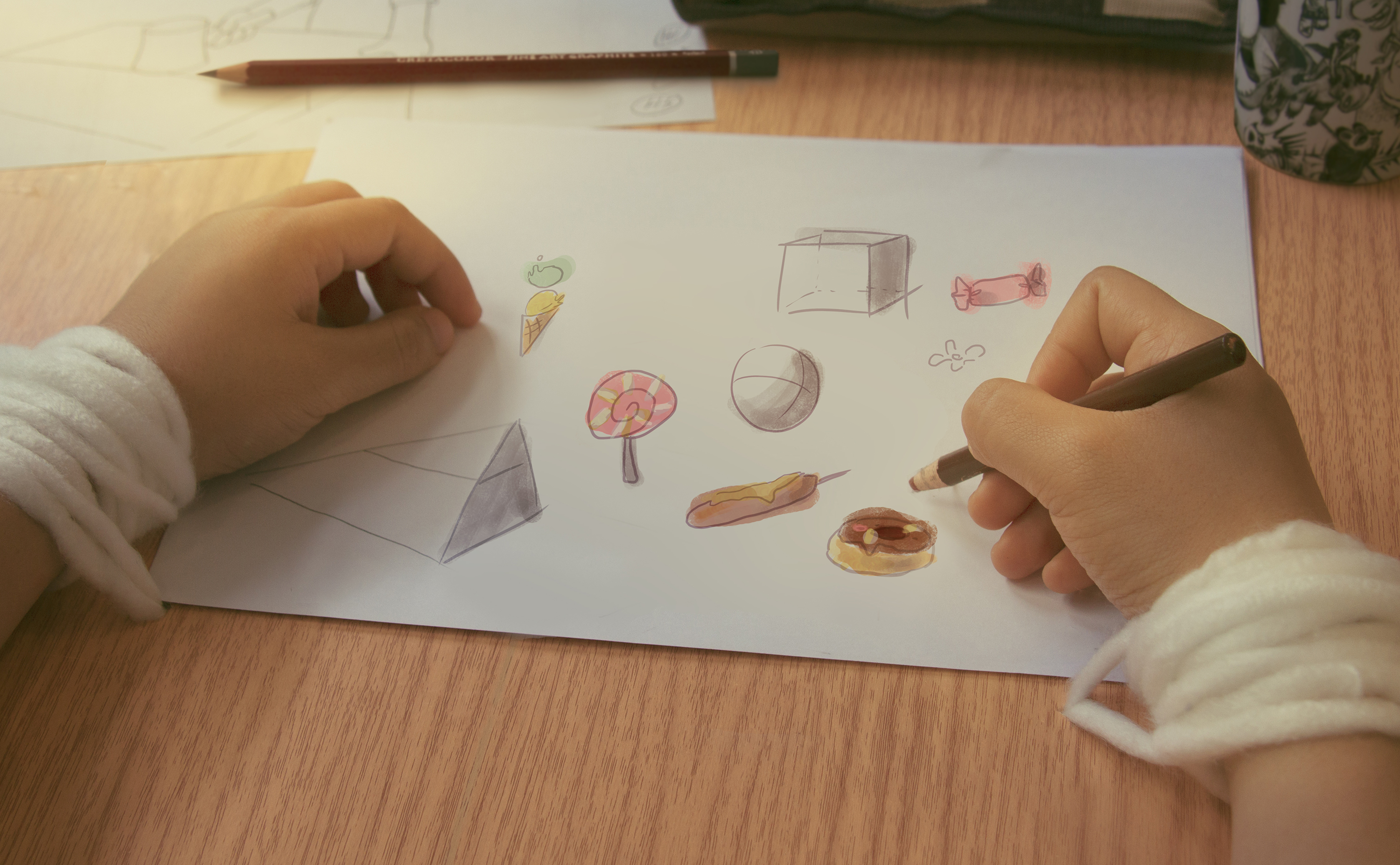
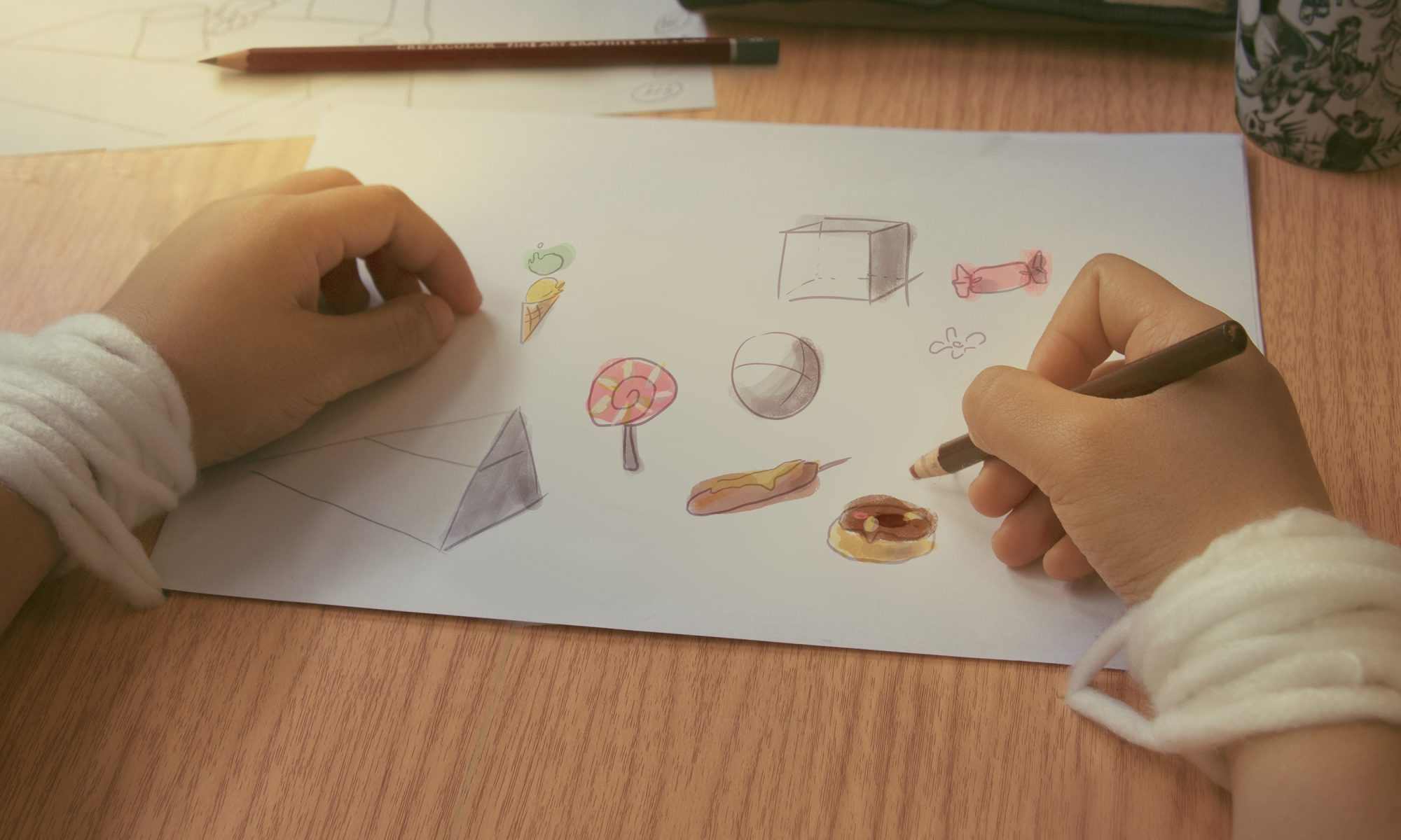
The title of this work is “Sweet Burden”, it shows how I feel about “drawing” as an animation student.
Artist Statement
There is a theory called “10,000-hour rule”, it says if someone want to be an expert of a skill, he/she need to spend at least 10,000 hours on it. This is still a controversial theory, but nobody will deny that continual practice is an important thing in skill training. Same goes to drawing. As an animation student, I feel that most of time my hand is tied to table and pencil, keep on drawing and drawing. This sounds horrible. In my point of view, it’s a tiring but enjoyable process, that’s why I call it a “sweet burden”.
Before Image
Because I want to show that “drawing is a tiring, but I enjoy it”, I use white yarn to tied around the wrist, and the hands are in very natural pose – no force, no hurt, no struggle. And all the props I choose to use wooden or brown color (like the drawing pencil), those natural color can give audience a friendly and comfortable feeling. And I put my pencil case and mug around to imitate my real working environment.
In order to show that the string is come from the table, I use paper and wooden-texture sticker to make a fake table cover. Then I zoom out my camera a little bit to make sure all the information I need is inside the frame.
For the camera angle I choose to use POV, point of view, to show the image, so the audience know what does drawing feel like in my eyes.
Camera Decisions
Camera: Cannon 650D
Lens: 18 – 135 mm (Has a wide range)
IOS: 200 (It’s a indoor shooting and the weather is cloudy)
Focus Length: 27 (35mm is the closest to the focal composition of the human eye. I reduce it a bit to include all the information inside the frame)
Shutter Speed: 1/50 (Based on my experience, if the speed is slower than 1/30, the picture will mostly become blur because of my hand shaking)
F: 5 (To get enough exposure and has a depth of view in the picture)
Digital Process
First thing I did is to refine the picture, it has too much unnecessary space in the original picture (like the white space that didn’t fully covered by the fake top.) So I rotate and crop the image, then extend the wooden texture and clean the scratches on the wooden part.
Then I start to think about “What kind of effect/feeling I want achieve in this work”.
Since my theme is “Sweet Burden”, my work should have a warm and comfortable feeling to the audience even the hands are tied by yarn. To achieve this, I did following steps.
1. Using Curve to brighten the image.
2. Raise the saturation to make the colors pop-up.
3. Adding red in color balance layer so the picture looks warmer.
Then I use brush to paint a yellow sunlight come across the picture diagonally and change the blend mode to “Screen”. This helps to bringing the atmosphere and leading the audience eyes. And I add one selective color adjustment layer to adjust the color based on my reference.
Then based on the lecturer’s advice, I cleaned the paper in the middle because the original drawing looked a bit nervous. I redrew some basic forms like cube and sphere, and some doodles of sweets – I always doodle when I’m doing my drawing homework, it’s time for me to rest and draw whatever I want.
Because of the cropping, the mug and pencil case around are not so obvious, so I use mask to crop the mug and take another photo of my pencil then add them inside the image, so audience can know this is my normal working space.
Artist References
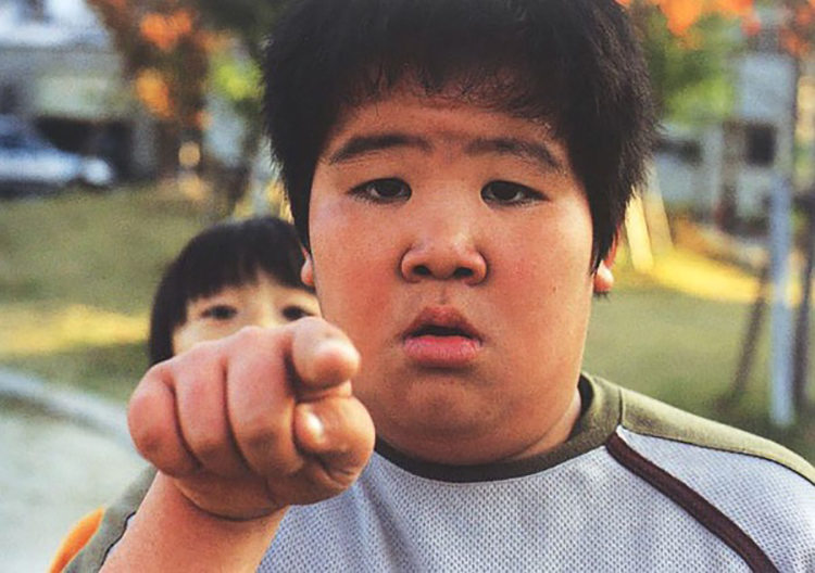
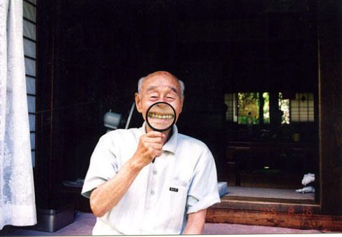
Ume Kayo is a Japanese photographer, her work is most focus on those little humour moment in daily life. The first time I saw her work I thought this photographer must be a very interesting and careful person, that why she can capture those little moments which always being ignore by many people. That’s also how I get the concept of “reflect the world through my eyes” and decide to use POV angle. And her pictures are mostly about daily life, give audience a very life-close feeling, so I have referred the lighting and color tone as well.
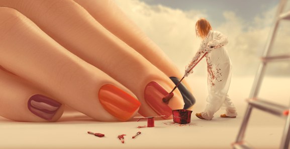
For colouring and atmosphere, I have gone through many digital advertisements for reference. And this Russian manicurist advertisement inspiring me a lot for the color adjustment, especially for the finger part. The whole image looks dreamy and comfortable, which match what I want to achieve in my work.