Final Assignment

My inspiration for this project was Kim Jung Gi. He used mainly inks and lines in his work. He utilised perspective to create a warp/ fish eye space.

I’ve been a fan of him for quite awhile so for this project, I wanted to mimic his style and create an artwork from it. With my theme set to 古代装, I tried to do some sketches on some elements I want inside my drawing. I wanted an ancient chinese setting.

However, the drawings didn’t went as well as thought, hence, I’ve decided to focus on just one element which is the buildings. Some problems I faced throughout my final is that I couldn’t foresee my perspective, it was quite hard for me when penning down what I want in my mind. I tried using the box technique that mr woonlam taught and realised it worked! (i forgot to take photo of the process T_T)


Below are some research images:


The final is shown below:
zine process; yishun

The process for this project was quite an excruciating one as I totally scrapped off my idea almost 3 days final submission and did something outside my comfort zone.

Below are some snapshots of my previous designs.

The reason why I decided to redo was that I felt that there isn’t a main focus in my zine. While I knew I wanted to do a zine about the colours of the buildings in yishun, I felt my previous zine didn’t bring out this idea as much I wanted.

Hence, I did more research to discover more ideas and concept on how to improve my zine which shown below.

I was reading a fashion magazine one day and I saw a mood board that the magazine did. It was a sudden thought but I decided to come up with a mood board too as I wanted the audience to know more about the colours I used in my zine.

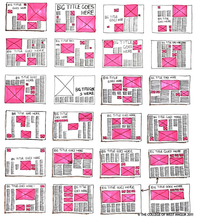
Below are some mockups I did during the process:

There were some deliberation with the cover page as I wanted something that will suit my theme better initially. However, after asking for my friends’ opinions, they thought that the first cover was nicer. Hence I decided to go with the first one but tweaking it abit to conform the theme.

The result is as shown below.

After much struggle, I managed to come up with something that I am satisfied with.

zine final; yishun

Imagine this zine as a lookbook. But not your usual one. This lookbook captures the colour essence of Yishun which is predominantly brick red and blue. We start with a short author’s write up and proceed to the introducing of colours in Yishun and finally, we top it up with a mood board.