Group 1- LEE YI JIE & TAN JIAO JUN
WHAT IS SEMIOTICS?
While the word, ” SEMIOTICS”, can be quite distant to many of us, it is actually ubiquitous in our everyday lives. Signs like traffic lights, toilet icon and even fast food icons like the colonel sander a.k.a white beard man from kfc, these are all part of what we call semiotics.

So what actually is semiotics? 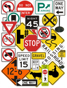
- It is the study of signs.
- It is both the theory and analysis of signs and
- signifying practices.
- It is the study of meaning-making and meaningful communication.
Formation of Meaning
Cultural and personal experience will curate how people first interpret the sign. It helps us to understand that reality depends not only on the intentions we put into our work but also the interpretation of the people who experience our work. These meanings are actively created, according to a complex interplay of systems and rules of which we are normally unaware.

For example, in this Panzani advertisement, our first impression screams Italian.Colours used are red, white and green which can be related immediately to the Italy flag. However, on the other hand, the texts are in French. Viewers with French background will understand that this is a French company marketing their Italian product. Whereas, for non-French or people who do not understand French, their first interpretation will be an Italian company selling Italian perishable.
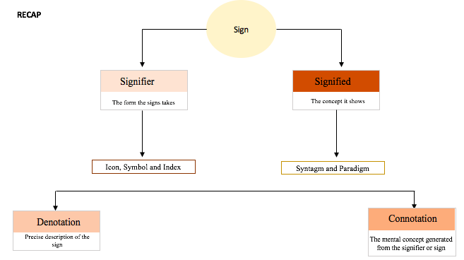
Signified and Signifier
To further elaborate on what is signified and signifier, here’s an example below.
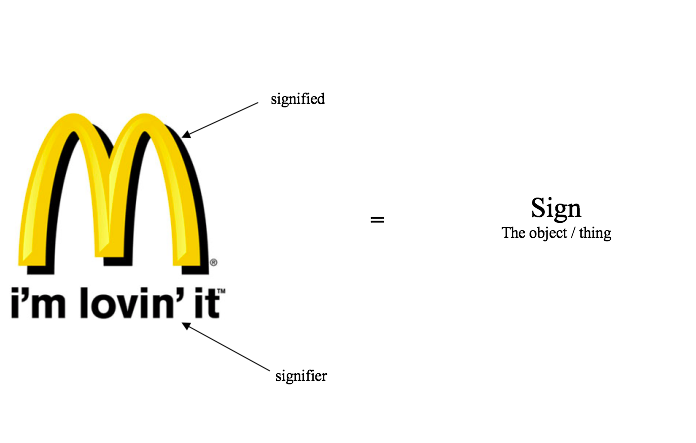
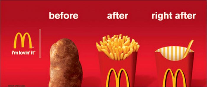
Here, the McDonald’s iconic yellow M is the signified whereby we can relate to McDonald’s immediately when we see it and the slogan, “i’m lovin’ it”, which is their tagline is the signifier where people link easily to the famous fast food chain.
In certain cases, the signifier have more than one signified meaning like the examples above.
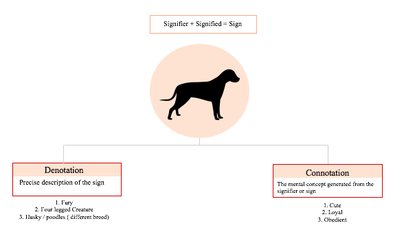
Connotation and Denotation
Connotation and Denotation are two principal methods of describing the sign.
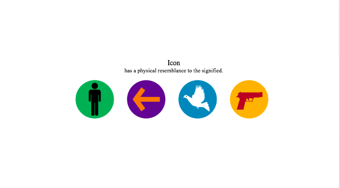
Icon, Symbols and Index
A signifier can also be explained through 3 elements:
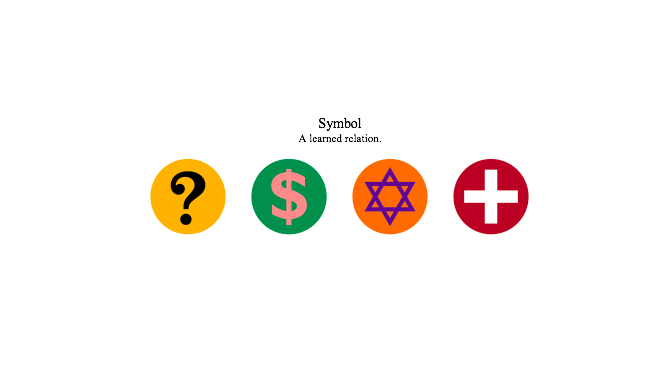
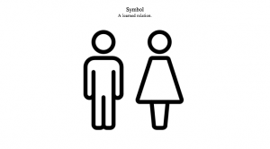
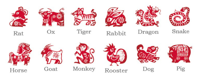
Symbols are learnt culturally, which explains why culture can develop unique traits.
A common example of a symbol is the male and female icons representing the presence of toilet facilities. These icons have become symbols because it takes on extra meaning.


The smoke cannot exist without fire. The signifier is the smoke, which leads to the signified being a fire.
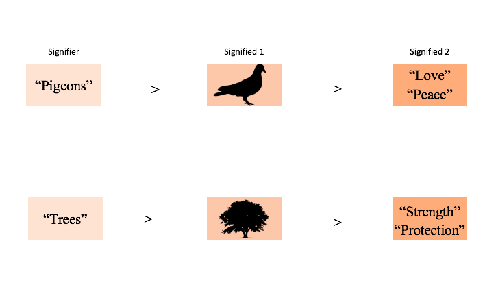
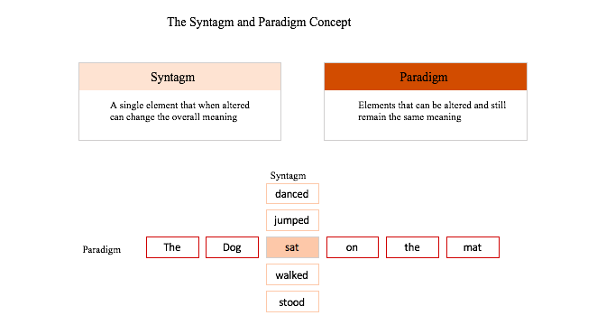
Syntagm and Paradigm
A signified can be explained or described using the syntagm and paradigm framework as explained below.
RECAP
Life Examples of Semiotics
Semiotics in Advertising

The signifier is represented by a public bus as well as a woman holding on to hand rails that are shaped like hands. There are also words, “WHOSE HAND ARE YOU HOLDING?”, which adds to the signifier.
What is signified to you?
Perhaps the feeling that it can be dirty, unhygienic and full of germs.
Semiotics in Architecture

Church being the signifier, it inspires people with the concept of god. The concept of god is also represented by the sign or symbol of the crucifix. Certain architectural elements like the crucifix are expected from a church of any architectural style. The signified meaning of the church is a place for pilgrimage.
Semiotics in Photography

Signified:
Text anchors the image and sets the narrative of the scene.
Signifier:
Red lips connotes passion.
Black background connotes meanings like mystery, forbidden and power.
Tattoo suggests the whole motion of danger and forbidden.
References
Boulton, Mark. “Mark Boulton.” Icons, Symbols and a Semiotic Web | Journal | The Personal Disquiet of Mark Boulton. Accessed January 15, 2017. https://www.markboulton.co.uk/journal/icons-symbols-and-a-semiotic-web.
Hodge, By Challis. “Semiotics: A Primer for Designers.” Boxes and Arrows. May 08, 2014. Accessed January 15, 2017. http://boxesandarrows.com/semiotics-a-primer-for-designers/.
“Min’s fyp process.” Mins fyp process. Accessed January 15, 2017. https://oss.adm.ntu.edu.sg/mwang6/tag/semiotics/.
“Semiotics.” Wikipedia. Accessed January 15, 2017. https://en.wikipedia.org/wiki/Semiotics.
Ajamesjr. “Semiotics of Architecture.” ARC 612. October 25, 2012. Accessed January 15, 2017. https://arc612.wordpress.com/2012/10/25/semiotics-of-architecture/.