


There are 10 posts filed in Foundation 2D 1 – G9 (this is page 1 of 1).

THEME: LIFESTYLE
I went with the idea of my lifestyle which forms the bits and pieces of my personality.
FASHION (PHOTOGRAPH)

For this strip, I am making a social commentary about how people conform to societal norms in order to fit in the society now.
1) The style here is what I have always wanted to walk on the streets with. I used a pink shade as it has a dreamy tone to it and the uniform colour here signifies the imposed conformity of the society. The stanza, “conformity fashion”, is a sarcastic remark here.
2) The city photo here I took is to show the society. Blue and yellow are complementary colours. Blue signifies a quaint environment and while yellow her signifies the potential danger in people. What I want to portray here is that in our society, although everything seems peaceful, people are bound to judge one another if we dress out of the norm.
3) The photo here is me in clothing deemed normal by people. Green is normally used as a grotesque colour. I used monochrome green here to emphasize the imposed conformity again.
Therefore, my style + society = society’s style
WORK (ILLUSTRATION)

For this strip, I wanted to show how school work is making me lost my sleep.
1) I am someone who does not really like to face reality and like to dream alot. I used pastel analogous colours here to represent the dreaming element and my wide spectrum of ideas.

2) Here I wanted to represent school work. Inspired by the starter pack trend. I created an anatomy of an art student. I used complementary colours, yellow and blue here as they are normally the few primary colours used by schools hence it can represent more of a school feeling.
3) The owl is to represent no sleep and the skull represents the haunting workload. >w< I used monochrome brown here to show my mundane life. 🙁
Me + School = No sleep
FRIENDS (PHOTOSHOP COLLAGE)

Life without friends for me is a sad thing for me.
1) This composition I want to represent life. Hence, I included different elements of life like earth and grass. I used triad colours here to show all elements of life like how the colours are at different spectrum of the colour wheel.

2) This composition I want to show friends. Carebears are the epitome of friendships and yellow roses meant friendship in flower language. I used RYB colours here to show different friends I have.
3) Here, I want to show the fear of not having friends in my life. Being an only child, I am grateful towards all my friends for their companion. Hence, I am afraid of not having friends in my life which is what I want to portray here. I used monochrome blue here as blue can mean sadness too and the red here is to signify the sense of wariness and danger I experience. The wilting flower also portray a sense of sadness too.
Life – Friends = Sadness
FOOD (WATERCOLOUR)

1) Here I used triad colours to show the wide variety and endless amount of food around the world.

2) I used mainly warm colours like brown and red here to represent my comfort food like fried chicken and bubble tea.
3) Cold colours like purple, green and blue, used here is to represent sadness without my favourite food or food in my life. The watermelon here represents me as it is one of my trademarks that I love watermelons. Basically, it signifies a sad me(watermelon).
If given more time, I would like to explore more on watercolour like joy suggested during critique and also try different styles like line art. I really want to explore further on one stroke painting too. Also, the regret for this project is that I wished I could have done the workmanship better this time.

COLOURS
The process for this project has been a fun one as I get to play around with different colours this time. Before starting on the project, I researched abit about colours and found out the different theories like analogous, complimentary…

MEDIUM
During my research, I came across this watercolour artists, Afu Lee.

Inspired by her works, I wanted to try watercolour for the first time. Hence, I decided to do some trial testing.


Trying out one stroke painting with gouache tempera.


Tried watercolour on printing paper but the watercolour effect did not come out as well as watercolour paper.

My original idea was to use watercolour as my main medium for this project, however, I was not quite satisfied with the quality of my watercolour. Hence, I decided to have a different for each of my line, watercolour, illustration, photoshop collage and photographs.
IDEA/THEME
My main source of ideas was mainly from tumblr due to the wide variety artists and artworks on it.


In the end, I settled with my theme for this project as Lifestyle where I display my relation to food, friends, work and fashion.

The seaweed is always greener in somebody else’s lake.
For this project, I want to make a social commentary about the increasing trend of pursuing unlimited wants. The 4 compositions will come together to form a circle about this neverending vicious cycle.


This composition is greatly inspired by The Great Wave of Kanagawa by Hokusai. For this composition, I wanted to do a relation to the original movie, The Little Mermaid, hence, the more cartoonish theme to the whole collage. In this, we have a recognizable figure, Ariel, I blanked her face so as to play on the viewers’ ability to recognise Ariel and I also wanted to link her to the perspective of the viewer. I made it a cycle on how the fishes wanted to have a face and be able to talk like Ariel while Ariel wanted legs. I made the waves seem like 1/4 of the circle here and to create this disorientated sense to reflect the emotional state of the elements like how they iaren’t satisfied with their current state in life.

This composition I focused mainly on the pursue of materialistic wants. Here, we see that the girl being attracted to some flowers which I interpret as beauty. We see a flower carpeted floor leading to the galaxy background behind with things like house and gems along the way, suggesting that the route to materialistic wants is never ending. I used some words “BIG GIRL IN A SKINNY WORLD” to suggest that many people these days aren’t satisfied with how that look and they conform to the social standards of being skinny, therefore, this is like a sarcastic comment about this social observation. I used the girl bending over for the next 1/4 of the circle.

Here, I focused mainly on the way many people are fixated in getting what they want so much that they fail to notice the potential dangers and hazard along the way. This composition I did some reference to a common folklore that everyone knows, The Frog Prince. Yet again, this is another sarcastic commentary that logistically speaking a frog will never turn into a prince. We see the frog so fixated to get the crown which I meant power here that it failed to notice that its falling of the cliff into the ocean and the upcoming crashing waves. I used poker cards here to signify that we are betting our odds. I also used bubbles here to show a sense of fragility in the whole situation and the another 1/4 of the circle.

This composition I made the whole scene to be similar to the ocean bed (dark and gloomy) to signify a “sunken” situation. Also I used a broken lifebuoy and fishes to represent the last 1/4 of the circle. We see the fishes surrounding this unknown “object” to show that whatever we are pursuing may result in our downfall and trapped situation if we lost the bet. This is when we thought of being free from all these sticky situations like a fish which I signify as freedom.
To see the circle more clearly, these are the finalised compositions.


This project proves to be quite tedious as I met alot of thinking blocks along the way. Initially, I wanted to use 4 different quotes to make a social commentary of how we pursue unlimited wants and they are:
1) Heavenly Forest
“I wonder if anybody’s nice enough to stop.”
2) Harry Potter
“After all this time?” “Always”
3) X-Men: Apocalypse
“Everyone fears that which they do not understand”
4) The Little Mermaid
“The seaweed is always greener in somebody else’s lake”
For the little mermaid’s quote, I was pretty inspired by Hokusai’s great waves, hence, I decided to incorporate the waves in my collage. Initially, the plan was to have this “imaginary” cycle of how the fishes wanted to be like Arial- have a face and able to talk, and I will do the same vicious for the three other quotes. However, after I consulted Joy in my first consultation, she proposed a suggestion of having one quote and to expand my vicious cycle to a larger scale. Also, to have 4 collages come together to show a circle so that it resembles a cycle.
On my second consultation, I had my 4 collages done but after consultation, I realised that there were many problems like some collages being too dark and the hint for the circle being too strong. Hence, I decided to redo my collages.


The silkscreen printing process was another problem like my other classmates. When I tried silkscreen printing for the first time, it turns out well. However, when I wanted to print the design on the bag, the prints turn out to be either too dark or too light. After 5 trys and 2 tote bags, I was able to get the right tone I want on my 6th trys. YAYY!! Lesson learnt: Use ample ink and glide the ink on the screen with minimum strength.
Proceeding on with my collages, I went onto tumblr for inspirations as I was pretty much experiencing major blocks and couldn’t fork up any ideas. These are some of the artworks I took inspirations from. All in all, I managed to overcome the blocks and come up something.


Language and Society
Every society has a story to tell.

BACKGROUND
As mentioned in my process post, it all started with a strip of Chinese characters. After consultation with Joy, she encouraged me to go on with this idea and I should develop this into a diversity of languages instead. After much researching, I realised that many languages are linked to the society they reside in, therefore, I decided to go with the theme of LANGUAGE AND SOCIETY.
CHALLENGES
As I embarked on a journey to retell the stories of different societies and cultures, I faced difficulties in curating the stories in a life form. How do you even artsify something that is intangible like cultures and norms? And to find out how I managed to overcome these obstacles, you will have to read on. (smirk)
STORY
With every strip made, there is a deeper meaning behind it.
Originally, I wanted to split the board into two segment(this suggests why there is 2 A2 boards)- one board for Chinese language (due to my love for it) and the other for other languages, however, after my group consultation, Joy and my classmates suggested that I should combine both boards and explore more languages and societies. Therefore, my finally product is an A1 board. Also, I mainly used normal print paper as I want to focus on the story behind in, however, for some strips, I felt that using a different textured paper will enhance and highlight the story that I am going to tell.


Affection

Italians are thought to be the most affectionate people on earth. To prove this point, I have wrote several Italian love expressions like “vita mia”, “cuore mio” and “tesoro” which means my life, my dear/ heart and treasure respectively. Also, the words are written in italics to further express my point of Italian language and out of the strip to express the uncontainable emotion.
Passion
Passion is the strong feeling/ emotion towards someone or something. The flower language of rose is love. By filling the whole strip with roses, I want to express the overflowing love and hence, this translate into passion.
Infatuation

When I think of infatuation, the first thought that comes into my mind was “心花怒放”, which literally means heart blossoming. How else can I convey this message perfectly other than drawing blossoming flowers?

To create realistic flower patterns, I utilised the one stroke technique of combining both black and white paint on my brush and painting both colours at the same time. I found this technique especially hard to prevent both paint from mixing together, however, I guess it is similar to the feeling of infatuation whereby you are unable to to control your heart.
Bliss

“山高路遠魂飛苦,夢云不到關山難“
This is a poem about missing someone. Personally, I feel that when you are missing someone, you might feel that you are walking on this ice, the feeling of uncertainty, however, to be able to miss someone is actually a bliss in disguise. Many people in this world do not have the luxury of missing someone. Therefore, I used wax paper whereby is resembles that of a Chinese calligraphy paper to bring out the meaning of the poem but at the same time, though the paper might seem fragile but its actually not in reality (it is able to tolerate high heat) which resembles the feeling of missing someone.
Happiness
 The Bhutanese are thought to be the happiest people on earth. They are the perfect example to express the feeling of happiness. Originally, I wanted to draw the mountain view of Bhutan, however, it did not turned out well as shown below.
 After putting in some thoughts, I’ve decided to incorporate clouds which signify cloud 9 and the bhutan flag into my markmaking. And voila, piece completed. 😉
Contentment

For this, I decided to go with child language. As we all know, children like to do scribblings and doodles. Putting a black background is to signify that in times when the situation is not to their own favour, unlike adults, children make do with what they have and can still create their own doodles (fun and joy) out of it.
Astonishment

Astonishment is the feeling of strong surprise. The use of Singlish has always seem crude to me for some reason due to the tone and way we say it. Also, due to its strong and crisp expression, this leaves a strong impact and a sense of bafflement when one uses it. Hence, I decided to use Singlish like “SIA LA”, “KIASU” and “LIDDAT ALSO CAN” to express the feeling of astonishment.

Surprise

Athena and Ares are siblings in greek mythology. Ares is the god of war and Athena is the god of wisdom and intelligence. The surprise emotion I want to get across here is that they actually went on war against each other during the Trojan war with Athena being on the Greek side while Ares being on the Trojan. In the end, Athena won against Ares. Hence, in the strip, I have put both Ares’s and Athena’s names together to show that they are siblings but the irony/ surprising thing is that you can see both of them in fighting stance against each other.

Amazement

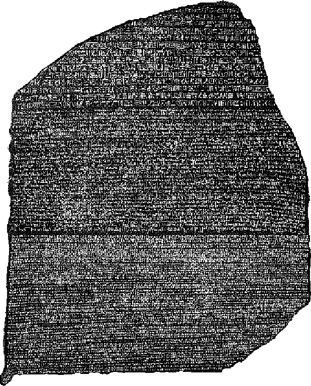
Egyptian hieroglyphics were first found on the rosetta stone. I can imagine the amazement of the people when they first found this revolutionary language on the rosetta stone. Hence, I have copied a small stanza of the hieroglyphics on the stone onto my strip. Also, the use of chalk on black background is to mimic the degrading process of the carvings over time and hence, giving the whole strip an ancient finish.
 Ferocity

Thai Khon is a common character in Thai plays and it is about a monkey warrior going on a journey to fight demons. I have used the word “ข้างหน้า” in the strip which means forward to represent the ferocity of this being in completing his journey against the evil. I have used newsprint due to its rustic feeling which can depict the traditional khon play which was passed through several generations.

Bitterness

Inspired by joy, I was set on expressing how japanese like to keep their emotions within themselves even when they are angry. Won’t this create bitterness for them? Hence, I decided to make patterns out the word “怒り” which means anger. Kept within the circles, this represent the kept emotions. With the neat repetitive patterns, this suggest one characteristics we often identify the japanese- systematic.
Torment

“Dozens die in suicide bombings across Syrian cities held by Assad forces”
This is the arabic words written in the strip. This is the latest news about the syrian situation currently. Despite Bashar al Assad being the president of Syria, we see little effort done by the president to control the current situation in Syria. With this, I feel that it must be such a torment for the people to be ruled under poor leadership and corrupted government.
Also, I have crushed the strip before mark making the background of the strip so show the ruined state of the country currently.
Defeat

To explain the whole arab spring situation will take days or even weeks. However, the main gist of arab spring is that people are fighting in wars now in the name of peace. The word in the strip, “سلام”, means peace. This is an irony as people are not gaining any more peace but chaos instead. Hence, the main aim of the arab spring failed and this translate into a sense of defeat. Therefore, I have mark made a chaotic background behind the peace which means chaos in the name of peace, this defeats the original purpose of arab spring.
Suffering

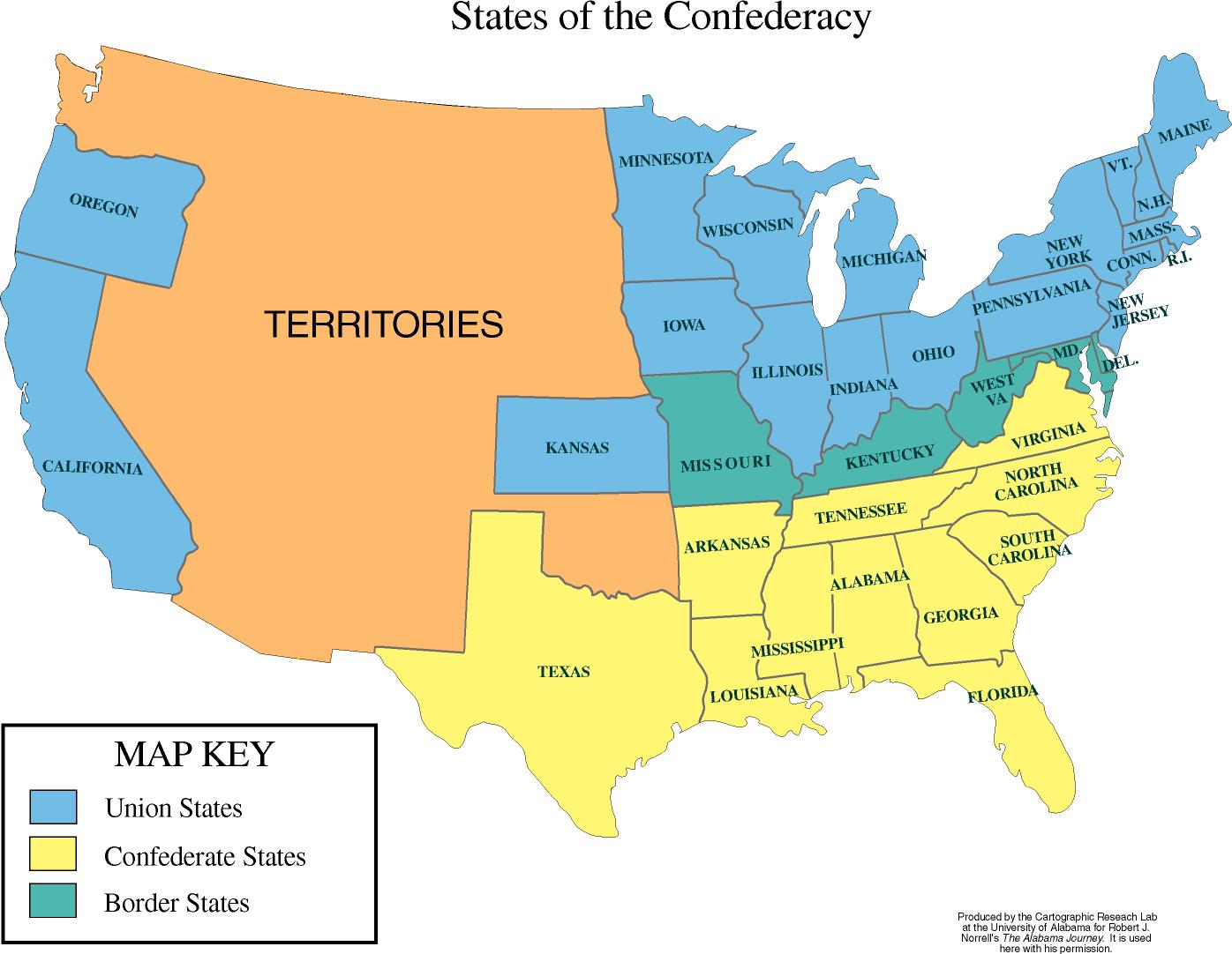
This strip is to document the process of freeing sufferings. I have drawn out different segments of the American states during the American Civil War. With the greyed zone signifying the Union states, slashed zone representing the Confederate states and greyed and slashed zone representing the border states where fightings mainly take place at. This is a war about freeing the slaves whom were shipped from different countries in Africa. At that time, slaves were legalised in the confederate states and hence, when the banning of slaves was introduced, this sparked of disagreement in the confederate states and this escalated into a civil war. In the end, the union states won and the slaves were freed off their sufferings.
 Insecurity

If you look carefully, there are Russian words behind the mark make. It means people are wanting the communist state to be back. After the fall of the Berlin wall, we see fall of the USSR and Russia being increasingly democratic. However, behind this facade, there are actually many Russians that want the resurrection of the communist era again. This is because after World War II, Russia was left in a pile of huge debt, the country isn’t prospering very well even till today. Hence, this led to insecurity among people which blossom into thoughts of gaining back their communist state in hope for better living despite the “democratic” facade (mark make).
Fear

The mayans are known for their prophecies about the world. They have made a few prophecies on the mayan calendar whereby some really did came true, hence, whenever a prophecy arise, this invokes fear among people. Therefore, i used the several symbols on the mayan calendar that are that similar to horoscopes to represent their prophecies. Also, the use of water patterns is to explain the moodiness nature of water which further substantiates the feeling of fear. I have used news print due to its rustic nature to depict the ancient society.
Anxiety

“Let me speak now please”
I used sign language in this strip to represent the anxiety when one is unable to convey their message effectively and they are constantly trapped (which explains the fuzzy lines around the sign languages) in an endless cycle of not being understood.
Distress

We all know that Koreans are mindful about their respect. With just one word “hello”, this can be branched out into the informal, formal, more formal and even when you pick up a phone call. The emotion I want to convey is the distress about when to use what form of “hello”. Isn’t there going to be blurred lines about which forms to use?
CONCLUSION
Markmaking has been a tough yet fun process for me and I have learnt alot about patience through this project due to me not choosing to use monoprinting. Also, I have learnt about how I can convey a story through simple depiction of lines and the characteristics of the story.

Mark Making- Process 2
I have always been inspired by the Chinese culture and would very much like to experiment further on this subject. After consulting joy, she encouraged me to explore the language vicinity like Egyptian hieroglyphics and not restrict myself to just Chinese itself. Also, she inspired my to research more on the norms and emotion standings of different races and religions.
 With that being said, this is my first draft of emotions. Although not much thinking process is put into creating these patterns initially, but one of the strips became the spark towards what I want to go for.
![]()
With the theme of LANGUAGE AND SOCIETY, I began doing some background research on different languages like korean, japanese, arabic, dzongkha, italin, spanish and many more. Also, I’ve tried different papers like newsprint, print paper, chinese calligraphy paper and even wax paper.
 How do I put across a message that emotions are kept within someone?

One of my ideas is to insert a Chinese poem, having tried different fonts and sizes, I finally found the perfect way to portray my idea.

Originally, one of my ideas was to show the evolve of Chinese characters. However, I can’t seem to put an emotion to it, hence, idea aborted.

Below are some examples of my thought process.


At this point, I have decided that writing materials will be my main medium due to it being one of the main form of communication in today’s world. Also, after my group consultation, my original idea of separating the board into 2 A2 boards with one focused on mainly Chinese language and the other one on world’s society and languages changed into just a A1 board depicting languages and societies around the globe.

Markmaking- Process
Before I started out with this project, I experimented a few pens and brushes for their textures.


This project seems all fascinating to me as “mark making” is a new foreign word that I picked up within these few weeks. Having no background in art at all, I was bewildered by all the fancy ways of creating patterns andeven textures. Hence forth, when joy introduced the procedure for mark making, I was so excited and eager to “touch” the roller!


Voila! I had my first mono printing ever! I’m so glad it turns out pretty well on my first attempt though.


Subsequently, I decided to explore the world of monoprinting and used many materials such as leaves, flowers, strings, foil, spray bottle and basically that’s in my sight. Some turns out print well and through this process, I’ve got the hang on how to do monoprinting.


Of course, coffee beans are not at my mercy too. HUHEUE. Although it was a failed attempt, but its okay, we all learn from our mistakes.


Feelin’ a little experimental today, I used chinese ink to create different momentums and patterns.


TADAH! These are the finished products of my markmaking process.


C Y _ T W O M B L Y
![cy-twombly-by-boillon[38642]](http://www.stars-portraits.com/img/portraits/stars/c/cy-twombly/cy-twombly-by-boillon[38642].jpg)
http://www.stars-portraits.com/img/portraits/stars/c/cy-twombly/cy-twombly-by-boillon[38642].jpg
“My line is childlike but not childish,”
Cy Twombly’s work are largely influenced by the Roman and Greek mythology however, in the form of childlike doodling. He is able to perfectly execute the mixture of two western accent, traditional European sources and new American painting. With inspiration from Paul Klee, Twombly’s artworks uniformly have a strong presence of childlike approach yet a lasting influence.

Leda and the Swan (1962)
One of Twombly’s most accomplished works, illustrates his career-long attraction to the stories, literature, and events of classical antiquity.
In my opinion, I feel that Twombly had exquisitely displayed the essence of applying his own personality into his drawings/ painting. His childlike approach on all his paintings showed appreciation of the “naive” and “untainted” aspects of children’s art. He is able to express a wide array of topics from social issues in the past to art history and finally to his own life experiences while conforming to his own dynamic style.
Reference:
http://www.artnet.com/artists/cy-twombly/
http://www.theartstory.org/artist-twombly-cy-artworks.htm#pnt_1
“My line is childlike but not childish,”
Cy Twombly’s work are largely influenced by the Roman and Greek mythology however, in the form of childlike doodling. He is able to perfectly execute the mixture of two western accent, traditional European sources and new American painting. With inspiration from Paul Klee, Twombly’s artworks uniformly have a strong presence of childlike approach yet a lasting influence.
Leda and the Swan (1962)
One of Twombly’s most accomplished works, illustrates his career-long attraction to the stories, literature, and events of classical antiquity.
In my opinion, I feel that Twombly had exquisitely displayed the essence of applying his own personality into his drawings/ painting. His childlike approach on all his paintings showed appreciation of the “naive” and “untainted” aspects of children’s art by utilizing basic mark making techniques like scratching, ink and pen marks. He is even able to express a wide array of topics from social issues in the past to art history and finally to his own life experiences while conforming to his own dynamic style.
Reference:
http://www.artnet.com/artists/cy-twombly/
http://www.theartstory.org/artist-twombly-cy-artworks.htm#pnt_1
–
A N D Y _ W A R H O L

https://www.youtube.com/watch?v=QAJJ35DVlTs
Andy Warhol is a magazine and ad illustrator and the leading artist of 1960s pop art movements. In 1961, Warhol developed a brand new concept, pop art, in which paintings are revolved around mass produced commercial goods which quickly gained worldwide recognition and causing a stir in the art world.

Personally, I feel that Warhol brings mark making to a whole new level as he is able to incorporate colour ink to his paintings while creating a balance between the wide array of psychedelic colours in each of his portraits. Adding on, it is amazing and astounding how Warhol is able to breathe life and vibrancy to even the most mundane portraits and household items we probably have at home.
Reference:
http://www.biography.com/people/andy-warhol-9523875
http://makingamark.blogspot.sg/2012/07/Andy-Warhol-The-Portfolios-Dulwich-Picture-Gallery.html
yijie;l

Mark making is a term used to describe the different lines, patterns, and textures we create in an artwork. It applies to any art material(s) we use on any surface(s), not only paint on canvas or pencil on paper.
(First Exposure) These are a few mark making techniques that I’ve found interesting.