zine process; yishun

The process for this project was quite an excruciating one as I totally scrapped off my idea almost 3 days final submission and did something outside my comfort zone.

Below are some snapshots of my previous designs.

The reason why I decided to redo was that I felt that there isn’t a main focus in my zine. While I knew I wanted to do a zine about the colours of the buildings in yishun, I felt my previous zine didn’t bring out this idea as much I wanted.

Hence, I did more research to discover more ideas and concept on how to improve my zine which shown below.

I was reading a fashion magazine one day and I saw a mood board that the magazine did. It was a sudden thought but I decided to come up with a mood board too as I wanted the audience to know more about the colours I used in my zine.

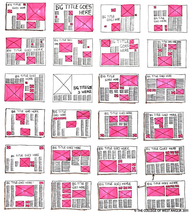
Below are some mockups I did during the process:

There were some deliberation with the cover page as I wanted something that will suit my theme better initially. However, after asking for my friends’ opinions, they thought that the first cover was nicer. Hence I decided to go with the first one but tweaking it abit to conform the theme.

The result is as shown below.

After much struggle, I managed to come up with something that I am satisfied with.

zine final; yishun

Imagine this zine as a lookbook. But not your usual one. This lookbook captures the colour essence of Yishun which is predominantly brick red and blue. We start with a short author’s write up and proceed to the introducing of colours in Yishun and finally, we top it up with a mood board.

Zine Presentation

义顺 / Yì shùn / Nee Soon / யீஷூன்


Yishun has a large population of up to 200000 people, comprising of many subdivisions within the town.


Yishun was part of territories inhabited by the indigenous nomadic boat-dwellers known as Orang Seletar – descendants of the orang laut or “sea people” who lived in boats and made a living as fishermen.

In January 2016, Yishun was designated as the first “dementia-friendly” town due to its large elderly population. Hence, in my final zine, I would like to show the transformation of Yishun from a kampong to what it is today.

To-do list:

Zine Research

ONE

This zine layout gives me a clear sense of how different principles of art is utlized within a zine and also it makes use of different art rules like the rule of third and hierarchy in the layout itself too. This zine also gives me a clear sense of what is expected from a zine and acts something like a guide for me.


TWO

The author made strong use of colours to give off an impactful message and grabs the readers attention within seconds. The coordination of colours within the pages tones down the biazarre0ly coloured images and seem harmonised in the viewer’a eyes.


THREE

The author made use of both illustrations and pictures in this zine which is what im going for in my zine. The author also arrange the different elements in such a way that although it might seem minimalistic, it is actually very congested with pictures and infomation.


FOUR

I like how the author made use of the pop art concept in her zine. We can see a uniform colour of pink her but the use of triad colours brightens up the whole zine, making it more funky and fun. The author also uses the true colour of images to highlight certain images.


FIVE

This is my personal favourite. I like how the words are placed in the photos and the utlisation of the world map to show the location. The designs are really simple but the overall touch still look classy and clean.