Teamlab response

TeamLab is an “art collective” of “ultra-technologists” consisting of engineers, programmers, CG animators, graphic designers, editors and more, specializing in combing scientific advancements with artistic endeavors to create interactive art installations. They use light as a medium to paint in an unrestricted unbounded canvas existing between the physical and virtual world.

They seek to merge Virtual Reality (VR) and Augmented Reality (AR) in real life, creating interactive artwork with very strong immersiveness.

In Nature, the participants personalize and scan their drawings, and their drawings appear within the walls of the installation. The existing displays interact with the added design, creating different responses in the flora and the fauna in the virtual environment.

Based on participant’s input, the installation, which spans the entire room, changes and evolves to the input, becoming like a living, breathing atmosphere. The participants are surrounded by this mix of AR and VR, thus creating a string suspension of disbelief, creating immersiveness with the artwork.


I believe a lot of inspiration has been derived from past immersive interactive artworks like “Osmose” by Char Davies, where a participating immersant’s input, like body tilt and breathing movements affect the VR display.

The concept of using participant’s input to create a interactive, unregulated output allows more room for exploration and interactivity which will transform the installation in unpredictable ways.

It is always interesting to debate the difference between are and commercial work. However, history has proven that thee two are early indistinguishable. In the arts and crafts movement, the Japanese Mingei folk art movement focused on creating normal, functional pieces of art for everyday use, eschewing from their ideals of creating luxurious, “high art” objects. Even though this is essentially commercial work, it is still classified as a work of art, for the craftsmanship, stylistic explorations, and aesthetic values elevate it into a form of art. Furthermore, this movement left a mark on the artistic trends of society, creating a impact in history. I believe, with significant impact, commercial work can also be considered “art”, for art is what tracks human growth and progress over the generations
Furthermore, the pressures of modern capitalist society force artists to have to resort to producing some version of commercialised works as a way to sell. Even though this notion is commonly recognised as “selling out” and abandoning ones pure artistic ideals for monetary well-being, it is also understood to be a necessary choice made.
Thus i dont think the distinction between “art” and “commercialised work” is important today.

Mobile of Hope: process

Conceptualization

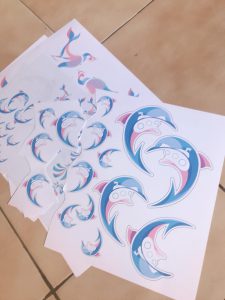
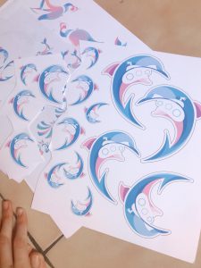
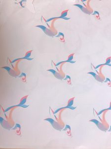
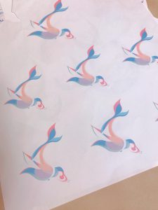
Because this project requires the use of gestalt to fuse two images together, with clear distinction of figure and ground, i started to research into easily recognizable images with clearly defined shapes.

At the same time i started to make mind maps connecting different concepts in which i thought would best represent hope. Below you can see that there are many different concepts, focusing in flight, water, and space.
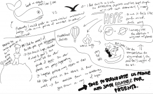
 

Originally, i started off with the idea of little prince, using space motifs like planets to represent hopes and aspirations of the patients. However, that design idea was scrapped because the circular shapes of the planets were too circular, lacking in contrast and an interesting silhouette.

I began to do more research, developing a design that made use of curves and at the same time retained contrasting angles. The concept of contrast, both in the design sense, and the conceptual sense, intrigued me. I felt that through utilizing contrast, I could create a design that truly resonates with the patients– for the patients live a life of constant juxtaposition of illness and health.

In the end, I ended up choosing the concept of Water, expounding on it and creating a contrasting dichotomy between two opposing forces- Man and Nature. I used the water motif to represent the harsh forces of nature, how insurmountable and challenging it seems. This reflects the reality of patients, constantly struggling over their illness. Even faced with such challenges, the patients bravely fight on, like humans who try to tame the waves.

The surfers, the submarine- navigators, and the yacht-sailors are just mere, weak humans, trying so hard to go against the currents of nature, pushing forward with their weak human bodies, against the cruel and uncaring brutal strength of nature. Even before the humans existed, and after the humans die, the waves have and will still exist, laughing at the face if the small, insignificant splashes made by human effort. But these people don’t back down, and neither do they give up, knowing the futility.

With this understanding and this layer of meaning, these imageries have close parallels to the patients’ journey and almost act as metaphors. Thus i chose these images to create my graphic form.
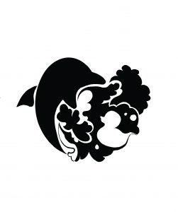
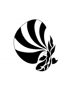
 

Initially, i had a very hard time coming up with graphic designs. My shapes tended to very towards the illustrative, as they were too detail oriented. After consulting with Michael, and comments from friends, I realized that the details, although adding flourish to the design, create too many focal points around the design, and confuse the viewer’s gaze.


after many trials, i finally was able to simplify my designs into clean graphical strokes. I attempted to design according to the Fibonacci spiral and golden ratio circles, creating designs with leading lines that highlight the blending of figure and ground.


 

The nature motif, represented by aquatic animals, makes up the positive space, and the human is the negative space, almost like the human effort is trying to chip and erode away some of nature’s power from within.

when adding color, I initially attempted to use gradiented pastels to create the soft and airy look. I wanted my colors to blend together harmoniously, to provide feelings of peace, serenity and encouragement. However, this idea was rejected became Michael explained to me the nature of logo design would be to have simple and crisp colors to save on printing cost.

Thus i looked into forming crisp sharp lines, aligning with the golden ratio, to block out colors in the positive space of my graphic form.
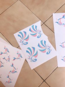
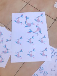


final images and a video of my mobile can be found here:

Mobile of Hope : FINAL


Poster analysis

The poster is overall very well structured as it makes very good use by leaving a lot of negative spacing, creating a string figure and ground distinction. This distinction, coupled with the central placement of the letterforms, directs emphasis onto the letterforms.

The poster is divided in three groups of text, the introductory, “the shining” and the credits. With “the shining” being in large bold text, with heavy weight, and in a skewed position, it is emphasized and differentiated from the other letterforms, and catches the eye strikingly as a graphic form rather than being mere typography.

The slant also guides the viewer’s eyes down in one straight column, directing the line of sight over the poster’s information in a concise order.

playing with the positive space of the font shape, a shocked, horror-filled face is embedded within “the”. The image, grainy and pointilised, retains structural ambiguity about is nature and its subject. It doesn’t reinforce if the figure is a human or a spirit, or in between. This creates an unsettling image, as the viewers are left to piece together the gap.

the figure’s eyes guide the viewer’s gaze down to the letters of “shining”, further emphasizing the movie’s title and creating a striking impression.


The color of the poster is intriguing. Mustard yellow and black make for a very strong contrast. In our nature, we associate such colors with danger, as evidenced from the colors of yellow jackets, tiers and venomous snakes. The poster is trying t communicate with our subconscious and notify us of the potential horrors that await us in this movie


i really love how Milton Glaser creates graphic illustrations using color blocking. Being more detail inclined, i often find it hard to create graphic forms/illustrations without veering into being too distracting. Milton Glaser creates simplified, clean designs using good grasp of colors and the use of ground and figure.

In this poster of aretha franklin, he blocks out a positive form using squares, with one contrasting edge of curves. The squarish positive form is placed in the center and further constrained by the solid rectangular line in the negative space of the background.

The curves of aretha franklin’s hair break the monotony of the otherwise constrained form, creating an interesting visual contrast. It also leads the eye around the form.

The colour contrasts in the positive image are blocked out by edge lines and curves, further leading the eye around a line of sight down the image


Reading Response: Jan Chipchase: Calibrating your cultural compass

In this chapter, we learn about different examples of designs that are suited for different climates and locations. As Jan Chipchase describes how the universal, ubiquitous Mcdonalds projects a differently designed image in every country; a homeless shelter/resting area in Japan, a mostly vegetarian place in India, and a healthier fast food alternative in France, it is clear that corporations have to design a different brand identity for themselves in different countries,

Colour shades

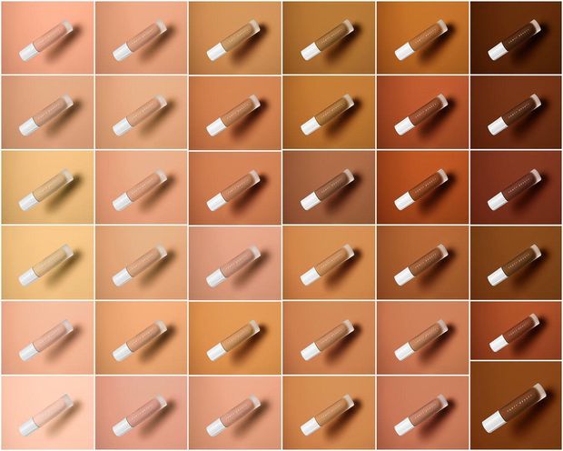
Imported brands have to cater themselves to the local market, by experiencing local culture and building a common understanding with the market and people’s wants and needs. For example, american beauty brands like Fenty Beauty are known for their extremely large range of foundation colours- having 40 shades in total, to cater to the Latino and African-American public.

However, in Singapore, there were less than 40 shades imported, presumably because the retailer’s understanding was that Singaporeans do not have such a dark skin tone. In places like Japan, where fair and light skin is enforced by cultural pressures of beauty, the dark shades are fully eliminated and only the light shades are sold.


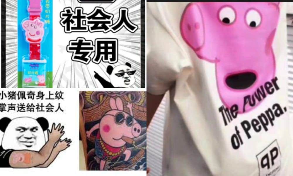
Besides catering to local taste on the retail scale, brands marketing and image changes fro country to country too. In England, Peppa pig is just an ordinary kids TV show. However in places like Taiwan and Hong Kong, the image of Peppa pig is a symbol of societal rebellion, even leading to the ban of Peppa pig in mainland china.

Because the locals can transform and twist the imagery and meaning of a simple and harmless children’s TV show into a political figurehead of societal rebellion, this serves as an incredibly resounding reminder to brands that brand identities must be carefully curated and built together with the local community.

Reading Response: Jan Chipchase- You Are What You Carry

From our previous week’s reading, we have learnt that behaviours are learnt, adapted and shaped by the forces of our environment. Thus, people behave differently in different countries, and designers have to find different methods to communicate in different countries. I recall his next chapter on how we must walk through the actual place to have the rue in-depth understanding of the affordances, signifiers and hidden affordances of each place, sign and action.

“it never left her sight. Whats more, it never left her grasp…”

Through Jan’s story of Meili, who is consciously in a high state of awareness of the security of her bag, we learn that environmental causes results in may a change in action. For example, a place high in theft would cause people to be more wary about their precious belongings. This notion of protecting their own things calls in the debate of ownership; If we never carry around anything tangible, will the risk of theft still be present?

Jan shows us the example transferring paychecks to SIM cards in Afghanistan. Without receiver physical money, the paycheck goes to the recipient straight, without the threat of thievery via the middleman. The idea, though helpful, did not work out as planned, as recipients began to cash out immediately because they felt no sense of ownership over their money.

It seems to me that humans are stuck between the tangibility of ownership– to own something, people still feel the need to see it, to be reassured of its tangibility. This attitude is reflected in how we express ourselves– for something to be truly representative or a part of who we are, we have to make it a visible part of ourselves. In daily life, we are faced with many symbols of status. Branded products help to increase our social standing and social associations. However, displaying such products leaves us susceptible to the risk of theft or robbery. Jan Chipchase brought out the example of how apple airpods became very high targets of theft. This brings us back to our original point on tangibility.

Personally, I feel that this attitude and obsession with the tangible creates an inherent struggle which prevents us from progressing to a less object-oriented society. As Jan Chipchase puts it, there is no risk of theft if there’s no ownership. In addition, a less object-oriented society would allow us to share items, due to their lack of ownership. This ubiquity would then allow us to carry less things, thus streamlining our lives and having less things to carry and be weighed down by.

Due to environmental limitations, or simply for the sake of maximizing efficiency or even due to the human laziness, the stuff we are willing to carry are gradually becoming lesser. “use more while owning less”- if we create things with universal affordances, communal objects born will bring about benefit to the large part of the population.


This is evidently the direction that the modern world wishes to proceed in, as seen from the rise of eBook or music cloud sharing services, where books and music are no longer trapped within the confines of their physical selves, and can now be shared ubiquitously without the constrain of ownership.