You can check out part 1 here: https://oss.adm.ntu.edu.sg/yuol0001/toa-payoh-site-research/
Part 1.2 Ideation: https://oss.adm.ntu.edu.sg/yuol0001/toa-payoh-ideation/
Part 3 Final: https://oss.adm.ntu.edu.sg/yuol0001/a-journey-in-toa-payoh-final/
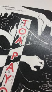
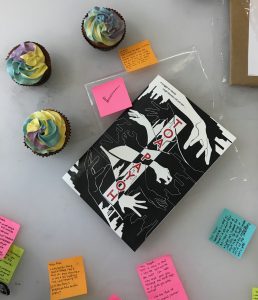
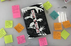
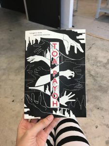
In my earlier ideation and drafts, I only used two colours- black and white to emphasise the graphic nature of my designs. After the first test print, I felt that the dichotomy of colours was not interesting enough to highlight key events of each spread. Thus I added bright red into each page. I kept it to a minimal to show consistency and harmonise the pages in its entirety.
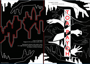
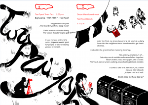
After consulting with mimi, her main advice to me was to create a logo to represent toa payoh, allowing me to introduce various locations to my readers. My friends suggested I add the timestamp onto each location, to emphasise the feeling of a travelogue. I feel these two additions really helped to stitch the zine together and bring the readers on a journey together.
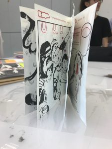
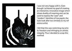
I believed that since the zine was a physical copy of our work, it should be not soley a visual experience, but also a sensory one. Tying in with the theme that Toa payoh is a town trapped between modernity and its past, I tried to evoke Toa payoh’s sense of tired identity into my zine. I tried to experiment and bring this out by incorporating 3d into the zine.
I attempted at embossing, creating a 3d bevel effect that will heighten and further highlight aspects of the zine.
To do so, I printed an additional cover of the zine.
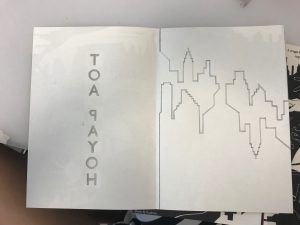
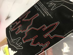
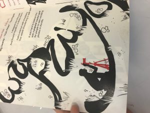
I traced the shape of TOA PAYOH using my tablet as a lightbox and used an art knife to trace over the contours. I later used a pencil to draw over the contours, creating grooves and imprints.
Only the T is embossed at this moment, as you can tell from the difference in reflectability between the alphabets.
I was worried that the texture is not that obvious and will be overlooked due to its subtle nature (and also because it cant be seen on camera), but my classmates all noticed and commented on how interesting it was.
I later glued the cover onto the zine.
Besides embossing, I sought to create additional texture through wrinkling the pages of the zine to create a tired, worn out look and feel.
wrinkle created by stacking uneven layers of glue
grainy, aged and dirty texture created by rubbing dirt over glue +further crumpling paper after paper has dried.
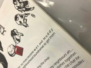
feathery texture created by applying glue and water over “muddy”, taking off layers of paper
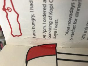
The edges of each page were also intentionally made wet and crumpled, causing the edges to be uneven and causing the zine to be unable to close.
These physical imperfections meant to depict how the zine has been passed through many hands and experienced many changes and effects of time. Its wear and tear are reflections of how Toa payoh has been over the years, its previous glory slowly eroding away, becoming worn out and tired.
Failure in attempt.sad

I did research and attempted this type of gilded embossing, but the embossing turned out to be rather unclean and could not tear away from my printed paper.
i learnt that the way to do a gilded emboss is when the majority of the paper to be embossed on is not oinked upon. In the case that it is inked up like mine, the gold leaf will stick to every surface with ink and will not achieve desired effect.
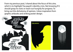
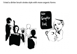


 Inspiration
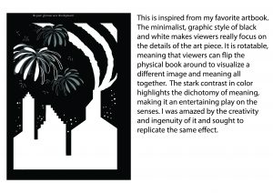
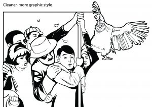


