maybe consider “golden hour” as my subject as it has the element of time to play with
“the sun” is in between “golden hour” (too restricted) and “light” (too broad) so maybe sticking to the sun is much better
More research
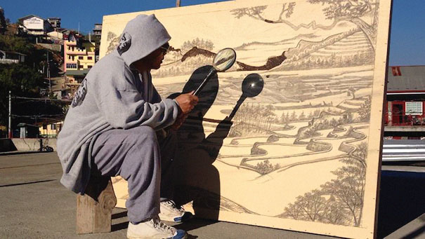
Jordan Mang-osan – Filipino pyrograph artist that uses sunlight and a magnifying glass to create his artwork by “burning”
… and apparently there is even a tool on Kickstarter to help with this technique: FEBO on KICKSTARTER
The results of these artworks are so pretty and might try to replicate this NOT by using the sun, but a similar look. (kraft paper + inked + silhouette cutouts????)
more ideations:
the sun from the pov of beijing is hidden
the sun from the pov of a heliophobic is trauma
the sun from the pov of photophobic is fear|discomfort|pain
the sun from the pov of a nightshift worker is home
the sun from the pov of a scientist is a different light
the sun from the pov of teletubbies is a face
ego from the pov of the sun is blinding
Also, I will try to conceptualize my ideas by playing with duality of with/without light, with/without sun or day and night.
In just 25 years, Gright was transformed from a developing country into a first class nation with extensive networking and infrastructure. Due to the intensive research put into design and technology, they were the pioneers in pushing boundaries and creating physics defying architectures. The outlook of the cities is filled with futuristic high-rise buildings, mostly glassy and shiny, or decorated with lights. Due to the short span of 25 years, new infrastructures were just built over old ones, leaving the old infrastructures still intact.
Some landmarks that can be found in Gright:
Downtown Gright
Gori Building
Gright Broadcasting Channel (GBC) Tower
Orion Circle – an o-shapped art museum building
Aquacitee – an underwater town beside Downtown Gright
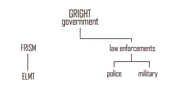
FRISM is an independent system. It does not belong to the government, but only a selected few from the government knows of its existence. It is so secret that anyone unauthorized who knows of its existence will disappear without a trace.
ELMT
ELMT is formed by FRISM, and with it being an independent system, the government has no control over it. ELMT is an independent covert group and it has the most power.
LAW ENFORCEMENTS
Although there is the normal police and military upholding the law of the country, FRISM does assist them in what was considered the “small, insignificant threats”. With such a strong, hidden backer, the law enforcement has a commendable statistics of a 99.89% crime solving rate, deterring and possible criminals of GRIGHT from doing anything stupid.
The military, on the other hand, supersedes the police and has the second most power in the country. Although they are the ones handling the bigger, real threats, there seemed to be none in the recent years. This is partly due to the involvement of the ELMT.
Finally! All compositions are completed. Here is long awaited breakdown of the final project:
Overall Concept: A milestones based on my Visual Effects artist timeline.
Style: From digital art works to traditional mediums or vice versa.
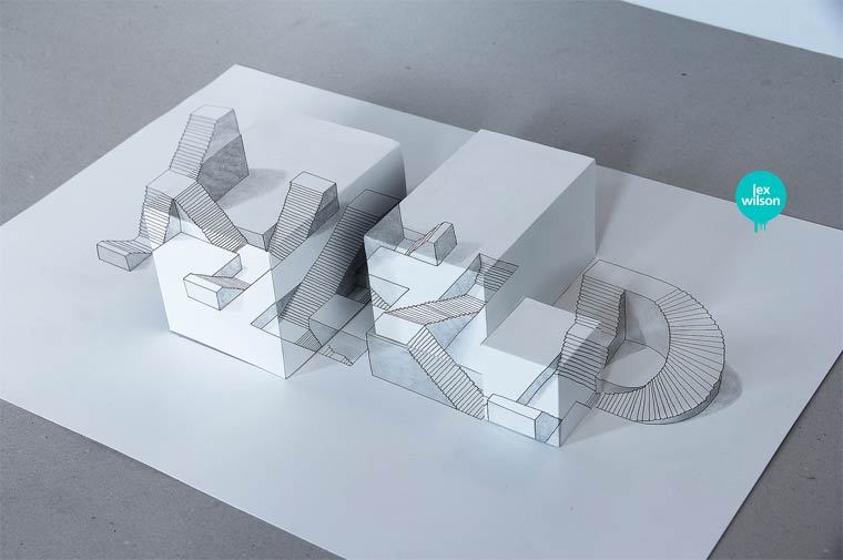
1. 3D ARTIST
This composition is based off my secondary school days, as I was quite lucky to be the pioneer batch that took 3D Animation as an GCE ‘O’ Level Subject – where I learnt and used Cinema 4D. The idea of using low-poly art, made from a few simple polygons, was also to show that I started from something basic.
This composition is made up of 2 layers, 1 transparency and 1 printed artwork.
Originally, as a 3D Artist, I wanted to incorporate a popup element in the design but the design was too complex. Hence, I have experimented with layers of transparencies, and it was an accidental success with these 2 layers, when overlayed, creates an illusion that the name “pops-up”.
2. LOVE DETAILS
For this concept, it is based on my Poly days, when I was interning and was tasked to primarily texture paint. My colleagues then taught me well – to observe any single details of the textures around me and even study some of the physics involved.
For this design, I have used a thumbprint as the background as it represents the macro details that can be found. I have modified a script font by using illustrator and painfully incorporated it to fit the lines of the thumbprint. Also, the medium for this was paper cutting as I felt that paper cutting is an intricate and delicate process that will truly bring out the concept of intricate details.
3. ART STUDENT
With Secondary and Poly days aside, this piece is based on my current status of an Art Student in ADM. This was originally a hand drawn handmade font done with graphite, then scanned and digitized and painted in Photoshop. This was to show that at this stage, I am trying my best to do things in both digital and traditional mediums. The coffee stain was added as a representation of the long late nights students spends doing studying or doing their assignments.
4. VISUAL EFFECTS ARTIST
Last but not least, being a Visual Effects Artist is the GOAL. Whenever someone asks me “what course are you in” or “what do you do”, I usually tell them visual effects, but some of them still does not know what is visual effects. So I usually use Iron Man as an example, and with that, I have decided to go for a HUD (Heads-Up-Display) style based digital “holograms” for my typeface.
Just like the breakdown video of the Swedish Idol Title sequence in my previous post, many layers are needed to create realistic visuals. With this concept in mind, I have created my typeface in 3 layers, with 1 background layer:
On the topmost layer, I have added a bunch of text on the right corner, of the programs that most vfx artists will use, to complement the balance of the composition of the bold and heavy typeface of my name. Also, with 4 layers in total, I have decided to give it a little depth, in z-space, to create an illusion that the text is in 3D. (from the parallax differences)
Last but not least, with all goals in mind, the ultimate goal is to see my work on a big screen.
So to start small, I have incorporated the last effect, the “negative filter”. Due to the some limitations (access to white ink, etc), I could not create the same effect in print, therefore I have thought of going back to digital – through the phone camera.
“POSITIVE”View of NEGATIVE FILTER from my phone camera
Creating this piece was a real challenge as I had to design this while looking through the camera filter, tweaking it in a way that the “positive” image will still look good.
Also, to create the depth, I had to find a transparent alternative to foam tape so after much thought, I have finally came up with using transparent straws and I have spent 2-3 hours gluing them onto the transparencies.
If you noticed, my compositions are also arranged (my opinion) from the most basic to the most intricate:
digital 3D < papercut < drawing < multi-layered “3D”
Overall I really enjoyed pushing my boundaries of sticking to digital work and experimenting with transparencies, tracing paper, papercuts and other traditional mediums for this project – some which was rather tedious as compared to doing purely in digital. I hoped you enjoyed it as much as I did!!
With less than 72 hours to submissions… here is my final update.
3D ARTIST
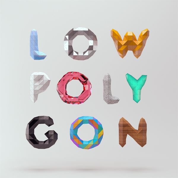
Based on the reference image above, I have started researching on a easier and/or more generative way of creating this in 3D. I have finally decided attempt this style, a trend in 2015, called LOW-POLY ART.
MountStar – Behance
I chanced upon a tutorial on a simplified way of creating these, and seemed like Cinema 4D is the way to go. With reference to the first image, I fired up C4D and created my name on a landscape, and here is the output.
JUSTIN low-poly
The typeface is created from selecting random polygons and extruding them, so its kinda like a handmade font. I am now attempting to convert or incorporate this into a pop up card for the final piece so… yep, I still have a little more to go..
VFX ARTIST
For the VFX image, I have already completed and printed onto my transparencies. (pardon the photo quality, my phone broke)
I am still thinking of a way to mount these together to create a some z-space in between each layers to create a parallax effect. Since its transparencies, I cannot use thick double sided tape and might have to use the left over transparencies instead.
LOVE DETAILS/EYE FOR DETAILS
Yep, I might be changing “love details” to “have an eye for details”. These will be based on papercuttings, definitely. I have yet to start on them, so here is some research.
A photo posted by Kristine Benum Braanen (@kristinebraanen) on
I should be going for a more geometric look (purely shapes or lines) for these patterns found on the cutouts. The lines will be fairly thin, creating a intricate overall design.
STUDENT
Here is some research on coffee painting that I might be referencing.
I might start my base of this piece with splatters of coffee, then adding these things I have used (the things I have already collected) throughout the entire period of creating all the other compositions in this “student” piece. This will only be done last after I have completed the other 3/4 of the typographic compositions.
With this, I’ll end off here with a cool website called Type to Design that I have chanced upon. The next post will be on my completed product! Stay tuned.
So this week I did not progress much: I have only finalized all my concepts and have to start experimenting and executing them.
VFX ARTIST:
First off, it’s the VFX concept. I have made use of transparencies and tracing papers and have already experimented on a prototype:
This was purely a test and I was pretty happy with the result, but my I have to try with colours this time and will need even more experimenting because of the translucency of each colours as compared to black ink. Here is a work-in-progress:
20% progress…
3D ARTIST:
WALL ART: Still Life Comes Alive
For 3D Artist, I will be creating a digital 3D piece with a 3D program – looking something like the wall art image above, but a more simplified version, so that I can try to push this concept further by incorporating this into a pop-up card, if possible.
A really simplified version of a pop-up card would be something like the image above, with the digital work being printed out onto a layer and cut with another design to form an “illusion” layer popup.
As for student, I will be using coffee, spoons, redbull??, wrappers, McDonald, etc – things that a student will use for studying or chionging work to create a typeface. I have already started collecting some of these materials, and I will start on them soon so stay tune for my next update(s)!