EGO – PART 3

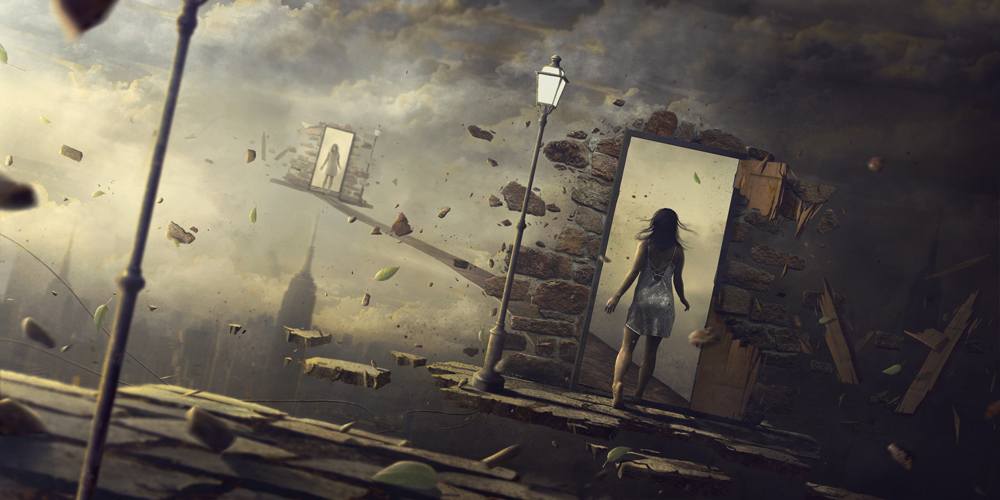
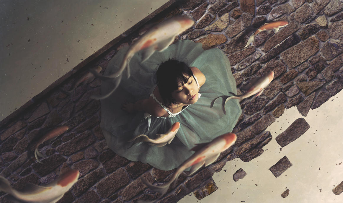
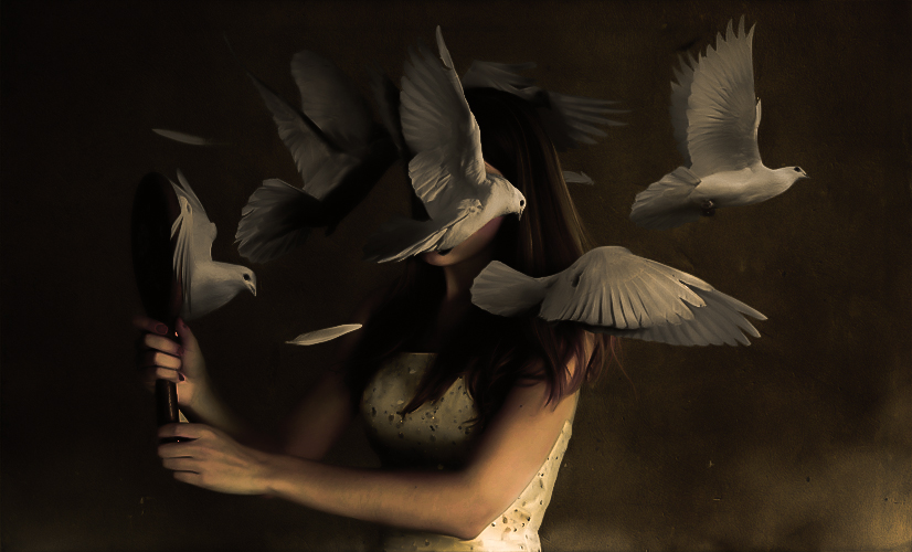
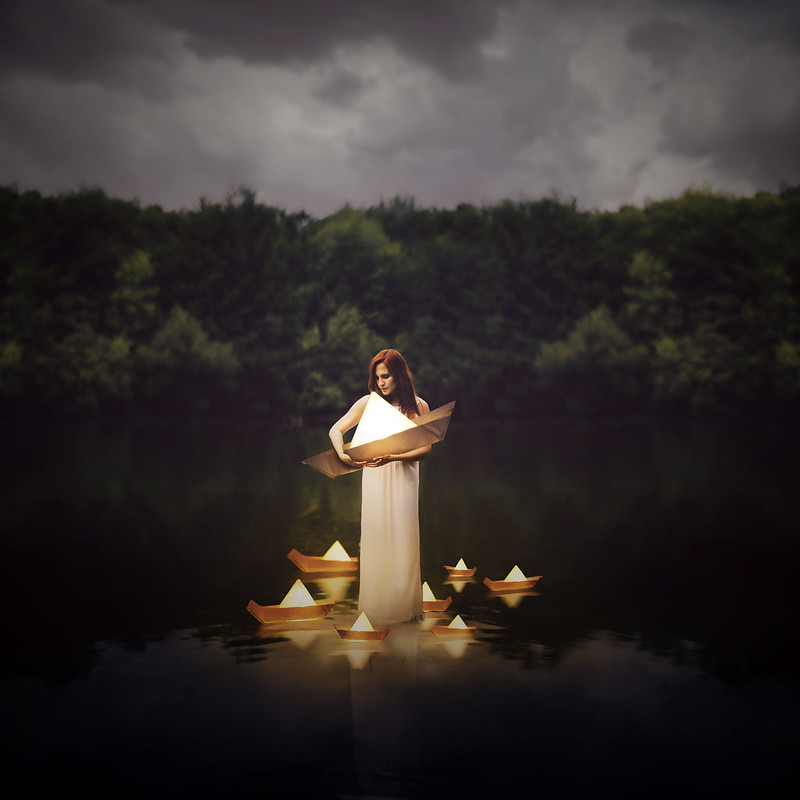
Final submissions is just around the corner, so here is one last work-in-progress update. I have to admit, that for 12 photo-realistic photo manipulations of 200mm large was a real challenge. Both sourcing for high-res images and then digitally manipulating them were extremely time-consuming processes, especially when I was trying to push for photo-real compositions.

I was feeling a little lost since my last update, but after a consultation with Joy, she directed me back on track. What I really needed was to define what was photo-manipulations and its themes.

Photo manipulation is an art where ordinary photos are transformed into something alluring, unexpected and totally out of the box. It is often done by designers to express their creativity or for experimental purposes.


REFERENCE ARTISTS


Joel Robison – Photographer/photo manipulation

Joel makes use of repetition and scale in his compositions. This seems to be an element in photo manipulations.

I have also noticed that good photo(s)/photography is key in creating quality manipulations.


Yaser Almajed – Double exposure photography

Mirror
Lost
Faceless

Taking double exposure to a next level, composting other elements in his photos.


CURRENT PROGRESS


oss2

I have finally managed to use colour theories other than just purely orange!!

As you can see from the image above, I have used complimentary colours for ME, due to the conflicting characteristics of myself.

In a BETTER ME, I have used red/orange in warm analogous harmony to portray passions and fear. These characteristics are often “dark”, hence the dark tones in the compositions.

As for an IDEAL ME, I have used yellow to orange for the compositions as it is found that they invoke feelings of joy/cheerfulness to inqusitiveness/mental activities in the mind.

The last row: ME IN 5 YEARS, I have come up with characteristics such as EXPERIENCE, UNCERTAINTY, CAREER, FREEDOM, etc, but have not decided on the final.

Concept wise, I have incorporated the idea of having the columns (from left to right) depict ENGAGEMENT, ARTICULATION and PERCEPTION respectively.


Breakdown(s)


breakdown2
PASSION

More to come in final post.


Draft Compositions


unsued
might be discarded, not sure yet

Before ending off, I want to mention that during my very first consultation, Joy has suggested of using movies as a source of inspiration in building my concept. Here is a trailer of a Thai movie HEART ATTACK that inspired me to do photo manipulations for this project. (Besides the other reason of being a visual effects guy)

Ego update

Initially, when Joy mentioned that I should use put the major that I will be applying for into consideration in this project, I thought about using photo manipulation to create photomontages for this project. As a visual effects person, I am keen on photo-realistic compositions and I am pushing my concept in that direction.


REFERENCE ARTIST


My reference artist is Norvz Austria (xetobyte), where the self-taught digital artist uses stock images on the web to create photo-realistic compositions.

Epiphany
http://xetobyte.deviantart.com/art/The-Bridge-486804419?q=gallery%3Axetobyte%2F12289825&qo=4
The bridge
Dysmorphophobia

CURRENT PROGRESS


After my first consultation with Joy, she have mentioned that I could try using my own photos in my compositions. Hence, I have thought about it and tried to use some of my own, as well as stock photos, to create these compositions.

oss
Current progress… 6/12

Here is the breakdown for my first composition:

tpcoolhandone

More updates to follow soon!

Ego Research

CLASS ACTIVITY

This was an activity where we wrote something about ourselves and we had to pass it around in a group, and let the others write something about us. It was really interesting and fun, and it has surely helped us in our final assignment: EGO.

me
ABOUT ME
mein5
ME IN 5 YEARS


INITIAL CONCEPT


Based on the elements in the previous pictures,  I have decided on an initial concept for this assignment.

3D + VFX = ME

HARD WORKING ME – RESERVEDNESS = A BETTER ME

TECHNICAL SKILLS x CONCEPTUALS =  AN IDEAL ME

SCI FI + VFX = ME IN 5 YEARS


COLOUR THEORIES


colorwheel

Monochromes Harmony

Same hue, different saturation and values.

Penning my thoughts. #abstract #lights #stilllife #xperiaz3

A photo posted by Justin Cho (@zomgno1) on

single-hexcone model of color space

Analogous Harmony

Analogous harmony is the use of 3 or more adjacent colours on the colour wheel.

Warm and Cool

The colour wheel can be split into 2 parts, the warm and the cool. In my opinion, it is more harmonious if we use adjacent colours from just one side as compared to combining part warm and part cool.

More #symmetry. #taipei #hdr #temples

A photo posted by Justin Cho (@zomgno1) on

Warm colour are passionate, energetic and lively.

tpcool
Taipei 101 – JUSTIN CHO PHOTOGRAPHY

Cool colours are calm and soothing.

Complementary Hues

Complementary hues are colours that are opposite on the colour wheel, creating contrast and could also draw the attention to a specific area.

Tokyo Tower – JUSTIN CHO PHOTOGRAPHY

Split Complimentary

Sunset on a boat – JUSTIN CHO PHOTOGRAPHY

As for split complimentary colours, just with a little tinge of yellow, it dilutes the intensity of the contrast, yet still has a high degree of it.


I thought that since this project is about ME/MYSELF/I, I have used my personal photography gallery to study colour theories. I hope you all enjoyed it. (: