It’s already semester 2, so being allocated to our majors, I have decided to go with the things I do/surrounding my major: Animation (vfx??). I have listed them out in my sketches below:
So I have decided to probably go with these 6:
VFX Artist
Photographer
perspectives
3D artist
loves details
student
Originally all the ideas I have came up with is all in 3D but after the consultation I was encouraged to try to go back to 2D since I have to stick closely with the project brief, so I have then went back to ideation again.
Here is some of my research I have been doing since:
For visual effects artist, I will be basing it on a visual effects breakdown, something like this one for Swedish Idol:
So elements like green(blue) screen, wireframes, etc, are elements that I could use.
For “loving details“, I have decided to use paper cuts maybe like the ones below:
For 3D artist, I will be doing a digital artwork in c4D/Maya with modelling, lighting & renderings.
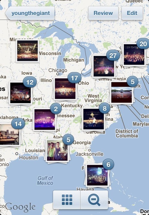
For photographer, I am deciding between going for a “travel/landscape photographer” or just photography in general. I am currently looking at the Instagram’s Photo Map as my reference at the moment.
For the rest of them, I am still currently churning out some new concepts so stay tuned!
Being a hobbyist photographer with a visual effects background, I have decided to do my compositions with the style of photo manipulations, incorporating photo-realism. I might also have been inspired by the Thai movie that I have watched recently, HEART ATTACK – a movie that revolves around a freelance digital photo manipulation artist.
First, I have carefully planned out each composition to depict ENGAGEMENT, ARTICULATION, PERCEPTION on each columns. I have used an image of a mouth, implied or not, to show articulation and an eye to show perception.
I have also planned each equations to fit a colour scheme of the hues of the golden hour, specifically red, orange, yellow, blue, blacks + the sun as light source.
Golden hour
BREAKDOWNS
VENTUROUS + SILENT = ME
As an venturous person, one might think that I might be a more outgoing and outspoken person, however, I am less verbal and more introverted. I have used complimentary colours of orange-brown and blues to show these conflicting characteristics of myself.
As for the last composition, it shows that I am venturing towards my goal, as depicted with the target cross-hair of the rifle scope. An implied sight is used to show perception.
PASSION – FEAR = A BETTER ME
In the first composition, I have used a tree to represent life, and fire to represent the burning passion in me. The lanterns that are attached to the tree is to imply that with passion, it will bring me higher and further in life.
As for the second composition, I have used an image of a werewolf to show fear. I have used a hand that is reaching out towards the light to show the goal but the cringed hand is there to show hesitation due to fear.
In the last composition, I have used a oil lantern with the eyeball as its source of light and a fiery passion that is still burning in me.
The colours I have chosen to use in this equation was red and black as these themes of passion and fear is usually intense and dark.
PassionA better me
CONCEPTUALS x EXPRESSIVENESS = AN IDEAL ME
I have used an egg yolk to show the process of birth with a light bulb to symbolize ideas. Compositing them together was to depict the birth of concepts.
As for the second composition, I have placed a mouth onto a loudspeaker to exaggerate the concept of expressiveness. The light in the background was used to create impact.
In the last composition, the egg has hatched out of the light bulb, showing the breaking out of my comfort zone. Concept/creativity is born and expressed with its superimposed eye and mouth.
In this equation, I have used primarily yellow to invoke joy/cheerfulness to inquisitiveness/mental activities in the mind.
An ideal me
RISK + CONFIDENCE = ME IN 5 YEARS
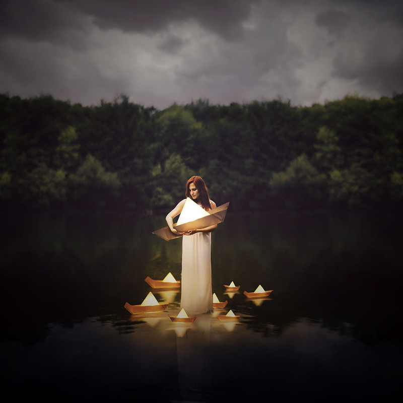
In RISK, I have set it in a sea context as it represents the sea of uncertainty. The boat was actually composited to show smooth sailing even thought there might be obstacles and dangers ahead, as represented with the shark heading in its direction.
In CONFIDENCE, I have used an image of a face as a landscape in the foreground. As you already know, being less verbal and expressive is my weakness, hence, I have composited a man doing a confidence jump over the mouth (obstacle). I have also composited lightnings in the background to further amplify the emotions.
In 5 years, I hope to see myself in a career, working on maybe the next vfx (sci-fi) film. This composition, when compared to the first composition of VENTUROUS, is a complete inverse of colours.
For this equation, I have used primarily BLUE hues as it is a colour of success and confidence. It was intentional as I have carefully planned for the very first composition, VENTUROUS, to imply the phrase of “into the blue”, and wanted to end the last composition by literally seeing blue.
confidence
REFLECTIONS
Even though the major challenge was the difficulty in finding high resolution images and the time consuming process (usually 2-3 hours searching for images, up to 6 hours compositing the composition together for each squares), I found myself enjoying the process as I try to achieve photo-realism in each and every composition.
Another challenge was that each composition was a concept itself and I had a really long and stressful time deciding on the elements/symbolism to use in portraying each composition. Nevertheless, I feel that I am slowly becoming closer to my ideal, conceptual, me!
Final submissions is just around the corner, so here is one last work-in-progress update. I have to admit, that for 12 photo-realistic photo manipulations of 200mm large was a real challenge. Both sourcing for high-res images and then digitally manipulating them were extremely time-consuming processes, especially when I was trying to push for photo-real compositions.
I was feeling a little lost since my last update, but after a consultation with Joy, she directed me back on track. What I really needed was to define what was photo-manipulations and its themes.
Photo manipulation is an art where ordinary photos are transformed into something alluring, unexpected and totally out of the box. It is often done by designers to express their creativity or for experimental purposes.
Taking double exposure to a next level, composting other elements in his photos.
CURRENT PROGRESS
I have finally managed to use colour theories other than just purely orange!!
As you can see from the image above, I have used complimentary colours for ME, due to the conflicting characteristics of myself.
In a BETTER ME, I have used red/orange in warm analogous harmony to portray passions and fear. These characteristics are often “dark”, hence the dark tones in the compositions.
As for an IDEAL ME, I have used yellow to orange for the compositions as it is found that they invoke feelings of joy/cheerfulness to inqusitiveness/mental activities in the mind.
The last row: ME IN 5 YEARS, I have come up with characteristics such as EXPERIENCE, UNCERTAINTY, CAREER, FREEDOM, etc, but have not decided on the final.
Concept wise, I have incorporated the idea of having the columns (from left to right) depict ENGAGEMENT, ARTICULATION and PERCEPTION respectively.
Breakdown(s)
PASSION
More to come in final post.
Draft Compositions
might be discarded, not sure yet
Before ending off, I want to mention that during my very first consultation, Joy has suggested of using movies as a source of inspiration in building my concept. Here is a trailer of a Thai movie HEART ATTACK that inspired me to do photo manipulations for this project. (Besides the other reason of being a visual effects guy)
This was an activity where we wrote something about ourselves and we had to pass it around in a group, and let the others write something about us. It was really interesting and fun, and it has surely helped us in our final assignment: EGO.
ABOUT MEME IN 5 YEARS
INITIAL CONCEPT
Based on the elements in the previous pictures, I have decided on an initial concept for this assignment.
Analogous harmony is the use of 3 or more adjacent colours on the colour wheel.
Warm and Cool
The colour wheel can be split into 2 parts, the warm and the cool. In my opinion, it is more harmonious if we use adjacent colours from just one side as compared to combining part warm and part cool.
Complementary hues are colours that are opposite on the colour wheel, creating contrast and could also draw the attention to a specific area.
Tokyo Tower – JUSTIN CHO PHOTOGRAPHY
Split Complimentary
Sunset on a boat – JUSTIN CHO PHOTOGRAPHY
As for split complimentary colours, just with a little tinge of yellow, it dilutes the intensity of the contrast, yet still has a high degree of it.
I thought that since this project is about ME/MYSELF/I, I have used my personal photography gallery to study colour theories. I hope you all enjoyed it. (: