EGO – I (EYE)

final


CONCEPT


Being a hobbyist photographer with a visual effects background, I have decided to do my compositions with the style of photo manipulations, incorporating photo-realism. I might also have been inspired by the Thai movie that I have watched recently, HEART ATTACK – a movie that revolves around a freelance digital photo manipulation artist.

First, I have carefully planned out each composition to depict ENGAGEMENT, ARTICULATION, PERCEPTION on each columns. I have used an image of a mouth, implied or not, to show articulation and an eye to show perception.

I have also planned each equations to fit a colour scheme of the hues of the golden hour, specifically red, orange, yellow, blue, blacks + the sun as light source.

Golden hour

BREAKDOWNS


1

VENTUROUS + SILENT = ME

As an venturous person, one might think that I might be a more outgoing and outspoken person, however, I am less verbal and more introverted. I have used complimentary colours of orange-brown and blues to show these conflicting characteristics of myself.

As for the last composition, it shows that I am venturing towards my goal, as depicted with the target cross-hair of the rifle scope. An implied sight is used to show perception.


2

PASSION – FEAR = A BETTER ME

In the first composition, I have used a tree to represent life, and fire to represent the burning passion in me. The lanterns that are attached to the tree is to imply that with passion, it will bring me higher and further in life.

As for the second composition, I have used an image of a werewolf to show fear. I have used a hand that is reaching out towards the light to show the goal but the cringed hand is there to show hesitation due to fear.

In the last composition, I have used a oil lantern with the eyeball as its source of light and a fiery passion that is still burning in me.

The colours I have chosen to use in this equation was red and black as these themes of passion and fear is usually intense and dark.

breakdown2
Passion
breakdown4
A better me

3

CONCEPTUALS x EXPRESSIVENESS = AN IDEAL ME

I have used an egg yolk to show the process of birth with a light bulb to symbolize ideas. Compositing them together was to depict the birth of concepts.

As for the second composition, I have placed a mouth onto a loudspeaker to exaggerate the concept of expressiveness. The light in the background was used to create impact.

In the last composition, the egg has hatched out of the light bulb, showing the breaking out of my comfort zone. Concept/creativity is born and expressed with its superimposed eye and mouth.

In this equation, I have used primarily yellow to invoke joy/cheerfulness to inquisitiveness/mental activities in the mind.

breakdown3
An ideal me

4

RISK + CONFIDENCE = ME IN 5 YEARS

In RISK, I have set it in a sea context as it represents the sea of uncertainty. The boat was actually composited to show smooth sailing even thought there might be obstacles and dangers ahead, as represented with the shark heading in its direction.

In CONFIDENCE, I have used an image of a face as a landscape in the foreground. As you already know, being less verbal and expressive is my weakness, hence, I have composited a man doing a confidence jump over the mouth (obstacle). I have also composited lightnings in the background to further amplify the emotions.

In 5 years, I hope to see myself in a career, working on maybe the next vfx (sci-fi) film. This composition, when compared to the first composition of VENTUROUS, is a complete inverse of colours.

For this equation, I have used primarily BLUE hues as it is a colour of success and confidence. It was intentional as I have carefully planned for the very first composition, VENTUROUS, to imply the phrase of “into the blue”, and wanted to end the last composition by literally seeing blue.

breakdown5
confidence

REFLECTIONS


Even though the major challenge was the difficulty in finding high resolution images and the time consuming process (usually 2-3 hours searching for images, up to 6 hours compositing the composition together for each squares), I found myself enjoying the process as I try to achieve photo-realism in each and every composition.

Another challenge was that each composition was a concept itself and I had a really long and stressful time deciding on the elements/symbolism to use in portraying each composition. Nevertheless, I feel that I am slowly becoming closer to my ideal, conceptual, me!

comments
Peer comments. THANKS GUYS!

EGO – PART 3

Final submissions is just around the corner, so here is one last work-in-progress update. I have to admit, that for 12 photo-realistic photo manipulations of 200mm large was a real challenge. Both sourcing for high-res images and then digitally manipulating them were extremely time-consuming processes, especially when I was trying to push for photo-real compositions.

I was feeling a little lost since my last update, but after a consultation with Joy, she directed me back on track. What I really needed was to define what was photo-manipulations and its themes.

Photo manipulation is an art where ordinary photos are transformed into something alluring, unexpected and totally out of the box. It is often done by designers to express their creativity or for experimental purposes.


REFERENCE ARTISTS


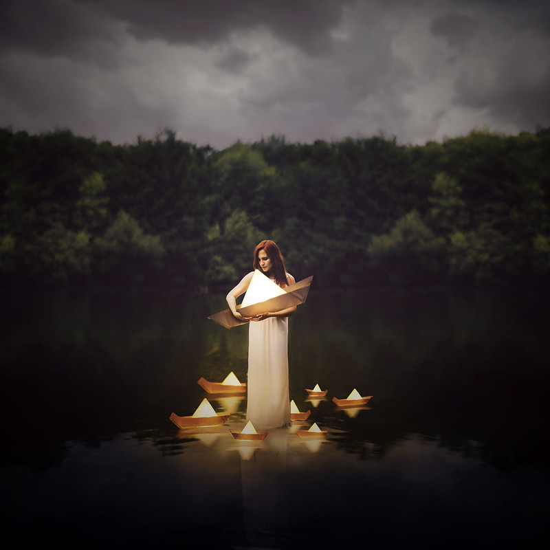
Joel Robison – Photographer/photo manipulation

Joel makes use of repetition and scale in his compositions. This seems to be an element in photo manipulations.

I have also noticed that good photo(s)/photography is key in creating quality manipulations.


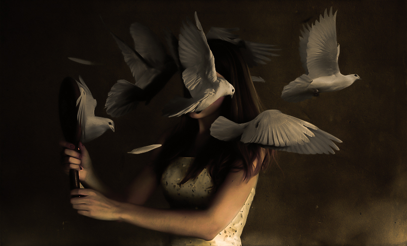
Yaser Almajed – Double exposure photography

Mirror
Lost
Faceless

Taking double exposure to a next level, composting other elements in his photos.


CURRENT PROGRESS


oss2

I have finally managed to use colour theories other than just purely orange!!

As you can see from the image above, I have used complimentary colours for ME, due to the conflicting characteristics of myself.

In a BETTER ME, I have used red/orange in warm analogous harmony to portray passions and fear. These characteristics are often “dark”, hence the dark tones in the compositions.

As for an IDEAL ME, I have used yellow to orange for the compositions as it is found that they invoke feelings of joy/cheerfulness to inqusitiveness/mental activities in the mind.

The last row: ME IN 5 YEARS, I have come up with characteristics such as EXPERIENCE, UNCERTAINTY, CAREER, FREEDOM, etc, but have not decided on the final.

Concept wise, I have incorporated the idea of having the columns (from left to right) depict ENGAGEMENT, ARTICULATION and PERCEPTION respectively.


Breakdown(s)


breakdown2
PASSION

More to come in final post.


Draft Compositions


unsued
might be discarded, not sure yet

Before ending off, I want to mention that during my very first consultation, Joy has suggested of using movies as a source of inspiration in building my concept. Here is a trailer of a Thai movie HEART ATTACK that inspired me to do photo manipulations for this project. (Besides the other reason of being a visual effects guy)

Ego update

Initially, when Joy mentioned that I should use put the major that I will be applying for into consideration in this project, I thought about using photo manipulation to create photomontages for this project. As a visual effects person, I am keen on photo-realistic compositions and I am pushing my concept in that direction.


REFERENCE ARTIST


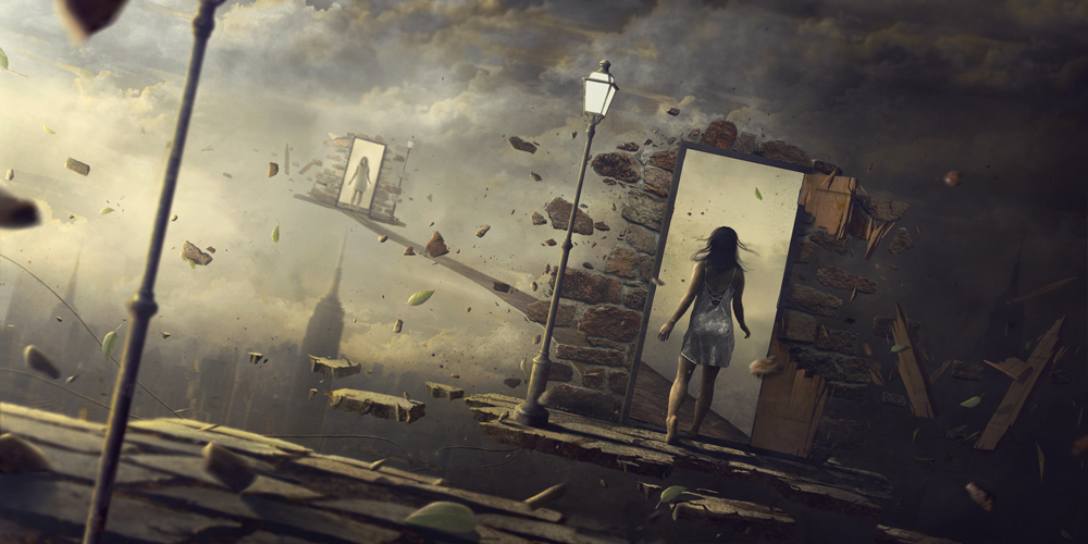
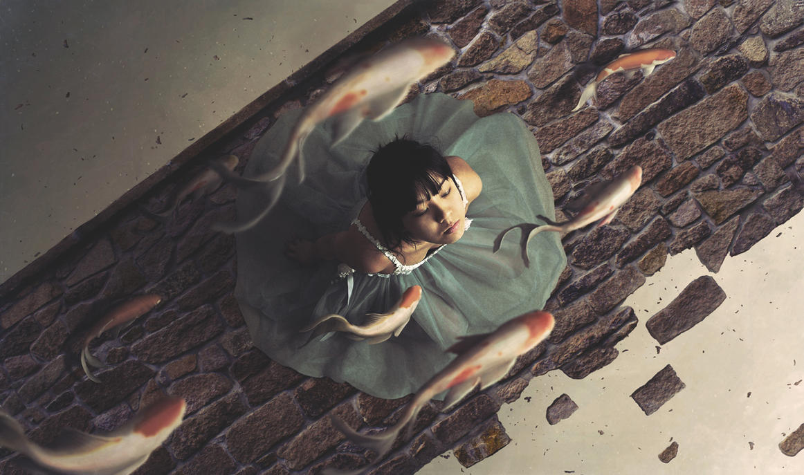
My reference artist is Norvz Austria (xetobyte), where the self-taught digital artist uses stock images on the web to create photo-realistic compositions.

Epiphany
http://xetobyte.deviantart.com/art/The-Bridge-486804419?q=gallery%3Axetobyte%2F12289825&qo=4
The bridge
Dysmorphophobia

CURRENT PROGRESS


After my first consultation with Joy, she have mentioned that I could try using my own photos in my compositions. Hence, I have thought about it and tried to use some of my own, as well as stock photos, to create these compositions.

oss
Current progress… 6/12

Here is the breakdown for my first composition:

tpcoolhandone

More updates to follow soon!

Ego Research

CLASS ACTIVITY

This was an activity where we wrote something about ourselves and we had to pass it around in a group, and let the others write something about us. It was really interesting and fun, and it has surely helped us in our final assignment: EGO.

me
ABOUT ME
mein5
ME IN 5 YEARS


INITIAL CONCEPT


Based on the elements in the previous pictures,  I have decided on an initial concept for this assignment.

3D + VFX = ME

HARD WORKING ME – RESERVEDNESS = A BETTER ME

TECHNICAL SKILLS x CONCEPTUALS =  AN IDEAL ME

SCI FI + VFX = ME IN 5 YEARS


COLOUR THEORIES


colorwheel

Monochromes Harmony

Same hue, different saturation and values.

Penning my thoughts. #abstract #lights #stilllife #xperiaz3

A photo posted by Justin Cho (@zomgno1) on

single-hexcone model of color space

Analogous Harmony

Analogous harmony is the use of 3 or more adjacent colours on the colour wheel.

Warm and Cool

The colour wheel can be split into 2 parts, the warm and the cool. In my opinion, it is more harmonious if we use adjacent colours from just one side as compared to combining part warm and part cool.

More #symmetry. #taipei #hdr #temples

A photo posted by Justin Cho (@zomgno1) on

Warm colour are passionate, energetic and lively.

tpcool
Taipei 101 – JUSTIN CHO PHOTOGRAPHY

Cool colours are calm and soothing.

Complementary Hues

Complementary hues are colours that are opposite on the colour wheel, creating contrast and could also draw the attention to a specific area.

Tokyo Tower – JUSTIN CHO PHOTOGRAPHY

Split Complimentary

Sunset on a boat – JUSTIN CHO PHOTOGRAPHY

As for split complimentary colours, just with a little tinge of yellow, it dilutes the intensity of the contrast, yet still has a high degree of it.


I thought that since this project is about ME/MYSELF/I, I have used my personal photography gallery to study colour theories. I hope you all enjoyed it. (:

Assignment 2: Rhymes Final

THE WHEELS ON THE BUS GO ROUND AND ROUND

a tragic bus crash story

CRXjrU0UcAEpxhU

loosely based on an actual public bus accident that my grandfather encountered


CONCEPT


(FROM TOP LEFT IN A CLOCKWISE DIRECTION)

THE WHEELS ON THE BUS GO ROUND AND ROUND
In this composition, my interpretation of the “wheels” are the steering wheels instead. From a first-person perspective, you see an impending bus crash from the inside of the bus driver’s perspective. I have made use of the many grabbing hands to show movement in the steering wheel.

ROUND AND ROUND
In this composition, it shows the external events that are happening in the bus, as it literally go round and round like clockwork. (hence the gears)The bus is spinning round and round; the old man is crying; the lady is screaming; the man is spinning around screaming; the sound of heartbeats; and objects, represented by the fish out of the water, is flying around.

ROUND AND ROUND
In this next composition, it shows the internal events that is going on in someone’s head, as represented by the dissected head and brain background. Family, food, religion, money, best experiences and memories goes round and round, represented by the ring.

THE WHEELS ON THE BUS GO ROUND AND ROUND ALL DAY LONG
Now in this composition, the bus is already overturned and stopped. It is a third-person perspective now. Everything has rolled out of the bus, round and round. I have used the “teeth” of the wheels, layered with a spiral dingbat, to show the wheels going round and round, all day long. I have made use of everyone’s dingbat that are either round in shape, or if it contains a face.

When pieced together, the final composition of all 4 images form a full circle, keeping a flow and linking them together. (I wanted to incorporate my photosphere in my previous post) This might have also helped enhanced the effect of the tragedy. I have chosen to use black as the primary background colour as I wanted it to feel dark and tragic.


ORIGINAL DINGBATS


ding
I have originally came up with 50/50 dingbats for each rhyme.

SKETCHES


sketches


CHALLENGES FACED


The biggest challenge I had, I think, was the choosing of the concept of my rhyme. As seen from my previous posts, I was actually trying to push for a social commentary style concept of the issues that I see in my commute. However, I took a step back to see my original rhymes I have shortlisted: the wheels on the bus and the crooked old man. The crooked old man reminded me of my grandfather who was affected by the accident, who had problems walking/unstability for a period of time after the accident. It really pushed me away from my original concept and made me conclude with the concept of a twisted and dark reinterpretation of the wheels on the bus rhyme.

Another challenge was the lines: “round and round” as they were very vague – it could mean anything! After coming up with a mindmap of what could go round and round, I have finally classified them into external and internal, using the dingbats that my classmates have created.

I am fairly familiar with all the technical jargon – so nope, no problems there.


REFLECTIONS


PERSONAL THOUGHTS
I thought that this project was very interesting as I have never thought about using Photoshop to do mono-toned photomontage style compositions before. As a digital person, it was definitely much easier than the traditional assignments that we have to do. I really liked the idea of sharing dingbats!

TUTOR THOUGHTS
Joy liked how my last composition juxtaposed the chaos with orderly circular objects that was arranged neatly. She also liked how I made use of a personal experience to incorporate into a concept, as well as how went back to my original shortlisted rhymes to come up with my final concept.

CLASSMATES THOUGHTS

comm
A picture speaks a thousand words

Rhymes: Progress

The wheels on the bus go round and round.. round and round.. round and round.. round and round… (I have probably repeated that line a thousand times already.)

Since my chosen rhyme was inspired by the idea of commuting, I was led into the direction to conceptualize what I felt and observed during my commuting process.

I have came up with a few issues that I could maybe address in this assignment:

  • Stomp-style on ARMY personnel
  • Old/Elderly people
  • People and their chatter (noisy)
  • Smartphones/social
  • Kids

Some thoughts on layouts:

layout
Layouts to best show round and round

Anyway, here are some work-in-progress.

wip2
Animal on wheels going round and round

wip1

“The wheels of the bus go round and round.”

For this sample, I experimented on just the literal meaning of the wheels on the bus going round and round in circles, going around the wheel.

wip3

“The people in the bus go ignore, ignore, ignore.”

For this, I have tried changing the rhyme lyrics a little to address the issue of the elderly while commuting.

wip5

“The people in the train go stare, stare, stare.”

wip6

“The people in the train go scroll, scroll, scroll.”


After much considerations, I have also came up with a dark narrative story too. This is inspired by an actual incident that happened to my grandfather a few years back when a tour bus ran straight into a public bus my grandfather was in.

Start from top left and go in a clockwise direction:

wipstory
The wheels on the bus go round and round, round and round, round and round, the wheels on the bus go round and round, all day long.

Assignment 1: Lines

OPPOSITES

inspired by Cai Guo Qiang’s explosion art where he creates organised chaos; beauty in destruction

ass1

As mentioned in my previous post, I have came up with 3 concepts: Adjacency, Opposites, Contrast. I noticed that they were quite similar, and thought that I could combine them into 1 – OPPOSITES.


CHALLENGES FACED


Originally, I have organised the 18 emotions into 6 categories – Rhythmic, Soft, Lines, Messy, Dark/Murky, Organisation.linesgroup

layout

As seen from the final layouts that we could use, there wasn’t any that could fit all 6 in, hence, I had to further re-categorize them and finally ended up with 4 – DARK, SOFT, MESSY, ORGANISED.


CONCEPT


The main concept is to place each emotions based on their visuals or their meanings beside/adjacent to each other to show the stark contrast between the 2.CLASSIFICATION

I have also further grouped them into row categories based on their visual elements.

ROW CLASSIFICATION
ROW CLASSIFICATION

I have also tried exploring/experimenting with using opposite meanings, objects or techniques to further expand on the styles/concept.

EXAMPLES

sloven: using cleaning metal sponge to explain messy
awkward: related to silence, so opposite is noise which led to “film noise”
aggressive: writing praises, compliments aggressively
distracted: opposite is focus, so out of focus is bokeh in the camera
fragile: instead of using fragile object, I used “durable” mats like the cloth and drew wireframes to show the fragility
indecisive: decisive (decision tree) so I flip it upside down and it becomes roots
embarrassed: this is a head hiding upside down like ostrich
systematic: inspired by Cai Guo Qiang’s organised chaos, I thought of a traffic jam at a highway, still orderly even though chaotic


REFLECTION


I have found the assignment really insightful as I have learnt how abstraction is not really random art but much thought have been put into the process. I have also learnt more about myself as to how I interpret different emotions as they are really subjective. I felt that I could have experimented with more techniques that can help push my concept even further.

Lines: Progress

This is a post of my progression of my Lines Project from start to end.

WEEK 1 & 2

Finally more done up

During previous consultation, I have learnt that by carefully selecting the placing of the emotions it can help bring out the stark contrast between them.

lines1
Drawn from my own interpretation, without any research done

So I figured I had to do intensive research on each emotions and what do they mean/best represented through their mediums, styles or even their symbolism. After much thought and research, I have came up with a table to categorize them accordingly:

linesgroup

6 styles: Rhythmic | Soft | Lines | Messy | Dark/Murky | Organisation


EXAMPLES OF RESEARCH


lines2

ANXIOUS

lines3
LYRICAL
lines4
PSYCHOTIC
lines5
TURBULENT, INDECISIVE, EXHAUSTED

MEDIUMS EXPERIMENTS


In week 2, I have started experimenting with new mediums, specifically Chinese Ink and Monoprinting.

MONOPRINTING
MONOPRINTING
Chinese INK
Chinese INK

I have also done some texture research to see if I can incorporate it into monoprinting.

TEXTURES RESEARCH
TEXTURES RESEARCH

RESEARCH AND SOME CONCEPTS


BIZARRE
BIZARRE
SLOVEN
SLOVEN
AGGRESSIVE
AGGRESSIVE
SYSTEMATIC
SYSTEMATIC


WEEK 3/4

As mentioned in the weekly consultation, I have yet to decide on a concept for this project. One method is to think of a TITLE for this project. Some concepts I came up with was:

  • ADJACENCYplacing a certain emotion adjacent to each other to bring it out (i.e. systematic vs distracted; nonsensical vs aggressive)
  • OPPOSITESusing strong objects to showcase fragility; harmless things to show aggressiveness
  • CONTRASTby categorizing the emotions of: soft vs dark; messy vs organised

CONCEPTUALIZING


fragile
FRAGILE
AGGRESSIVE
AGGRESSIVE
DISTRACTED
DISTRACTED
SYSTEMATIC
SYSTEMATIC
AWKWARD | EMBRASSED
AWKWARD | EMBRASSED

MORE EXPERIMENTS


TOOTHBRUSH STROKES
TOOTHBRUSH STROKES
Monoprinting in progress
CHINESE INK
CHINESE INK

Lines: Reference Artist

cgq1

CAI GUO QIANG

cgq2


I particularly like Cai Guo-Qiang’s explosion art as it shows duality of exhilaration and destruction. Using gunpowder as his medium, he creates beauty from destruction. After creating his scene with scattered gunpowder and pre-cut stencils, he ignites them and this creates a sort of controlled randomness – organized chaos – in his art.


He also describes his process as to making love: “You can try to steer it, but you can’t. It’s like making love. It’s very in the moment. And there should be no regret.” The process of making these drawings are publicly displayed, and I feel that there is much appreciation in the process of making art.

cgq3

cgq4
CLOSE UP OF THE MARK OF 921

Also, in Cai Guo-Qiang’s drawings at up close, you can see that there are much details and randomness, yet it can portray the emotions of pain.


In relation to assignment 1, I am looking into his artwork in smaller pictures and seeing how it portray emotions.

Wheels on the Bus

The Wheels on The Bus

The wheels on the bus go round and round,
Round and round,
Round and round.
The wheels on the bus go round and round,
All day long.
The horn on the bus goes beep, beep, beep,
Beep, beep, beep.
Beep, beep, beep.
The horn on the bus goes beep, beep, beep,
All day long.
The wipers on the bus go swish, swish, swish,
Swish, swish, swish,
Swish, swish, swish.
The wipers on the bus go swish, swish, swish.
All day long.
The people on the bus go chatter, chatter, chatter,
chatter, chatter, chatter,
chatter, chatter, chatter
The people on the bus go chatter, chatter, chatter,
All day long.

“THE WHEELS ON THE BUS GO ROUND AND ROUND, ALL DAY LONG”


I have been experimenting with panoramic images, and I had come to love taking Photospheres photos. With a photosphere photo, there is a method to join them into a seemless image called Tiny Planet, which makes them look round as if it is a planet by itself. Here are examples:

#tinyplanet attempt. #photosphere #taipei #nofilter

A photo posted by Justin Cho (@zomgno1) on

Central Park Tiny Planet

Hence, I have created my draft composition using many “dingbats” to create a Tiny Planet (of sights you see when you commute on a bus) which go in full circle around the wheels of a bus.

RoundNRound
The wheels on the bus go round and round, all day long

I have further plans to improve this (scale, contrast, etc) to be used as 1/4 of the final output.


“THE PEOPLE IN THE BUS GO CHATTER, CHATTER, CHATTER”


For this line, I have thought about using windows as frames, as suggested by Joy at my last consultation. I can use these window frames in 2 ways – interior or exterior – the view from inside the bus, or to see into the bus.

crimea_press_freedom_second_selection_09
Seeing inside the bus

For this composition, I have used an exterior view of seeing into the bus.

peopleChatter
The people in the bus go chatter, chatter, chatter

For this photo-montage style image, I have made use of mouths to emphasize the noise.


3206745443_48136e11ee
Seeing out side the bus

I will be trying an interior view next, as well as more iterations of these 2 lines in other styles.

THE DINGBATS I HAVE CREATED

ding