Typo update… not so much

So this week I did not progress much: I have only finalized all my concepts and have to start experimenting and executing them.

VFX ARTIST:

First off, it’s the VFX concept. I have made use of transparencies and tracing papers and have already experimented on a prototype:

vfx-con

This was purely a test and I was pretty happy with the result, but my I have to try with colours this time and will need even more experimenting because of the translucency of each colours as compared to black ink. Here is a work-in-progress:

vfx-d
20% progress…

3D ARTIST:

WALL ART: Still Life Comes Alive

For 3D Artist, I will be creating a digital 3D piece with a 3D program – looking something like the wall art image above, but a more simplified version, so that I can try to push this concept further by incorporating this into a pop-up card, if possible.

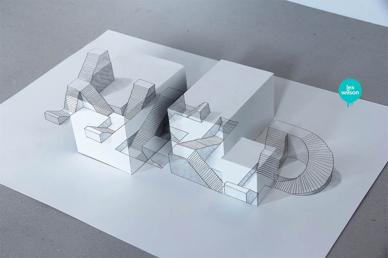
A really simplified version of a pop-up card would be something like the image above, with the digital work being printed out onto a layer and cut with another design to form an “illusion” layer popup.


As for student, I will be using coffee, spoons, redbull??, wrappers, McDonald, etc – things that a student will use for studying or chionging work to create a typeface. I have already started collecting some of these materials, and I will start on them soon so stay tune for my next update(s)!

Typo Ideas

It’s already semester 2, so being allocated to our majors, I have decided to go with the things I do/surrounding my major: Animation (vfx??). I have listed them out in my sketches below:

nameis

So I have decided to probably go with these 6:

  • VFX Artist
  • Photographer
  • perspectives
  • 3D artist
  • loves details
  • student

draft1

Originally all the ideas I have came up with is all in 3D but after the consultation I was encouraged to try to go back to 2D since I have to stick closely with the project brief, so I have then went back to ideation again.

Here is some of my research I have been doing since:

For visual effects artist, I will be basing it on a visual effects breakdown, something like this one for Swedish Idol:

So elements like green(blue) screen, wireframes, etc, are elements that I could use.


For “loving details“, I have decided to use paper cuts maybe like the ones below:


For 3D artist, I will be doing a digital artwork in c4D/Maya with modelling, lighting & renderings.


For photographer, I am deciding between going for a “travel/landscape photographer” or just photography in general. I am currently looking at the Instagram’s Photo Map as my reference at the moment.

For the rest of them, I am still currently churning out some new concepts so stay tuned!

Best,

justin-drawn

Ego Research

CLASS ACTIVITY

This was an activity where we wrote something about ourselves and we had to pass it around in a group, and let the others write something about us. It was really interesting and fun, and it has surely helped us in our final assignment: EGO.

me
ABOUT ME
mein5
ME IN 5 YEARS


INITIAL CONCEPT


Based on the elements in the previous pictures,  I have decided on an initial concept for this assignment.

3D + VFX = ME

HARD WORKING ME – RESERVEDNESS = A BETTER ME

TECHNICAL SKILLS x CONCEPTUALS =  AN IDEAL ME

SCI FI + VFX = ME IN 5 YEARS


COLOUR THEORIES


colorwheel

Monochromes Harmony

Same hue, different saturation and values.

Penning my thoughts. #abstract #lights #stilllife #xperiaz3

A photo posted by Justin Cho (@zomgno1) on

single-hexcone model of color space

Analogous Harmony

Analogous harmony is the use of 3 or more adjacent colours on the colour wheel.

Warm and Cool

The colour wheel can be split into 2 parts, the warm and the cool. In my opinion, it is more harmonious if we use adjacent colours from just one side as compared to combining part warm and part cool.

More #symmetry. #taipei #hdr #temples

A photo posted by Justin Cho (@zomgno1) on

Warm colour are passionate, energetic and lively.

tpcool
Taipei 101 – JUSTIN CHO PHOTOGRAPHY

Cool colours are calm and soothing.

Complementary Hues

Complementary hues are colours that are opposite on the colour wheel, creating contrast and could also draw the attention to a specific area.

Tokyo Tower – JUSTIN CHO PHOTOGRAPHY

Split Complimentary

Sunset on a boat – JUSTIN CHO PHOTOGRAPHY

As for split complimentary colours, just with a little tinge of yellow, it dilutes the intensity of the contrast, yet still has a high degree of it.


I thought that since this project is about ME/MYSELF/I, I have used my personal photography gallery to study colour theories. I hope you all enjoyed it. (: