With less than 72 hours to submissions… here is my final update.
3D ARTIST

Based on the reference image above, I have started researching on a easier and/or more generative way of creating this in 3D. I have finally decided attempt this style, a trend in 2015, called LOW-POLY ART.
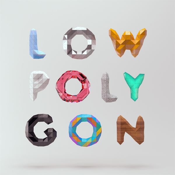

I chanced upon a tutorial on a simplified way of creating these, and seemed like Cinema 4D is the way to go. With reference to the first image, I fired up C4D and created my name on a landscape, and here is the output.

The typeface is created from selecting random polygons and extruding them, so its kinda like a handmade font. I am now attempting to convert or incorporate this into a pop up card for the final piece so… yep, I still have a little more to go..
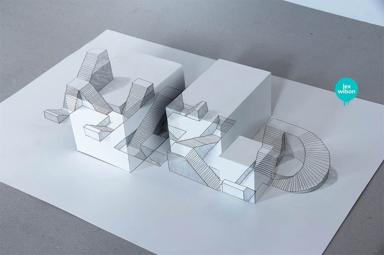
VFX ARTIST
For the VFX image, I have already completed and printed onto my transparencies. (pardon the photo quality, my phone broke)

I am still thinking of a way to mount these together to create a some z-space in between each layers to create a parallax effect. Since its transparencies, I cannot use thick double sided tape and might have to use the left over transparencies instead.
LOVE DETAILS/EYE FOR DETAILS
Yep, I might be changing “love details” to “have an eye for details”. These will be based on papercuttings, definitely. I have yet to start on them, so here is some research.
I should be going for a more geometric look (purely shapes or lines) for these patterns found on the cutouts. The lines will be fairly thin, creating a intricate overall design.
STUDENT
Here is some research on coffee painting that I might be referencing.
I might start my base of this piece with splatters of coffee, then adding these things I have used (the things I have already collected) throughout the entire period of creating all the other compositions in this “student” piece. This will only be done last after I have completed the other 3/4 of the typographic compositions.
With this, I’ll end off here with a cool website called Type to Design that I have chanced upon. The next post will be on my completed product! Stay tuned.