POV: Process

So…. With the concept in mind, I have started experimenting with some styles and compositions that I am going for.

For the idea of “Skin is sunburn, Face is UV damage” here are some reference images I am looking at:

UV damage
Sunburn skin peeling

So I have came up with some mock up compositions..

face-wip
UV Mapping of a human head texture
20160315_220901
my failed experimentation

With this mock up, I have originally planned to use the pyrography technique to try to burn holes into the face to show the damage done.. So I have experimented with burning a stick and poking it into paper, but it only resulted with burnt marks….

head-wip
photo manipulation of a head texture

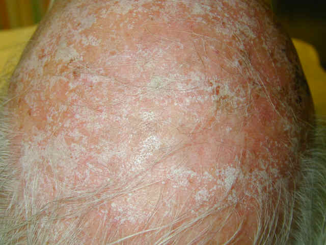
As for “skin is sunburn” I have decided to also follow the style of a “head mapping texture” and also to recreate the peeling skin on the scalp. I thought of using those Daiso Charcoal / nose skin cleanser products (when dried) as they give off that peely effect but it seems like Daiso was out of stock.. hahafrown


Next up, I tried composing the shot for “ex-convict is freedom”, and with some sketchy-style images I found + drawing with a mouse, I have managed to recreate the pyrography style in Photoshop. (yay to photomanipulation)

excon
The sun from the point of view of an ex-convict is FREEDOM without silhouette.

I kinda really loved the result of this image.. so I have decided to create the other compositions in this style… For the silhouettes, I have fired up Illustrator and started creating the prison/barbed fences… then went to process the papercuts out.

exconfull
composed image on Illustrator
IMG-20160314-WA0007
barbed wires papercut

So to end this post… here is the sneak peak of the “draft” of all of the compositions after adding the silhouettes counterparts in Illustrator.

all

2D Typo: Last update!

With less than 72 hours to submissions… here is my final update.

3D ARTIST

Based on the reference image above, I have started researching on a easier and/or more generative way of creating this in 3D. I have finally decided attempt this style, a trend in 2015, called LOW-POLY ART.

MountStar – Behance

I chanced upon a tutorial on a simplified way of creating these, and seemed like Cinema 4D is the way to go. With reference to the first image, I fired up C4D and created my name on a landscape, and here is the output.

3d
JUSTIN low-poly

The typeface is created from selecting random polygons and extruding them, so its kinda like a handmade font. I am now attempting to convert or incorporate this into a pop up card for the final piece so… yep, I still have a little more to go..


VFX ARTIST

For the VFX image, I have already completed and printed onto my transparencies. (pardon the photo quality, my phone broke)

vfx-almost

I am still thinking of a way to mount these together to create a some z-space in between each layers to create a parallax effect. Since its transparencies, I cannot use thick double sided tape and might have to use the left over transparencies instead.


LOVE DETAILS/EYE FOR DETAILS

Yep, I might be changing “love details” to “have an eye for details”. These will be based on papercuttings, definitely. I have yet to start on them, so here is some research.

Emily, paper cut ? #papercut #art #silhouette #portrait

A photo posted by Sari Friedman (@sari.friedman.art) on

Papercuttttts #papercut #design

A photo posted by David Ackerman (@ogbigdv) on

As allways, freehand cut within the shape of a circle ◉

A photo posted by Kristine Benum Braanen (@kristinebraanen) on

I should be going for a more geometric look (purely shapes or lines) for these patterns found on the cutouts. The lines will be fairly thin, creating a intricate overall design.


STUDENT

Here is some research on coffee painting that I might be referencing.

• ☕️?• . . Good morning Sunday !

A photo posted by Ranveig (@ranli_) on

I might start my base of this piece with splatters of coffee, then adding these things I have used (the things I have already collected) throughout the entire period of creating all the other compositions in this “student” piece. This will only be done last after I have completed the other 3/4 of the typographic compositions.

With this, I’ll end off here with a cool website called Type to Design that I have chanced upon. The next post will be on my completed product! Stay tuned.

Typo update… not so much

So this week I did not progress much: I have only finalized all my concepts and have to start experimenting and executing them.

VFX ARTIST:

First off, it’s the VFX concept. I have made use of transparencies and tracing papers and have already experimented on a prototype:

vfx-con

This was purely a test and I was pretty happy with the result, but my I have to try with colours this time and will need even more experimenting because of the translucency of each colours as compared to black ink. Here is a work-in-progress:

vfx-d
20% progress…

3D ARTIST:

WALL ART: Still Life Comes Alive

For 3D Artist, I will be creating a digital 3D piece with a 3D program – looking something like the wall art image above, but a more simplified version, so that I can try to push this concept further by incorporating this into a pop-up card, if possible.

A really simplified version of a pop-up card would be something like the image above, with the digital work being printed out onto a layer and cut with another design to form an “illusion” layer popup.


As for student, I will be using coffee, spoons, redbull??, wrappers, McDonald, etc – things that a student will use for studying or chionging work to create a typeface. I have already started collecting some of these materials, and I will start on them soon so stay tune for my next update(s)!

Typo Ideas

It’s already semester 2, so being allocated to our majors, I have decided to go with the things I do/surrounding my major: Animation (vfx??). I have listed them out in my sketches below:

nameis

So I have decided to probably go with these 6:

  • VFX Artist
  • Photographer
  • perspectives
  • 3D artist
  • loves details
  • student

draft1

Originally all the ideas I have came up with is all in 3D but after the consultation I was encouraged to try to go back to 2D since I have to stick closely with the project brief, so I have then went back to ideation again.

Here is some of my research I have been doing since:

For visual effects artist, I will be basing it on a visual effects breakdown, something like this one for Swedish Idol:

So elements like green(blue) screen, wireframes, etc, are elements that I could use.


For “loving details“, I have decided to use paper cuts maybe like the ones below:


For 3D artist, I will be doing a digital artwork in c4D/Maya with modelling, lighting & renderings.


For photographer, I am deciding between going for a “travel/landscape photographer” or just photography in general. I am currently looking at the Instagram’s Photo Map as my reference at the moment.

For the rest of them, I am still currently churning out some new concepts so stay tuned!

Best,

justin-drawn