Typo update… not so much

So this week I did not progress much: I have only finalized all my concepts and have to start experimenting and executing them.

VFX ARTIST:

First off, it’s the VFX concept. I have made use of transparencies and tracing papers and have already experimented on a prototype:

vfx-con

This was purely a test and I was pretty happy with the result, but my I have to try with colours this time and will need even more experimenting because of the translucency of each colours as compared to black ink. Here is a work-in-progress:

vfx-d
20% progress…

3D ARTIST:

WALL ART: Still Life Comes Alive

For 3D Artist, I will be creating a digital 3D piece with a 3D program – looking something like the wall art image above, but a more simplified version, so that I can try to push this concept further by incorporating this into a pop-up card, if possible.
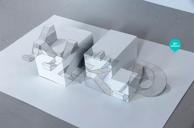
A really simplified version of a pop-up card would be something like the image above, with the digital work being printed out onto a layer and cut with another design to form an “illusion” layer popup.


As for student, I will be using coffee, spoons, redbull??, wrappers, McDonald, etc – things that a student will use for studying or chionging work to create a typeface. I have already started collecting some of these materials, and I will start on them soon so stay tune for my next update(s)!

Typo Ideas

It’s already semester 2, so being allocated to our majors, I have decided to go with the things I do/surrounding my major: Animation (vfx??). I have listed them out in my sketches below:

nameis

So I have decided to probably go with these 6:

  • VFX Artist
  • Photographer
  • perspectives
  • 3D artist
  • loves details
  • student

draft1

Originally all the ideas I have came up with is all in 3D but after the consultation I was encouraged to try to go back to 2D since I have to stick closely with the project brief, so I have then went back to ideation again.

Here is some of my research I have been doing since:

For visual effects artist, I will be basing it on a visual effects breakdown, something like this one for Swedish Idol:

So elements like green(blue) screen, wireframes, etc, are elements that I could use.


For “loving details“, I have decided to use paper cuts maybe like the ones below:


For 3D artist, I will be doing a digital artwork in c4D/Maya with modelling, lighting & renderings.


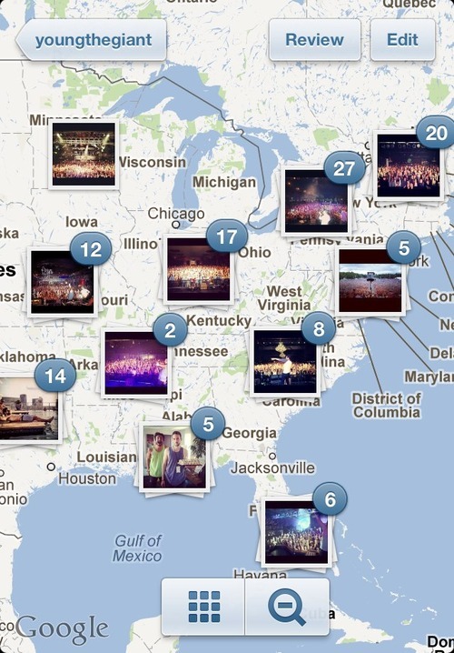
For photographer, I am deciding between going for a “travel/landscape photographer” or just photography in general. I am currently looking at the Instagram’s Photo Map as my reference at the moment.

For the rest of them, I am still currently churning out some new concepts so stay tuned!

Best,

justin-drawn

Hello Name Tags

First 2D lesson back in school (yay!), we were tasked to come up with some designs based on our names. A typographic, abstract and a conceptual design. Here is some sketches and doodles on my brainstorming process:

DSC_0872DSC_0873

This in class activity was pretty interesting, I felt like I was designing my own identity/logo. I have then decided on the following designs:

TYPOGRAPHY

TYPOGRAPHY
TYPOGRAPHIC DESIGN

My general concept is minimal design, hence I have decided to simply use my own handwriting. Yes, I am a fan of Sans Serif and Caps. As you can see, I have a pretty bad handwriting so I have decided to go digital for the next few designs.

ABSTRACT

ABSTRACT
ABSTRACT DESIGN

This digital design is derived from converting my name “Justin” into hexadecimals: 4a757374696e. I chose to use hexadecimals because I do a little programming as a hobby.

I have then split them into #4a7573 and #74696e which gives me those colours. I have also decided to use circles as a representation of eyes.

This design is based on hex colours so they are in RGB. I totally forgot that printing is in CMYK, so this design will not really work.

CONCEPTUAL

CONCEPTUAL DESIGN
CONCEPTUAL DESIGN

This will be the design I have settled for to be used as my nametag.

For this design, I have actually used Illustrator to draft out the design and used a machine to do the paper cuts. So its basically a digital back to traditional medium.

CHO

My surname Cho is somewhat from a Korean origin (err nope I’m not Korean) so here is the letter CHO in Korean. I have incorporated it into my name as when it is rotated in +90 degrees, it seems like the letters “IN“. Got this inspiration from the KOI logo.


OTHER DIGITAL DRAFTS

DRAFTS
DRAFTS

Project 1: Typo

TYPOGRAPHY

The first thing that comes to mind on typography is the documentary on Helvetica that I watched in one of the mods in my Poly years. Personally for me, I prefer San Serifs and minimalist typography. Also, I have a bad handwriting so I prefer digital to traditional handwritten text.

DOUBLE EXPOSURE TYPOGRAPHY

3D Typography

I have seen many of these being applied in 3D motion graphics in TV Spots and title sequences. In fact, some motion graphic reels are quite inspirational.

As for traditional 3D typography, I am really interested in paper sculptures/paper cuts.

ERODE

Recently I have been looking into popup cards and some of them make use of unique typography to create an object. Below is an example of a birthday card made with some greetings that forms a 3-layered birthday cake.

Other Interesting Typography

DOTSIES