2D Zine Research

Since the style throughout my 2D works changes everytime, I find it difficult to find a common theme for my zine. Hence, I am inspired by those zine design with only single colour per page, so that the whole design has an unity.

Below are some of the zines that I have looked into:

I am also not an excellent writer, hence I want minimum writing in my zine.  Thus, I just summarize my thought process for almost every 2D work as below:

Cool about it

Angry at it

Get over it

Check out next post for the progress~

2D Typographic Portrait Research

2D Research on Gestalt Psychology

Gestalt Laws:

  1. Law of Proximity: objects that are near or ‘proximate’ to each other tend to be grouped together.

  1. Law of Similarity: similar objects tend to be grouped together

  1. Law of Figure and Ground: identifying a figure from the background

  1. Law of Continuity: perceptions of connected and continuous figures to disconnected and disjointed ones

  1. Law of Closure: constructive or generative aspect of perception

  1. Law of Simplicity: elements are always perceived in the most easiest way possible

2D Research on Typographic Potrait

16

The above picture is a list of things I want to be or I am.

Below are some of the images from internet that inspired some of my work:

For slow runner, I initially wanted to use my name to form turtle shape.

For animator, this is using flip book to present the typography.

For comic lover, using comic style to arrange my name.

For happy, I want to try to in-cooperate English alphabets into my chinese name 乐.

Click on my next post for the progress in my project.


4D ideation week 3

点虫虫 (Point the insect)

点虫虫,虫虫飞,飞到荔枝基,荔枝熟,摘满屋,屋满红,陪住个细蚊公

Rough translation: Point to the insect x2. (The insect) flies to lychee trees, the lychees ripen. Lots of lychees are picked that it fills up the room, with a little boy

The Game

  • Put an index finger on the child palm and sing out 点虫虫
  • The child is expected to quickly grab the finger after the first sentence of the rhyme
  • Move index finger away to avoid getting caught by the child

gif 3

(Click on image for gif)


Narrative

Overall idea: Comparison between the rhyme and the growth of a child &

the idea that this rhyme is passed on for generations.

  • Scene 1: A room with a child and his father. (点虫虫, point the worm)
  • Scene 2: A butterfly pupa hanging on tree branch. (点虫虫, point the worm)
  • Scene 3: The child playing the game with his father. (点虫虫, point the worm)
  • Scene 4: A butterfly pupa hanging on tree branch. (点虫虫, point the worm)
  • Scene 3 and 4 repeated a few times to show the comparison.
  • Scene 5: A butterfly emerged slowly from the pupa and flies to nearby lychee tree (飞到荔枝基, flies to lychee trees)
  • Scene 6: The child (slightly older) went out to the lychee trees to play. (荔枝熟, the lychees ripen)
  • Scene 7: The child always picked lots of lychee fruits back to his house. (摘满屋, Lots of lychees are picked)
  • Scene 8: A room filled with lychees with a happy child (even older) (屋满红,陪住个细蚊公, that it fills up the room with a little boy)
  • Scene 9: Everything disappeared. Only a old man (the child) in a room.
  • Scene 10: A voice called the old man “Father”. It is the old man’s son with his grandson.
  • Scene 11: The son offered the old man a bowl of lychees
  • Scene 12: The old man smiled. He looked at his grandson.
  • Scene 13: Old man played with his grandson the “point the worm” game (点虫虫, point the worm)
  • Scene 14: Ending in a room with old, son and grandson. (The rhyme continue playing in the background)

Stop motion animation film

12

gif 2 (Click on image for gif)

gif 1

(Click on image for gif)


Yes, my style of drawing. Anyone wants to collaborate? 😀

I don’t mind working on other projects with animation stop-motion.

Color scheme

Colour Scheme is the choice of colours used in design for a range of media. Colours that create an aesthetic feeling when used together will commonly accompany each other in color schemes.

List of colour schemes:

Monochromatic colours – All the colours of a single hue. Energy is more subtle due to the lack of contrast in hue. 

Complementary colours – Pairs of colours when combined together will cancel out each other. Creates high contrast on the design, captures attention. 

Split complementary colours – In addition to the base color, it uses the two “Analogous” colors adjacent to its complement. Also creates a high contrast, but not as strong as complementary colours. 

Achromatic colours – Any colour that lacks strong chromatic content is said to be unsaturated, achromatic, or near neutral. Easily modified beside saturated colours. 

Analogous colours – Group of colours that are adjacent to each other on the color wheel, with one being the dominant color, and two on either side complementing.

Triadic colours – Three colors equally spaced around the color wheel. Tend to be vibrant. Offer contrast along with colour harmony. Easiest to create a balance in colours. 

Tetradic colours –  Richest of all the schemes because it uses four colors arranged into two complementary color pairs. Difficult to balance, need one of the colours to be dominant. 


Research on Colours

Real_Color_Wheel_475

I believe that there are infinite numbers of colours in the world, it will be impossible to name out every single colours that I know.

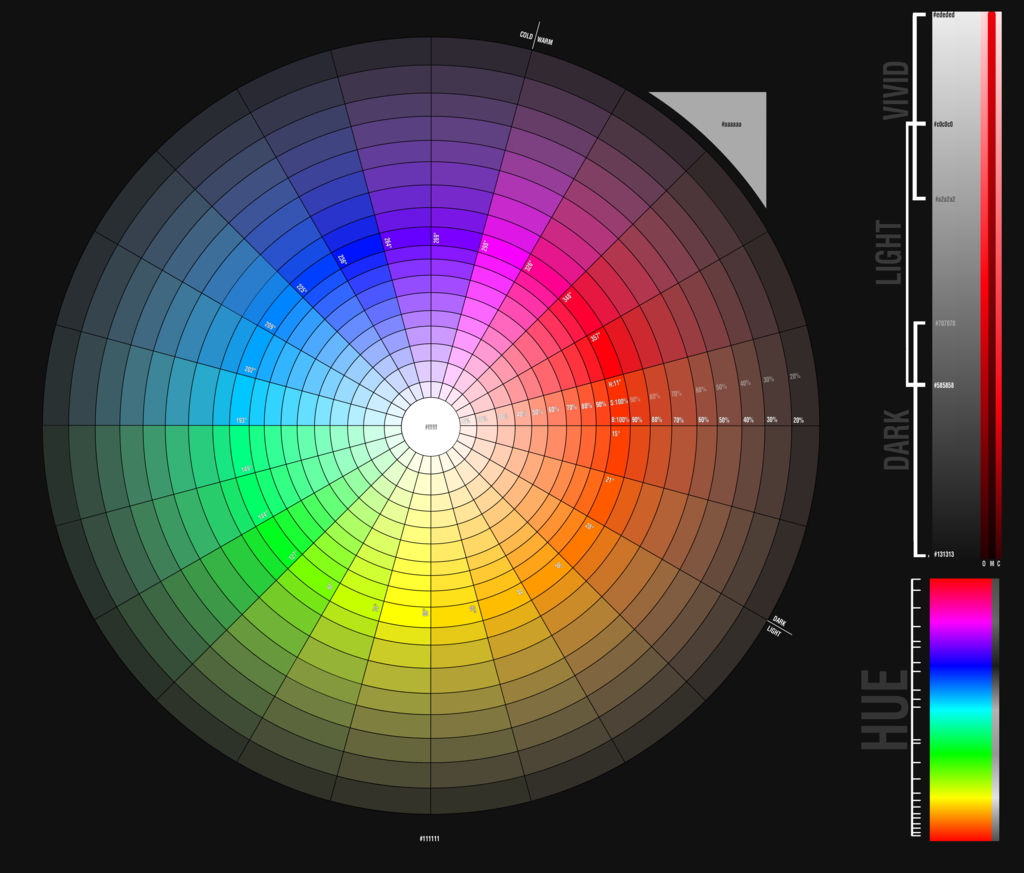
From a scientific perspective, there are different level of light-dark, level of red-green and level of yellow-blue to create different shades of colours. In addition, the surrounding conditions of also affect how we identify the colours. (Ref. http://www.rit-mcsl.org/fairchild/WhyIsColor/files/ExamplePage.pdf)

In computer display, it can only show 256 shades of red, blue and green each. Hence, the computer can display 256x256x256, roughly 16.7 millions different colours. (Ref. http://www.astropix.com/HTML/J_DIGIT/MON_RES.HTM)

colour wheel


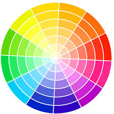
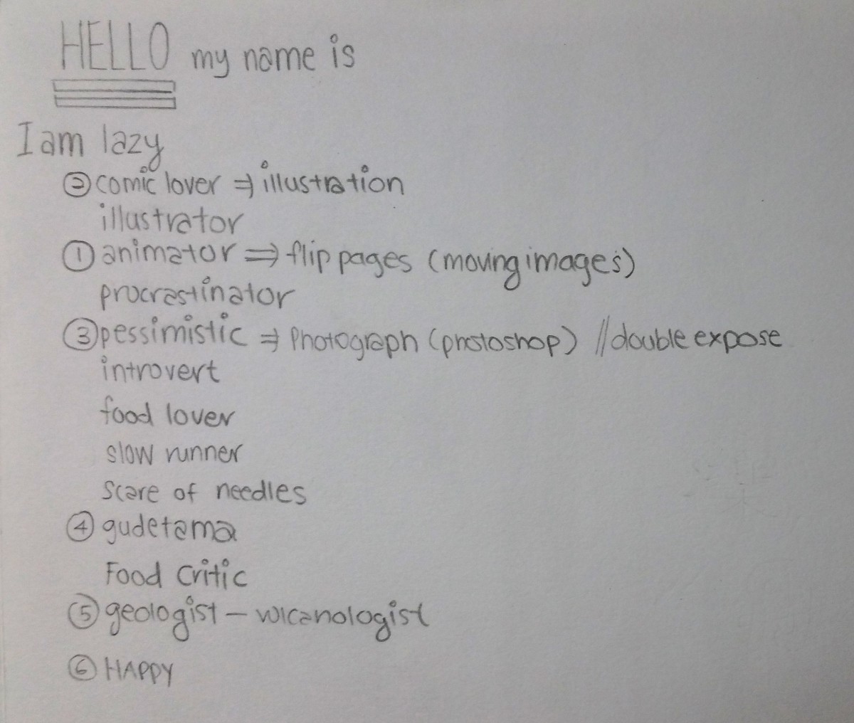
However, for my research, I will only be writing 11 different basic colours: Red, Orange, Yellow, Green, Blue, Purple, Pink, Brown, White, Grey and Black.

Red

red

Red is a warm colour with green as a complementary colour. It always appears striking and catches the viewers attention. Red often represents anger, agressive, strength, danger and stop. Red is often used to alert people of danger ahead. Red also represents good fortune for the Chinese.

Orange

orange

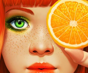
Orange is a warm colour with blue as a complementary colour. It often represents passion, sensuality and immaturity.

Yellow

yellow

Yellow is a warm colour with purple as a complementary colour. It often depicts as something positive. Yellow represents passion, cheerful, optimism, happiness, friendly and confidence.

Green

green

Green is a cool colour with red as a complementary colour. It represents the nature and is pleasing to see as it does not strain the eyes. Green often means environment, refresh, relax, peace and negatively, jealousy.

Blue

blue

Blue is a cool colour with orange as a complementary colour. It is also another smoothing colour and blue objects often appear to be far and distance. Blue can represents the sky, water, calmness, cool, shy and negatively, cold and aloof.

Purple

purple

Purple is cool colour with yellow as a complementary colour. It is often shown as a spiritual colour. Purple represents wealth, luxury and introvert.

Pink

pink

Pink is a warm colour. It is often depicts as something cute and lovely. Pink can also represents love and kindness.

Brown

brown

Brown is the colour of the soil, hence it often gives people the feeling of reliable and support. However, negatievly, brown is also viewed as dirty and old.

White

'Yayoi Kusama: Look Now, See Forever' Installation view

White complementary colour is black. It often communicates purity and peace. White can also represents cleanliness, clarity, elitism and coldness. It can also represents the season winter, hence snow and ice.

Grey

grey

Grey often represents something negative. It can mean sadness, depression, lack of confidence, neutral and lack of life.

Black

black

Black also often represents something negative. It often represent death, sadness, depression, coldness and mystery. However, positively, black could mean sophistication. Black is the easiest to match with other colours and acts as a barrier.