The printing version


The final digital version
The actual copy version

End of project ~
人间蒸发 (´・ω・`)
These are the final outcome of my work.
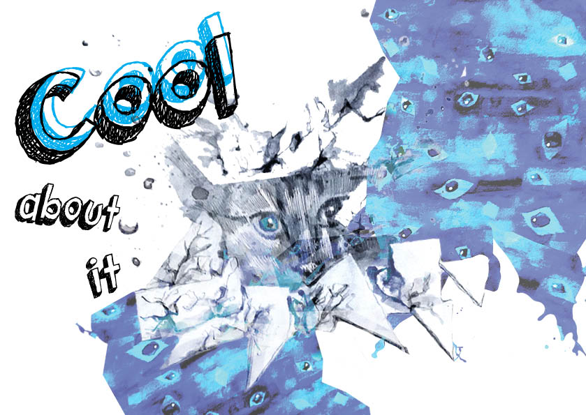
 Overall work
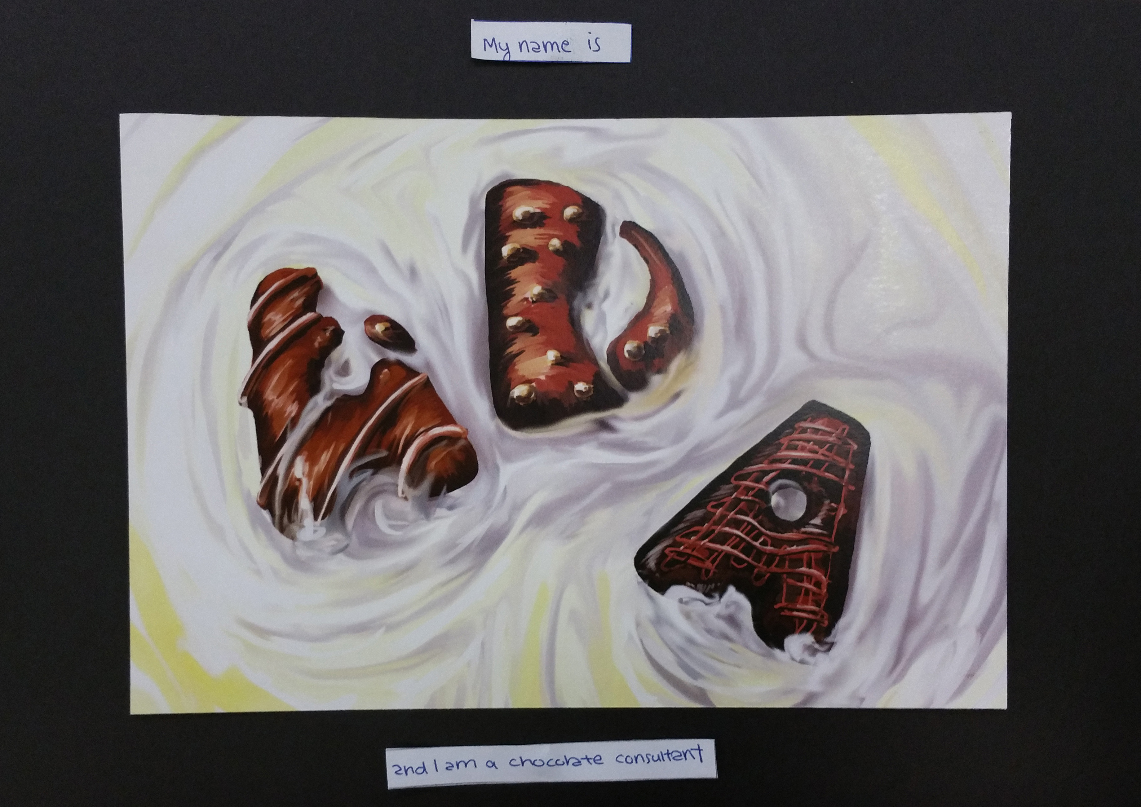
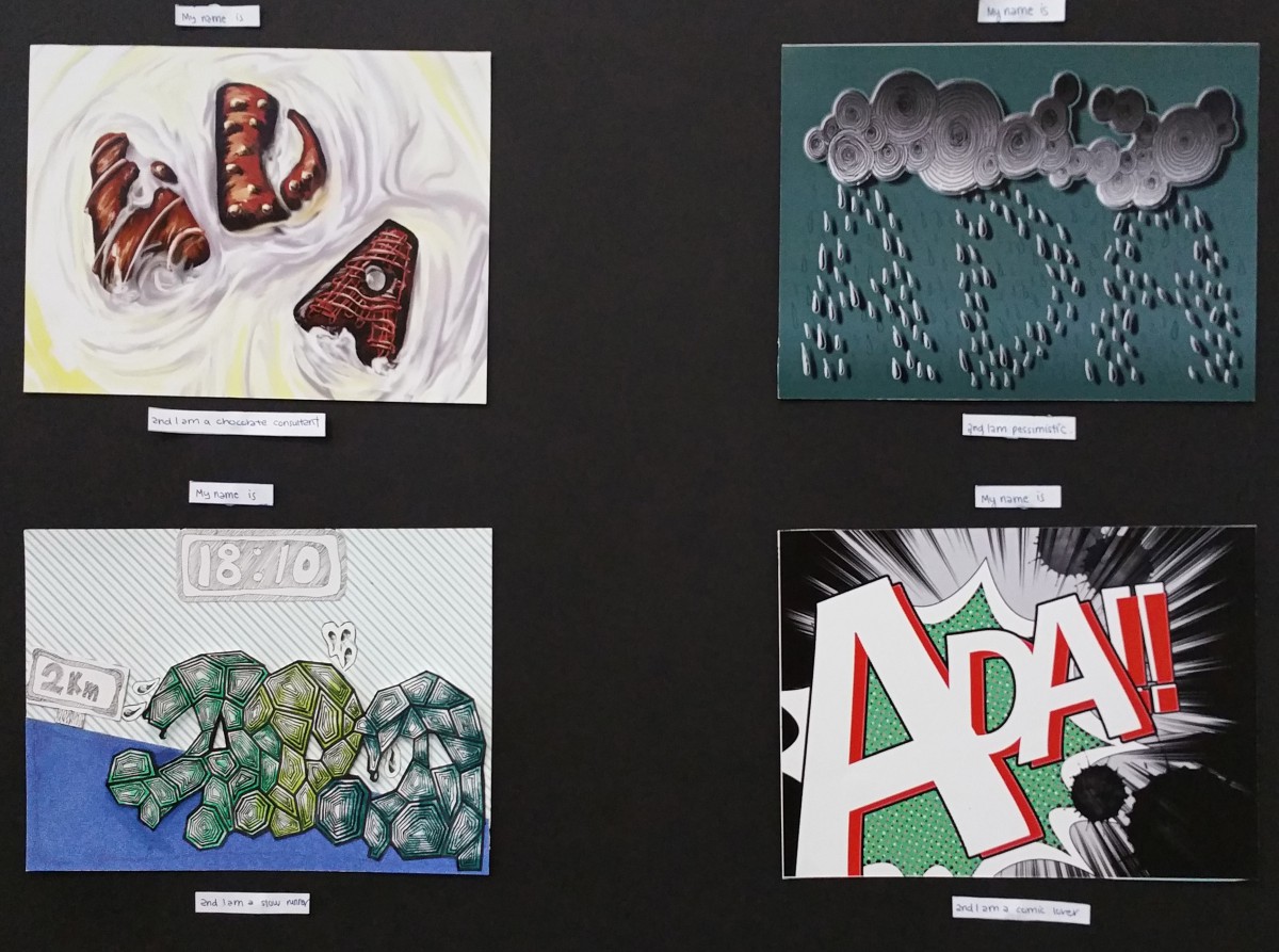
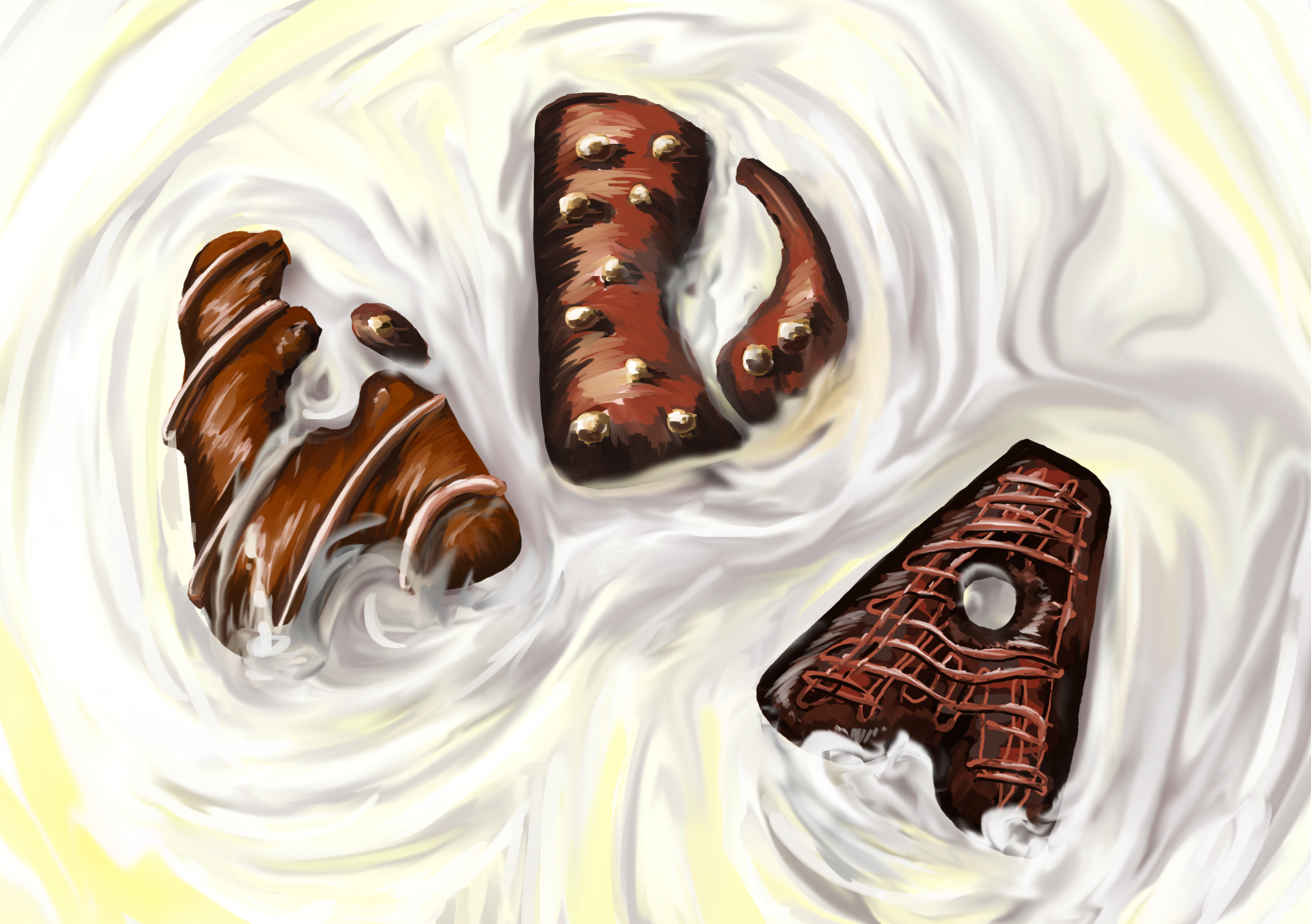 I tried to be as realistic as possible in my digital drawing. The dark chocolate contrasts with the white chocolate background. Gestalt Closure theory is applied here with the first letter A and D to make things interesting.

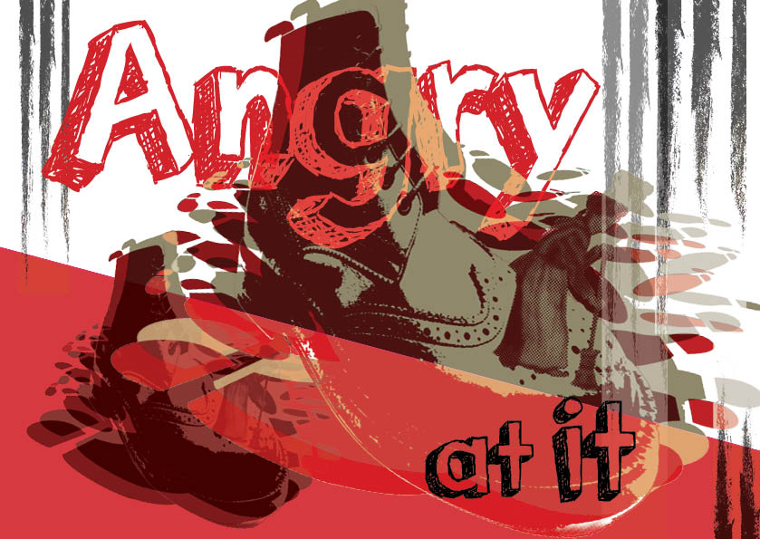
 The leading lines are are pointed towards the name. The name is also off balance from the image to create dynamic effect. Alphabets are overlap as often seen in comic book. The red on the name contrast with the green halftone background.

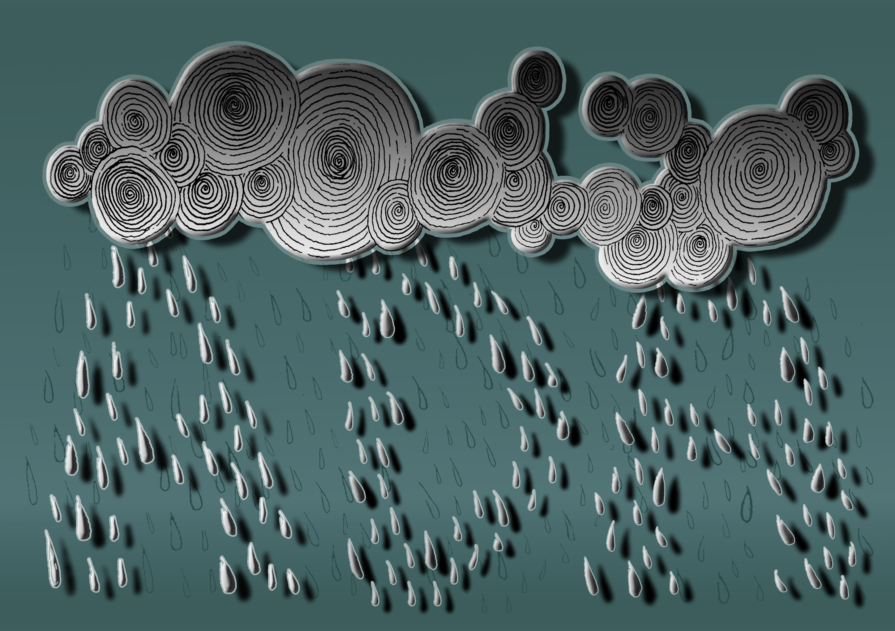 Gestalt Similarity theory is used here since similar raindrops shape are grouped together to form my name. The colours and gradient used give off a gloomy feeling. Original sketch of the raindrops are also added into the background to fill up the space. Shadows helps to make the name stands out.
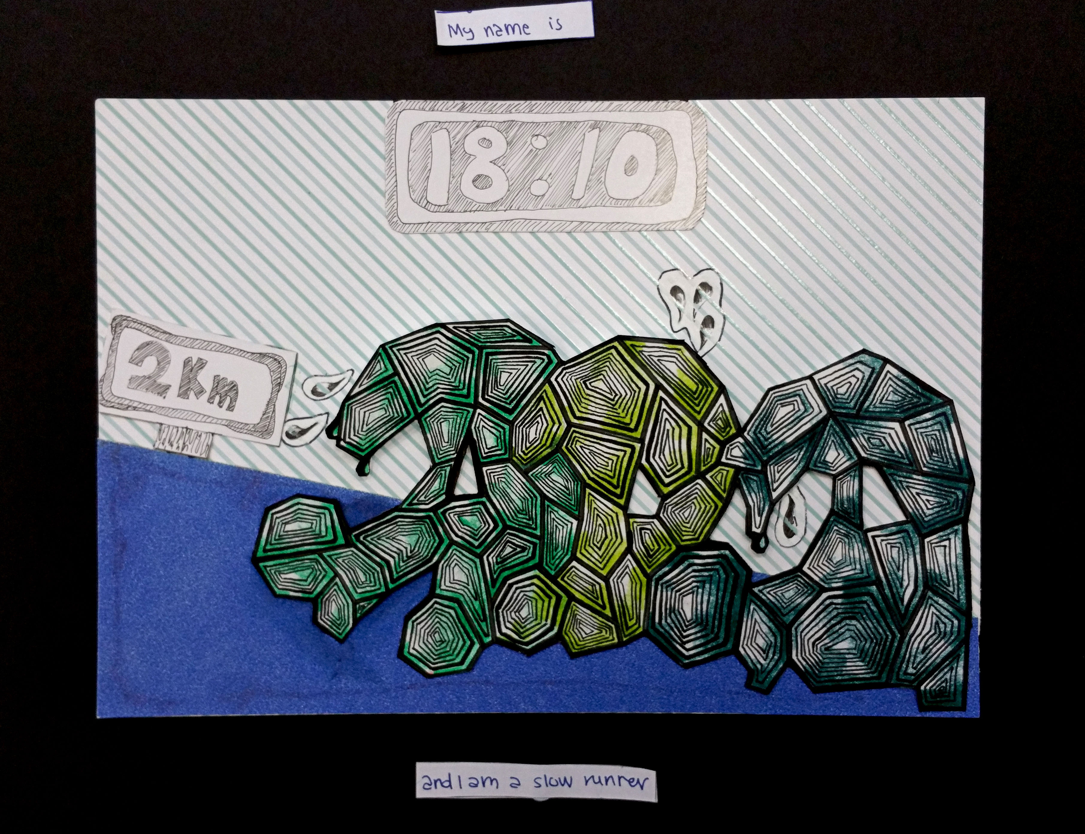
The alphabets are are designed like they are wearing shoes. Different shades of green help to separate the alphabets. Blue floor is chosen to represent the stadium running track. The alphabets are running upwards to give off a tired feeling. Sweats, timing and distance are also added in.
Thank you for reading ~
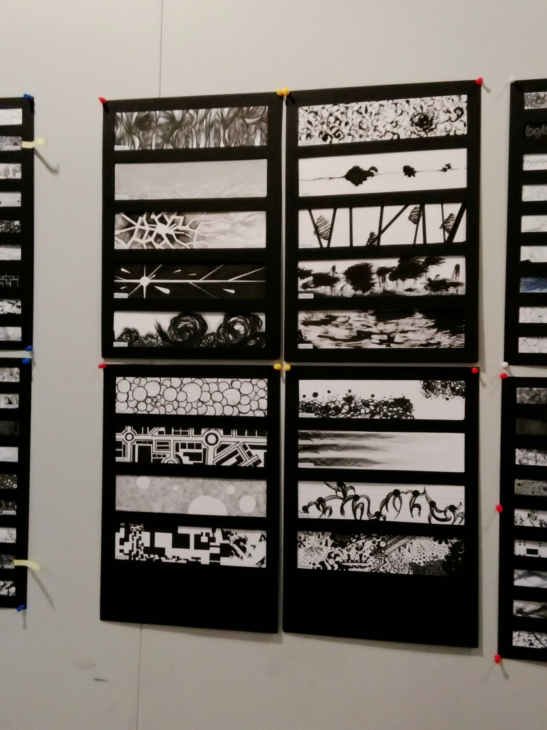
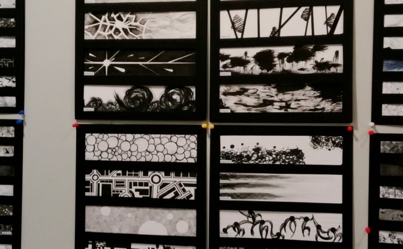
From top to bottom: Awkward, Sloven, Distracted, Aggressive, Psychotic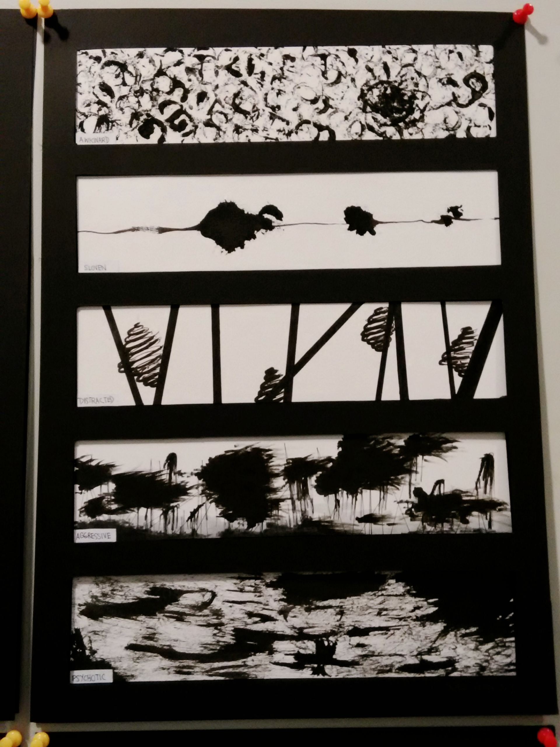
From top to bottom: Sensual, Ambiguous, Fragile, Spontaneous, Turbulent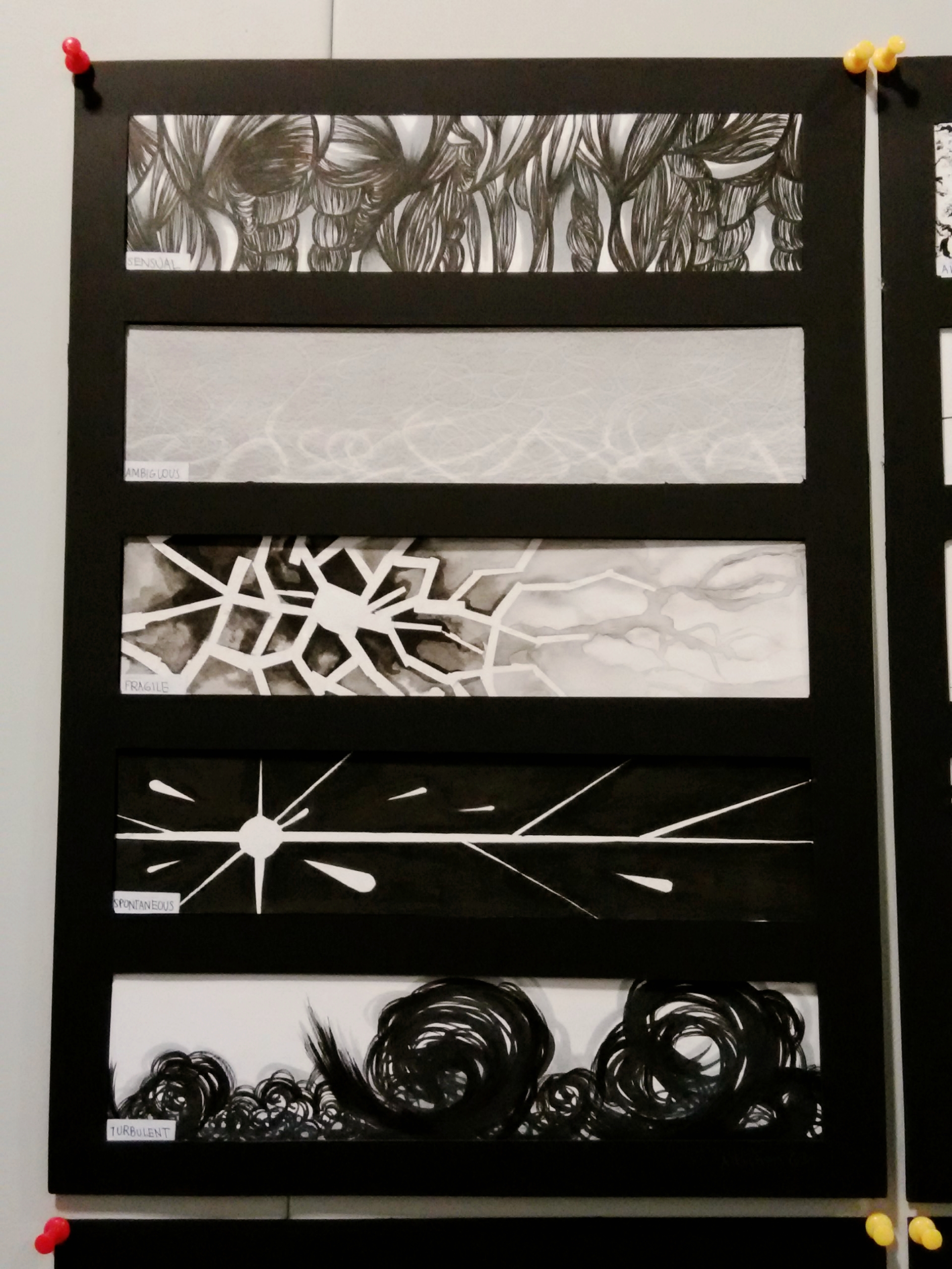
From top to bottom: Nonsensical, Exhausted, Lyrical, Bizarre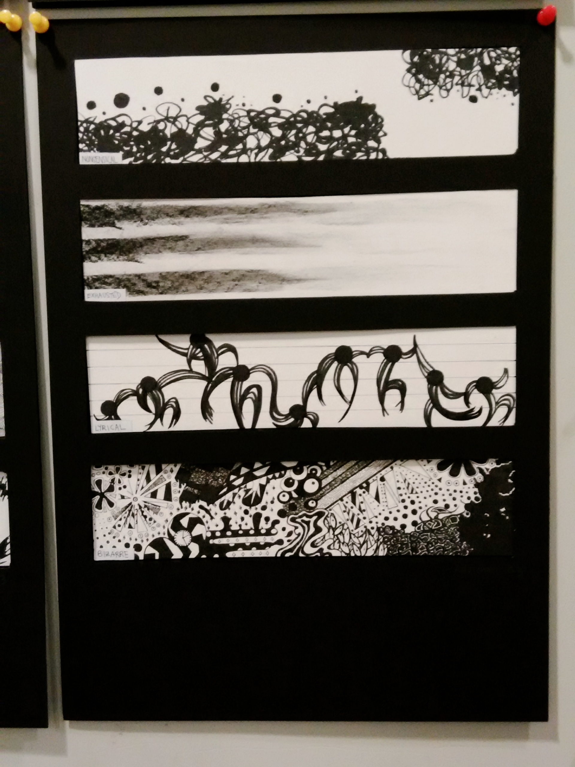
From top to bottom: Anxious, Systematic, Embarrassment, Indecisive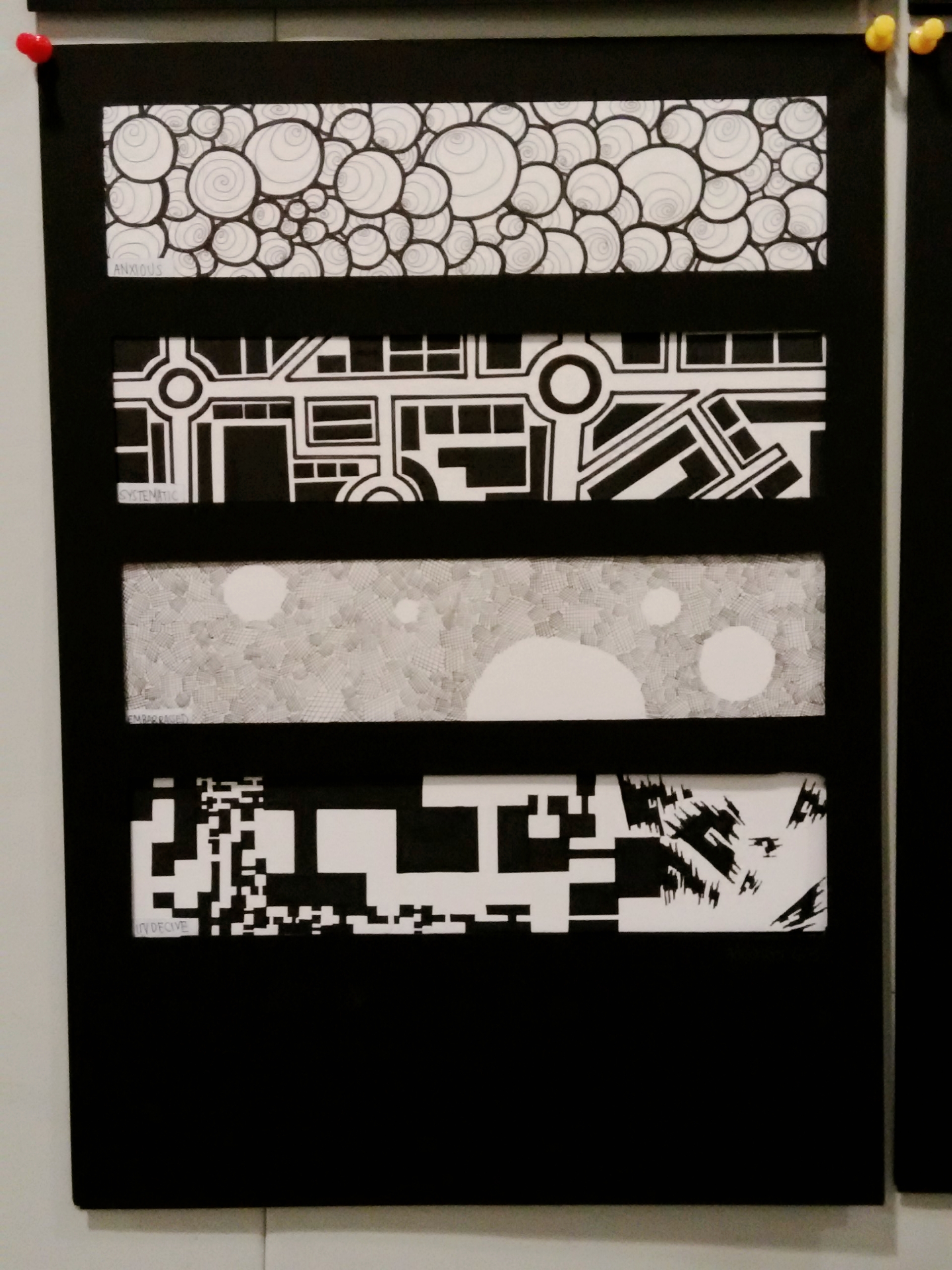
Overall work:
The explanation each design can be found in journal/research folder.