POV
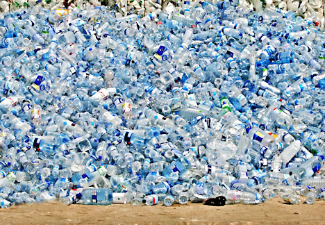
OBJECT = BOTTLE
Was really struggling to bridge the 2 initial ideas of [Environmental] and [Nostalgia] themes throughout this project. Ultimately decided to bridge the 2 themes together through Execution.
Execution = Digital Manipulation + Abstract paintings using Bottle as medium
Chosen 6 POVs:
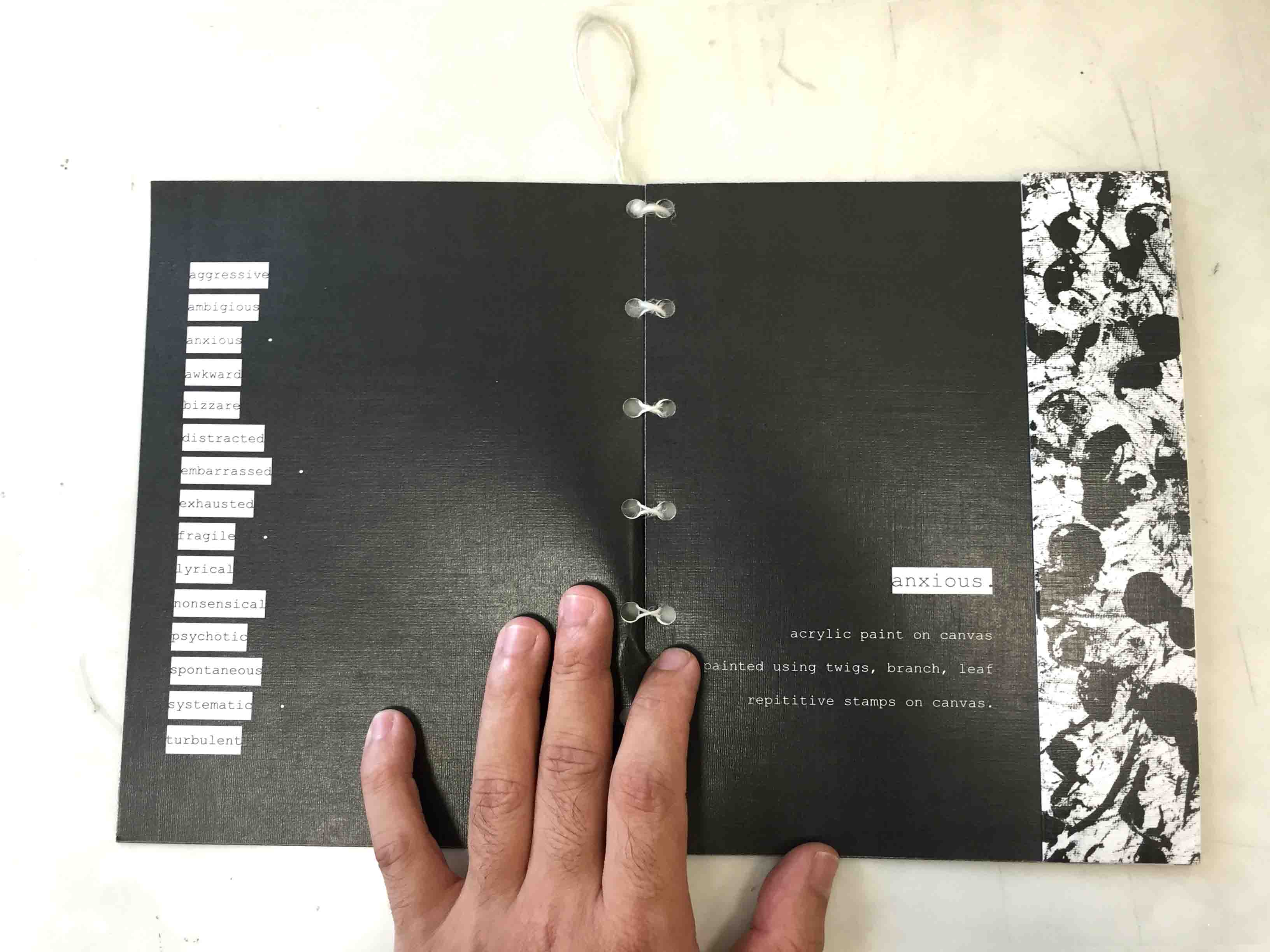
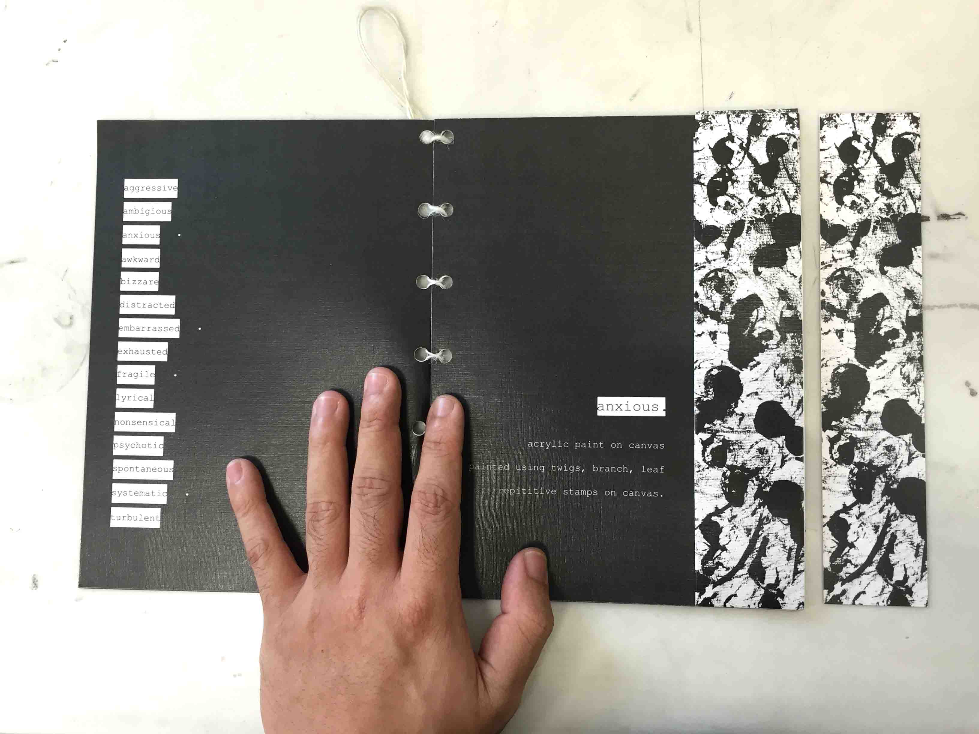
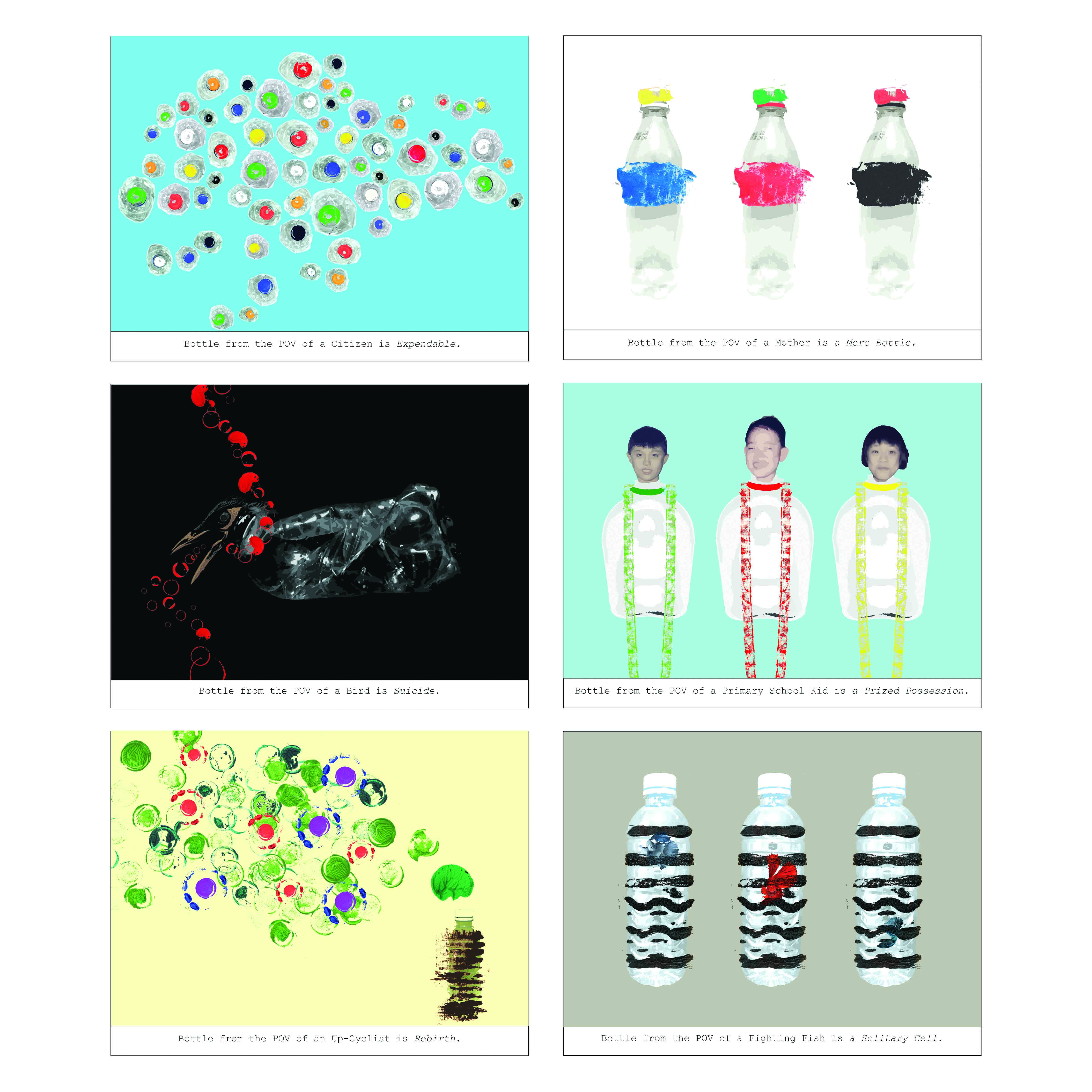
Bottle from POV of a Citizen is Expendable.
Bottle from POV of a Bird is Suicide.
Bottle from POV of an Up-cyclist is Rebirth.
Bottle from POV of a Mother is a Mere Bottle.
Bottle from POV of a Primary School Kid is a Prized Possession.
Bottle from POV of a Fighting Fish is a Solitary Cell.
Execution:
BOTTLE PHOTOSHOOT
Collected as many varieties of Plastic Bottles and did a makeshift photoshoot to be used in the final composition.
 Took out the labels, took photos of the plastic bottles in different forms such as chilled, crushed, empty, capped and without cap.
ABSTRACT PAINTING
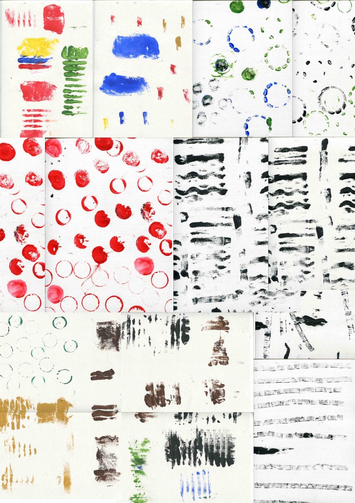
Used Acrylic Paint on Acrylic Paper and various parts of the bottle to paint. Some interesting parts include the grooves of the bottle caps, grooves of different bottles and the bottom of the different bottles.
Ideas:
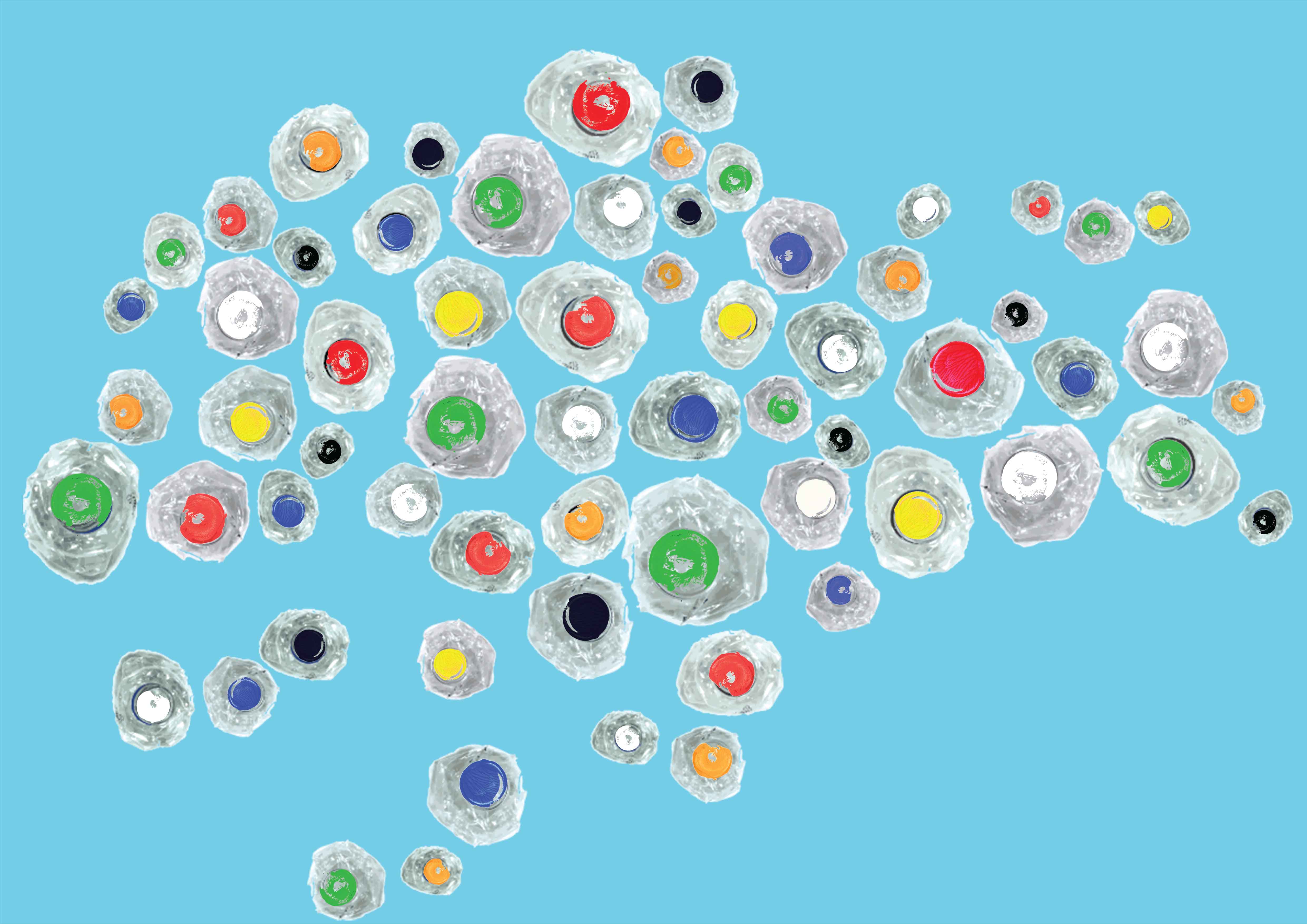
Bottle from the POV of a Citizen is Expendable.

Idea is based on how readily available Plastic Bottles are in a City, and how readily abandoned they are. I made used of the Map of Singapore to convey the idea of a City, and created the composition using crushed bottles. Crush bottles are used for the idea of how easily abandoned the plastic bottles are. Finally added painted bottle caps of different colours to show the vast variety of bottles.
Final Composition

Bottle from the POV of a Citizen is Expendable.
Crushed bottle forms the Map of Singapore. Different coloured bottle caps signify the variety. The crushed bottles looks to be floating on the sea, signifying the idea of easily abandoned.
—
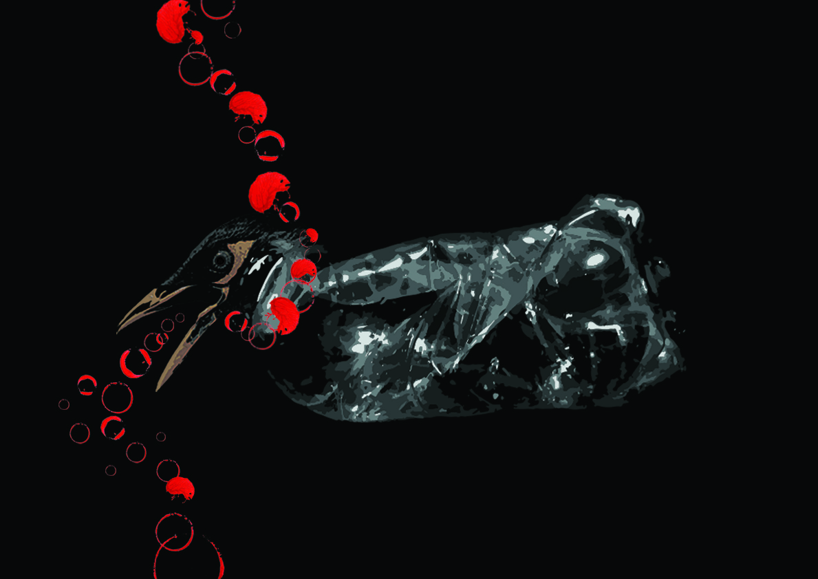
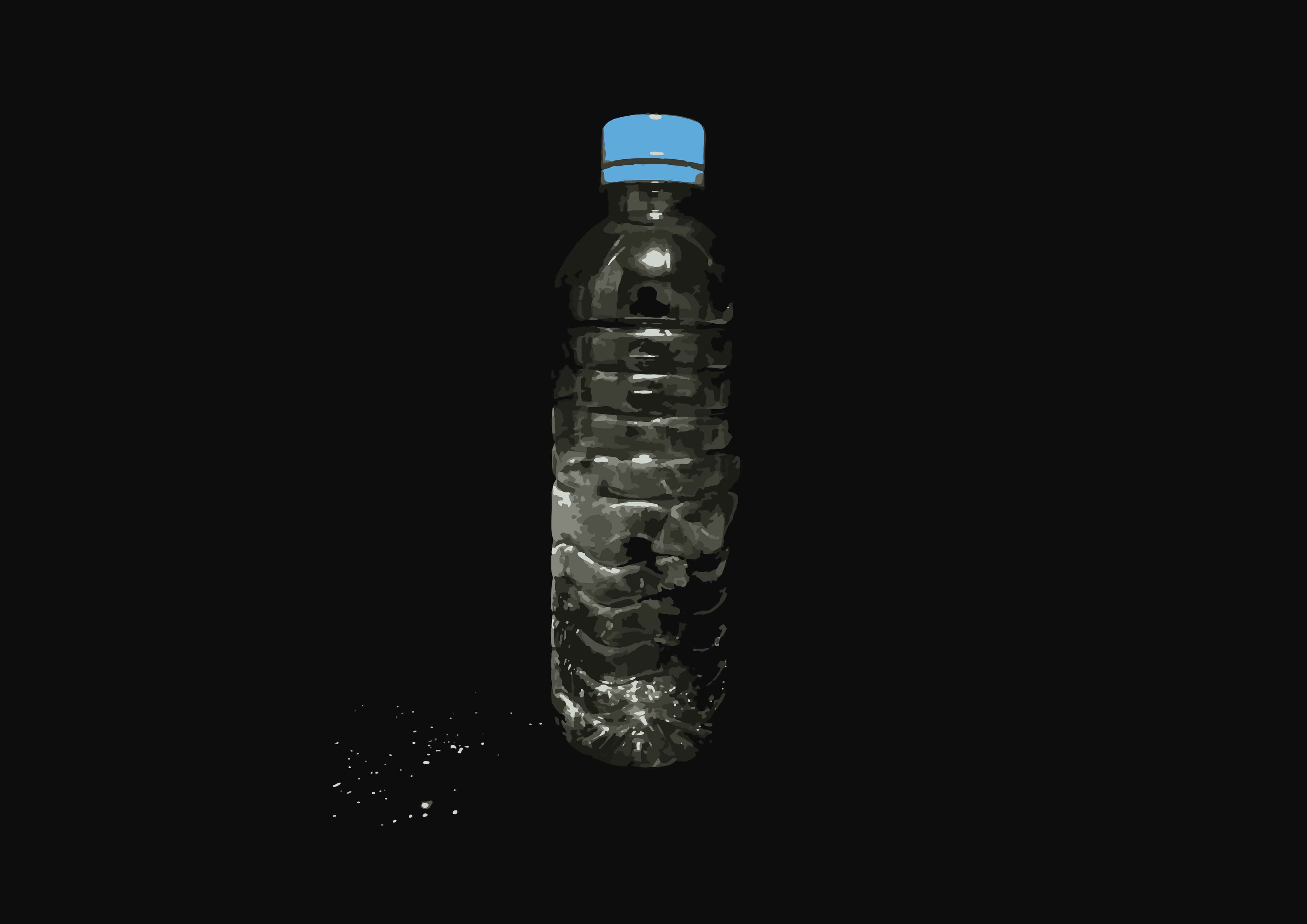
Bottle from the POV of a Bird is Suicide.
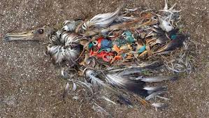
Idea is based upon the images captured of birds who choked after ingesting bottle caps that have floated on the sea thinking that they are edible.
Digitally manipulated the head of the Myah, one of the most common birds in Singapore, and a crushed bottle. Crushed bottle signify death of the bird. Added the painted bottle caps in the form of blood and the noose to tell of the bird being choked to death. Made adjustment to the size of the bottle caps digitally.
Final Composition

Bottle from the POV of a Bird is Suicide.
The idea of a noose was suggested during the group consultation by Andrew. Many thanks brother.
—
Bottle from the POV of an Up-cyclist is Rebirth.
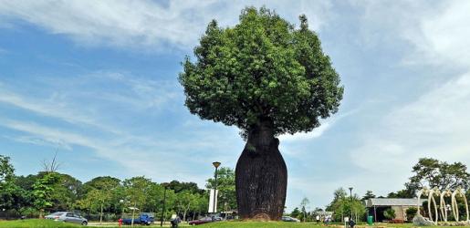
Idea is based on Upcycling and giving new life of recycled objects. The idea of using bottle to form the shape of the tree and painting leaves and flowers using the bottle. The use of the Bottle Tree from the Bottle Tree Park was sprouted from the Group Consultation.
Final Composition

Bottle from the POV of an Up-cyclist is Rebirth.
Bottle was coated with brown paint to show the idea of a tree. The different bottle caps painted green signify leaves while the blue and red flowers signify growth and Rebirth.
—
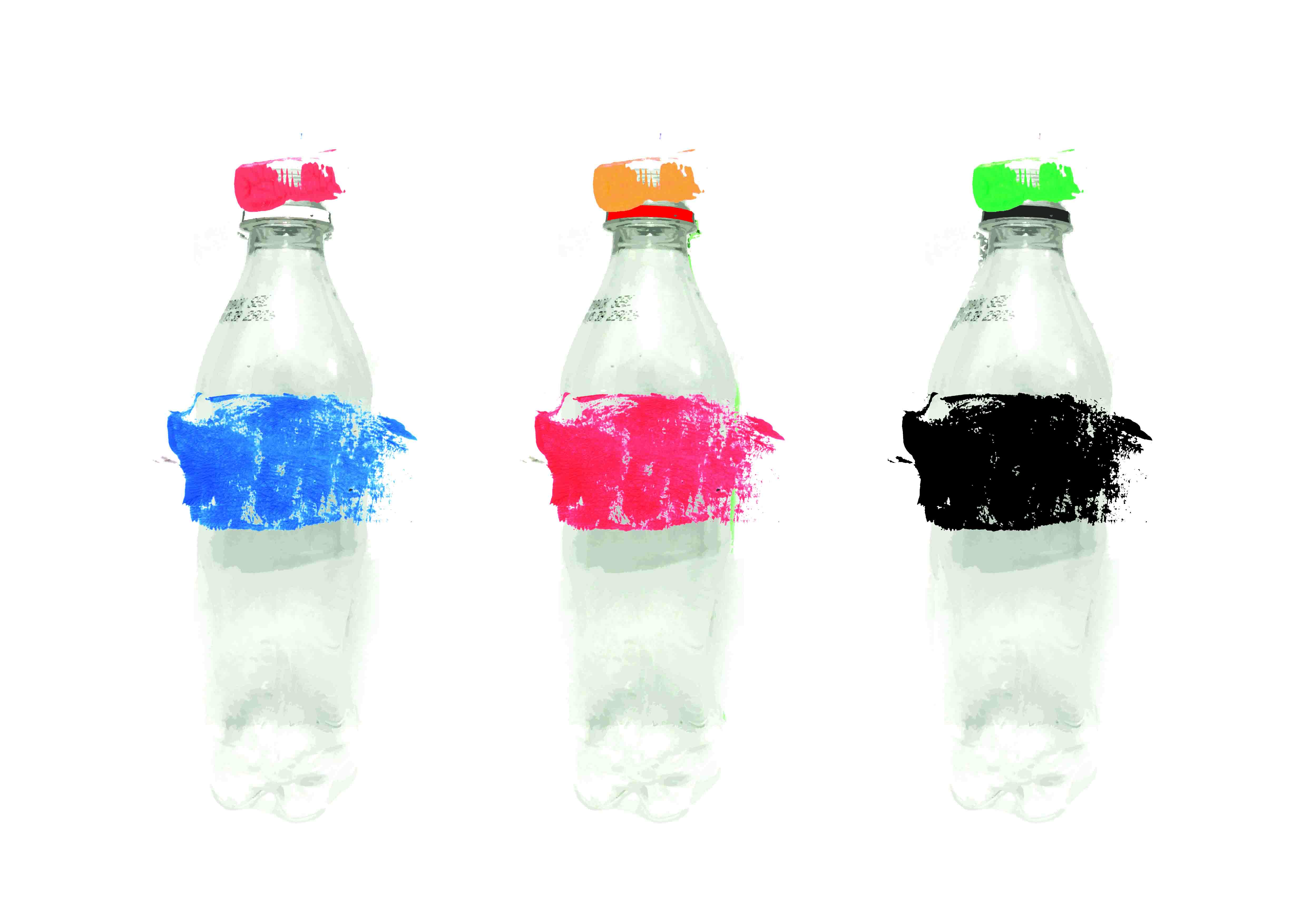
Bottle from the POV of a Mother is a Mere Bottle.
The idea was generated during the group consultation (again). Prof Joy mentioned the idea of having different caps to the bottles just because they fit. I felt it was really interesting and a powerful motif to be conveyed.
Used the Idea of portraying 3 bottles in 3 different compositions. Added the mismatched painted labels and bottle caps. Played around with different bottles but felt that a uniform composition is more powerful.
Final Composition

Bottle from the POV of a Mother is a Mere Bottle.
—
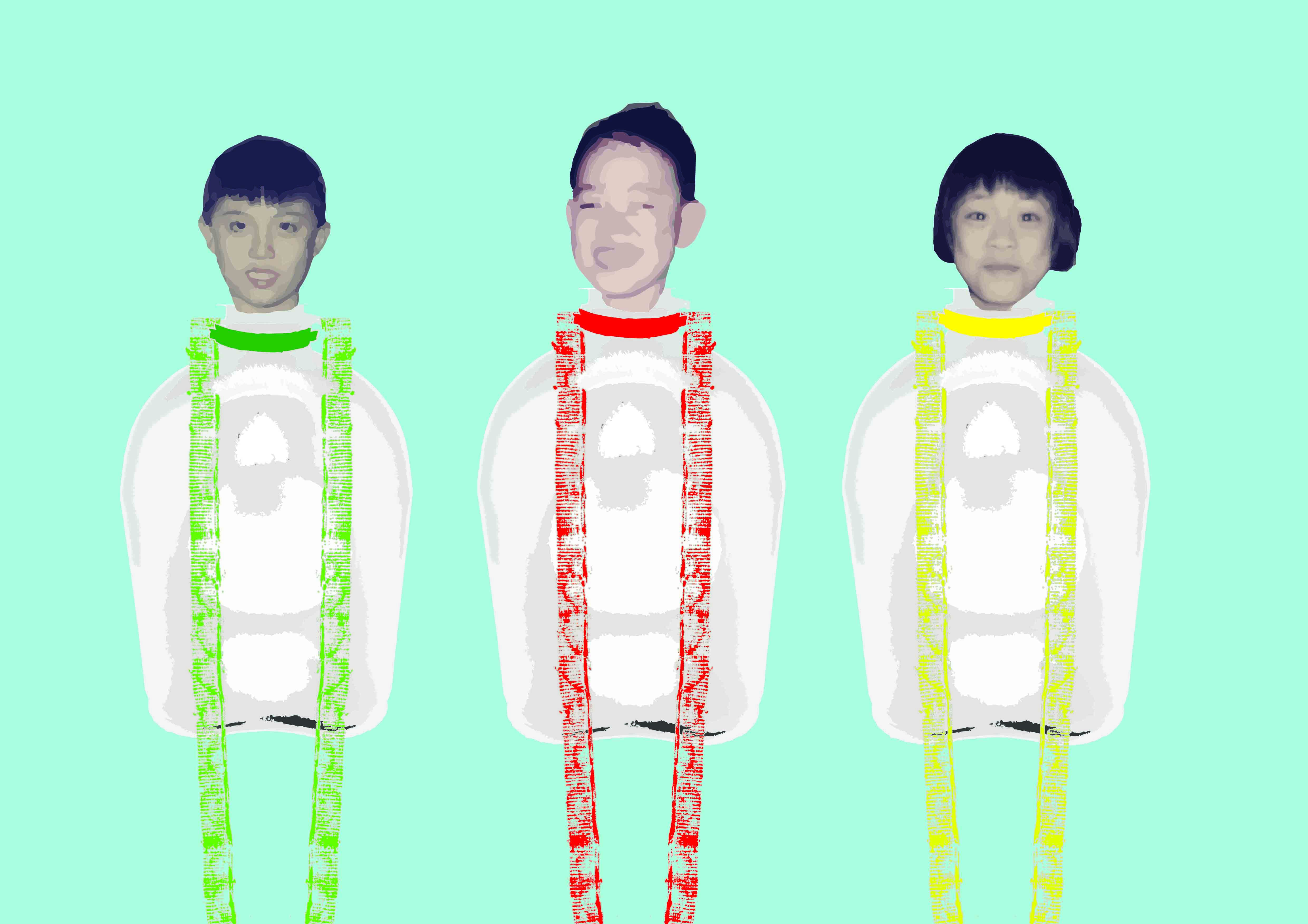
Bottle from the POV of a Primary School Kid is a Prized Possession.
Idea was based on the Clip-Strap that clips to any bottles that was really popular among the Kids, when I was young. The Clip-Strap has since become obsolete.
Initially I used the word ‘Accessory’ in my ideation. I decided to look back at my family’s old albums to see if I have any pictures taken of my bottle when I was a Kid.
Yup that was me then. Looking at how happy I was with my Bottle, I felt that the bottle signified more than an Accessory, but a Prized Possession.
I again based my Composition using 3 bottles. I base my idea on showcasing the straps on the bottle, similar to how Jewelries are showcased in Shops. I used the bottle of a similar shape, however nobody recognised the relation during the initial composition. Thus I added my face as a Kid, and dragged my siblings faces into the final composition. I made use of the grooves of the bottle caps to paint the strap of the Clip-Strap.
Final Composition

Bottle from the POV of a Primary School Kid is a Prized Possession.
—
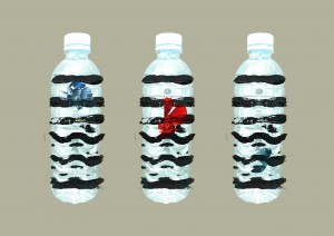
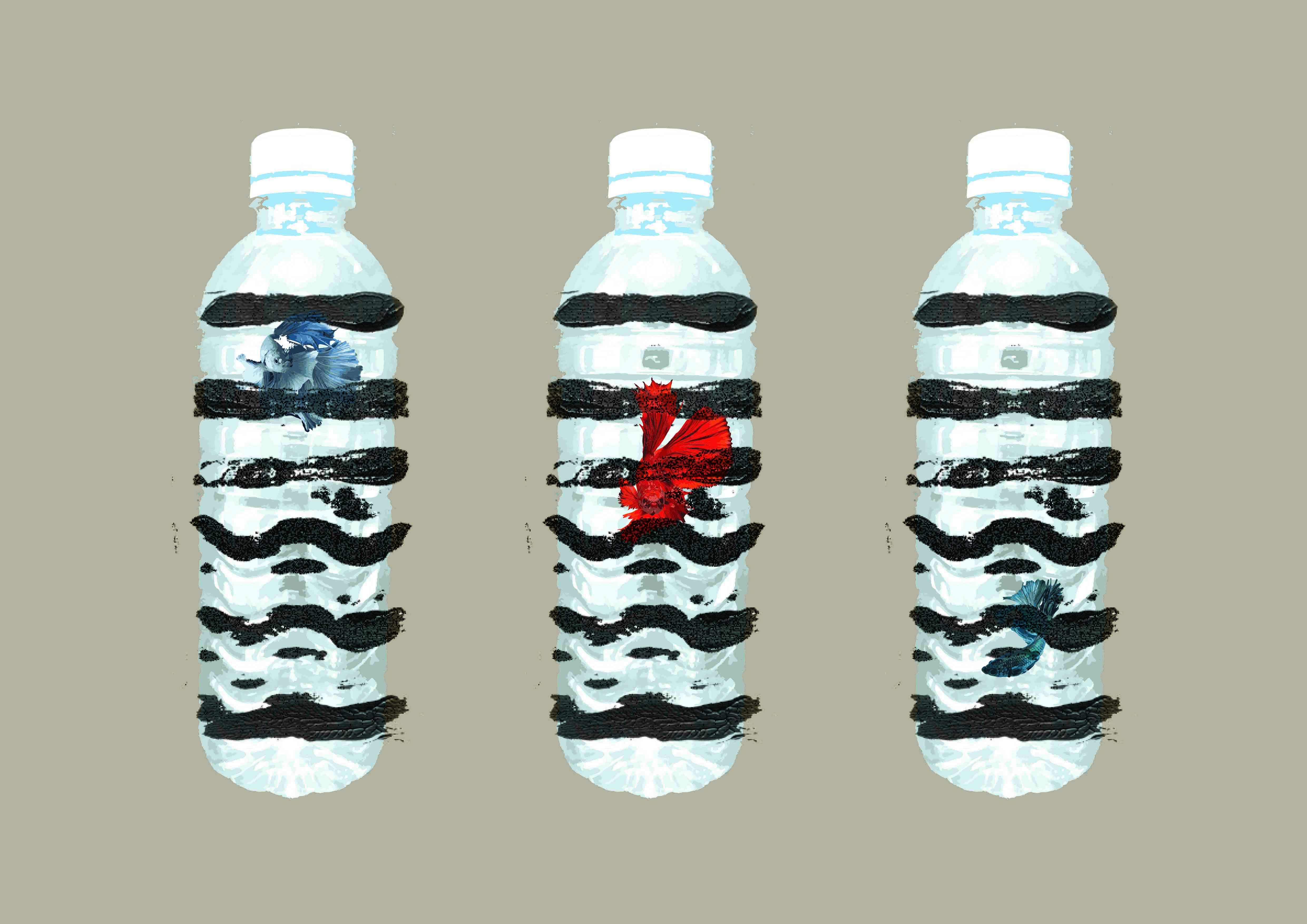
Bottle from the POV of a Fighting Fish is a Solitary Cell.
The idea is fairly simple. I wanted to compose the image as a fighting fish trapped as a Prisoner in a bottle. I made use of the side grooves of the plastic bottle to signify the idea of cell bars.
Initially the idea looked fairly finished, but the idea of a cell wasn’t really conveyed. Also the composition did not fit the general format of the 5 other pieces. I redid the composition in 3 bottles with 3 different fighting fishes.
Final Composition

Bottle from the POV of a Fighting Fish is a Solitary Cell.
Final Composition

Rejected Ideas:
Bottle from the POV of a Hiker is Mandatory.
Idea is based on Water Bottle as an essential pack for a hiker. Added the idea of 2 extra mountains to simulate the idea of Lungs, and wanted to paint the image of a rib cage over the image. Felt the idea wasn’t conveyed strongly and didn’t fit the theme, thus REJECTED.
Bottle from the POV of a Novice Cook is a Measuring Tool.

Idea is based on using the bottle as a measuring tool. Used powder to simulate the idea of flour over the bottle. Composition felt unfinished and weak in execution, thus REJECTED.
Final Thoughts
Having struggled with 2 conflicting ideas throughout the project, I felt that the group consultation was really useful. I am happy with my outcome.
End.