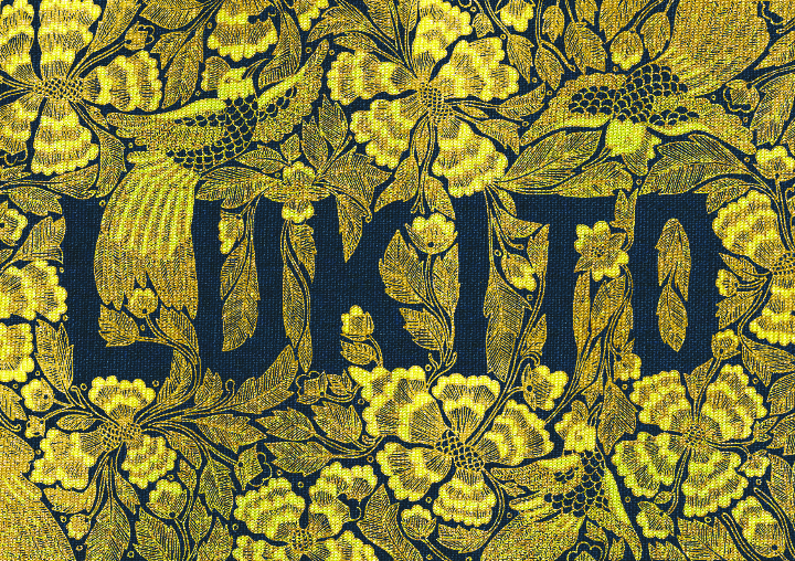
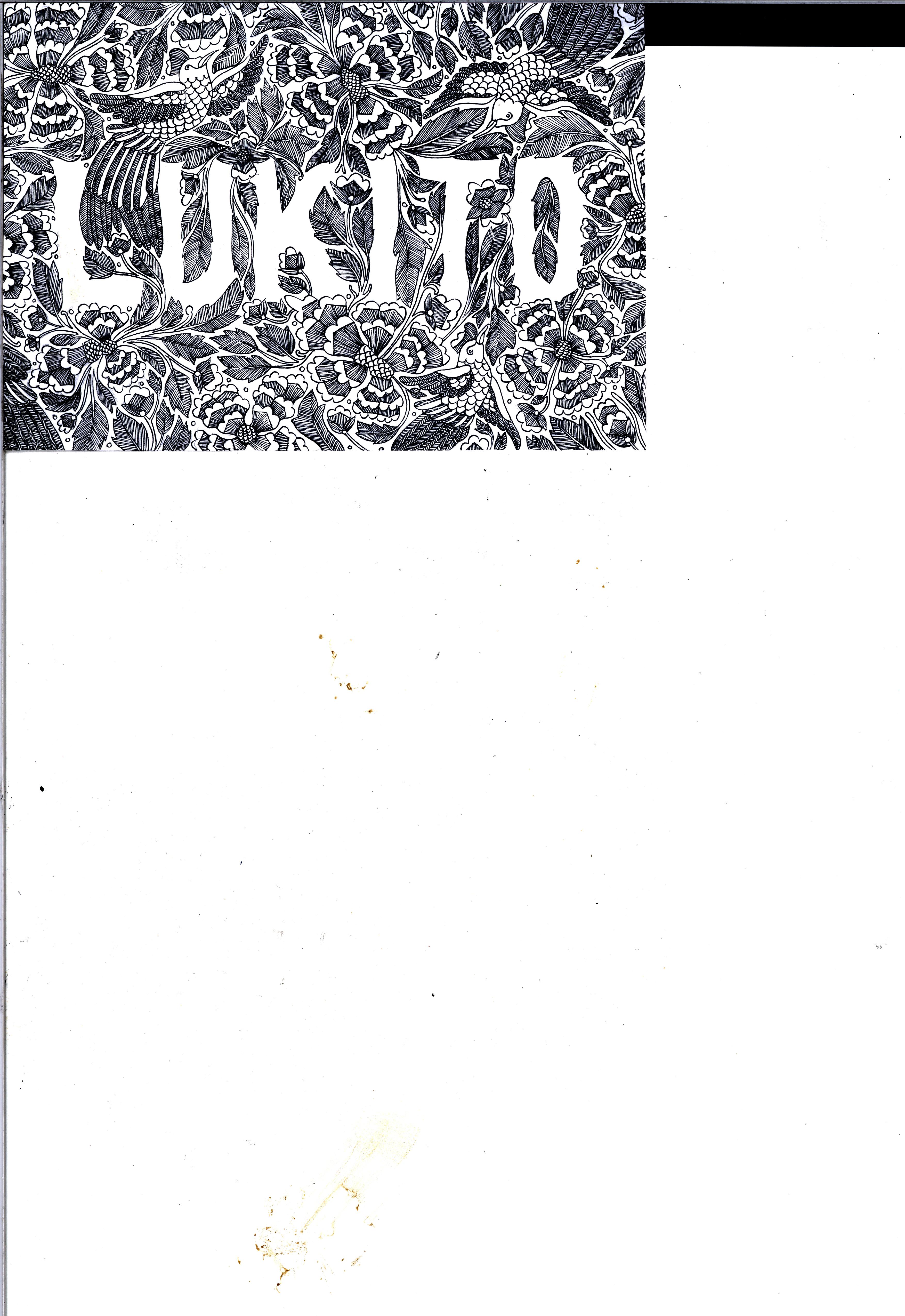
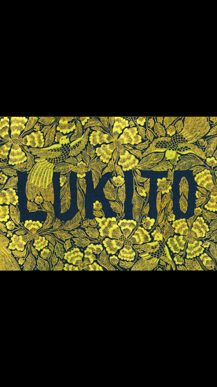
As I have previously mention on my other posts I used a couple elements to unify my zine which are

  1. Hierarchy

I always have a vocal point in each spread. The cat, the dog’s head, the whipping hand and the moon and cows became the main focus in each composition.

  1. Colors

I used monochromatic and complementary colors. The monochromatic is used to identify my Rhyme project, the central image (dog’s head, whipping hand, the moon and cows). Then used blue hues on my background so it would complement my orange title text.

  1. Texture Background

This was a recurring themes in each of my Rhyme project. Besides balancing and giving a rhythm to my spreads, I personally like them, so I decided to keep them

Using Adobe Indesign I added additional titles and texts:

FRONT AND BACK COVER PAGE

cover

I added my name in the cover page, and added contact information at the back cover.


PRINCIPLES OF DESIGN

456

90

I decided to make boxes for each principle of designs.


DEADLINES

76

56

6556

I added a bowl on my “Deadlines” spread because I did not have sufficient text to cover the whole left page.


EMBRACING CREATIVITY

6779

Because the background was quite dark, I decided to change my text color into white so it will be easier to read.


After finishing making my spreads. I rearranging my pages for printing. i rearrange so that I can use saddle back stitch.

cover

2,9

45

6

Then I export it to a pdf file.

Untitled

And then print!


This is the final result!

hjhjhjhjh

ghgh

hjhj

yuyu

I enjoyed my final 2D Foundation project. I will miss this class, because not only I met a lot of friends, but it was one of the few modules that I put a lot effort when doing the projects. See you next time in my next post!

I was very happy with the final results. Even though it took quite a long time making them, I had lots of fun mixing and experimenting with different styles. Let me present you the six “Point of View”!


A RABBIT FROM THE POINT OF VIEW OF ALICE IS CURIOUS

I wanted to emulate Tenniel’s style so I used micron and pen to recreate those thin lines and I kept it black and white.

20160314_235817-1-1


A RABBIT FROM THE POINT OF VIEW OF THE RED QUEEN IS A SERVANT

This one I eventually created a high contrast so that it showcased the Red Queen’s dominating and demanding nature. We see the rabbit is at the corner left of the composition and seems to be small again to emphasize his lower status in front of the queen.

20160314_235810-1-1


A RABBIT FROM THE POINT OF VIEW OF A CARROT IS THE END

I used color in this one. I wanted the style to resemble children’s alphabet book. In my opinion the cute and innocent drawing style contrasts with the dark themed sentence. I eventually added the feet to balance out the composition.

20160314_235827-1-1

A RABBIT FROM THE POINT OF VIEW OF A RECKLESS DRIVER IS ROAD KILL

This was my first try! At first this was meant to be a sketch, but I liked the unclean look that I used it for my final submission. (LOL) I actually repeated the illustration but ended up to clean! So I used the first one. This shows that I am a very clean type of artist. Clean to a fault!

20160314_235717-1

A RABBIT FROM THE POINT OF VIEW OF CHINESE ZODIAC IS THE FOURTH

This one I took queue from Ralph Steadman’s style. I like how the rabbit is looking at his trophy. He seems dissatisfied, but seems reluctant to argue with the results. I mostly used earthy colors such as orange, yellow, brown and dark green. For the rabbit I used hues of grays and blue to differentiate it from the others

20160314_235743-2-1


A RABBIT FROM THE POINT OF VIEW OF THE SUPERSTITIOUS IS LUCKY

I used Shirley suggestion to create the solution for this sentence. I like how the red color really pops among the green table. I liked how the green also framed the rabbit feet, further emphasizing their importance.

20160315_025832-1

I’M INDONESIAN

After having the concept nailed, I immediately start working. At first it was just sketching on paper which I will redo on Photoshop using my tablet. But then I realized it was taking a lot of time for me to sketch. After the third day I was tired of counting the hours I spent with one of the typography. Then my good friend Joyce, who is also in the same class as me, suggested to scan the design and clean it in Photoshop. It was a great advice! This is the scanned design. Imagine how many hours it would take to redraw this again on Photoshop.

3

I up the contrast and eliminated the white background. Then I layered a yellowish gold cloth. I use the clipping mask option so that the line work I did would have the same texture as the cloth. After that I added a navy blue clothe as background. I think it contrasts really well with the yellow-ish gold. In the process of it I edited the colors a lot. Tweaking here and there until I got what I was looking for.

Here is the final look!
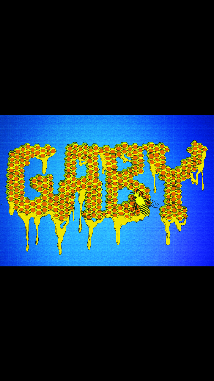
Screenshot_2016-02-18-00-45-49


I’M DILIGENT

With this one I took up que from the Im Indonesian design. I drew the design first in black and white and scanned it into the computer. Afterwards I added the colors and background in Photoshop.

2

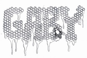
I drew a honeycomb with the honey dripping and added a bee to represent me the diligent hard worker.

In Photoshop I colored in the honeycomb one by one. What a pain it was. There we so many.

Screenshot_2016-02-18-01-14-47

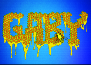
In the end I used a blue background, because it complements the orange and yellow hues that my typography has.
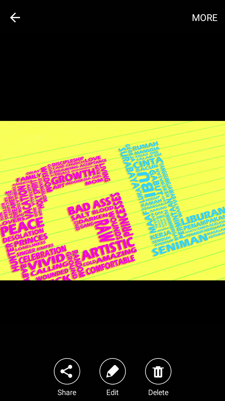

I’M A TRANSLATOR

With this one I used Photoshop completely.

First I though of words to create the letter.

I was listening to some English songs such as Taylor Swifts “Bad Blood” and Justin Biebers “Sorry”. So some of the words ended up being use in the letter. (LOL)

After finishing the G, I moved on to the L which contains the Indonesian words. So I just translated some of the words in G and added some in.

Added a notepad background to finish the look.

Screenshot_2016-02-18-01-14-23

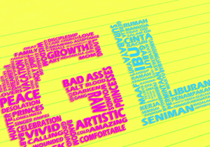
However I wasn’t satisfied. It was too straight. So I tilted the words a bit and crop them. The diagonal angle made the composition more interesting.
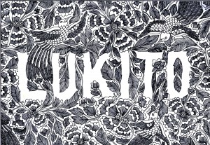
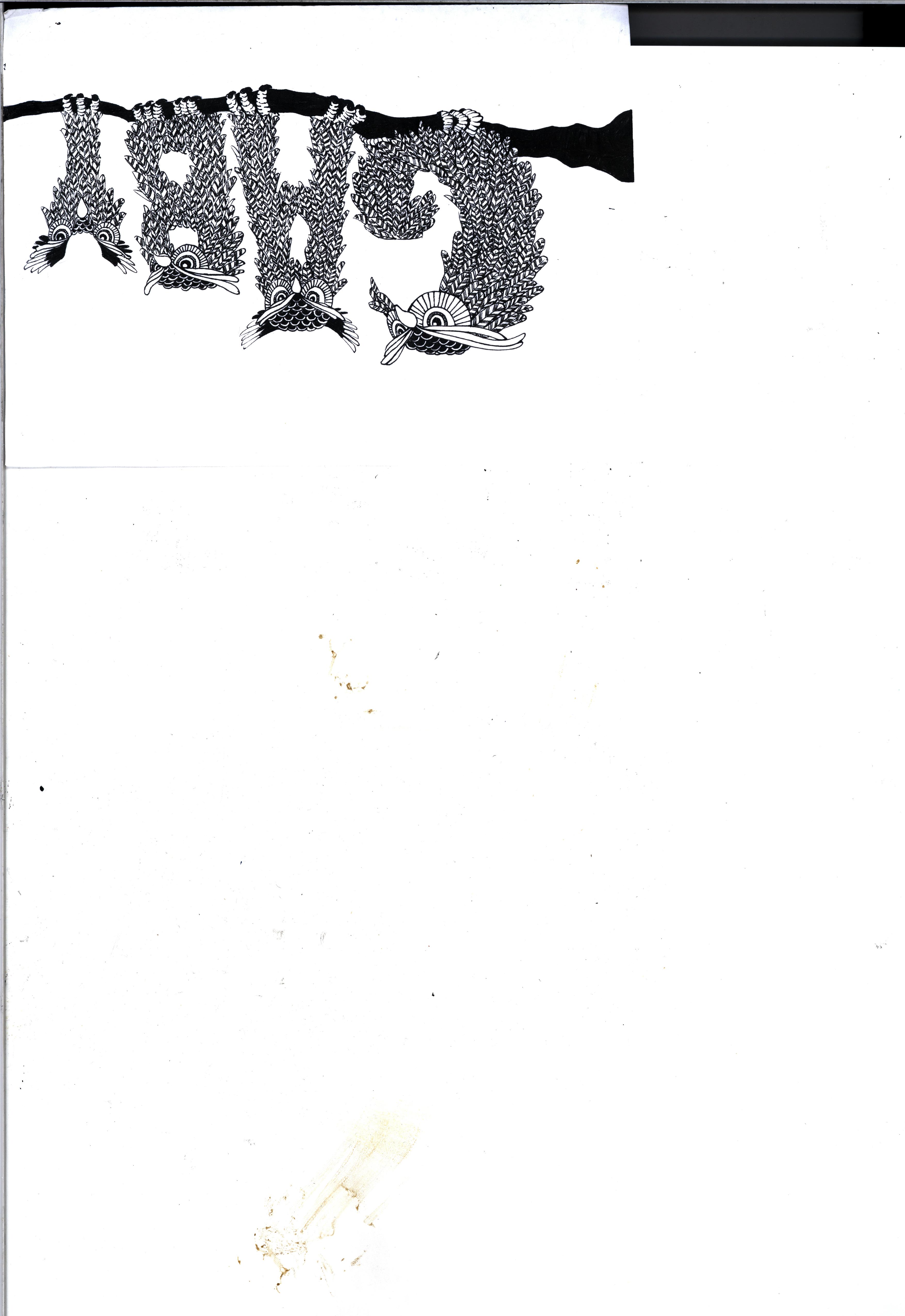

I’M A NIGHT OWL

I drew the owls on paper first, just like the “I’m Indonesian” and “I’m Diligent” typography. I finally decided to warp my owls into letters to spell out my name. Like the others that I had to design first on paper, this one was a labor of love. Those feathers took a long time!

1

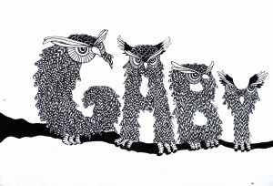
After scanning them, I opened Photoshop. The look that I wanted to achieve was it to look like paper cut outs, in fact this my initial idea after finishing the design. It was just that my design was very intricate, I knew it would take a long time to create and a great amount of patience to accomplish it nicely (which unfortunately I do not have)

Screenshot_2016-02-18-01-14-42

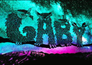
In the end I added a colorful background of blue and pink to represent the breaking of dawn. This is because I’m usually awake till 3 in the morning which in my country we can usually see the sun rising. Its different in Singapore. Its still dark even at 6.


So guys, those are the four characters that represents me. Personally my favorite would be the first one, “I’m Indonesian”. I’m very proud of my country and its culture. Being in another country made me more appreciate my homeland even more.

See you in the next post!