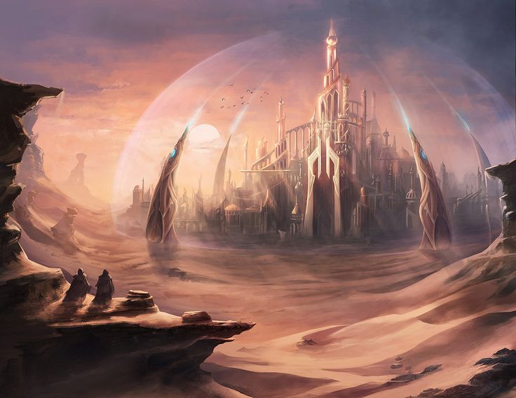
And, Gregg Van Der Beek, the Leader of the Leftist Union rose to power and governed the Utopia, a safe haven where you could find almost any resource for bettering the world and the people were so kind and never had ill-intentions against one another.
After Gregg came into power, there was a cold change. You could feel as if winter was here to stay and evil prevail. Soldiers started sweeping the streets of the hobos and nobody knows what happen to them. Eventually, Utopia became hell. There was a deadly stench that stuck through the whole of Utopia, which came from the carcasses.
Bit by bit, those who were in debt, homeless and basically all of the people who could not survive in Gregg’s reign were deported to the Detention Barracks. But there were too many of them that a divide was established. The stench and the sight of The Poor caused those who were in the “Rich” region to be disgusted and The Poor were looked down upon. Law and order was still managed by Gregg’s army. Every noon, mid-noon, sunset, night and break of dawn, there will be patrols carried out.
There were a few instances where a group of people from The Poor will try to cross to other side but all were shot dead on the spot and of course, their meat was not wasted. The soldiers on duty would bring them back for a feast. But this soon got out of hand because more and more citizens in The Poor divide got angrier and were posing more of a threat to the solders on duty at the divide.
Hence, inevitably, the force field was deployed. However, there were still some who were willing to try their luck. Little did they know that the force field disintegrates anything that passes through unless you have an ID tag like the rich – where it will grant you a safe passage through the force field.
Ever since that fateful day, no one dared to cross the force field. Instead, this gave The Poor motivation to try and take it down and kill Gregg and end all these suffering and barbaric rule. Each day, as more and more people were deported and killed, the campaign to end this all gets stronger.
Reynolds and the leaders and all the rest of The Poor awaits…
Tommy and Jason, you met way back when you both were thrown into the Poor divide. During the journey, you both exchanged your views and goals to take down the Rich.
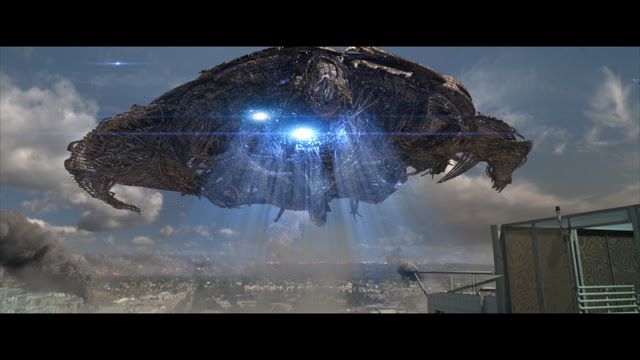
Jason, you are now going to meet Tommy at a secret location and are 15 minutes away from your destination. However, it was the time of the week that the Rich come to collect the 30 humans. You see the ship approaching and everyone around you frantically scrambling around, running for their lives like how chicks would in a chicken farm, being chased by the farmer.
You have two options:
Escape as best as you can and meet Tommy
Stay and help defend against the Rich and take over the ship
Roll 1 dice for strength and 1 for agility, then add the points you get to each attribute. Both should be above 5 which allows for option 2 to be open for consideration.
In any case, both Tommy and and Jason are free to interpret and decide what happens after Jason rolls the dice and determines the outcome option. Use the given information in Lore 1 & 2 to make decisions and judgement based on the goal of meeting with each other and hopefully, devise a plan to hack into the force field.
[OOC] – Do let me know if there are anything you are unclear of. This chapter sets out to test the intelligence of the both of you and your creativity in problem solving.
Every morning, the poor wake up to smells beyond bearable to their nose but what is this to them after smelling it for years?
In the poor divide, what is justice? What is choice? What is fairness? What is humility? What is friendship or family ties?… What is life?
However, in this divide, there exist some who do are strong enough to possess great values. Eventually, these are the people who make it to form an underground cult, to lead the poor into an arms race to bring order to the world.
In this cult are
Techies:
These are the people you wanna work with when it comes to making anything you can ever imagine as a weapon or a tool to help you with a task or mission. Commission them to make what you have in mind for 8 intelligence and 2 days of lead time. Explore your creativity!
Researchers:
These are the people that never leave the bunker. All their lives, they spend it on their research on making an ultimate bio-weapon and potions and one in particular, that grants immunity to anything possible on this planet. It is still in the making and results aren’t very positive at the moment.
The Preachers
These group of people posses somewhat supernatural powers. They are able to glance into the future and past but only for a very limited time period; 1 min in the past and 5 mins into the future. And because of this power that they have, they also are able to motivate the people to keep them going and fighting for their cause; to take down the force field and overthrow the Rich.
The leaders
They are the ones who managed to escape from the rich because of the strong determination and wits they have. They also know a lot about the Rich and thus, are able to make well-informed decisions. Behind the driving force of this campaign is a man by the name, Reynolds. He seldom have long speeches but each time he delivers one, it was motivational and enough to keep the Poor going.
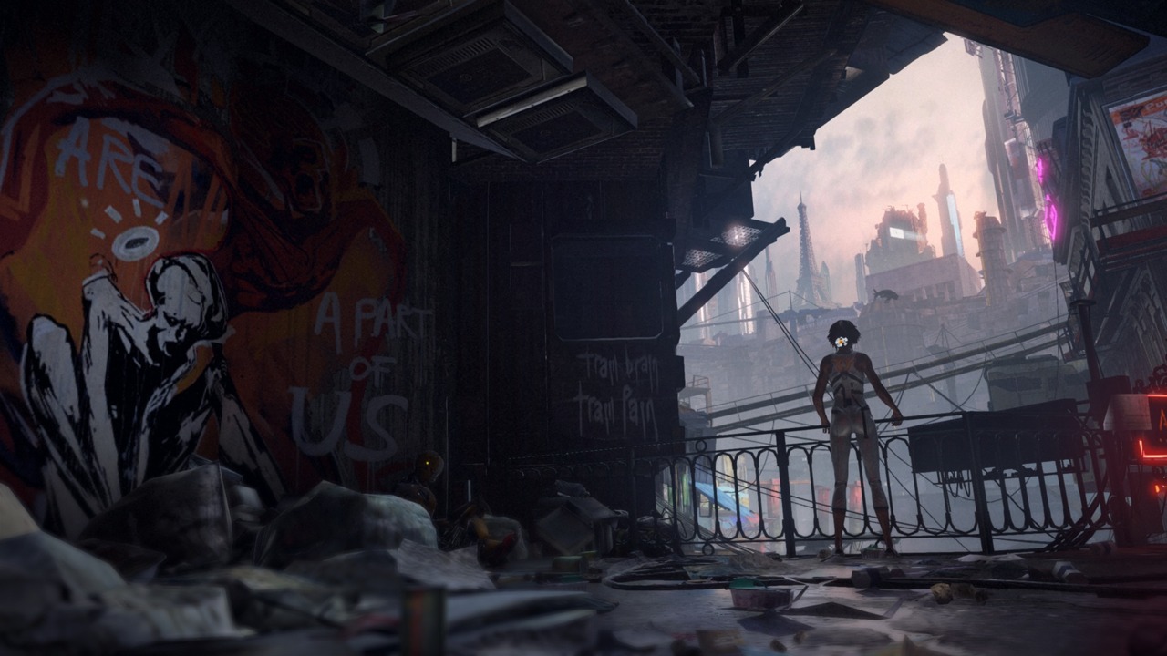
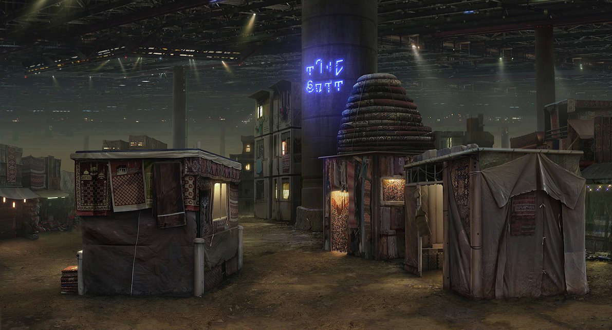
About the Poor Divide:
Transport:
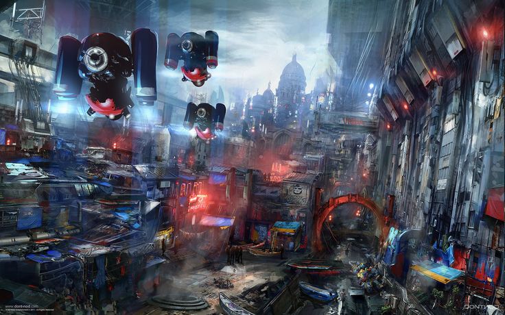
In this humble region, everything is made from high quality eco-friendly recycled materials. The most basic form of transport is a hydraulic legs assisted mechanism that all the Poor wear. This device can then attached to other forms of transport modes such as a super solar powered hover board and a bicycle. The whole unit is auto-regulated in that it uses solar and air resistance to charge and power all devices. The catch is that the moment these devices cross the force field, everything disintegrates, leaving only the footwear so the Rich wouldn’t know of the technology that the Poor divide possess. There are no cars whatsoever, but there are airships armed with weapons so destructive it can wipe out the entire planet. These ships are known to be hidden deep inside the many tunnels in the Poor divide.
Housing:
The Poor live in semi-sunken houses, the top part harnesses the radiation from the force field and is also solar powered. It is also an escape pod that allows up to 5 people to fit inside it. These houses are all well camouflaged as “attap” houses on the outside. Of course, the occupants sleeping and living area is at the bottom half of the house. You must be wondering how is it that the Poor can be so well equipped and high-tech. This is all thanks to The Researchers efforts.
Vegetation:
All food sources are grown in green houses and secured facilities, that are 100% organic. Similarly, these are powered by solar energy and radiation from the force field. The seeds were smuggled from the Rich each time someone from that side gets banished to the Poor divide.
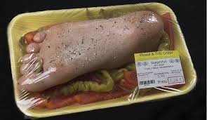
In short, the Poor divide are poor because of the lack of many rights and are subjected to the Riches Authoritarian regime. Every week, the Rich would snatch away 30 people for their cannibalistic desires. In a way, the Rich knows of the smuggling of seeds but close an eye because they want the meat they get to be well nourished before they eat them. How sick! Those in the Poor divide live in fear everyday but it is because of this fear that drive them forward in their cause to take down the force field and wipe out the Rich.
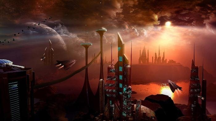
In this world, in the year 2112, where there is a huge disparity between the rich and poor countries, many of those who live in the impoverished countries suffer very horrible fates.
The current situation in this world is that the rich are too affluent and selfish that they get richer and strip off the poor from basic rights everyday and every minute. In short, its a rich man’s world. However, there are still activist within the rich who still have a heart; fighting for the right cause and fighting for the poor to live and with dignity.
The poor on the other hand, are reduced to being objects. In that they are not even treated like humans, they get taken and thrown into labour camps and into meat grinders to feed that small percentage of rich cannibals.
Within the poor are also a group of activist who constantly fight an uphill battle with all the bad that’s going on.
And, all that separate the rich and poor is a force field wall. Only the rich can access it with their thumb print.
Your role is to make the world a better place to live in by braving the toughest of situations and finding solutions to end this cannibalistic disaster, either on the poor side or the rich side.
Over the course of the following chapters, you will solve one problem existing in this world each.
Attributes:
Strength – Strength in this story can be ability to influence in a decision making process and or strength to fight off authorities or the cannibals
Agility – How quick you can dodge and escape any threats Intelligence – Depending on which side you choose; poor: you will possess intelligence far superior than the most intellectual rich person; rich: you will posses knowledge of all the key processes, laws, security codes, launch codes and all other top secret information ( however, you will not posses all these info at once. It will be given to you in due course)
*You are warned that the if your choose the poor side, you will only be able to have +2 str, so do allocate the other 2 attributes accordingly.*
Fulfill your destiny now:
Character type (rich/poor)
Name
Gender
How are you going to help alleviate the lives of the impoverished
Choose three values for your character (e.g. responsibility, disciplined etc)
Allocate your attribute points (only 8 pts in total)
This was a very fun project to work on and definitely an apt one to end our module for this semester, by sharing about our personalities with our classmates. I love how everyone has their own unique way of interpreting the theme and it was heartening to see everyone share about themselves.
This project allowed me to rediscover myself and the goals in my life that I have set out to achieve. And, I am really glad that I was given the opportunity to do so.
The most important thing however, was that I was not the very person that I was when I first started this module with you, Shirley. I had neither the knowledge of the jargons we are to use as designers and concepts of designs and the principles that accompany them nor did I have the skills needed to work on digital art/design work. 3 months in, I am proud of what I have worked on for all of my projects, learning very valuable things along the way that I can apply to my designing work in and outside of school. I definitely found my own style in designing and I explored many possibilities with the given theme for each project. I am very thankful for shirley’s guidance and support! Thank you!
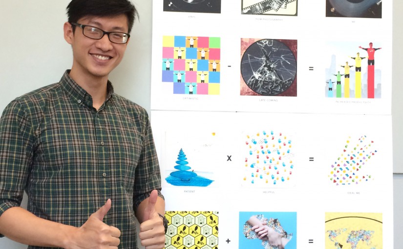
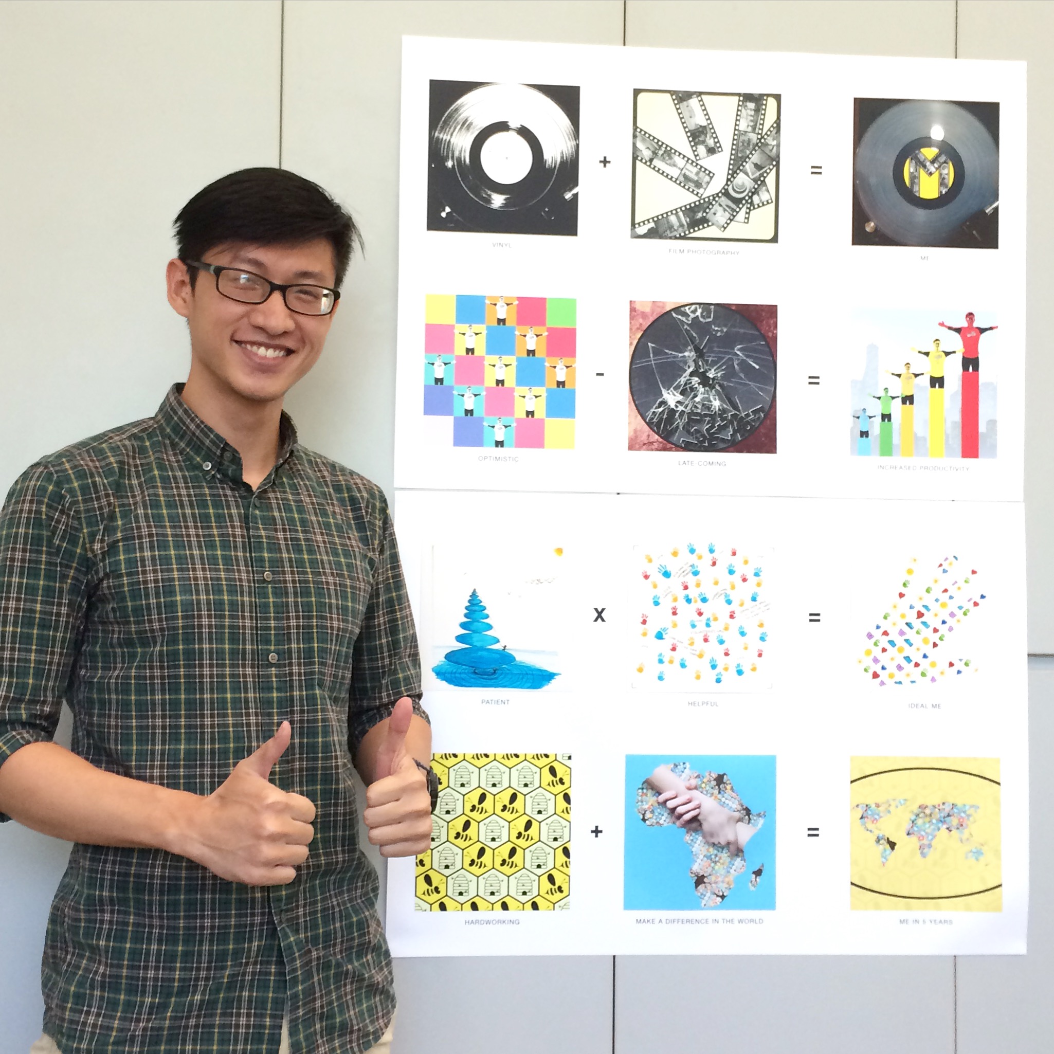
Below are the 12 pieces of my final project and the short write-up for each one.
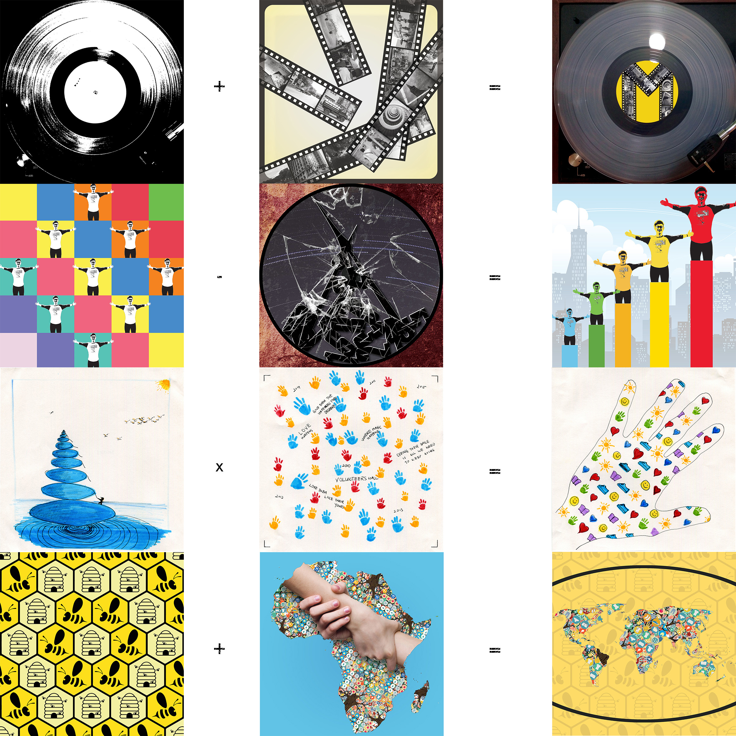
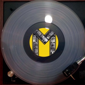
Overall image:
Vinyl
+
Film Photography
=
Me
For this row of equation, I decided to go with a simplistic design that tells the story straight to the point. If anyone were to ask me to describe what I love doing the most, the two things I would say immediately would be to listen to chill vinyl records and to wander around Singapore, making images with meaning. And something that would amalgamate these two things with my personal self would be a simple letter ‘M’, to represent my mother who raised me up very well to be a person of great character and values and also to represent, yours truly.
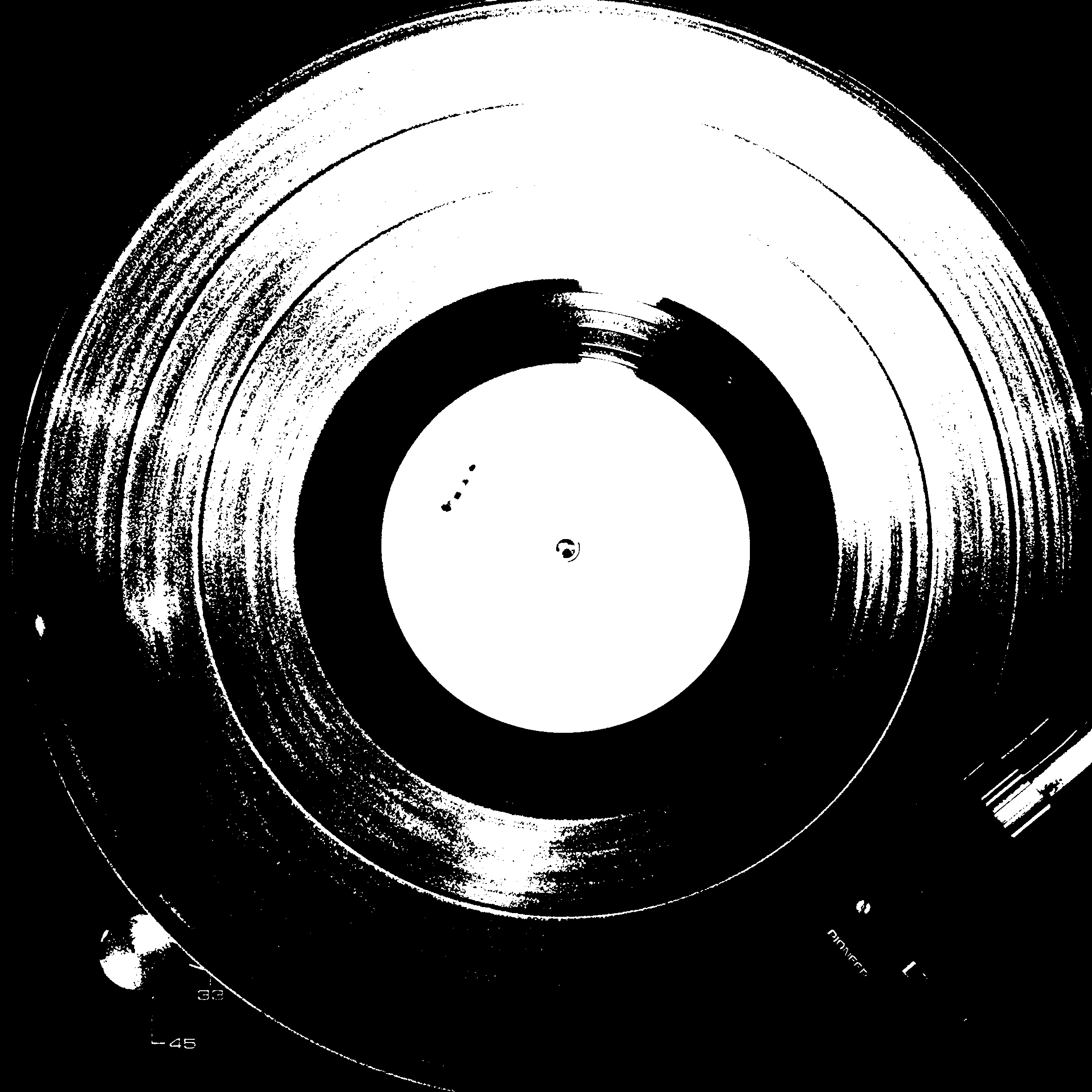
Vinyl:
Listening to vinyl’s are way way more pleasing to the ears as they are more warm and the tonal range is wider. I fell in love with vinyl’s the very moment I listened to it being played. I made an image of a vinyl record playing on my vinyl player and decided to do a threshold and effect and up the contrast of the image to bring out the texture of grooves on the vinyl record.
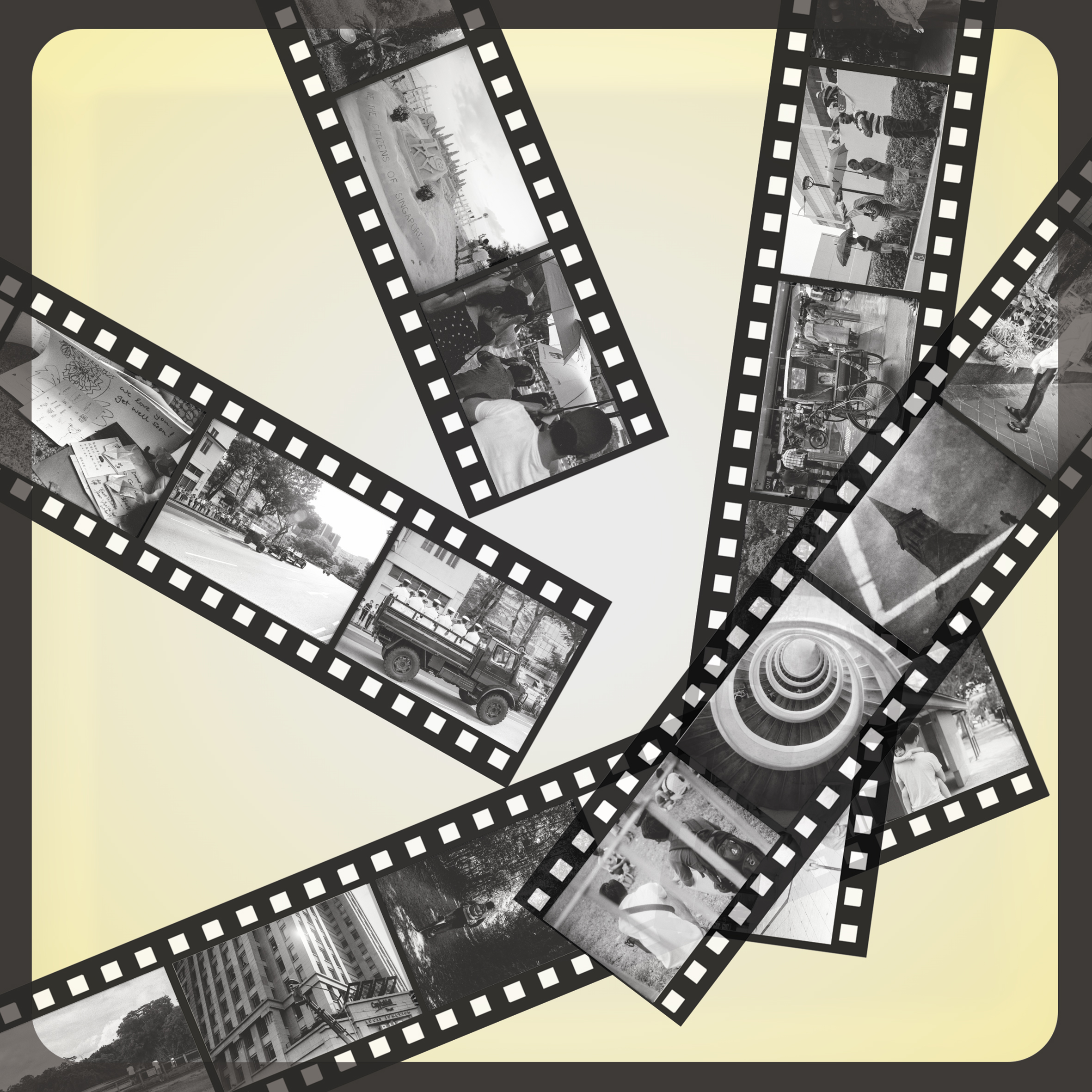
Film Photography:
I started my photography journey with my Nokia phone back in the day, with a standard issue camera. Subsequently, I used my mum’s film camera to make images and that was when I truly appreciated film photography. The entire process of it, from knowing what settings to use when I photograph to the development of the film. I am the traditional man who appreciates the old ways, and Film Photography was one form of medium that eventually became a part of my life. So, I chose to portray Film Photography in the old way of how one would view their negatives/positives. I designed a light box and contact sheets with images I made with the passing of the late Mr Lee Kuan Yew as my tribute to him, aligned at bottom right third of the composition. I am working on my first photo book, with images made using black and white film. I hope I am able to finish it by the end of this year:)
Me:
As I have mentioned above, the ‘M’ refers to my mother and myself. I found that the letter ‘M” was apt to represent us. I chose to show the vinyl in colour to let the view know how a record vinyl would look like in real life and the kind of color it can come in. The yellow I used to fill the centre of the vinyl is represent the happy and joyous time I had growing up, doing the things I like to do!
Optimistic
–
Late-coming
=
Increased Productivity
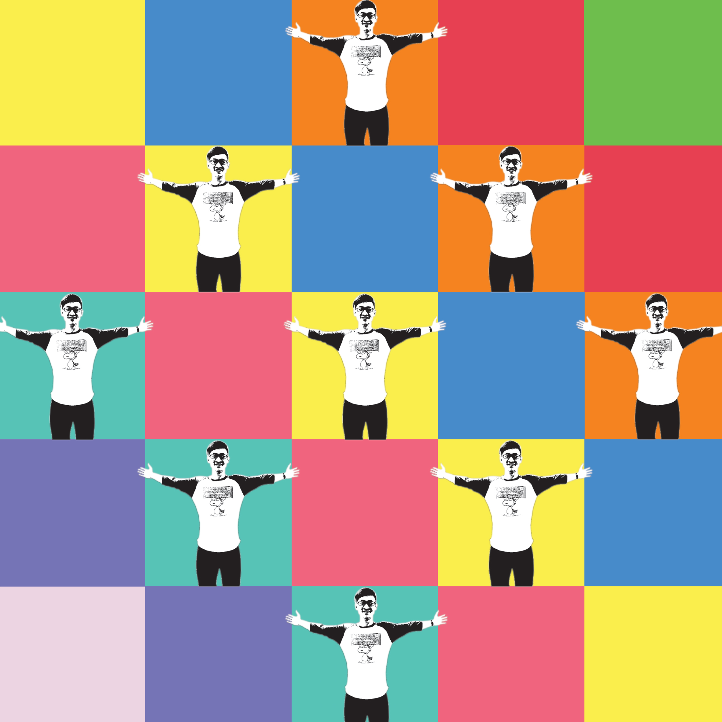
This was a series I enjoyed a lot and one of the series that I used many colours to tell my story. It took me a good amount of time to conceptualise and then designing the above three designs.
Optimistic:
I am someone whom you’ll always see smiling to anyone and everyone. I am one who want others to feel acknowledge and happy. I am optimistic. i attribute this to what I have learnt as a leader during my secondary school days, where I had to make a lot of improvised decisions and be optimistic about them. So now, whenever I am tasked to do something or I set out to achieve or do something, I will approach it in an optimistic way, always, thinking positive of the outcome. And, every time, they do. 🙂 Hence, for this design, I went with very optimistic colors, which are bright as well as the complementary colours that follow. I also added in a pose of myself in an extremely happy state and arranged it in a well balanced way in the square frame. These allows the viewer to tell that I am a very optimistic person, the moment they see this design.
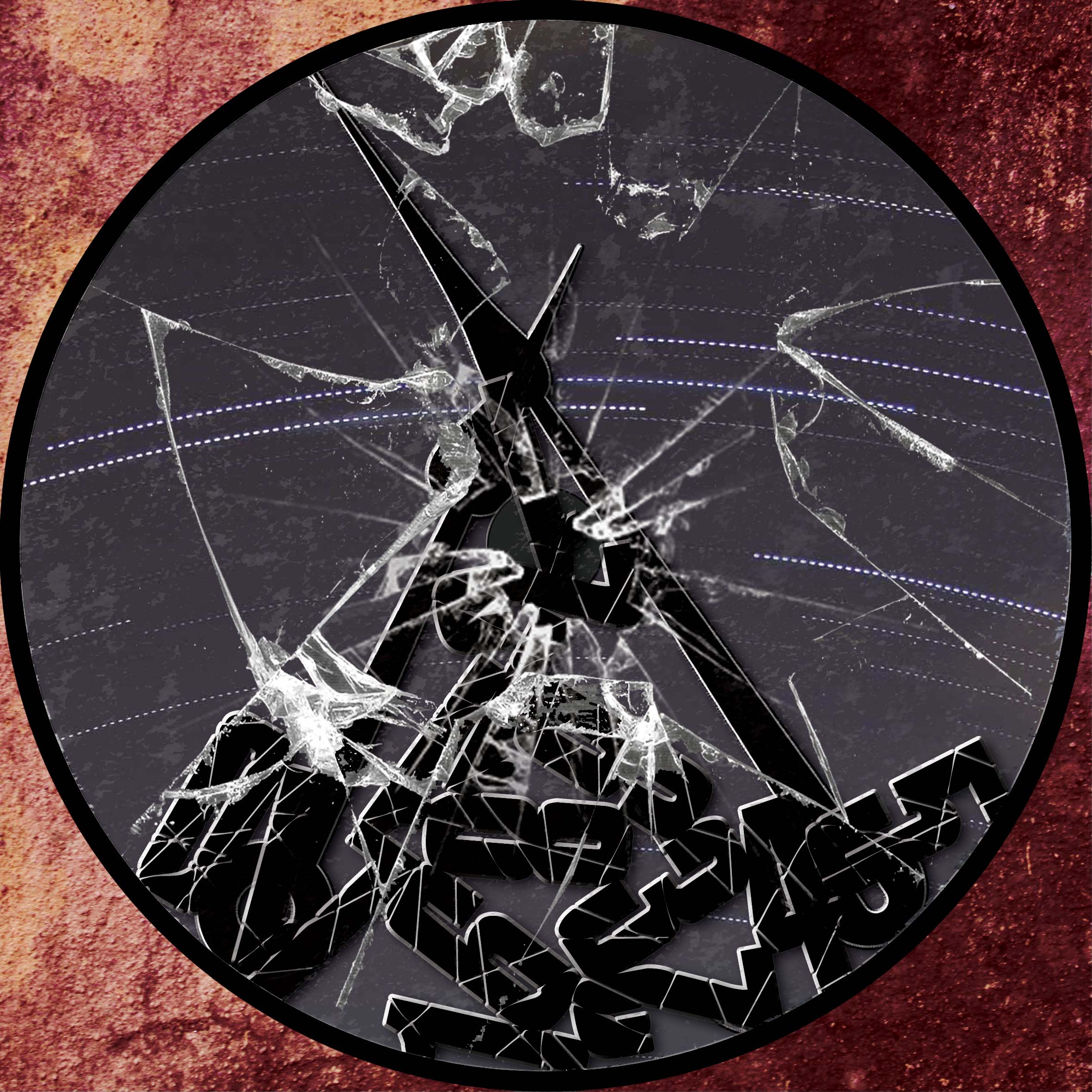
Late-coming:
Though I am very optimistic and I have pretty decent character and values, there’s alway one flaw that I’d always want to get rid off. That is, late-coming. I have a bad habit for being late, most of the time. I just can’t seem to correct it. But, I hope that I will be able to change my ways as soon as possible. For this design, I went with a very subtle and negative/uneasy mood. I made a broken clock with the numbers all fallen and the glass at the front of the clock shattered, including the two hands of the clock. This shows that I have a really bad sense of time to the point that I am always not on time because my internal clock is broken. The background inside the clock shows star trails captured me and this was intended to show how time was for me, passing by so quick for me but actually slow to others. The outer background with the textured red was used to set the overall negative mood and also signify the internal clock within myself, with the dull maroon/red depicting the inside of my body. I really enjoyed designing this and I hope that you will too have a great time looking at this!
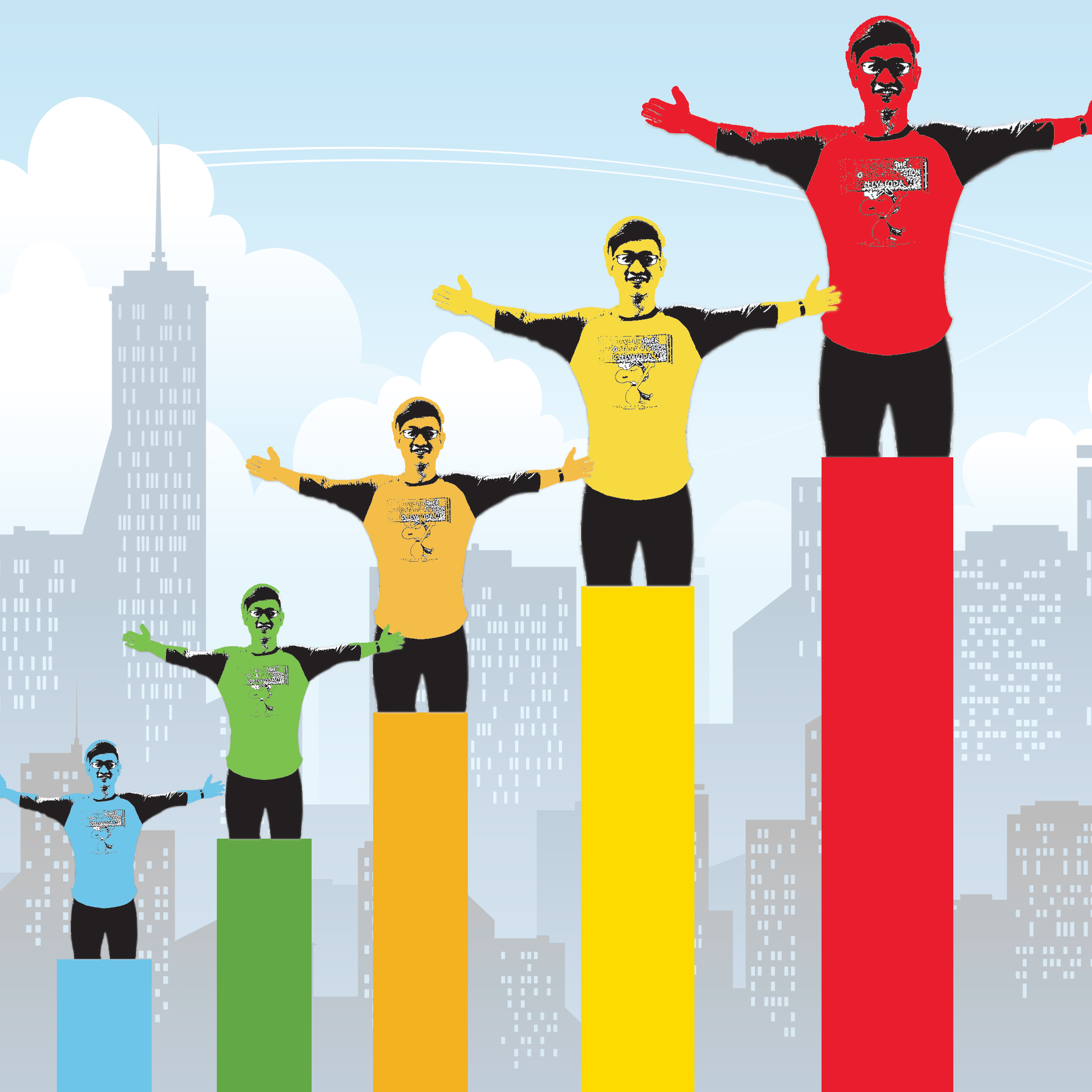
Increased Productivity:
So, what does optimism and the removal of late-coming equal to? I would like to think of it as increased productivity. Because once the late-coming issue was settled, I am able to manage my time well, be able to complete more tasks, quicker and more efficiently, and thus, leading to increased productivity. And, I thought what better way to make an increasing graph to show this! I used the rainbow colors to lead the eyes of viewers from the left side of the image to the right side, from blue to red. I used the pose of myself in the first image and amalgamated it into the last square composition for this equation and placed them a top the bars, in increasing length and size to show a more efficient me over time! I hope you enjoyed my works so far!
Patient
+
Helpful
=
An Ideal Me
For this equation, I decided to explore the inner child within me. I went ahead with handwork instead of digitally designing my equation. I thought, why now just try designing something in a child-like way because I have never done it before and also because this is my final project for 2D, so why not? Shouldn’t I be exploring different ways of designing and conceptualising?
Patient:
Besides being an optimistic person, I am also very patient with the things I do and with everyone one around me. I believe that this is a very important trait to have because, when we handle issues that needs a long time to solve, remaining patient and calm at that point of time does help in getting us thinking straight and in the correct way. So, I approached this by making use of zen stones. Zen stones are used for cultivating patience and calmness in us. I used the colour blue because it allows us to feel calm when we view it. If you noticed the little silhouette on the first stone as well as ropes hanging out from the other stones above, it’s meant to signify patience because the person needs to climb up to the top of the stone but each rope is not enough for him to reach it. Hence he needs to be patient and think of a solution and keep his cool during the instances of setback.
Helpful:
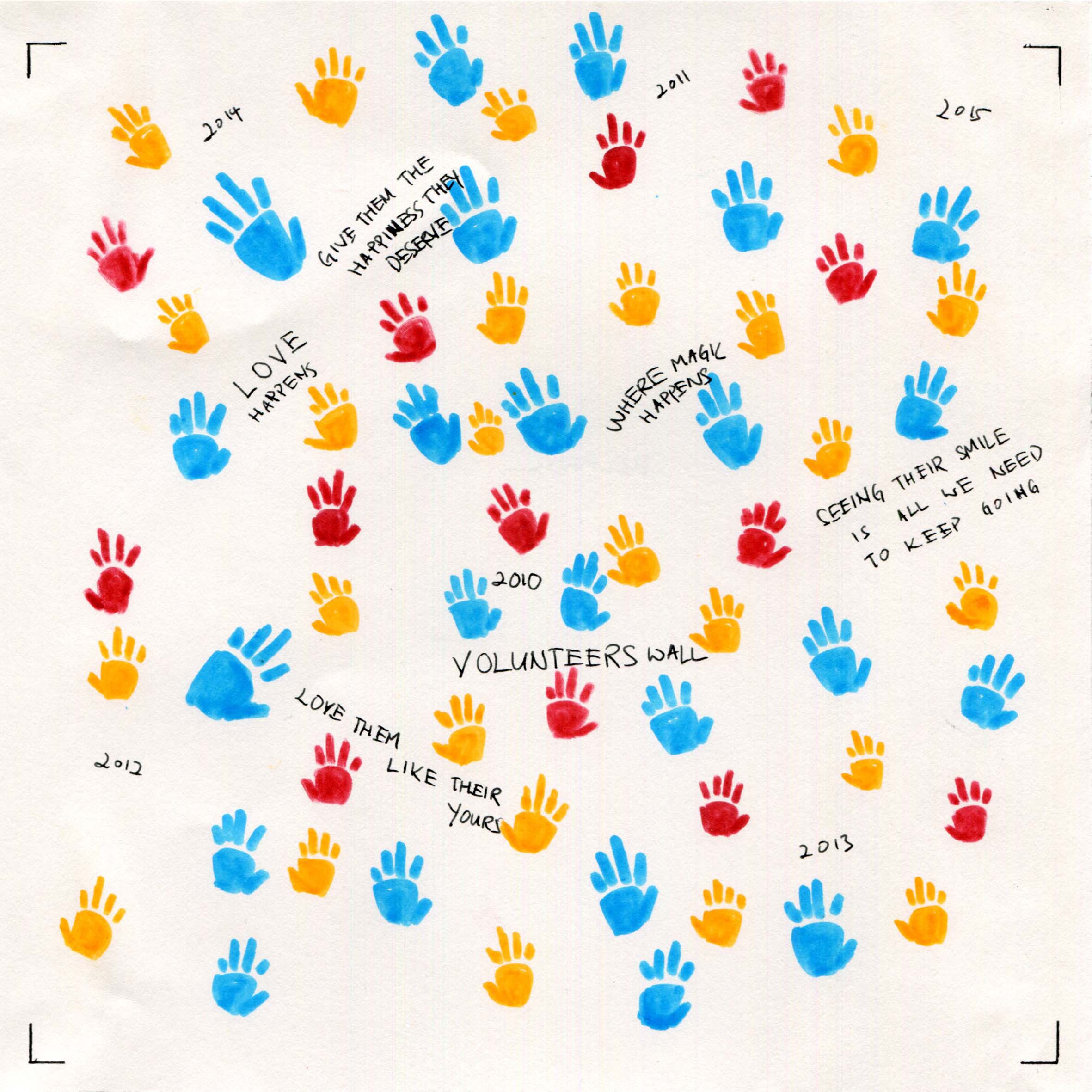
I used the idea of the people whom I want to help most (less fortunate children) and also the mural wall that people who usually does community work would do. So, on the “wall”, are hand prints of the children and also the years at which I started doing community work and the years after that follow. I have also included the words of encouragement that people will usually write on the wall. I used hand prints to show how much that I have helped the community and the bright colors I used represent how happy and contented I was with every community service I completed.
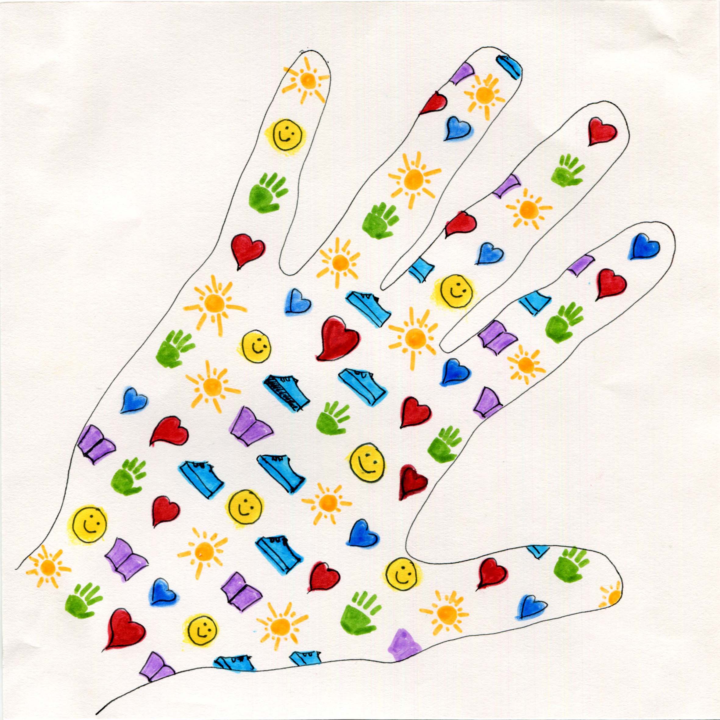
An Ideal Me:
With the patience I had along with my helpful self, I intend to help as many people in as many societies as possible. Hence, I traced the shape of my hand, and filled it in a balanced and organised manner, with simple icons that represent what I want to bring about in the lives of those I touch with my hands:
Heart shape: To feel loved
Book: Education
Sun: To feel warmth
Shoe: To have proper footwear and clothes
Smiley: To always smile
I used bright and vibrant colours (primary and secondary colors) to show the positivity I have in achieving my ideal self;)
Hardworking
+
Make a Difference in the worldMe in 5 Years
=
Hardworking:
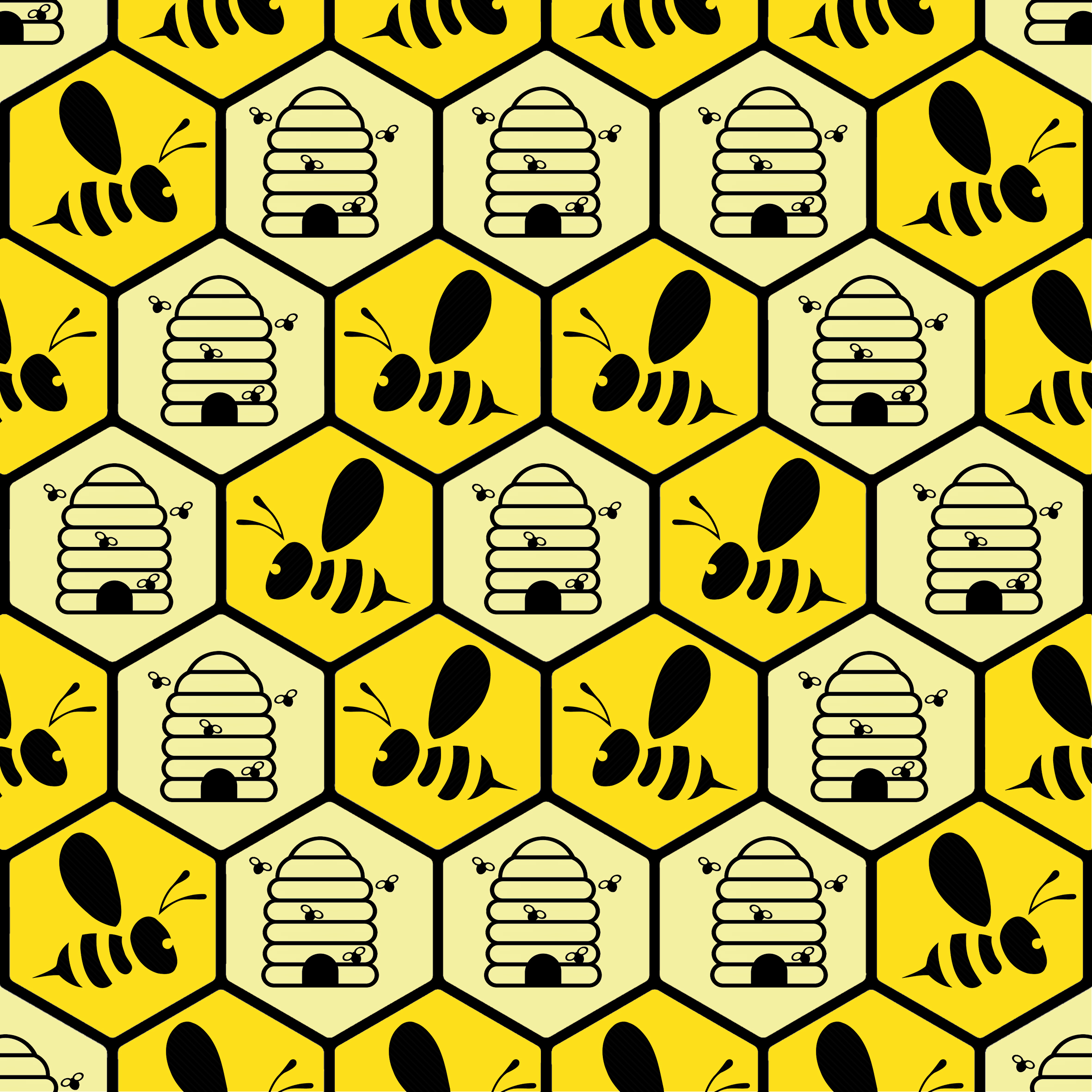
I am someone who works really hard for things that I love and enjoy doing; things that have a greater meaning in life and have a sense of purpose. To show this, I picked a honey bee to represent “hardworking”. They are resilient and hardworking and true to their conviction. I placed them in hexagons that resemble that of the honeycomb structure. The honey bees conviction to collect nectar and then making honey gave them a sense of purpose and so I used bee hives to show that I had a purpose for being hardworking in the things that I do. I used two shades of yellow to differentiate the bee from the hive and to add variety to the overall design. The use of yellow was to let viewers know that I approach every task optimistically;)
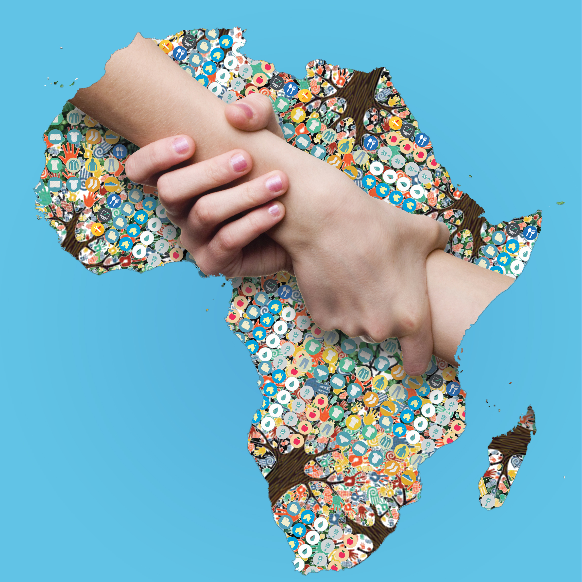
Making a Difference:
With the abovementioned traits; optimistic, helpful, hardworking, patient, I believe I am able to make a difference in the lives of others. With the knowledge and the help I can garner from those around me, I want to back to society and be able to alleviate poverty in Africa first. Hence, I started this design by using a map of Africa. And filling it with many icons that represent what I intend to do in Africa and how I want to help alleviate poverty of the less fortunate. The icons include sanitation, food, education, clothing, and many more along with the tools that I am going to use to effect a positive change. The tree trunks and branches represent the help that I get with my endeavour. And most importantly, the intertwined hands represent me helping the people there. I chose a myriad of positive colors to emulate the positivity that I have with what i envision but keeping in mind to have a balance with the entire image.
Examples of the icons:
Me in 5 years:
In 5 years, I hope that I am able to help as many people around the world as possible. Of course, this would be done with the all the traits and experience that I possess. I really hope that when I have passed on in this world, I am able to say that I have done my part as a human being. For this design, I went ahead with the amalgamation of the Hardworking and Making a Difference designs into the world map. Though it is a simple design and a humble goal, I think this design encapsulates all that I want to do into this square. I will work very hard and through the process, I hope that I am also able to effect change with as many people as possible. I muted the bees and honeycomb design to be the background and see of the world to show the amount of hard work I am willing to put in and filled the land of the world with all that I want to achieve. The final design was satisfying.
On a high note
In all, I am extremely happy with all my designs because I was not only able to communicate what I intended to share but also surpassed my expectations of how much I can actually design using photoshop. I have truly learnt a lot during my first semester. Thank you, Shirley, for a wonderful semester 1! Cheers and see you next sem! 🙂
Thank you for knowing more about me! Thank you and have a great day ahead!
What are colours? Google says: “the property possessed by an object of producing different sensations on the eye as a result of the way it reflects or emits light.”
What I say: Colours are different different shades of pigments that evoke emotions in viewers, creating a mood.
There are 3 Basic colours:
RedBlueGreen
Through the 3 colours ( additive primaries), our eyes and brain will interpret them and result in the 7 main colours:
Seeing things in colours can affect our mood and emotions at any given point of time. This is why it is important to know colour theory as designers so that we can come up with designs that fit the theme of the design that our clients are looking for and evoke the correct intended emotions from the viewers.
Warm colors include red, orange, and yellow, and variations of those three colors. These are the colors of fire, of fall leaves, and of sunsets and sunrises, and are generally energizing, passionate, and positive.
Red:associated with anger, but is also associated with importance (think of the red carpet at awards shows and celebrity events). Red also indicates danger (the reason stop lights and signs are red, and that most warning labels are red).
Orange: means warmth, inviting, friendly and passionate but also deceit and distrust.
Yellow: bright yellow can lend a sense of happiness and cheerfulness
Light yellows also give a more calm feeling of happiness than bright yellows Dull (dingy) yellow represents caution, decay, sickness, and jealousy.
The bright yellow sunflower reminds visitors of summer on this site, and combined with the antique-yellow background, it gives a homey and established feeling.
Cool colors include green, blue, and purple, are often more subdued than warm colors. They are the colors of night, of water, of nature, and are usually calming, relaxing, and somewhat reserved.
Blue is the only primary color within the cool spectrum, which means the other colors are created by combining blue with a warm color (yellow for green and red for purple).
Green: Dark green is associated with ambition, greed, and jealousy. Yellow-green can indicate sickness, cowardice, discord, and jealousy. Aqua is associated with emotional healing and protection. Olive green is the traditional color of peace.
Blue: Light blue is associated with health, healing, tranquility, responsibility.understanding, and softness. Dark blue represents knowledge, power, integrity, and seriousness.
Purple: Light purple evokes romantic and nostalgic feelings. Dark purple evokes gloom and sad feelings. It can cause frustration
Neutral colors often serve as the backdrop in design. They’re commonly combined with brighter accent colors. But they can also be used on their own in designs, and can create very sophisticated layouts. The meanings and impressions of neutral colors are much more affected by the colors that surround them than are warm and cool colors.
Black: associated with power, elegance, formality, death, evil, and mystery.y.
White: associated with purity, cleanliness, and virtue
Grey: It can sometimes be considered moody or depressing
Brown: associated with dependability and reliability, with steadfastness, and with earthiness. It can also be considered dull.
This a quick guide to all the things we need to know about colours!
When I learnt about what I had to do for Project 2, I admit, I was a little afraid and apprehensive. Because I had never done anything related to designing digitally. Mastering photoshop was also a steep slope even though I al had prior knowledge of how to use it. I was very thankful that there was a segment during one of our tutorial that we were taught to use the pen tool and using masking as well as filters. One of the most intriguing point that I picked up during the photoshop crash course was the part where we are to convert our files to a smart object to maintain the quality of the image. It was something that I had never done in my past works, which explained why some of my final works are a little pixelated. I’ll definitely apply what I have learnt into my future works.
With regard to the realisation of the prints in relation to the given rhymes that we need to work with, I found it very fun because I love the process of coming out with a design. I was very intrigued with this especially during my National Service in the Public Affairs Department in SPF. I remember telling my friends in the department who were graphic designers, that I want to do design work just like how they did it in office. I guess, for this project, I was able to get a feel for it. Definitely loved it!
When I saw my work being printed out with the design work that I have put in time and effort into, it was exceptionally gratifying. I never really had the chance to experiment with design work in my earlier phases of education and I am thankful for being able to do so in ADM.
My 4 choices:
The little dog laughed to see such sportThe cow jumped over the moonShe had so many children she didn’t know what to doCouldn’t put humpty back together again
Here are the documentation of my designing process.
“The cow jumped over the moon”
I experimented with the use of patterns to show movement –> cow jumping over the moon. The spiral pattern shows the movement of the cows and the direction it’s moving at. There is an overall sense of dynamism in this image and I really love how it turned out. The overall image resembles a sun with the moon as the core and the cows are the sun rays. It is a well-balanced image.
“All the King’s horses and all the King’s men”
For this rhyme, I experimented with the element of balance and scale along with patterns. I used scale to bring up the significance of “all the king’s men” and repetition with “all the king’s horses” forming the border of this image. I tried to insert a background but it covered the legs of the men, which results in no separation with the background. So I removed some part of the background.
“The dog laughed to see such sport”
I went with a simple design to emphasise the laughter of the dog, very much similar to how we laugh. We don’t simply “haha”, instead we laugh like this, “hahahahahaha”; so the repetition of the laughing dog definitely worked. I chose a simple crystallized background to add a sense of depth as well as a separation from the dog. It also fits my emotion about this rhyme where it’s a little trippy and surreal
“There was an old woman who lived in a shoe”
For this image, I wanted to experiment with a more positive pictorial description of the rhyme along with implied meaning, “There was an old woman who lived in a shoe”. And , I think I did that. I designed it in a way that it shows the old woman doing some chores outside the house, to show she resides in the house (which is a shoe).
“Couldn’t put humpty together again”
This was a simple design that described the rhyme the way I interpreted it. Simplicity is best and I think this example definitely exemplifies it. I used a background with cracked glass and a cracked Humpty to show that he could not be pieced back together again. This was a result of Humpty having a great fall (implied meaning). I love this simple and fun design.
“She had so many children, she didn’t know what to do”
I experimented with the use of leading lines as well as the outward “sun rays” to express shock and despair of the old woman because she didn’t know what to do with so many children. I supplemented the expression with the context of the old woman having so many children through the use of repeated pattern (growing in scale) of many children; who are arranged in line with the sunray lines. A simple use of an old woman expressing shock pieced together the entire interpretation of this rhyme.
Overall, I had a great time and fun working on this project. I look forward to the next project where I get to add colours into my work! 🙂
To understand what the Principles of Design, we must must acknowledge the Elements of Design – Things that make up a Design.
Elements of design:
LINE – The linear marks made with a pen or brush or the edge created when two shapes meet.
SHAPE – A shape is a self contained defined area of geometric (squares and circles), or organic (free formed shapes or natural shapes). A positive shape automatically creates a negative shape.
DIRECTION – All lines have direction – Horizontal, Vertical or Oblique. Horizontal suggests calmness, stability and tranquillity. Vertical gives a feeling of balance, formality and alertness. Oblique suggests movement and action
SIZE – Size is simply the relationship of the area occupied by one shape to that of another.
TEXTURE – Texture is the surface quality of a shape – rough, smooth, soft hard glossy etc.
COLOUR – Colour is light reflected off objects. Color has three main characteristics: hue or its name (red, green, blue, etc.), value (how light or dark it is), and intensity (how bright or dull it is).
Principles of Design – is what we do with the above mentioned elements of design
Balance is the distribution of the visual weight of objects, colors, texture, and space. If the design was a scale, these elements should be balanced to make a design feel stable. In symmetrical balance, the elements used on one side of the design are similar to those on the other side; in asymmetrical balance, the sides are different but still look balanced. In radial balance, the elements are arranged around a central point and may be similar.
Rhythm is created when one or more elements of design are used repeatedly to create a feeling of organized movement. Rhythm creates a mood like music or dancing. To keep rhythm exciting and active, variety is essential.
Emphasis is the part of the design that catches the viewer’s attention. Usually the artist will make one area stand out by contrasting it with other areas. The area could be different in size, color, texture, shape, etc.
Proportion is the feeling of unity created when all parts (sizes, amounts, or number) relate well with each other. When drawing the human figure, proportion can refer to the size of the head compared to the rest of the body.
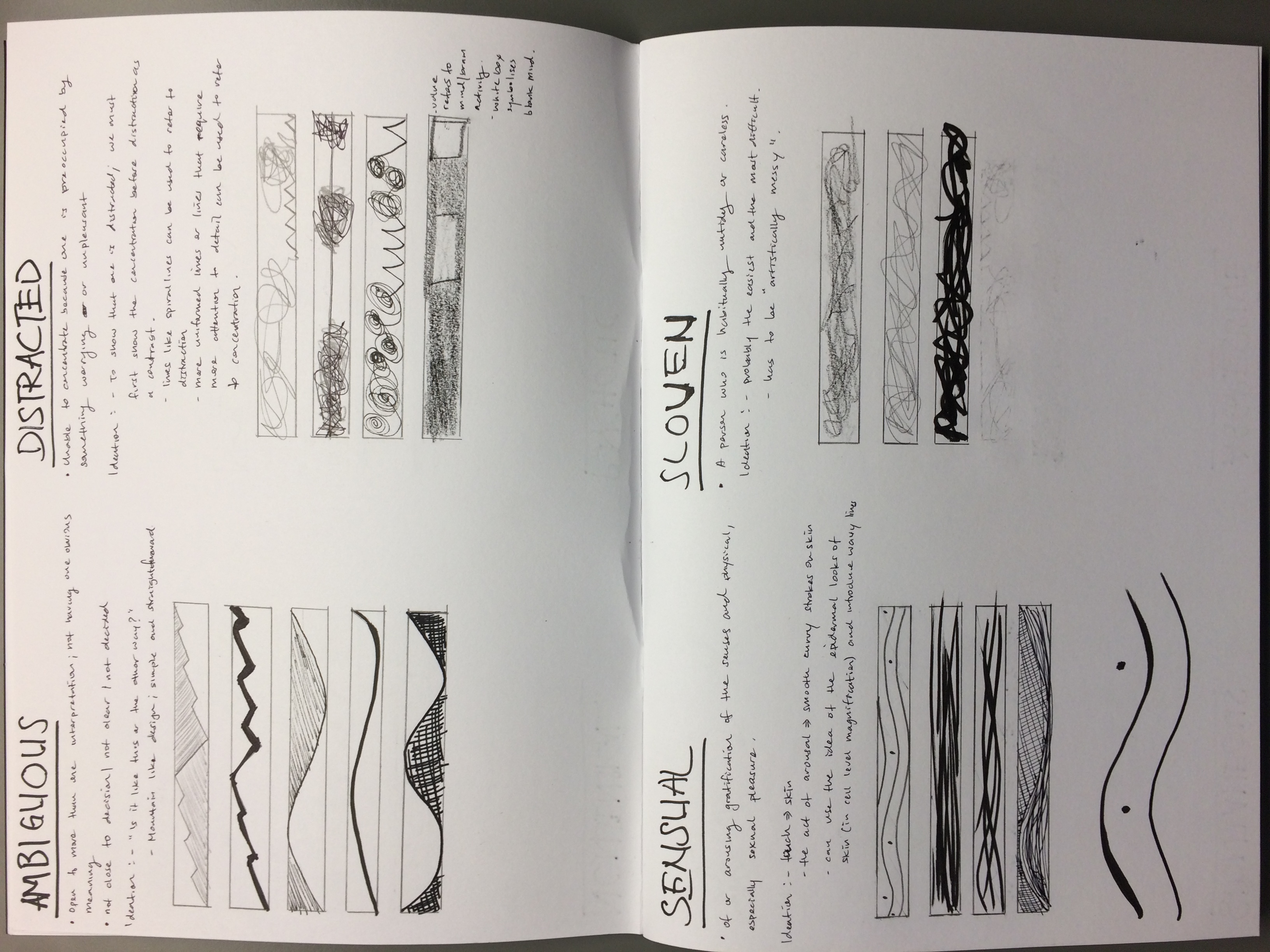
An overview of the 18 emotions portrayed with lines
The general sense of direction for my approach to this work was to keep things as simple and easy to understand as possible for viewers to appreciate my work on the 18 emotions. And I believe I have done that. I think this is my style whenever I’m involved in a creative process. However, I did try various methods just to get an idea of how the outcome may be. I used marker, drawing pens, pencil, Charcoal, charcoal pencil and brush pen. One key take away for me is that, now, I have a clearer idea on how lines can be manipulated to achieve a certain emotion and look and this can not only be applied to my future projects in ADM but also in any of my future works outside of school. It was indeed a very meaningful and fun project!
I hope that you will enjoy my work!
Presentation:
Indecisive – Not providing a clear and definite result
I started off being very literal with the emotion, indecisive. What immediately came to my mind was of a path (person) walking in circles or in a continuous movement, symbolising an unclear and indefinite pathway. Noted that the pathway was somewhat in a controlled manner but I did so because a person who is indecisive usually ponder about the same few cases at any one point and will circle round the same pathway repeatedly. I think I was able to do just that.
Not asked during presentation but would like to talk about my thought process.
One other emotion that I particularly like is the “Ambiguous” emotion. Ambiguous means being open to more than one interpretation. Using simple lines, I wanted to achieve a look where the viewer will question the orientation of the strip. Like, “is this supposed to be view in this way or another way?” I did so by creating a symmetrical mountain shape. Thick lines we’re used to accentuate the slope, but done in symmetrical way. This results in ambiguity of this particular emotion. I used a brush pen to help achieve this a smooth and sharp line.
Very often lines are the main tool used to “describe” an emotion to viewers. Emotions can be represented by lines in different form; thick, thin, curly, strong, weak, etc.
My style is to keep things as simplistic as possible with the use of brush pen, felt marker, drawing pen and my ideas.
The main goal is to get idea of the emotion across to the viewer in the best way possible. And I think I was able to do just that.
View my progress book to get an emotional rollercoaster ride!
*The meaning and thought process are in my journal:)


 (https://www.flickr.com/photos/46909884@N05/4422269729
 (http://www.msbabkiesclass.com/principles-of-design.html
 (https://prezi.com/5prenxucodwr/smithwick-principles-of-design/


 One other emotion that I particularly like is the “Ambiguous” emotion. Ambiguous means being open to more than one interpretation. Using simple lines, I wanted to achieve a look where the viewer will question the orientation of the strip. Like, “is this supposed to be view in this way or another way?” I did so by creating a symmetrical mountain shape. Thick lines we’re used to accentuate the slope, but done in symmetrical way. This results in ambiguity of this particular emotion. I used a brush pen to help achieve this a smooth and sharp line.


