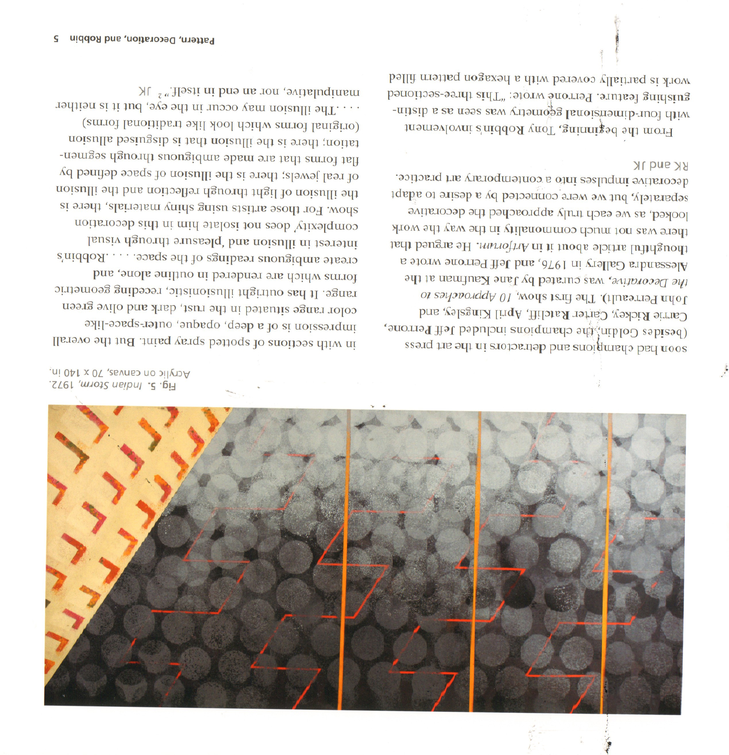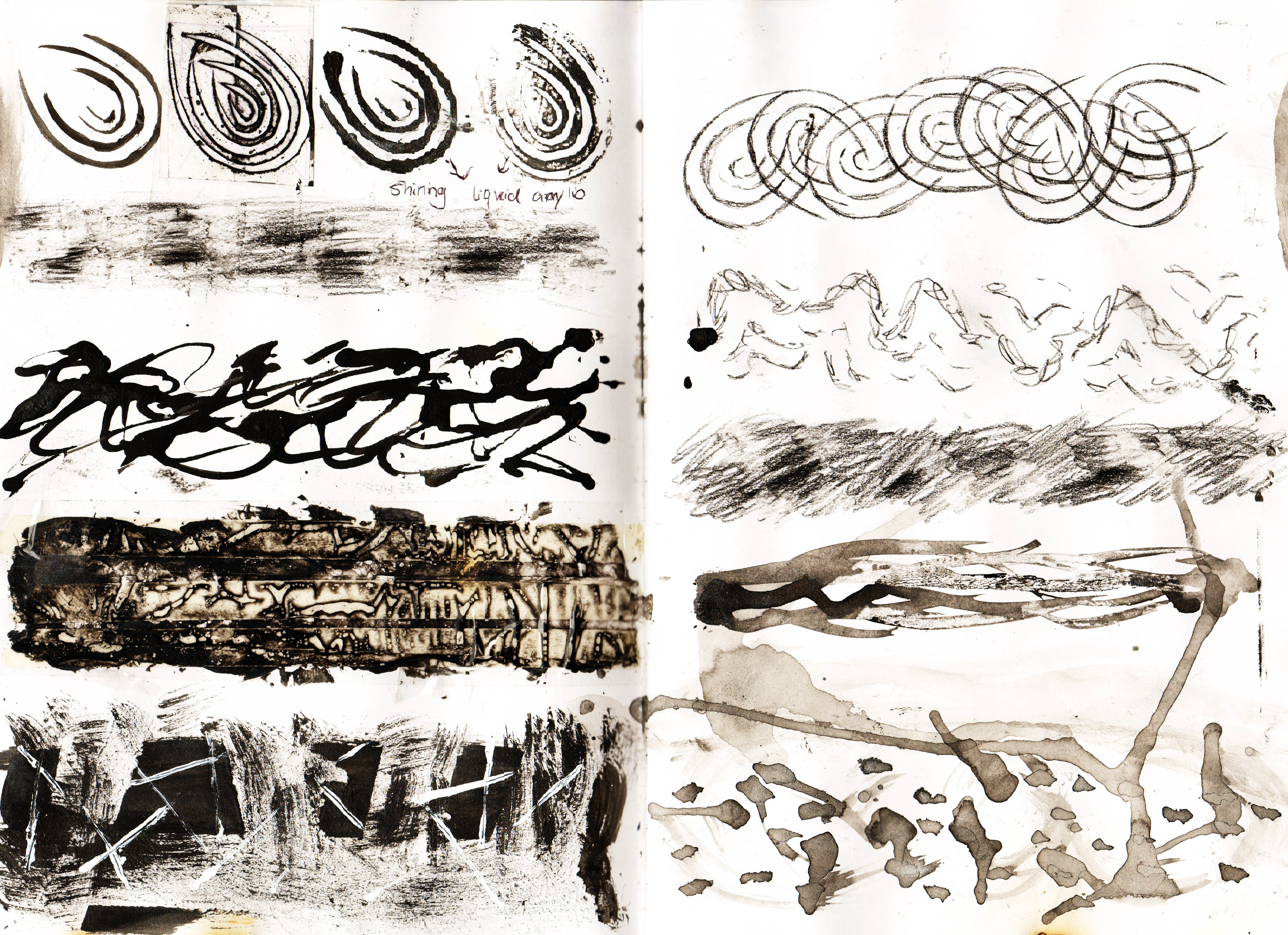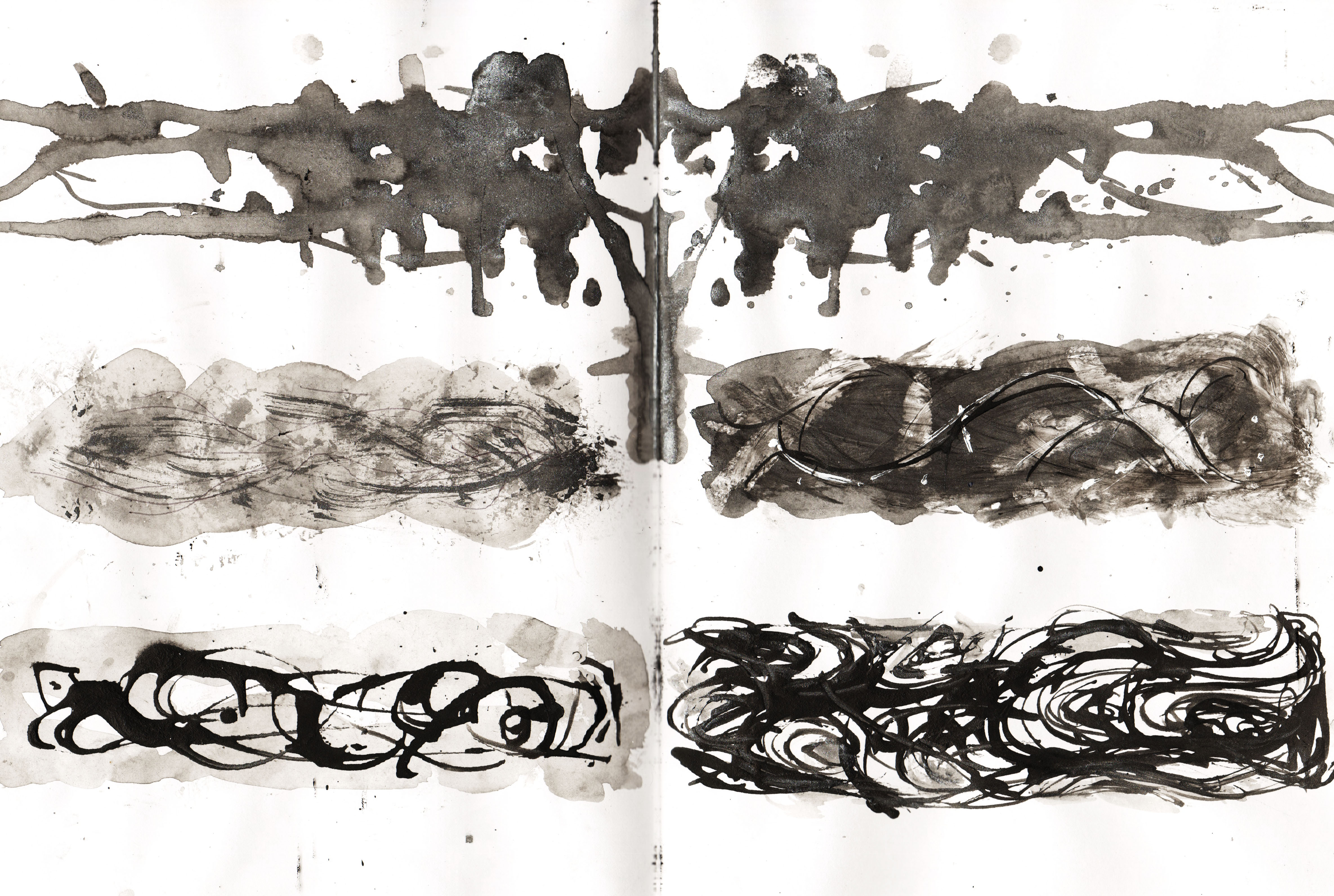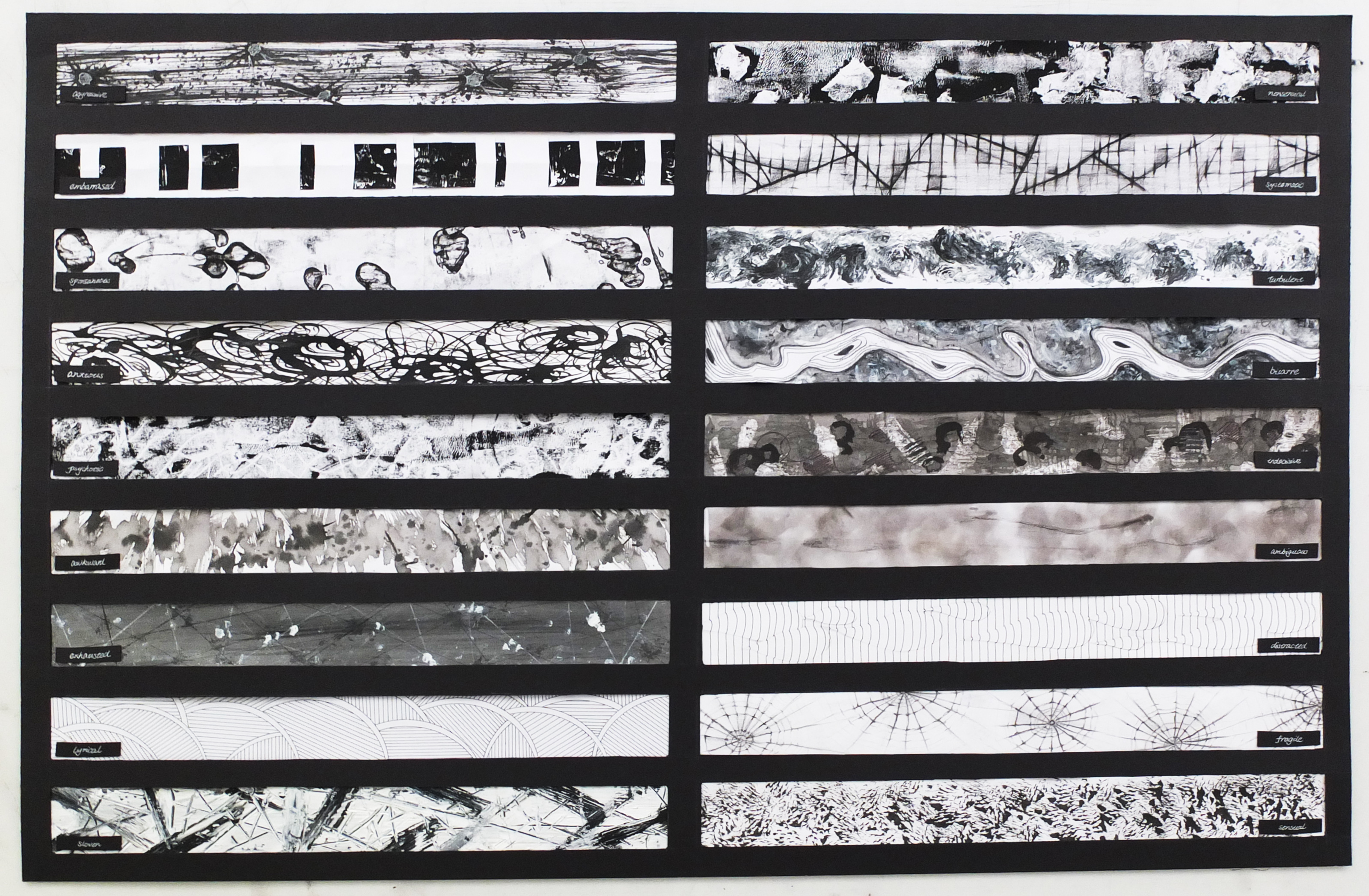
‘A Line Is A Dot That Went For A Walk’
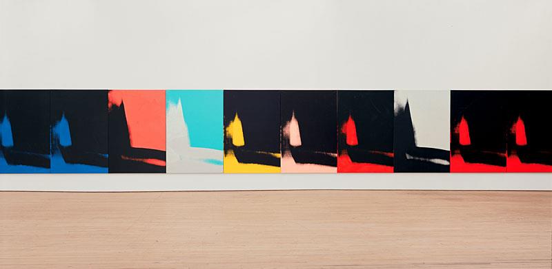
Final Submission for the Line project was in A1 Landscape format. I arranged the lines so that too similar ones won’t fight for attention and there were some orders such as going from darker to lighter colors. Through the process of exploring and making all these lines, I learned a lot more about ways of creating images, which would not been achieved easily by just pen. And I actually enjoyed a lot when I was doing the lines as it doesn’t really require us to be always careful and accurate. On the contrary, sometimes coincidence created beautiful unexpected results.
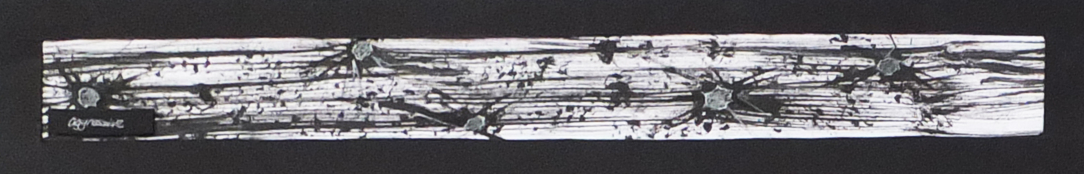
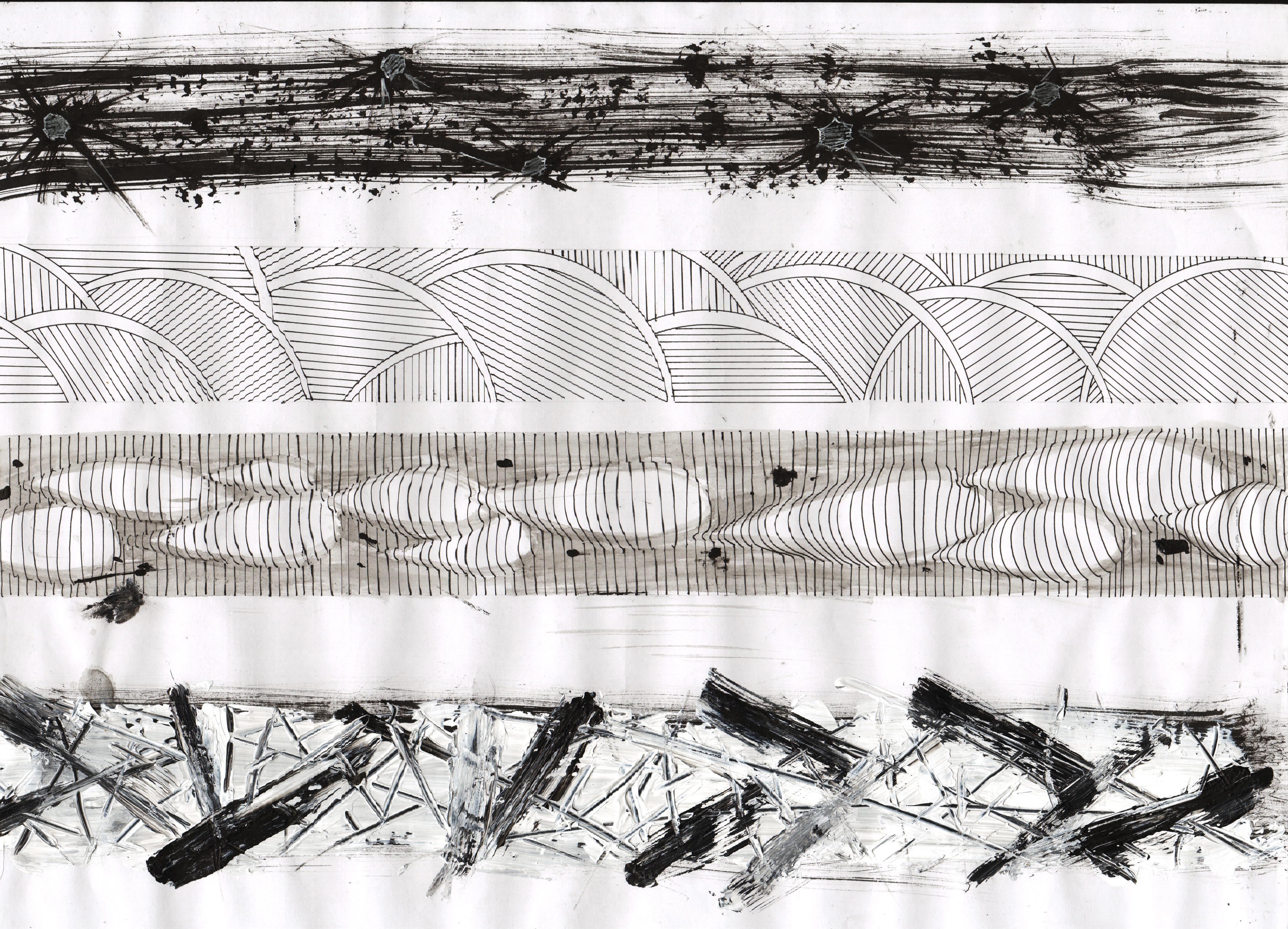
Aggressive
There are many speedy lines flying from the left to the right as well as many shapes that look like bullet holes on the window.
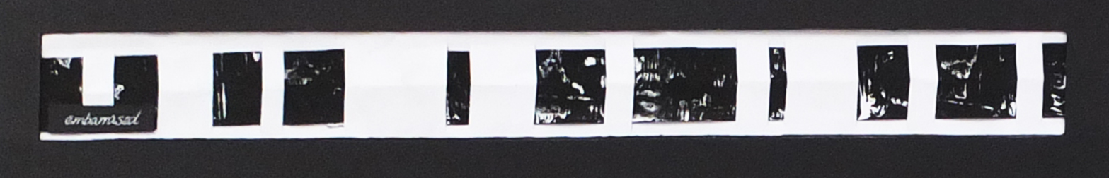
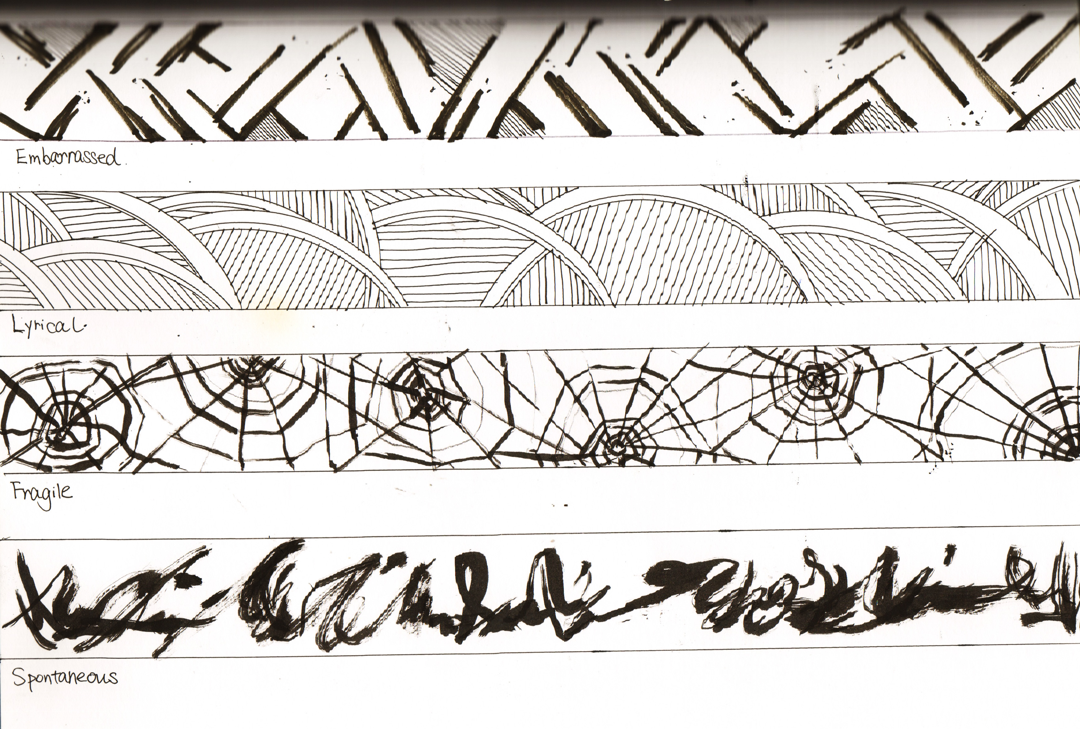
Embarrassed
The patterns are hiding behind the bright white lines of exposure. They are dark and barely showing the details almost like they are embarrassed.
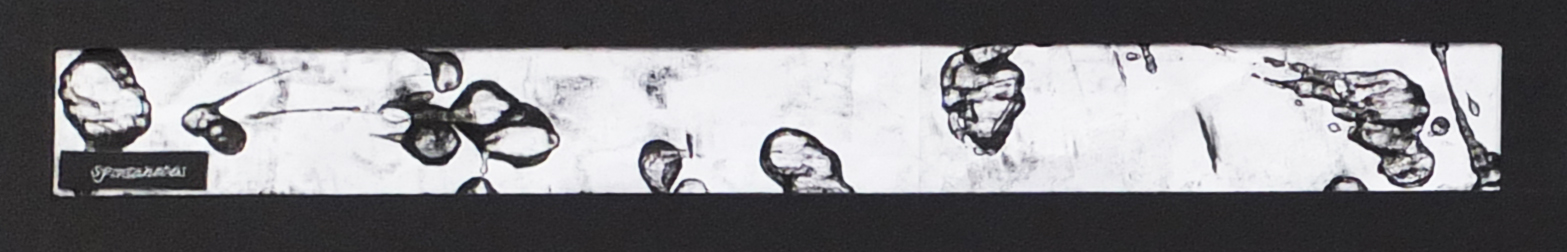
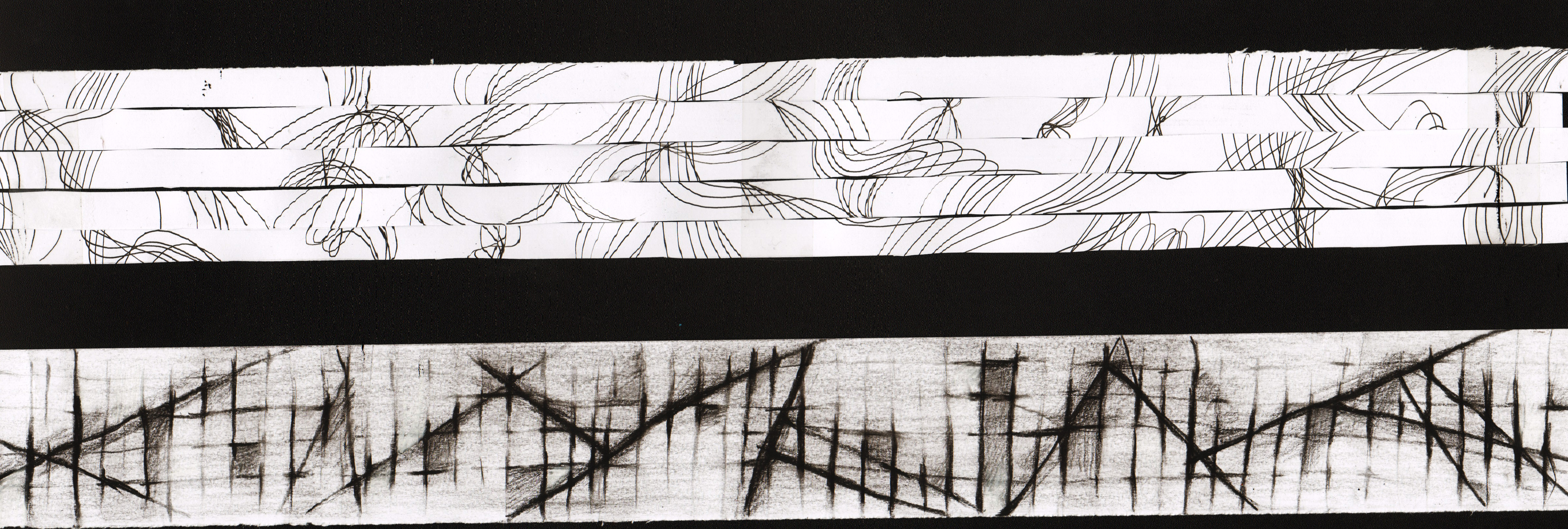
Spontaneous
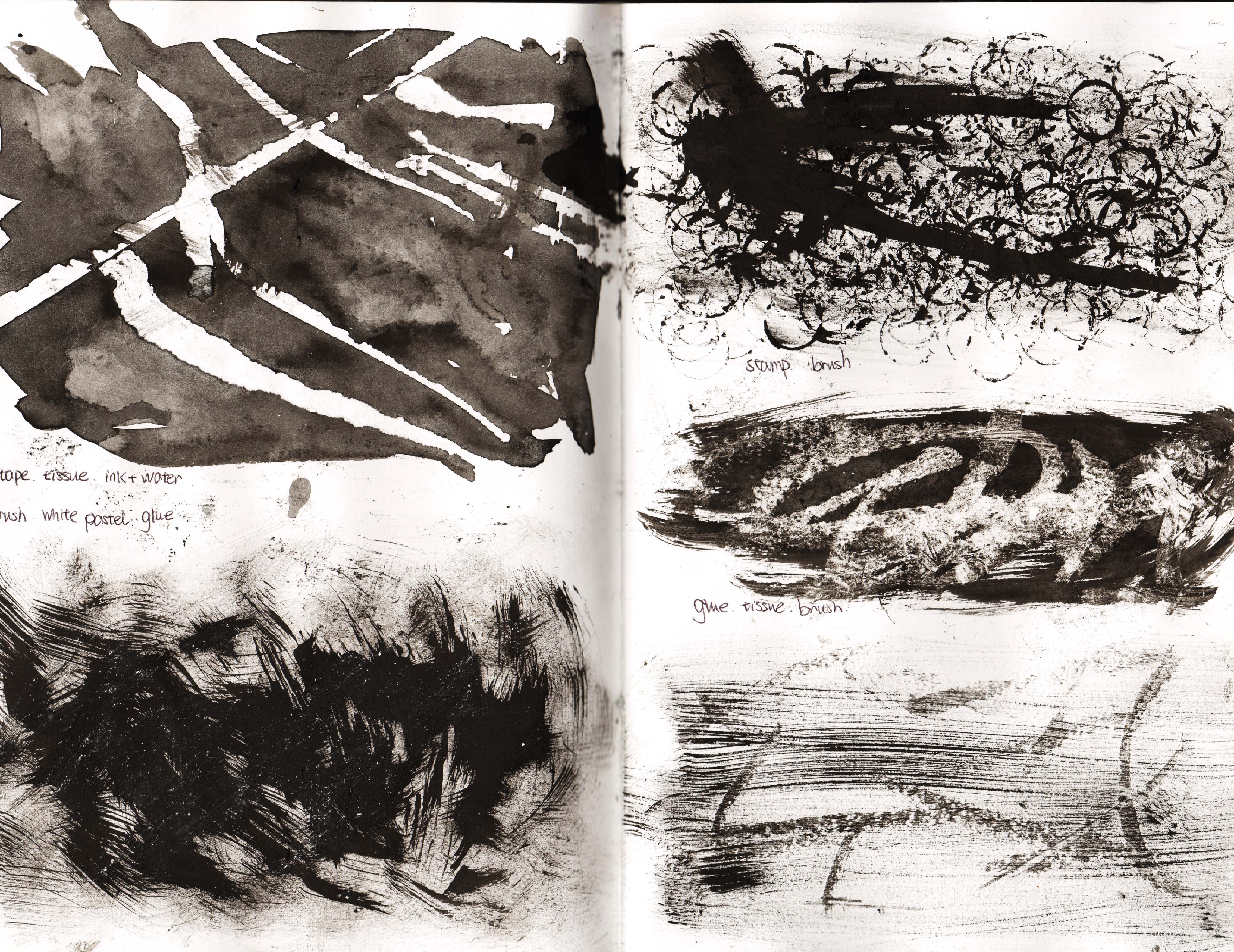
This line is a happy incident from the combination of glue and ink, which creates the free flow of the water-like shapes.
Anxious
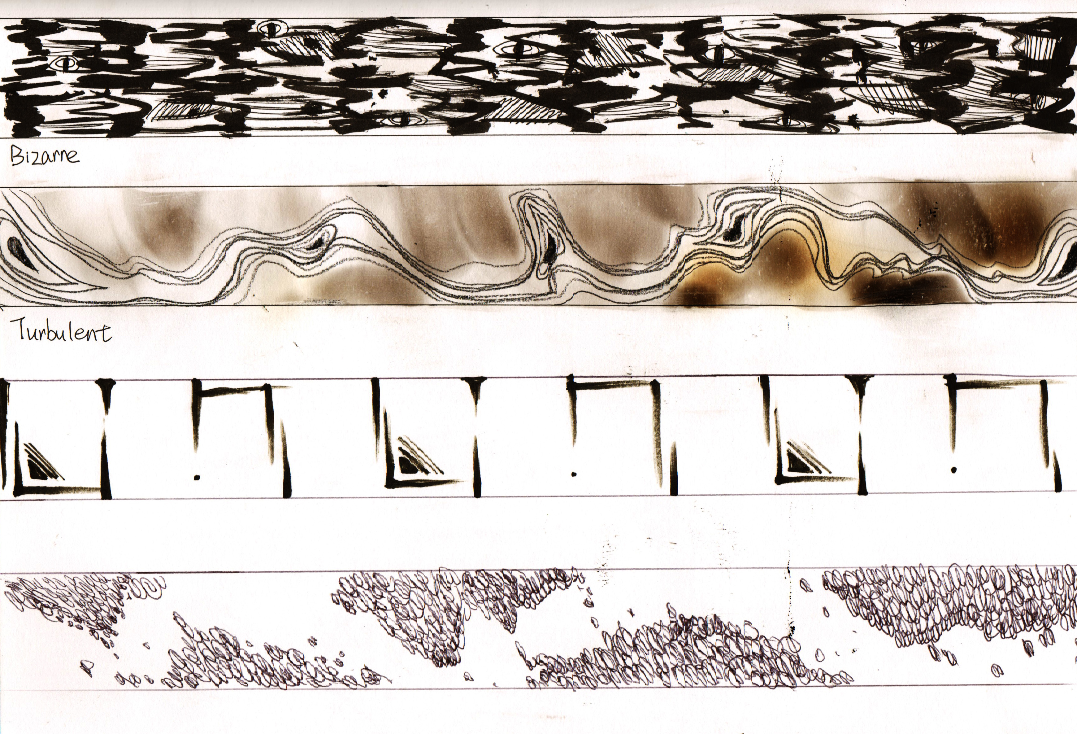
Repeating and messy lines are what I tend to draw a lot when feeling anxious. They also happen to have many round or ellipse shapes.
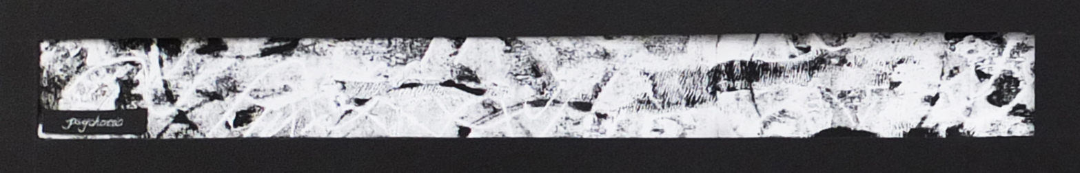
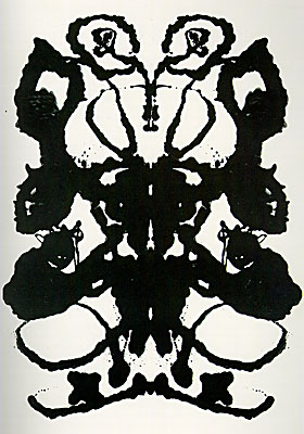
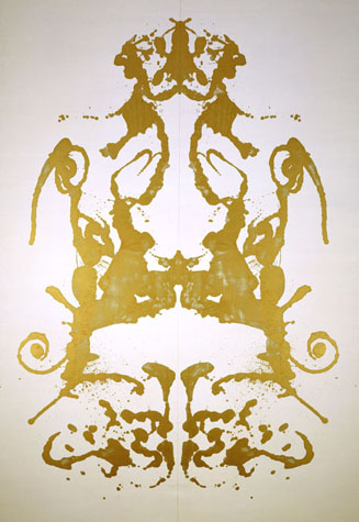
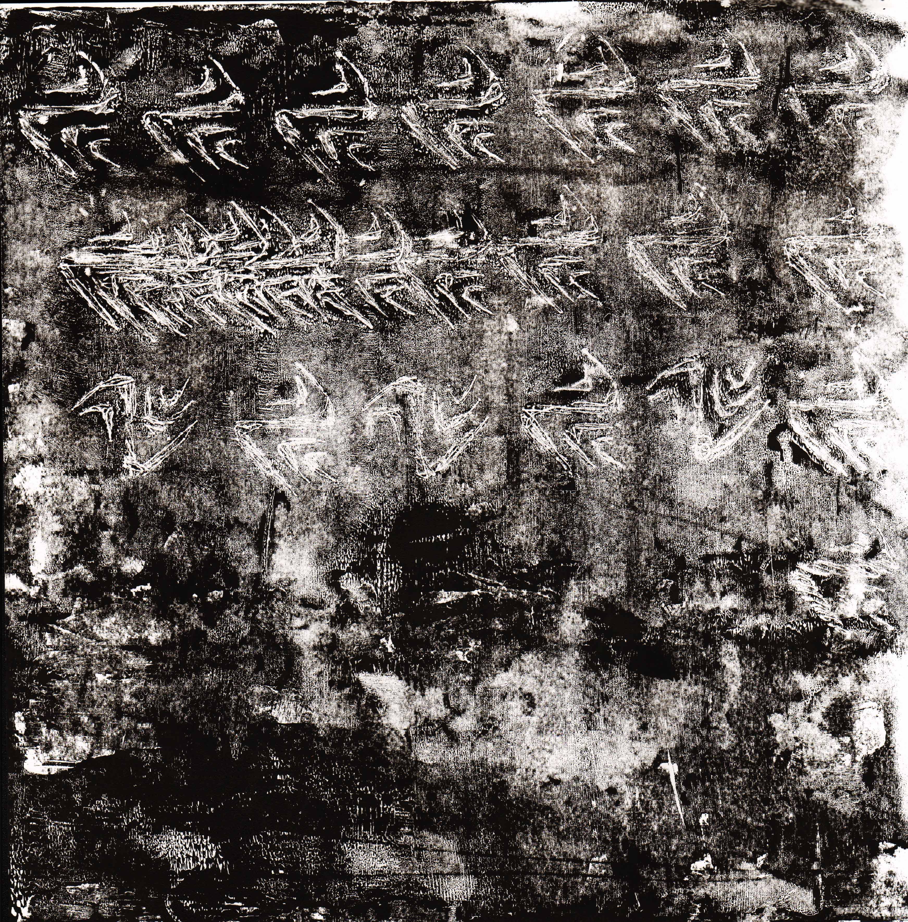
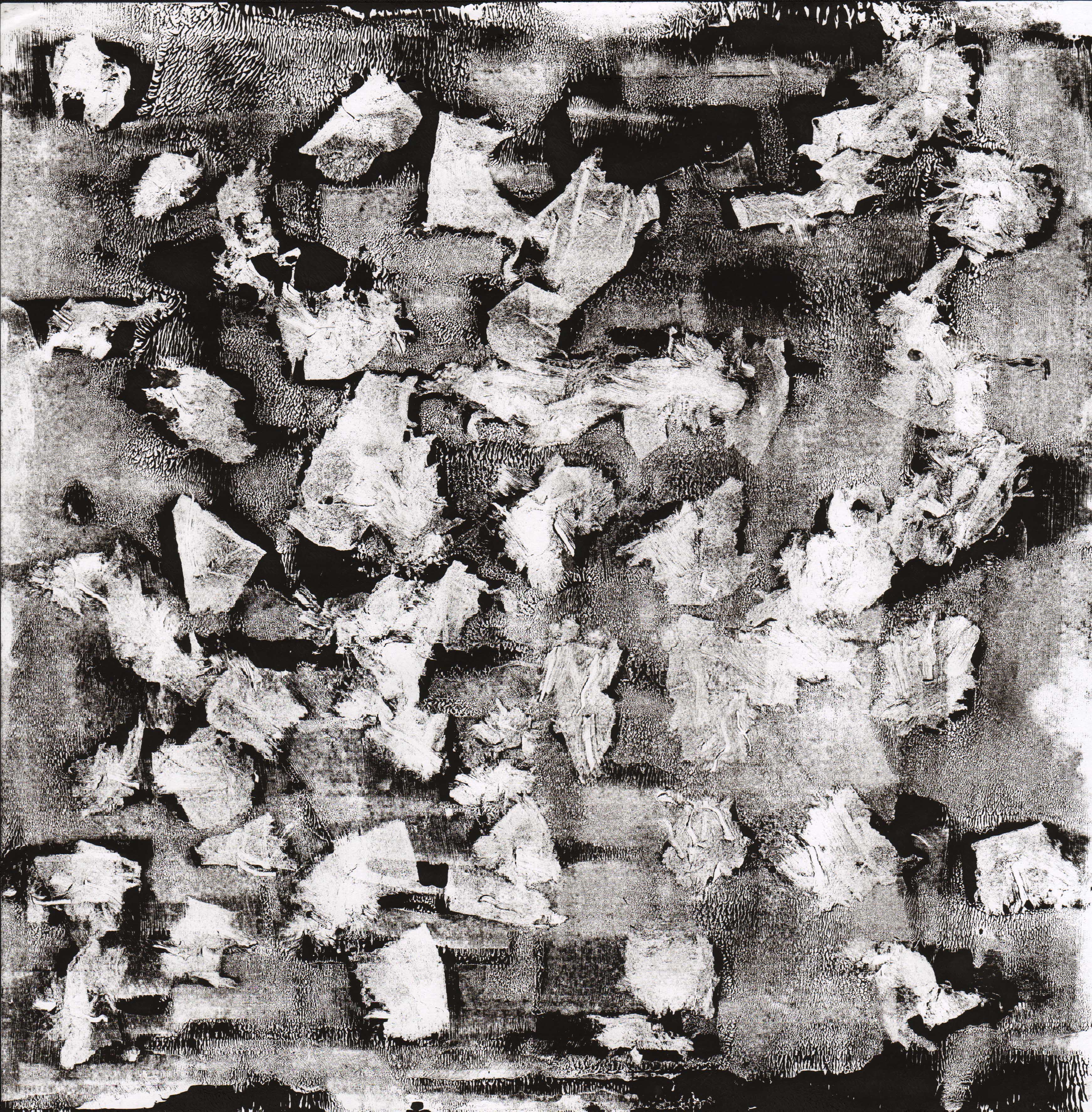
Psychotic
This was done with monoprints and as mentioned in the previous post, I liked the way the thin lines look glowing the the contrasting background. Somehow it reminds me of some scenes in the psychotic horror movies
.

Awkward
The darker marks on the lighter ones seem awkward. They are in different directions and all over the line while the background is more organized in comparison.

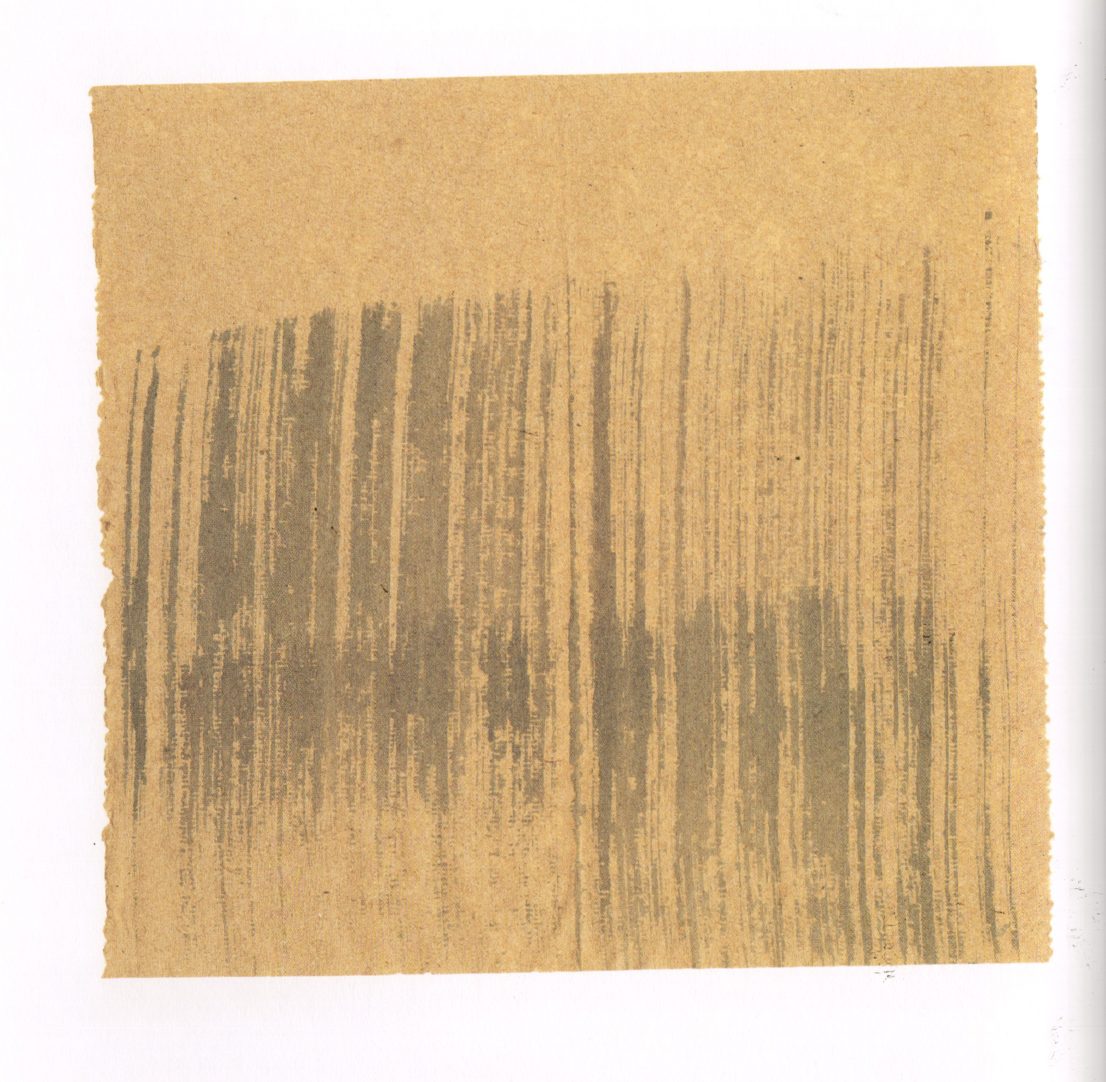
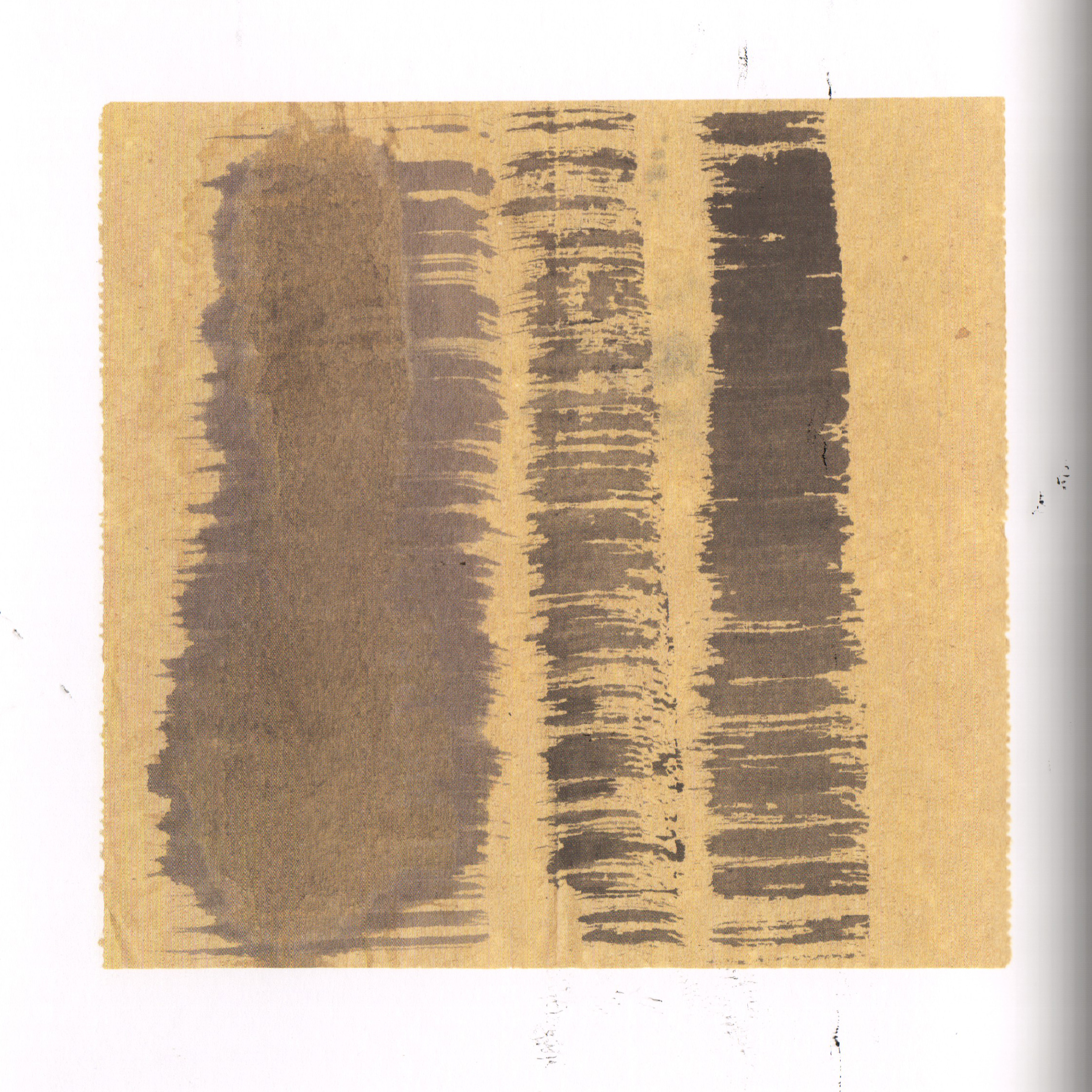
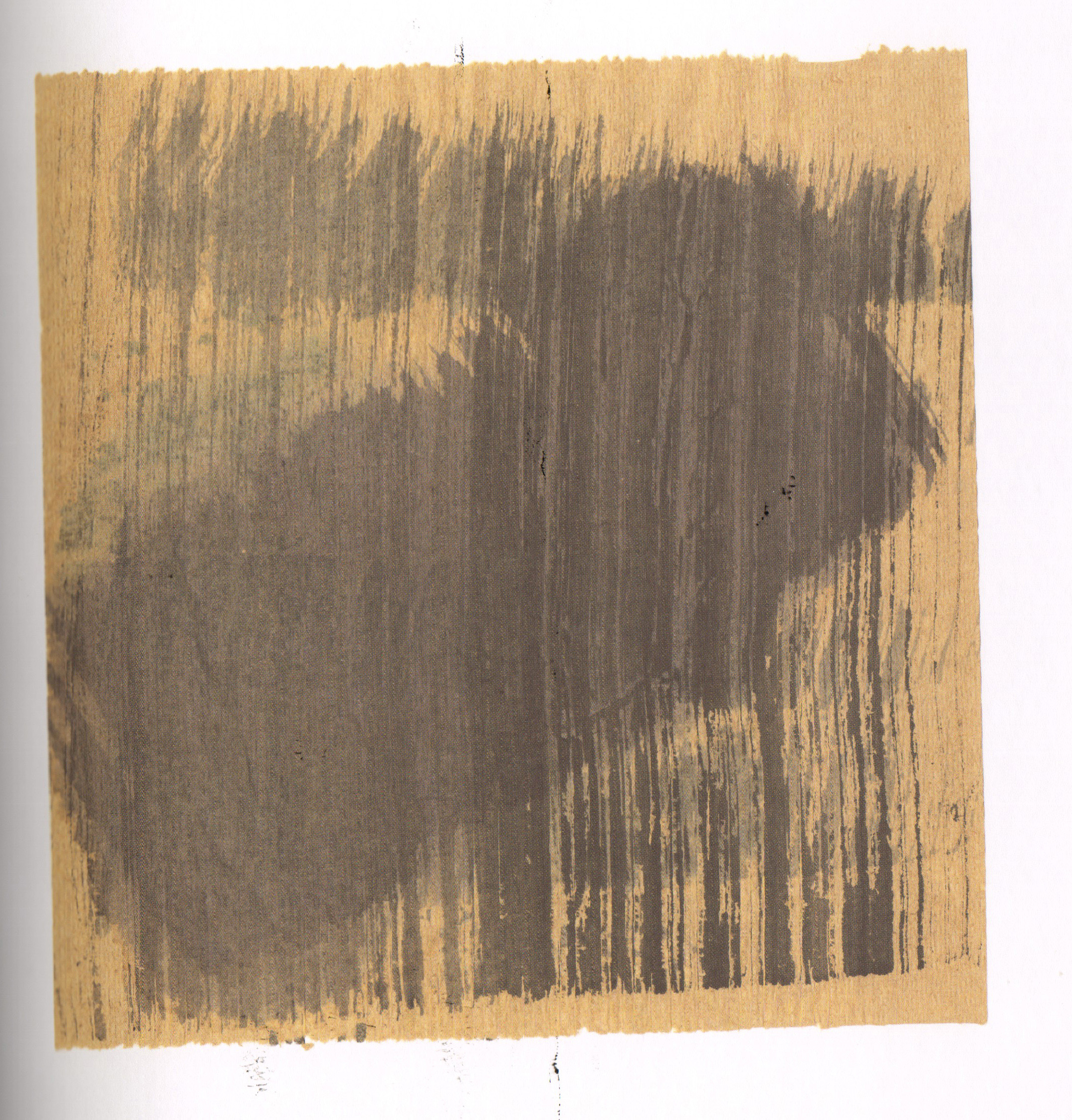
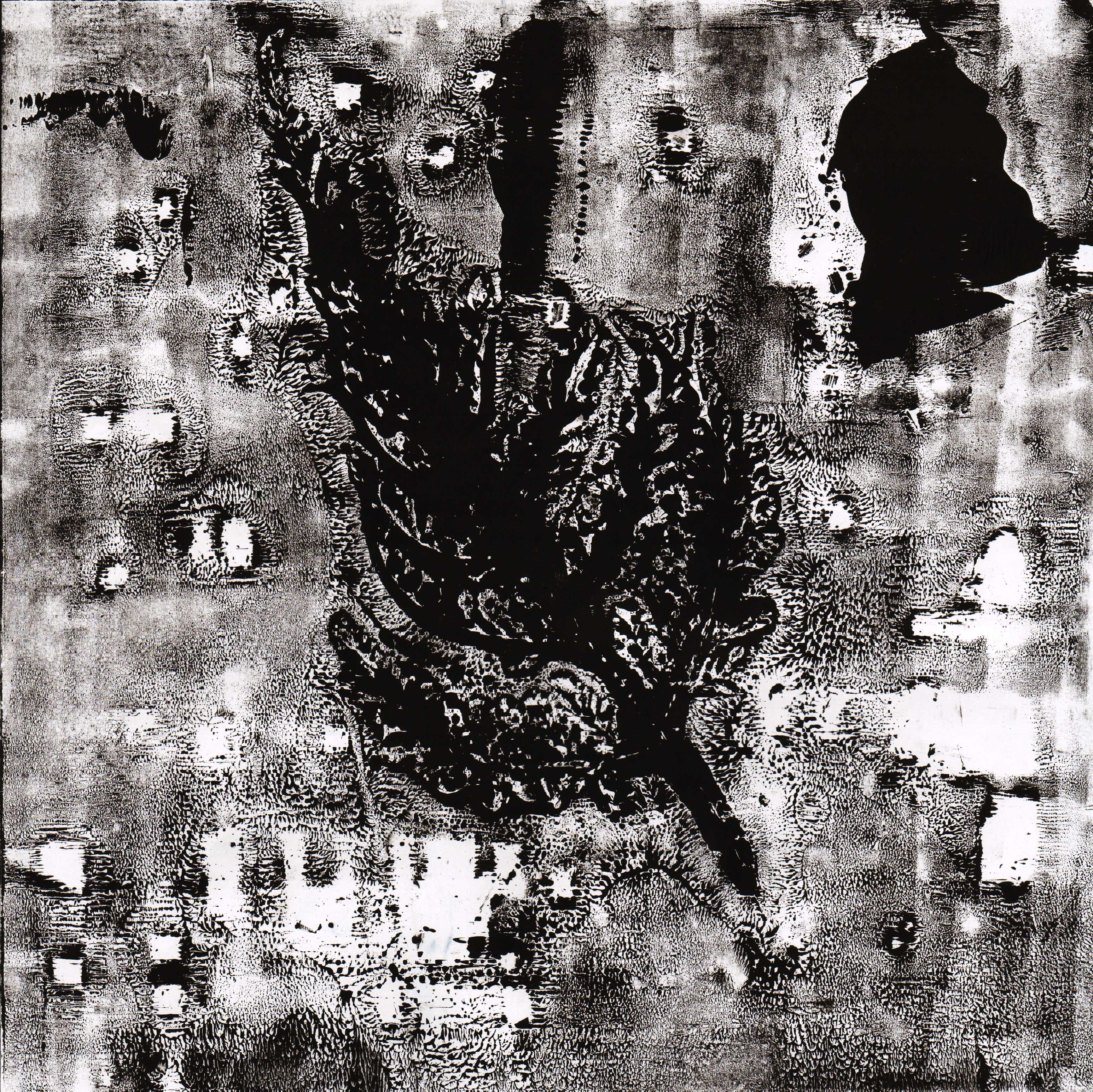
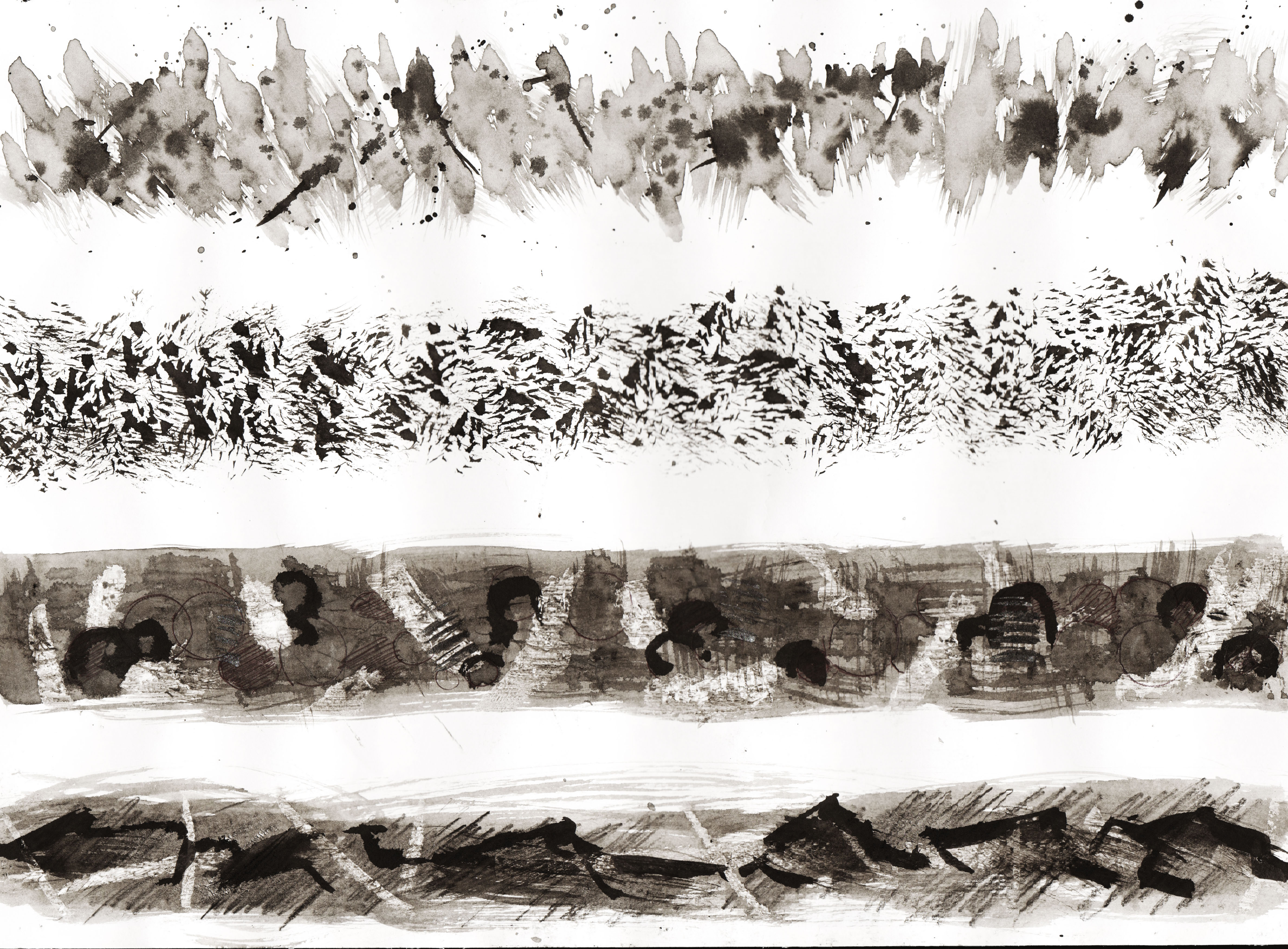
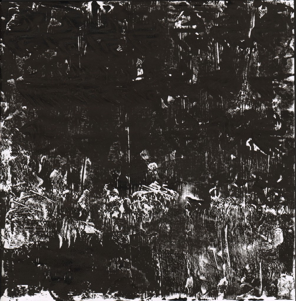
Exhausted
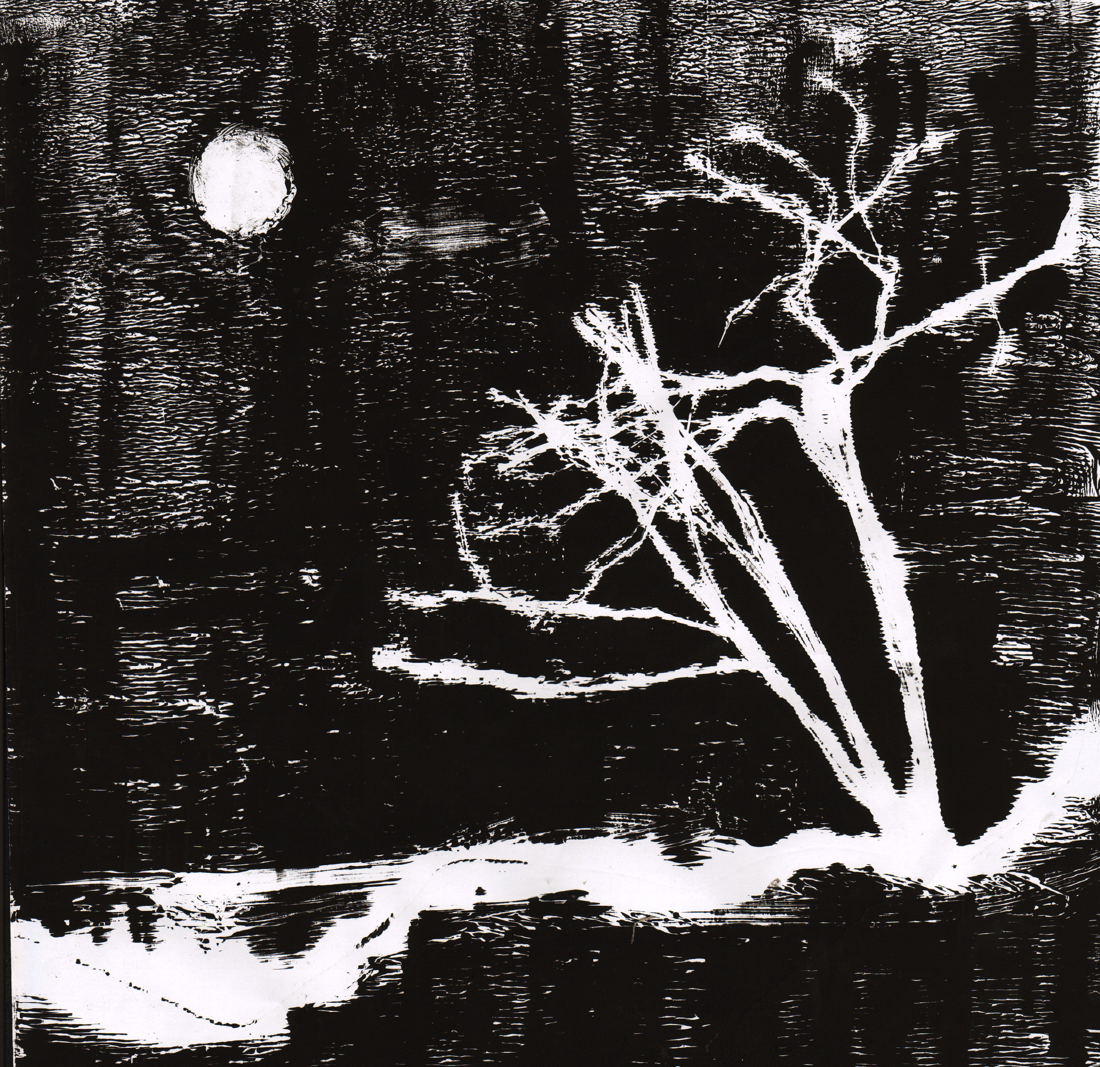
The ink used in the background is glittering. The black lines and white lines are trying to create a space as the brighter ones are nearer to the viewer. I think it represents exhausted because it looks like abstract meteorite fall. They are so exhausted that they just let gravity takes control of the fall.
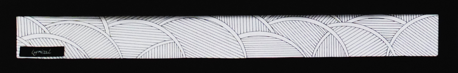
Lyrical
This line was done using only pen and protractor. It is wavy with the ellipses yet not turbulent because of the presence of the straight lines to balance.
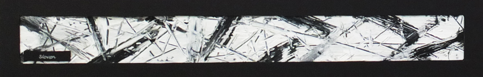
Sloven
There are several layers to this line. The bottom one being black and the top one being white allows me to scrape lines on it. The line has an untidy and messy feel.
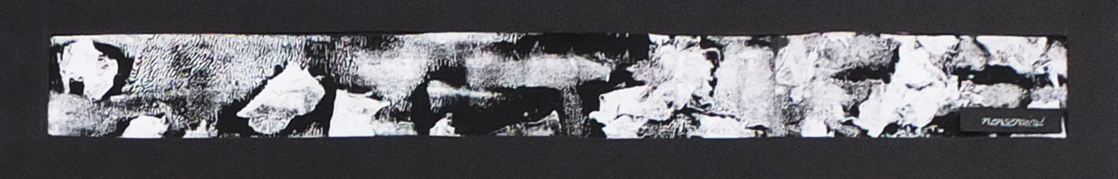
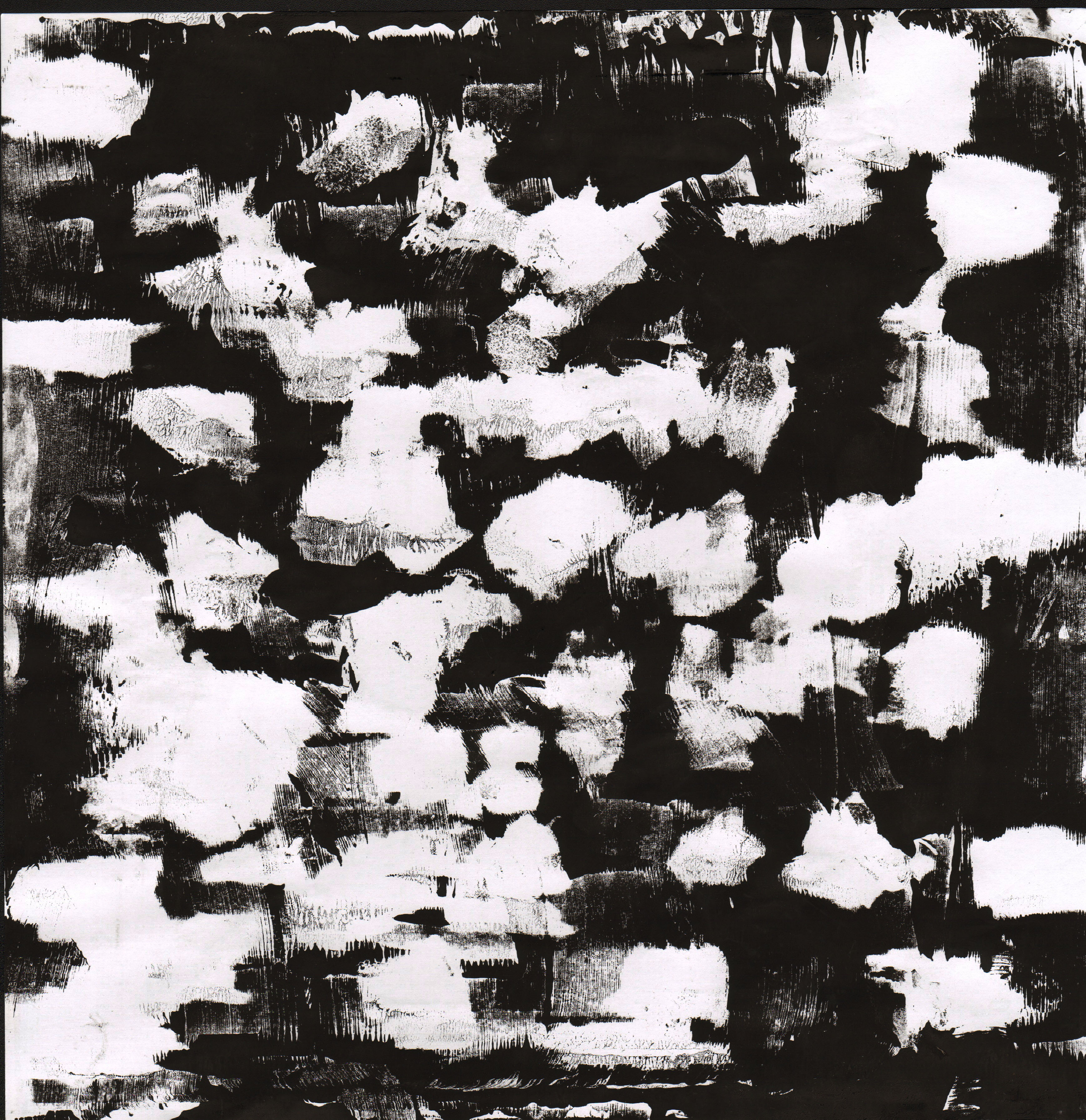
Nonsensical
Done using monoprint with tissue and ink. The shapes are very random and irregular. There is a section on the left top part of the line that contains interesting patterns.

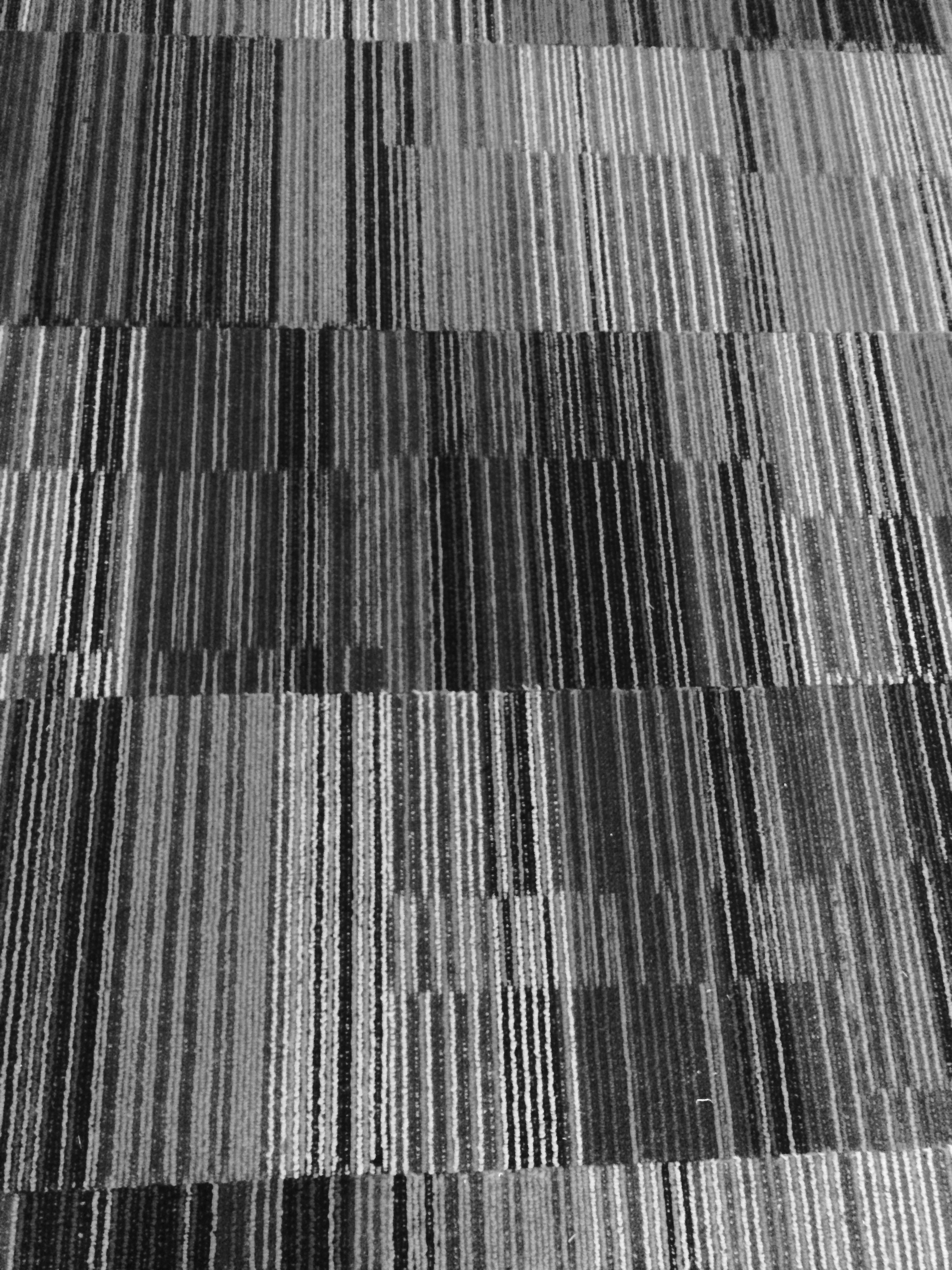
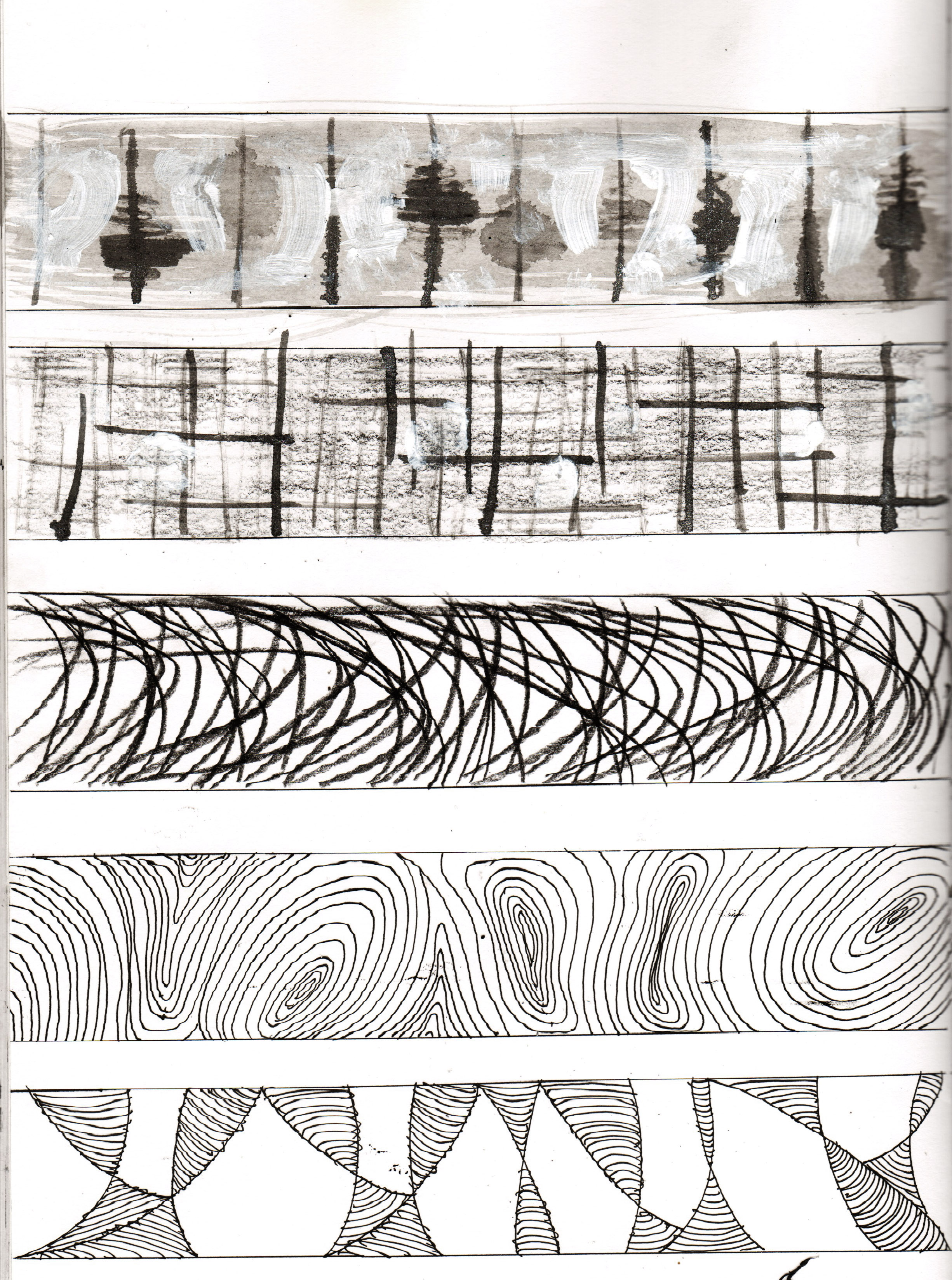
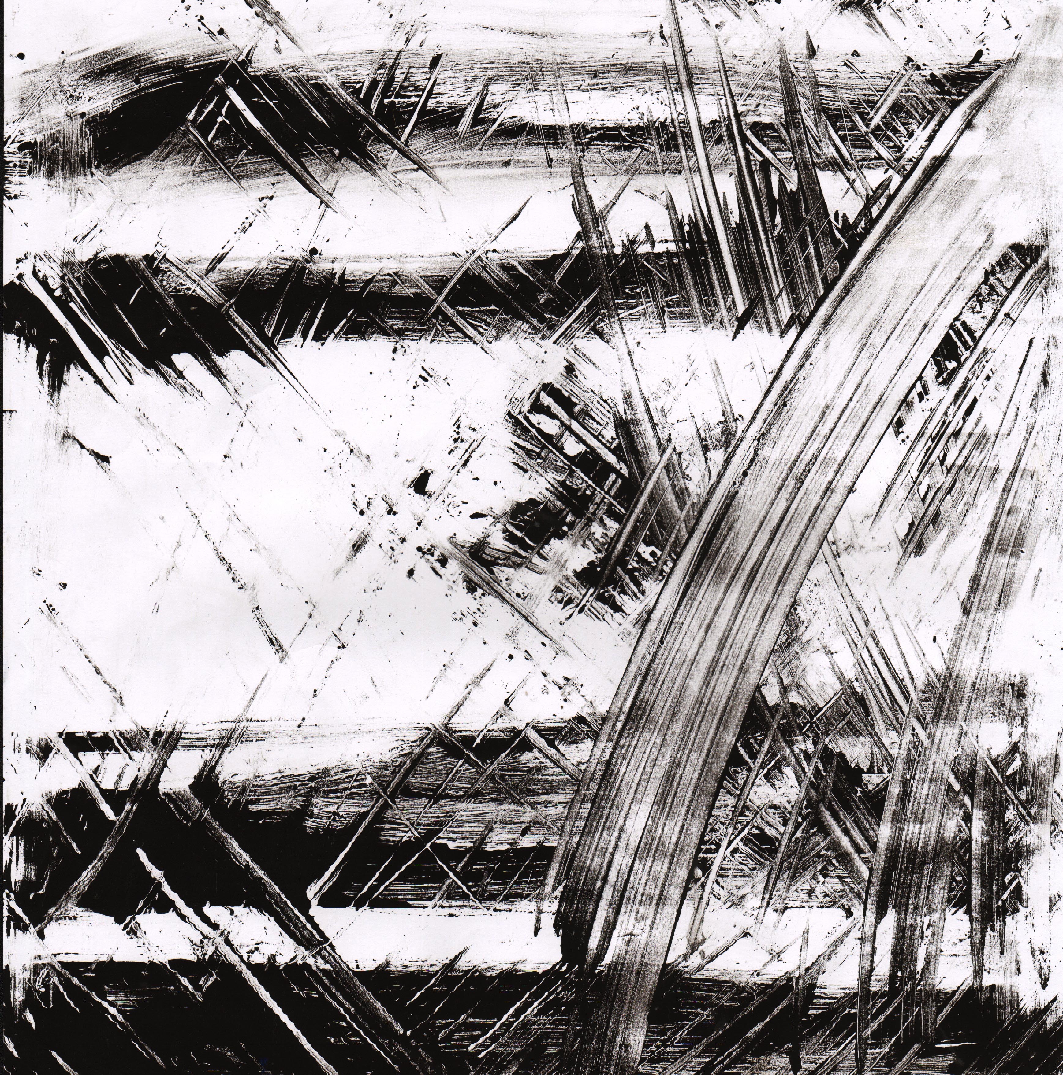
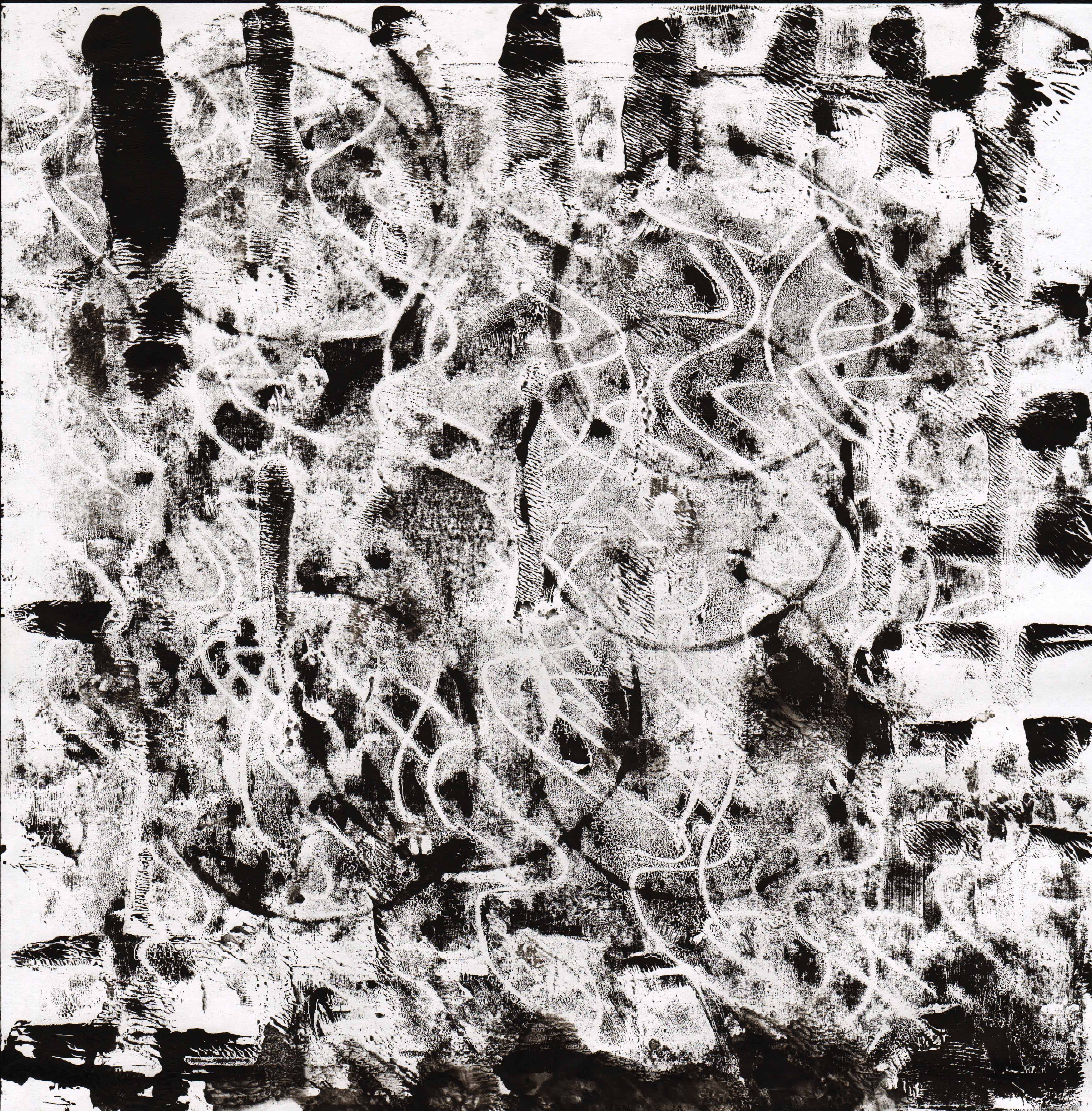
Systematic
There are horizontal and vertical lines in the background with some stronger lines. Then I erased some edges on the line with a certain rule I made up and also for applying darker colors for some grids.
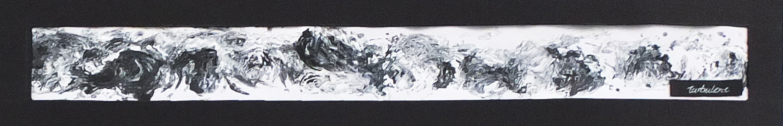
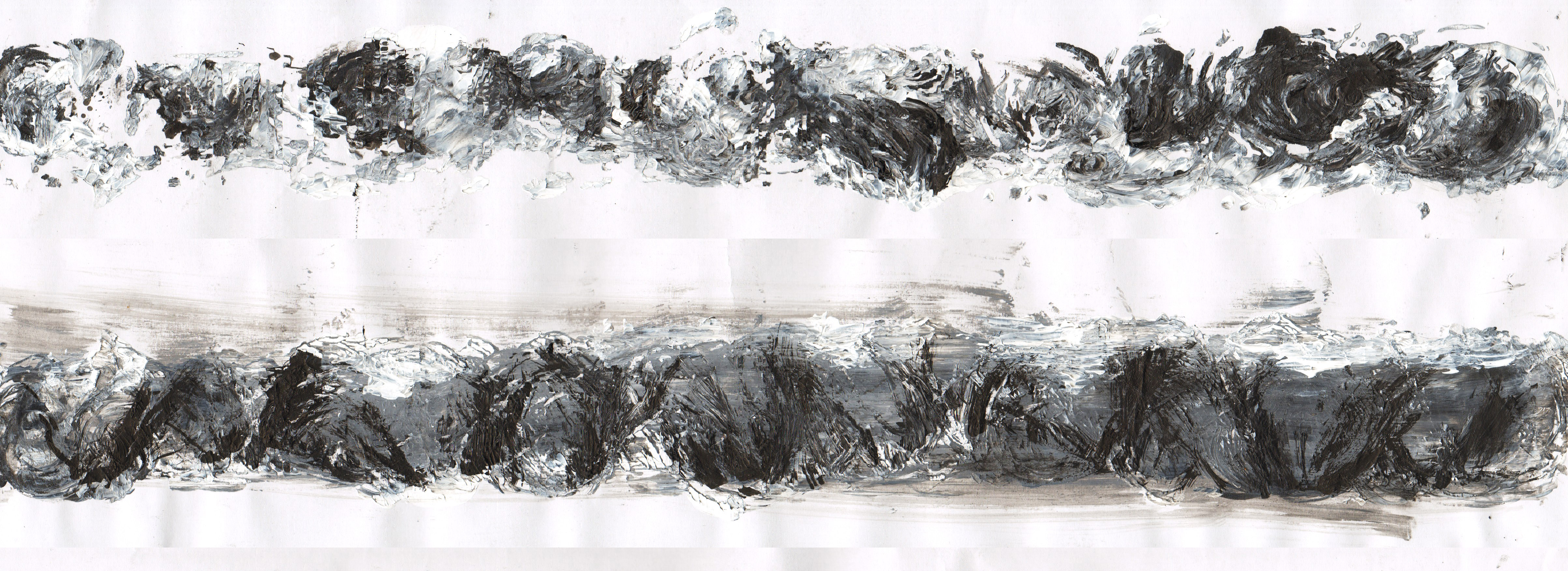
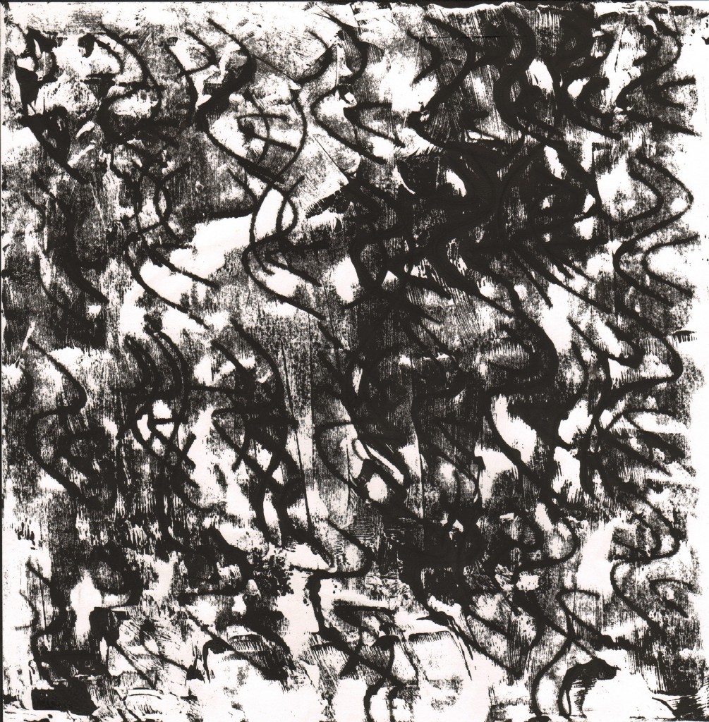
Turbulent
For turbulent, I meant to create the abstract look of the strong waves in the ocean. They were drawn with dark ink and white paint.
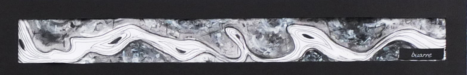
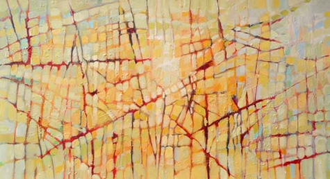
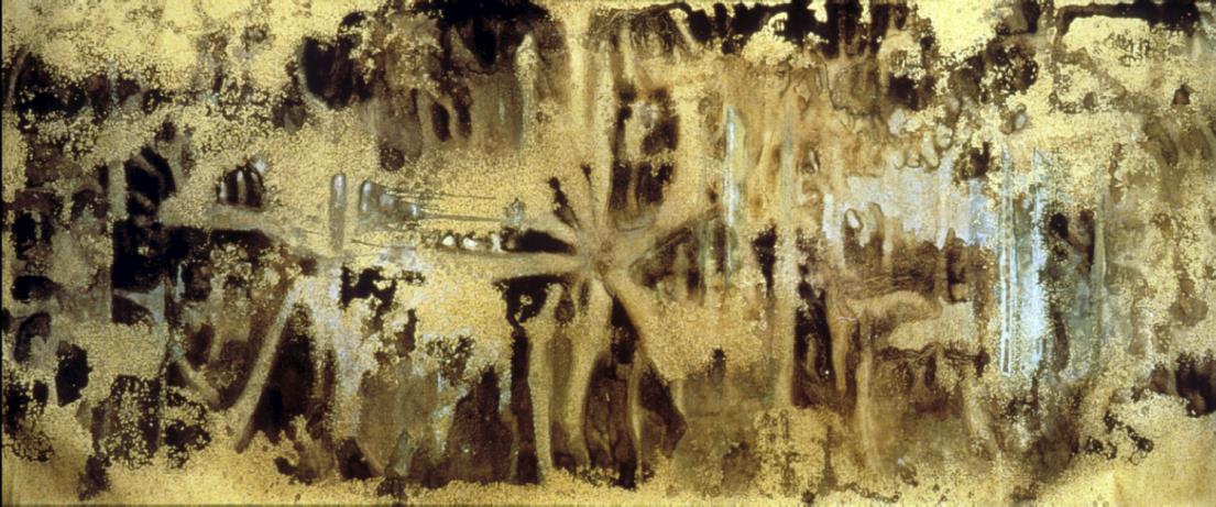
Bizarre
There is a river with weird eye-like shapes in it and it is surrounded with patterns. I made those patterns with as many different inks and paints to produce more details. Then I scribbled on them something like those ancient cave drawings.
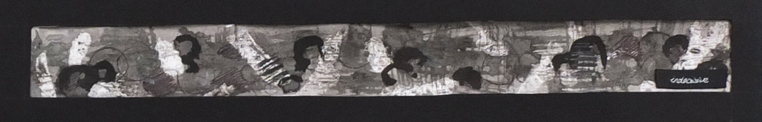
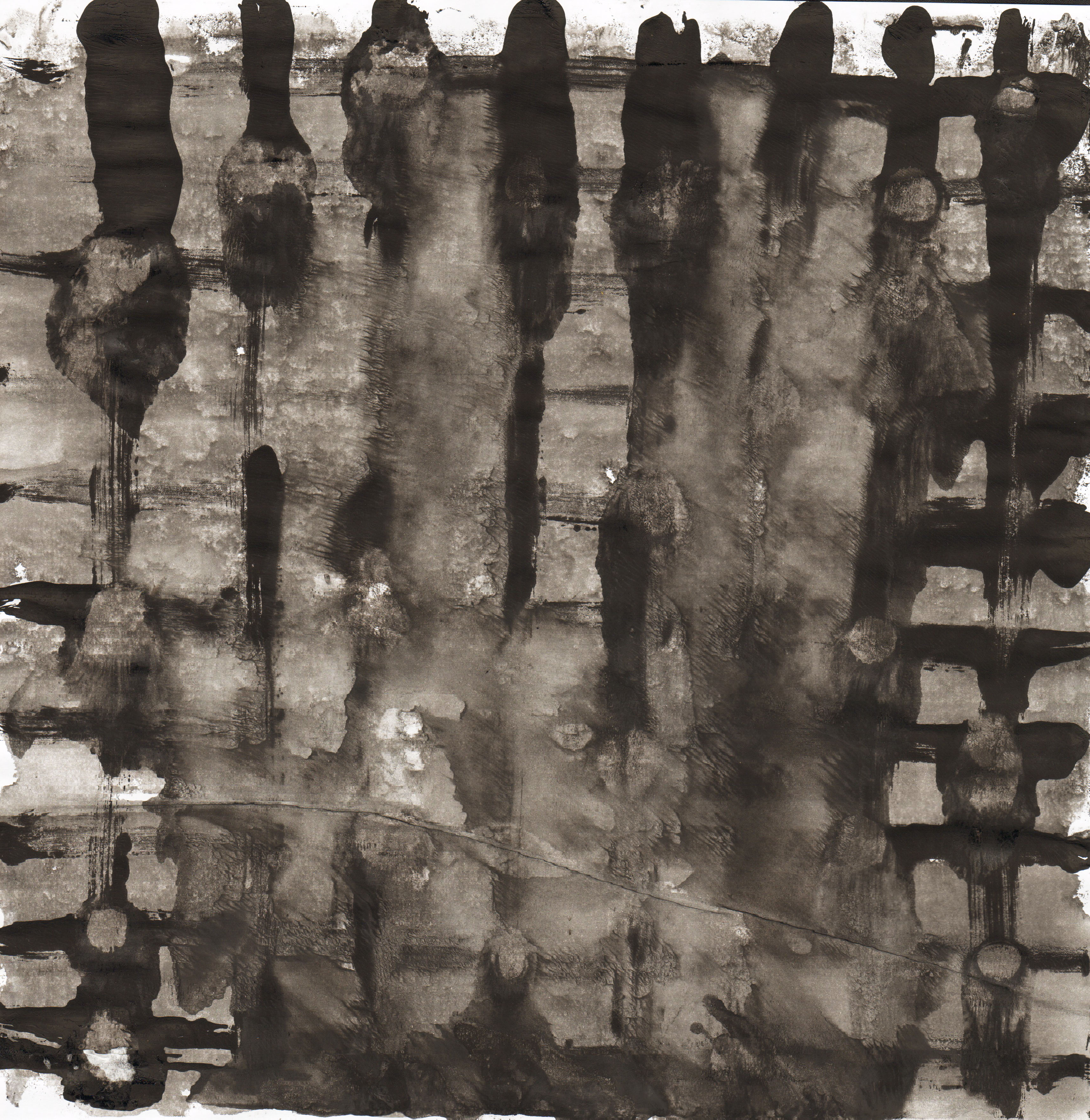
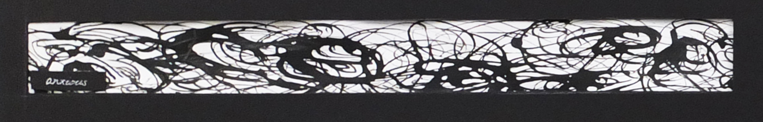
Indecisive
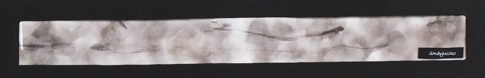
Ambiguous
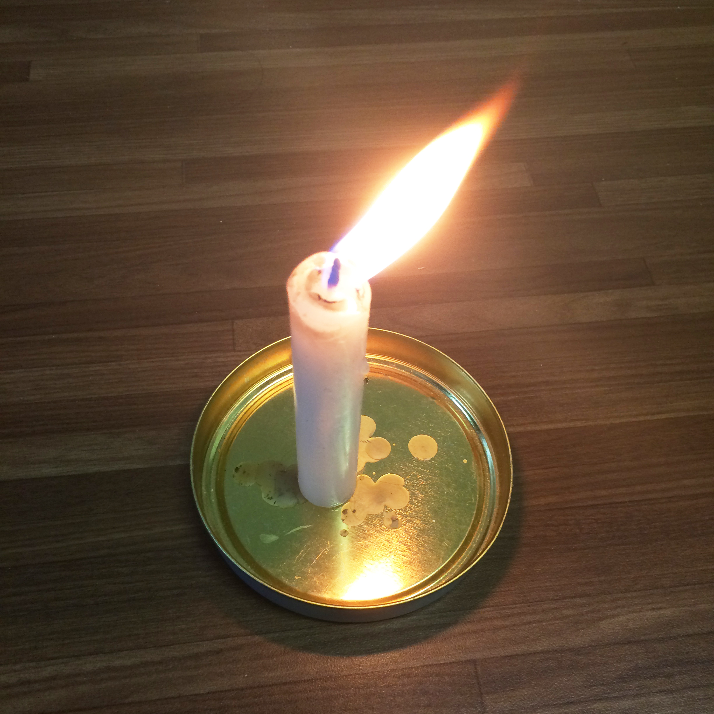
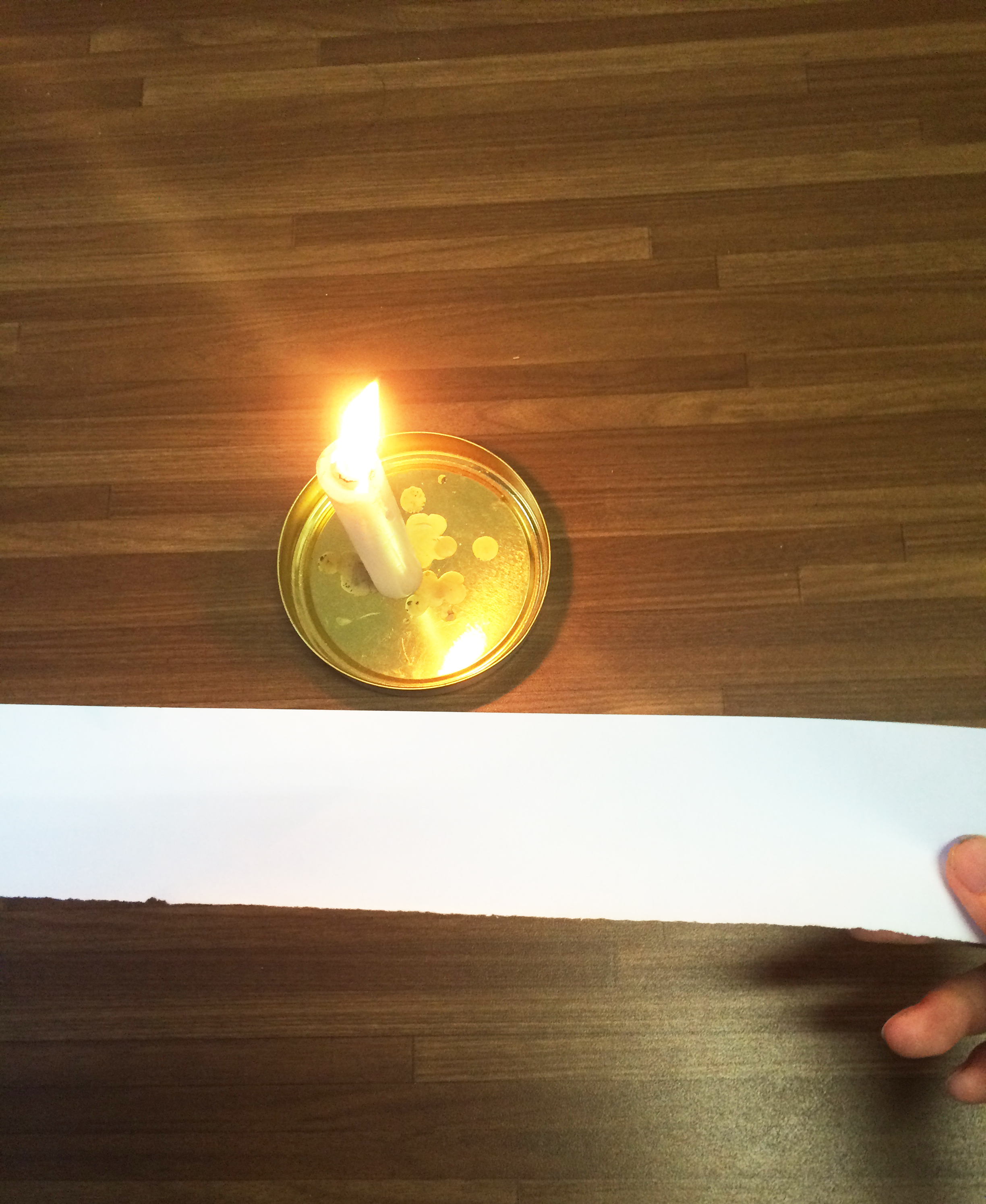
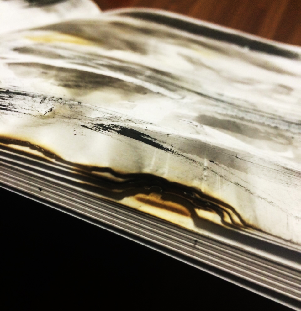
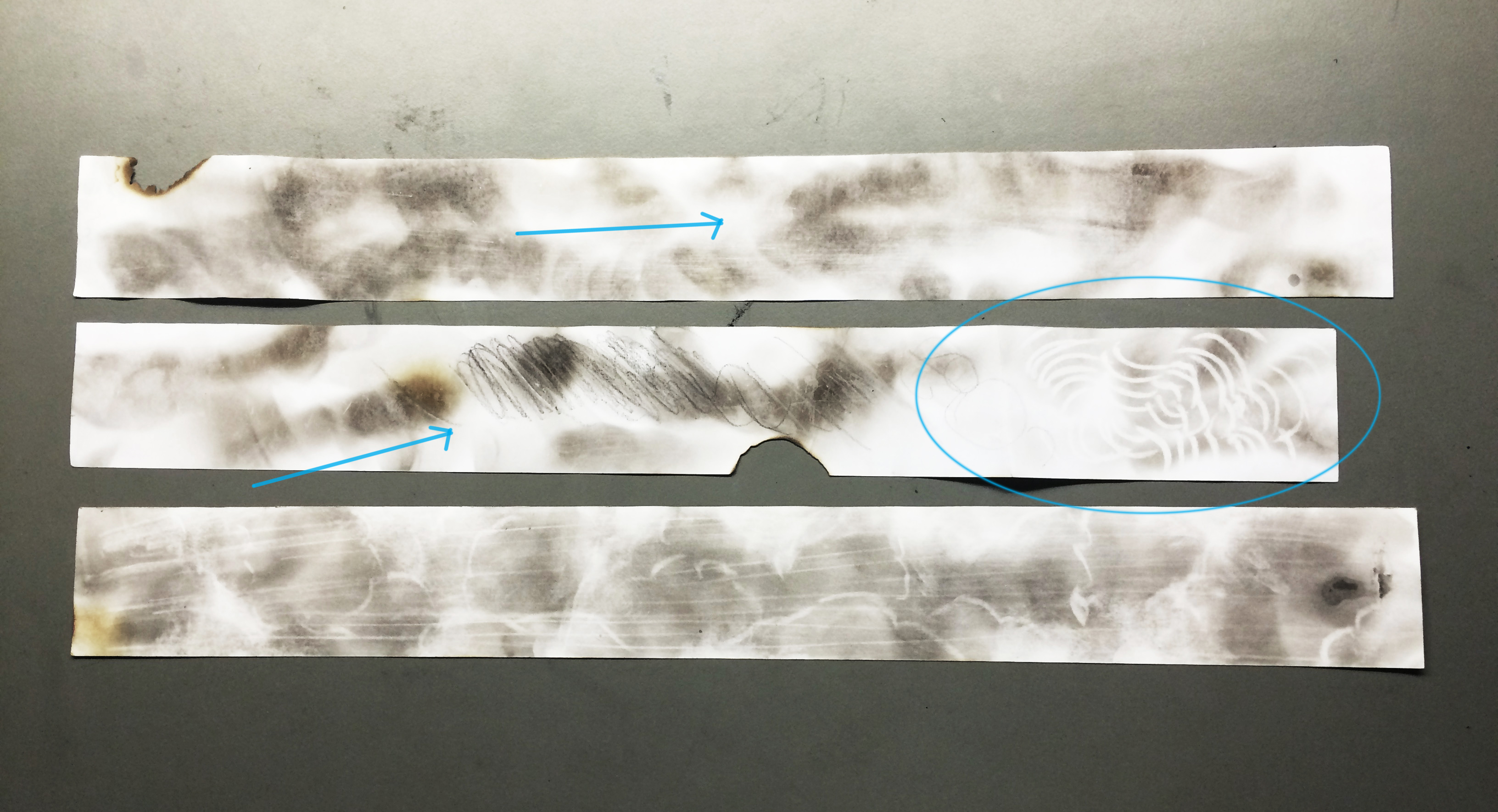
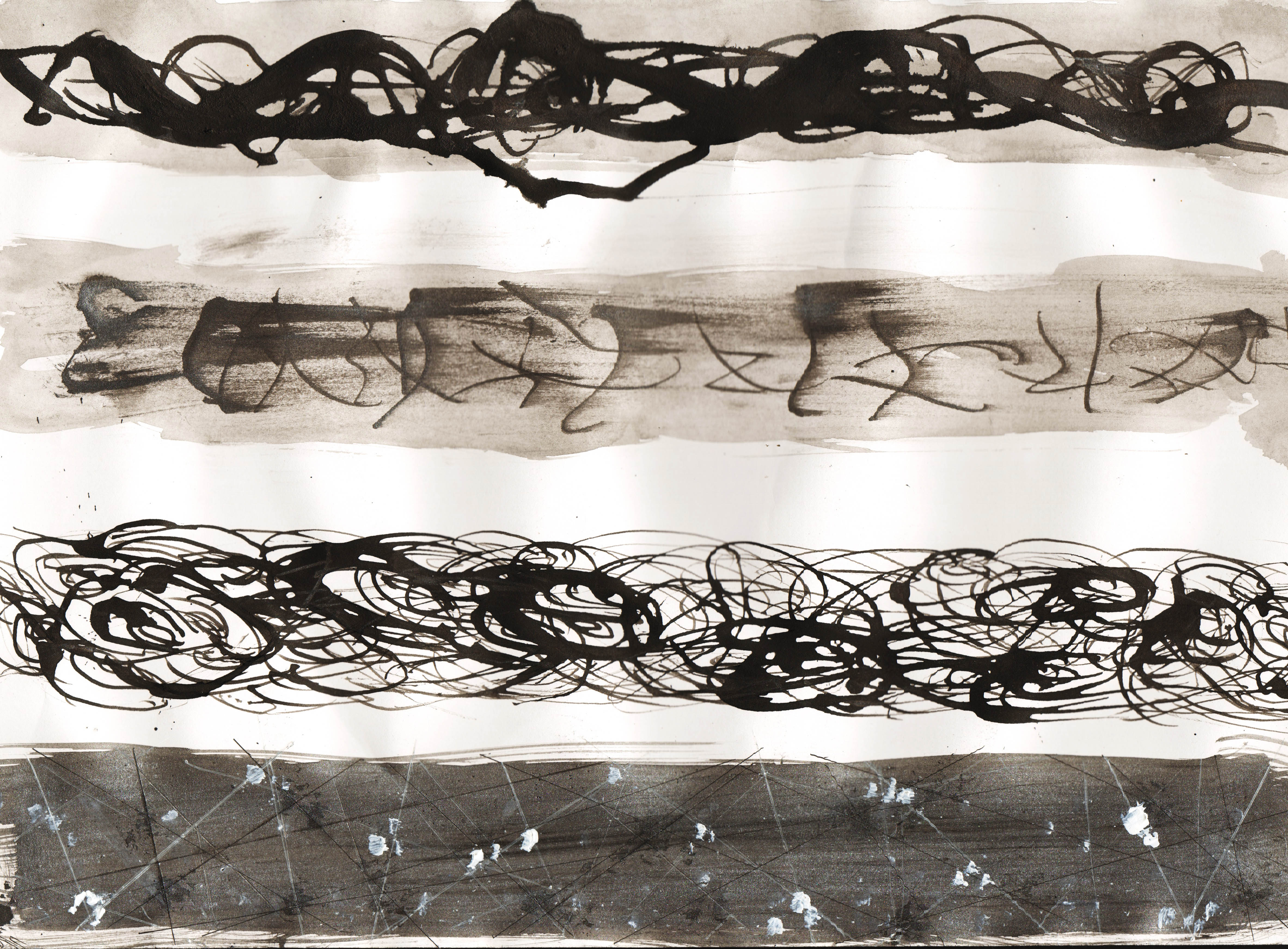
The line was created with the technique of fumage. It took quite long and several trial and error to have the paper covered with smoke marks. Then I wiped it lightly with tissue to create the unclear and ambiguous atmosphere.
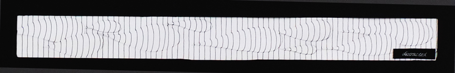
Distracted
The straight lines going from the top to the bottom. It is like some shapes are behind there distracting the lines.
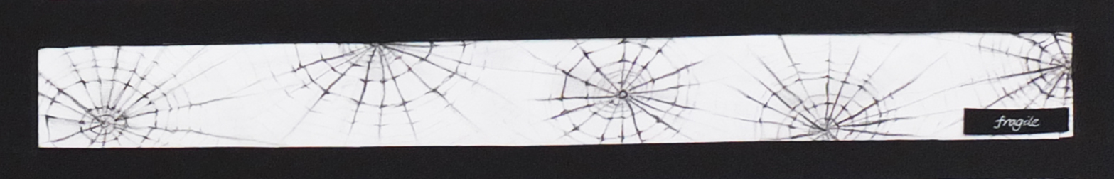
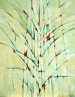
Fragile
The inspiration for the fragile line came from the nature, the spiderweb. Similarly, they were first drawn with hard solid lines and then I erased them to create the space in between each shapes.
 Sensual
The sharp patterns were produced with a dry and spoiled brush. The tip was dipped in the ink and went over the line with passion and movement.