Chen Yue & Matthew – Week 4 (Part 2)

Following the part one on research posted by Matthew: https://oss.adm.ntu.edu.sg/mong017/2018/02/07/chen-yue-matthew-week-4-part-1/http://click here

We came up with the idea of incorporating a see-saw into our design as it requires at least two people to cooperate to play. This represents the Nantah spirit of teamwork and it would also bring some fun element into the area where this installation would be placed.

Firstly we did some explorations of the form of see-saw. One of the inspiration came from the honey bees. These are great team players and creatures with perseverance. We thought about using the electricity generated from the usage of the see-saw to power lights that can be used at night.


After consultation with Prof Fabrizio & Ker Siang, we did some more research , discussed and decided to focus our designs on this direction:

Bringing comfort and coziness with the installation to attract people to go to Nanyang lake, creating a sense of belonging 

Below are some explorations of what the installation could be to provide a comfortable surroundings for people to spend some time in the Nanyang lake area. There are translucent plastic strips to keep out the heat from the sun and rain to act as a shelter, which will also create dynamic visual movement when two people sit and play on the see-saw installed beneath.  Shelter with solar panel could harness power to provide light during the night time, which will also reflect on the lake surface, bringing more attention to this location.

One idea was to build a small elevating platform as shown in the above image, where people can sit or lie down in a more relaxed posture to enjoy the surroundings. The other concept tied in with the see-saw that provide stillness for one individual user but become fun and dynamic when two people sit on it.

Chen Yue & Matthew – Week 1

The article The Infra-Ordinary ” by Georges Perec raised  many questions on the ordinary and mundane things that happen almost everywhere everyday. We are so familiar with them that we stop noticing. Perec encouraged people to ask questions about daily things and challenge the ordinary. It’s only when we think about it that we realize how little we actually know and how much information is just being neglected by us.

With this realization, we started to think about our daily life in NTU and began to obtain more observation. During our discussion, this photo below that caught our attention.

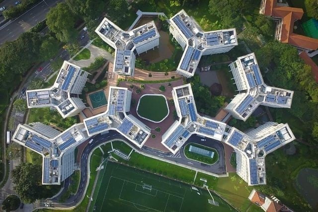
It was the icon of NTU pioneer hall on the wall as shown in this photo. It resembled a bone icon but actually it derived from the top view of the Pioneer hall cluster.

It was quite shocking to find out this interesting fact about pioneer hall. Even though we rely highly on our sight to navigate around places, there were still many things that we overlooked.

We decided to create a sculpture to describe many mundane details of this place.  An experience of the pioneer hall was composed of not just the visual but many other senses. According to this article (https://velvetchainsaw.com/2012/05/23/your-senses-your-raw-information-learning-portals/), the percentage of senses we reply were as followed:

83.0% – Sight
11.0% – Hearing
03.5% – Smell
01.5% – Touch
01.0% – Taste

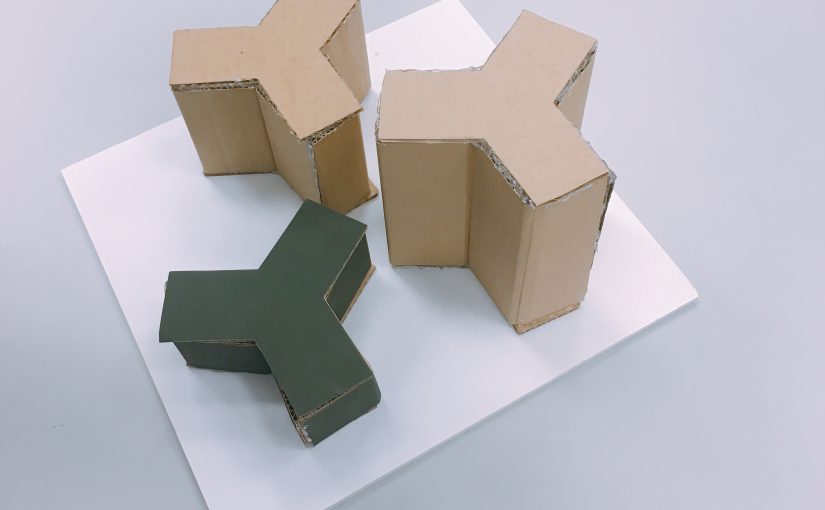
For this experience sculpture, there were three blocks, in the shape of the building icon. With varying heights, each represented the following senses: hearing, smell and touch. The tallest one contained dry tree leaves to create the sound of tree branches. The following had a smell of coffee, representing the canteen experience and lastly, the lowest one provided touch that simulated the texture of the walls in the pioneer hall.


Singapore Diary Research

Interview

“What is like living in Singapore for you?”

A senior said that she usually takes public transport around, has meals at hawker centres and wonders around casually. Even though she goes to shopping malls, things are too expensive and it is crowed during peak hours.

A student said that he has very busy school life and many classmates worked very hard. They were finding balance between school and cca, waking up early and staying up late.

Research

Seeing so many ongoing construction everywhere made me wonder:

How the old buildings co-exist with the modern architecture? 

So I went on to research on news on construction in SG as well as preservation program by URA (Urban Redevelopment Authority).

Some of the questions popped up while I was researching:

What’s relationship between the place and people with so many new buildings coming up?

How are the buildings  different now and how construction affects people’s life

What do people feel about the old and new buildings?

etc…

Then I thought of the Singapore Red Dot Museum and that it was a Colonial-era building so I decided to work on that and did some research…For me personally,this is the place where I started my design journey. Almost four years ago, and as I went there several times more, I found it very fascinating. The bright red color of the whole building makes it distinguish from the street.

Red Dot Museum is the first contemporary design museum in Asia and is housed in the former Singapore Traffic Police Headquarters, a colonial-era building. It was converted in 2005 into a creative hub known as Red Dot Traffic, whose facade was then painted in its now signature red hue. Besides the Red Dot Design Museum, the Red Dot Traffic building also houses food and beverage outlets, creative agencies and a bar.

The building was given conservation status by the Urban Redevelopment Authority in 2007.

Progress does not always have to mean that all things need to be shiny and new. A passion for the past, a bit of imagination and some careful reinvention has allowed some of Singapore’s conservation buildings to take on new lives through adaptive re-use.


Sound Art -World’s quietest place

ANECHOIC CHAMBER

An anechoic chamber (“an-echoic” meaning non-reflective, non-echoing or echo-free) is a room designed to completely absorb reflections of either sound or electromagnetic waves. They are also insulated from exterior sources of noise. The combination of both aspects means they simulate a quiet open-space of infinite dimension, which is useful when exterior influences would otherwise give false results.

The picture above is earth’s quietest place: The ‘anechoic chamber’ at Orfield Laboratories, which is 99.99 per cent sound absorbent and capable of giving the visitor hallucinations. It was constructed with fiberglass acoustic wedges, double walls of insulated steel and concrete.

Visitors are challenged to sit in the chamber in darkness and the longest record now is 45 minutes by a reporter. We would thought that silence is quite nice and yet when it is so quiet, you can hear your own heartbeat, your stomach and many many usually unnoticeable noises. As they said”In the room, you are the sound.”

The experience is said to be very disorientating and visitors will have to sit down to feel less disconnected. Only when you can’t rely on reflection of sounds, echoes to define the space and orientate yourself that you realize how much you usually move around. It is absolutely fascinating to experience that.


EGO inspiration

IMG_3329

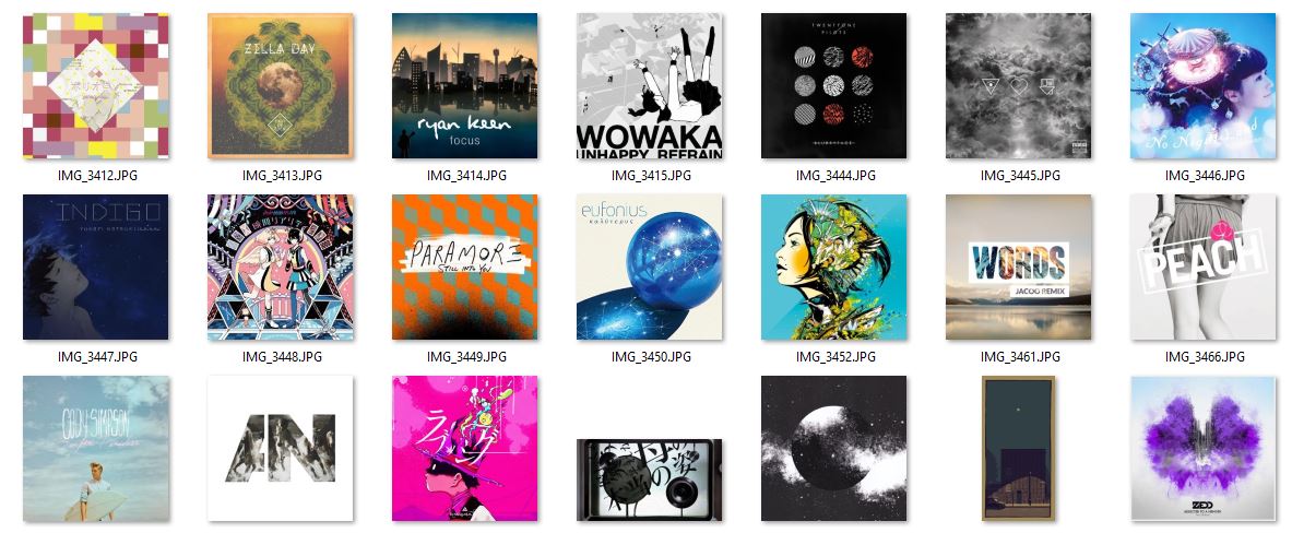
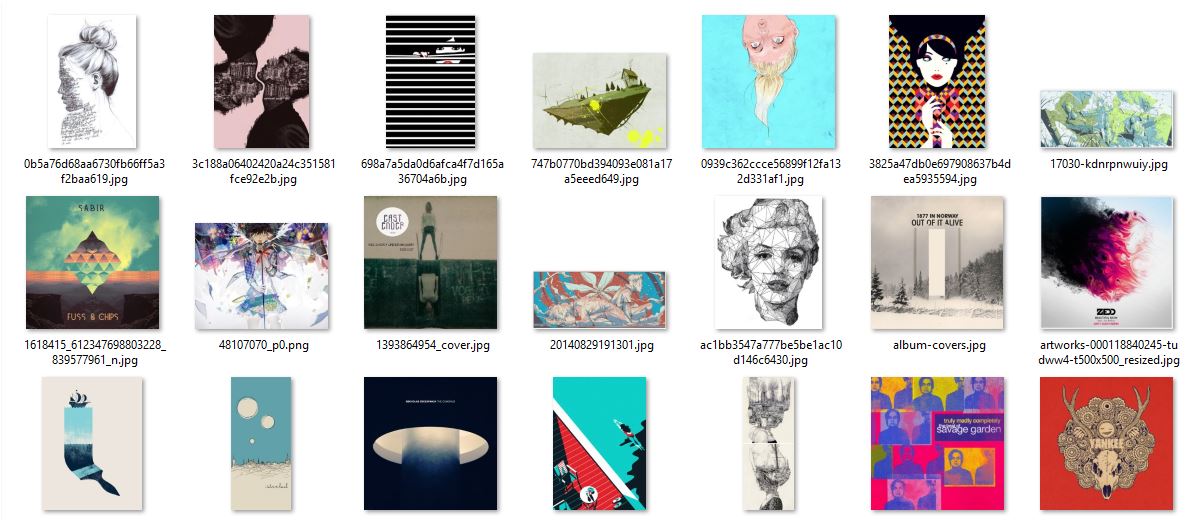
Besides Nakamura Yusuke, I also went to the library and looked through the entire collection shown above. There were so many different and distinct styles that they have and I believed that some of them influence the design decisions I made later on in the projects. There were artists who use only solid bright colors, bizarre combination of colors as well as playing with texts……and besides this I flipped through some on the minimalists as well…Since there were too many of them…I don’t want to fill the whole page with references. Instead I would like to share how I got inspired with a few examples.


e

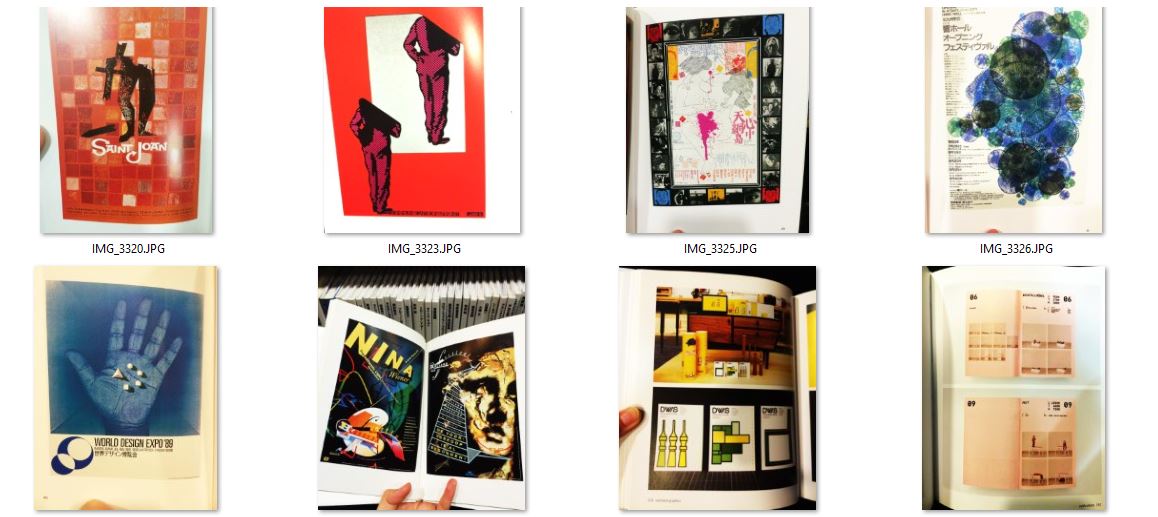
First thing I noticed was that it is safe to play with monochrome and in many cases mix with black&white. The bigger the range in brightness or saturation determine the contrast of the image. And in the case of the bottom left image, since the background and the hand is similar blue, the bright white naturally becomes the focus and the first thing viewers notice.

In order to make the colors less dull but without risking too much…we can add an appropriate portion of the color adjacent to the main color. As you can see in the first and second images. The slight change of tone gives layers to the images.

The third image is a combination of photograph and solid colors. It also reminded me of the art from Bauhaus period with the popular usage of blue, yellow, red and white.

There are also minimalist style with simplest shape to describe the objects and bold black outline.

For the second image on the bottom row, it is a very bizarre yet nicely-balanced design. I am not sure if I am anywhere near to the right answer. But, I assumed that it is due to the big portion of black/dark background and the balance between each colors. Also the very contrasting colors may seem far on the color wheel but yet similar in either saturation or value.


sa

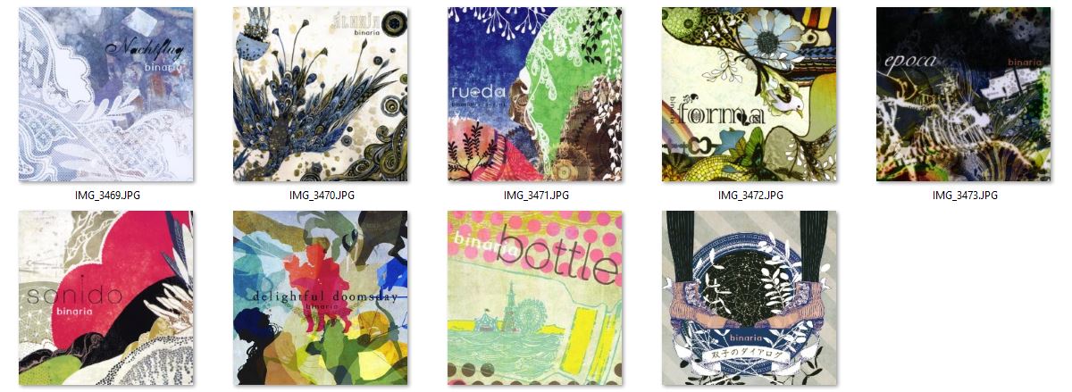
There is this artist that designed all the album covers for the singer group called Binaria. I couldn’t really find any more information on the artist but as you can see above, the colors were very nice in each of them. As compared to Nakamara, these are duller and more netural colors. But also similar in amounts of details and line work in some of them.


Besides I was also inspired by many album covers of various artists and I studied how they played with colors and contrast…etc.


Capture2 Cre


THE END

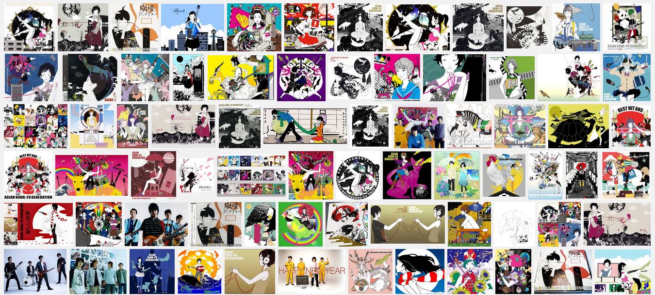
EGO Artist Inspiration -Nakamura Yusuke

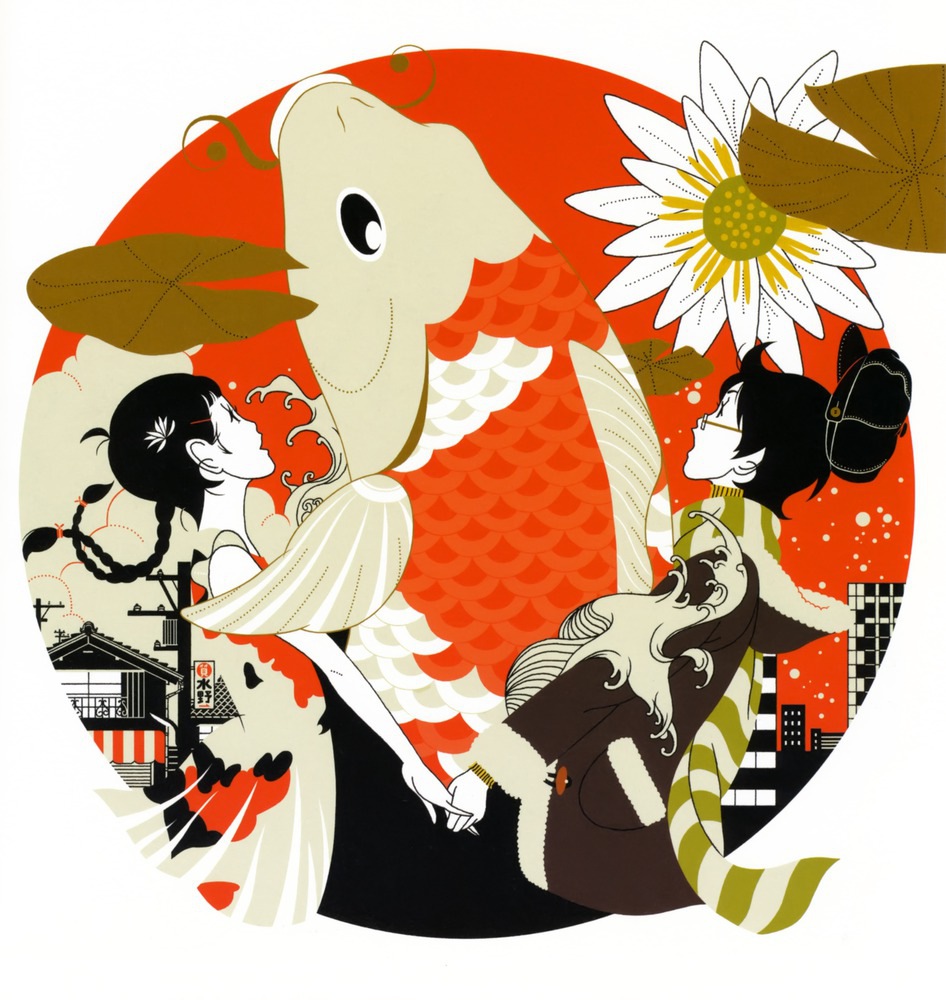
I have always liked the artwork by Japaneses artist named Nakamura Yusuke. He was a graphic artist. Nakamura’s art has been featured along with various other forms of media. And probably most known for his designs for Tomihiko Morimi‘s The Tatami Galaxy and Yoru wa Mijikashi Arukeyo Otome.

aaaaaa


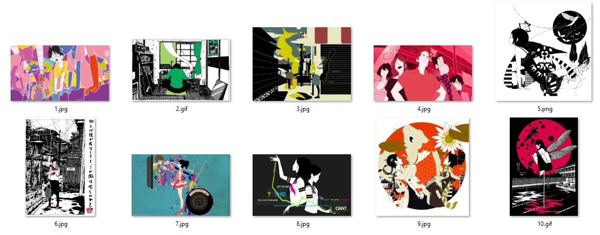
Above is a screenshot of some of his artwork. As you can see there are the clean, simple but fine line work and very bold use of colors. He uses mostly solid colors instead of gradients and many of his illustrations are black&white line work against saturated colors. I have always admired his style since he did all the album covers for the band called asian kungfu generation. Below is a screenshot of the google search result for AKG album. He did a tremendous amount of art work that he became so sophisticated in the ways he played with colors.

CaJPG


Rhyme-research & inspiration


FullSizeRender

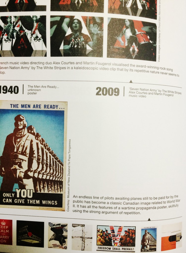
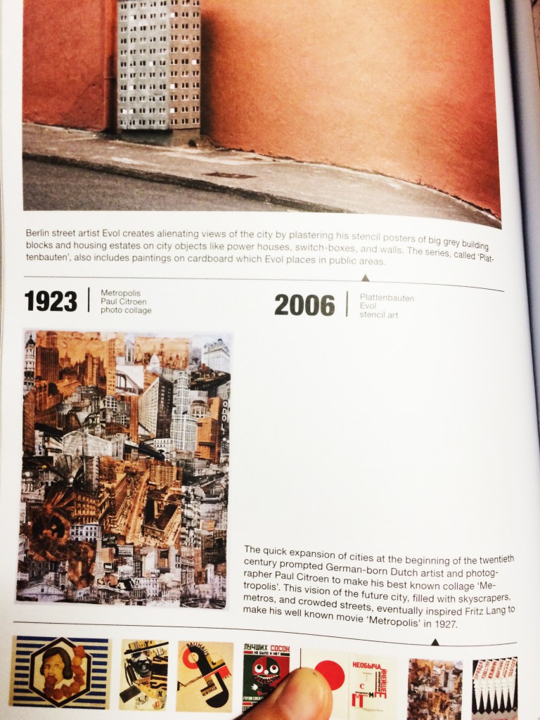
This is the book I looked into when I was researching for inspiration for the project. It’s called “I don’t know where I’m going but I want to be there,the expanding field of graphic design 1900-2020”  Paperback – October 18, 2011, by Sophie Krier (Draft Writer), Marjolijn Ruyg (Draft Writer) Graphic Design Museum printed by Pfset Yapimevi, Turkey.

This book consists of so many great examples of graphic design and below are some photos taken from the book. Besides that, there are more thumbnail images that inspired me on the rhyme composition as well. In fact, if given more time, I would like to experience more with the images.

FullSizeRender(1) FullSizeRender(2) FullSizeRender(3) FullSizeRender(4)  IMG_2776  IMG_2780 IMG_2781 IMG_2782 IMG_2783


IMG_2750

  Besides, I also looked into  a book titled “Index A” by Charles Wilkin, published Die Gestalten Verlag (April 15, 2003) “Index A is in essence a catalogue of thoughts, images and instinct collected and reassembled by American Charles Wilkin of Automatic Art and Design. With clients ranging from Coca-Cola to Urban Outfitters, Wilkin combines multiple layering of images and type reminiscent of David Carson. In an era of multimedia full of visually aware consumers and highly targeted marketing, Index A acts as a reminder of the increasing influence of design on the human culture and the individual expression in a very commercial world.’“

  It has great examples that inspired me too but I didn’t scan or take photos of the pages inside.


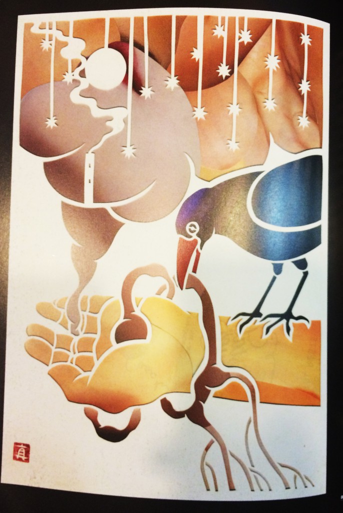
There was another book I found interesting as well. Besides its the nice colors in each picture, there is a concept of masking layers. And the composition of the images were inspiring.


IMG_2759IMG_2751 IMG_2752 IMG_2753 IMG_2754 IMG_2755 IMG_2756 IMG_2757

2D line inspiration & process


I found two interesting books on lines and compositions. They were written by Tony Robbin and John Cage respectively. As we can tell from the book covers, they were very different in the atmosphere.IMG_2172


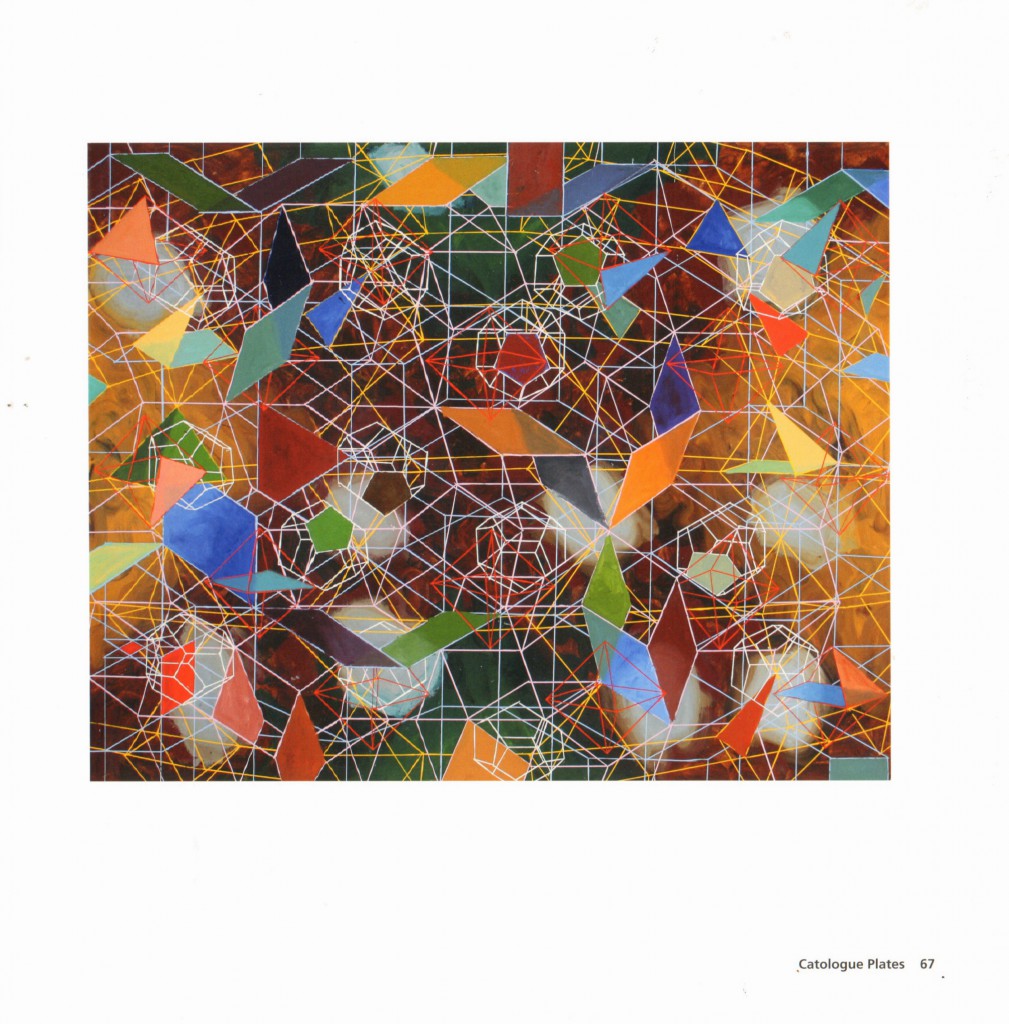
reference is taken from : Book Title “Tony Robbin: A Retrospective: Paintings and Drawings 1970-2010″ by Linda Dalrymple Henderson (Author), Robert Kushner (Author), Joyce Kozloff (Author), Tony Robbin ( Author) Publisher: Hudson Hills; First Edition edition (July 16, 2011)ISBN-10: 1555953670

About Tony Robbin: Tony Robbin is a pioneer in the computer visualization of four-dimensional geometry. Since 1981, his realtime rotation programs of four-dimensional figures have been useful for obtaining an intuitive feel for four-dimensional and quasicrystal space.

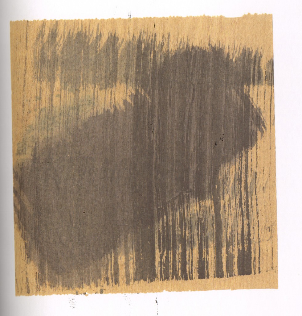
John Cage: Zen Ox-Herding Pictures Hardcover – October 7, 2009
by Stephen Addiss (Author), Ray Kass (Author) Publisher: George Braziller Inc. (October 7, 2009) ISBN-10: 080761601X
” This book brings together fifty never-before-seen watercolor images from the brush of renowned artist and composer John Cage. These pieces were initially considered a by-product of a 1988 Mountain Lake Workshop, test sheets used to experiment with the flow of color from Cage’s brush as he prepared for larger Zen pieces, but authors Stephen Addiss and Ray Kass unite them here to explore the influence of Zen in Cage’s life. They juxtapose the compositions with the Ten Ox-Herding Pictures, a series of images used to communicate the essence of Zen for nearly one thousand years. They refer fragments of Cage’s poetry and his many statements about Zen practice, providing a fascinating lens through which the reader can view the Mountain Lake Workshop paintings. Cage’s images seem to become mysterious echoes of the centuries-old Ten Ox-Herding Pictures themselves, images about searching for the path to enlightenment.” (http://www.amazon.com/John-Cage-Zen-Ox-Herding-Pictures/dp/080761601X/ref=sr_1_1?s=books&ie=UTF8&qid=1442143981&sr=1-1&keywords=John+Cage++Zen+ox+herding+picture)

John Cage was famous for his music and he was avanguard composer ”
From Publishers Weekly
“Known best for his music and performances, John Cage also painted and wrote extensively. Zen Buddhism influenced his approach to his work—nature as a path to self, collaboration in performance and happenstance in composition. The art and poetry in this book represent a collaboration both accidental and deliberate between Cage, Addiss and Kass. Cage was working on another series of paintings when he marked a series of brown paper towels. Artist Kass and artist/composer Addiss ordered the towels into a sequence, then Addiss culled Cage’s writings to create a cutup or recomposition of found words and phrases into a new work. Cage recognized the importance of the remix long before it became fashionable. The accidental circumstances of this work’s assemblage doesn’t diminish its charm or delicacy. The introductory material provides essential context, but the best approach may be to read and view the work, read the essays, then review the piece again. Addiss and Kass prove the continuing relevance of the tradition of ox-herding as a format for teaching and connecting the heart to the mind. 50 color and 12 b&w illus. (Oct.)
Copyright © Reed Business Information, a division of Reed Elsevier Inc. All rights reserved.

First of all, there were some of the images I really liked in the first book so I scanned them in. The simple geometrical shapes created a 3 dimensional space. They might look plain at first glance, but then I started to look into all the details and realized just there were so many interesting arrangements of elements creating several layers.  MDS00004 MDS00003 MDS00001 MDS00002  MDS00005

John Cage: the choice of the yellowish paper and lines were very different from Tony Robbin  The atmosphere of Zen as he mentioned. MDS00007 MDS00008MDS00006As a matter of fact, I didn’t get to spend more time on exploring similar effects from these books. If I had more time, I would definitely try out more lines with 3 dimensional space and on more types of paper.


Process

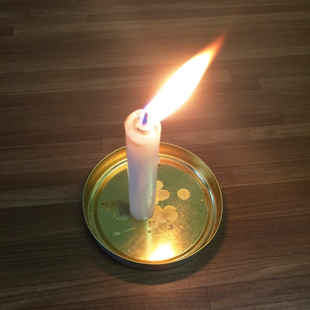
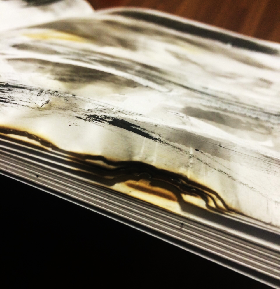
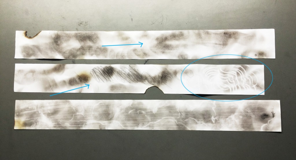
fumage: I fixed the candle to make it standing and then I could move my paper over the fire to get the smokes on the strips. When I first tried out this technique on my hard copy journal, several pages were burnt though. Therefore, I cut out the lines instead.

IMG_2141 IMG_2142 FullSizeRender(2)

In the image below were experiments I did with fumage

When you move the paper fast enough, you will get the intermittent effects

Then I erased the color with different things such as pen, tissue paper and my finger…

Drew on it using charcoal as well

the one below I was trying to create the clouds and raining effects to it

IMG_2373


I also looked into straight lines and how they could be possibly arranged.

Below was a photo of the carpet at SAC (originally colorful)  I think it looked great and kind of remind me of the scan bar codes.

FullSizeRender(1)


This one was one of the experiment I did. I was wearing a stripped dress at that moment so I took this photo.FullSizeRender

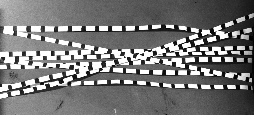
And then I cut the lines into equal width and aligned them in all kinds of way to explore.

54

19


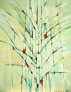
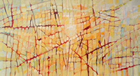
Besides, I also found these amazing art works online by Filomena de Andrade Booth. As a matter of fact, one of my line was inspired by her works. There were not  much information on her but she being an American contemporary artist.

IMG_2146 IMG_2145


images referenced from: http://filomenabooth.com/MDS00009


After I completed all my lines, I cut out the small black papers with the emotions written as I didn’t want to write directly on the lines.


FullSizeRender(3)


2D lines artist research-Andy Warhol

LINE PROJECT

a


Image referenced from: revolverwarholgallery About Andy Warhol  https://revolverwarholgallery.com/andy-warhol/


Andy Warhol (American, 1928-1987)

He was one of the leading artists of 1960s Pop Art Movement. He explored in a wide variety of art forms, including performance art, filmmaking, video installations and writing. Andy Warhol was generally known as a successful commercial illustrator.

b c


Image referenced from: The Warhol Campbell’s Soup: Ode to Food

http://www.warhol.org/education/resourceslessons/Campbell%E2%80%99s-Soup–Ode-to-Food/

Image referenced from: Pinterest  https://www.pinterest.com/pin/419679258996976244/


In 1962, he exhibited the now-iconic paintings of Campbell’s soup cans and he also used vivid and garish colors to create celebrity portraits. “My idea of a good picture is one that’s in focus and of a famous person.”, he said.


Process

For most of the twentieth century, screen-printing techniques were kept confidential. It wasn’t until the 1960s, with the help of Andy Warhol, that it became a more widely recognized art form.

He produced silkscreen paintings based on photograph and used its efficiency to his advantage to create multiple copies of the same composition in different colors.

d


Eight Elvises was sold for a reported $100 million

Image referenced from: Total Histroy Eight Elvises  http://totallyhistory.com/eight-elvises/


The concept of speed was depicted simply by decrement of space in between each print.
e


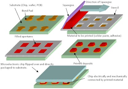
Image referenced from: microstencil What is stencil printing? http://spc.microstencil.com/tutorials/what-is-stencil-printing

The screenprinting process is a form of stenciling, in which a stencil is placed on top of a sheet and then ink is pushed through the stencil to create an image.


Shadows

“Isn’t life a series of images that change as they repeat themselves?”

f


Image referenced from: AZZURRO 23 MAY ANDY WARHOL, CHASING SHADOWS IN PARI  http://azzurrodue.com/andy-warhol-chasing-shadows-in-paris/


I saw the quote above and wonder maybe this was what Andy Warhol expressed in his work” Shadows”. There were in total 102 parts exhibited as one work displayed like a long film strip. There were produced using his famous process of silkscreened and hand painting.

They were based on photographs of real shadows taken in The Factory (his studio in NYC)

There were alternate between positive and negative imprints with range of hue. Seriality and repetition created visual music, artwork full of mood and mystery. Following his previous experiments on abstraction e.g. Oxidation

Inspiration from the Shadows for me was that he made use of the photograph taken of real life. He chose the specific part of the shadows and combined different colors to express his emotion and feeling. With black and white contrast in the variation of hue background, a strong yet mysterious atmosphere emerged.  All the paintings were displayed in a strip, creating a flow with vitality, symbolizing ups and downs in life.


g h

Oxidation also referred as Warhol’s Piss Paintings

Generally attributed to 1977-78

Canvas pre-coated with copper painted by Warhol. Uric acid would oxidize the metal in the copper ground, causing it to discolor, allowing patterns to be created according to the ‘movement’ of the ‘painter’. He experimented with both pattern and coloration by using a variety of metallic background paints and varying fluid and food intake.

May be inspired by Pasolini’s film, Teorama (1968) where a man urinated on a canvas in search for ultimate methodology and activities in sex clubs and gay bathhouses.

Image referenced from: christies the art people Andy Warhol 

http://www.christies.com/lotfinder/paintings/andy-warhol-oxidation-painting-5074062-details.aspx

Image referenced from: Study Blue https://www.studyblue.com/notes/note/n/final-2/deck/6214367

From my point of view, this was experiment Andy Warhol carried out on the chemical reactions. Since the movement of the painters wasn’t fixed and the exposure to the air made a great difference on the outcome of the art work, they were in a sense unpredictable and spontaneous and adventurous as one may say.


i j


Image referenced from: Pinterst https://www.pinterest.com/hayetdeb/rorschach/

Image referenced from: The Warhol Rorschach, 1984 http://www.warhol.org/collection/art/work/1998-1-297/


Rorschach

These paintings were achieved by painting on one side, and folding vertically to imprint it on the other half. Andy Warhol used this pour-and-fold technique to obtain the symmetrical images that appeared somewhat resembled body parts.

This technique was modeled on the famous “inkblot” test invented by the Swiss psychiatrist Hermann Rorschach. The actual test provides ten standardized blots for a patient to decipher to interpret about the subject’s personality, intelligence and sexual proclivities.

The research brought me back to the definition of automatic drawing and realized the similarity of them. We draw or pour ink spontaneously and let our heart lead the way. The outcome in some level reveals something deeper about us.


 Links to other posts:

2D LINES EXPERIENMENT (including stencil printing inspired by Andy Warhol)

MORE LINES!