EGO Process

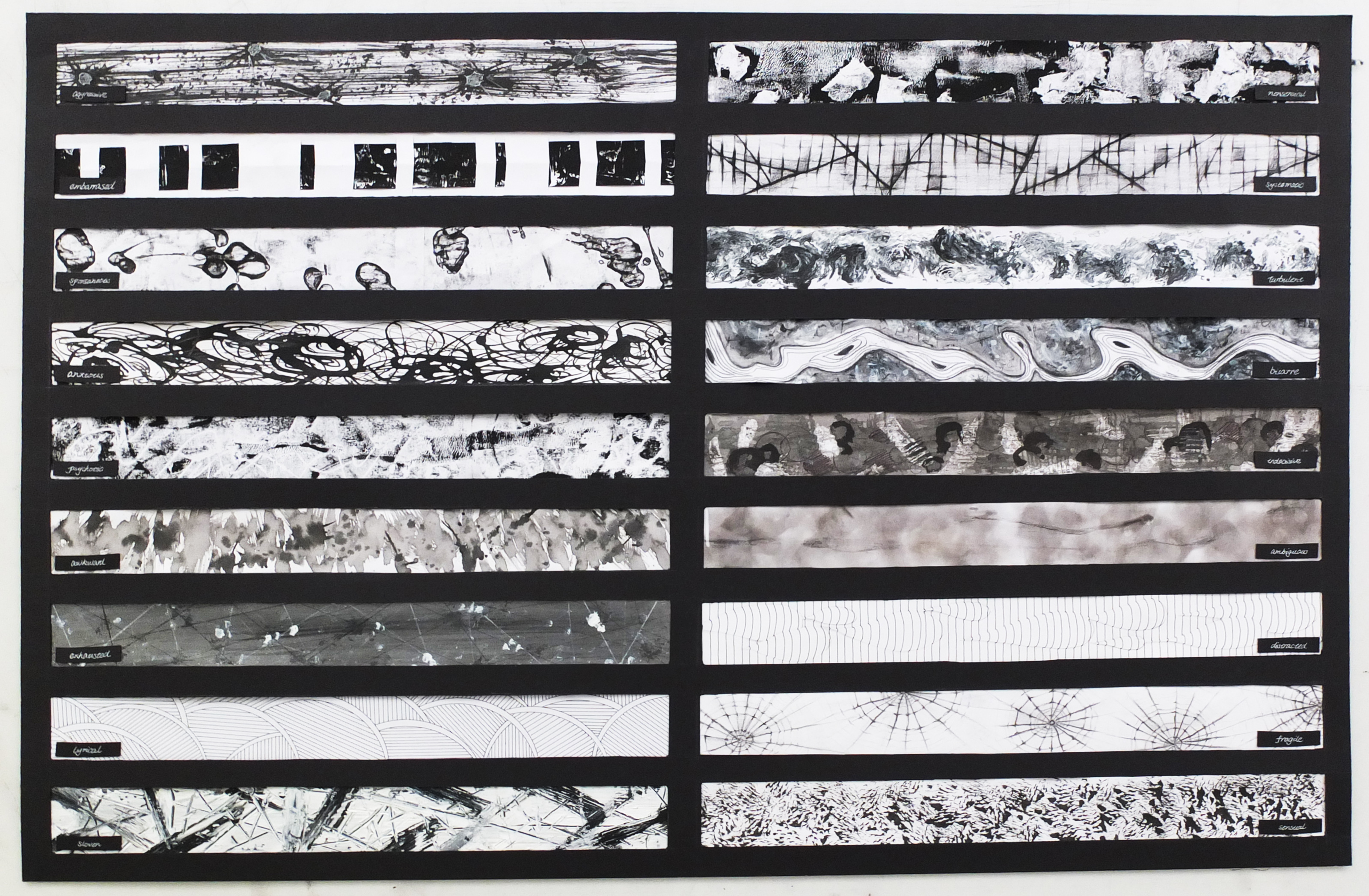
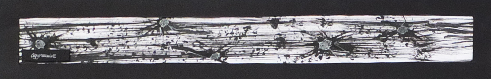
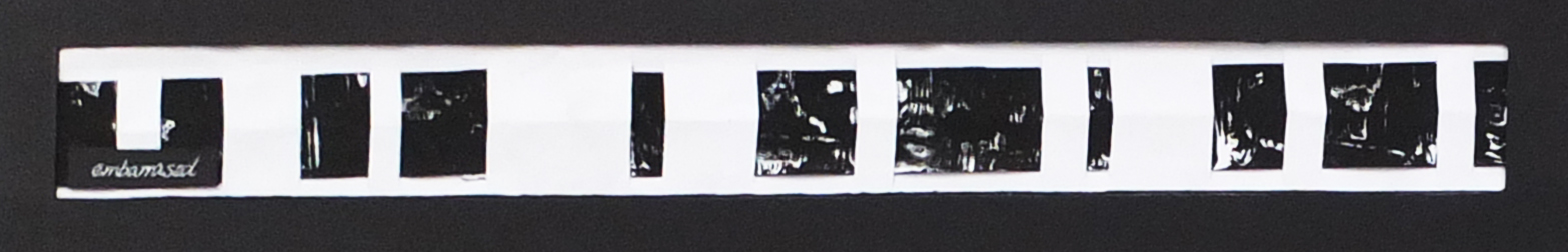
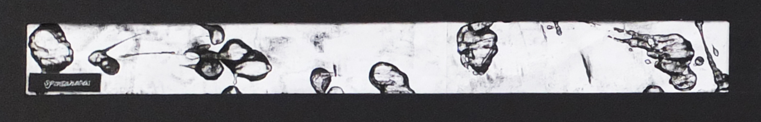
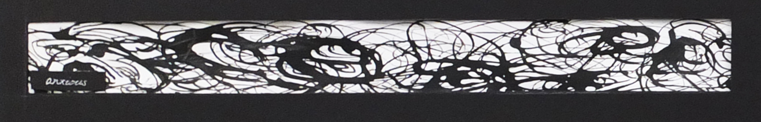
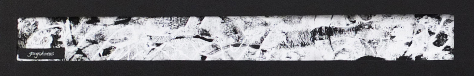
Process for each line

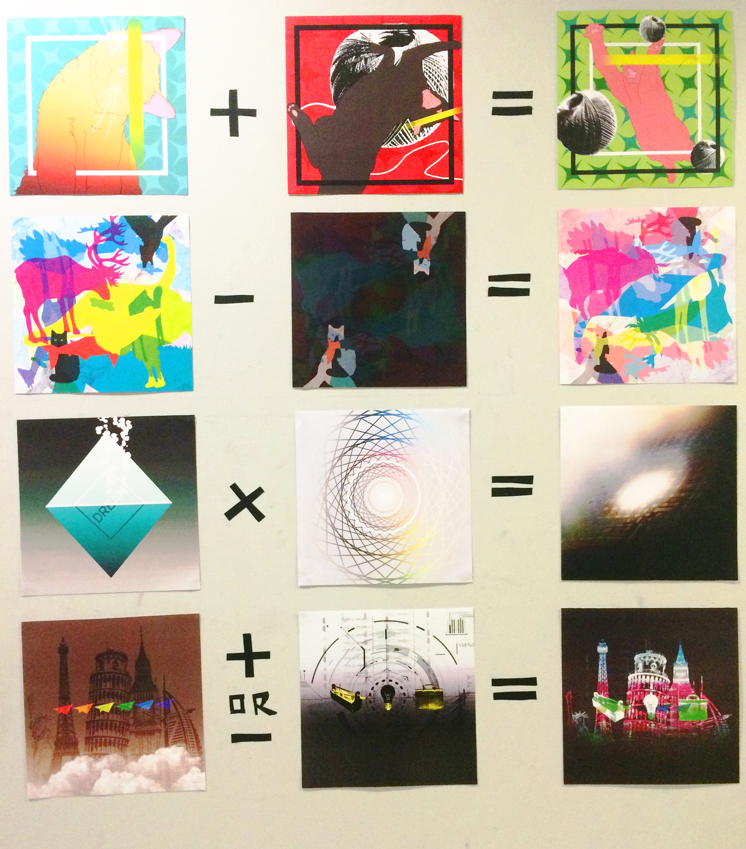
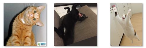
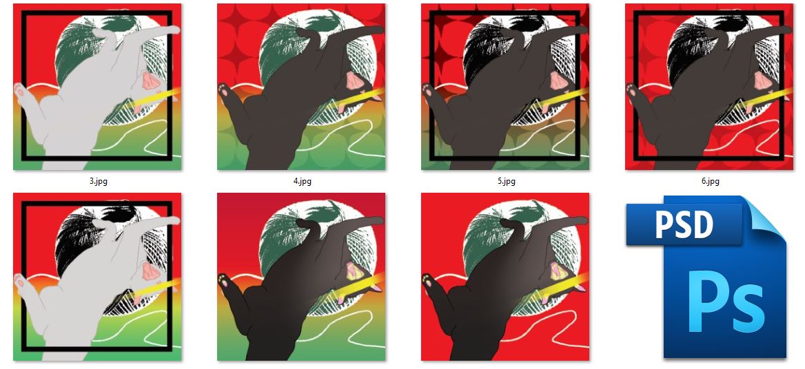
The first line is based on photograph of the cats as shown below. With the outline drawn out, colors were added as well. The square boxes  were then added but with some parts erased to create an illusion of distance. The cats were drawn in a very flat 2d style so the boxes may help to create sense of space. The second one also contained a yarn ball photoshoped from a photograph.  For the last one, the ball in front was applied with motion blur…


Capturecurious


5


3


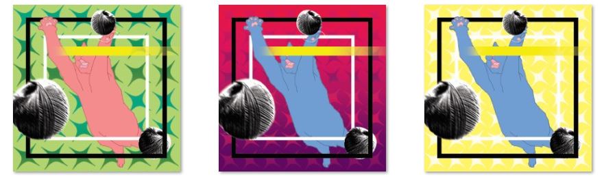
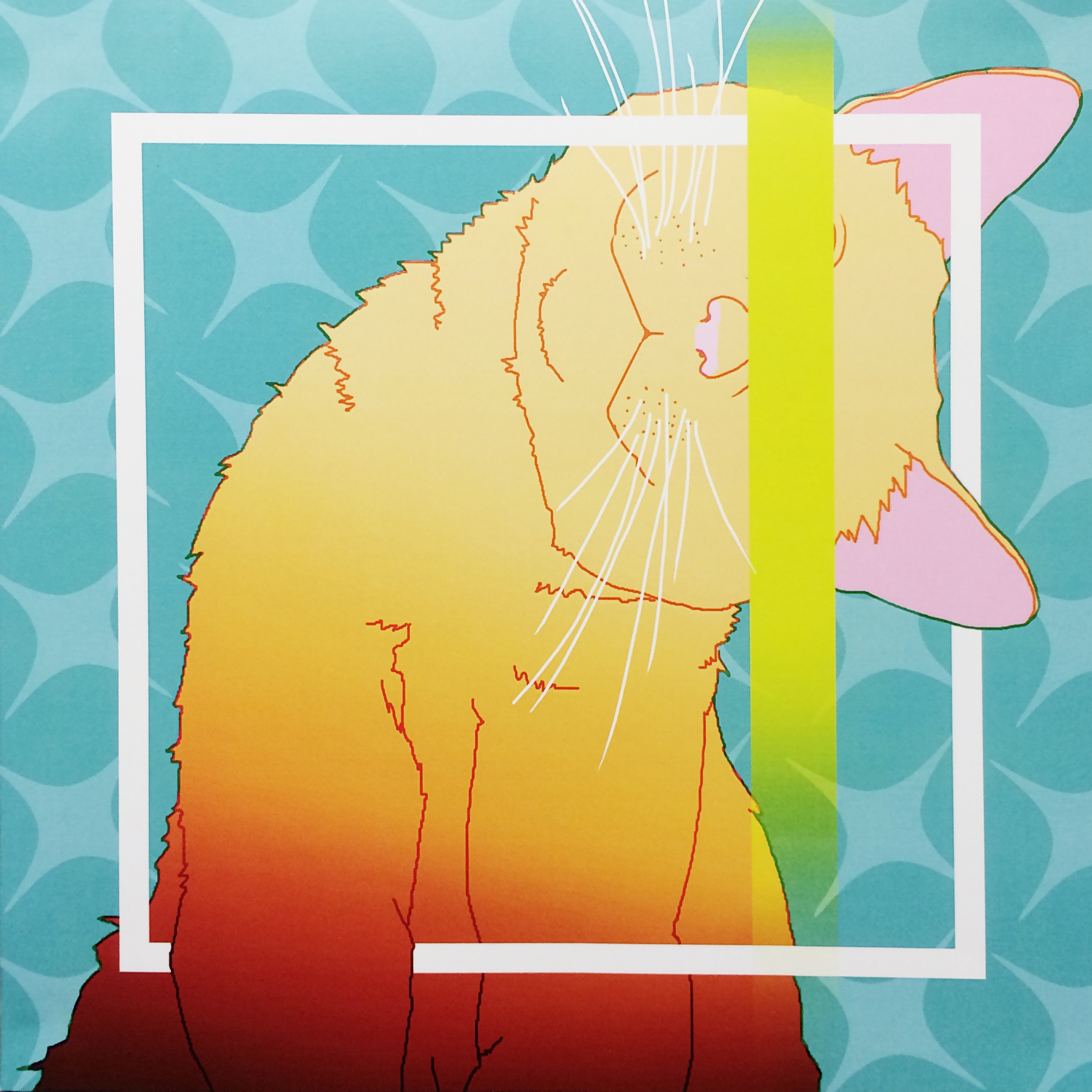
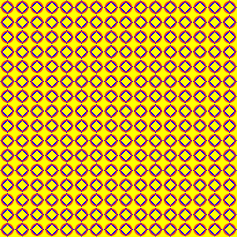
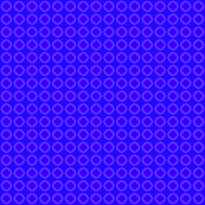
For the second line, as mentioned, it was about manipulation of blending modes of layers and colors. Variation to be chosen potentially was shown below. ad

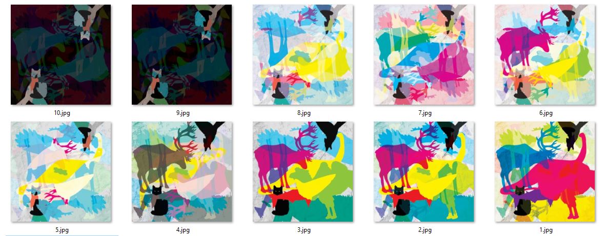
And a simple cut-down process is as shown below. Starting with textured background, arranging the silhouettes of animals so that they look balanced and assigned colors to them. Then changed some of the blending modes of the layers and then duplicate the entire composition, rotated or fliped to explore…as well as changing colors and blending modes.

There were lots of trials and errors in the process and frankly speaking quite challenging to achieve the right balance of cold and warm, solid and translucent colors…but they turned out good. And it is in fact efficient in a sense that you could get three very different outcomes through editing one file.


Capture


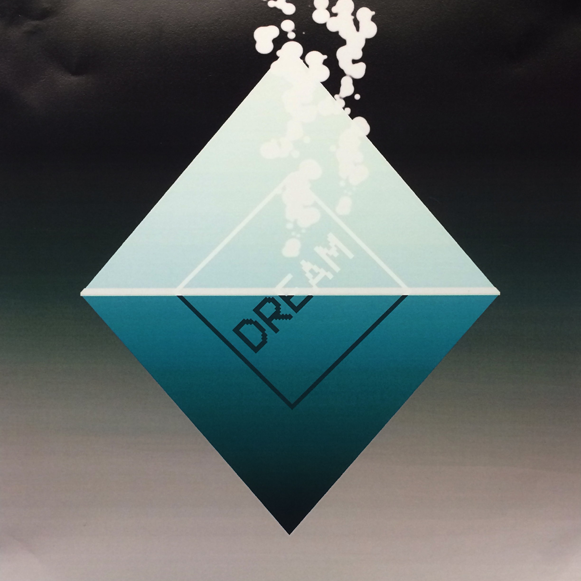
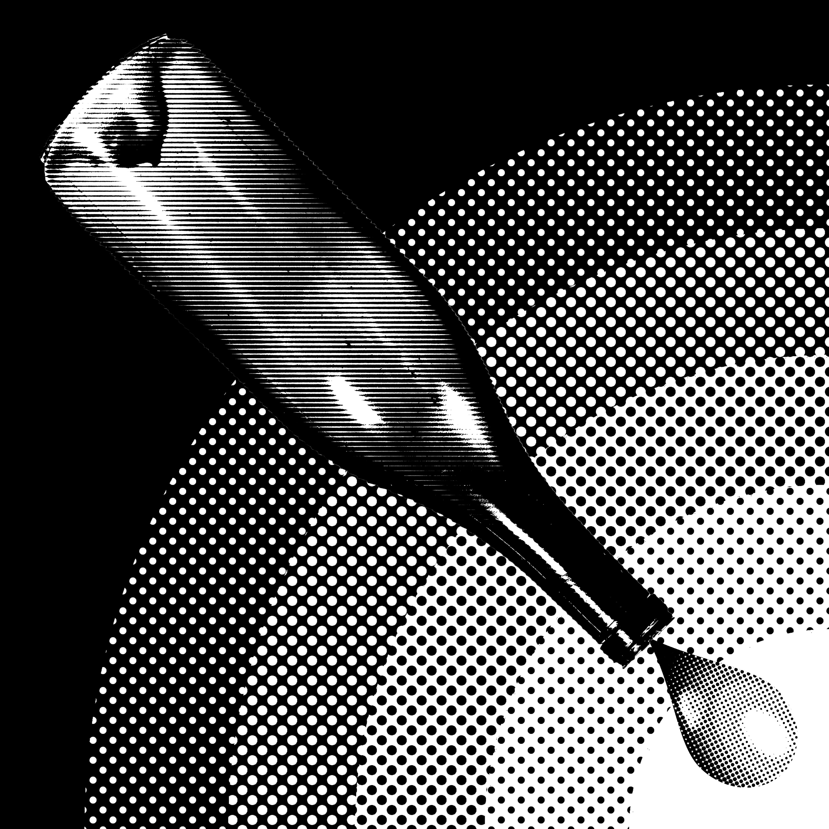
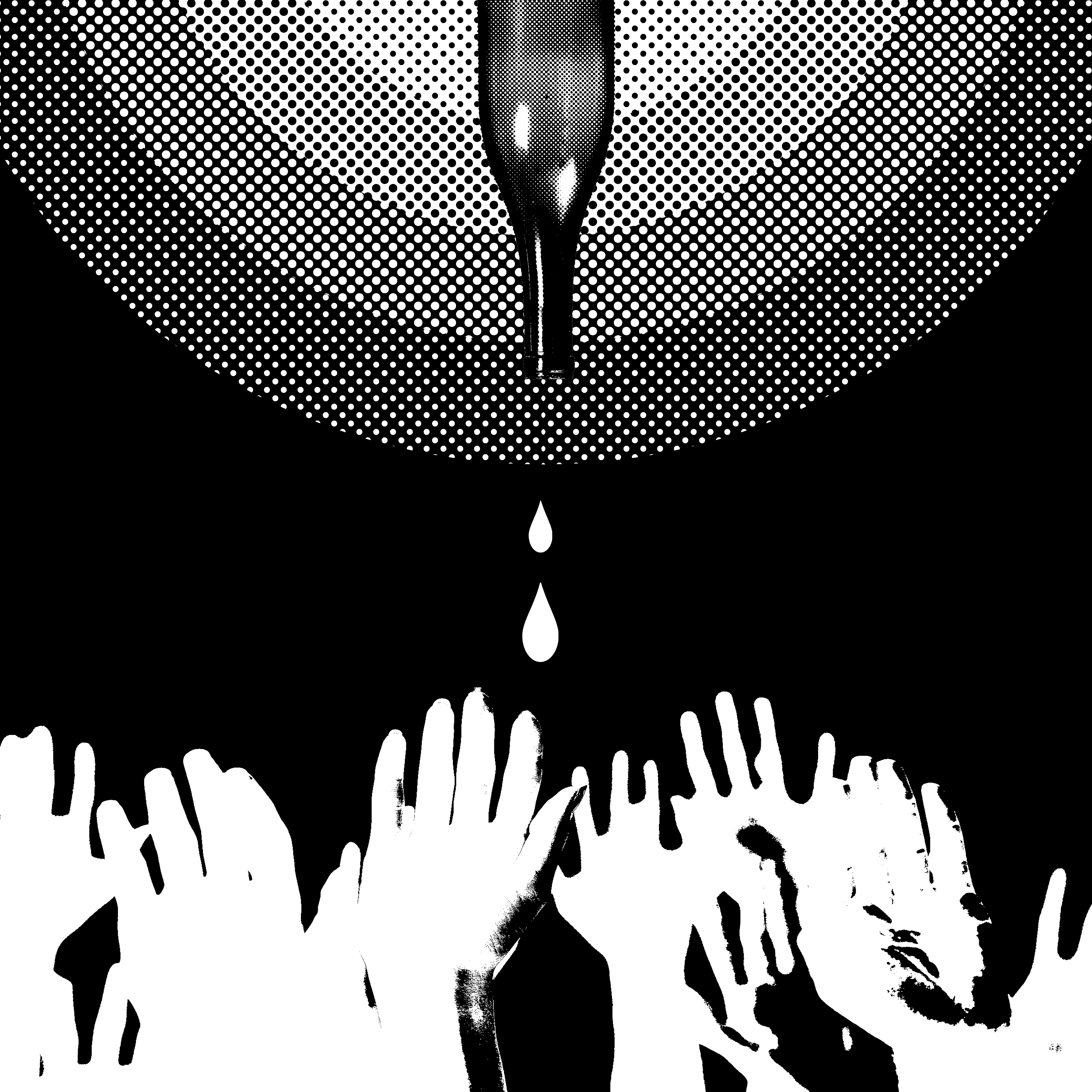
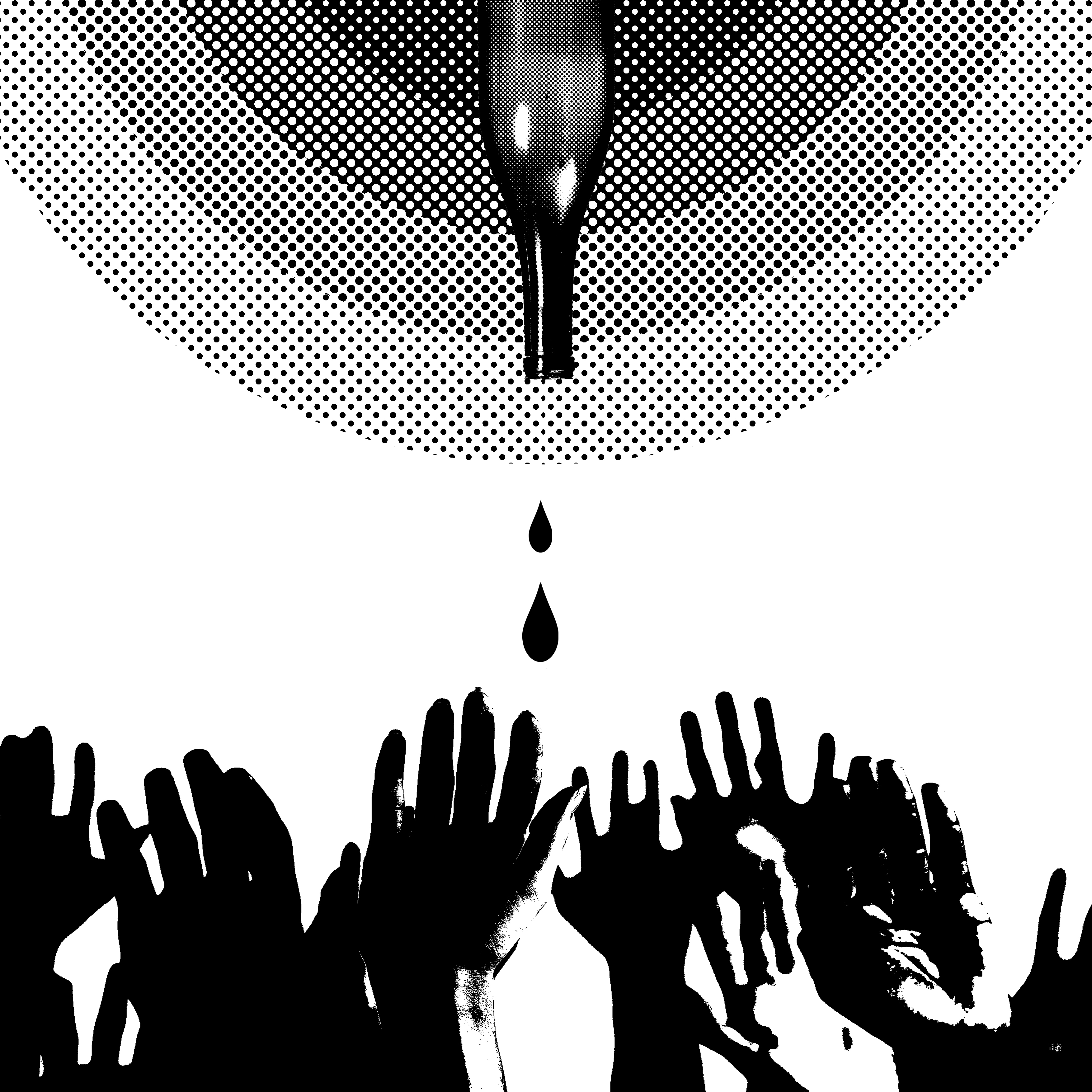
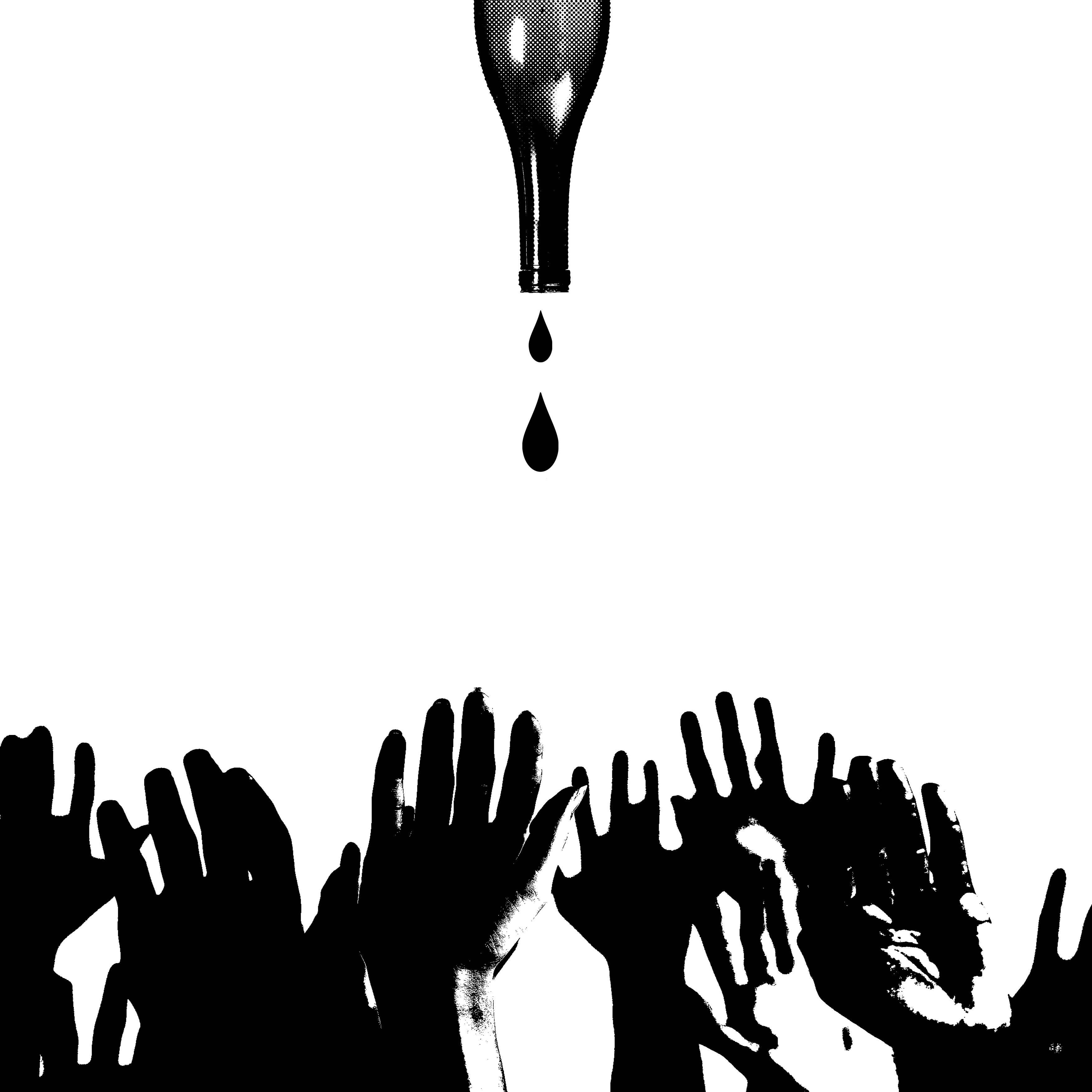
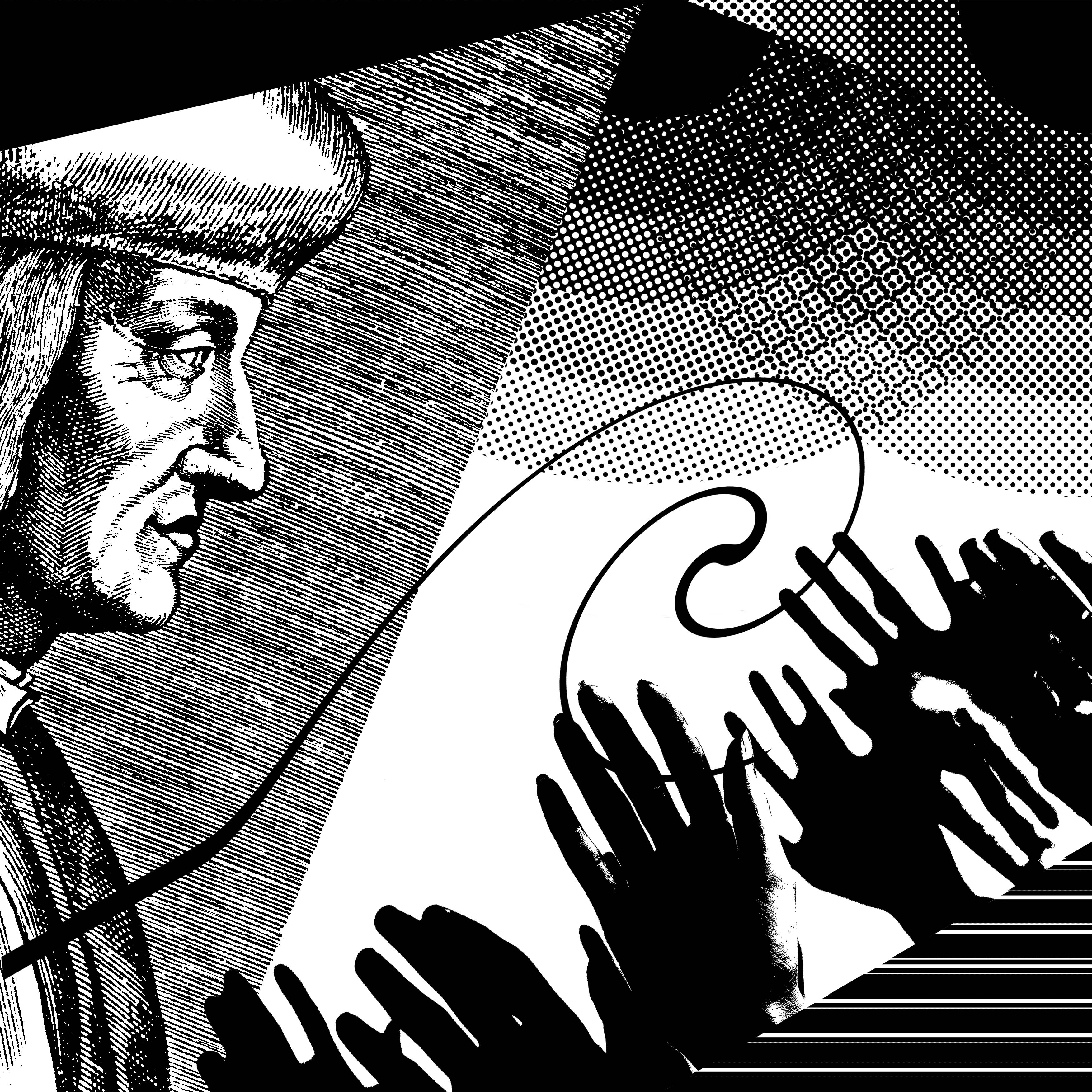
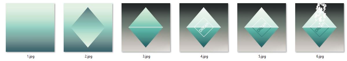
For the third line…the image of the hands was actually my very first tryout on this project. The bright yellow and lighter blue is contrasting well but somehow I felt there was something missing.

4BELIEF

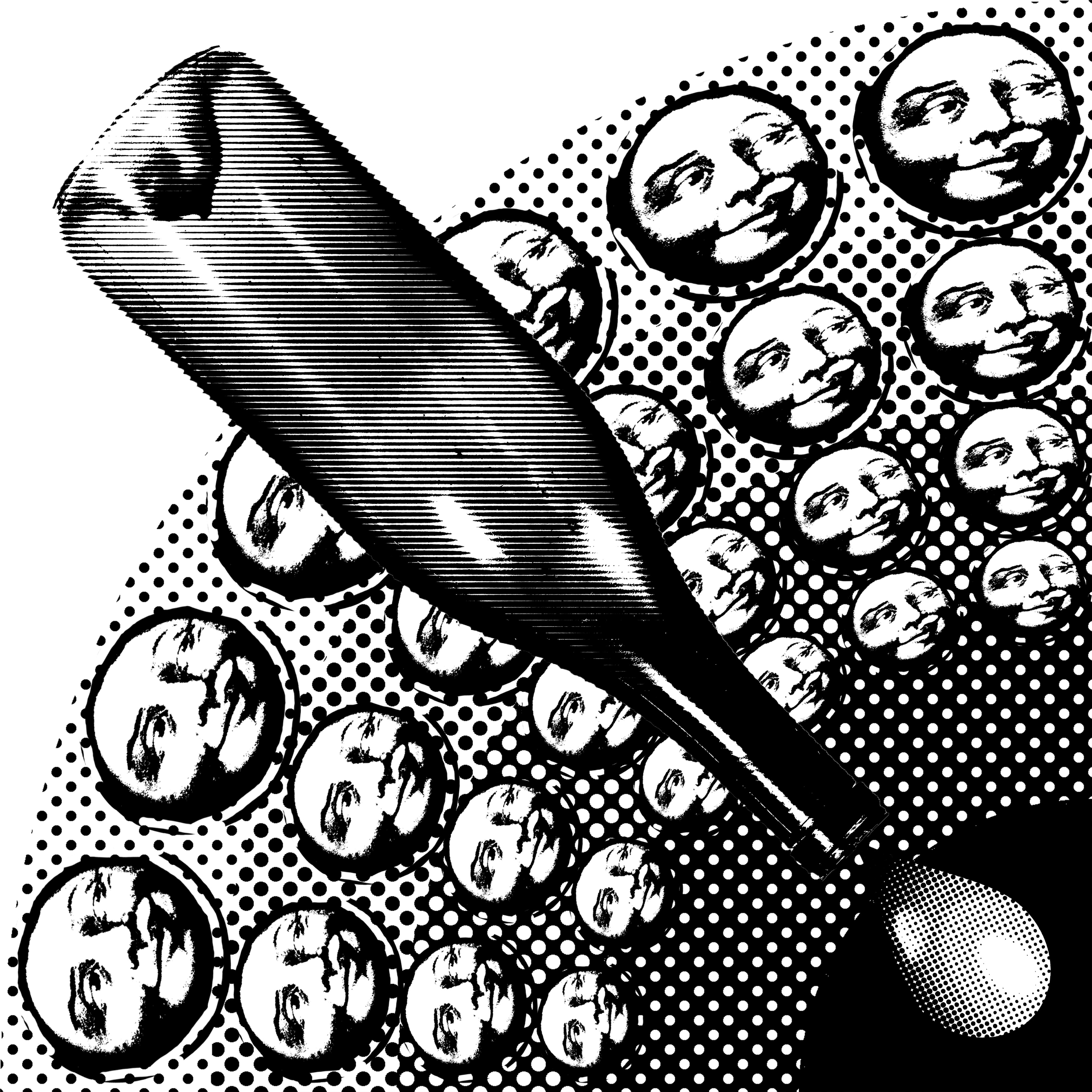
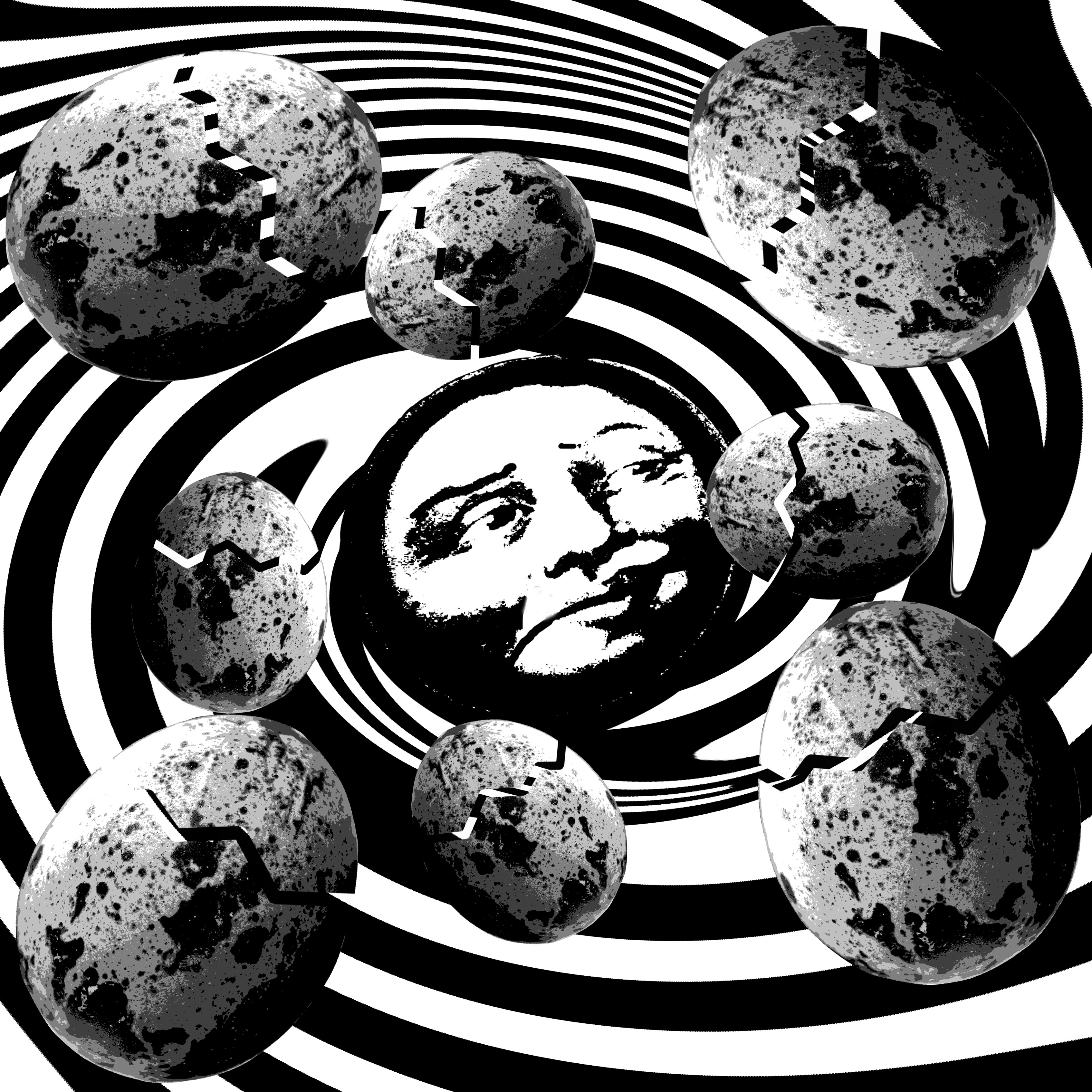
So after a while I went on with another design but with the same concept of a melting sugar cube. The processes were shown below and it was quite self-explanatory.

Capture

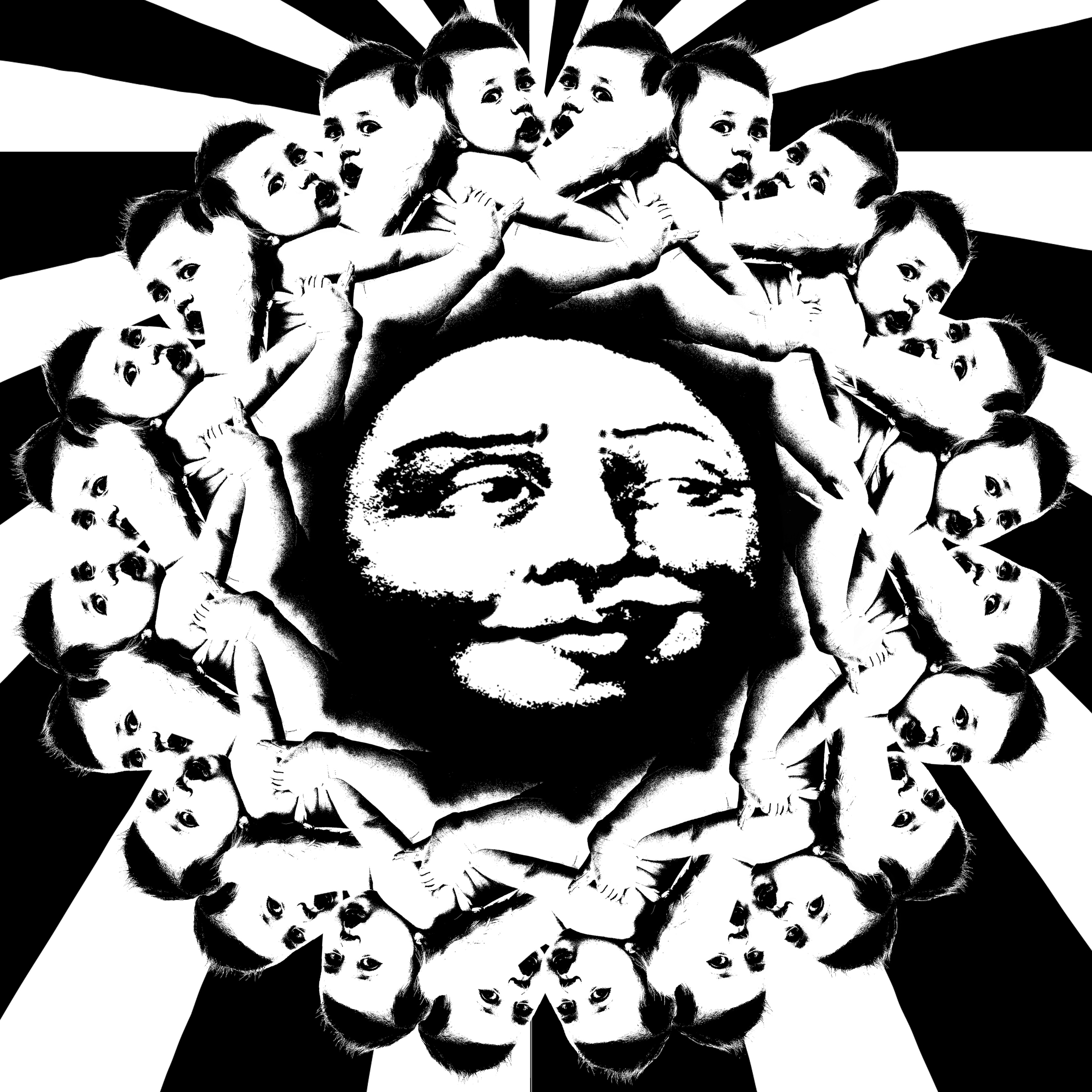
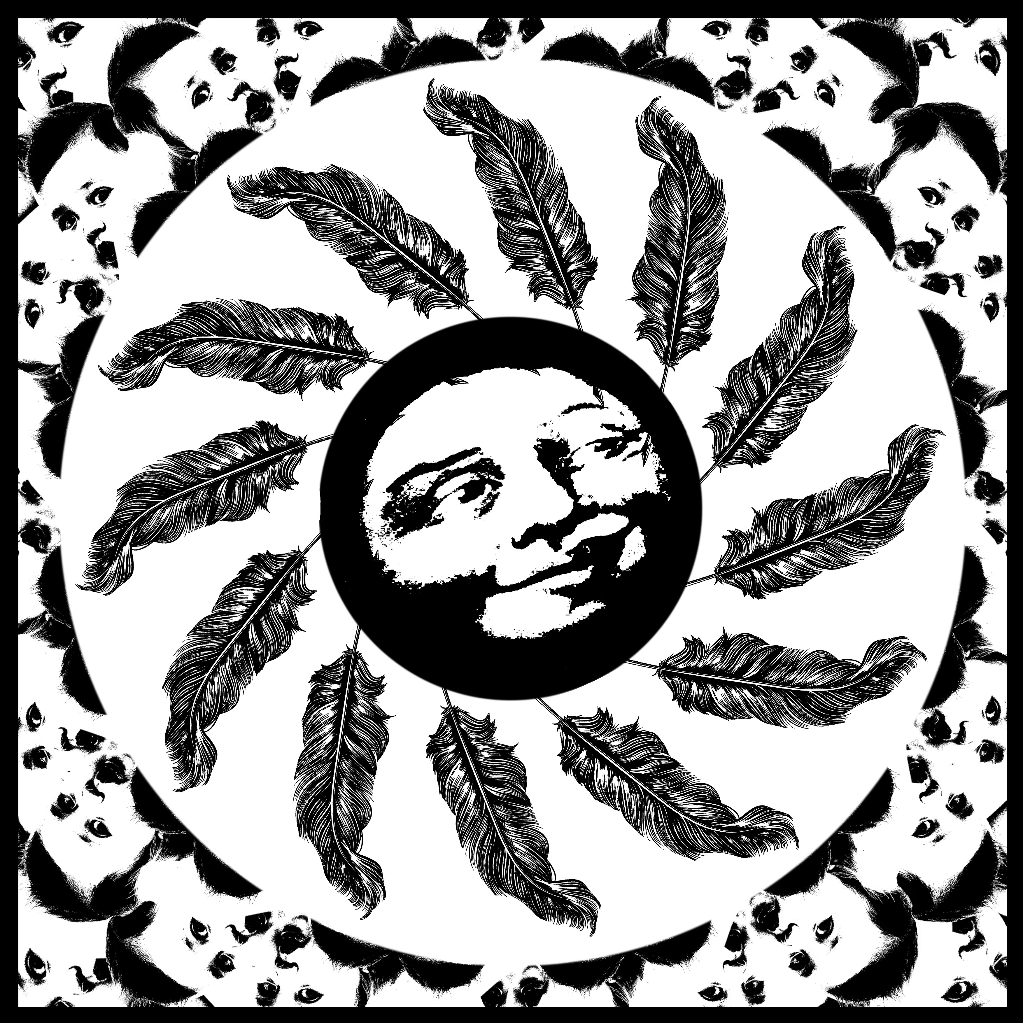
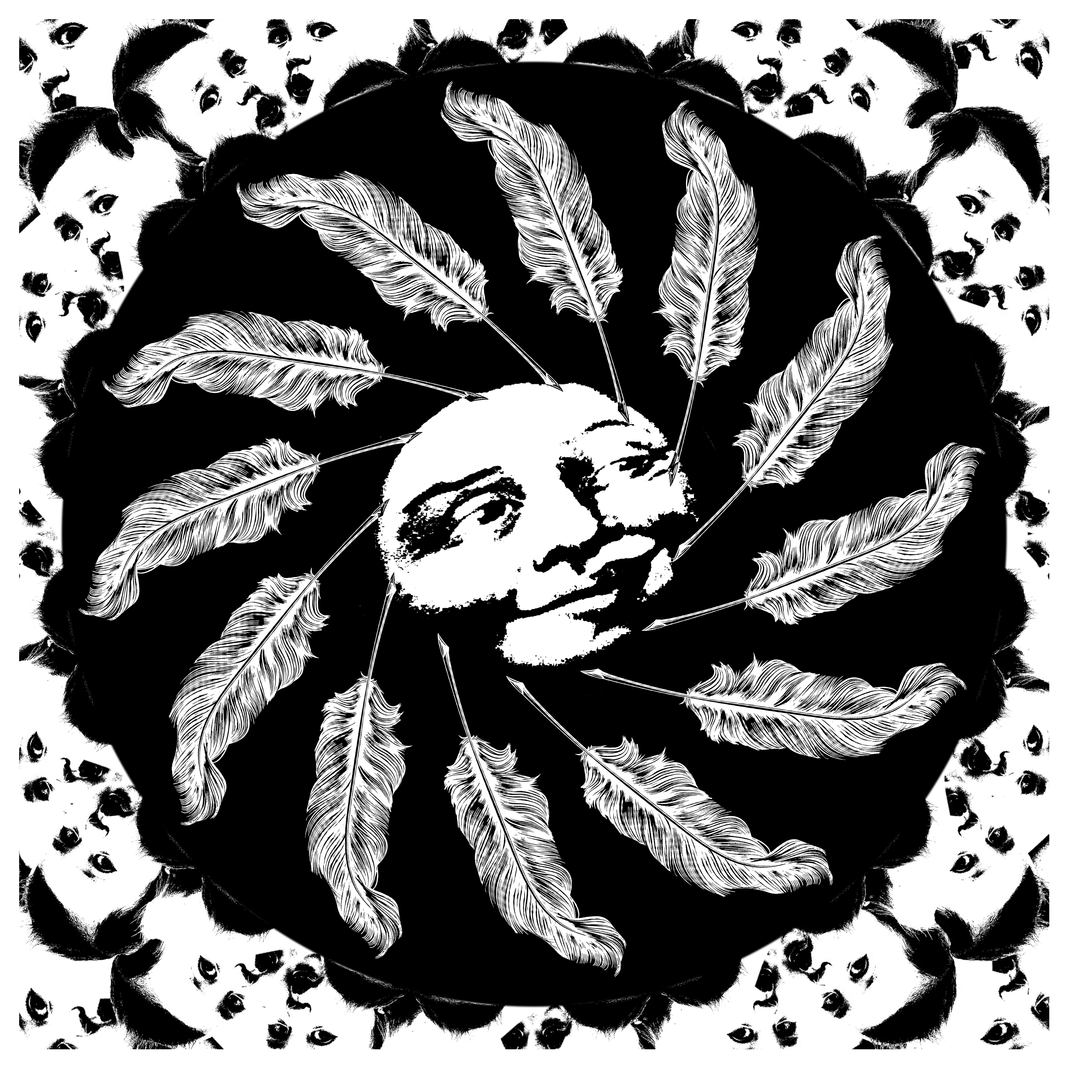
And for the word “Perseverance” I wanted to show the concept just through making a tedious and time-consuming design.


8


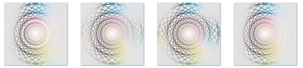
It started with a simple square on a grey background and all that left was repetition of duplication, rotation and scaling.  After that colors were added and as well as the white highlight.

Capture


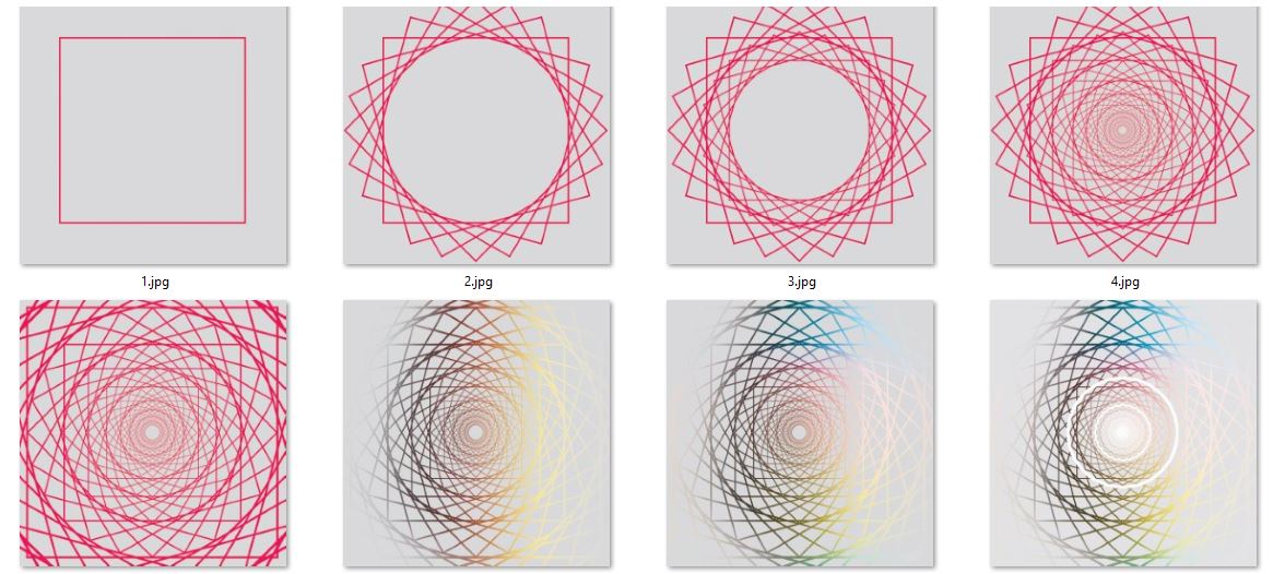
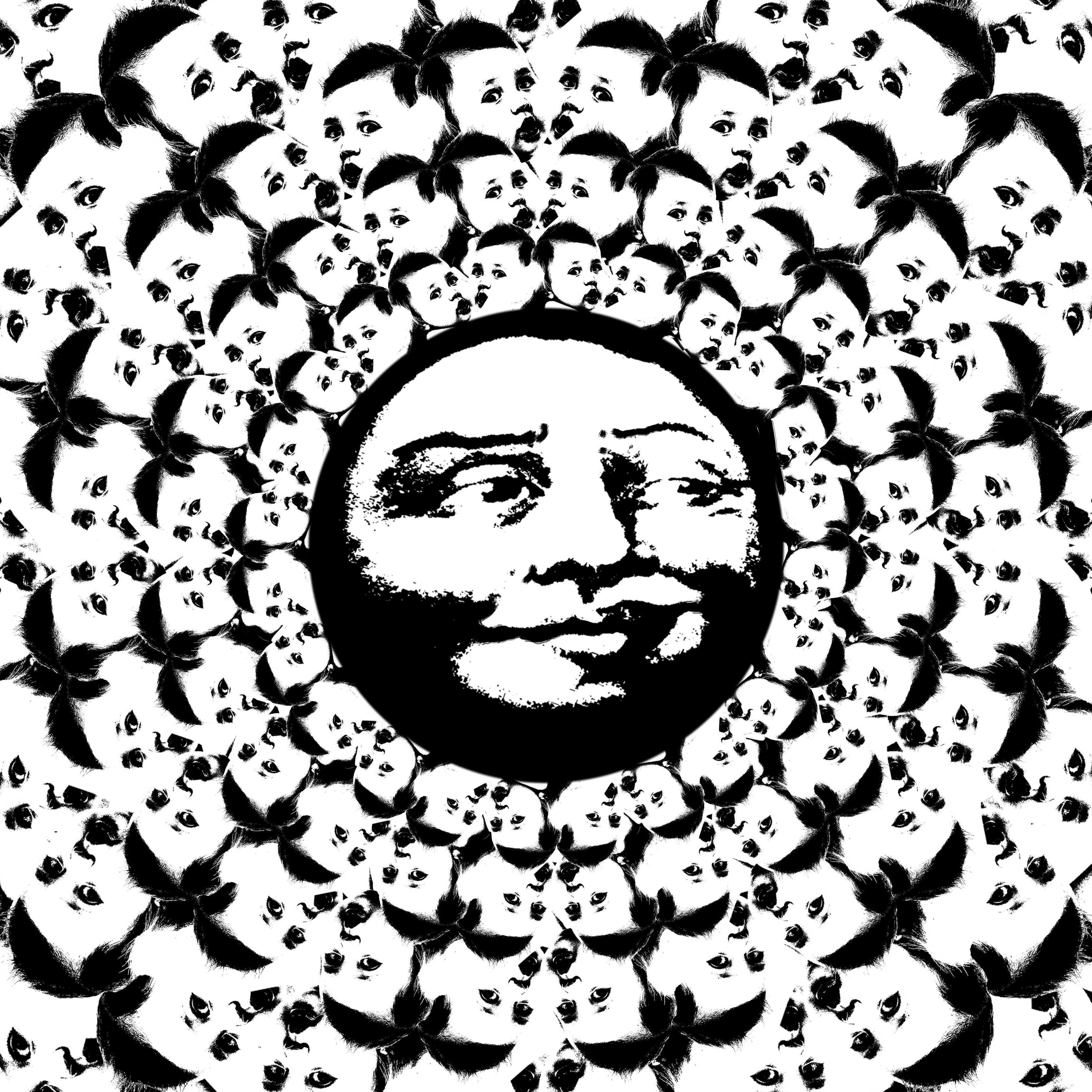
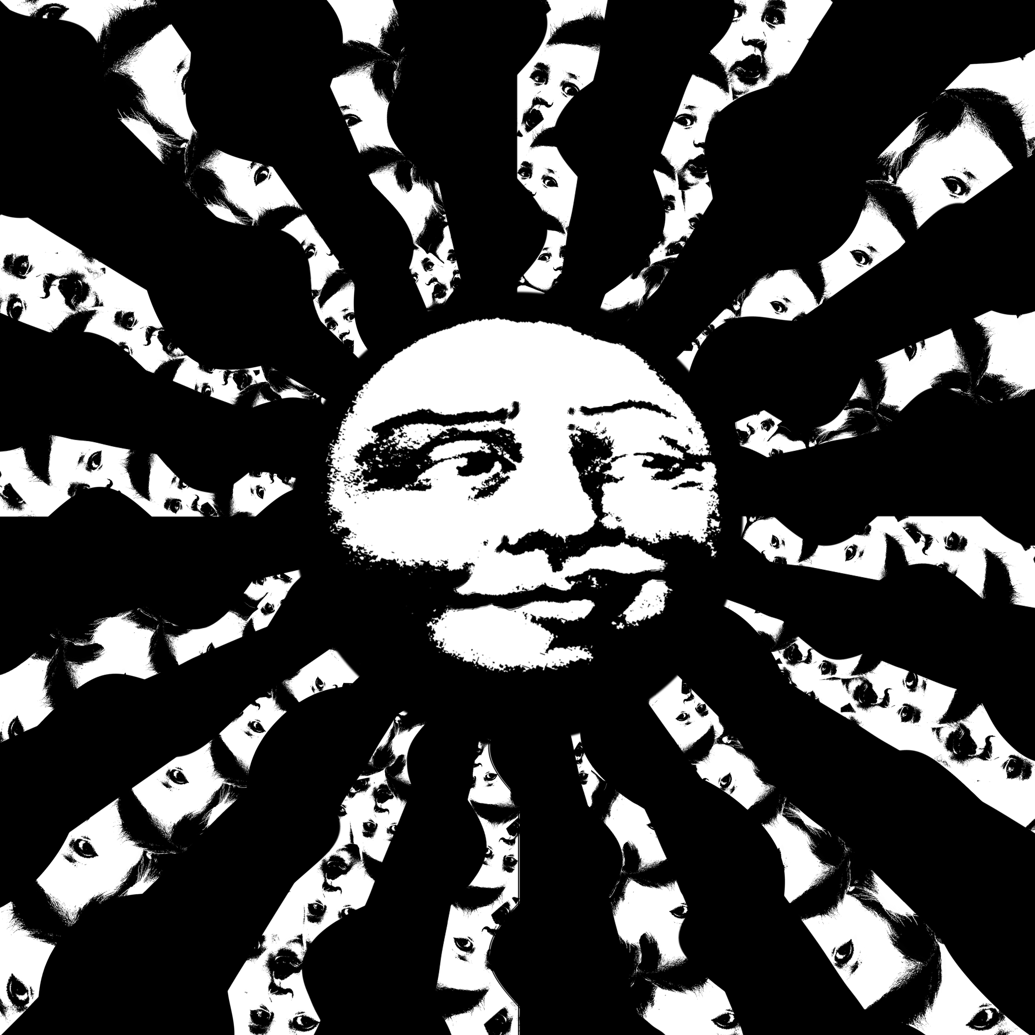
Below is another tedious design…

6

And the process:

Capture


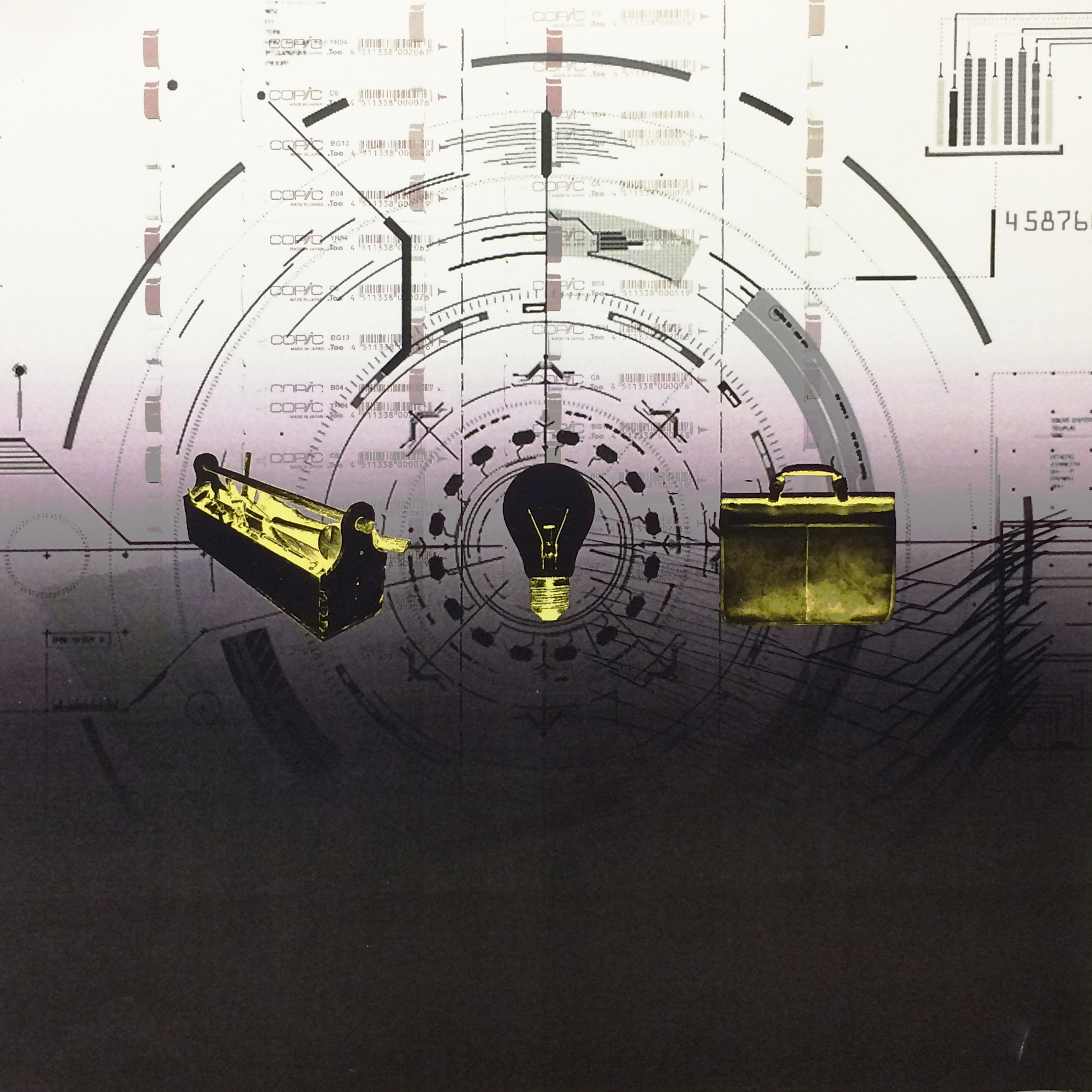
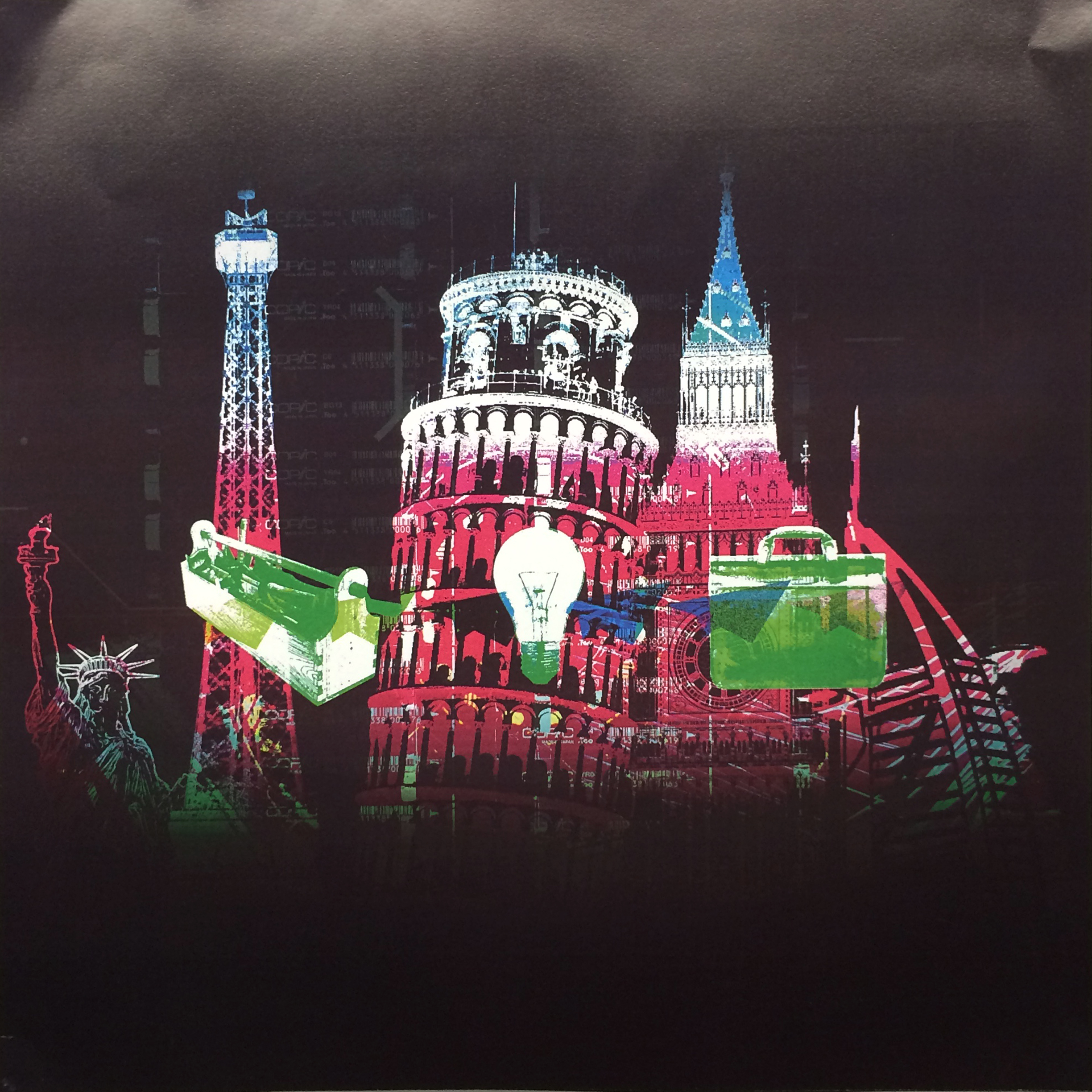
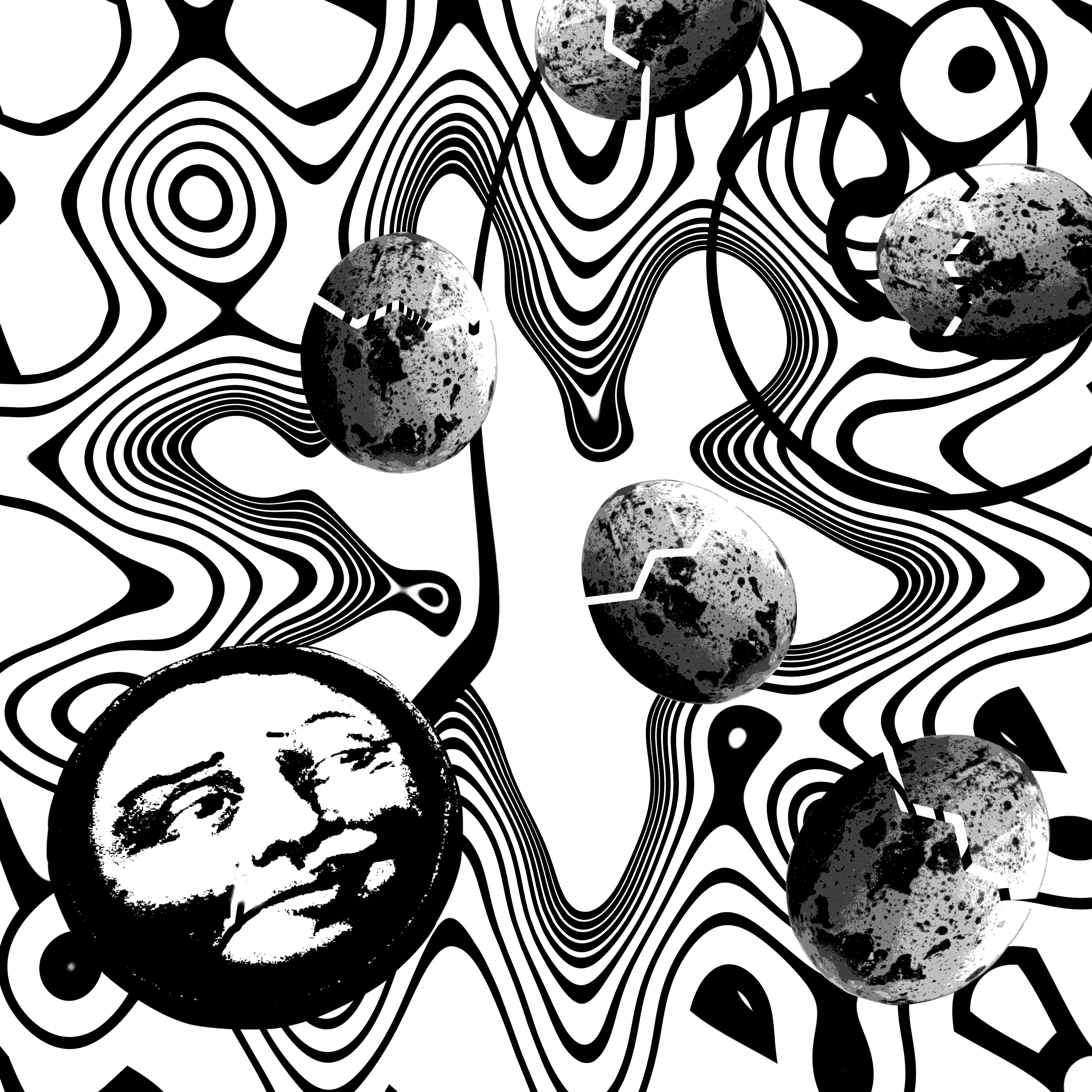
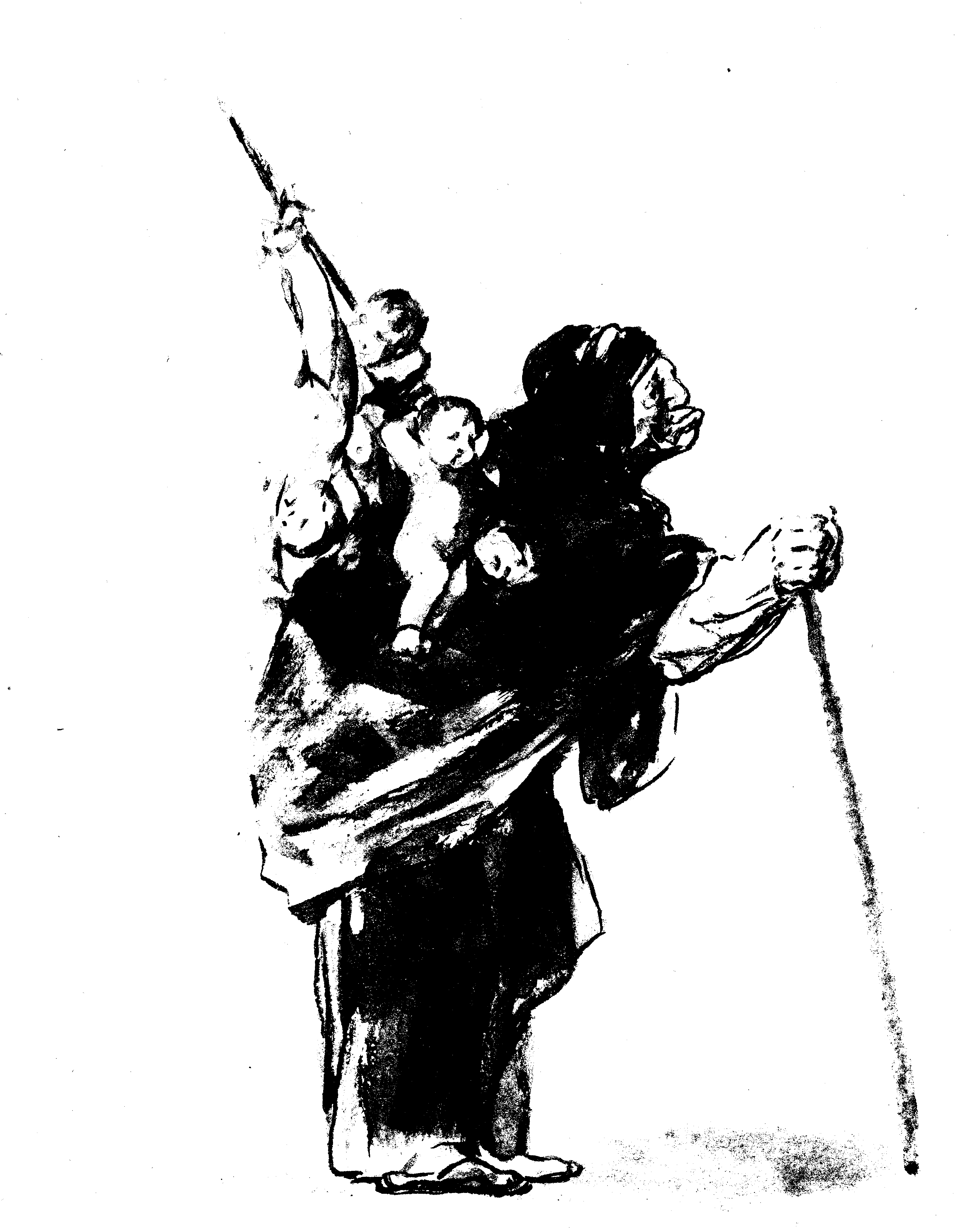
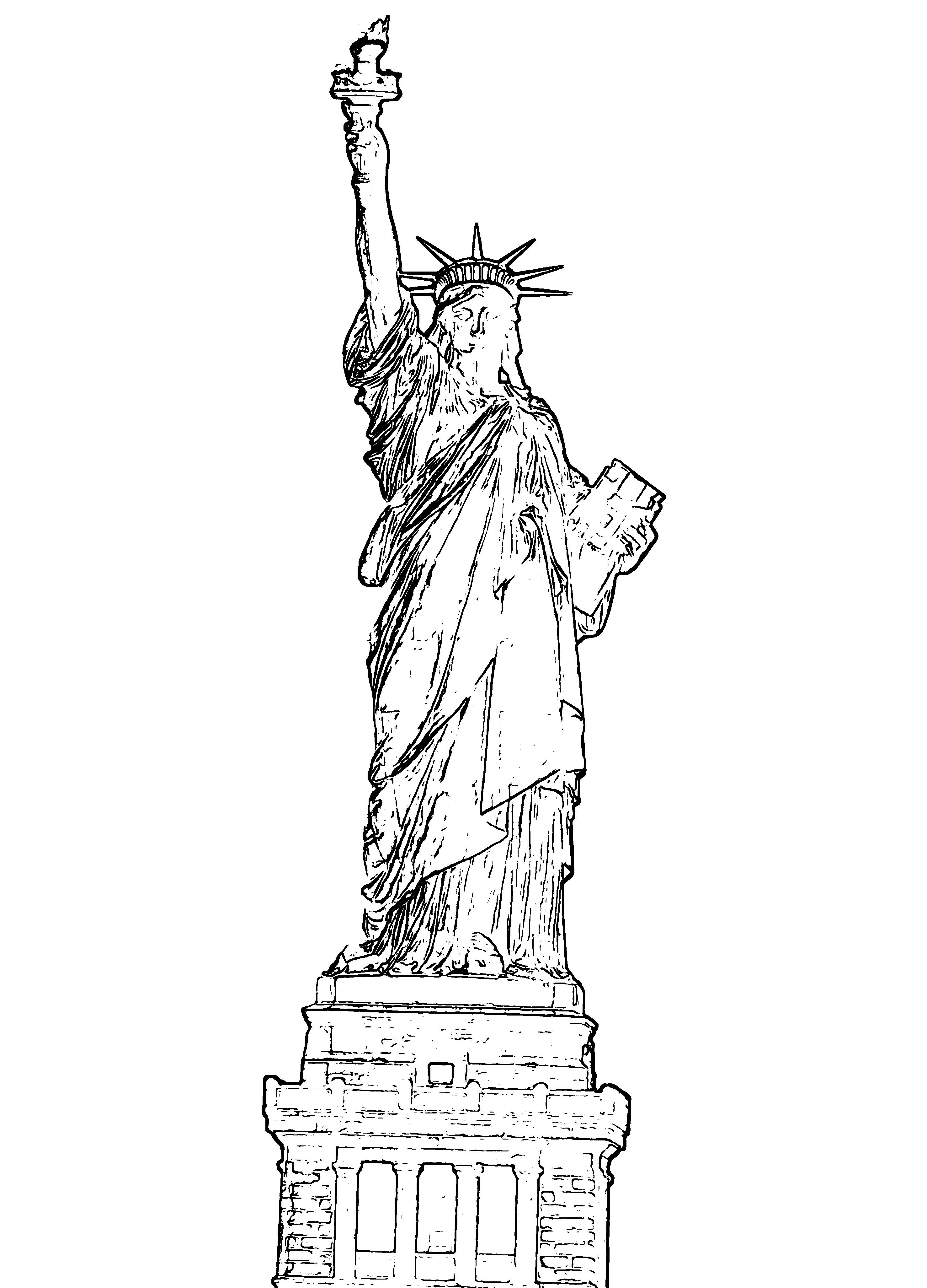
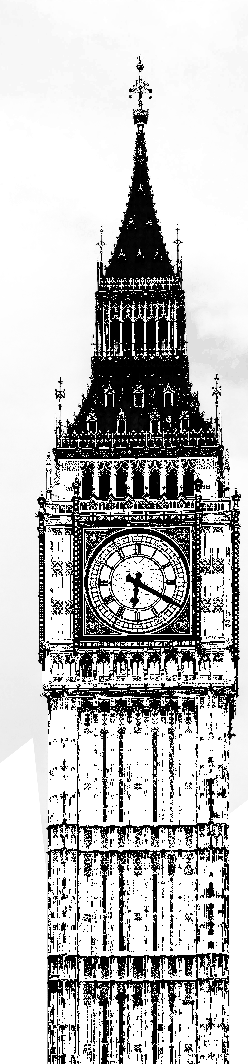
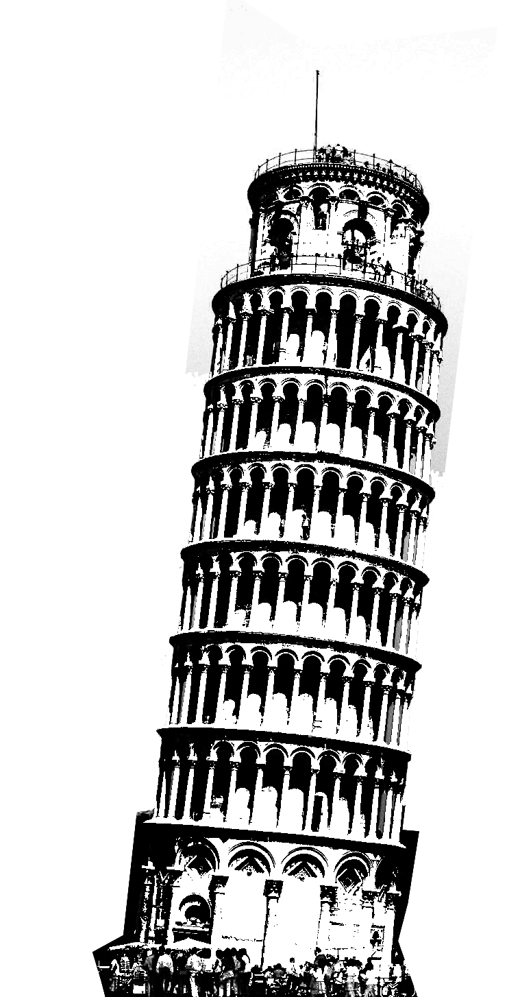
The last line made use of photoshoping on photograph as well and emphasized on details.
a

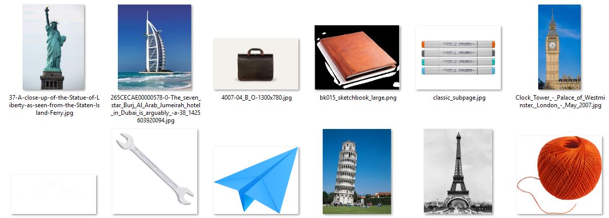
Below were some of the images found on the Internet and were editted. There were many clean convenient illustrations of the buildings and landmarks but I didn’t use that because a photograph contained so much more details and textures.


Capture37-A-close-up-of-the-Statue-of-Liberty-as-seen-from-the-Staten-Island-Ferry265CECAE00000578-0-The_seven_star_Burj_Al_Arab_Jumeirah_hotel_in_Dubai_is_arguably_-a-38_14256039200944007-04_B_O-1300x780Clock_Tower_-_Palace_of_Westminster,_London_-_May_2007pisa-towerproject_lightbulbTool_Box_DetailedTour_Eiffel_3c02660

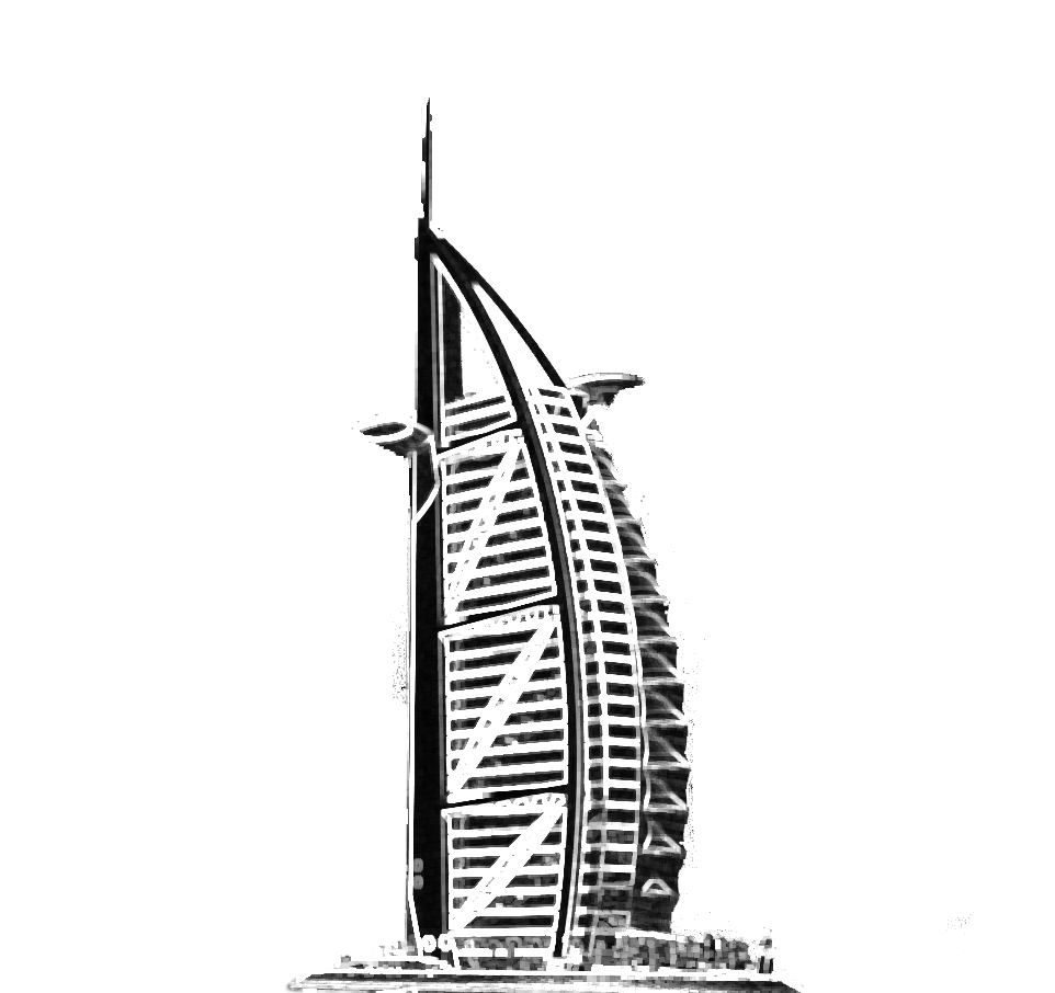
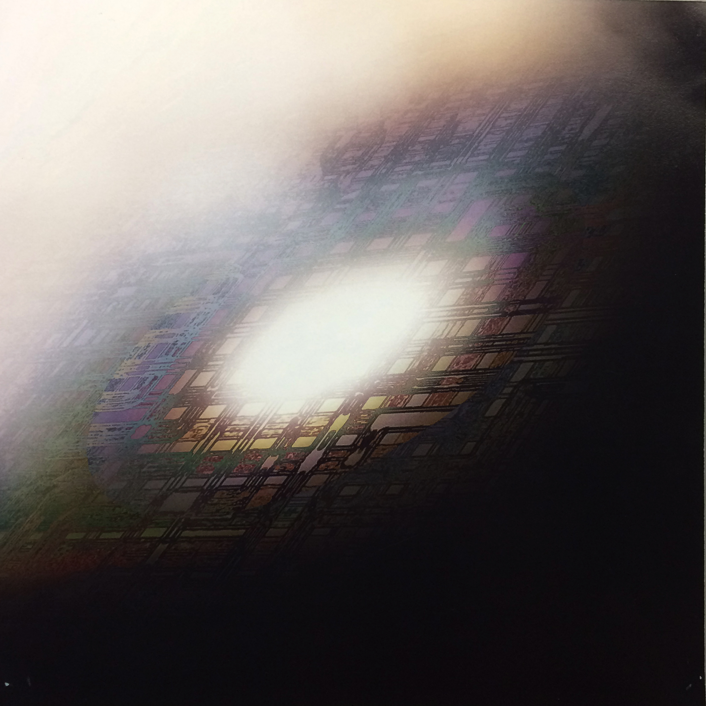
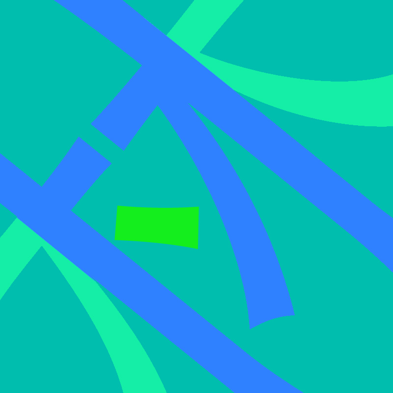
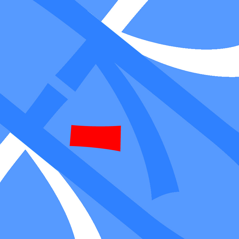
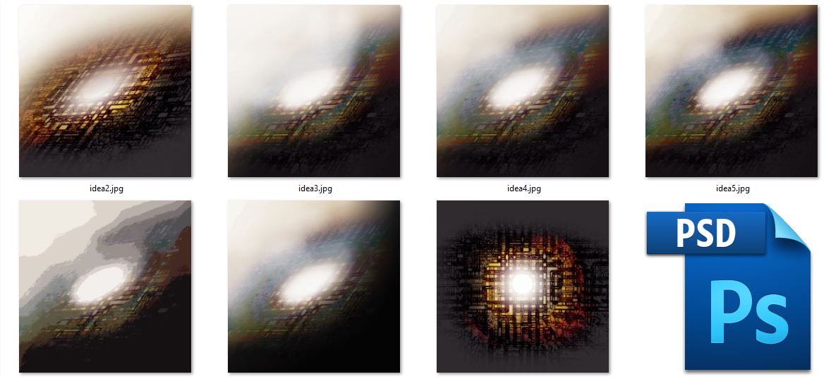
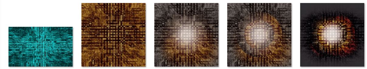
For the image below, I wanted a futuristic/sci-fi feel to it. Below were different color versions as well as the reversed ones.

9

Process:

Capture

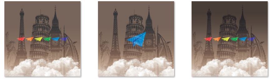
And similarly, the third image was a combination of the other two. Below were the variation of them, including the night versions and the day version.


7


EGO inspiration

IMG_3329

Besides Nakamura Yusuke, I also went to the library and looked through the entire collection shown above. There were so many different and distinct styles that they have and I believed that some of them influence the design decisions I made later on in the projects. There were artists who use only solid bright colors, bizarre combination of colors as well as playing with texts……and besides this I flipped through some on the minimalists as well…Since there were too many of them…I don’t want to fill the whole page with references. Instead I would like to share how I got inspired with a few examples.


e

First thing I noticed was that it is safe to play with monochrome and in many cases mix with black&white. The bigger the range in brightness or saturation determine the contrast of the image. And in the case of the bottom left image, since the background and the hand is similar blue, the bright white naturally becomes the focus and the first thing viewers notice.

In order to make the colors less dull but without risking too much…we can add an appropriate portion of the color adjacent to the main color. As you can see in the first and second images. The slight change of tone gives layers to the images.

The third image is a combination of photograph and solid colors. It also reminded me of the art from Bauhaus period with the popular usage of blue, yellow, red and white.

There are also minimalist style with simplest shape to describe the objects and bold black outline.

For the second image on the bottom row, it is a very bizarre yet nicely-balanced design. I am not sure if I am anywhere near to the right answer. But, I assumed that it is due to the big portion of black/dark background and the balance between each colors. Also the very contrasting colors may seem far on the color wheel but yet similar in either saturation or value.


sa

There is this artist that designed all the album covers for the singer group called Binaria. I couldn’t really find any more information on the artist but as you can see above, the colors were very nice in each of them. As compared to Nakamara, these are duller and more netural colors. But also similar in amounts of details and line work in some of them.


Besides I was also inspired by many album covers of various artists and I studied how they played with colors and contrast…etc.


Capture2 Cre


THE END

EGO Artist Inspiration -Nakamura Yusuke

I have always liked the artwork by Japaneses artist named Nakamura Yusuke. He was a graphic artist. Nakamura’s art has been featured along with various other forms of media. And probably most known for his designs for Tomihiko Morimi‘s The Tatami Galaxy and Yoru wa Mijikashi Arukeyo Otome.

aaaaaa


Above is a screenshot of some of his artwork. As you can see there are the clean, simple but fine line work and very bold use of colors. He uses mostly solid colors instead of gradients and many of his illustrations are black&white line work against saturated colors. I have always admired his style since he did all the album covers for the band called asian kungfu generation. Below is a screenshot of the google search result for AKG album. He did a tremendous amount of art work that he became so sophisticated in the ways he played with colors.

CaJPG


EGO Final

EGO

As shown below, these are my final panels.With the sequence of:ME, BETTER ME, IDEAL ME &ME IN 5 YEARS. The prints turned out good as I did a test print prior to this and adjusted them accordingly.

ossIMG_3689


First Line is one based with cat images. For one reason that I like cat and for another are their characters. Inspired by my research, I tried to play with bright, saturated colors in the contrast with black&white.

IMG_3715

CURIOSITY

A curious looking cat was tilting its head in the image and one of its hand reaching forward. I am always curious about many stuffs and most of time very keen to learn new and interesting things. Also, quite often I feel confused and sometimes lost… This image has both flat colors as well as gradient, which was kind of my focus of experiment for this line.

+

IMG_3714

Passion/Craziness

I feel very passionate about the things that I really like and enjoy doing them. Just like when a cat sees a ball of yarn! Red is also the color for passion. I can keep on doing the thing that I love for hours without feeling tired or distracted sometimes skipping meals…it’s a good thing to be concentrated but also sort of crazy as my friends said.

=

IMG_3713

ME

So adding the two distinct traits…is me. This is a popular internet image of the cat titled as ”I regret nothing!” Red and green as you all know, are complimentary colors and many times they look horrible together when they are both very saturated. Somehow when they are similar in a less saturated but lighter, everything looks balanced, which I assumed were to the yellow and blue-green colors that linked red and green.


IMG_3712

Adventurous/Bold

As shown above, there are many animal silhouettes in the panel, as I always associate animals with wild & adventures. For this line, there actually consist of same layers but they were blended and combined in different ways to achieve different moods. The first one is colorful and highly saturated as well as dark black colors. It’s about being bold and also confidence with what we are doing.

IMG_3711

Negativity/Darkness

Everyone has his/her own dark side…I tend to be pessimistic deep inside and sometimes I feel depressed, which is not beneficial at all. It would be impossible to only purely joyful and positive all the time…Still I believe minus some portion of the negativity there will be a better me.

=

IMG_3710

A Better Me

Here is a version of the same composition with brighter and delightful colors. If you notice, there is actually less black color but still some. The colors also have a better variety in comparison to the first one, which I think represent a better me.


For the third line, I wanted to try a simpler and minimalist style as the ones above were very colorful and busy.

IMG_3709
Dream

This was inspired by a melting sugar cube in a cup of hot tea that I was drinking. Dream is represented by the sugar cube, although slowly, it melts and the sweetness spreads. Dream is slowly coming true.

X

IMG_3708
Perseverance

This image was created from a simple square by rotating and scaling them, and then I add different colors onto the pattern and made it faded away at the sides. The background was not white but very light grey so the contrast of saturated colors and white colors on grey was very interesting and created a solid feel in the middle and a softer one at the side.

=

IMG_3705
An Ideal Me

Combining the two things will complete an ideal me…With numerous grids and lines and the fuzzy background of black and grey. There is same grey background like the previous one and the ellipse, which even though is not the brightest white, seems very bright and the highlight of the whole composition. The concept of this is that there is both brightness and darkness but with hardwork, one will eventually shine.


For the last line, it is about 5 years in the future…I created two images and overlay them in a way that it looks different with another style.

IMG_3704
Travel

As shown in the images, there are landmarks of many countries arranged together. They were all based on actual photos so that they consist of great amount of details. With a much less saturated background, there are 6 colorful bright paper planes icons, which represent travelling.

+ or –

IMG_3706

Work

In 5 years, I believe there will be great difference in the ways people work as technology develops. That explains the sci-fi feeling background, but it was combined with traditional tools such as sketchbooks paper and Copic Marker, which were fading away slowly.  The three icons in the middle were toolbox, light bulb and a brief case. They represented designing work, idea-based work and a brief case of course symbolized professionalism.

=

IMG_3707

Me In 5  Years

Therefore, the combination of the two images brought the whole picture of a possibility of me in 5 years. The colors were contrasting against each other as well as the dark background. It probably hinted that I will be working late at nights.


The End

Thank you

Rhyme-research & inspiration


FullSizeRender

This is the book I looked into when I was researching for inspiration for the project. It’s called “I don’t know where I’m going but I want to be there,the expanding field of graphic design 1900-2020”  Paperback – October 18, 2011, by Sophie Krier (Draft Writer), Marjolijn Ruyg (Draft Writer) Graphic Design Museum printed by Pfset Yapimevi, Turkey.

This book consists of so many great examples of graphic design and below are some photos taken from the book. Besides that, there are more thumbnail images that inspired me on the rhyme composition as well. In fact, if given more time, I would like to experience more with the images.

FullSizeRender(1) FullSizeRender(2) FullSizeRender(3) FullSizeRender(4)  IMG_2776  IMG_2780 IMG_2781 IMG_2782 IMG_2783


IMG_2750

  Besides, I also looked into  a book titled “Index A” by Charles Wilkin, published Die Gestalten Verlag (April 15, 2003) “Index A is in essence a catalogue of thoughts, images and instinct collected and reassembled by American Charles Wilkin of Automatic Art and Design. With clients ranging from Coca-Cola to Urban Outfitters, Wilkin combines multiple layering of images and type reminiscent of David Carson. In an era of multimedia full of visually aware consumers and highly targeted marketing, Index A acts as a reminder of the increasing influence of design on the human culture and the individual expression in a very commercial world.’“

  It has great examples that inspired me too but I didn’t scan or take photos of the pages inside.


There was another book I found interesting as well. Besides its the nice colors in each picture, there is a concept of masking layers. And the composition of the images were inspiring.


IMG_2759IMG_2751 IMG_2752 IMG_2753 IMG_2754 IMG_2755 IMG_2756 IMG_2757

Final Rhyme

There was an old woman who lived in a shoe.

She had so many children she didn’t know what to do.

She gave them some broth without any bread.

Then whipped them all soundly and put them to bed.


There was an old woman who lived in a shoe.

The shoes were flushing down the whirl

to the bottom where the old woman was at

Rotation and change of scale creates a sense of depth

2


Then whipped them all soundly and put them to bed.

an unbalanced composition

Consists of different images and overlapping texture

Contrast variation with the left side being lower and the right being extreme black & white

4


She gave them some broth without any bread.

The composition that seems symmetrical but not completely

The black background and white diamond creates a stage with spotlight

And the hero for the play is the bottle

The show is on and the many faces appear like the audience


6


There was an old woman who lived in a shoe.

As mentioned by Prof Ina. This composition made use of a technique called Gestalt.

‘Gestalt’ is a psychology term which means “unified whole”. It refers to theories of visual perception developed by German psychologists in the 1920s. These theories attempt to describe how people tend to organize visual elements into groups or unified wholes when certain principles are applied.”

The positive space in the composition will be the two halves of the old woman’s face

Yet with a small heel tiled at an angle,

the negative space appears like a person with a wicked smile

it indicates the dark side of the friendly and kind-looking old lady

And it is upside-down from the original picture,

which also imply a message of something being wrong


8


There was an old woman who lived in a shoe.

I like the wired and mysterious smile of the old woman

It seems like she is looking at somewhere out from the window of the shoe she lived in

And the shoe being presented in black and white  on the background of the opposite color

This composition is simple with big contrast and just some small texture to balance it out

1


She had so many children she didn’t know what to do.

A  radial composition

The old woman is at the center,

symbolizing the sun

burning out her energy for so many children she had

When looked closely carefully,

you will discover the children are facing different directions,

they are in a chaos

3


She gave them some broth without any bread.

The two compositions are arranged together as they flow naturally

together

The contrast in the images brings the focus

The second composition consist of the bottle as well as many hands,

which appear in other composition,

making a connection among the series.

5

7


Rhyme Concepts


There was an old woman who lived in a shoe.

She had so many children she didn’t know what to do.

She gave them some broth without any bread.

Then whipped them all soundly and put them to bed.


So I will be posting all of my compositions except those selected for printing here.

Begin with the very first few attempts on this.

The egg was supposed to represent the children of the old woman.

The whirl/vortex images in the background indicated the emotions of her, which changes according to the sentence from the rhyme.

She had so many children she didn’t know what to do.

2

She gave them some broth without any bread.

3

Going for a creepy scene when she is actually feeding the eggs with an egg.

Then whipped them all soundly and put them to bed.

4

And a background that is much more distorted.

She had so many children she didn’t know what to do.

Variation for radial composition

Repetition & Contrast

and lots of eye contacts

The Funeral Wreath

The old woman could barely took the burden of so many children

2-1

There are so many of them…the place is all filled up

She tried to smile with a frown

It’s suffocating her

2-1-1

The old woman is in the center just like the sun,

giving our energy to her children

2-1-2

A similar composition as the second one

A sunflower-like shape

2-1-3

There are not only so many of the children

They are even in a chaos

disagreeing in the  direction they face

2-1-4

2-1-6 2-1-7

Inspired by what you see when you flush the toilet…

or  unplug a bathtub filled with water(children)

2-1-8

Then one attempt for a linear composition

Some shadow to create a floor and distance in space

3 - 1

There was an old woman who lived in a shoe.

1-1

Some play with the positive and negative space

Two halves of  one face of the old woman on the sides

a tiny small shoe that appears like a smile on a white person

11

10

She gave them some broth without any bread.

The old woman was feeding them with the liquor

It is almost empty

But there were so many of them waiting

It is kind of linked with the previous sentence of the rhyme

“She had so many children…”

6-2

6

5-6

5-5

5-3

5-2

5

Then whipped them all soundly and put them to bed.

 collage with different texture to create a stage

7 7-2 9-2 8

Project 2- image editing

Below are the edited images for the rhyme ‘Old woman lives in a shoe’. The original images were from different sources: woodcuts, old engravings and even real life photographs. I edited them to create the vintage feel required for this project.

Also, from what we learnt last week, different ways of editing result in variation in styles. As shown below, the same images give no similar impression after editing.

Capture Capture2 Capture3

2D Lines final submission

‘A Line Is A Dot That Went For A Walk’

Final Submission for the Line project was in A1 Landscape format. I arranged the lines so that too similar ones won’t fight for attention and there were some orders such as going from darker to lighter colors. Through the process of exploring and making all these lines, I learned a lot more about ways of creating images, which would not been achieved easily by just pen. And I actually enjoyed a lot when I was doing the lines as it doesn’t really require us to be always careful and accurate. On the contrary, sometimes coincidence created beautiful unexpected results.

DSCF4943

1

Aggressive

There are many speedy lines flying from the left to the right as well as many shapes that look like bullet holes on the window.

2

Embarrassed 

The patterns are hiding behind the bright white lines of exposure. They are dark and barely showing the details almost like they are embarrassed.

3

Spontaneous

This line is a happy incident from the combination of glue and ink, which creates the free flow of the water-like shapes.

4

Anxious

Repeating and messy lines are what I tend to draw a lot when feeling anxious. They also happen to have many round or ellipse shapes.

5

Psychotic

This was done with monoprints and as mentioned in the previous post, I liked the way the thin lines look glowing the the contrasting background. Somehow it reminds me of some scenes in the psychotic horror movies

.

6

Awkward

The darker marks on the lighter ones seem awkward. They are in different directions and all over the line while the background is more organized in comparison.

7

Exhausted

The ink used in the background is glittering. The black lines and white lines are trying to create a space as the brighter ones are nearer to the viewer. I think it represents exhausted because it looks like abstract meteorite fall. They are so exhausted that they just let gravity takes control of the fall.

8

Lyrical

This line was done using only pen and protractor. It is wavy with the ellipses yet not turbulent because of the presence of the straight lines to balance.

9

Sloven

There are several layers to this line. The bottom one being black and the top one being white allows me to scrape lines on it. The line has an untidy and messy feel.

10

Nonsensical

Done using monoprint with tissue and ink. The shapes are very random and irregular. There is a section on the left top part of the line that contains interesting patterns.

11

Systematic

There are horizontal and vertical lines in the background with some stronger lines. Then I erased some edges on the line with a certain rule I made up and also for applying darker colors for some grids.

12

Turbulent

For turbulent, I meant to create the abstract look of the strong waves in the ocean. They were drawn with dark ink and white paint.

13

Bizarre

There is a river with weird eye-like shapes in it and it is surrounded with patterns. I made those patterns with as many different inks and paints to produce more details. Then I scribbled on them something like those ancient cave drawings.

14

Indecisive

15

Ambiguous

The line was created with the technique of fumage. It took quite long and several trial and error to have the paper covered with smoke marks. Then I wiped it lightly with tissue to create the unclear and ambiguous atmosphere.

16

Distracted

The straight lines going from the top to the bottom. It is like some shapes are behind there distracting the lines.

17

Fragile

The inspiration for the fragile line came from the nature, the spiderweb. Similarly, they were first drawn with hard solid lines and then I erased them to create the space in between each shapes.

18Sensual

The sharp patterns were produced with a dry and spoiled brush. The tip was dipped in the ink and went over the line with passion and movement.

The End

Hope you enjoy them! Thank you