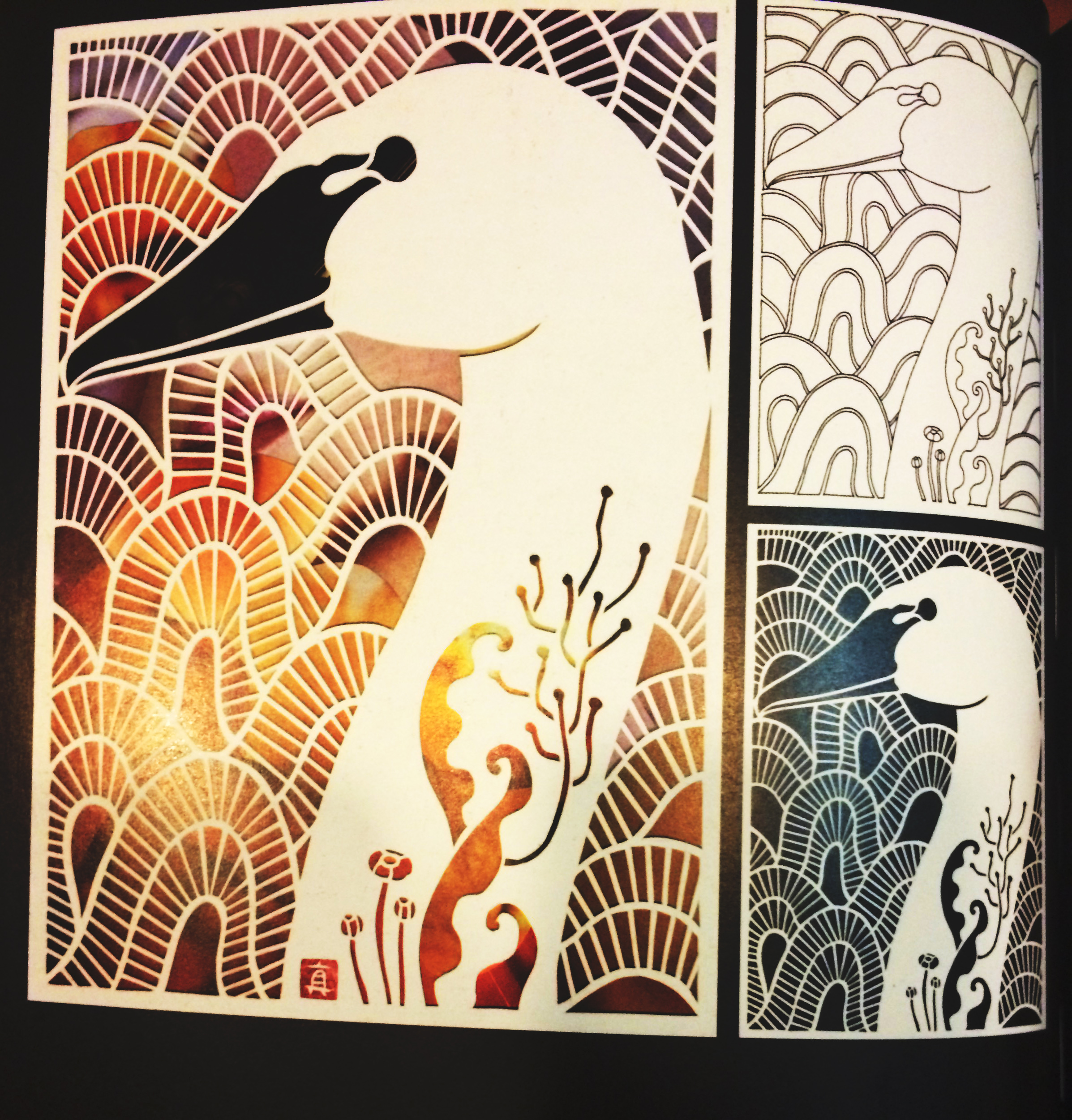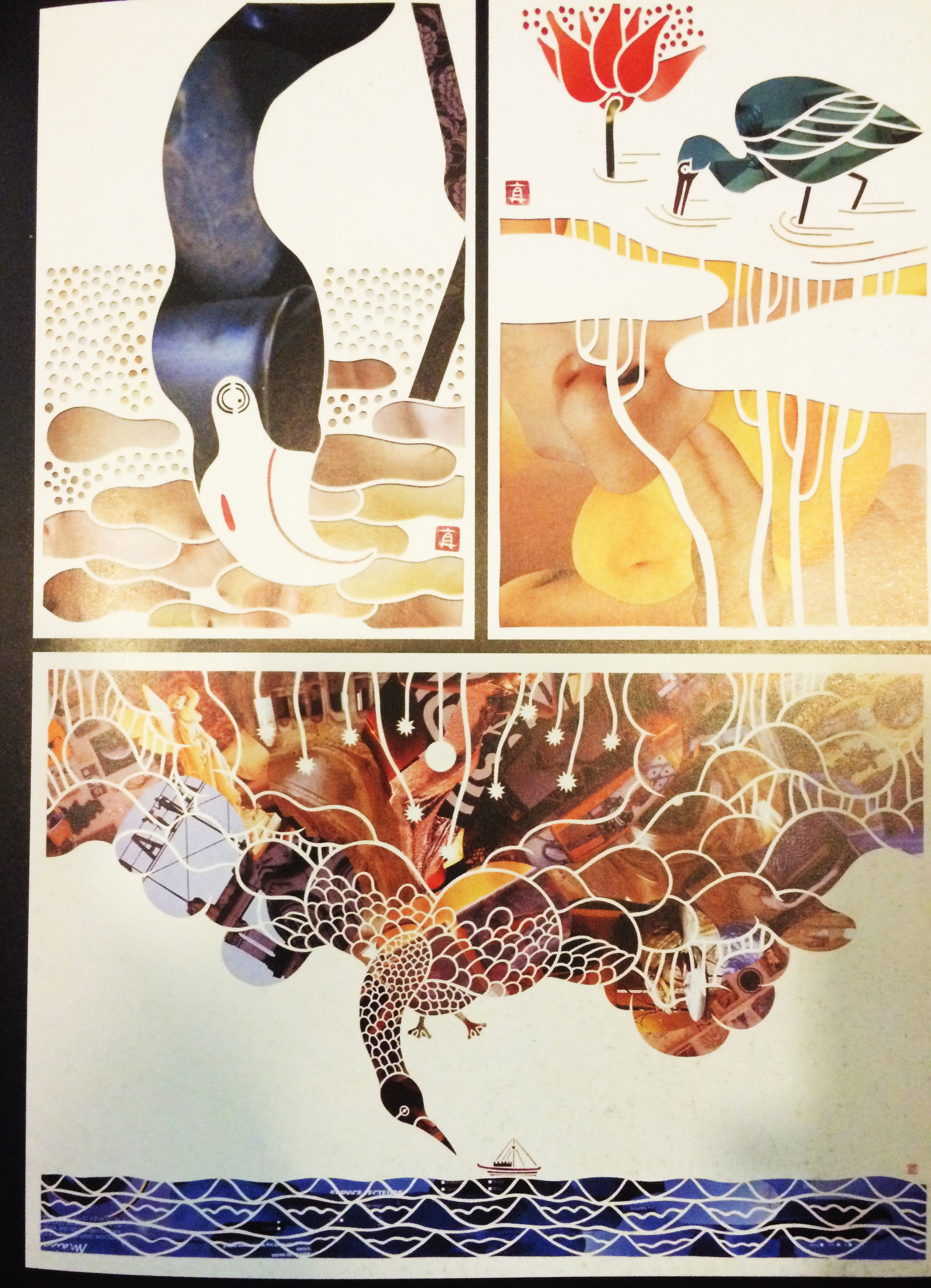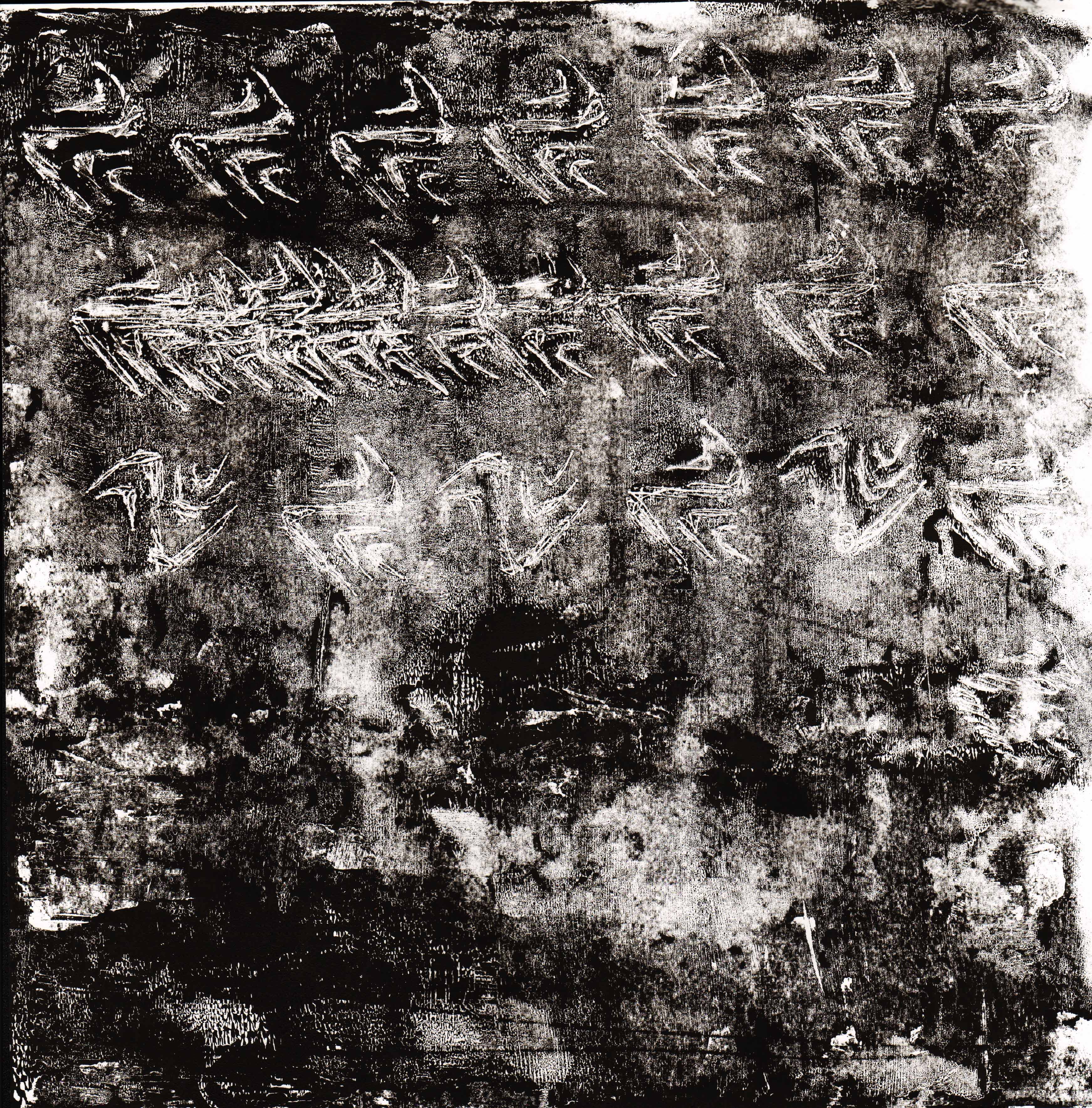
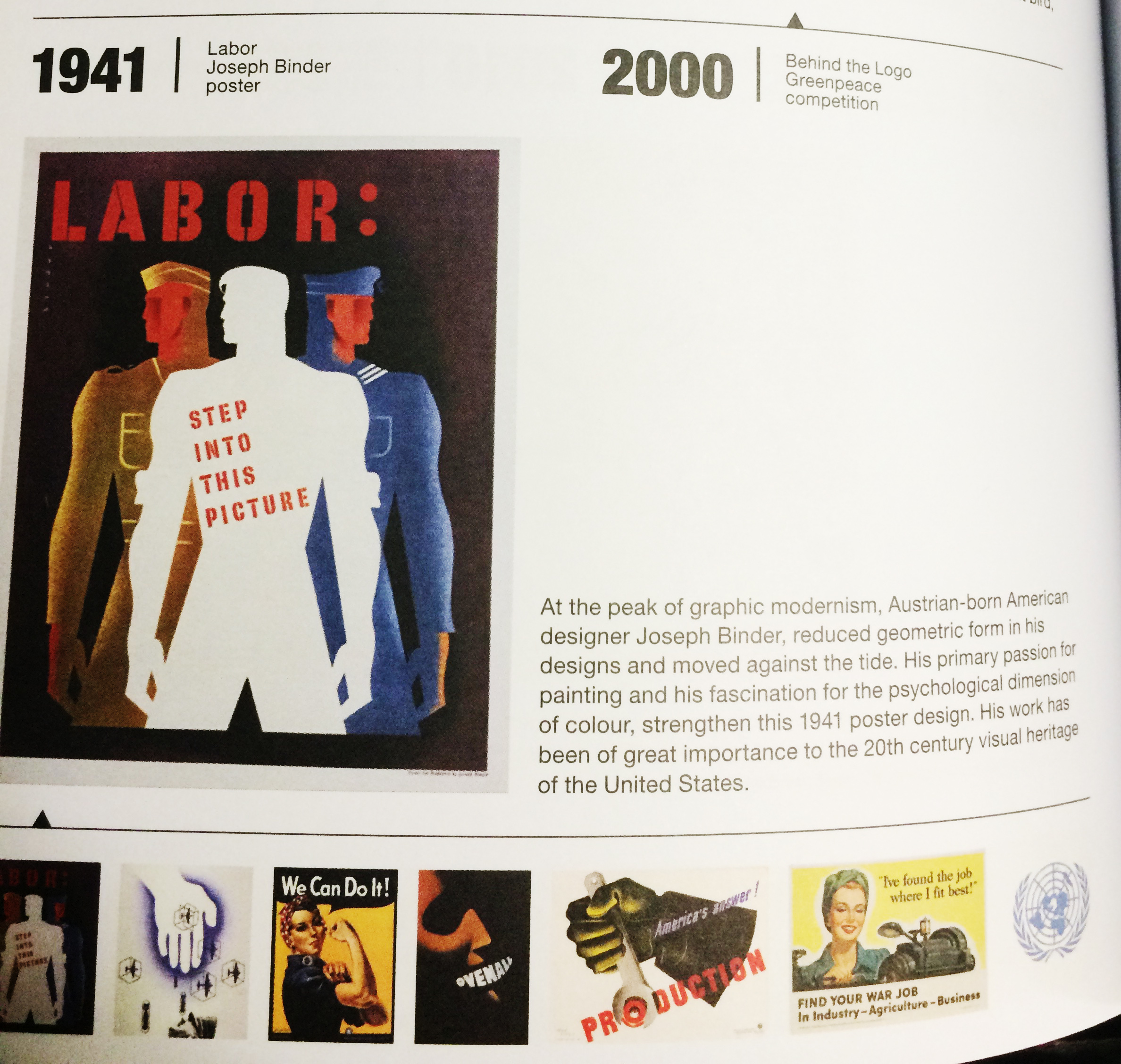
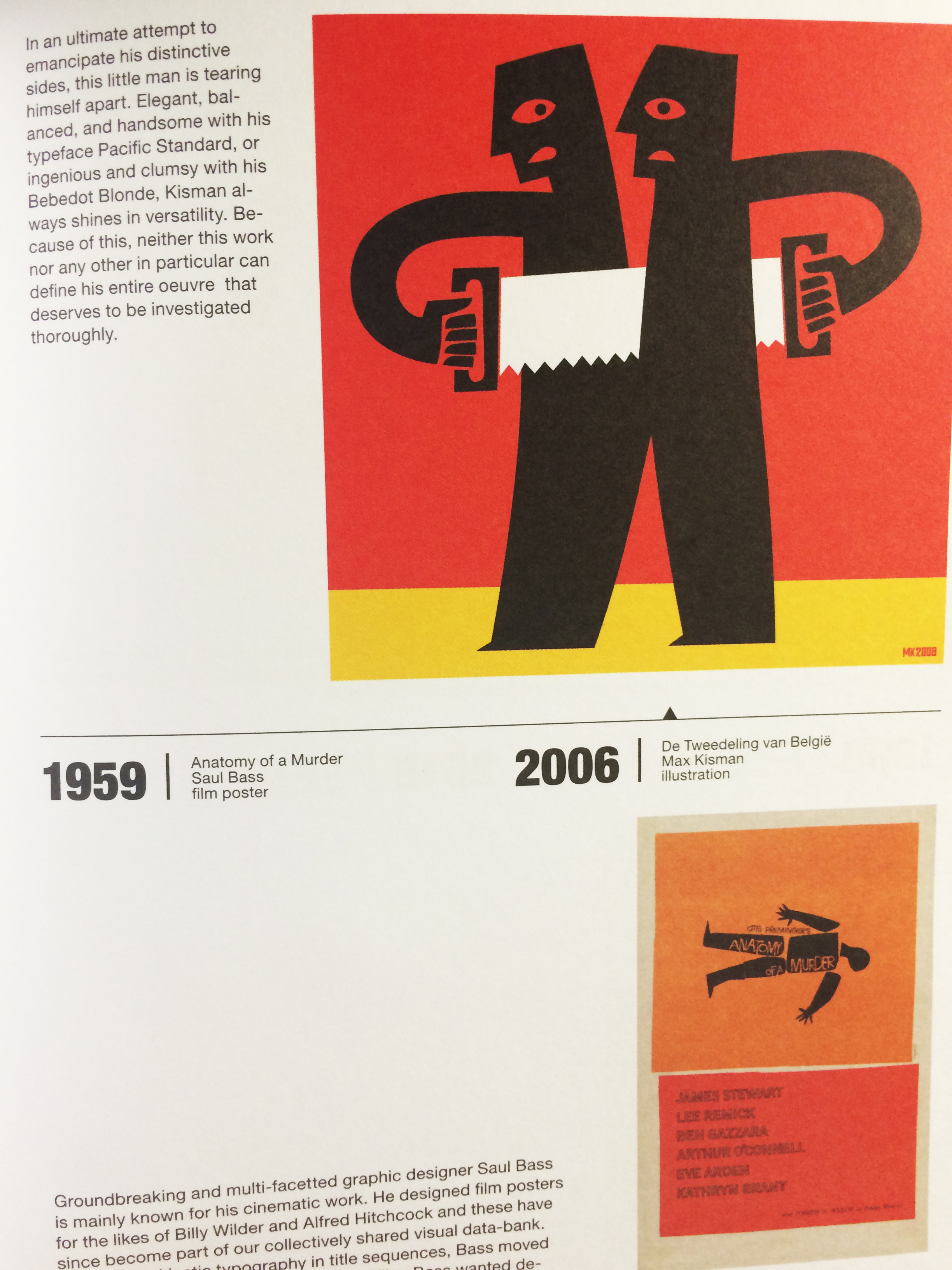
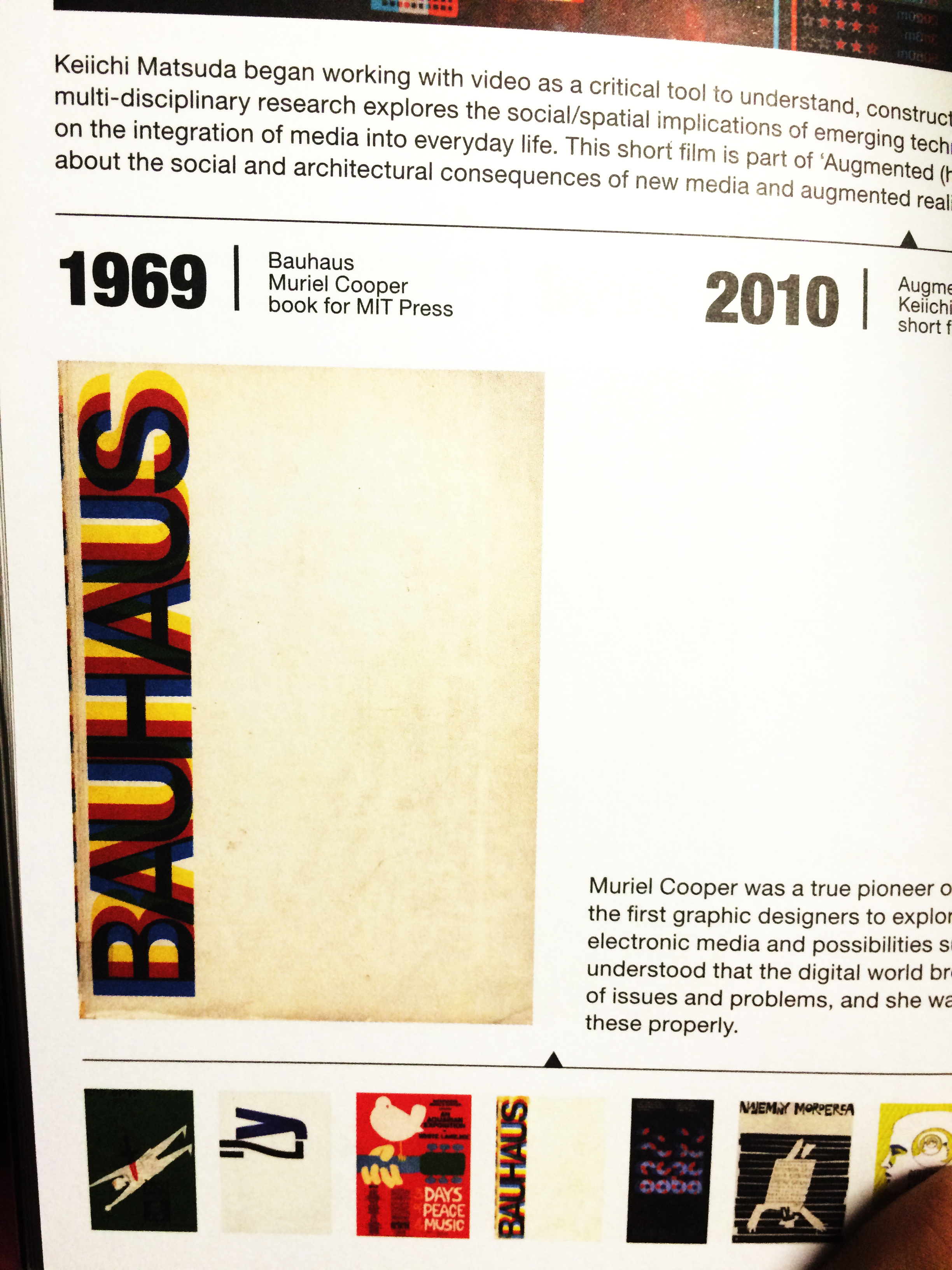
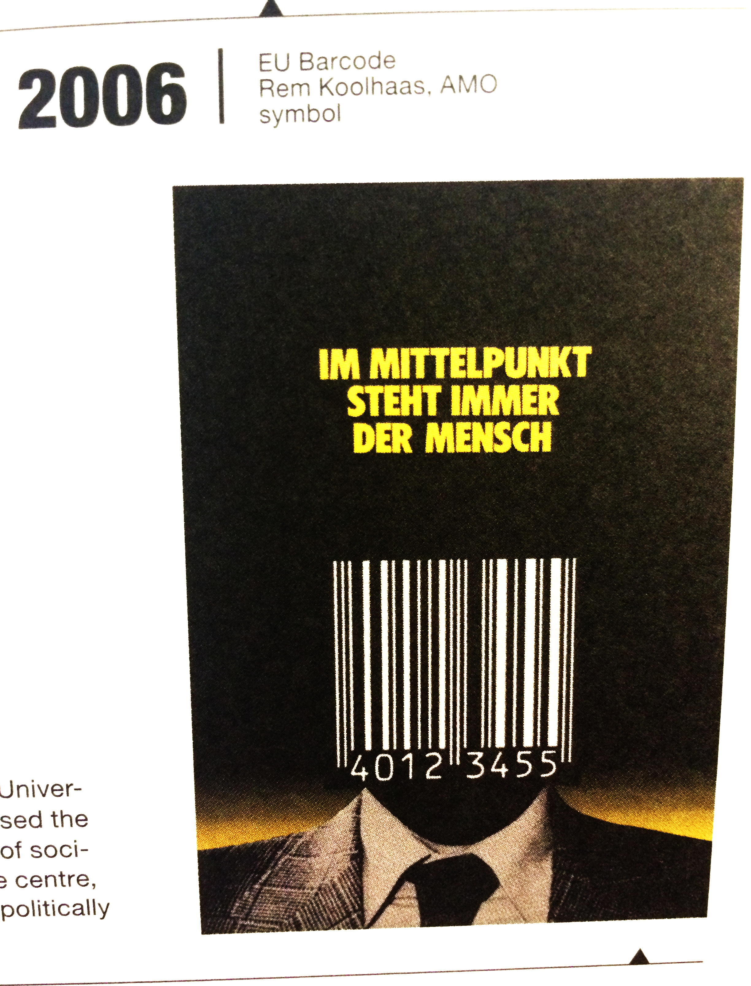
This is the book I looked into when I was researching for inspiration for the project. It’s called “I don’t know where I’m going but I want to be there,the expanding field of graphic design 1900-2020” Paperback – October 18, 2011, by Sophie Krier (Draft Writer), Marjolijn Ruyg (Draft Writer) Graphic Design Museum printed by Pfset Yapimevi, Turkey.
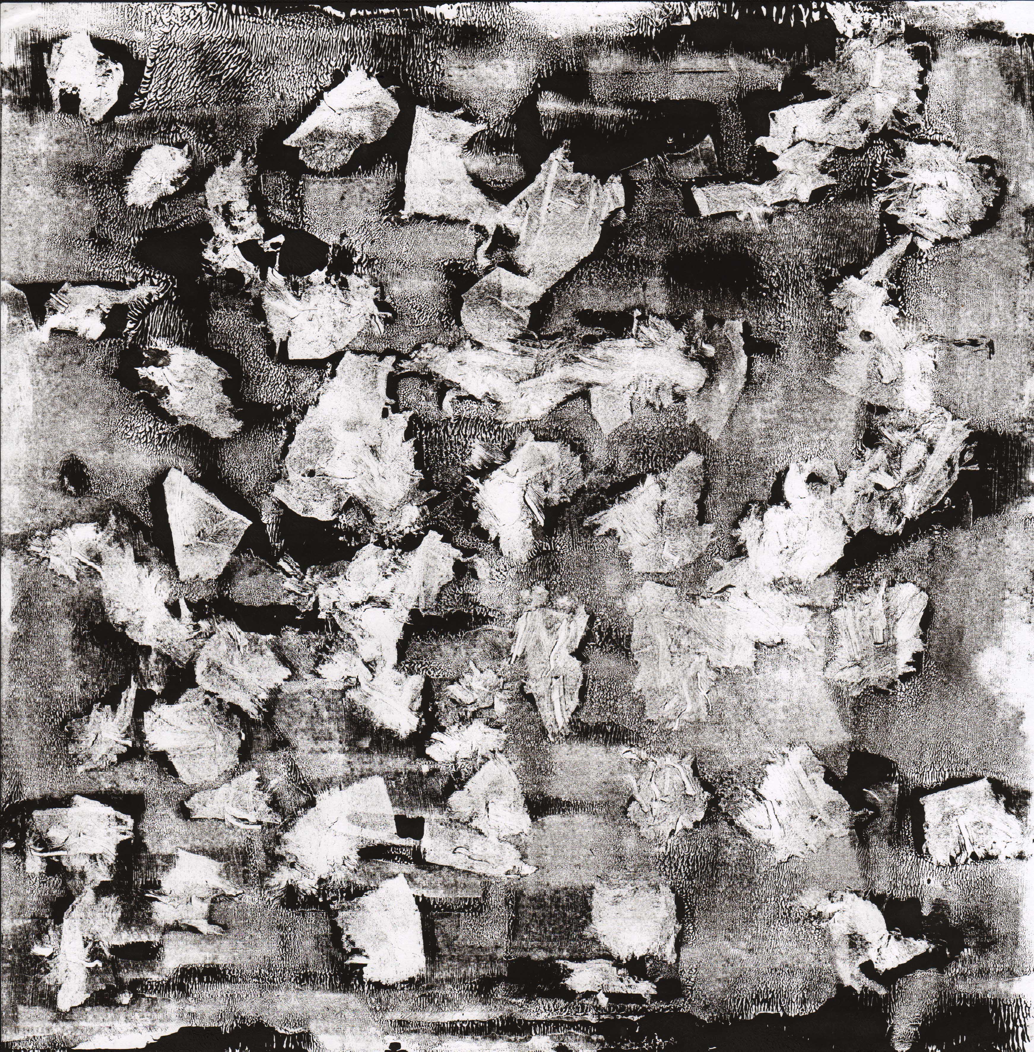
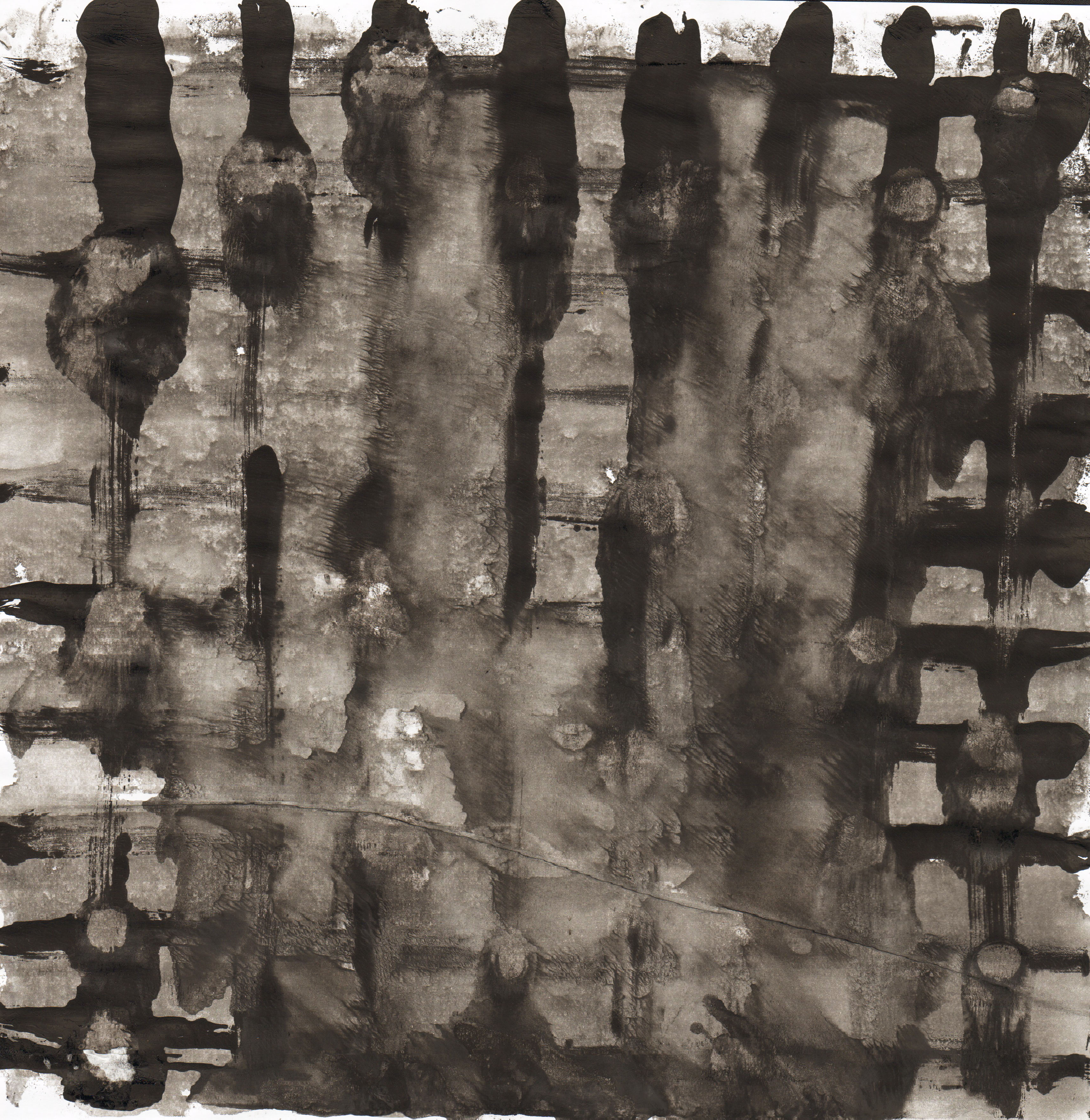
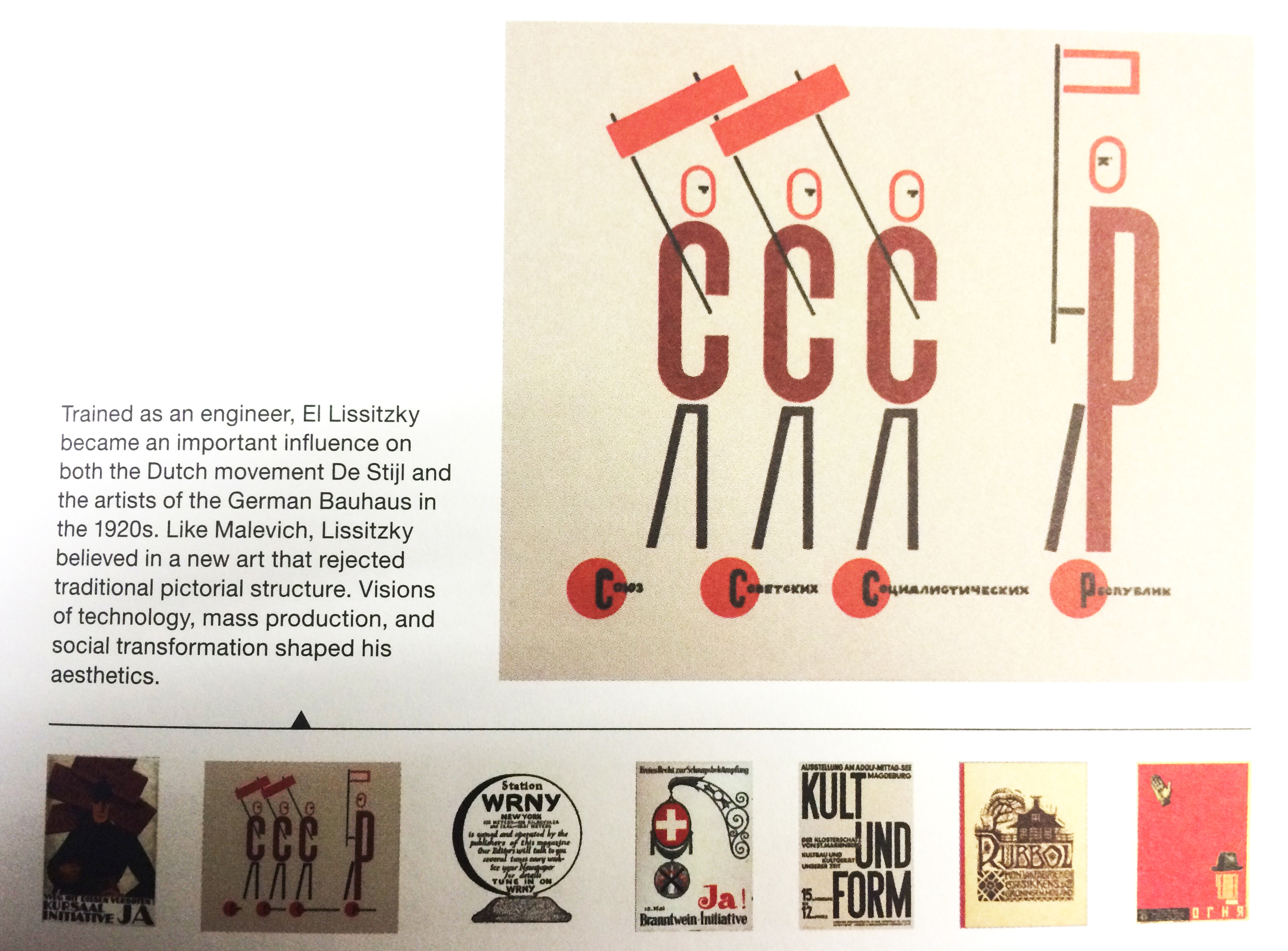
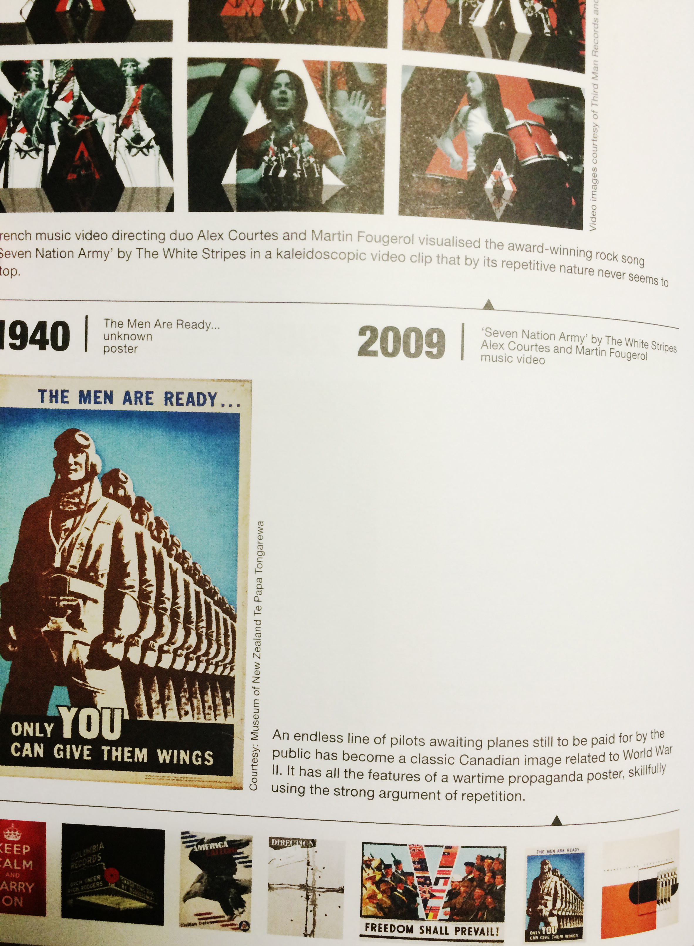
This book consists of so many great examples of graphic design and below are some photos taken from the book. Besides that, there are more thumbnail images that inspired me on the rhyme composition as well. In fact, if given more time, I would like to experience more with the images.


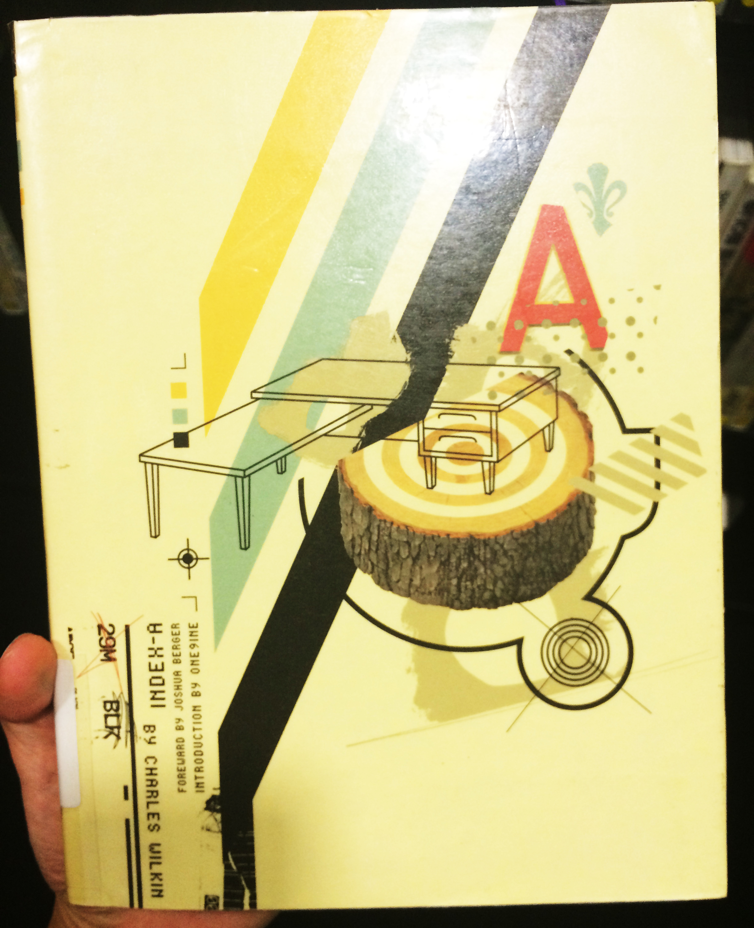
Besides, I also looked into a book titled “Index A” by Charles Wilkin, published Die Gestalten Verlag (April 15, 2003) “Index A is in essence a catalogue of thoughts, images and instinct collected and reassembled by American Charles Wilkin of Automatic Art and Design. With clients ranging from Coca-Cola to Urban Outfitters, Wilkin combines multiple layering of images and type reminiscent of David Carson. In an era of multimedia full of visually aware consumers and highly targeted marketing, Index A acts as a reminder of the increasing influence of design on the human culture and the individual expression in a very commercial world.’“
It has great examples that inspired me too but I didn’t scan or take photos of the pages inside.
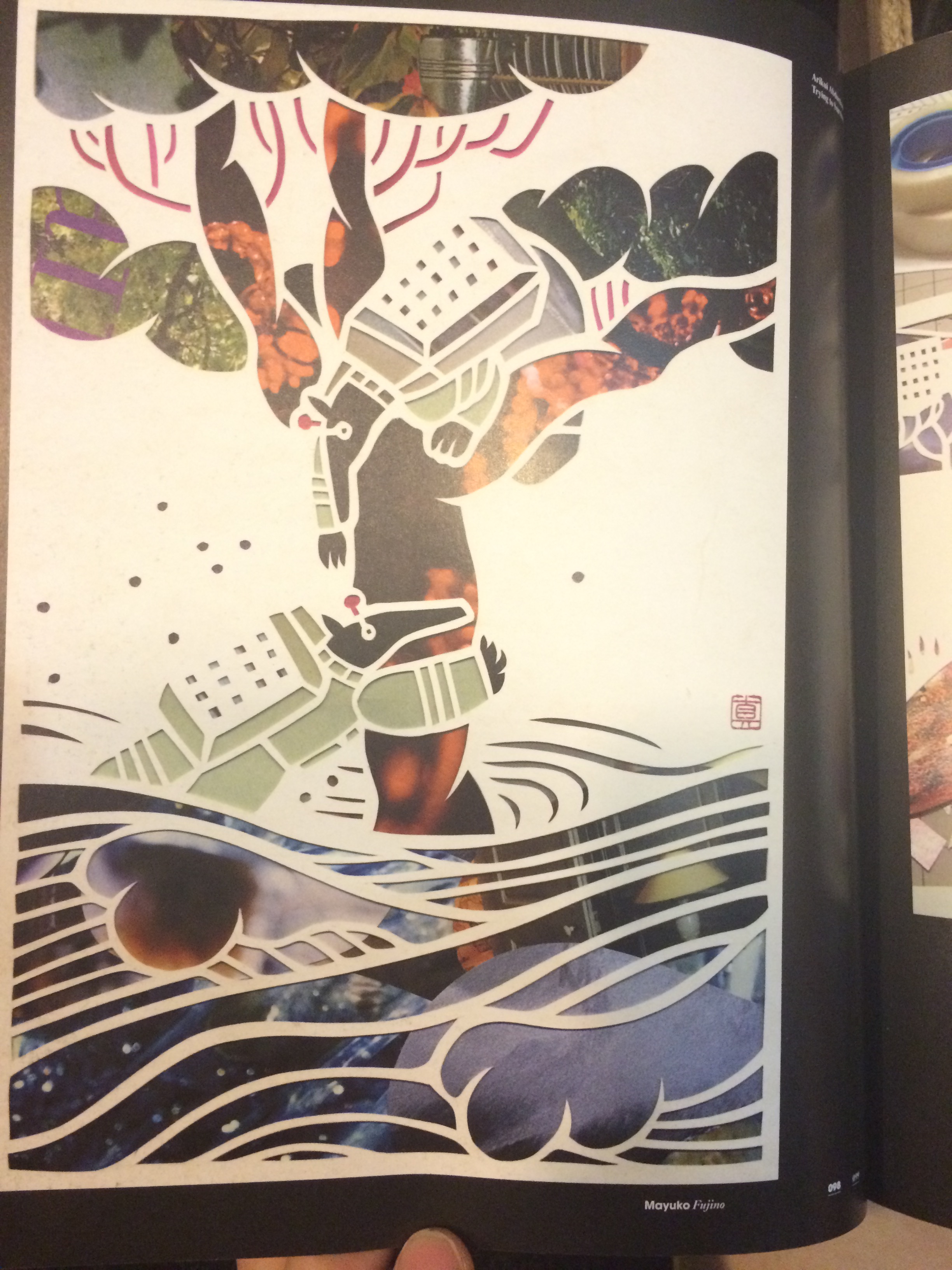
There was another book I found interesting as well. Besides its the nice colors in each picture, there is a concept of masking layers. And the composition of the images were inspiring.