Trip to Harvey Norman

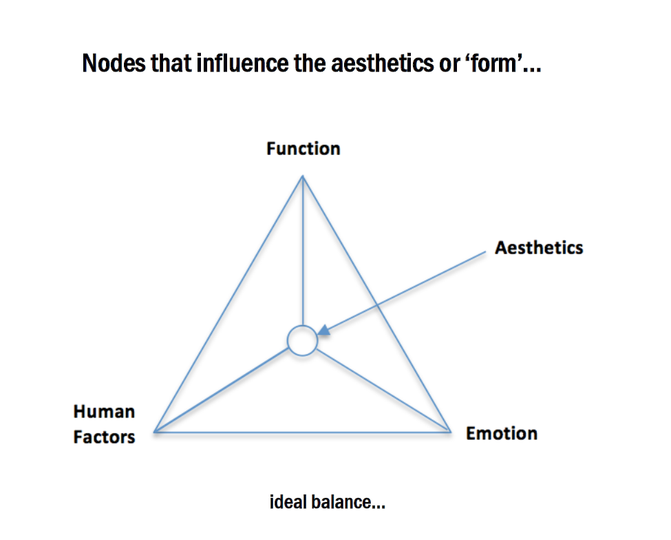
Observation from the field trip at Harvey Norman…

The first things we noticed were the pastel-color retro toasters and misers just like many posts by the class mentioned. There were quite some interesting details I noticed.

The Coffee Machine

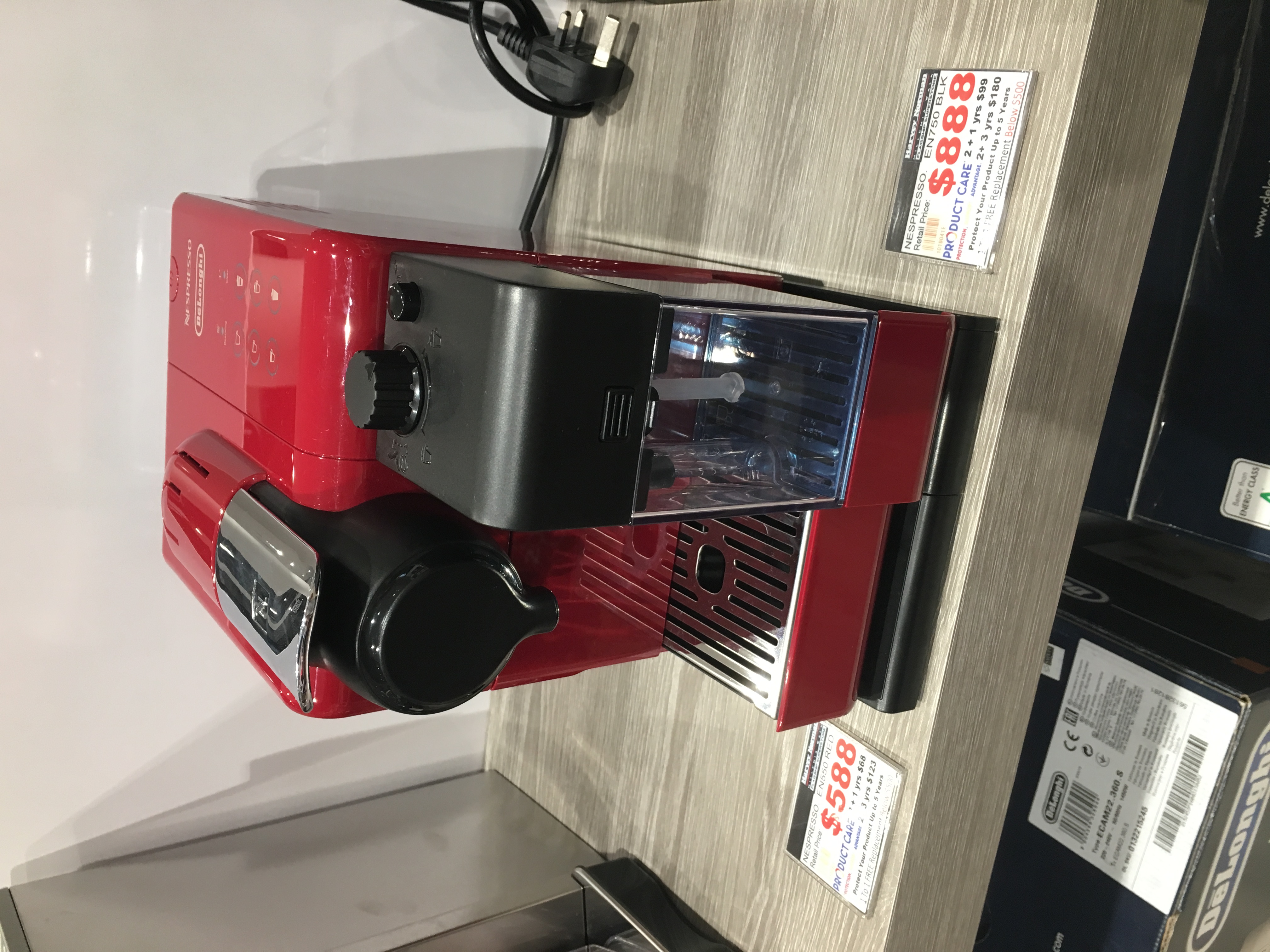
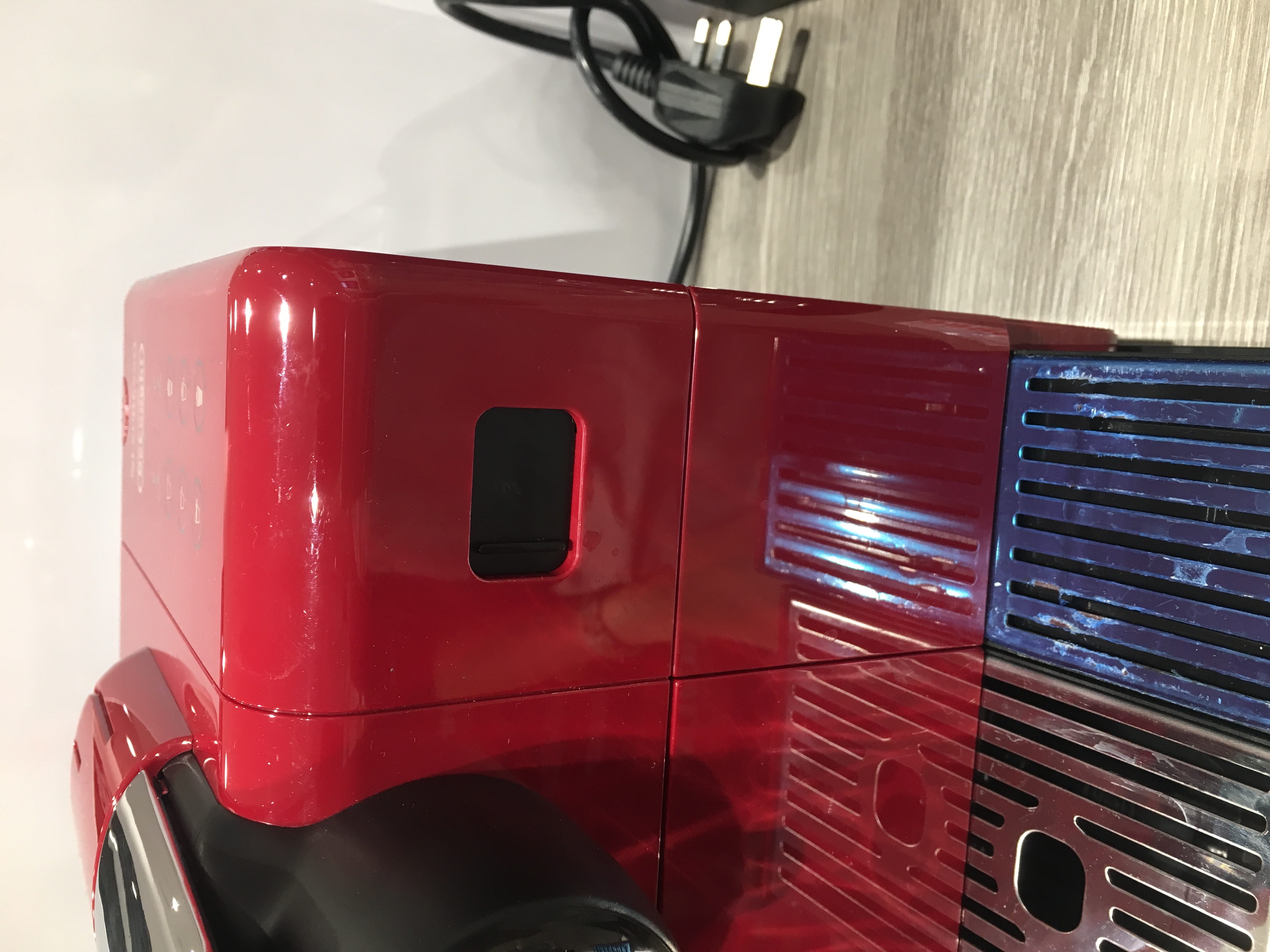
Although the placing and removing of the bottle wasn’t easy and it felt a bit awkward, there was this nice little detail. The small black cover that could be closed. For Food related product, having a nice appearance was one thing, but to have consideration for hygiene was rather important.  This applied to especially for some products that look fabulous with details and gaps that ended up catching many remaining of the ingredient.  Therefore, I believe kitchen products were more function-based and then emotion.


Design Trends

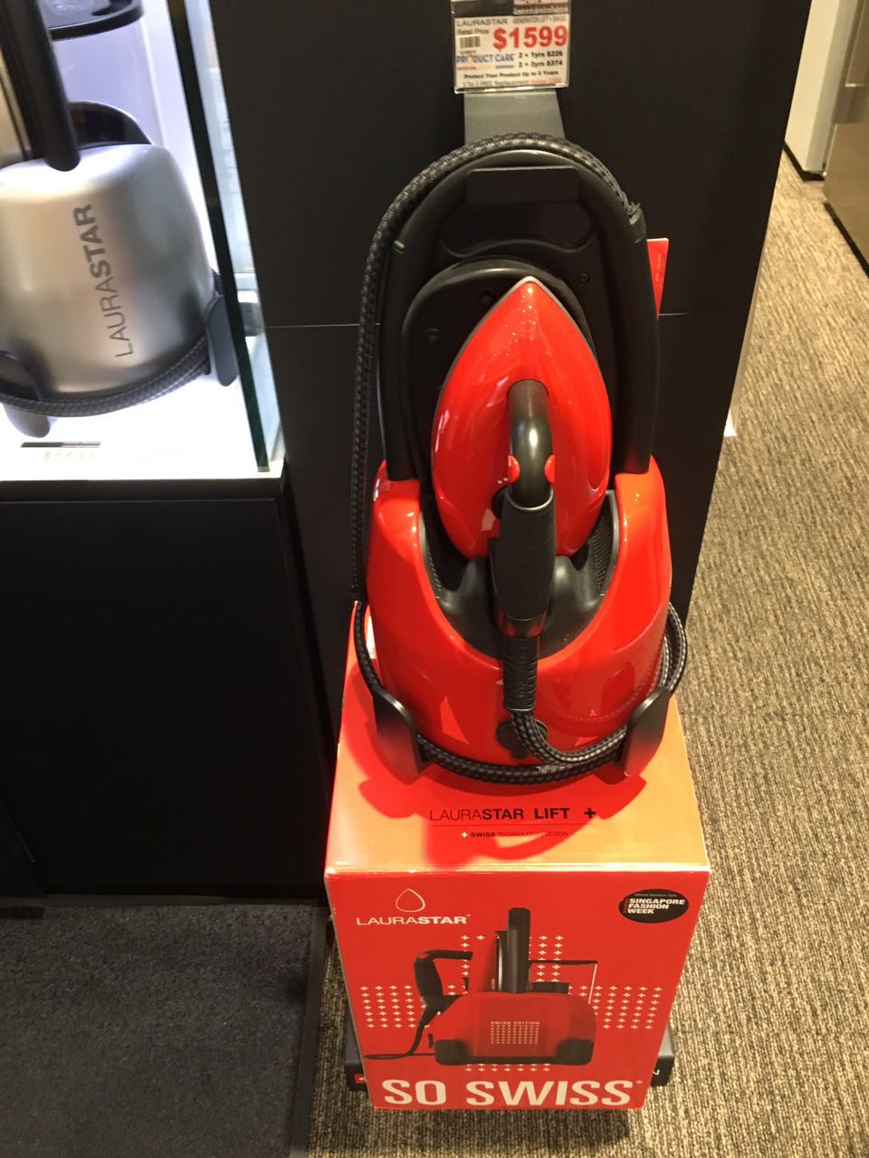
As many of us noticed, there were actually many retro-looking products. They had the big radius the bulky form and very vibrant domain color. For example, the iron shown in the above image. It was modern technology concealed in the retro design, bringing back the nostalgic feel of an iron. Looking at it sorted reminded me of scenes I saw when I was kid and my mom was using a traditional iron.  This trend ,in my opinion, was driven mostly by emotion.

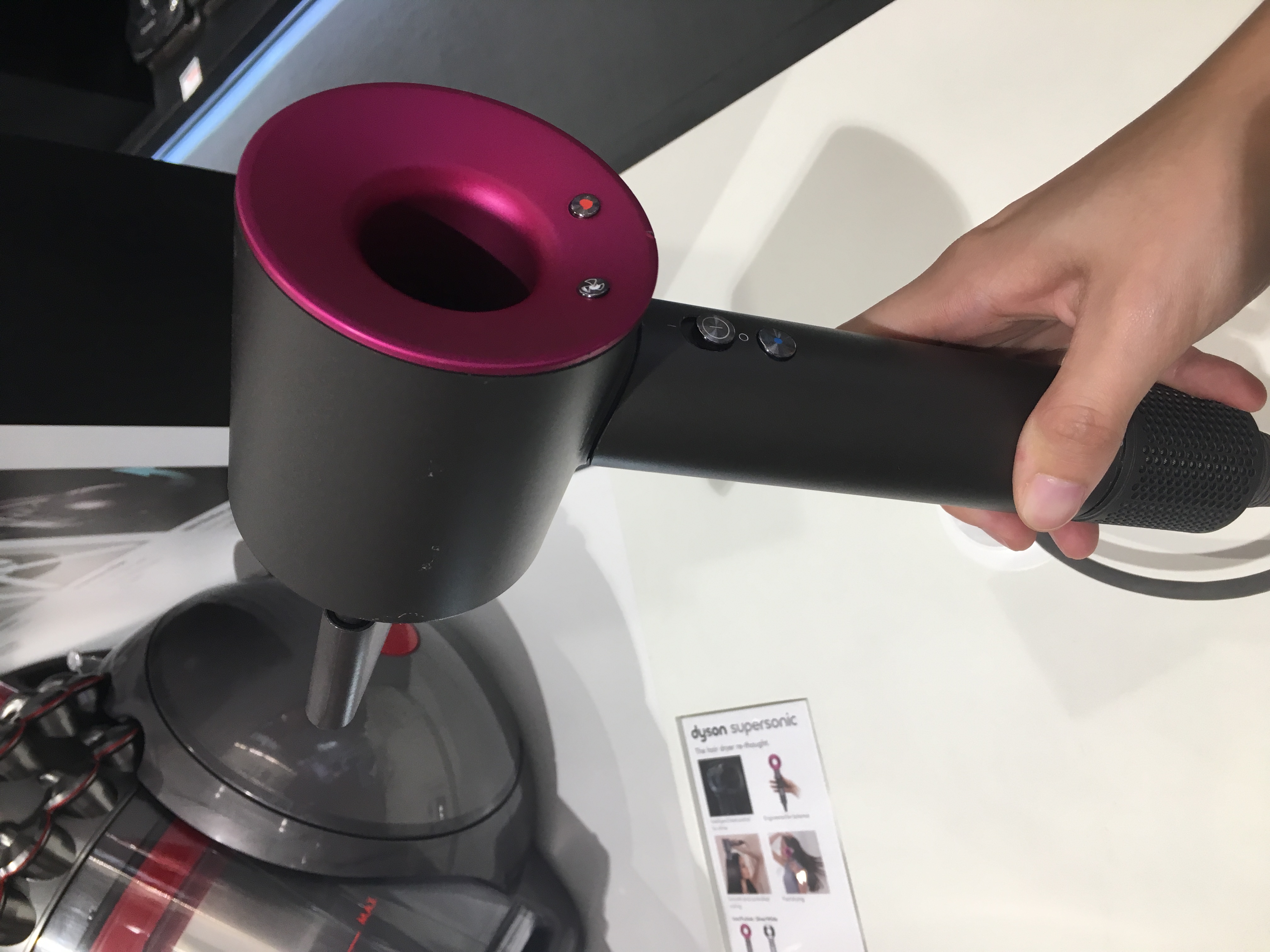
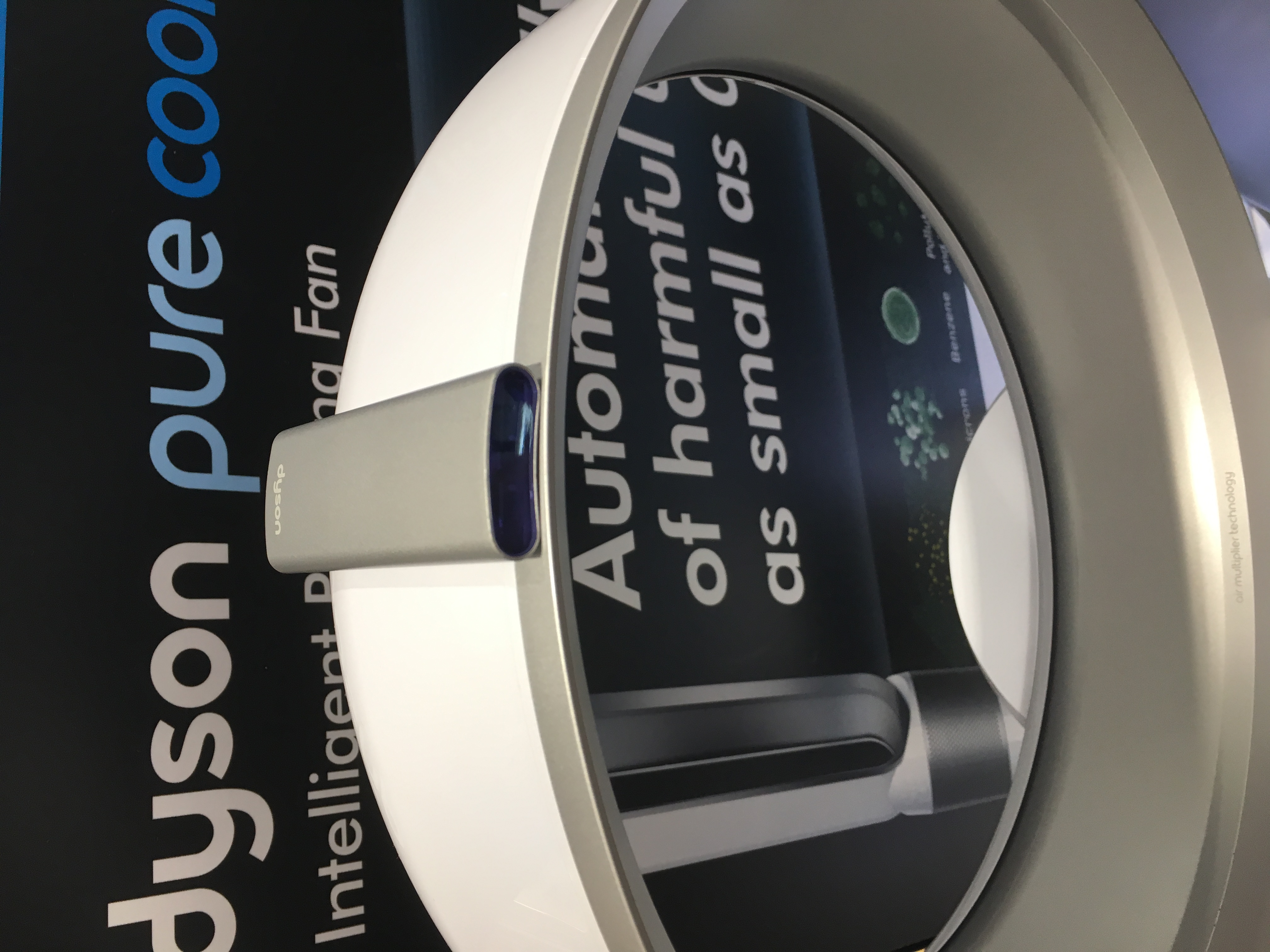
Another trend was pretty obvious through the Dyson products here. Thanks to the development of technology, designers were given more and more freedom to design the form of products. Creative and unconventional-looking products like the hair-dryer and the fan immediately caught our attention. They both have used magnets as a connection media to reduce unnecessary details. This is a cleaner and a LESS deisgn trend, a futuristic one in contrast to the one above.


The Product Triangle

The Triangle

Products are not just a function fitted inside a form. There are many thoughts going into every design and details, considering all the factors that influences the outcome.

For many product, as shown in the above image, are influenced by the 3 factors, function, human factor and emotion, when they are designed. And conventionally, specific types of product have their specific focus. Below are 3 example that, in my opinion, represent each category.

Function-Focused

One of the most common products in our daily life, paper. The most basic requirement would be that people can write or draw on it. Especially for many types of paper, there isn’t much consideration on aesthetics or human factor. They just need to be functional whether they are for writing, painting or crafting.

However, without compromising the function, shifting of the focus can sometimes bring creativeness into the product, expanding the market. For instance, decorative paper with nicely designed graphics are demarking themselves from plain ones as they focus more on the aesthetics. Extra values are added into the product.


Human-Factor-Focused

A pair of scissors as shown above is a example of a product influenced more by human factor. The form needs to be designed to suit the ergonomics of human. Is it easy to hold and cut? Can it be used by left-handed users as well? The dimension etc… In this case, the function is the scissors being able to cut while the form impacts largely on the user experience and even the functionality. Aesthetics is not a primary factor in the design.


Emotion-Focused

And lastly this  pendant lamp is more influenced by the emotion factor. The form is very elaborate and conveys the style of the designer. The light and shadow pattern created adds aesthetic value to it, making it unique and attractive.

Inspiring Designer – Naoto Fukasawa

FUKASAWA

  Japanese industrial designer, Naoto Fukasawa was born in 1956. He started Naoto Fukasawa Design in 2003 and was known for his famous works for MUJI. He also cooperated with many other world-leading design company over the world and gained a great reputation. Products designed range from electronics, furniture to lighting and wearable, etc. His distinct design style definitely has influential impacts over the design industry.

  Personally I truly appreciated his clean yet elegant design. They are simple but well thought of and provide pleasant visual aesthetics as well as user experience, just as stated on his website, “Designing shape is to give form to values that people tacitly share and wish for.” He aimed to approach essential values of things and promoted his concept of “Without Thought”. He observes and finds subconscious behavior of users and shares his thoughts through workshops.


 CD Player/1998/MUJI

  This is probably one of his most representative designs. This CD Player is so easy to understand that almost everyone would react immediately to it by simply putting the CD in and pulling the string. This design incorporated our common understanding of a fan and subconscious intention of pulling down the string. It was a truly brilliant expression of his own observation and understanding of people. In comparison, many electronic products tend to get too complicated and overwhelming with their buttons and icons. This resulted from lack of confidence in their design, in my opinion. Good design should be true to themselves and have no need to eagerly show the users all the functionality of them .