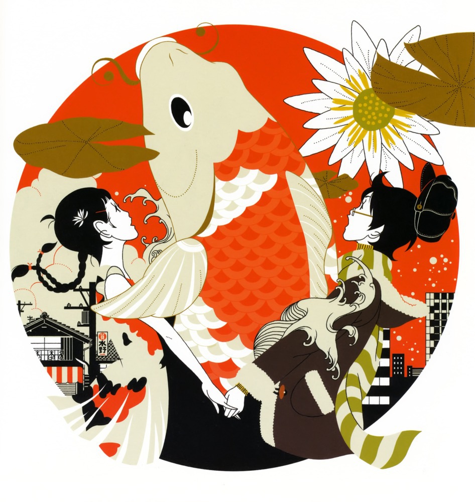
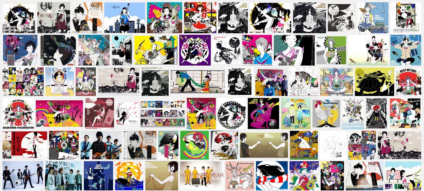
Besides Nakamura Yusuke, I also went to the library and looked through the entire collection shown above. There were so many different and distinct styles that they have and I believed that some of them influence the design decisions I made later on in the projects. There were artists who use only solid bright colors, bizarre combination of colors as well as playing with texts……and besides this I flipped through some on the minimalists as well…Since there were too many of them…I don’t want to fill the whole page with references. Instead I would like to share how I got inspired with a few examples.
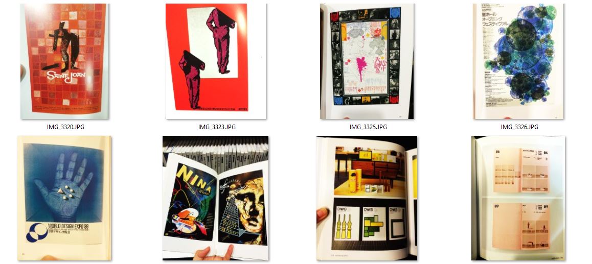
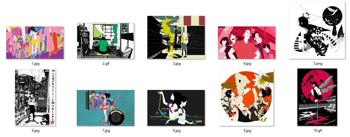
First thing I noticed was that it is safe to play with monochrome and in many cases mix with black&white. The bigger the range in brightness or saturation determine the contrast of the image. And in the case of the bottom left image, since the background and the hand is similar blue, the bright white naturally becomes the focus and the first thing viewers notice.
In order to make the colors less dull but without risking too much…we can add an appropriate portion of the color adjacent to the main color. As you can see in the first and second images. The slight change of tone gives layers to the images.
The third image is a combination of photograph and solid colors. It also reminded me of the art from Bauhaus period with the popular usage of blue, yellow, red and white.
There are also minimalist style with simplest shape to describe the objects and bold black outline.
For the second image on the bottom row, it is a very bizarre yet nicely-balanced design. I am not sure if I am anywhere near to the right answer. But, I assumed that it is due to the big portion of black/dark background and the balance between each colors. Also the very contrasting colors may seem far on the color wheel but yet similar in either saturation or value.
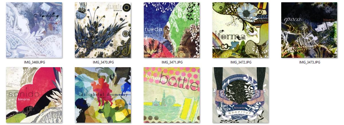
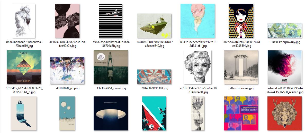
There is this artist that designed all the album covers for the singer group called Binaria. I couldn’t really find any more information on the artist but as you can see above, the colors were very nice in each of them. As compared to Nakamara, these are duller and more netural colors. But also similar in amounts of details and line work in some of them.
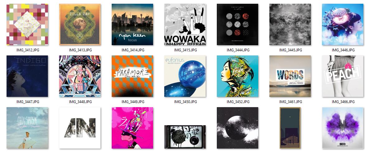
Besides I was also inspired by many album covers of various artists and I studied how they played with colors and contrast…etc.