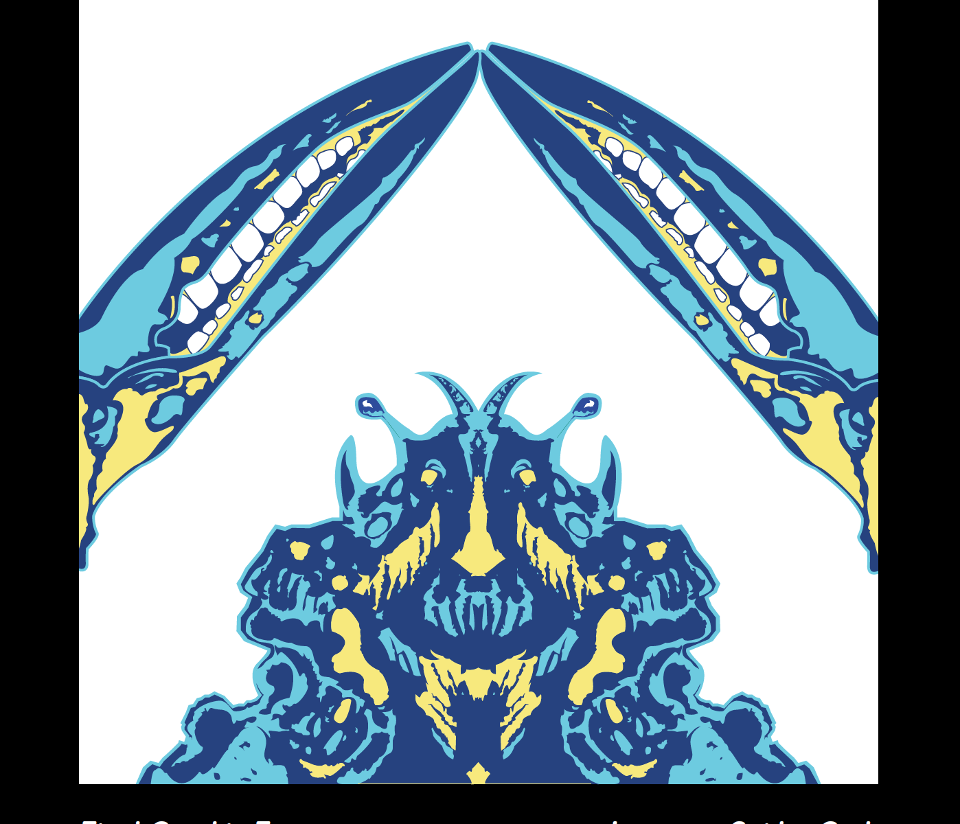
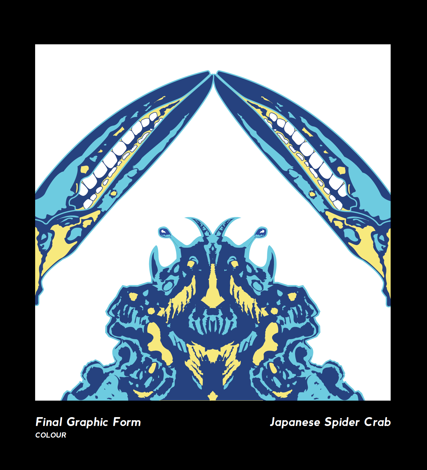
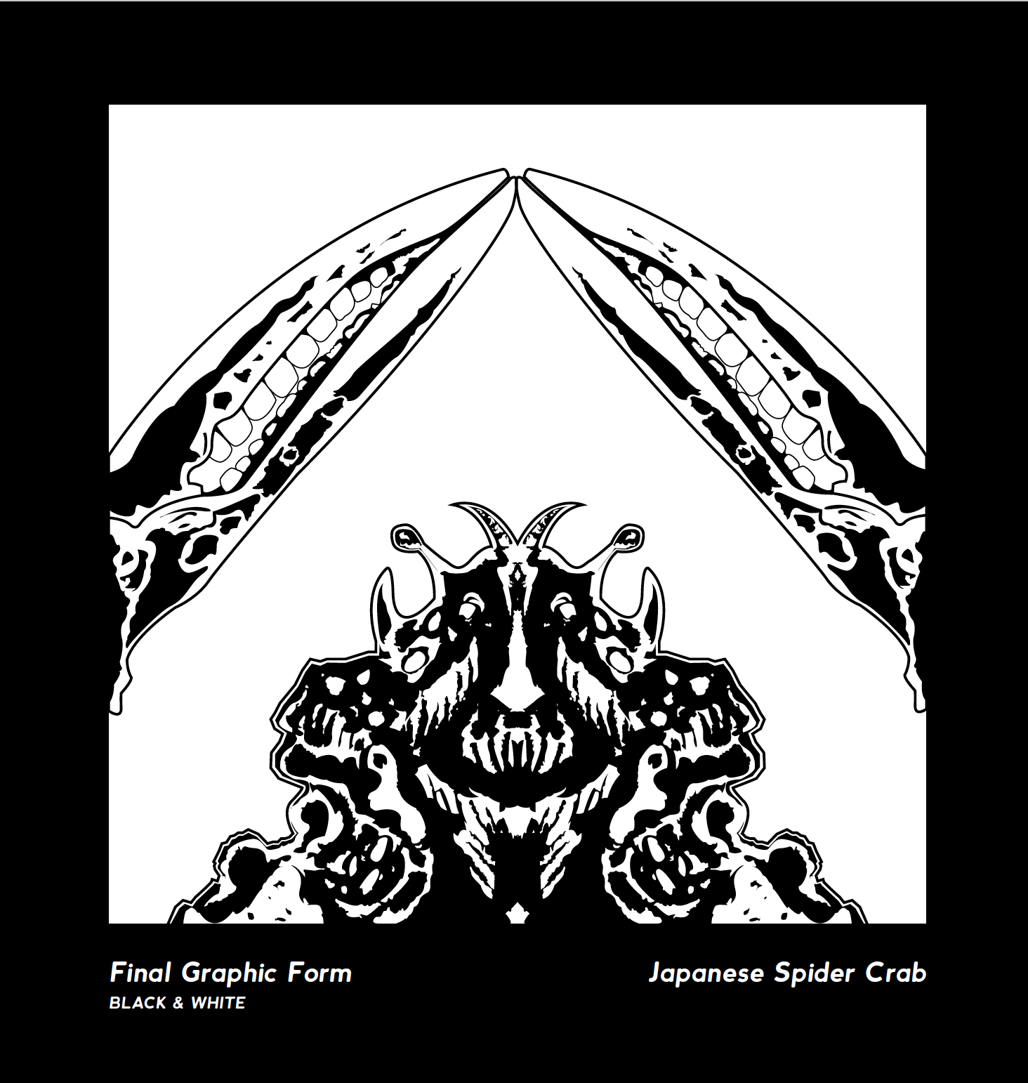
Final Outcome.


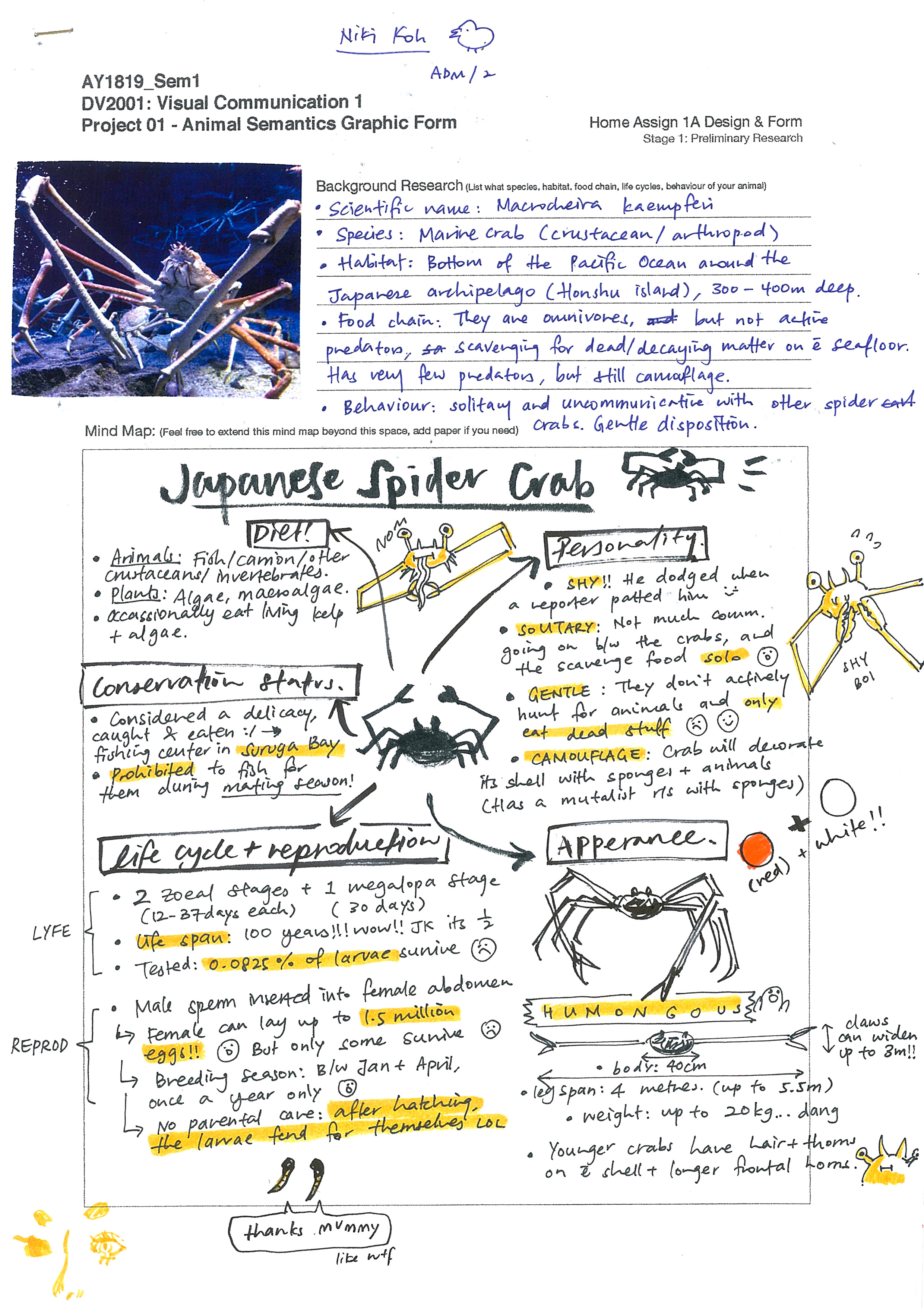
Process.


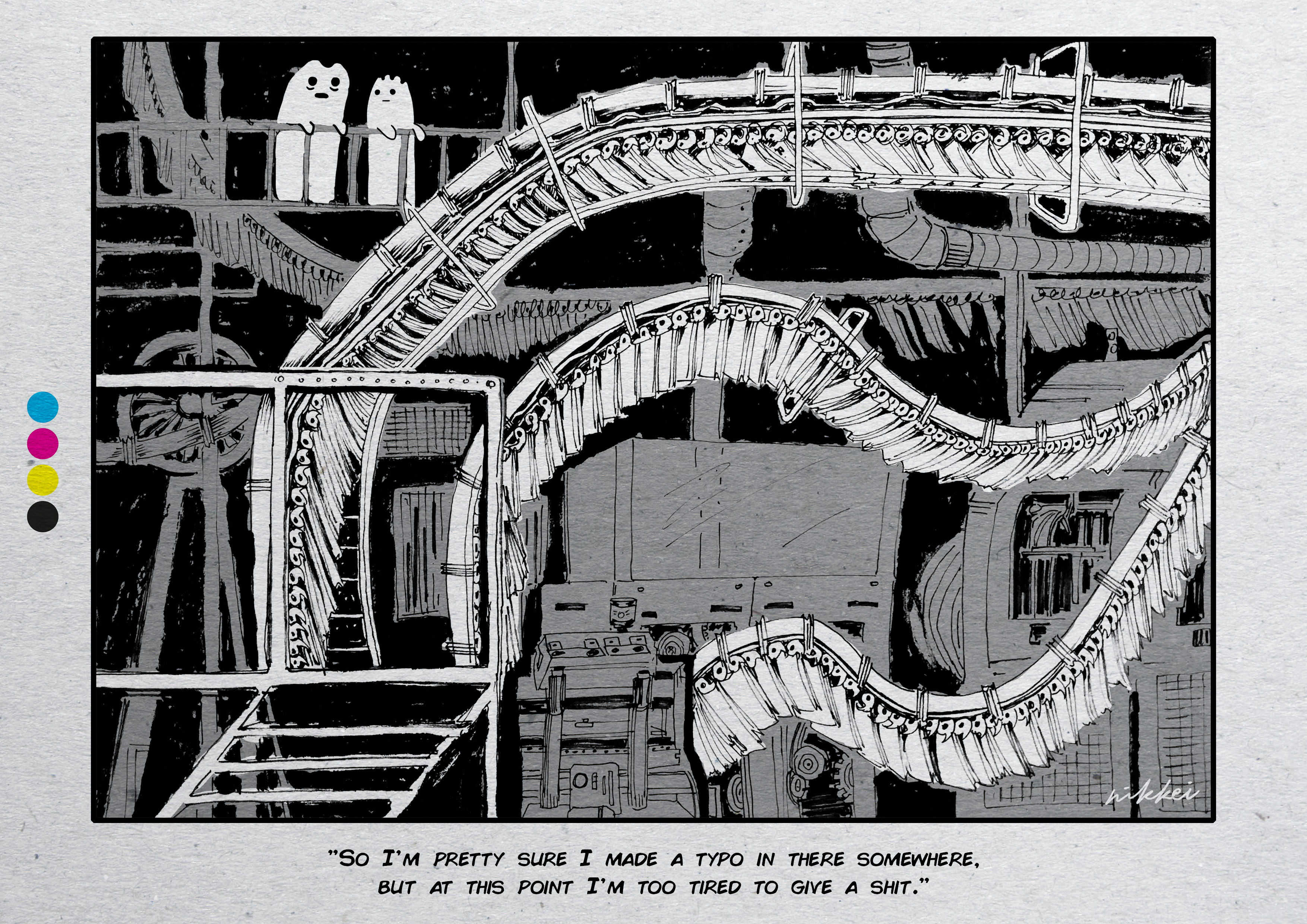
@nikkei.dex

Final Outcome.
Process.

Final Outcome.

Process.


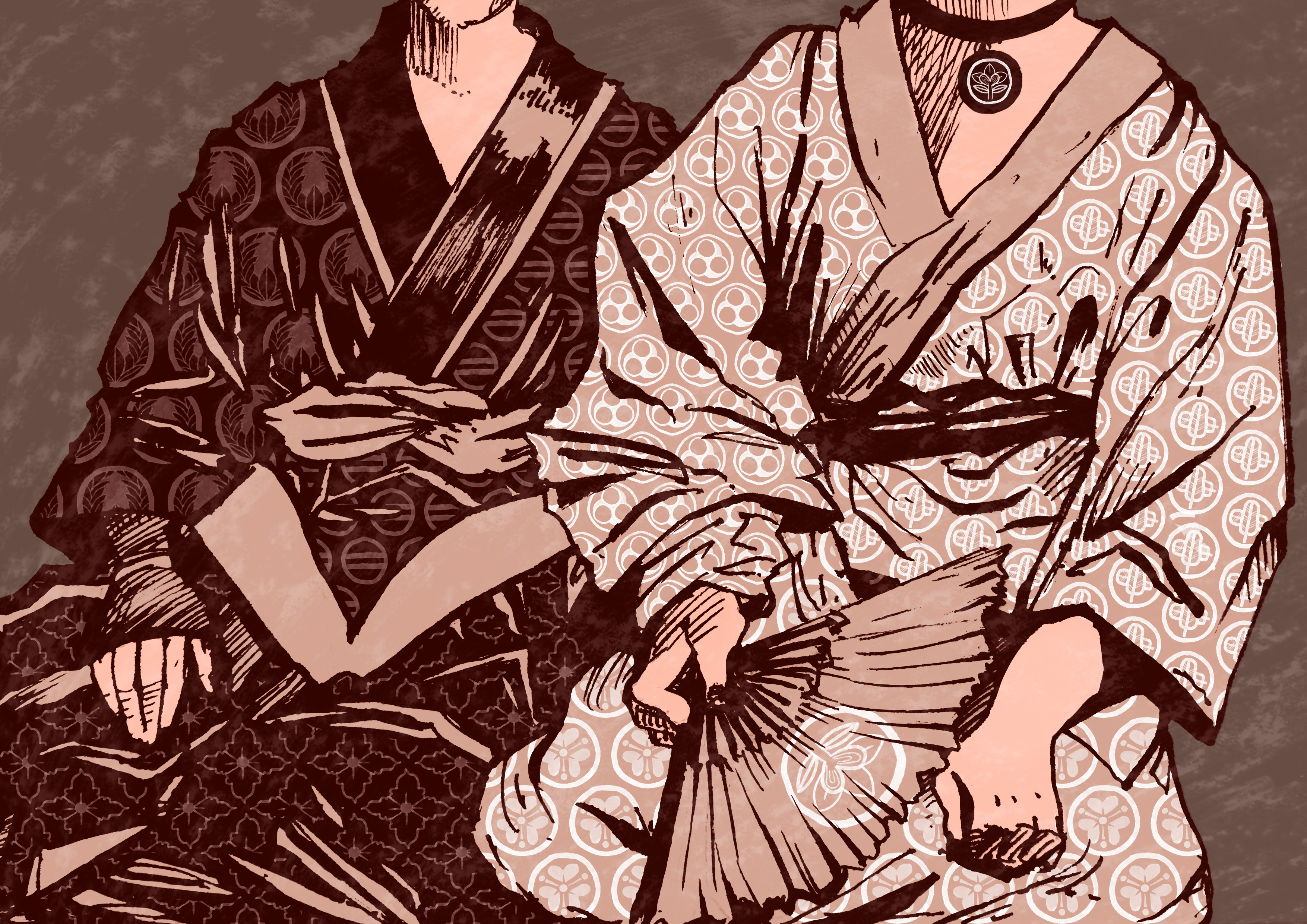
An example of dharmayuddha is the Kurukshetra War from the Indian epic poem Mahabharata, where two groups of cousins, the Kauravas and Pandavas fight for the throne of Hastipura in the Indian kingdom of Kuru. Completed around the 4th century, the Mahabharata is considered the longest poem ever written, with about 1.8 million words in total, and the Kurukshetra War is a central section of the account, forming over a quarter of the entire poem.
The entire story of the war is incredibly long and complicated and spanned 18 days and I really wish I could digest it but anyway what I could process was how the dharmayuddha was carried out in the war. Rules were set for both the Kauravas and Pandavas to follow, which generally follows:
The rules were flouted soon after the death of Bhishma, a prominent warrior on the side of the Kauravas. On the 13th day, Abhimanyu was killed with a strike to the back to the head, which was illegal. I thought it was an interesting parallel to the idea of how classical physics has defined rules that constrained what could happen in the macro world, but these rules are defiantly flouted in the quantum world, tainting our perception of what is possible.
I thought it would be interesting to create a tapestry of sorts with the constraints of these rules of battle in place within the motifs, with the opposing sides


Not gonna lie for the zine I was pretty lost?? Initially I had ideas but like I didn’t know it had to be..ABSTRACT….so when I heard that I was like Oh No how??
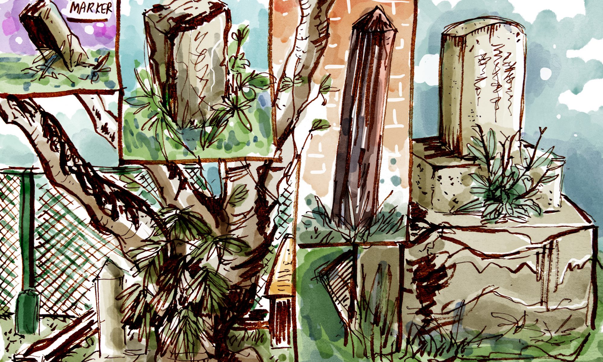
But eventually the plan of action was to have the spreads follow a chronological order of changes within the cemetery, with a focus on unique Japanese visual cues:
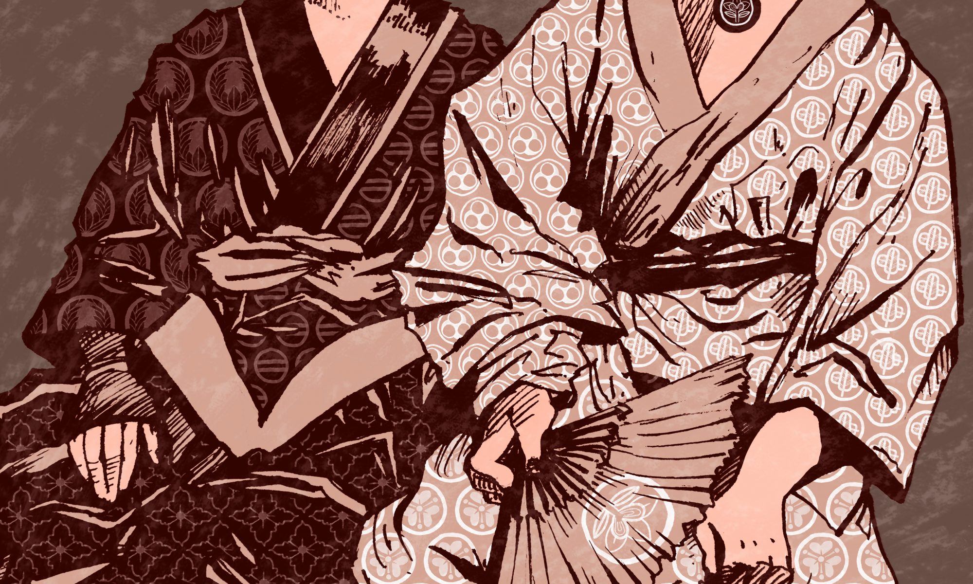
Since I wanted to incorporate the karayuki-san, who were the first to be buried in the cemetery, as well as the interesting motifs in the kamon family crests found on some of the graves, I thought I could combine the two into one spread.

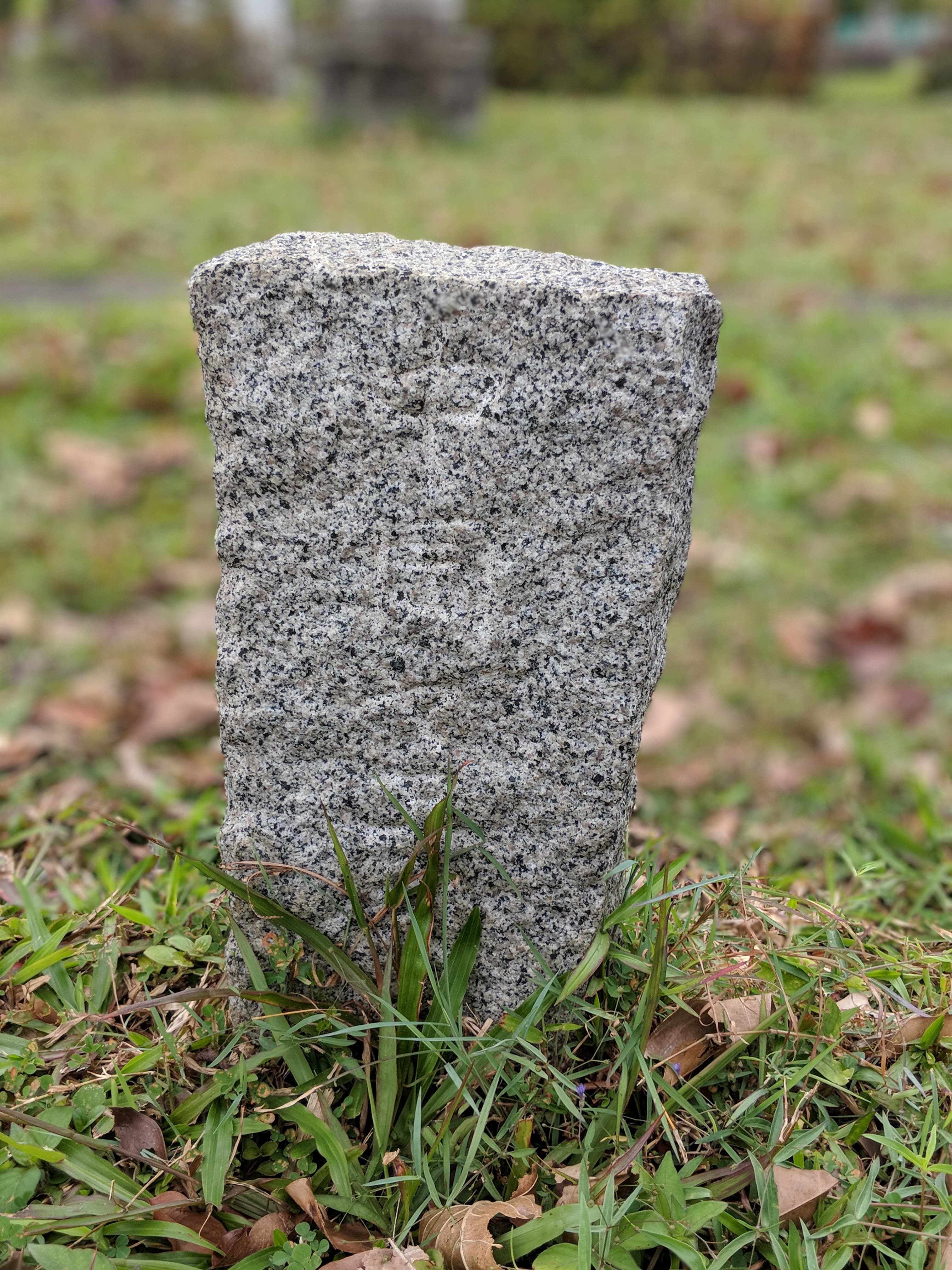
In total I found seven different crests (Some of them might not be crests like the non-circle one??? I can’t be certain.) and tried my best to reproduce them even though a lot of them were very faded.
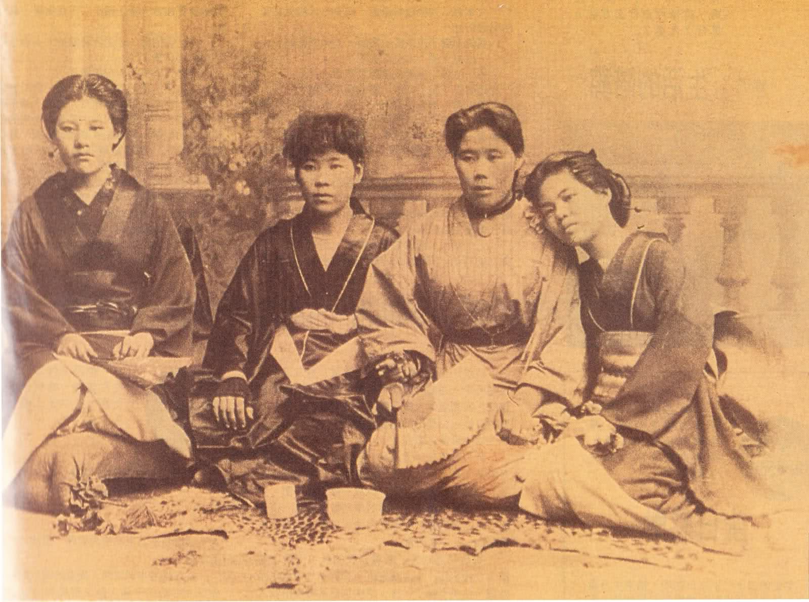
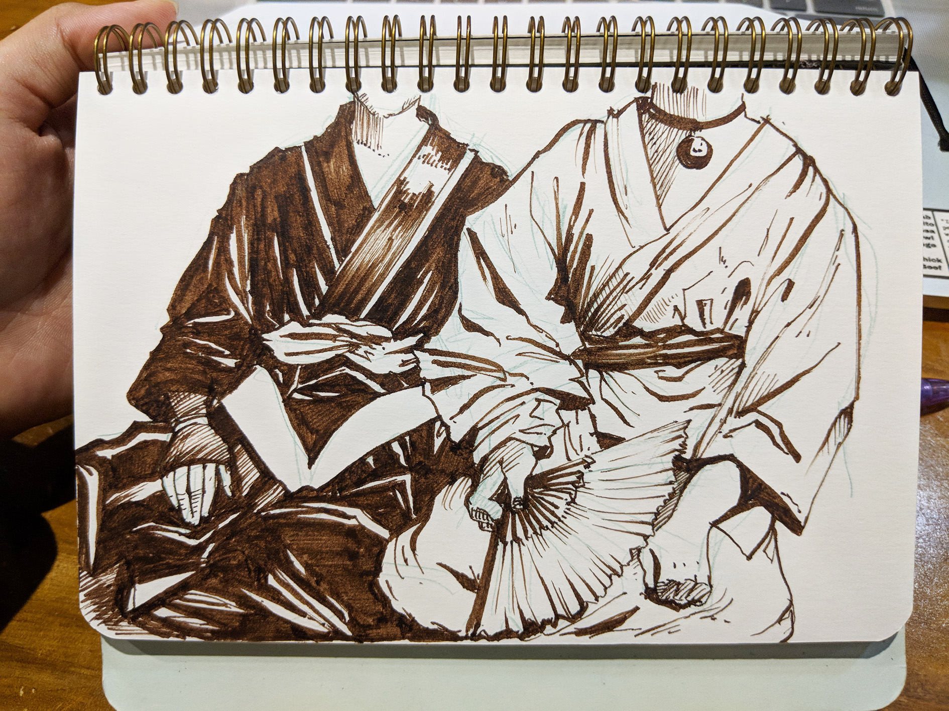
I sketched out karayuki-san from a photo, purposely leaving out their faces (apart from not wanting to burden myself with facial features) to drive home the point about the forgotten souls that rest in the place, as a lot of them died in the conditions they were under, with diseases like cholera and dysentery spreading. 🙁

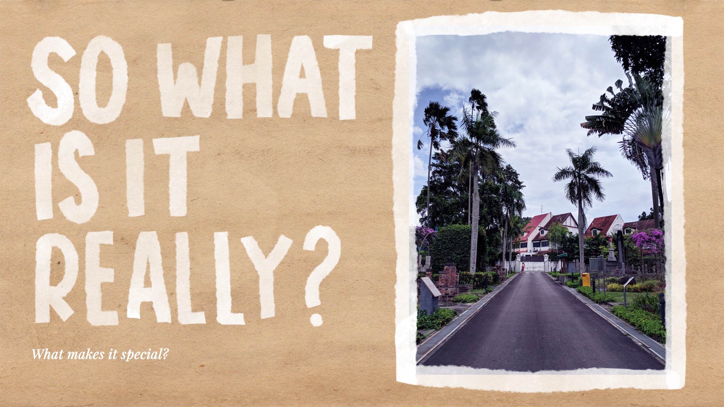
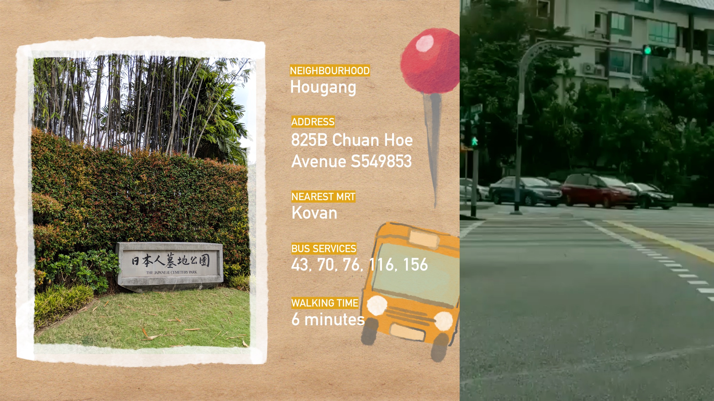
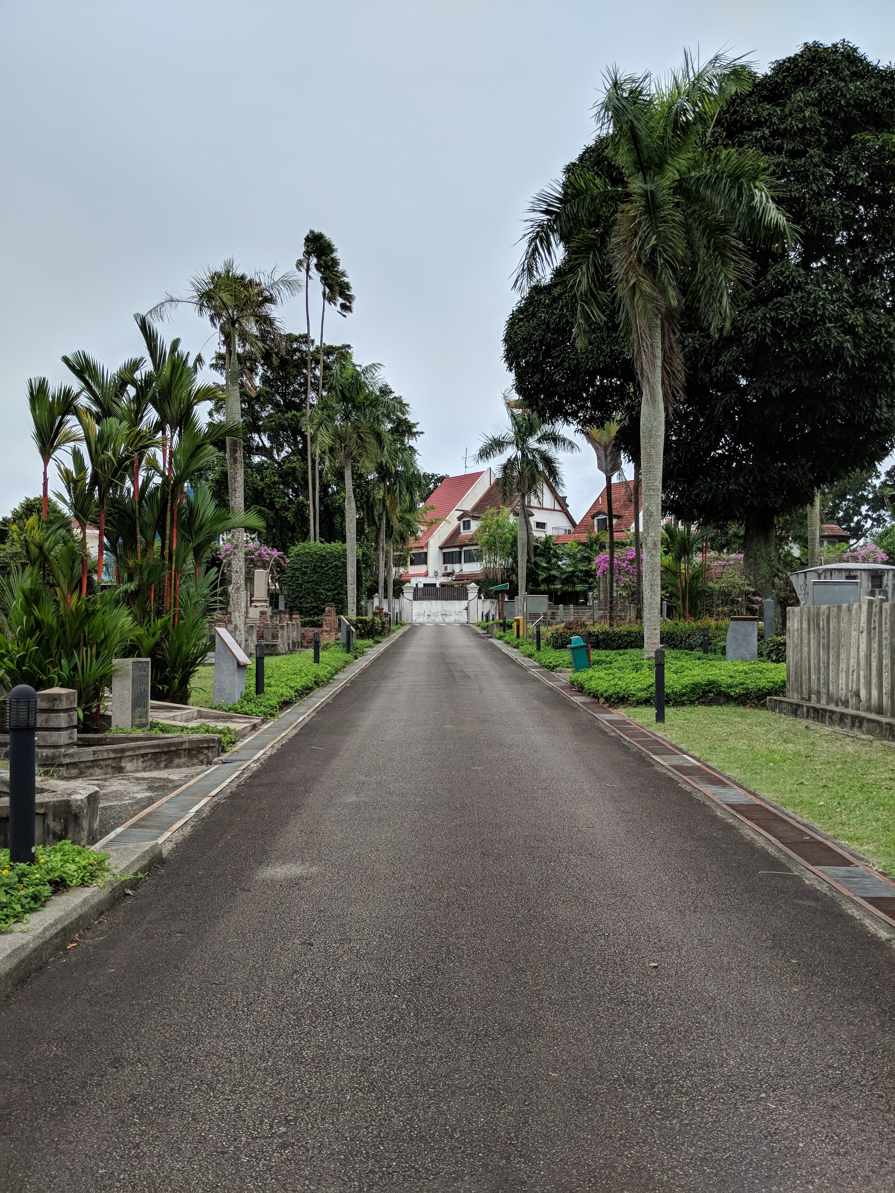
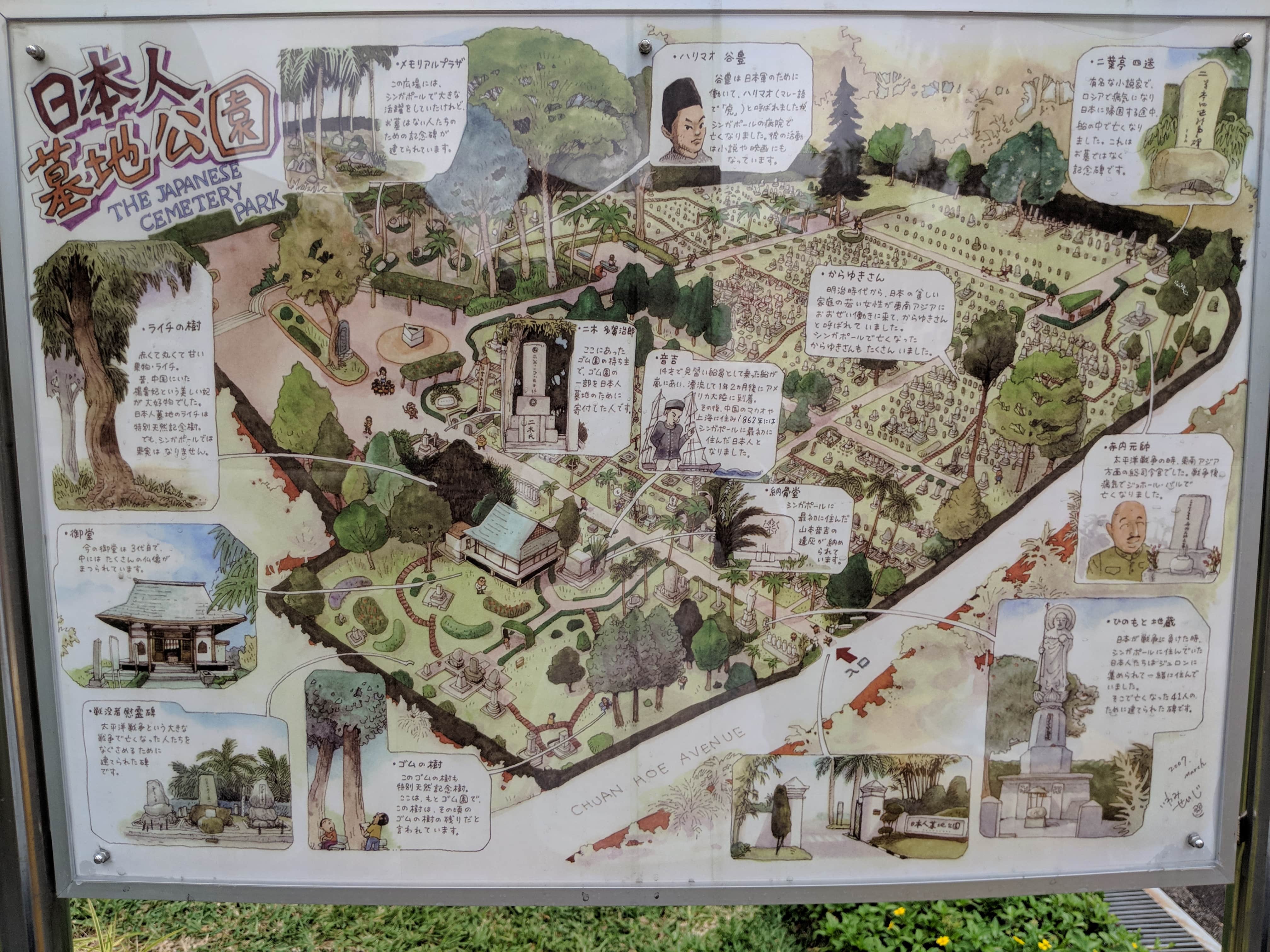
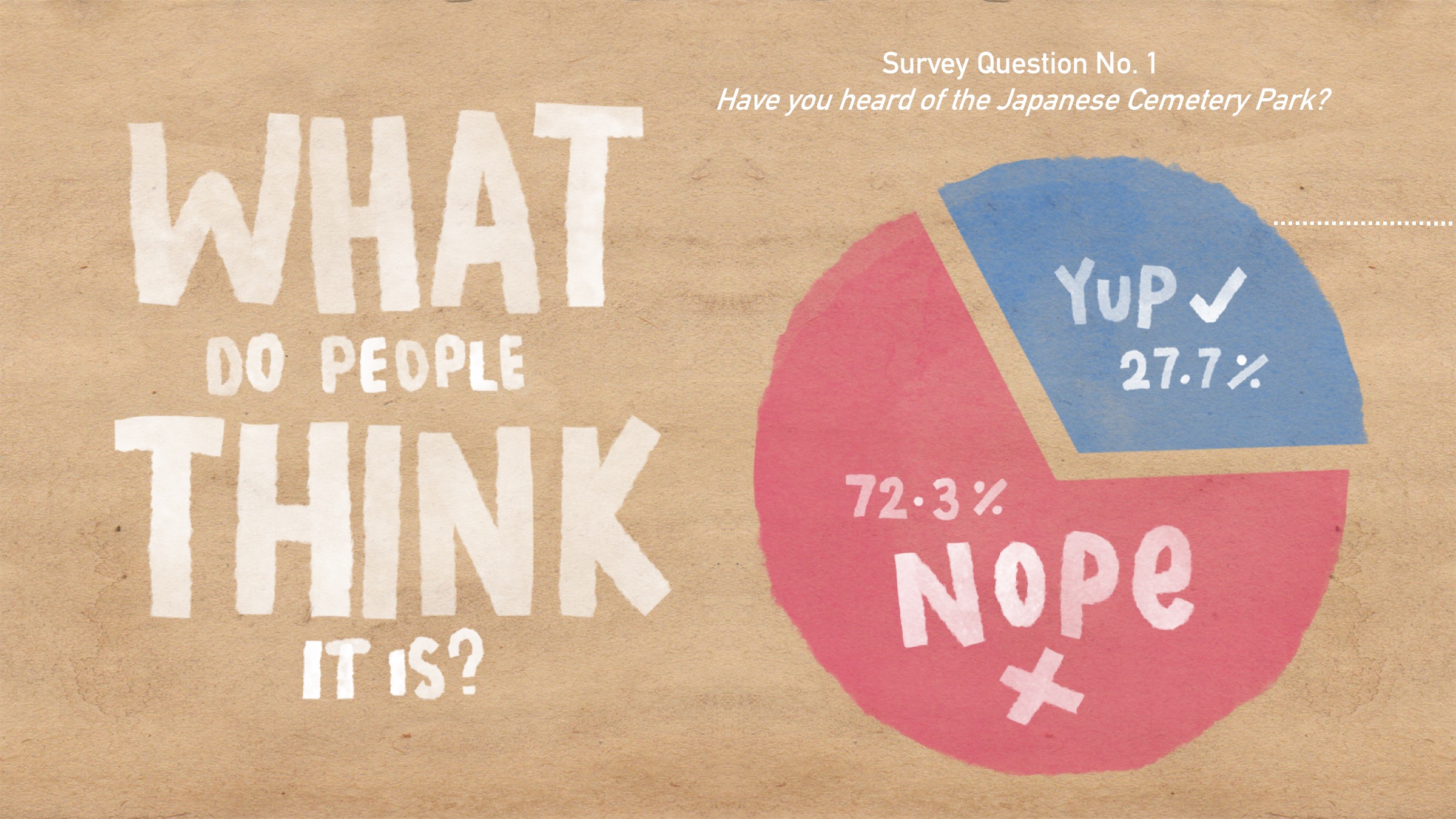
Why? I visited the location often in JC for research for a history project, and it’s a place that I find really peaceful and historically rich, so I thought it would be apt if I used this project to dig down into the unique aspects of the site. :))))))

Photographs and written observations about the Park. :))

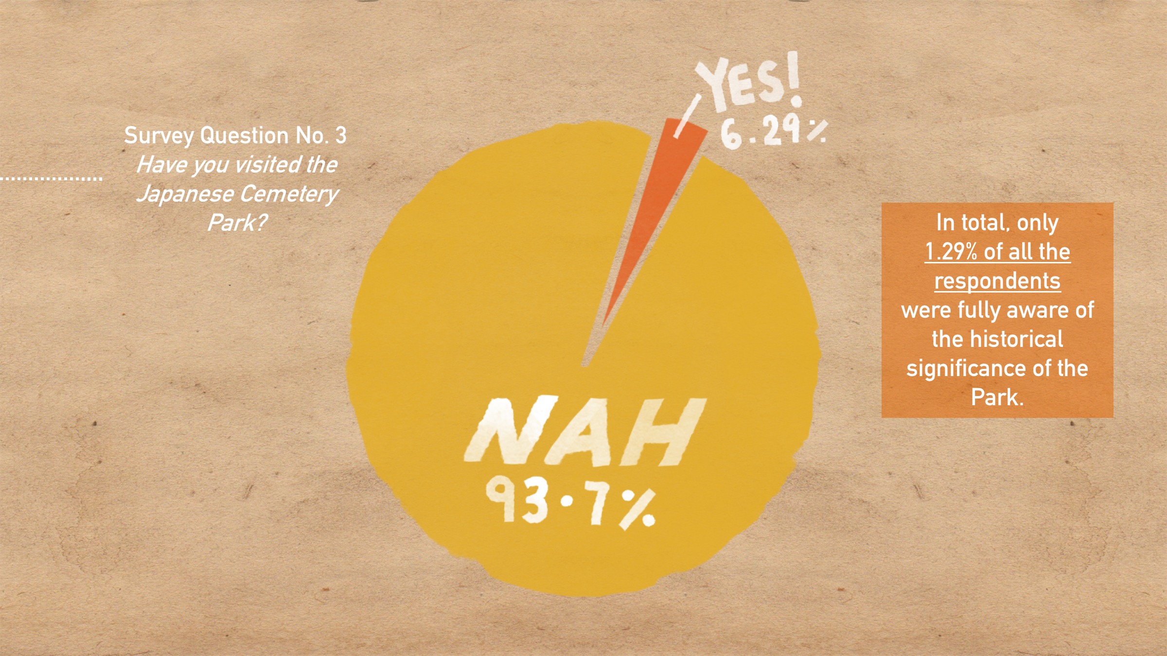
Here’s a brief overview of the history of the Park, which is Southeast Asia’s largest Japanese cemetery, housing 910 tombs. :O
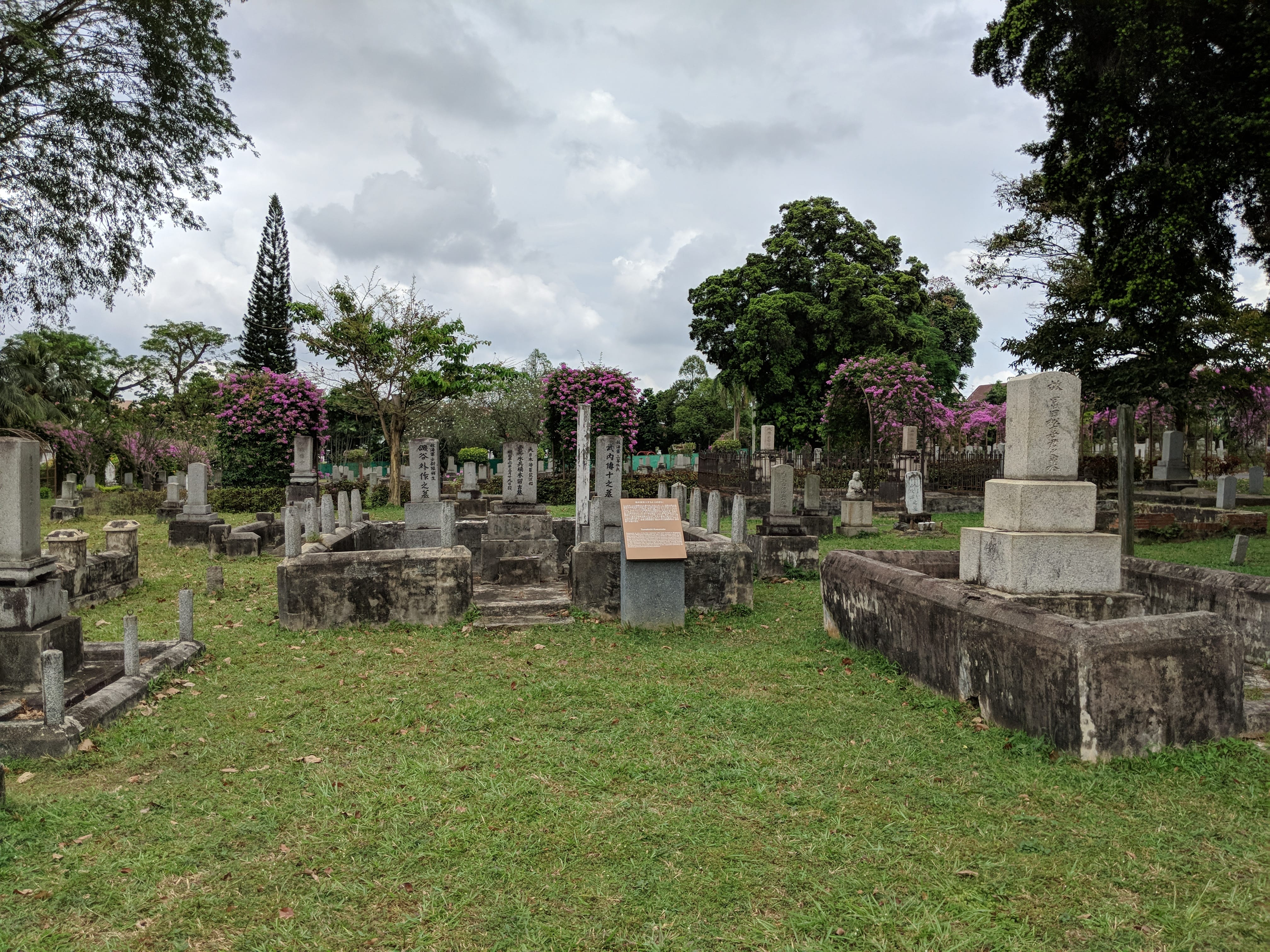
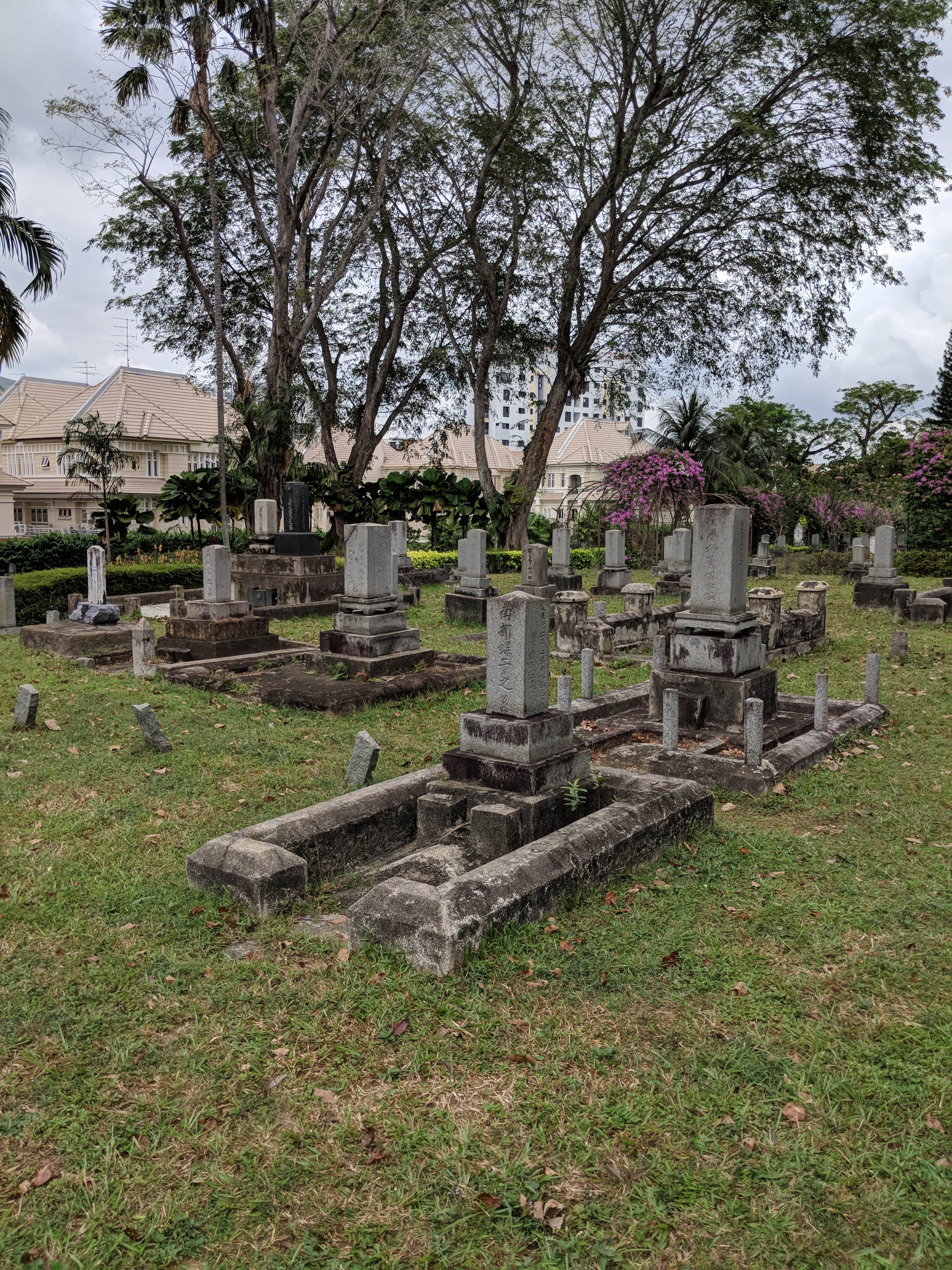
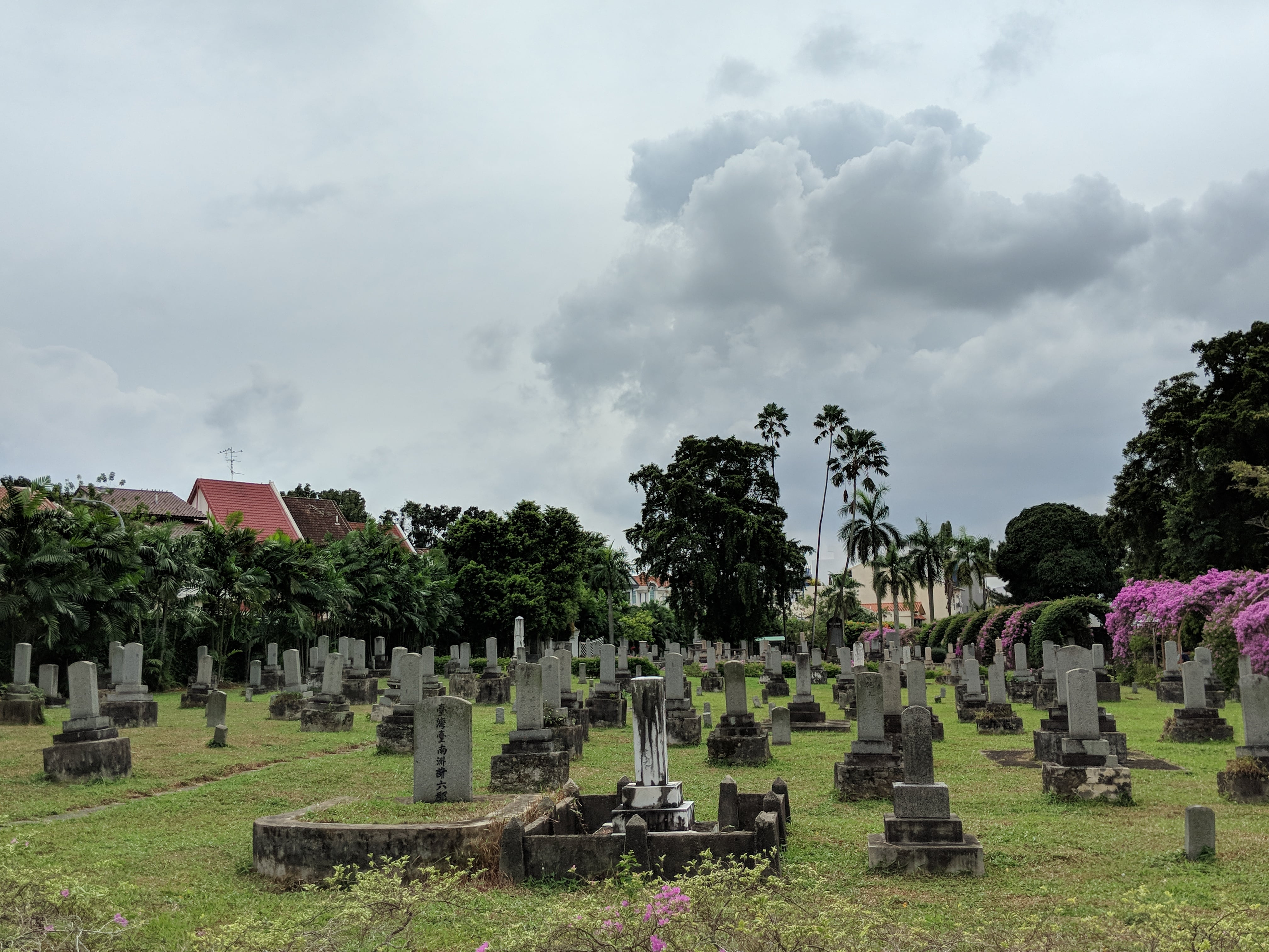
So as a cemetery would have it….graves and tombstones dating from the pre-war times to the post-war times. In my presentation I gave a brief overview of some of the different tombs, like tomb markers for the karayuki-san, Japanese prostitutes who were surprisingly some of the first Japanese people on the idea. As the community flourished, the Japanese’s socio-economic status heightened and you can see this from the shift in the tombstone to more elaborate designs. With the war came memorials and tombstones dedicated to the war dead as well. I thought it was interesting how you could see the rise and fall of the community through the different groups of tombstones.
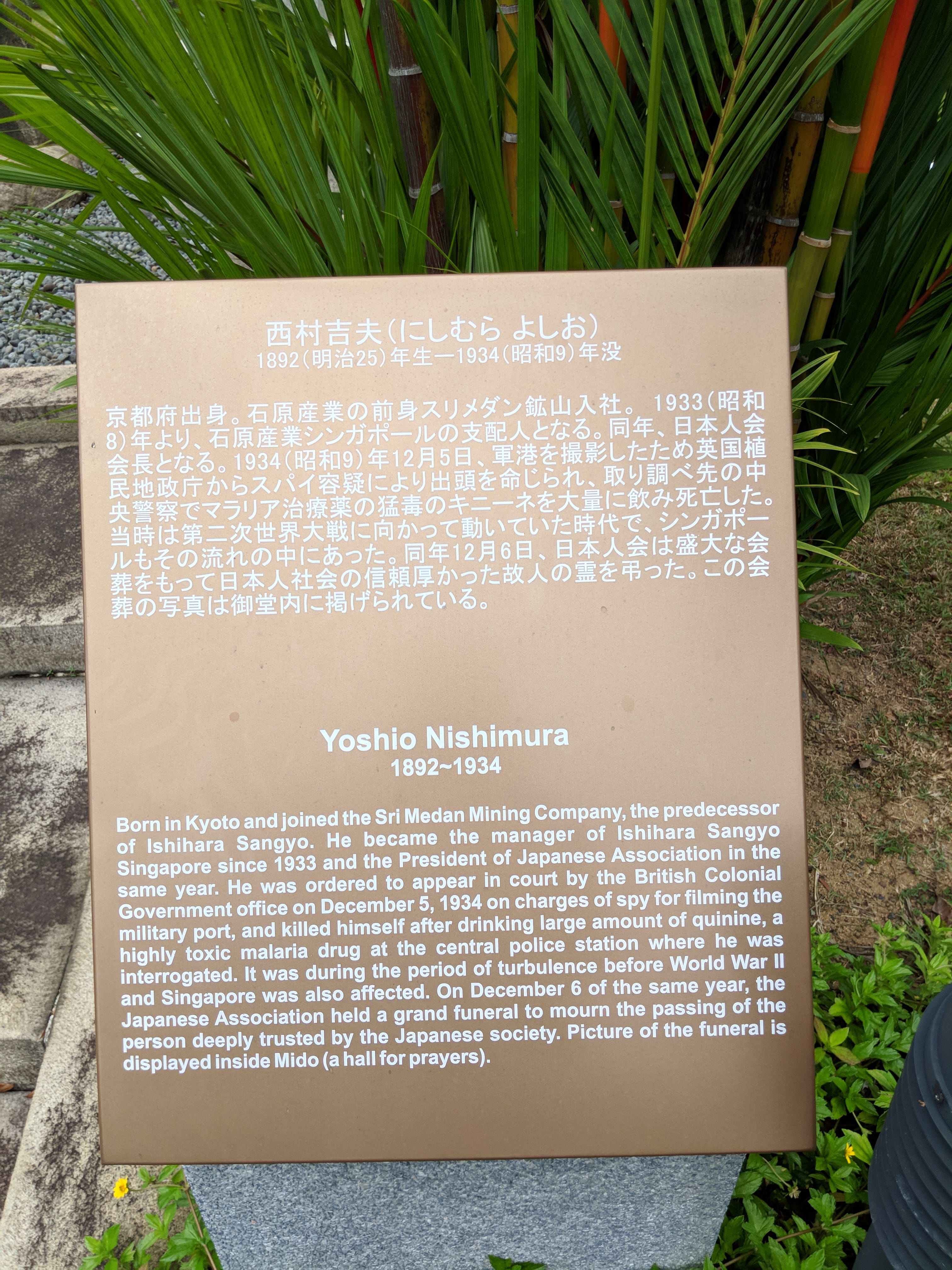
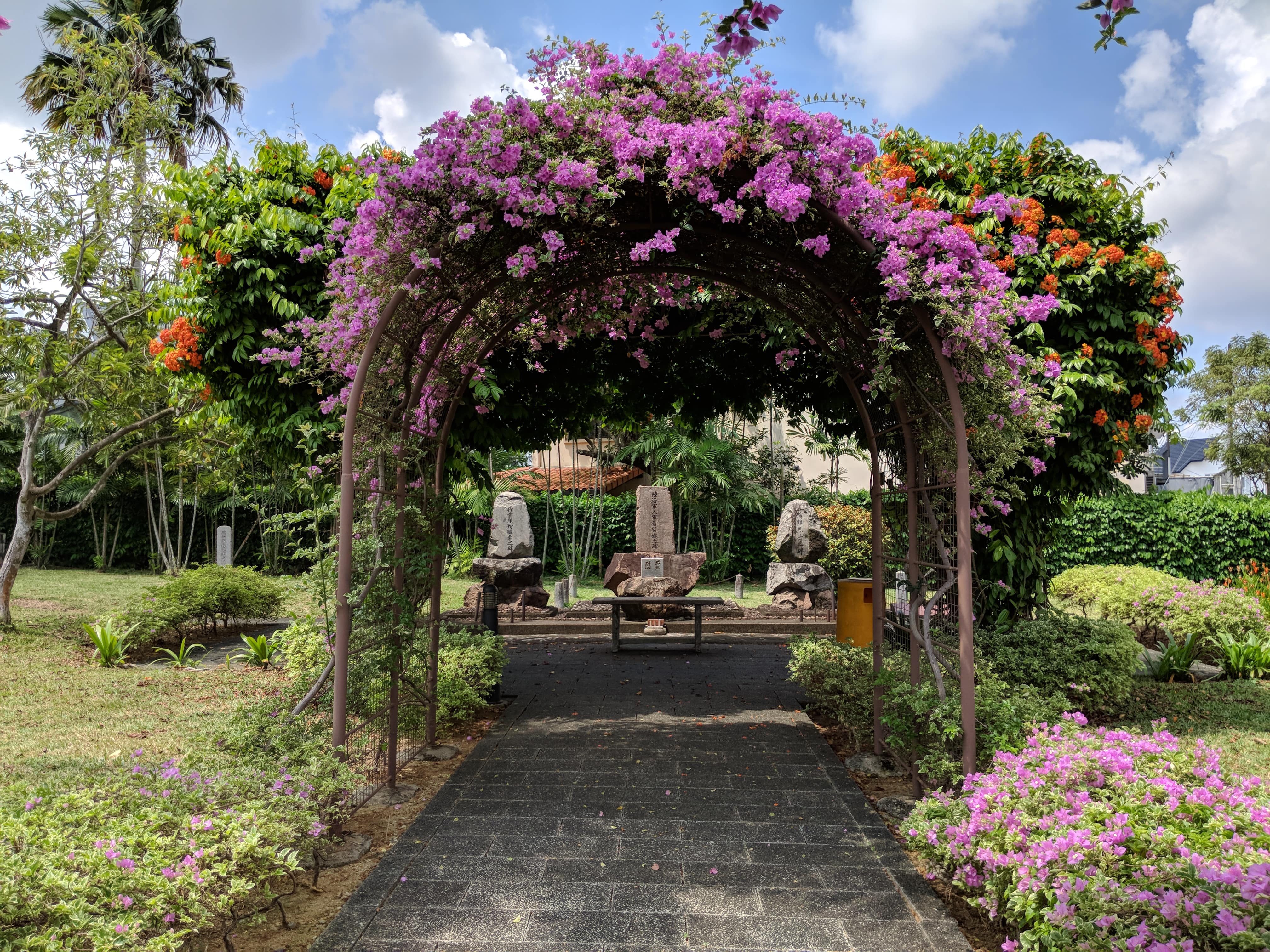
There are a lot of plaques littered around the Park, especially at tombstones of notable Japanese people who for example, made contributions to not just the Japanese community, but pre-war Singapore as well.

Interestingly enough the prayer hall isn’t supposedly for a fixed religion, so anyone can come here to pray. Midō is a religion neutral term apparently.
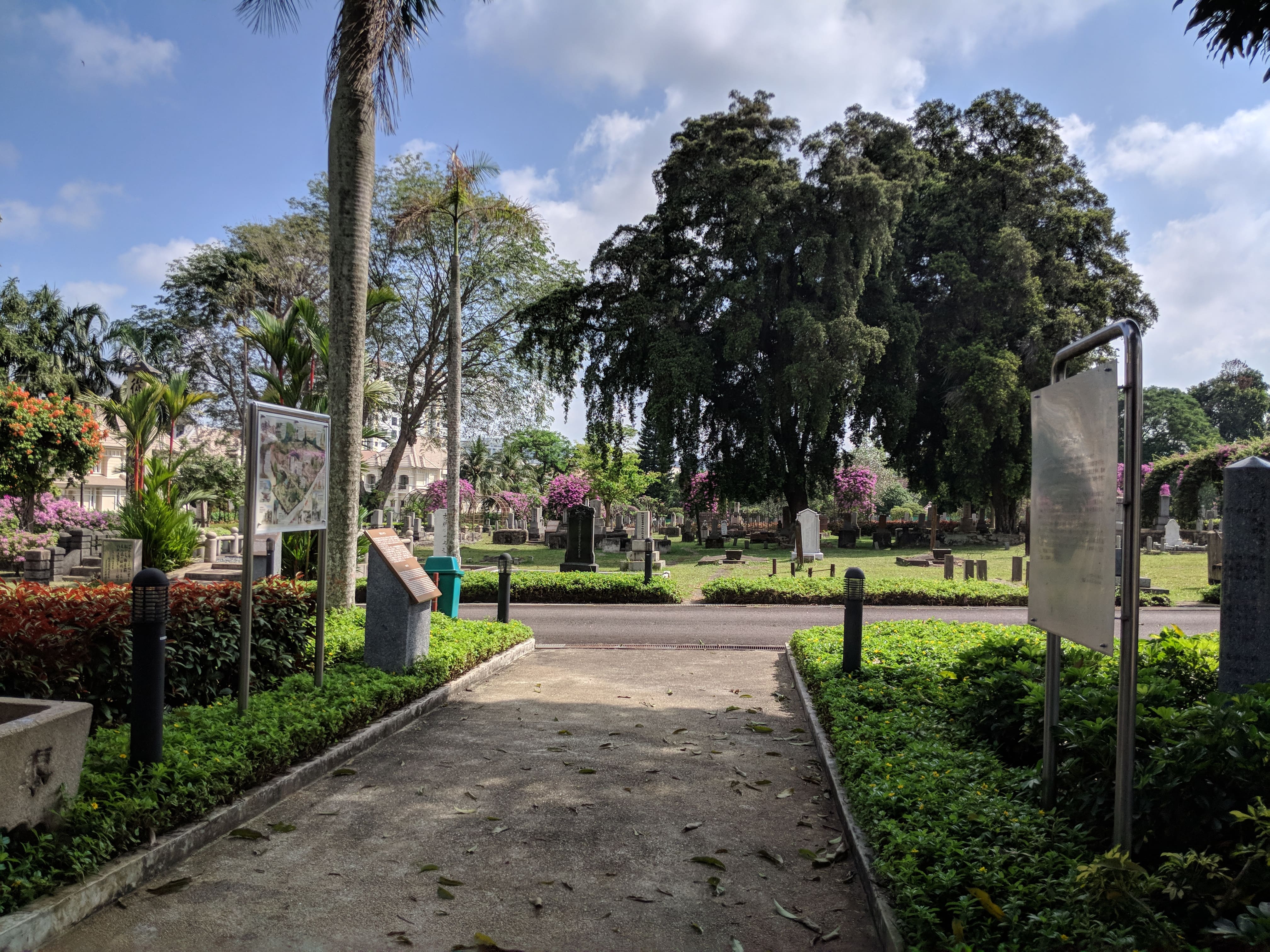
On my first visit I sat down on the steps and noted down some observations about the place:
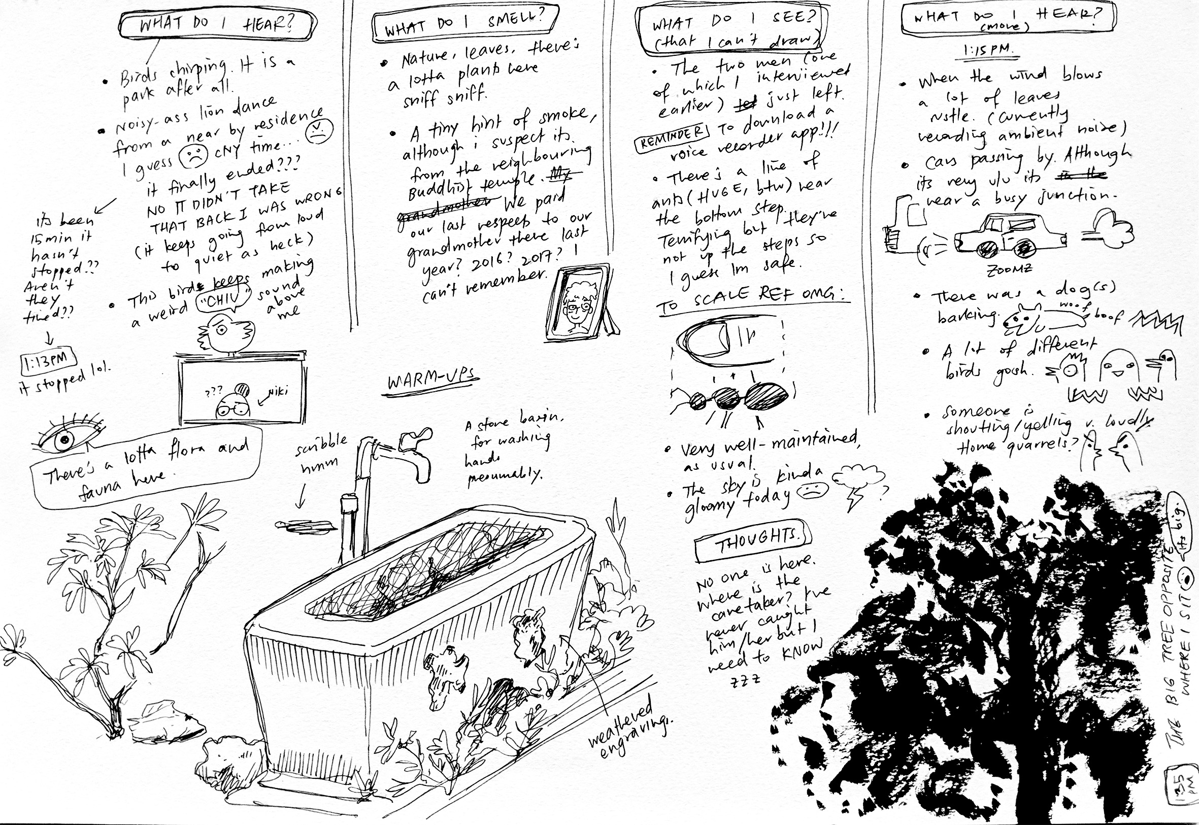
Recorded some ambient noise but there was really barely anything other than rustling haha.
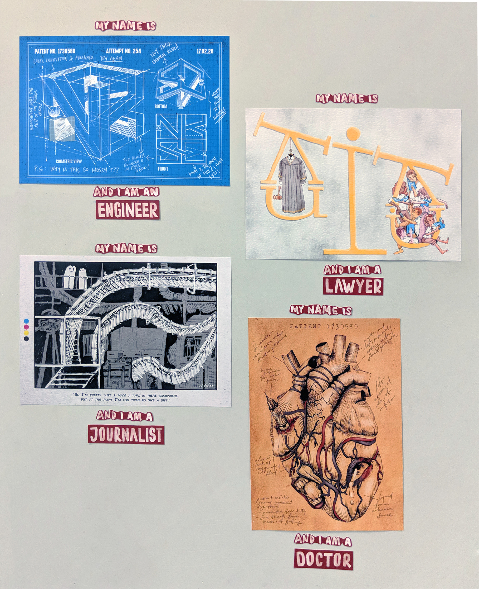
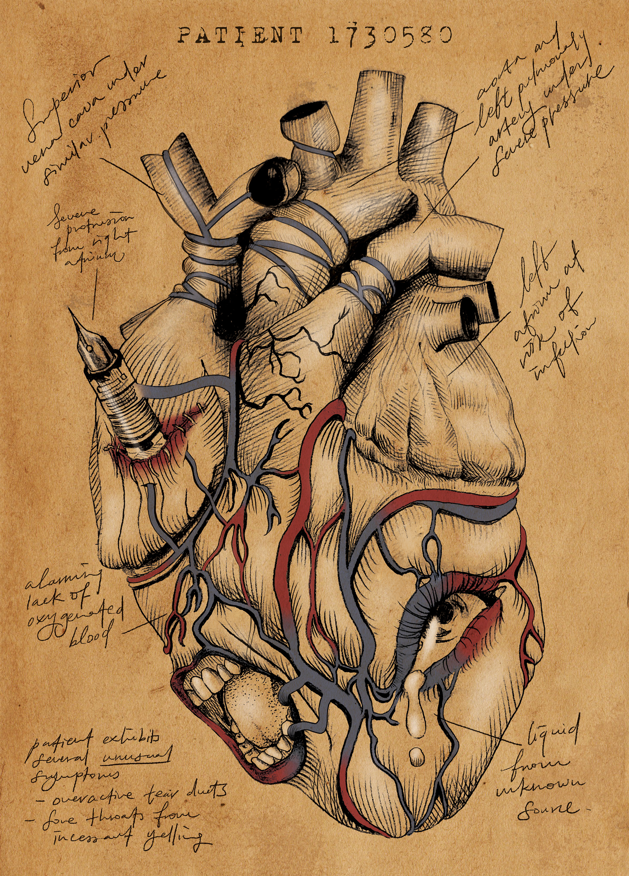
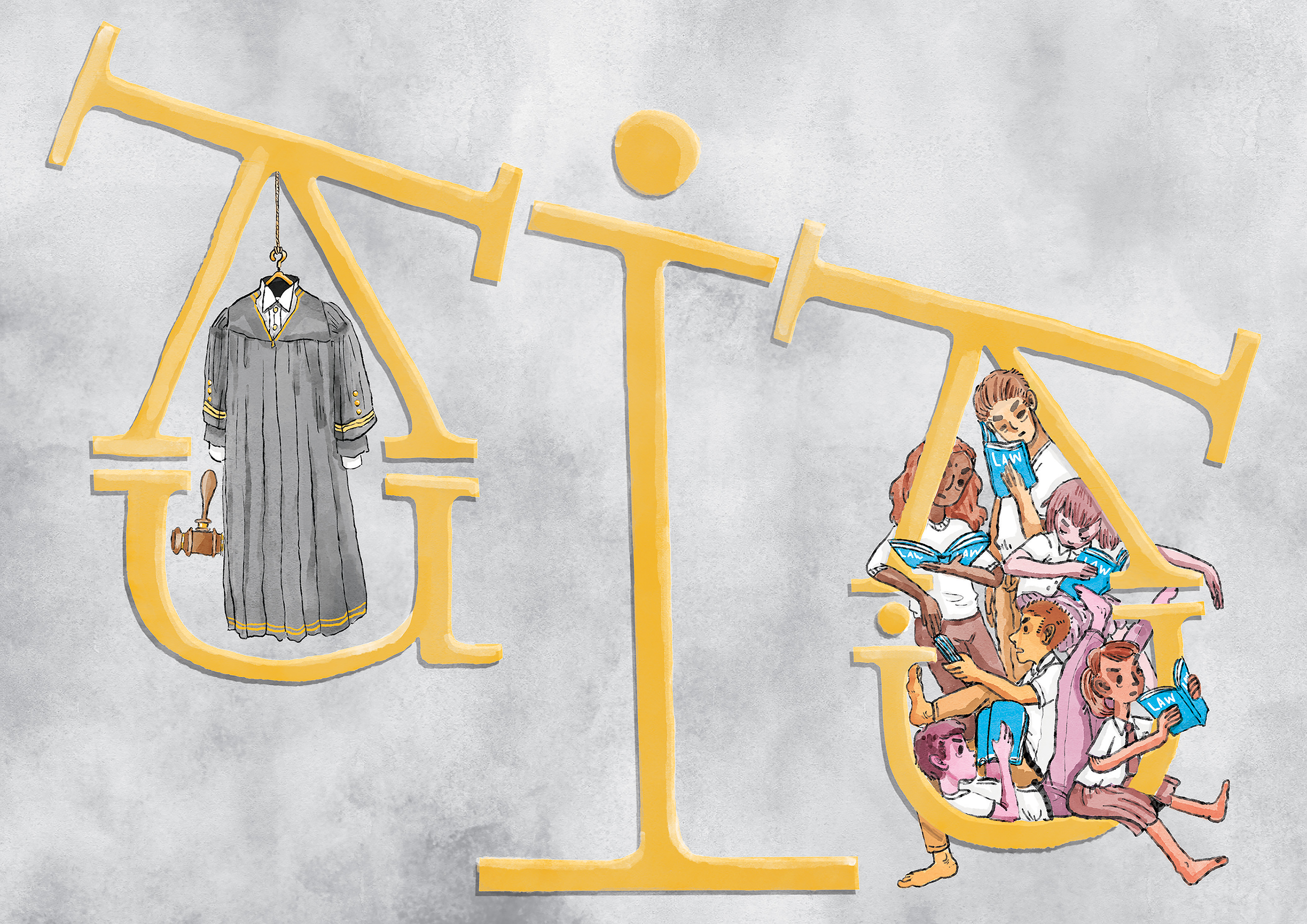
I wanted to do a topic that I could personally relate with?? Like wacky job sounded cute but I wanted to do something more serious like a social commentary. So I picked the theme of stereotypical Asian occupations that were supposedly stable and safe and high-paying, which is something that is quite close to my heart considering that I’ve been subjected to a lot of these expectations throughout my life. :’) So I thought that I could put my personal experiences in the portraits, as a sort of like series of “Futures that could have been, but now will never be.”

Also, I didn’t want to rely on a literal portrayal of a person doing the job to convey my ideas. I wanted to represent the ideas through the themes of documents associated with the jobs, like newspapers, blueprints, drafts etc.
JUMPING STRAIGHT INTO THE PROCESS BC NO TIME TO DILLY DALLY AND RAMBLE!!
Steady income!! Everyone needs engineers…right……I mean. I couldn’t imagine doing math all day every day but props to those who do?
But some traits of the job I thought of were:
When I thought of an engineer I immediately thought of a blueprint? I’m not even sure engineers use blueprints but I’m sure the fact that it was a image that popped up in my head is telling of some sort of stereotype or perception of engineers.

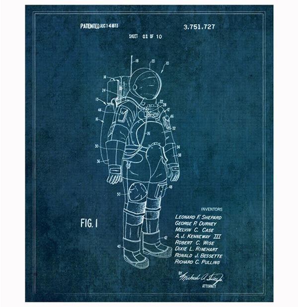

Important features I had to adopt were the clean cut lines, grids, labelling and that faded shade of blue. Also I thought the text in the corners really added to the realism of the blueprint.
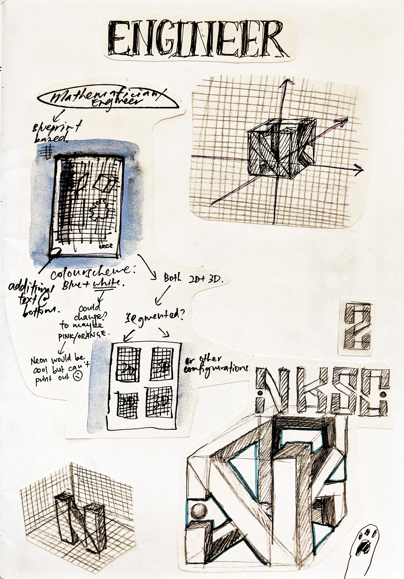
What was in the blueprint was an idea I arrived at pretty quickly. The initials I chose, NKSC (Niki Koh Suat Chee) were pretty blocky (apart from S and C but that could be fixed), and came in 4 so I was like…..cube……
So I made my letters into a cube. Planning out the connecting areas was a bit of a chore though.
I was also deciding whether I wanted to have only one configuration of the letters in the middle, but realised that ohno!!! The other two letters (S and C) couldn’t be seen clearly in the 3D cube. So I decided to create other orthogonal drawings of the cube, in a smaller size at the sides of the paper.

Created a grid in Photoshop and added various textures and stains to make it look more worn. The white lines were made with a pencil brush to make it look more authentic. :)))
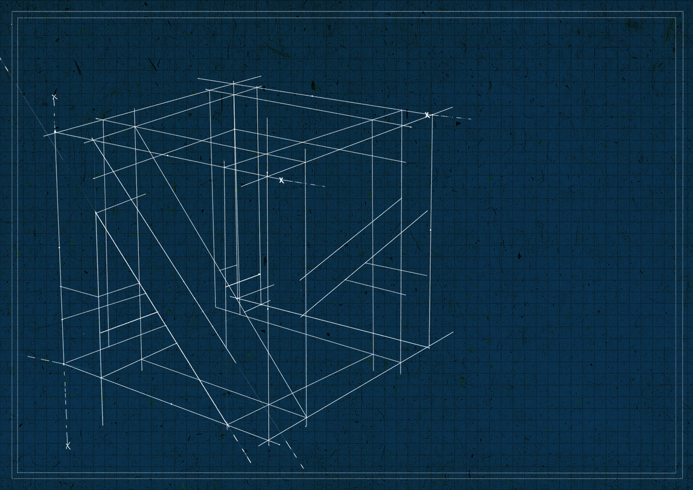
The 3D cube was done purely in Photoshop with a pencil brush and the click + Shift + click method. At that point it was the most tedious drawing done in the history of my Photoshop experience (little did she know she would soon have to face a worse fate). I think I cried a bit when I finished it. JK?? (Or not??)

So when it came to the smaller drawings I was like…..not gonna go through the pain again man. No!! So I did them on paper and scanned them in and life was much easier. 🙂
Joy’s feedback throughout the process was to incorporate the idea of ‘tediousness and laborious’ more through textures of the engineer ‘rubbing out’ lines, and making mistakes here and there. She suggested adding a bit of extra over the drawing as a way to ‘cover up’ the mistake as well. I thought it would be fun to add snide comments by a sort of ‘supervisor’ as well by the side, and used the ‘titles’ at the top to add to the effect as well (like the number of attempts).

Here’s the final product!! Tweaked the blue to make it look fresher and more modern since I realised the setting was the future. I really tried my best to bring out the idea of ‘trying and trying again but it’s never enough’ that kind of thing?? And always being put down and being frustrated with yourself.
Essentially, the pursuit of a perfection that is impossible to fulfil D:
I think that’s quite relatable? It’s a volatile mindset that shifts between “This is toxic because I’m spending too much futile energy,” and “This is important for me to improve my skillset.” And you might never know whether the problem is actually you or society’s standards. Moderation I guess?? :O

ABOUT THIS PROJECT
‘Locale’ required us to pick a site to explore, quantitatively and qualitatively, its unique and interesting features. Part I of the project was to create a visually engaging presentation on our site, whereas Part II was to curate our materials to create a zine with abstract elements, about our location.
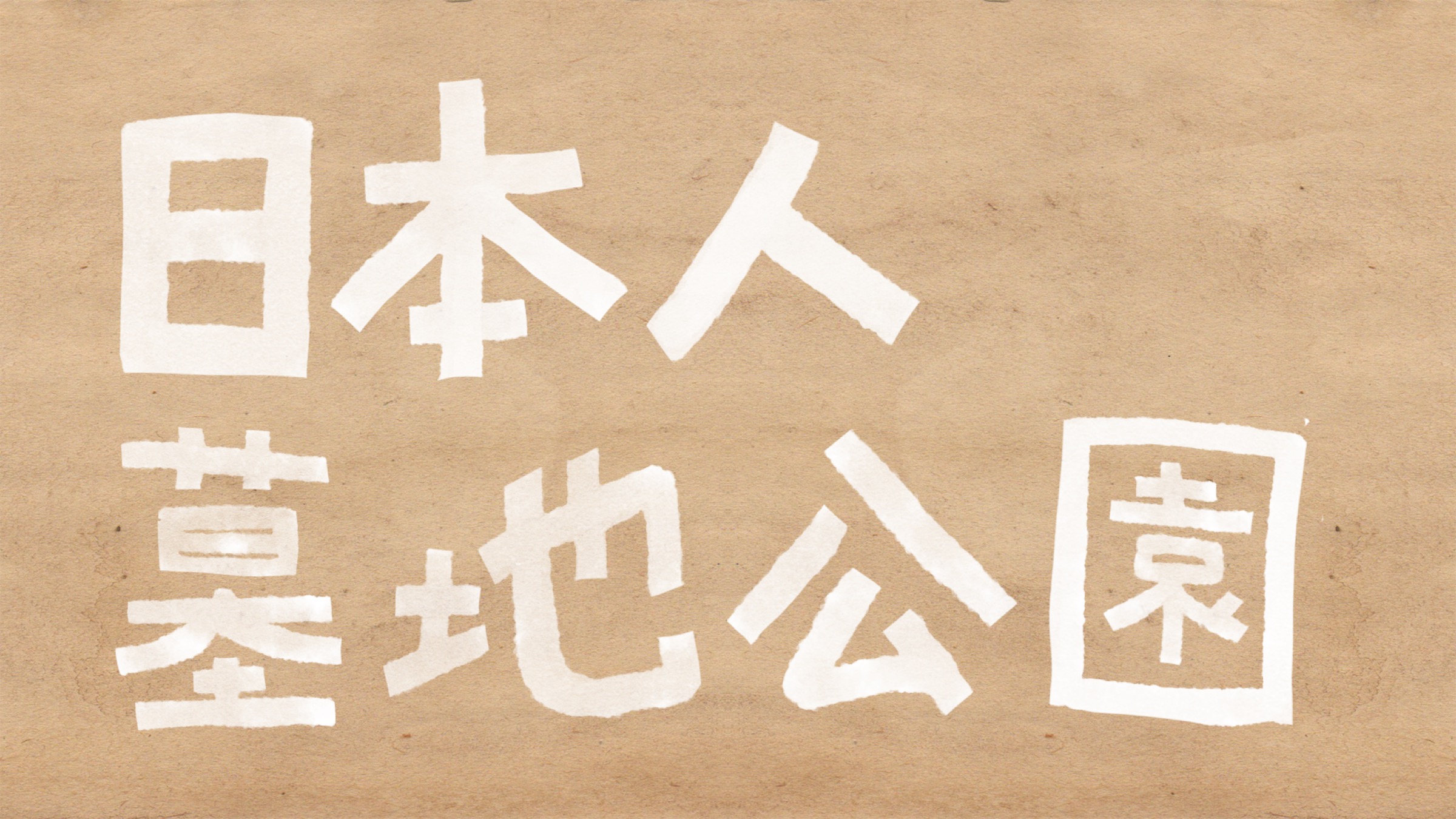
My choice of site was the Japanese Cemetery Park, an overlooked historical site in Singapore that was a site I often visited in JC for research. It houses Japanese tombs from the Japanese community that lived in Singapore before the war, as well as the Japanese war dead.
PART I – PRESENTATION


ABOUT THE PROJECT
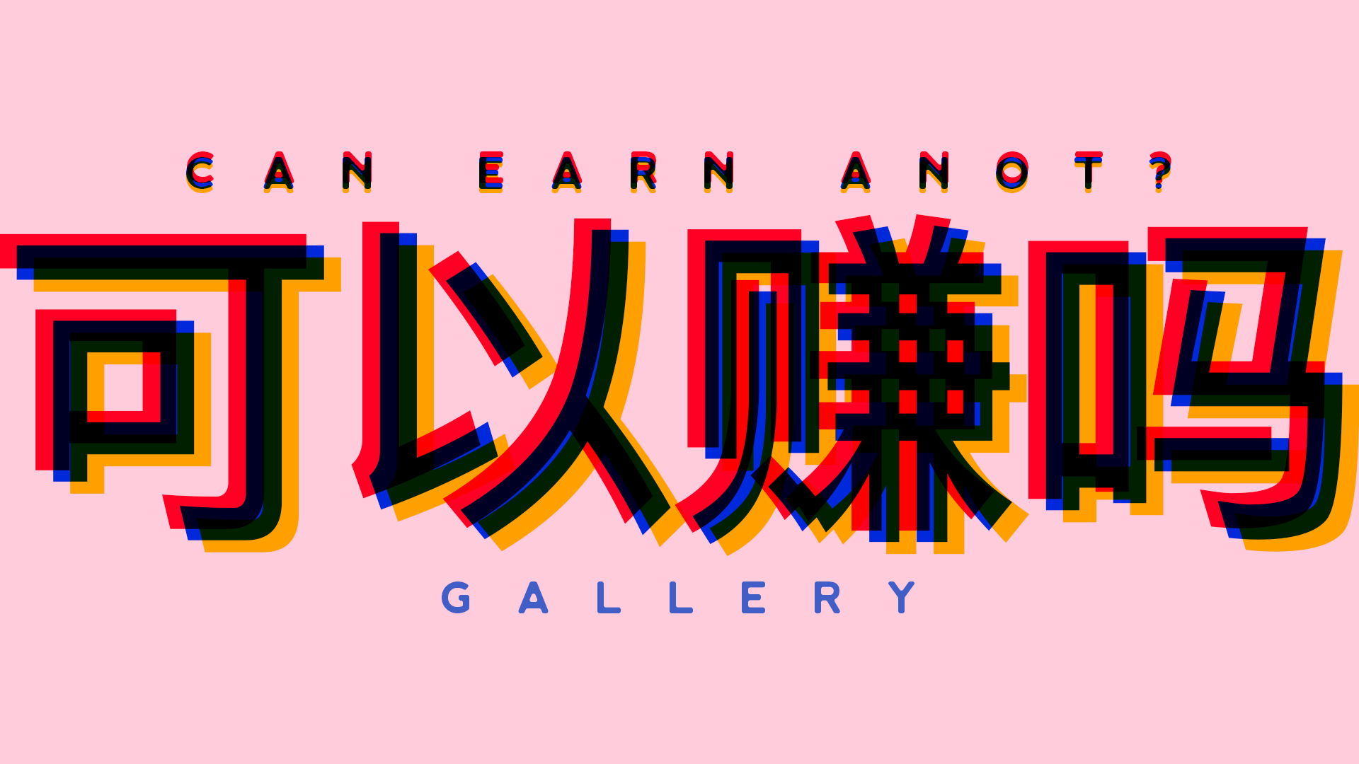
We were required to create 4 typographical portraits of our name (or variations of it, like nicknames) to describe our future job, with attention to type in particular, especially weight, style, size, and usage of upper or lowercase characters.
Since I tend to have a unifying theme for my Graphic Form/2D projects, I decided on the theme of stereotypical Asian expectations when it comes to stable, safe and high paying jobs — namely a doctor, lawyer, engineer and a journalist.
PRESENTATION DAY GALLERY
PROCESS
Got called out by Shah for putting a weird replacement here before I finished my Process post HAHA.
Background sound from an installation in the ADM Gallery
Sound of the ADM handicapped lift moving


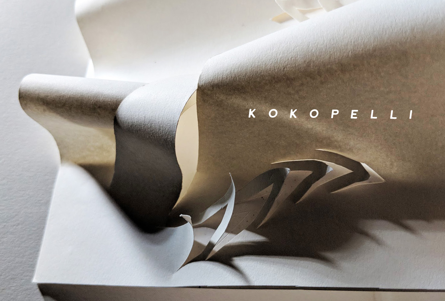
We wanted to convey the swelling of the bass of the music, which occured twice, through the gentle swelling of the paper.
The husky saxophone sound gradually emerges into the foreground in the sound, which we depicted as a wave cutting over the swelling base.
There are twinkling bells sounds as well, which we depicted as a series of delicate cuts into the paper. They are repeated twice.
For the continuation of the analysis of the ‘Bad Sound’ sculpture, check out JJ’s post at this link: