Animation Prototype & Publication Process

Mapping the Invisible: Transforming Singapore urban data into art through effective colour pallets experimental animation prototype test at NTU Media Art Nexus (MAN).

Video Stills:

Animation Process

As the previous visual exploration was rather abstract and does not seem to convey the data effectively, I’ve decided to change the visual approach to make it more condense and less abstract by creating representative icons for easier comprehension. (Legend box at the side to explain the icons)

Publication Process and Mockup

Initial design:

  • Rigid
  • Corporate branding tone
  • Does not reflect my findings in a unique way

Revised design:

Mockup

Nature Environmental Data & Visual Exploration

After reading through my FYP report, I’ve decided to use nature environmental data (sunlight and air) to connect to colours and urban screen. As mentioned in my report – we perceive colours through the comparison with its surroundings. The contrast plays a role in determining how we recognise and react to the colours in our environment; the external conditions in both nature and social environment. The appearance of colour is subjected to the alteration of neighbouring colour and the susceptibility of it varies from the state of the perceiver to the physical conditions of viewing it such as light, distance and volume.

Therefore, I would be using UV Index data (measures the level of solar UV radiation exposure at the Earth’s surface; could also be inferred as the amount of sunlight we’re being exposed because when the direct solar radiation is not blocked by clouds, it is experienced as sunshine ) and PSI data (measures the air quality; could also be inferred as the amount of particulate matter we’re being exposed and the concentration levels reflect the amount of “saturation/intensity” of the colours we perceive).


Visual Exploration

I did some motion graphics based on the UV Index while incorporating Josef Alber’s Colour Theory. So how it works is based on the UV Index which range from 0–11+(cool–warm), each value is assigned to a colour that starts from cool to warm. Cool values have 2 graphic elements to represent it and same goes for the warm values. Additionally, big circles are included to reflect the current value. For this instance in Image 1, 7am UV Index was 0 value thus there are big blue(cool) circles with both cool and warm graphic elements hovering around it. The background also goes with the flow. Image 2 & Image 3 depicts the different values at different timings.

screen-shot-2017-01-27-at-5-21-17-pm

Image 1

screen-shot-2017-01-27-at-5-39-58-pm

Up close image of Image 1

screen-shot-2017-01-27-at-5-22-01-pm

Image 2

screen-shot-2017-01-27-at-5-22-18-pm

Image 3


What is Not Visible is Not Invisible

What is Not Visible is Not Invisible is an exhibition held at the basement level of National Museum of Singapore(NMS). It features contemporary artworks from the French Regional Collections of Contemporary Art (FRAC) and all of the works explores the idea of intangibility as it encourages viewers to interact with it. The title reminded me of a short article I read on Refik Anadol’s 350 Mission Building titled Refik Anadol Turns The Invisible into The Visible as he used invisible data to create the installation that reflects the surrounding environment.

Like what the title describe – What is Not Visible is Not Invisible, similarly what is not observed is not unobserved. Perception of seeing happens within split seconds for one to be able to notice what has just been observed. Thus to bring out the unobservant of one, I was planning to use data based on the interaction people had with the environment (as colours are all around us) within NTU to bring awareness towards colour and its influence to the space around it with the use of processing. However I could not find any of such data on NTU website..

Some images taken from this exhibition that’s somewhat related to my topic.

20161210_113911 20161210_113938 20161210_114024 20161210_114039

I also went to Story of the Forest at NMS. A digital art installation that uses projectors to reflect the animation based on William Farquhar Collection of Natural History Drawings.

20161210_103458 20161210_103517 20161210_103654 20161210_103838 20161210_104027 20161210_104142 20161210_104452 20161210_105047 20161210_105100

Urban Screens

Based on the observation of a number urban screens, I realised that most of the screens reflect and highlight the space and its activities while some are an extension of the a certain project. There are few points noted through my readings of The Relationship between People and Urban Space in an Urban Space by Basauli Umar Lubis and Litta Primasari that further emphasis on the above observations.

“Urban screens that display moving images capture the activities and movements of people in public spaces by offering an expansion of space, a virtual space.”

“Indirectly, the space character is formed by what and how the public interacts with the media shown on these screens.”

“The experience of space in the urban space is directly affected by what is seen and how to view it.”

“Vision and motion are interrelated and become important aspects of the interaction between urban space and urban screens.”

“Urban screen helps to shape the movement in urban space.”


On a side note, there is a digital art installation that’s happening at National Museum of Singapore‘s Glass Rotunda on 10 Dec by teamLab that features William Farquhar Collection of Natural History Drawings as well as Robert Zhao’s photography.

Artist's impression of the installation

Artist’s impression of the installation

LED Screen References

Found some references purely base on of how artists deal with LED screens in an enclose space.

Aram Bartholl – Full Screen

The colours are inhabiting the space with the help of the white walls. I felt that it actually helps to create a coherent atmosphere in relation to the graphics on the screen.

Leo Villareal – Field

Both examples are screens that are placed in given locations.. The closer the screen are to the walls, it produces a more visible effect.

Tiananmen Square, Beijing, China in 2014 

“Protecting atmospheric environment is everyone’s responsibility”

Ann Veronica Janssens’ Installation

Ann Veronica Janssens is a light artist that works with colour, fog and other materials to create experiences that help viewers to perceive themselves and their surroundings. Somehow her works reminded me of James Turrell and Olafur Eliasson as both also deal with colour, light and space.

Yellowbluepink is an installation from the States of Mind exhibition that experiments with colour, light and unscented dry mist in an attempt to push the limits of human perception (aware of own consciousness) as it challenge viewers’ interaction with external environment.


The exhibition also includes an app devised by neuroscientists that allows visitors to discover illusions.

Experience of Colour

Colour, Environment and Human Responses: An Interdisciplinary Understanding of Color and Its Use as a Beneficial Element in the Design of the Architectural Environment by Frank H. Mahnke, Published by John Wiley & Sons, 1996

(Frank H. Mahnke is an environmental designer and consultant for architectural)

“To perceive colours means to “experience”; to become conscious or aware.” (Page 10) Many factors are involved in this process in both conscious and unconscious level that makes it hard to define the experience in a systematic way. Thus the “Colour Experience” Pyramid is created with an assumption of six basic interrelated factors that influence the experience of perceived colours.

Biological Reaction to a Colour Stimulus

Psychological aspect where it covers the natural effects of nature and its environment (animals and plants) of which this reaction is beyond anyone’s control.

Collective Unconsciousness

Personal experiences.

Conscious Symbolism – Associations

Associations and symbolisms made on a conscious level.

Cultural Influences and Mannerisms

Colours related to certain cultures, groups and regions.

Influence of Trends, Fashions and Styles

Temporal effect where colour changes to adapt to a particular time; industries such as fashion, products, interior design, architecture, etc.

Personal Relationship

Personal likes and dislikes.


FYP Abstract (2nd Draft)

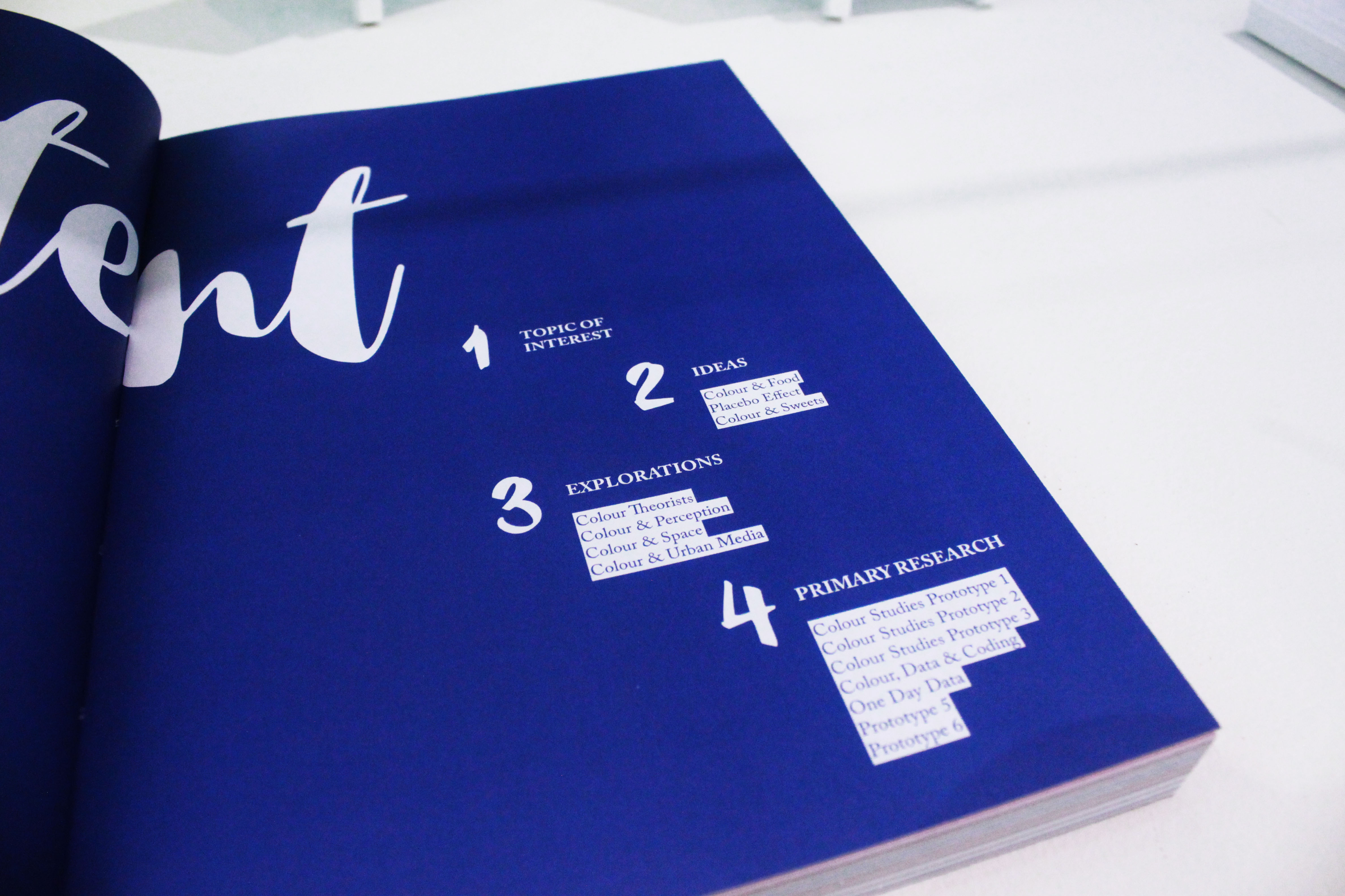
Propose a project: What are the reason(s) or aims for doing project?

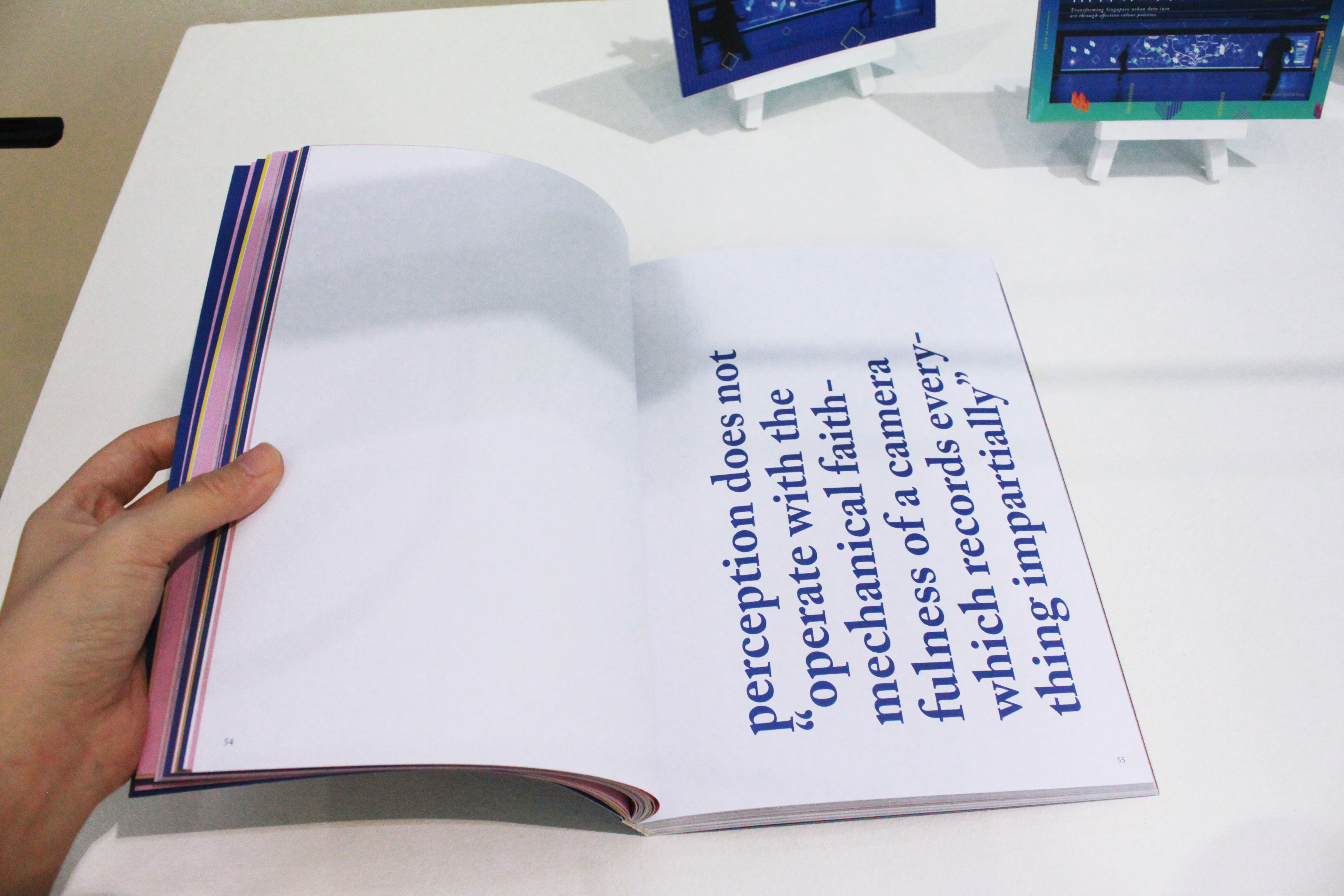
People make assumptions everyday be it trivial or not but many do not realise that it is the brain that colour the way things are seen. Senses can be fooled easily and therefore seeing isn’t always believing as anything in an environment could be assumed based on individual perceptions. Assumption prevents us from see things differently for we assume our assumptions as accepted truths without any proofs.

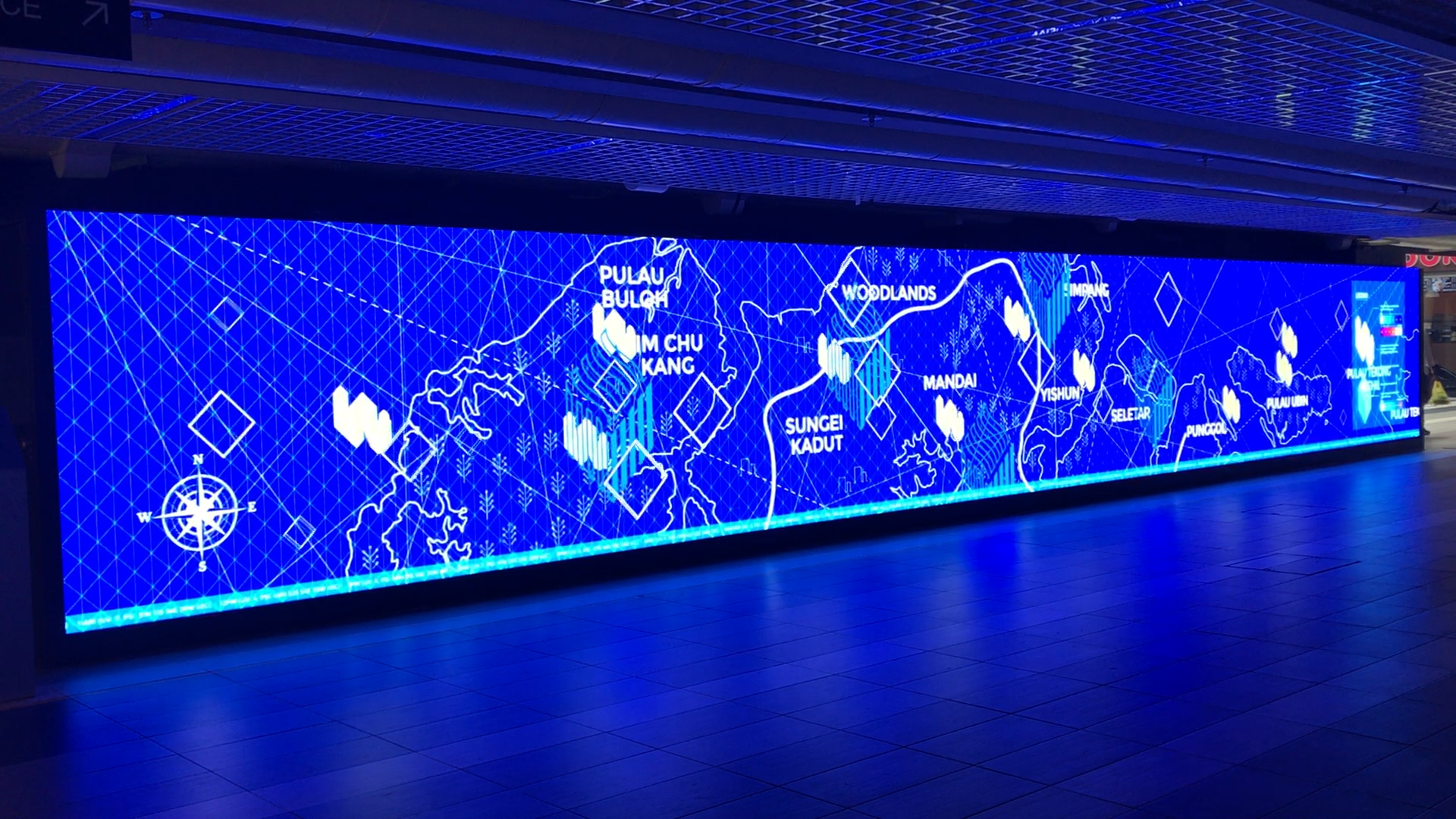
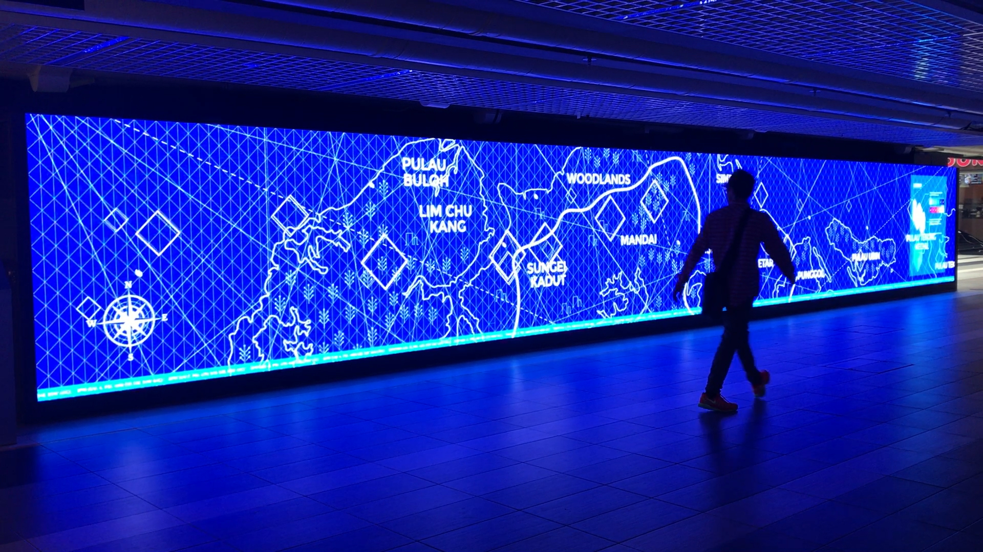
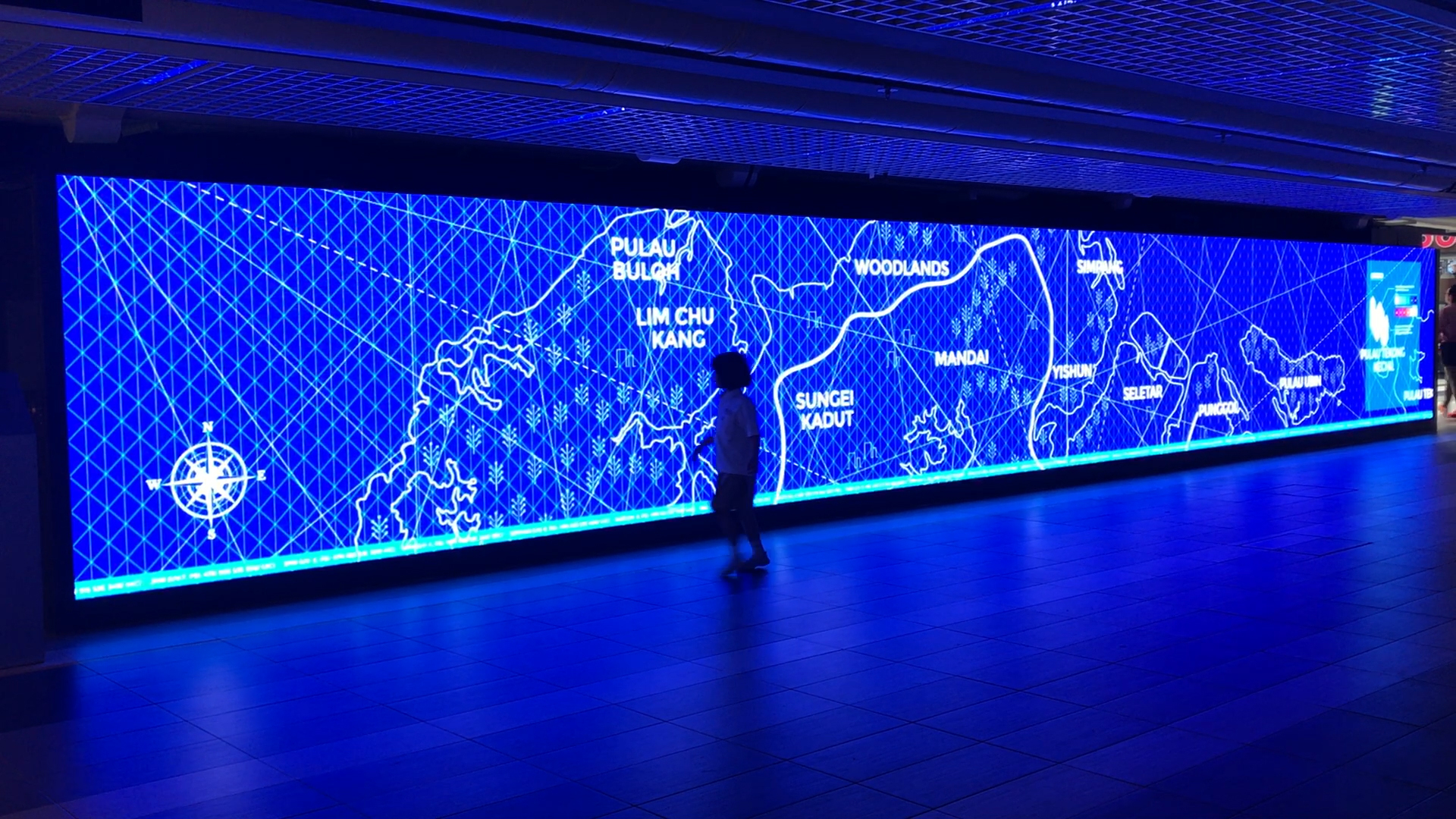
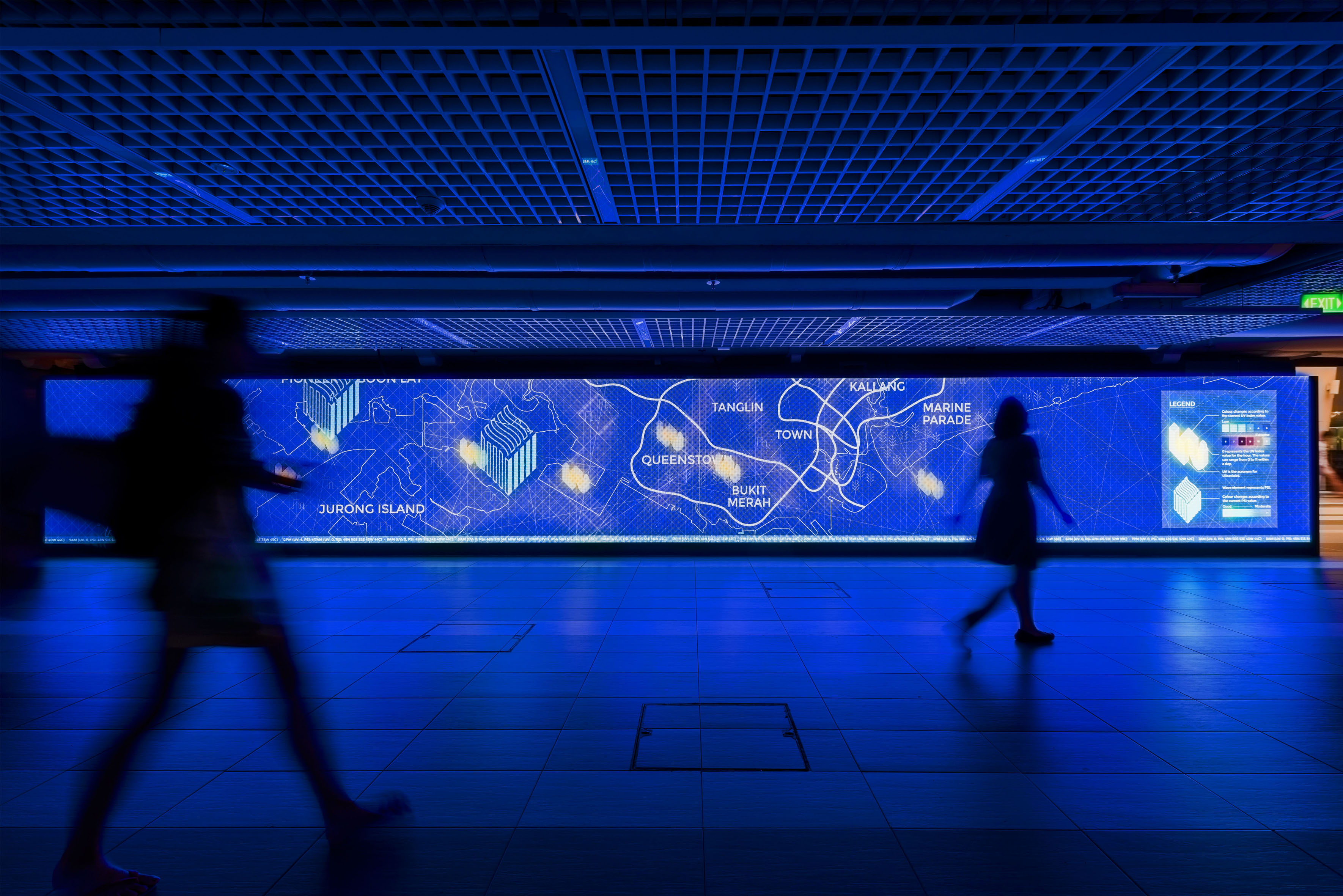
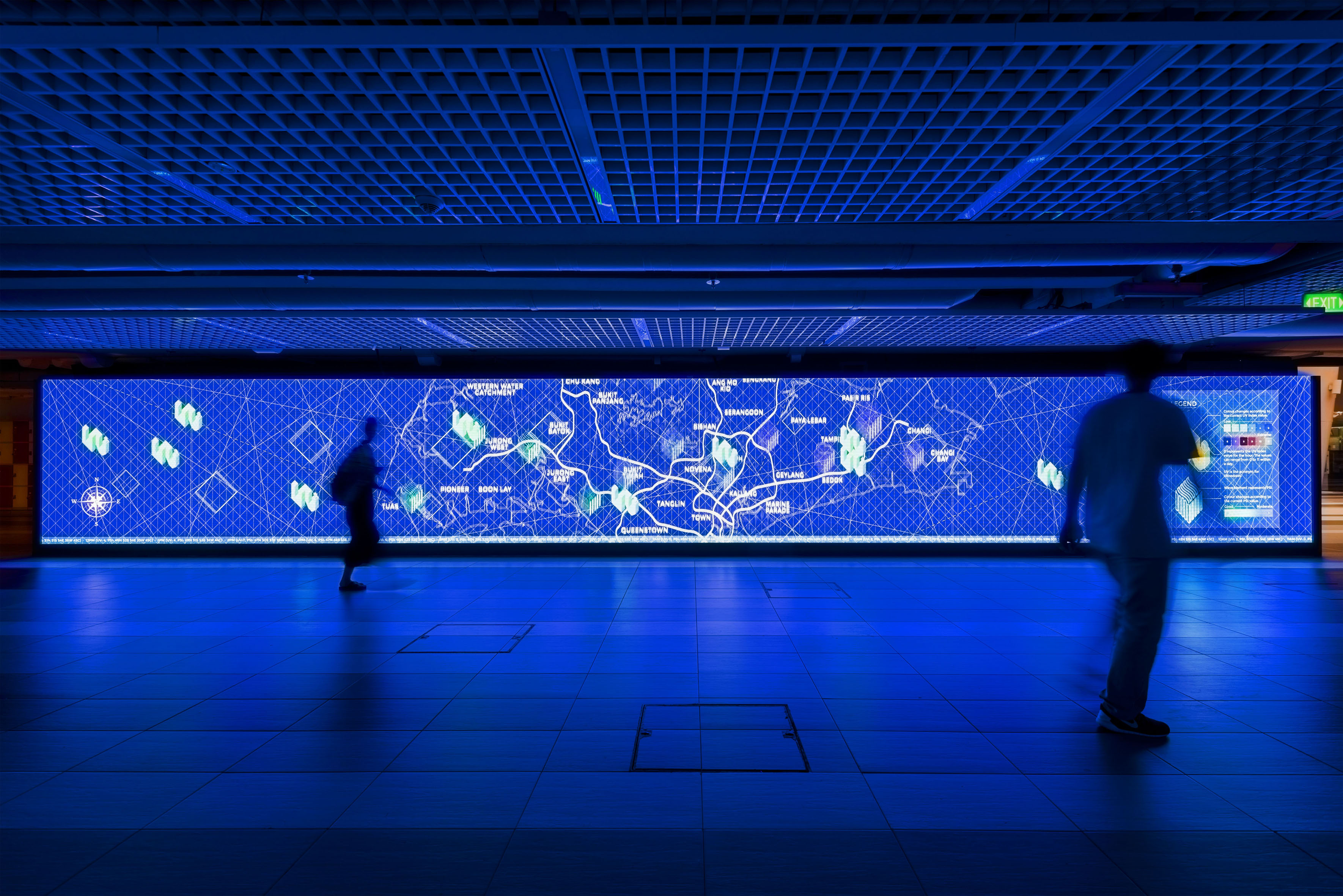
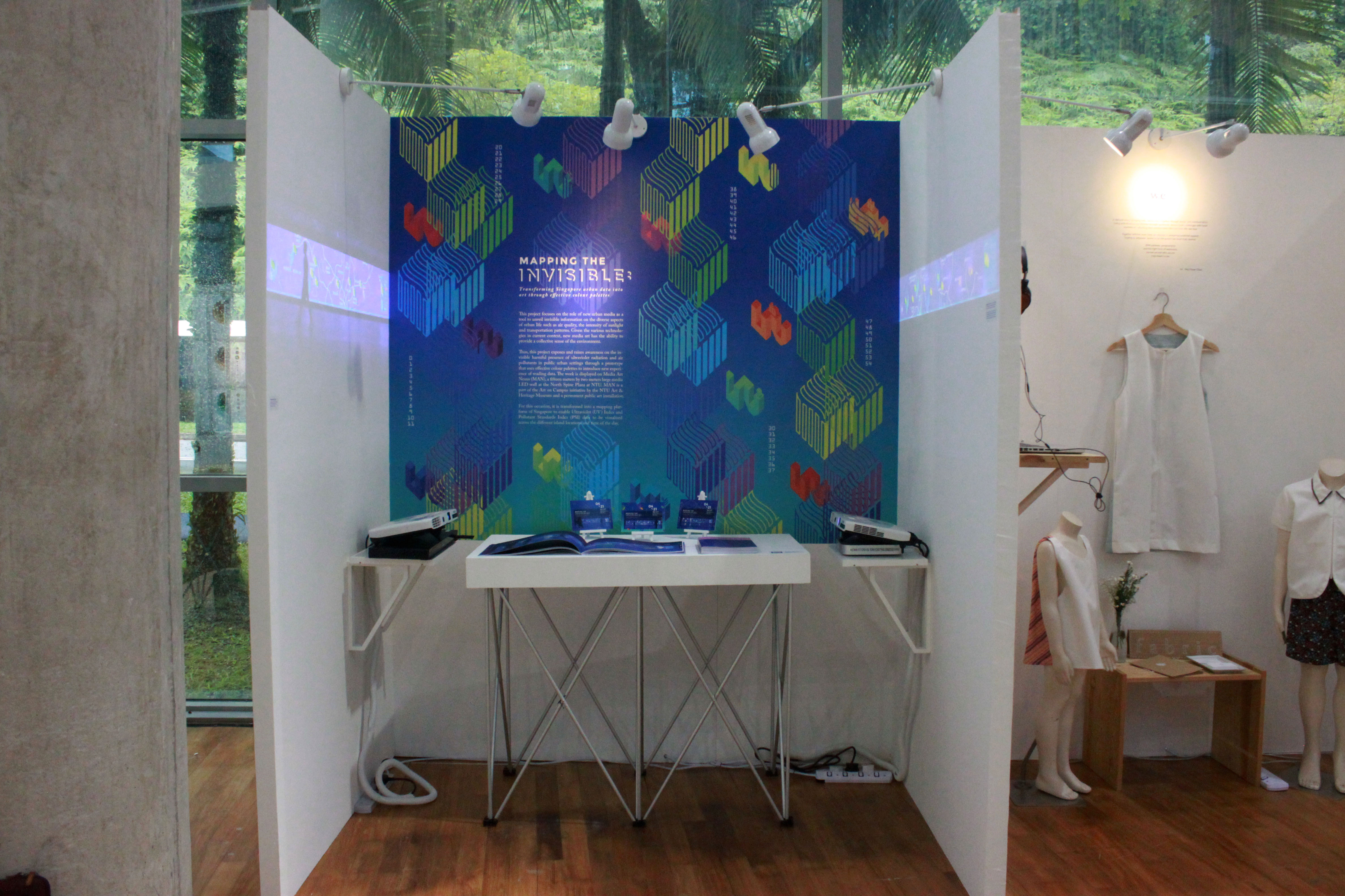
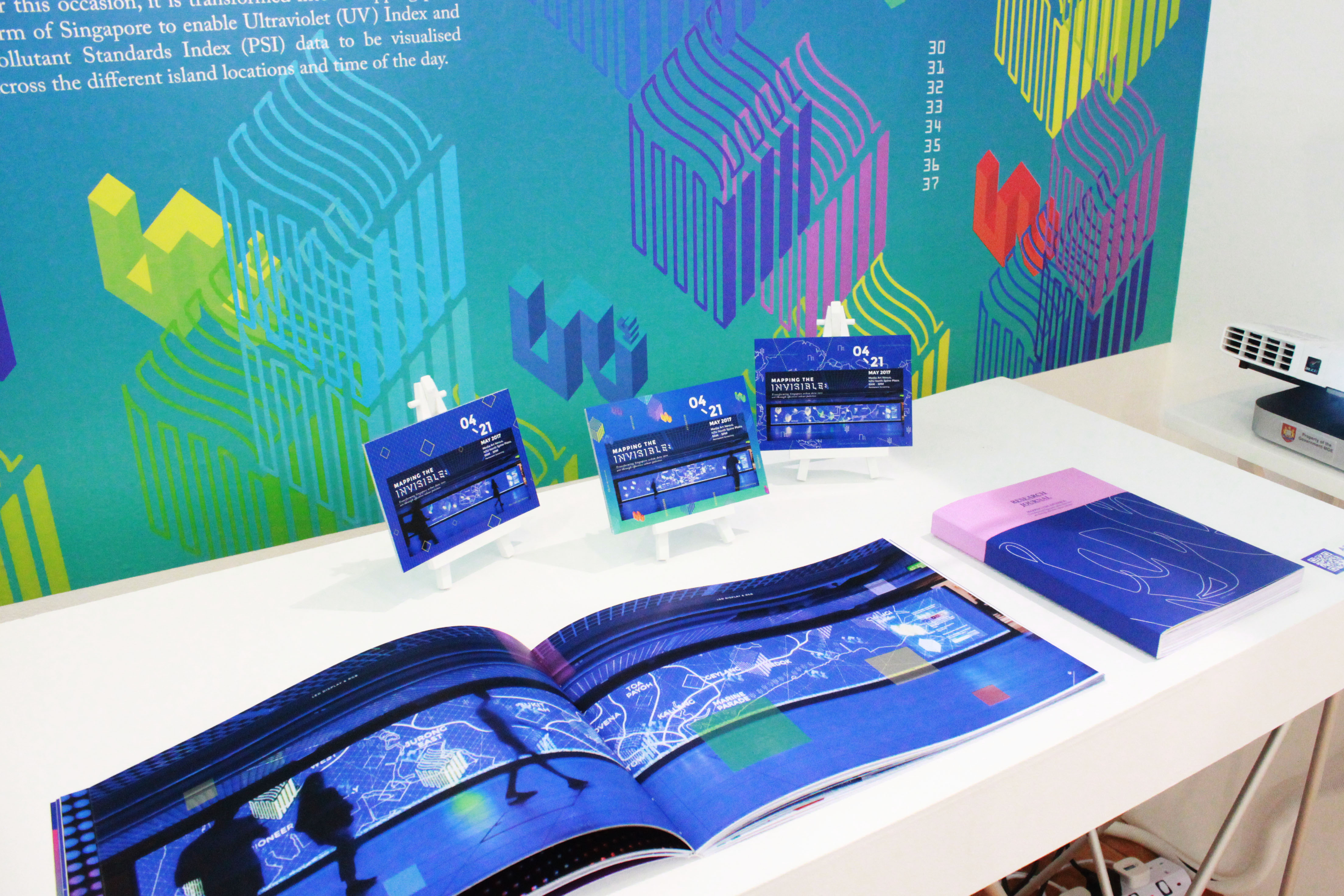
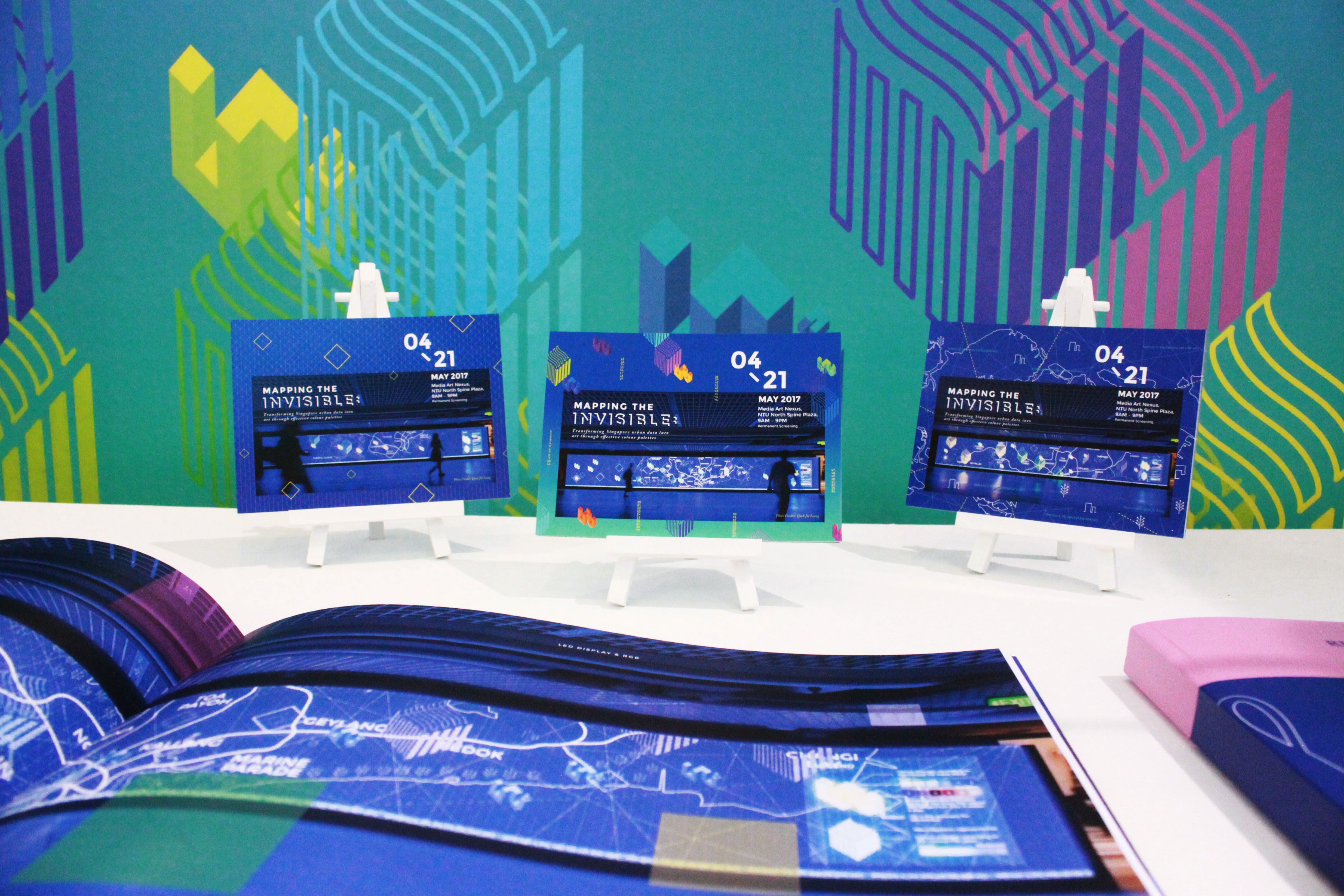
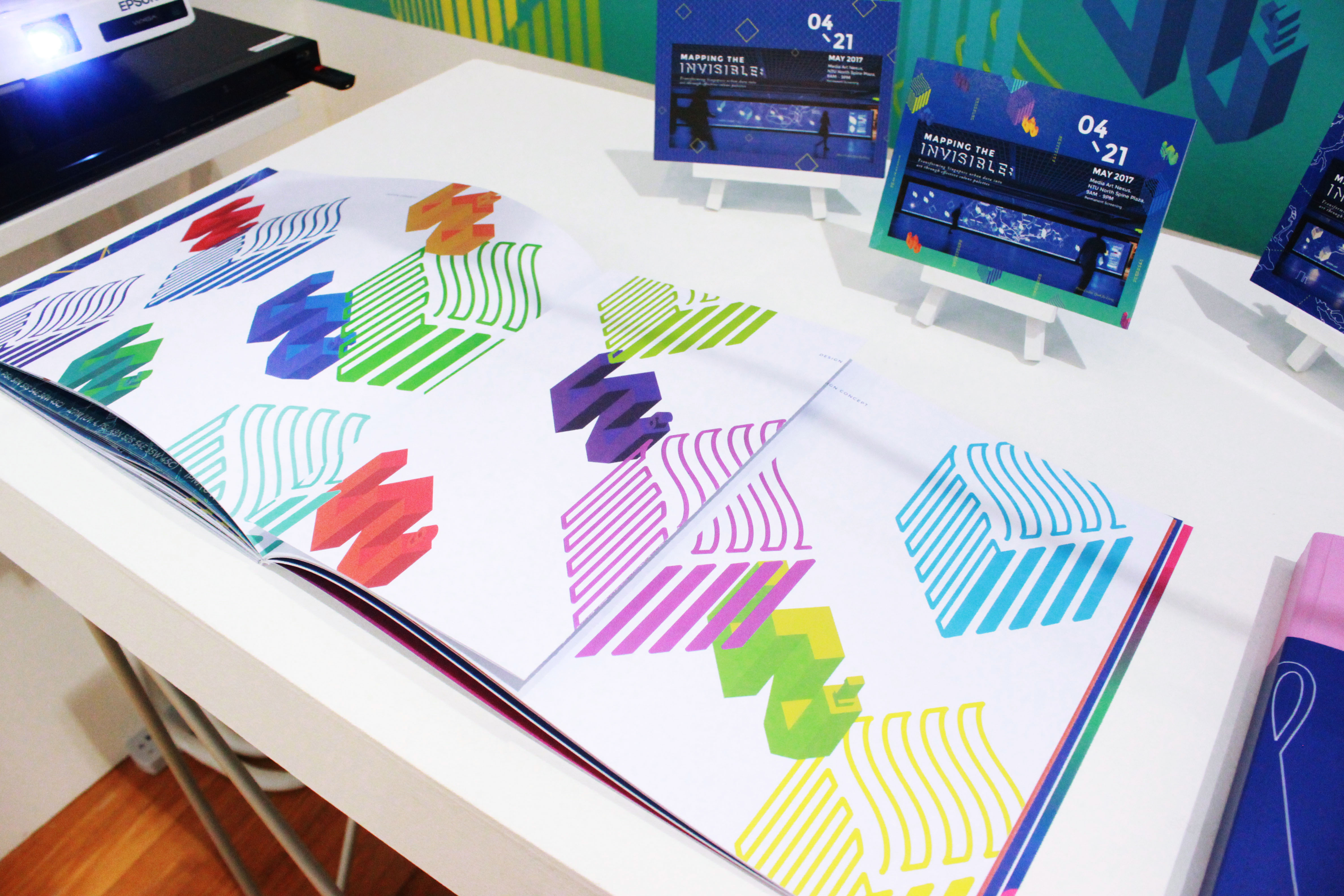
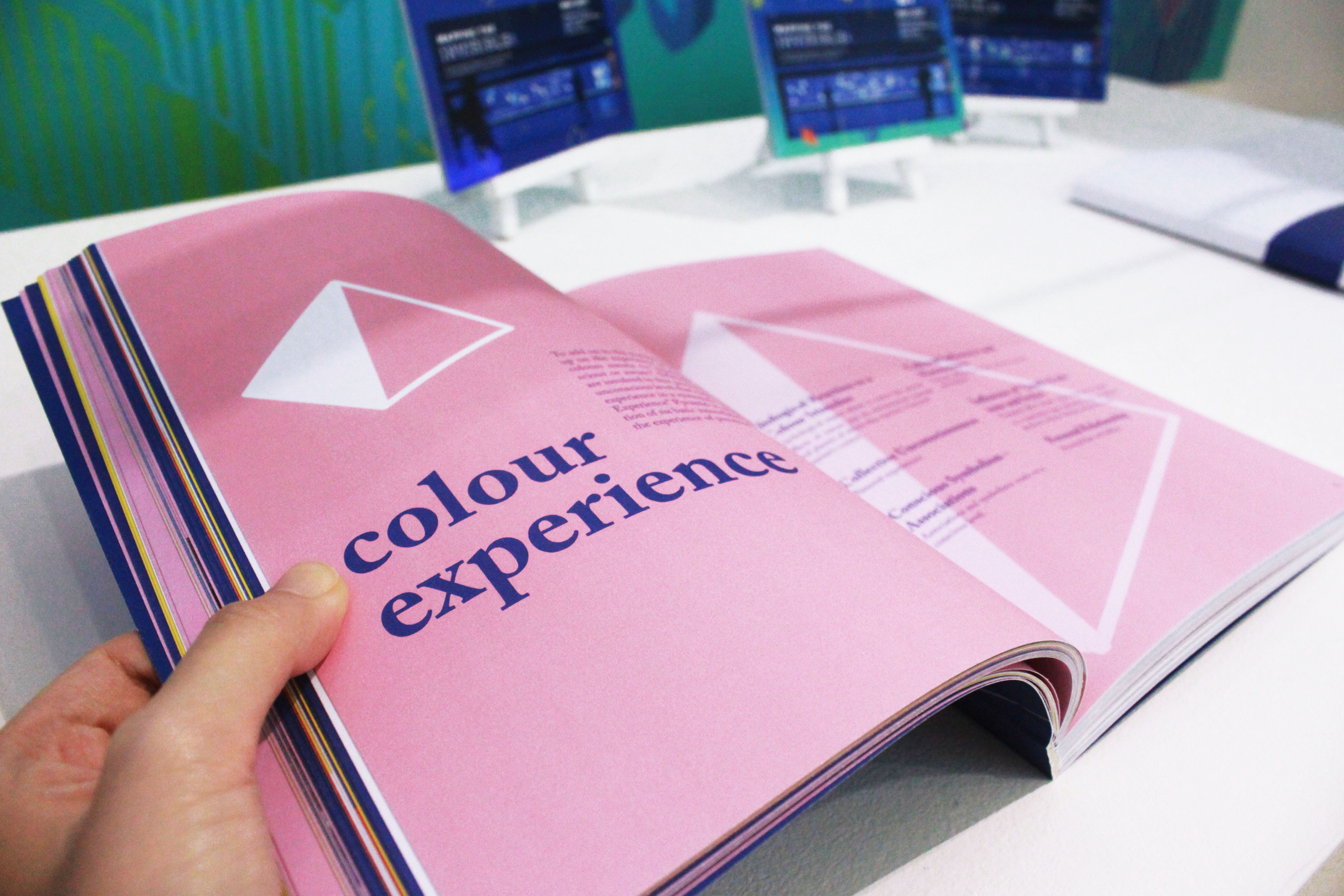
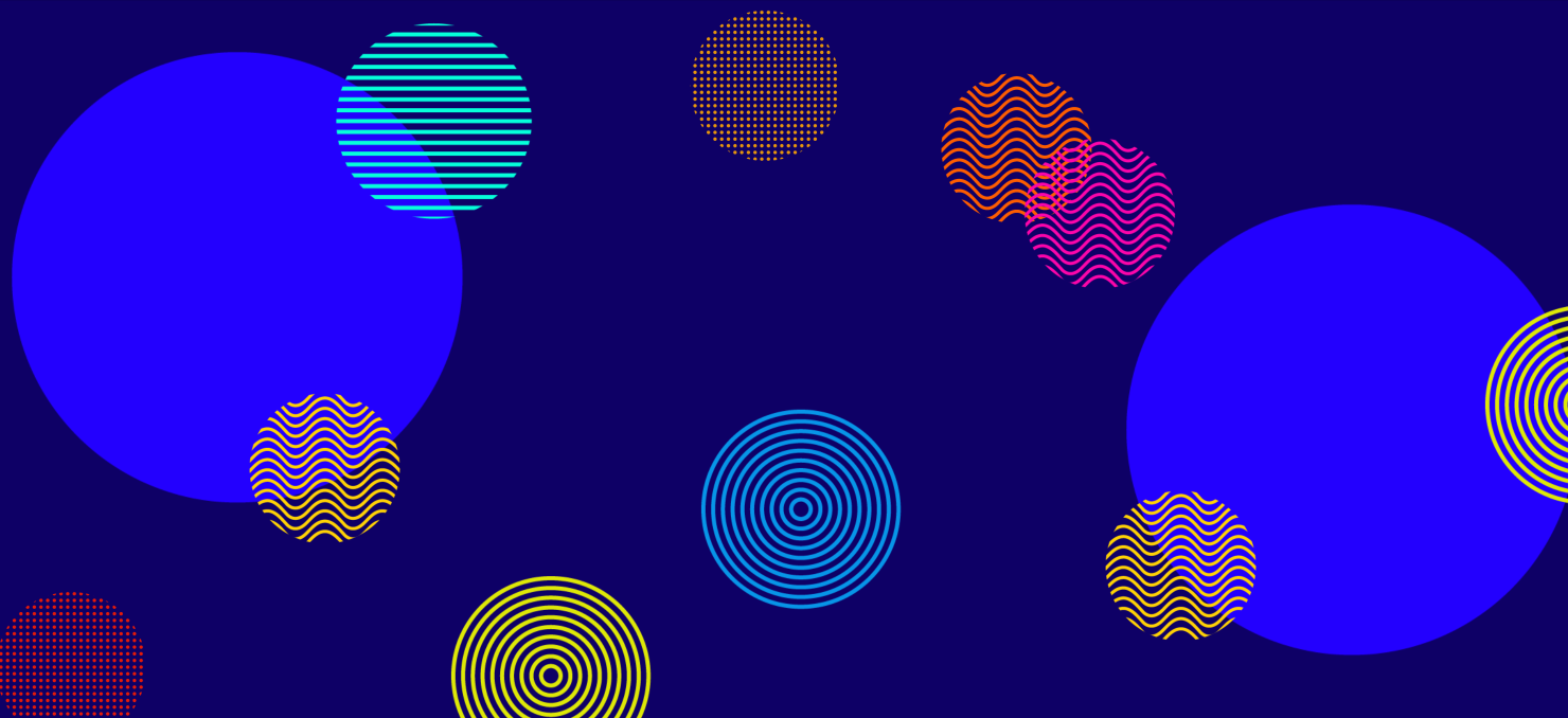
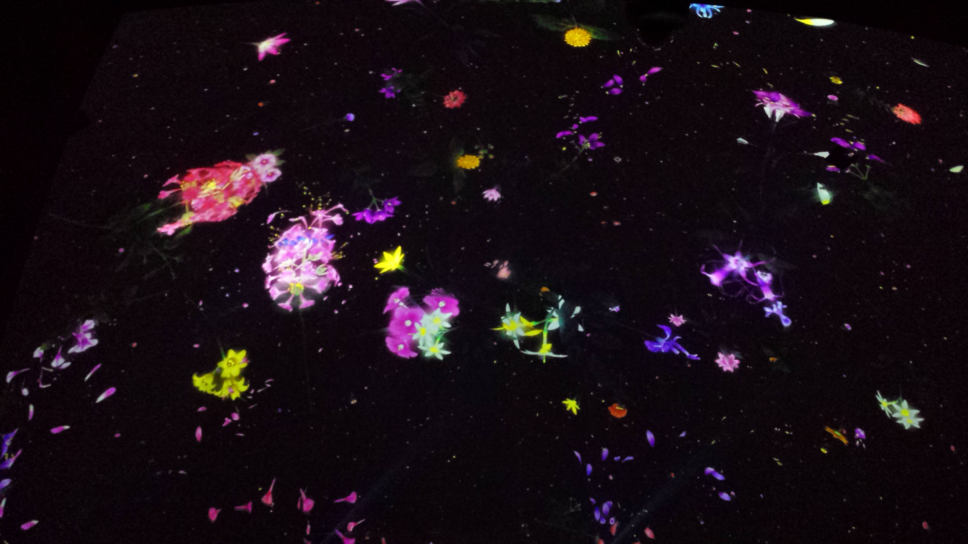
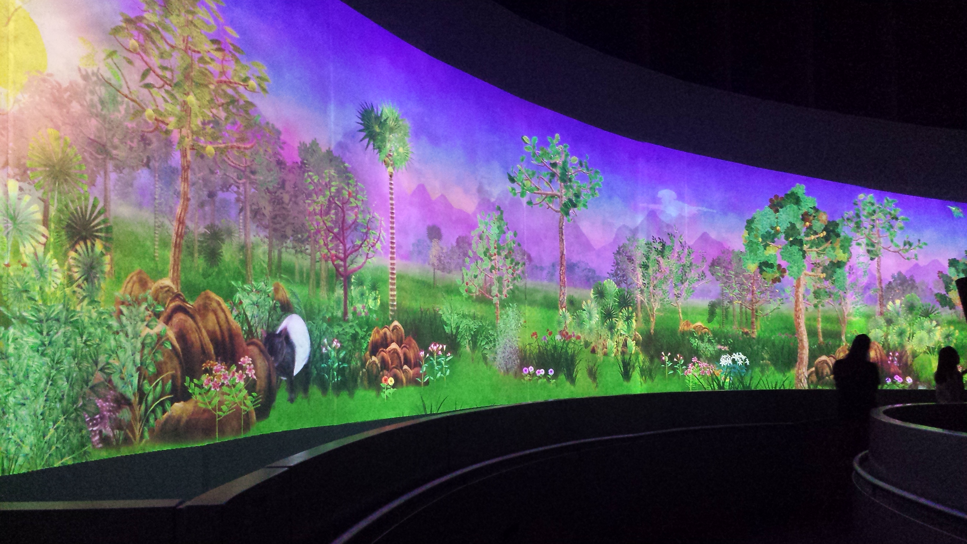
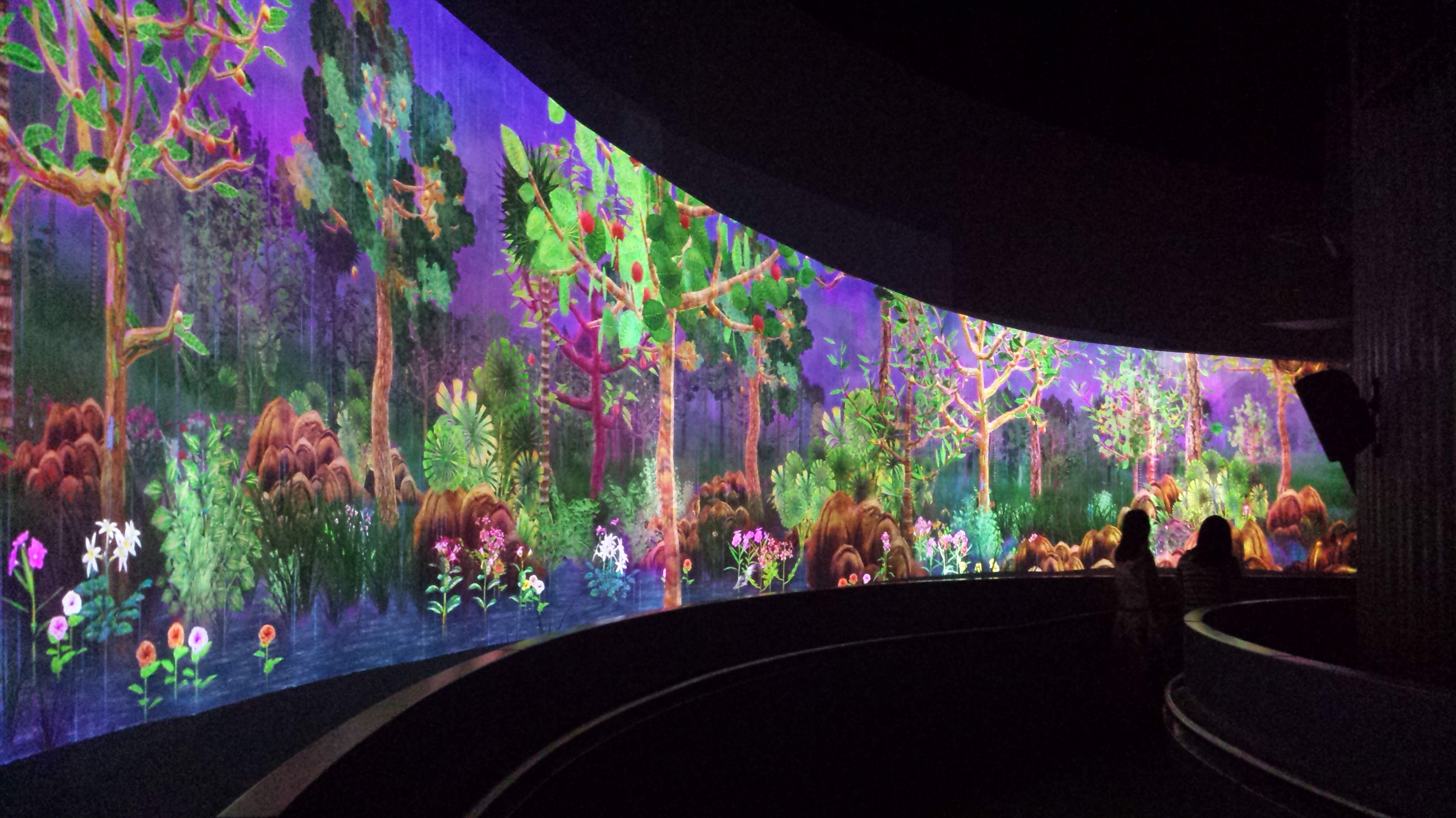
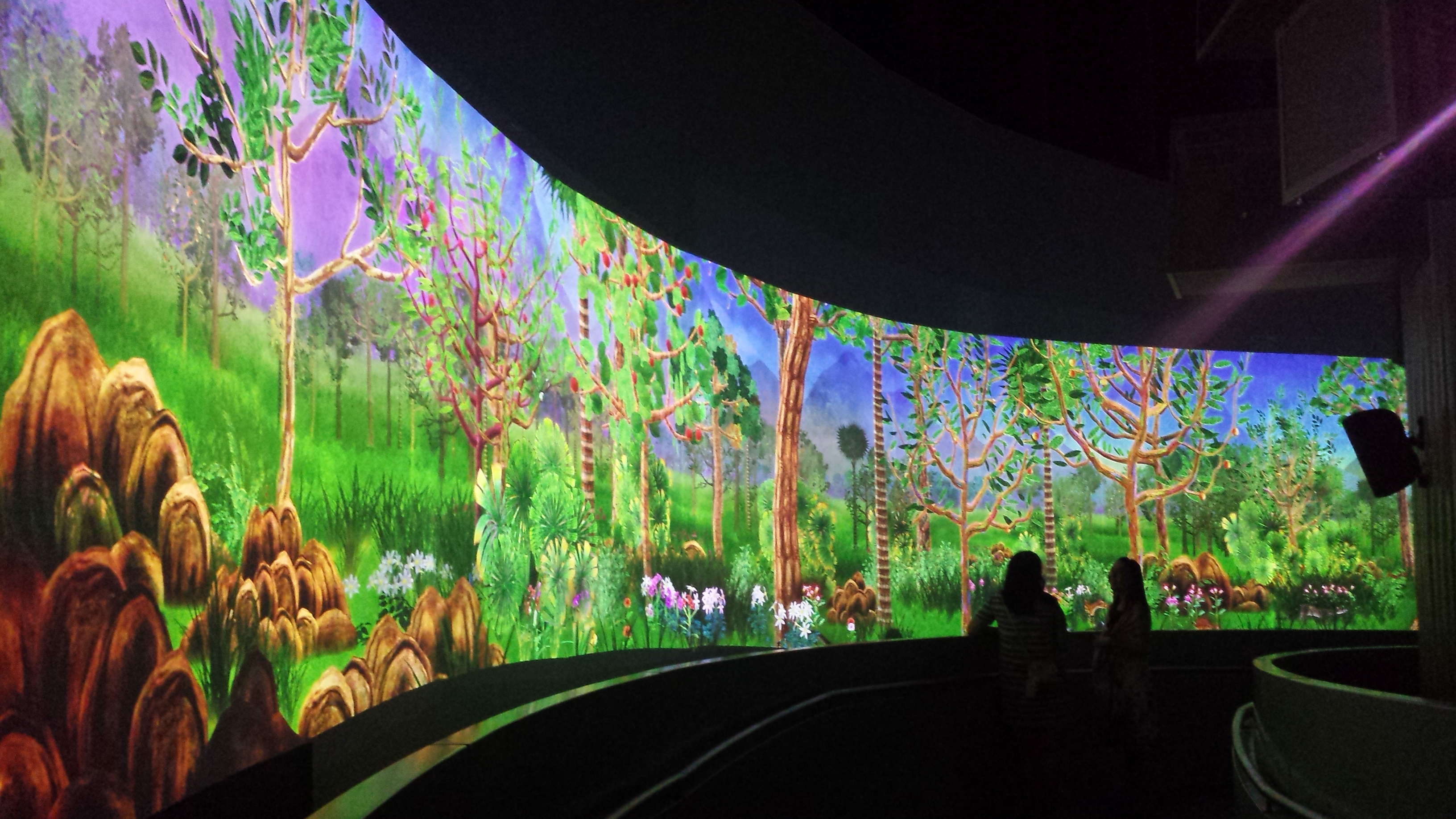
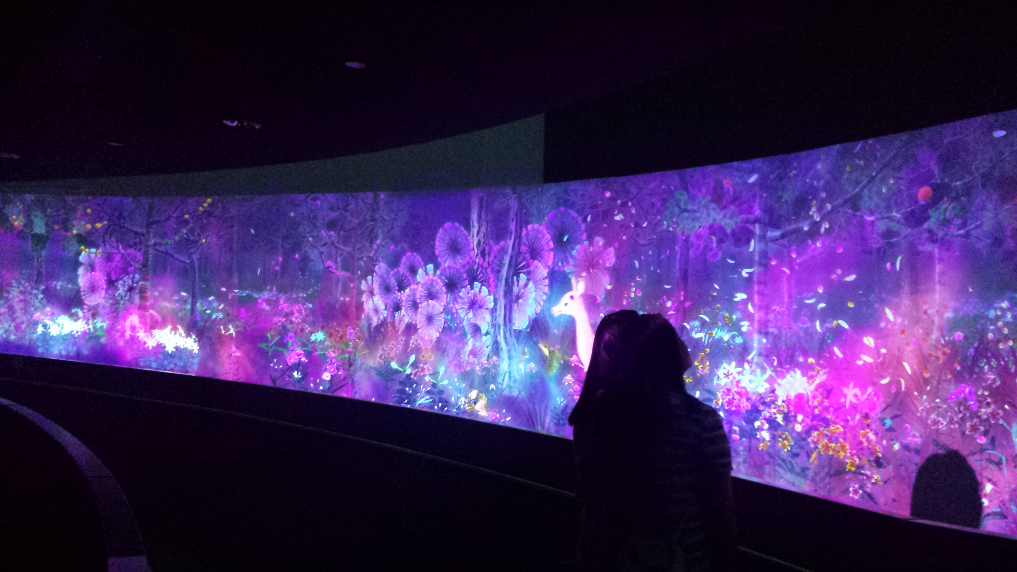
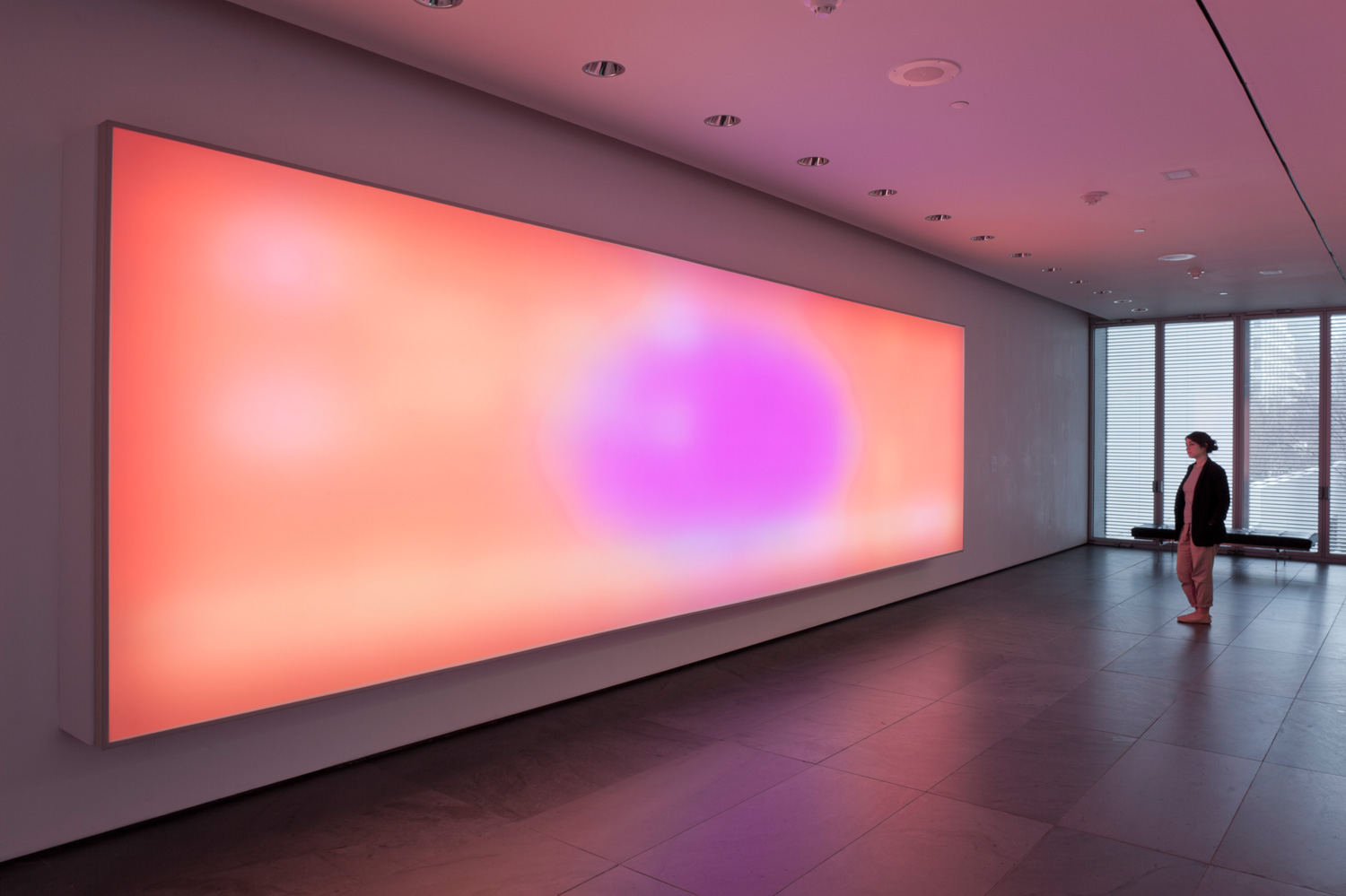
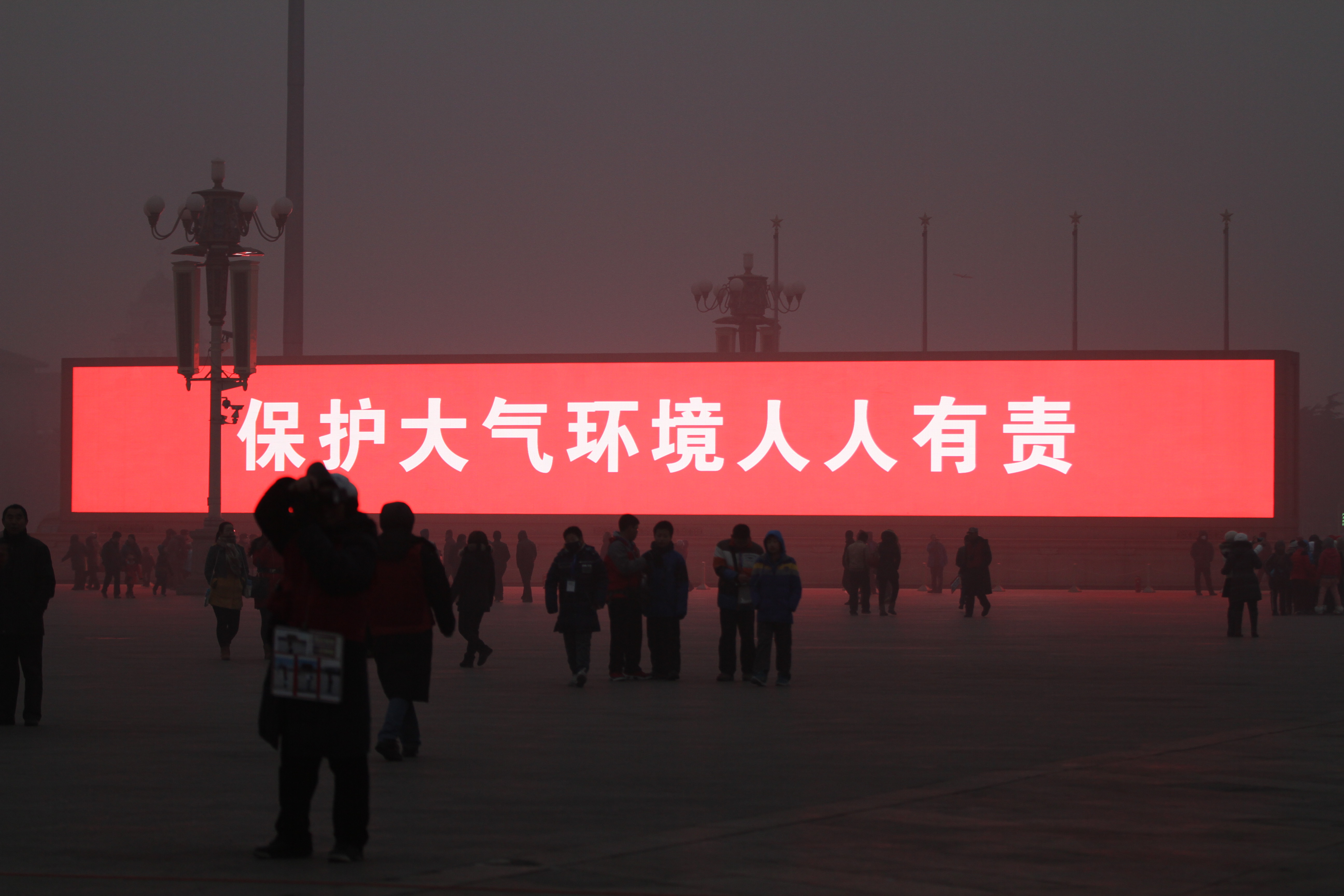
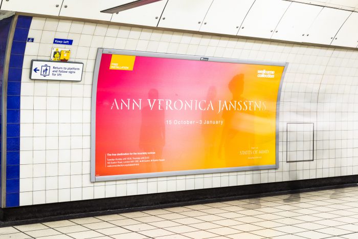
Thus, the project aims to create awareness of individual’s consciousness of seeings and question own perceptions through the use of colours and illusions because colours are often taken for granted as it is presented to us from birth. Also, it plays an important and powerful role in the world we live in as it has the ability to change how people observe, think, feel and react.

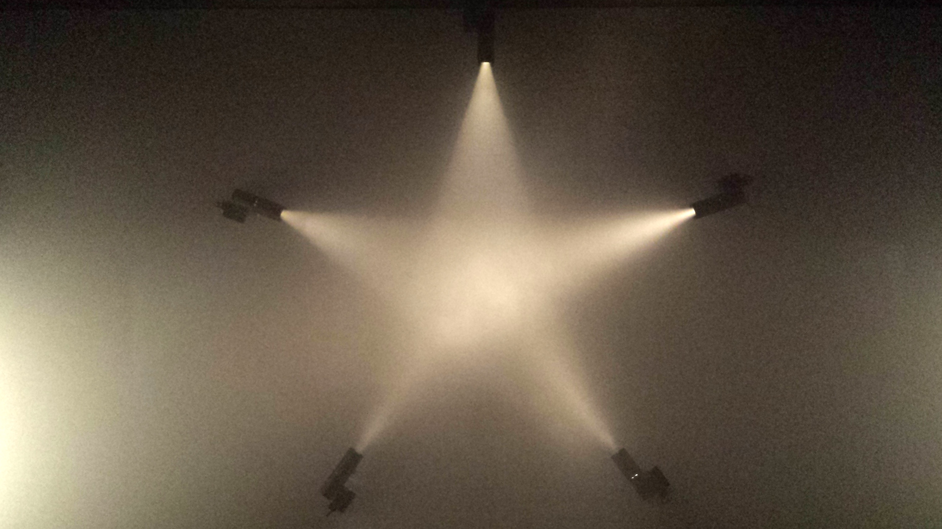
An illusion make uses of our assumptions about the world and surroundings to demonstrate our visual perception and it reflects the susceptibility of our seeings.


Design/ Methodology/Approach How are the objectives achieved?

Include the main method(s) used for the project. What is the approach to the topic and what is theoretical or subject scope of the project?

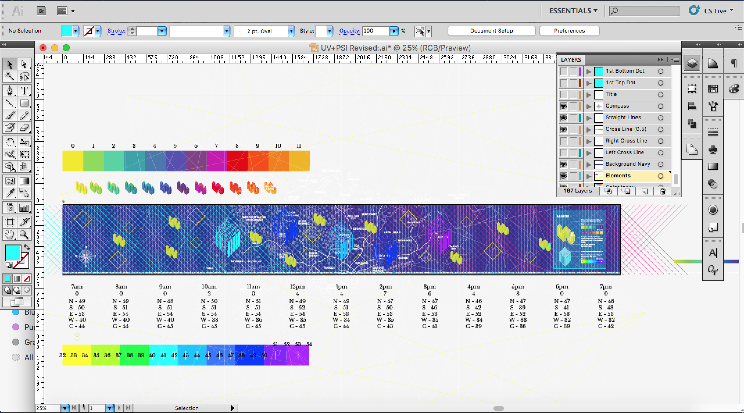
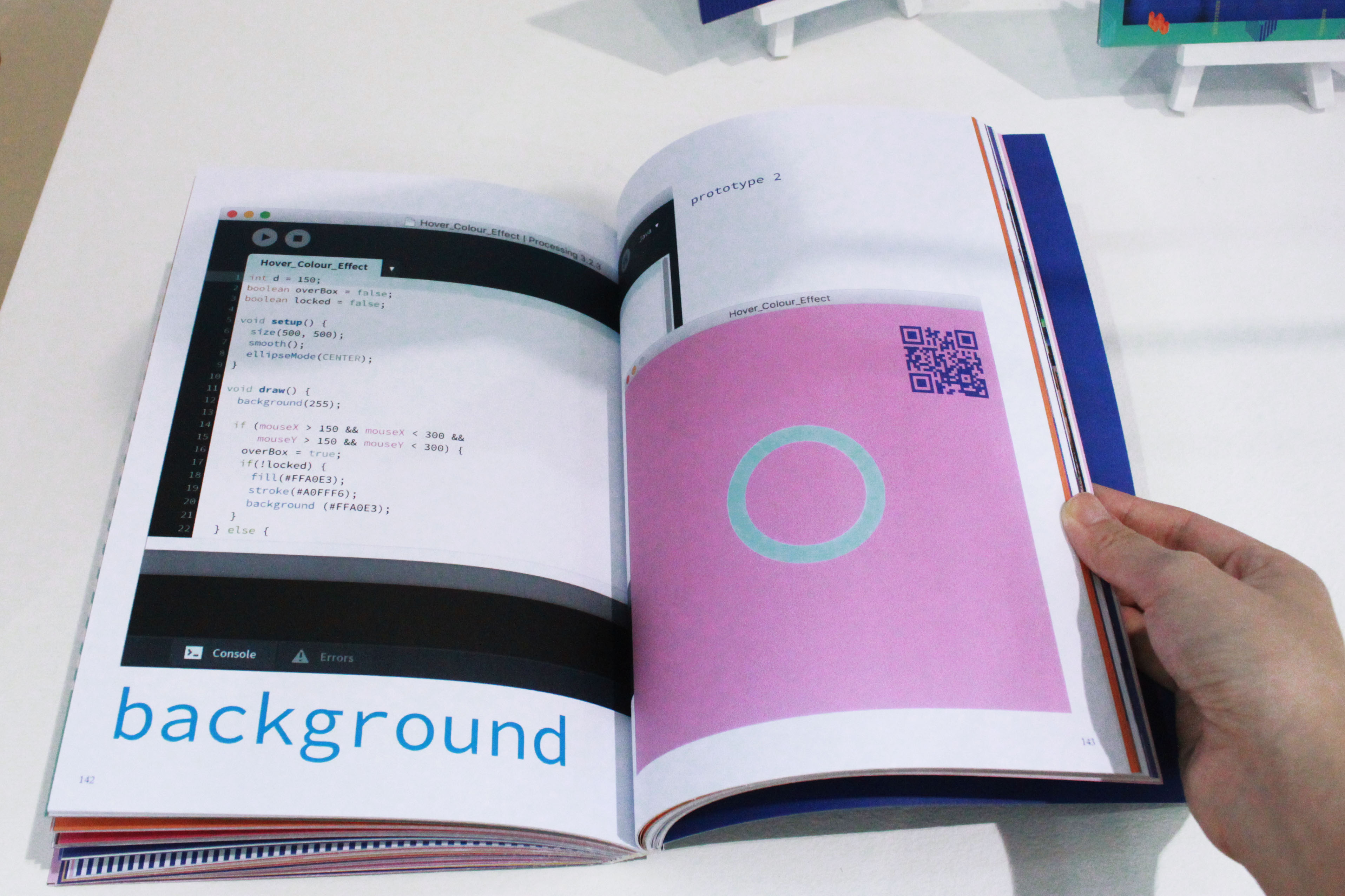
The objectives are achieved through literature and non literature findings. The main method used would be an experiment accompanied with survey to validate the solution towards the hypothesis – colour illusions does help people to be conscious of their seeing and question their perceptions. The other method is unstructured interview conducted with a professional in the related field of studies to understand more about human perception towards colours as well as the relation between the eyes and the brain.

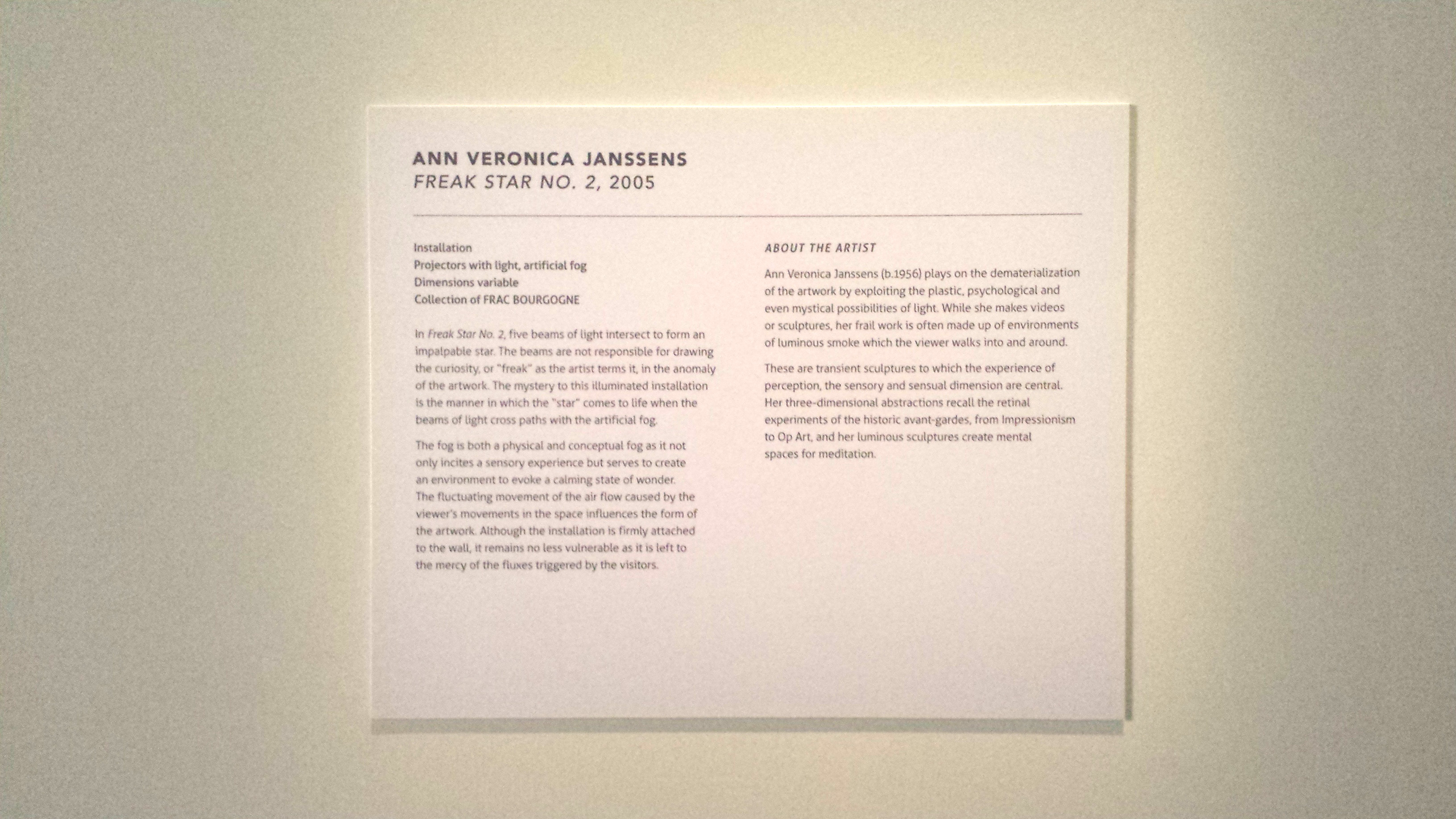
For literature findings, books such as Interaction of Colour by Josef Albers, Art and Visual Perception: A Psychology of the Creative Eye by Rudolf Arnheim and Ambiguous Illusions by Humberto Machado and videos such as The Logic of Magic and Colour by Josef Albers and Optical Illusions by Beau Lotto would be used as evidences to support the idea and the non literature findings. All these would contribute towards the scope of the project that consist of the study of colour and its effect on individual perception.


Originality /Value: What is new in your project? State the value of your project and to whom?
Colours and illusions has been explored by many yet it has not been dealt with as a project from another perspective in terms of translating it into daily context. This would benefit to anyone as the project acts as a window towards the realisation that our eyes can be tricked easily.


Keywords: Keywords act as search terms and are like entry points to your project


Colours, Illusion, Seeing, Perception

Gestalt Psychology

Gestalt Psychology is the study of how humans perceive things in patterns rather than separate components. The word ‘Gestalt’ is a German word for shape or form of which embodies the idea of grouping or unified whole. Gestalt theory has certain laws of perceptual organisation to outline the fundamentals/principles of it.

  • Proximity — Elements tend to be perceived as groups if they are placed near each other.
  • Common Fate — Elements tend to be perceived as groups if they move together (despite unequal distances between each other).
  • Similarity — Elements tend to be perceived as groups if they are similar to each other in terms of visual attributes such as lightness/ colour/ size/ orientation/ shape.
  • Continuity — Groups tend to be perceived as whole if they are aligned with each other.
  • Closure — Elements tend to be perceived as whole even when they are not closed figure.
  • Figure and Ground — Smaller areas tend to be perceived as figures if they are against a larger background. Dark figures on light background are perceived easily due to its commonness.
  • Symmetry and Surroundedness — Symmetrical areas tend to be perceived as figures if they are against asymmetrical backgrounds while surrounded areas tend to be perceived as figures.
  • Past Experience — Elements tend to be perceived as groups if they are seen often from past experience of the observer.

Some existing examples in the market:

Proximity

Surroundedness

Similarity, Closure


Similarity, Closure                              Closure

Continuity


Proximity, Past Experience