Project 3 I Research

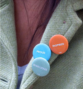
Bright Button is an interactive wall installation where coloured pins are attached with a different word on it to describe a mood. People could take these pins that reflect their mood for that day and pin it on them. I like how ‘flexible’ colours are used in this context where it transfers the value from one place to another.

Pins


Nature Matching System is an eye catching installation due to its bright swatches of which is used to attract attention towards food choice people should make as these are the colours of fruits and vegetables.


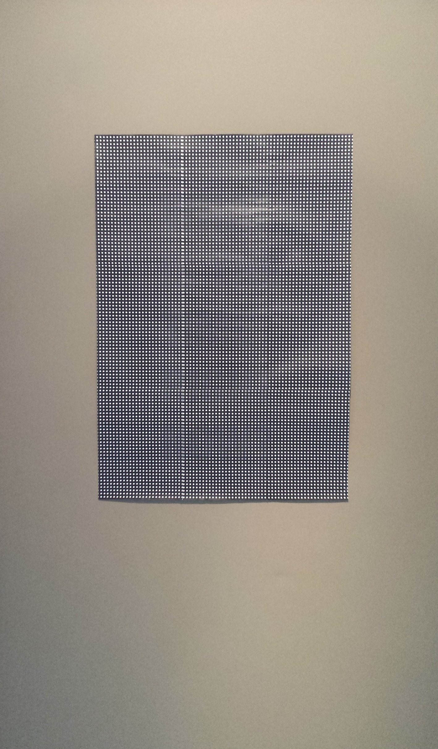
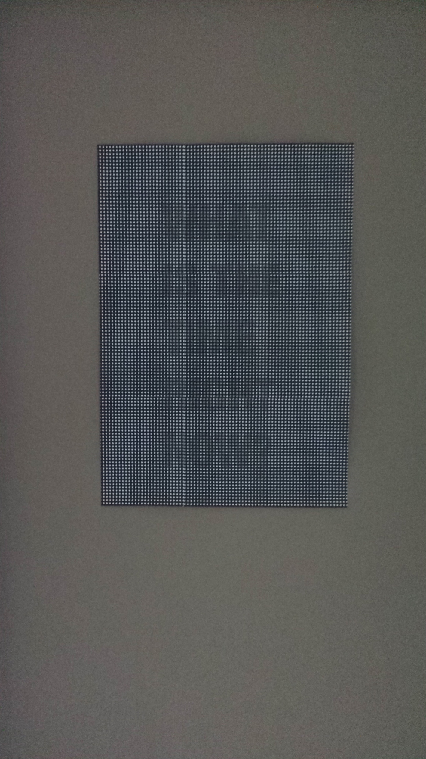
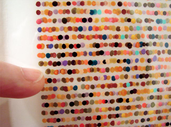
“a system of Braille for the colour inclined” is a colour codification code that uses colour dots to represent alphabets in text blocks for the colour inclined. The result was unique and intriguing!

Dots


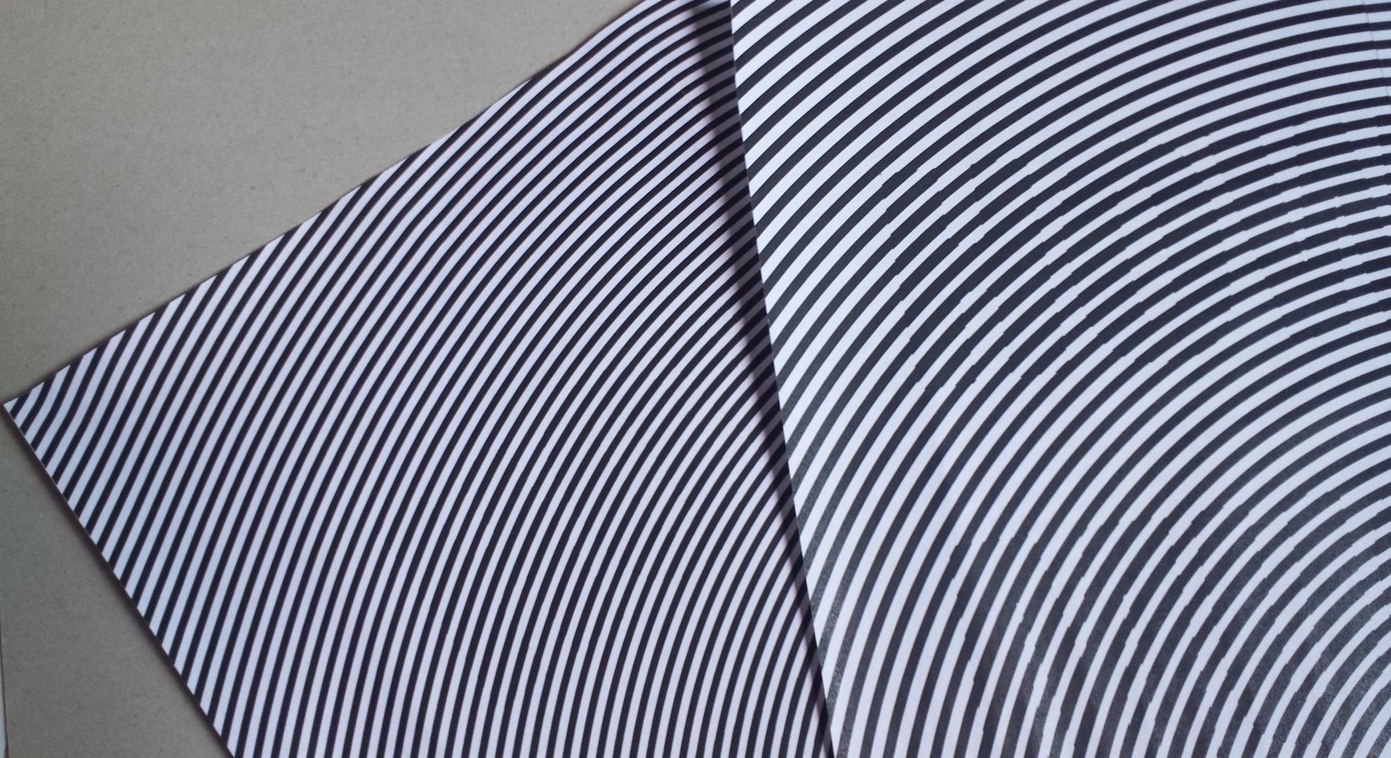
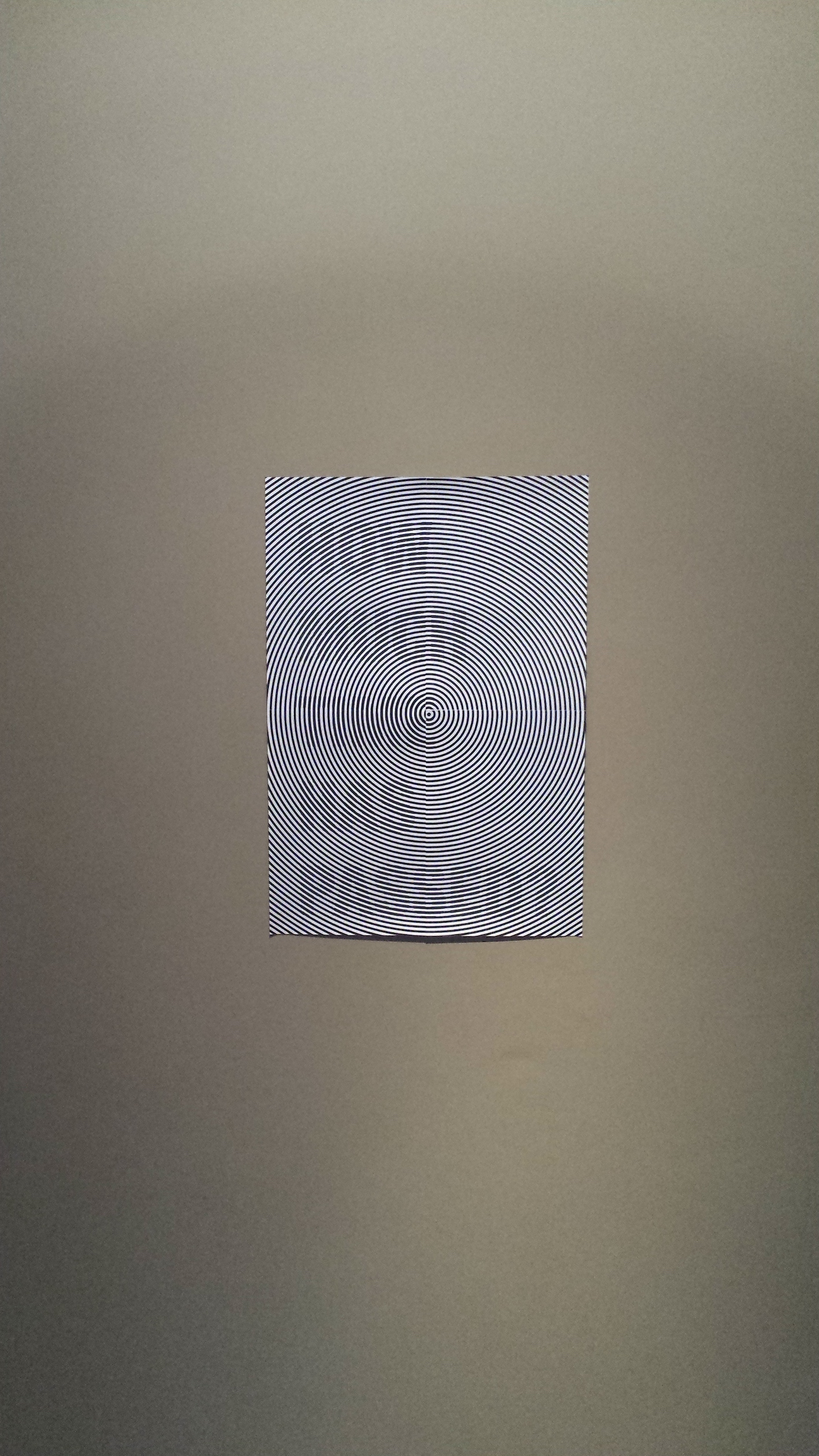
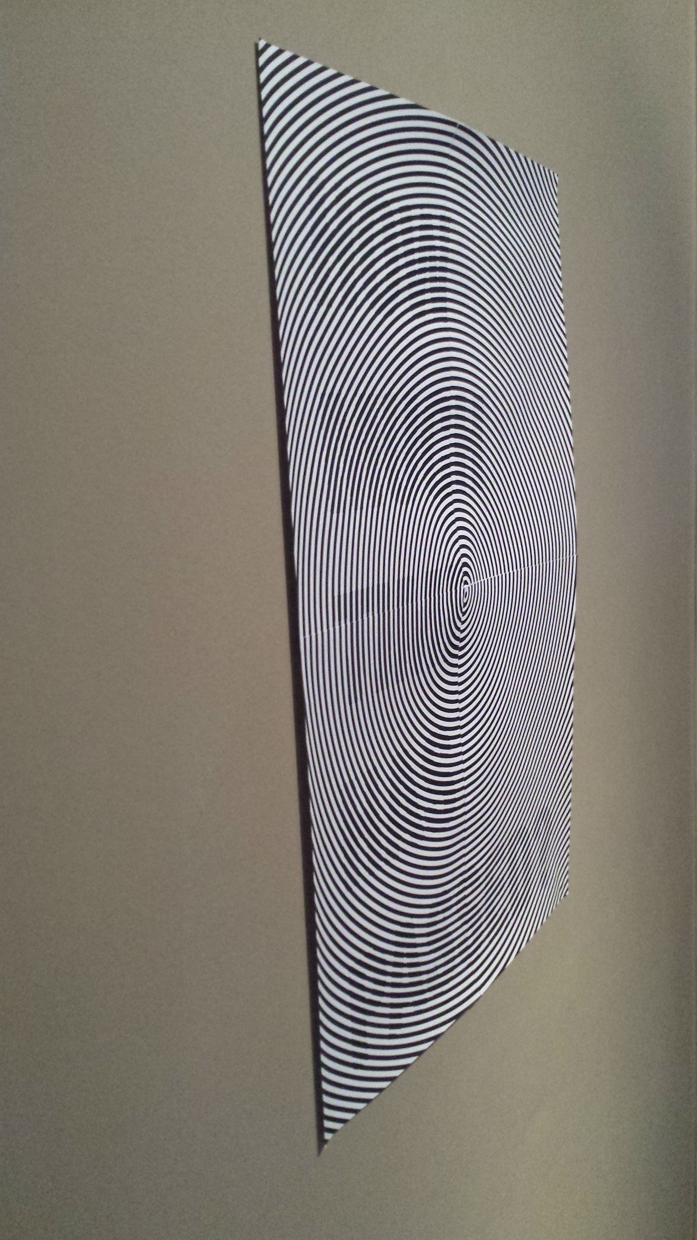
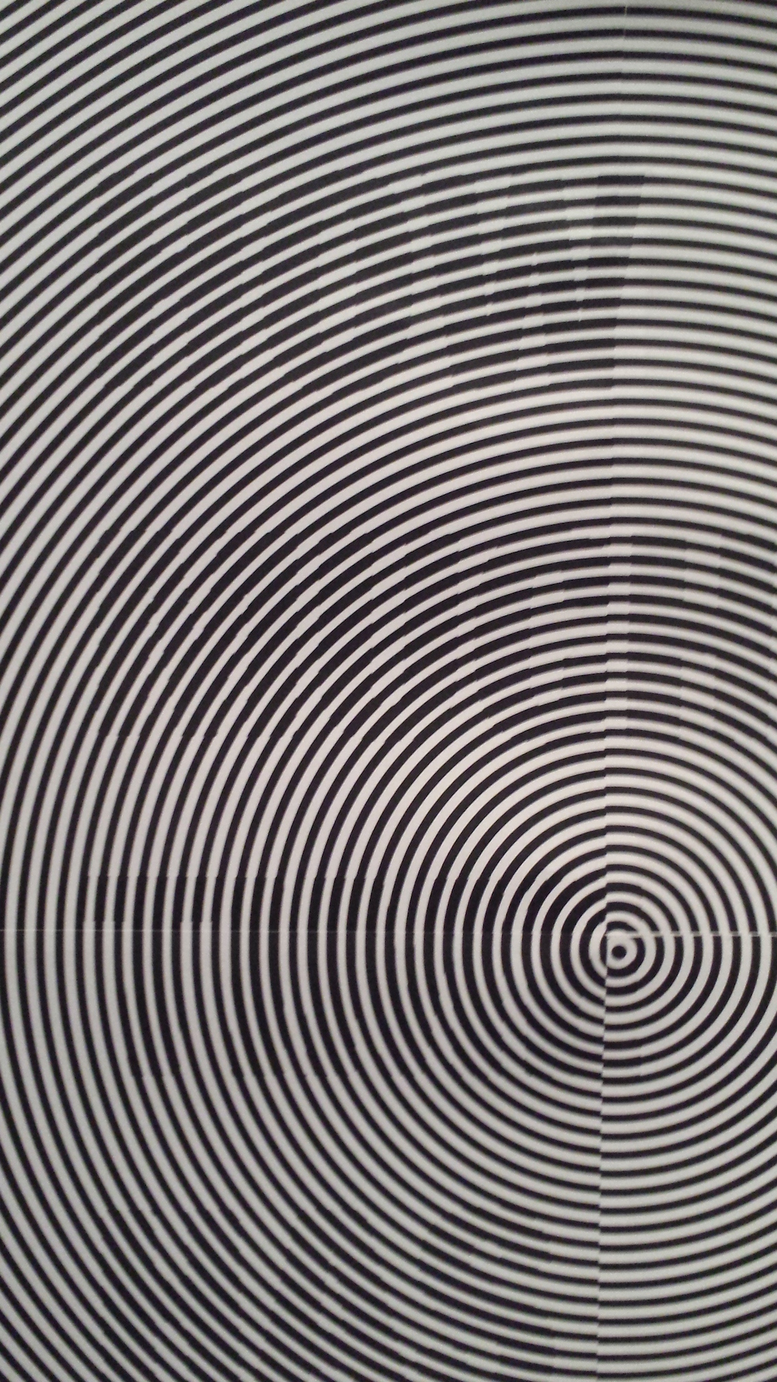
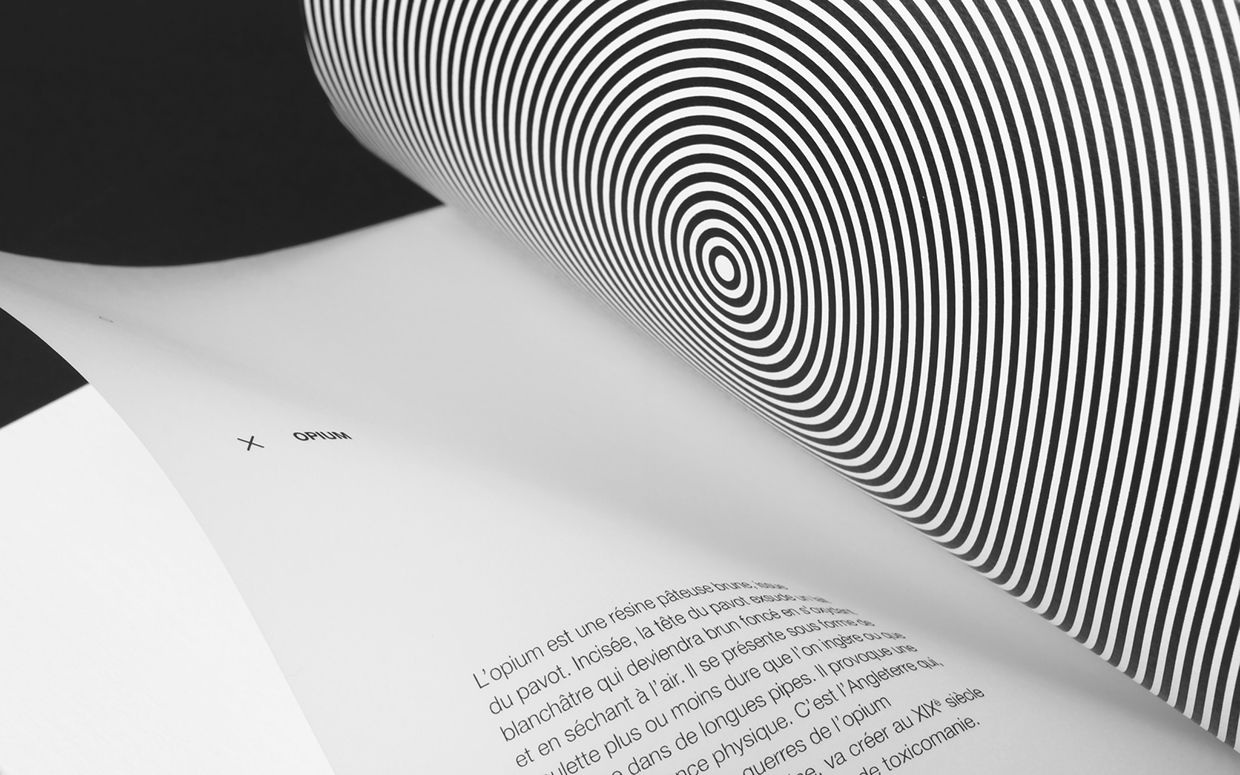
Drogues caught my attention for it’s use of illusion just like the effect I did for Project 1. In this case, the illusions reflect the effects of the different kinds of drugs.


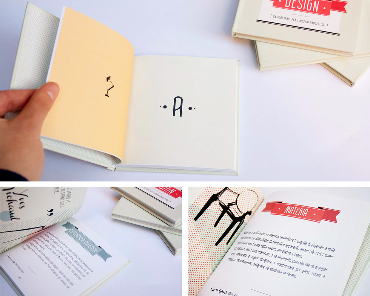
Another example is a small glossary of 20 Words of Design.


My Individual Dictionary is pretty cool as it is illustrates personal interpretation of words using objects and colours. To me, this somehow is an expanded and more detailed version of emoji.


The Lexicon of Unconsciousness is a rather creative approach towards questioning questions. It describes the lexicon book as the brain towards questions.


Slanguage as the title proposed, it is a mini book on slangs. The pages are rather interesting as it reminded me of those paper flyers pasted on lamp posts and boards with tearable telephone numbers at the bottom of the paper.

Project 3 I Mindmap, Proposed Idea & Moodboard

Colourful Mindmap

Based on the 50 words that I’ve came up with, more than half of them are metaphoric representation of me and I plan to use the idea of metaphor as part of the project together with the word Colourful, which I’ve chosen among the 50 words to expand and explore on the possibilities.

Colourful encompasses a variety of definition that includes the psychological, physiological, scientific and other aspects of which I would like to focus on perception, under the psychological aspect. Gender, age and culture contributes to how individuals perceive and react towards colours. Though colours give off specific moods (e.g. red = danger, active), personal emotions, memories and experiences does affect how one feel and think about that particular colour(s).

Thus, my proposed idea is to create a Lexicon of Colours using personal interpretation and perception of colours and represent it in a metaphorical way that would reflect my personality. Basically, it is a vocabulary that uses colours to express my perspective as an asian adult. The aim of this is to show how colours play a part in the psychological aspect of life, in terms of personal preferences and perception. The purpose is to communicate the idea that different colour brings different degree of reaction based on the feeling attached to it and therefore, individuals may share the similar or different views as/from me.

Pinterest – Mood board as to how I could present this idea..

Project 1 I Final (Reflection)

Time perception began with a personal take based on what I’ve experienced as well as the realisation of similar encounters by my friends. This sparked me to create something to reflect upon this kind of experience that is usually taken less seriously as it was just a matter of individual perception. Through my research, I began to understand the “science” behind it and this somehow changes my perception towards time since I know how the brain works. Thus, the idea of illusion and typography came about as a form of medium towards the expression of this topic.

Time perception is defined as a field of study that is link to psychology and neuroscience in which it is subjective to the experience of time and measured by own perception. I couldn’t less agree to this yet I felt that this is a scientific approach toward the definition of such experience. From a less scientific view, I would define it as a rather common yet quite odd encounter with time as it differs from each individual.

Project 3 I Interesting Colour Dictionary Examples

An interesting redesign of Pantone (the dictionary of colour) by artist Pierre David where he created Human Pantone based on human skin tone/colour.


Another kind approach towards colour dictionary is the use of colour pencils as the content / ‘words’.

22178    Screen Shot 2016-03-10 at 10.21.37 pm


Pantone cafe uses their food and furnitures as their ‘dictionary of colour’, which makes the entire cafe more fun and unique. Dictionary in this context, goes beyond the boundaries of just pieces of papers. Objects can be considered as part of the dictionary depending on how you perceive it.


Pantone Universe collaborated with Sephora and came up with 2016 Pantone Colour of the Year lipsticks. (Didn’t know that a dictionary could be so adventurous and of different objects, shapes, sizes)

Sephora and Pantone Launch the Makeup Collaboration of Our Dreams


Another Pantone example that used beer colour. Imagine cans of dictionary…

What Pantone Color Is Your Favorite Beer?

Issues I Research

An article from TODAY newspaper that raises their concern on the decrease of recycling even when more homes have recycling bins. Also a sustainability consultancy – Green Future Solutions points out that more needs to be done in the reduction of plastic waste.


Another is a series of posters by RECYCLE EVERYWHERE that smartly portrays the items produced after recycling. I personally found this method of advertising rather interesting as it attempts to pull you in for a second look and even reflect upon the waste that you’ve thrown away.

Project 1 I Mock Up

Mock up of the 5 posters. I realised that one of the effect works slightly different from the rest and thus, I would like to change the effect to dots instead of applying the same effect to another poster.

5

20160223_155040


The visibility between being placed under spotlight and not under it is rather different. (It’s easier to see without direct spotlight.)

20160224_112359 20160224_112408


Adjusted the stroke to make it less visible

20160224_112817

Project 1 I Illusion Research and Experimentation

Sourced for some inspiration from Shigeo Fukuda’s illusion works where he uses typography as a space/form to create illusions. One thing I’ve realised is that he often uses hands and legs to create such illusions and one of the reasons I think is because both have two rather straight lines which makes it easier to connect.. He also played with plane lines to create different perspective/illusions. Such effect instantly make me think of Monument Valley, which is an optical puzzle game that has this effect but in a 3D version. (It’s super addictive plus it has very nice and simple graphics!)


Meanwhile, printed one of the design to test out how well the illusion would work on paper and I realised that lighting plays a part in the contribution towards how well it can be seen. When it is placed directly under the light, the text can’t be seen as clearly (up closed) as compared to it being placed somewhere slightly far from the direct light. Another thing is, the text can be seen rather easily thus I’ve adjusted it to make it harder to see.

Took some pictures of the first experiment (A2 size, without the adjustment yet).

20160217_190810   20160217_190752   20160217_190920

Project 1 I Memories and Experiences to Time Perception

Through this talk by Andre Fenton – The Future of Hope (a famous neuroscientist that studies the brain in relation to stored experiences as memories), he covered details of memories (construction/reconstruction of experiences) and mentioned that “your experience determines how you see and understand what is presented to you”. As I reflected upon this, I found it on par to the research that I’ve done and mentioned in the previous post – when the brain do not need to process so much new informations (also means that the brain had experienced same/similar experience before), time would be perceived to be faster as the process is faster.

In another article which talks about Fenton’s incorporation of art to his lab through a table designed by Shuli Sade, where the images applied on the table are distorted and fragmented. This execution reflects well upon how memory works in the brain as he mentioned “memories in the brain are distorted and fragmented. They appear together in this space kind of like how they appear together in your brain”

ReconfmemorySade4crop  Encode:Decode


In link to memories and experiences to perception of time, The Experience and Perception of Time wrote about memories of events from past experiences that are “accompanied by a feeling of pastness” where emotions could be inclusive towards remembrance of the past.

Project 1 I Interesting Findings

There’s this “game” that plays with time perception called Unlock the Mysteries of Time Perception. Rather interesting to experiment/test myself as I got to know how I perceive time.


A project called Time Wizard that revolves around the idea of tricking and distorting one’s perception of time through activities that can be found in the toolkit.


Another is about optical illusions and I personally found the grid amazing! So was Einstein too.(Thatcher was rather scary..)

Project 1 I Time Perception Research and Moodboard

Some additional interesting research found besides the links that was embedded in my previous post (Time Mindmap and Idea).


One of it is a project called DURR by Skrekkogle Studio that alters the function of watch to change how people perceive time.

DURR


Another is a talk about Perception of Time Delation by David Eagleman, a neuroscientist and an author who is famous for his specialisation of time perception and more.


Alternative approach towards time perception is the creation of illusion poster by Agnes Herr that challenges people to look at it differently.


Moodboard can be found at Pinterest.