
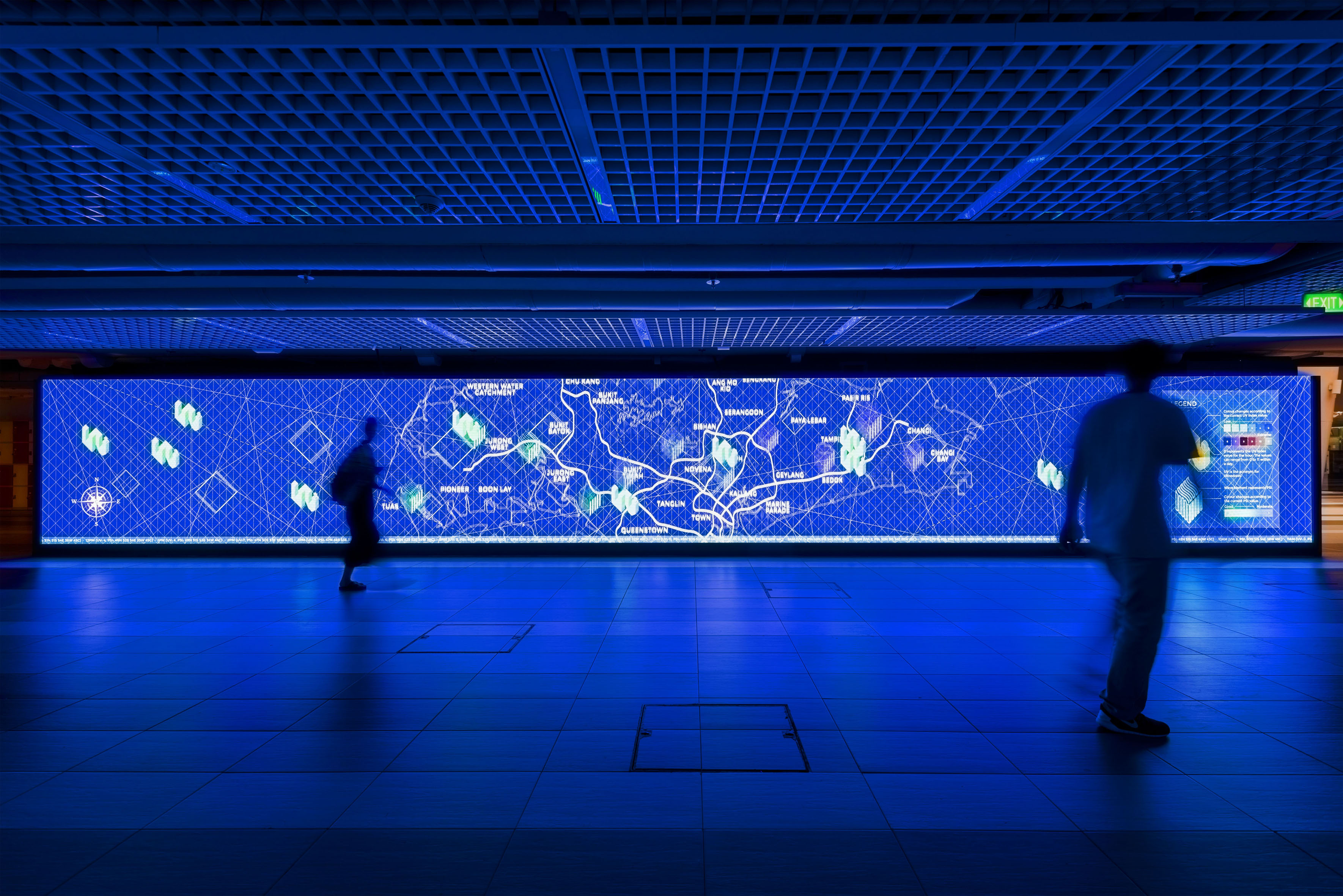
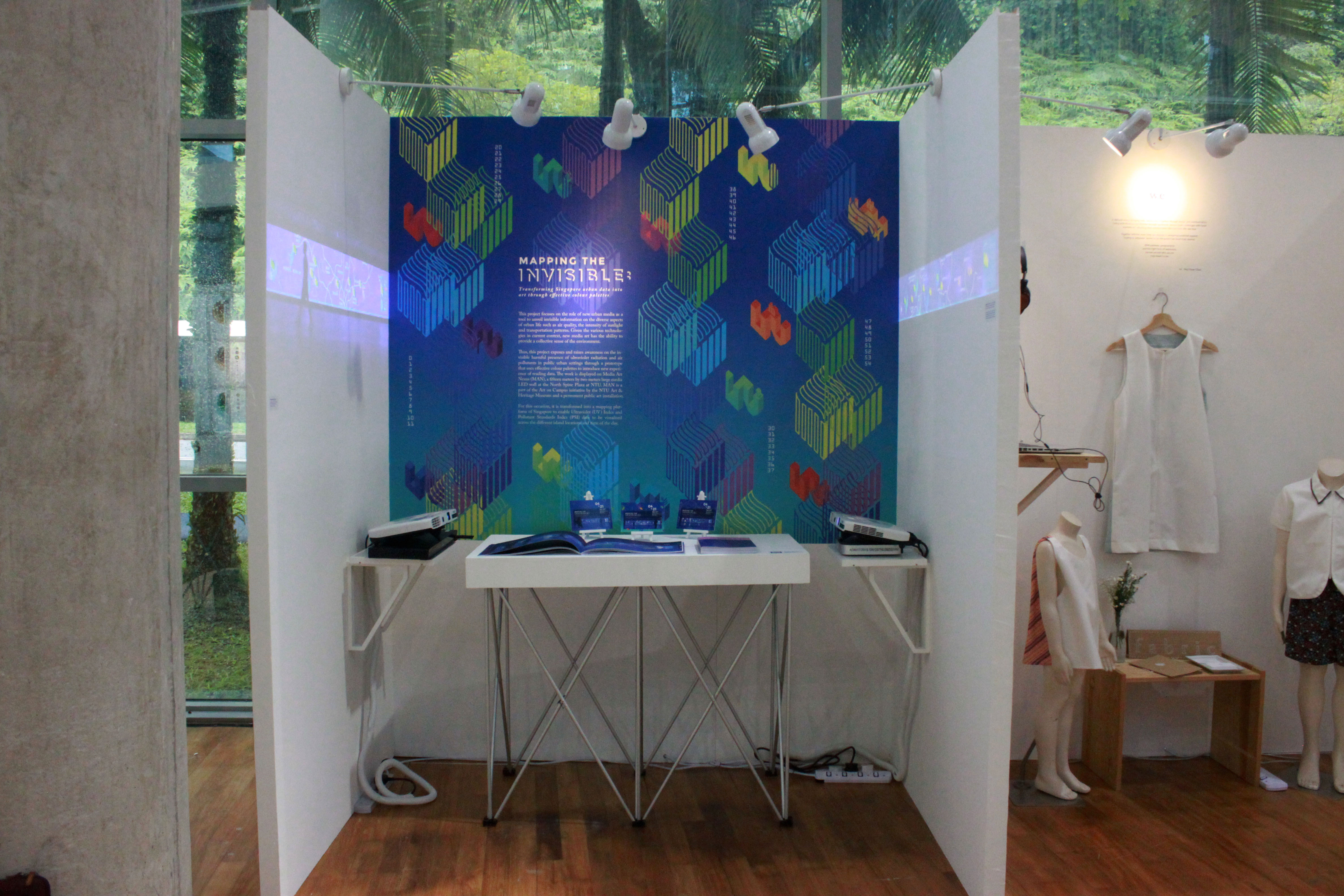
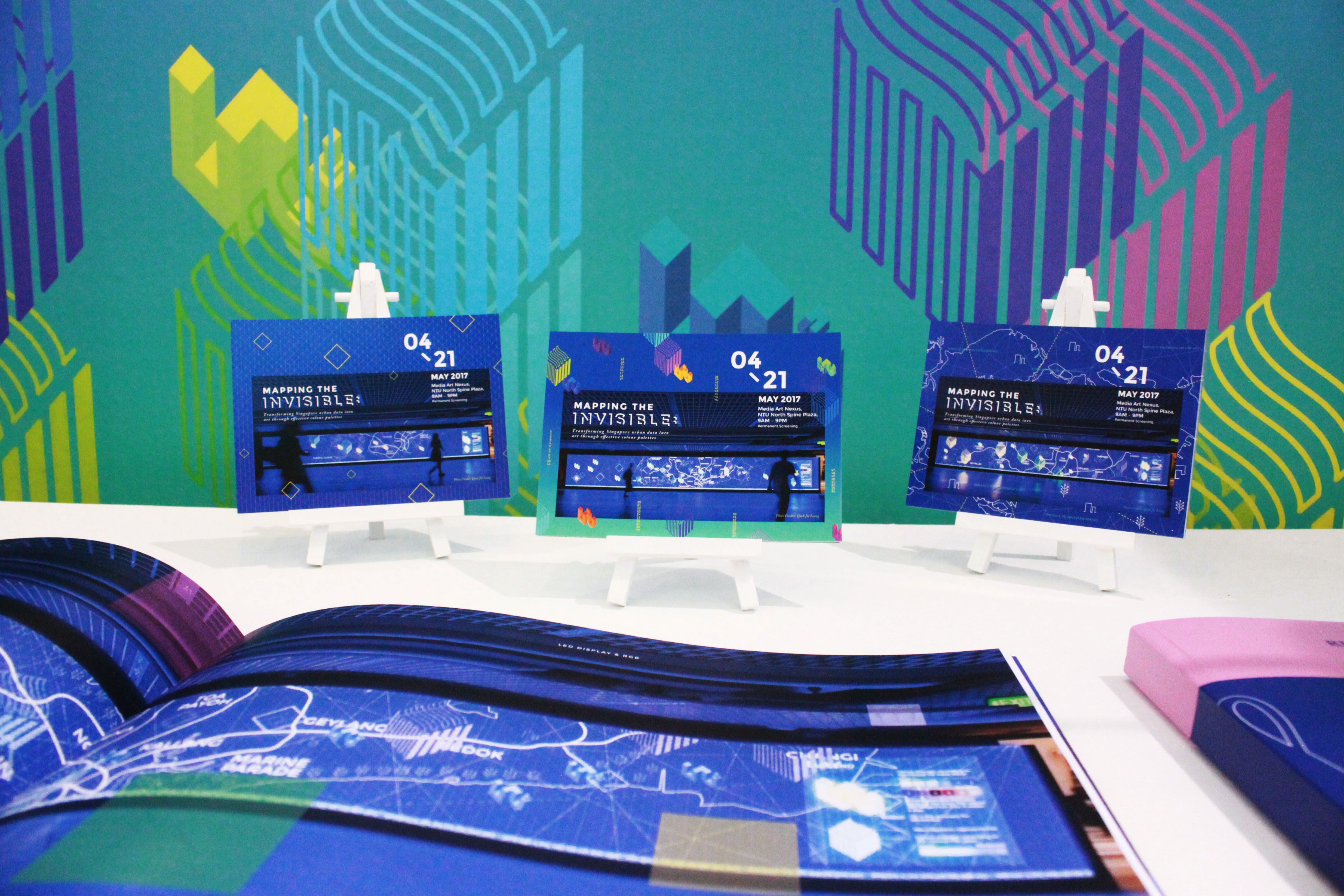
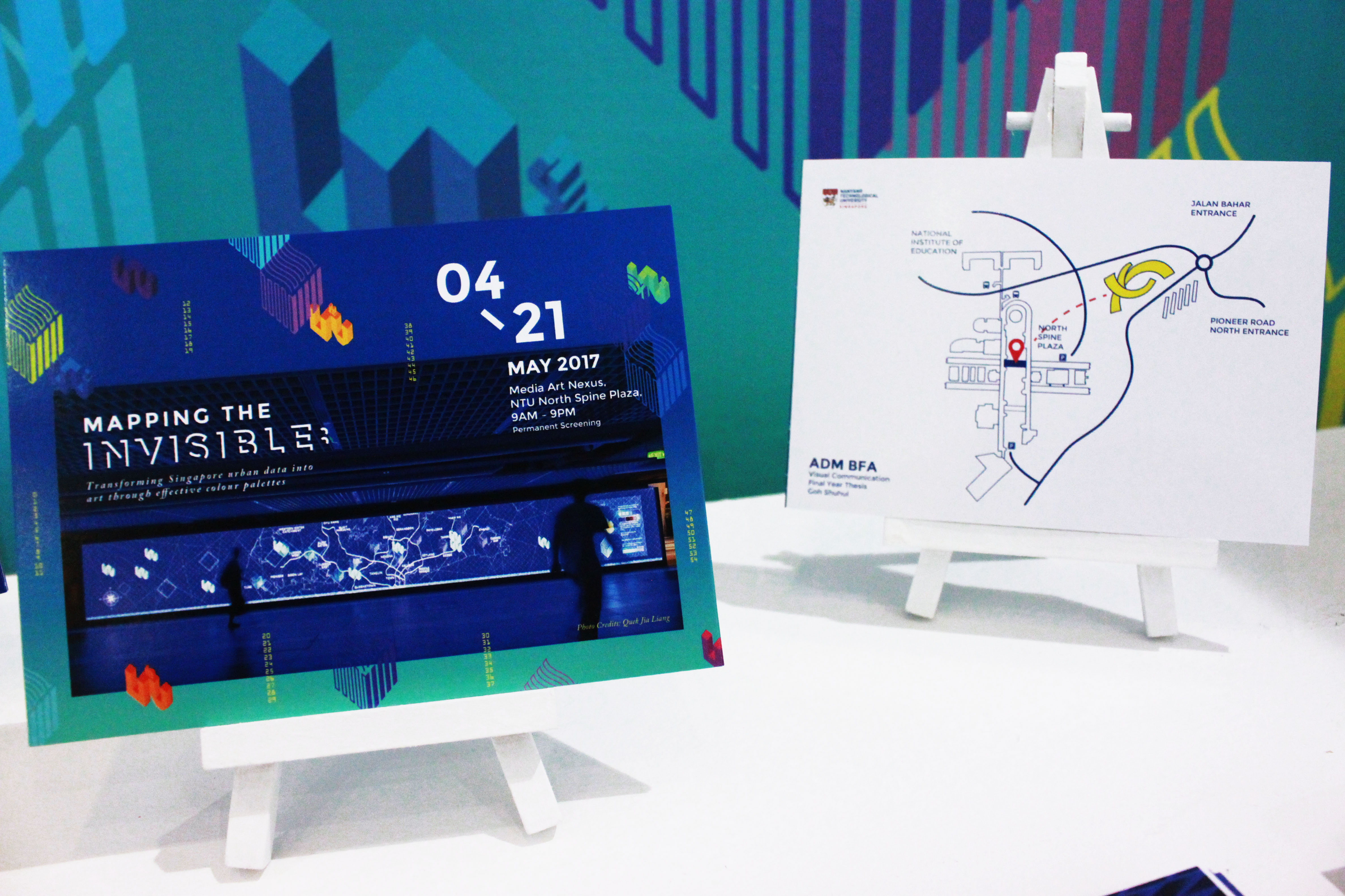
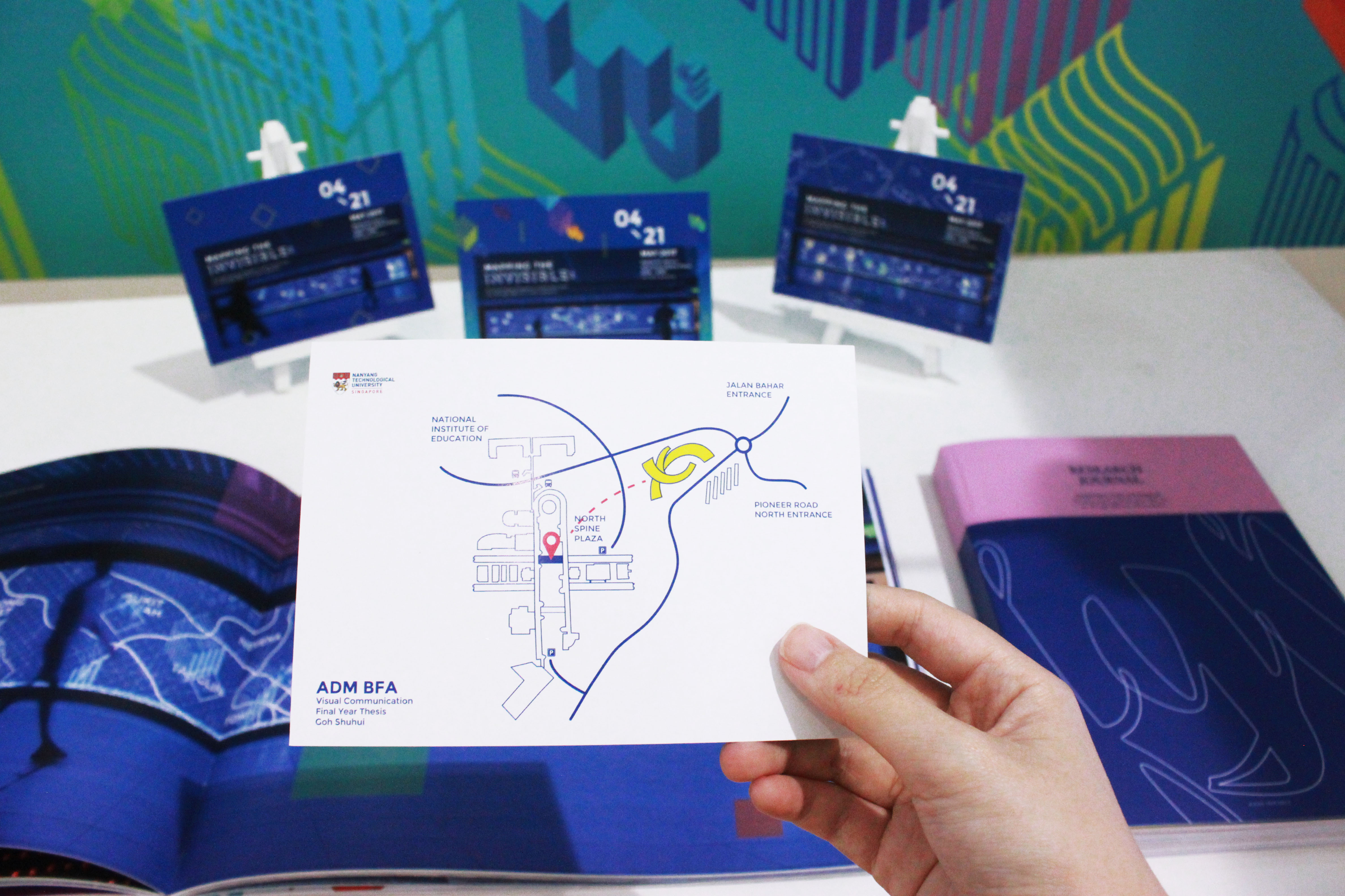
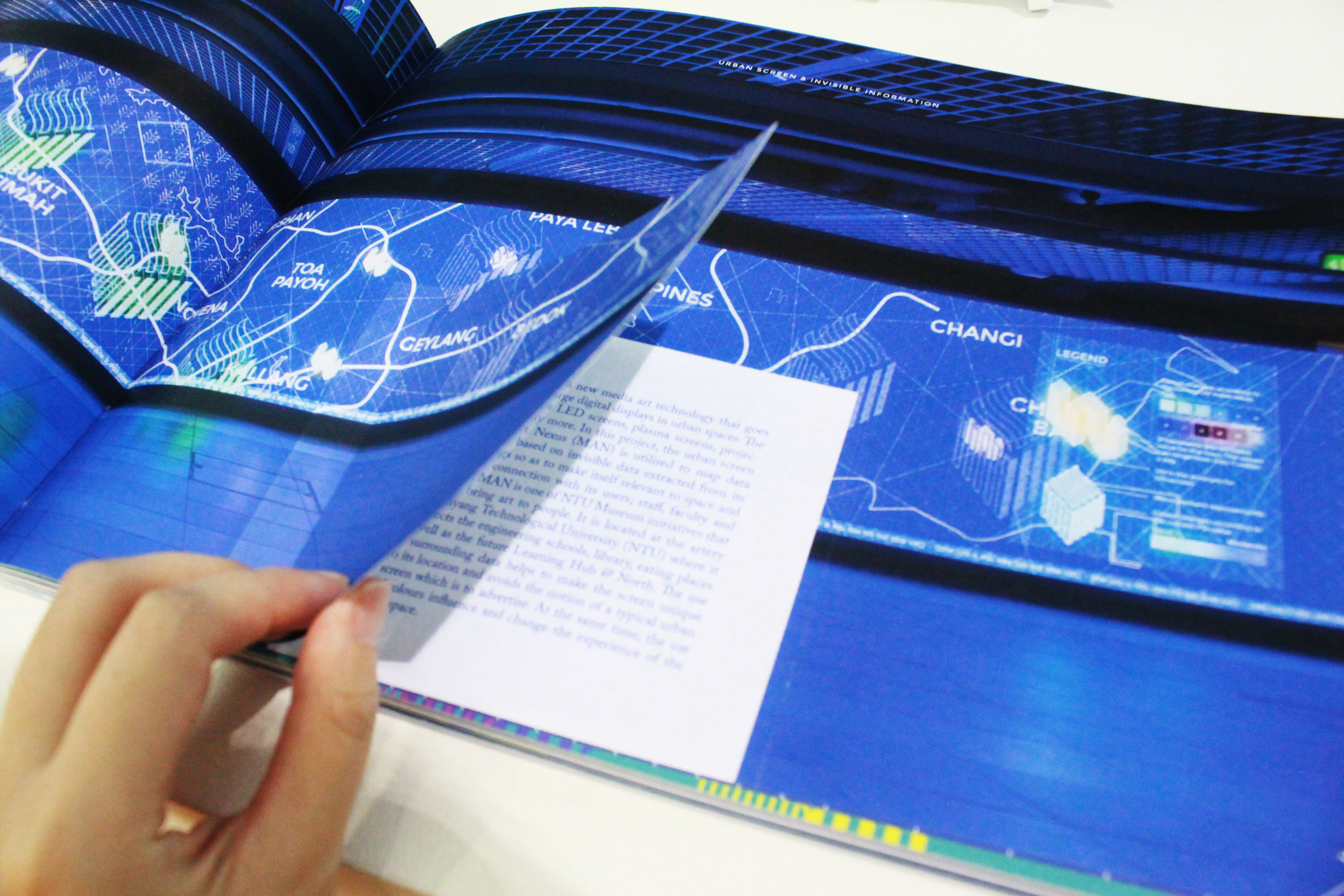
Images of prototype @ MAN


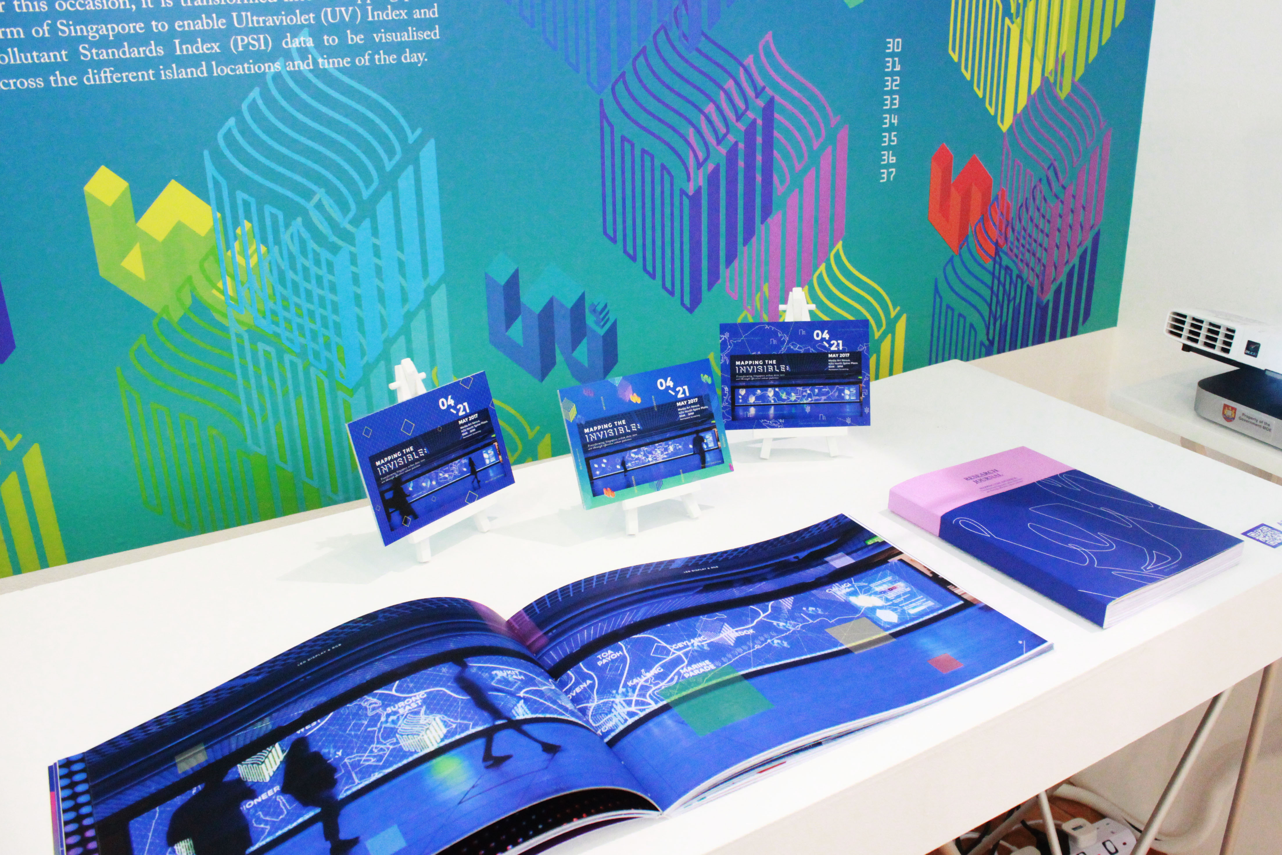
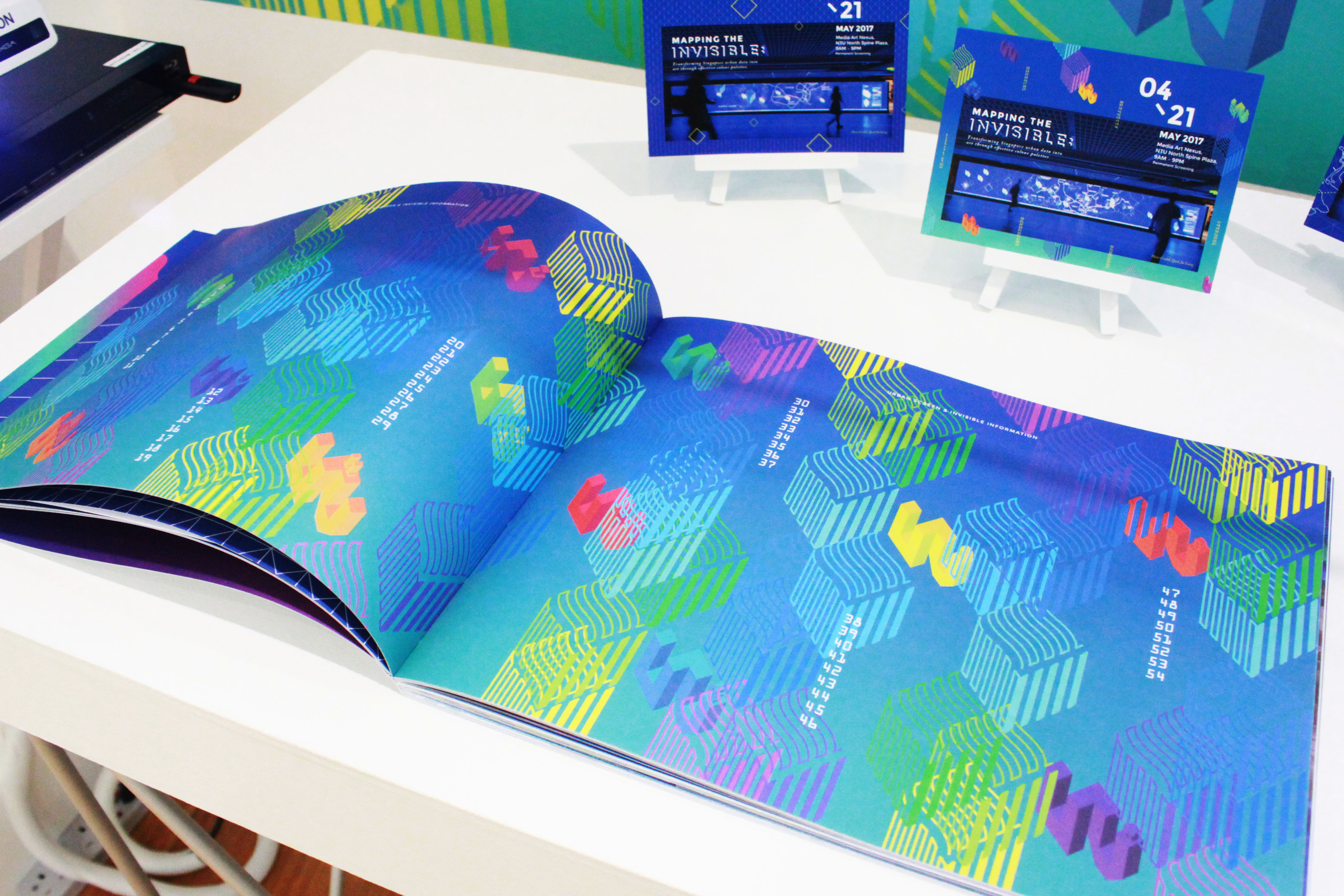
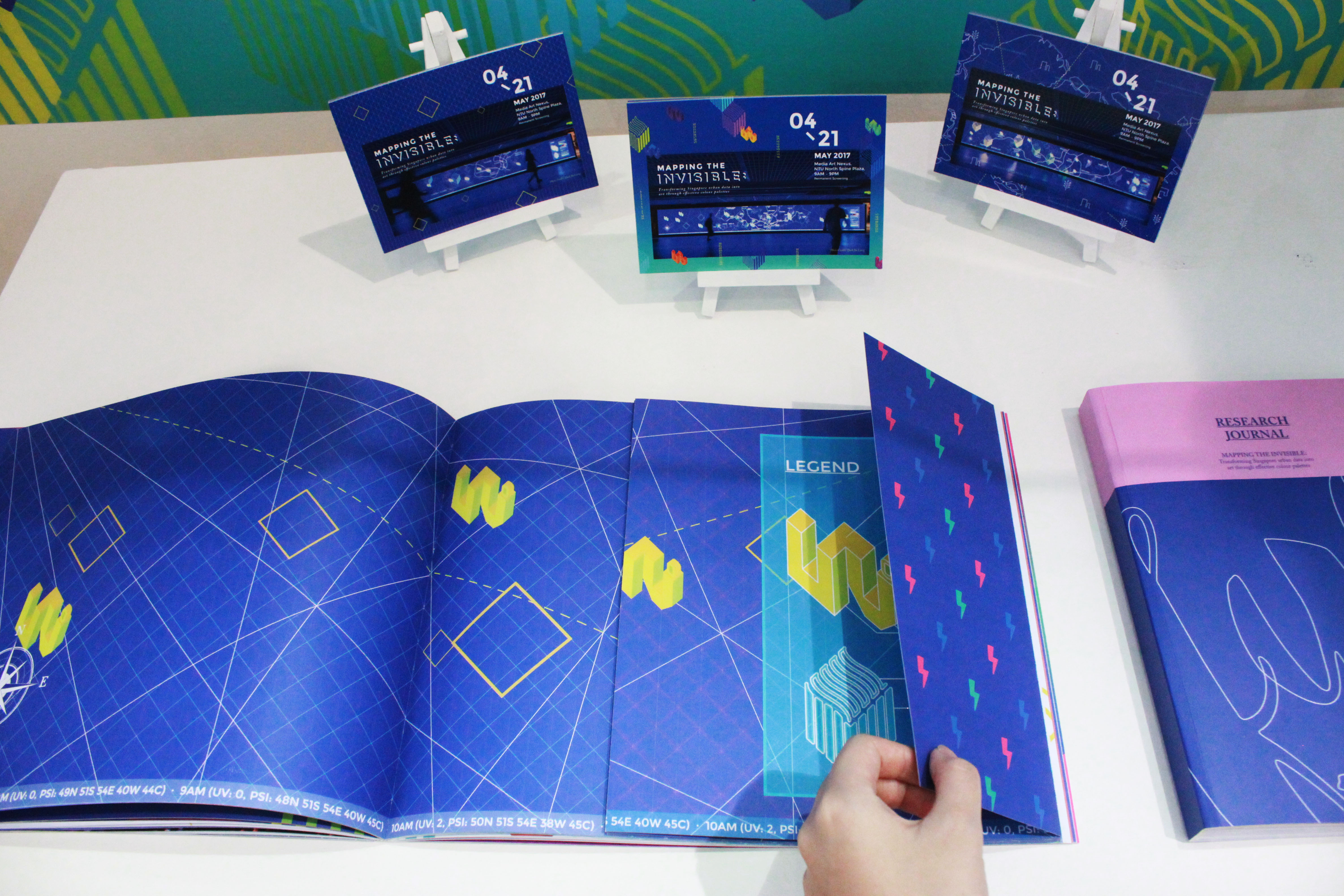
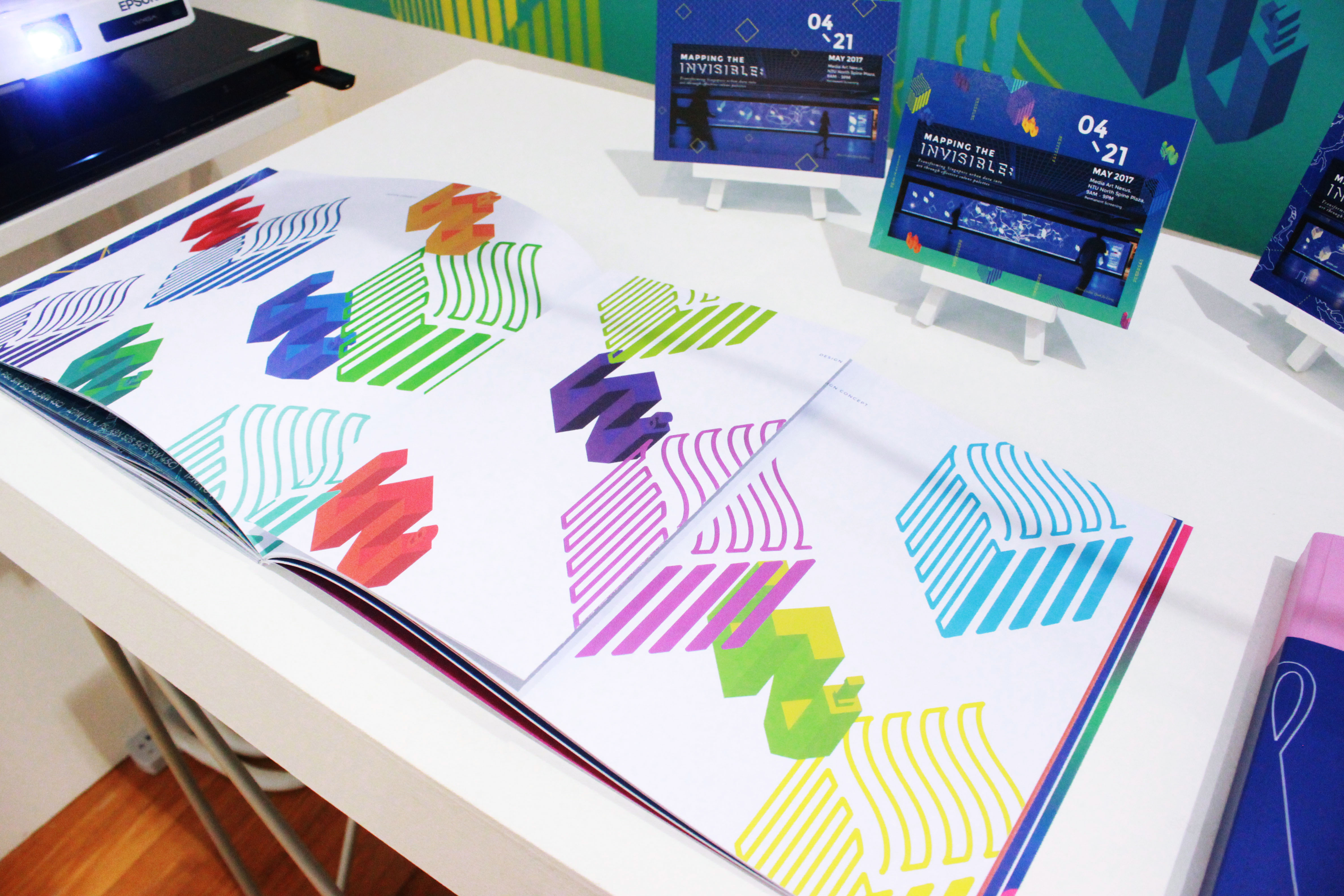
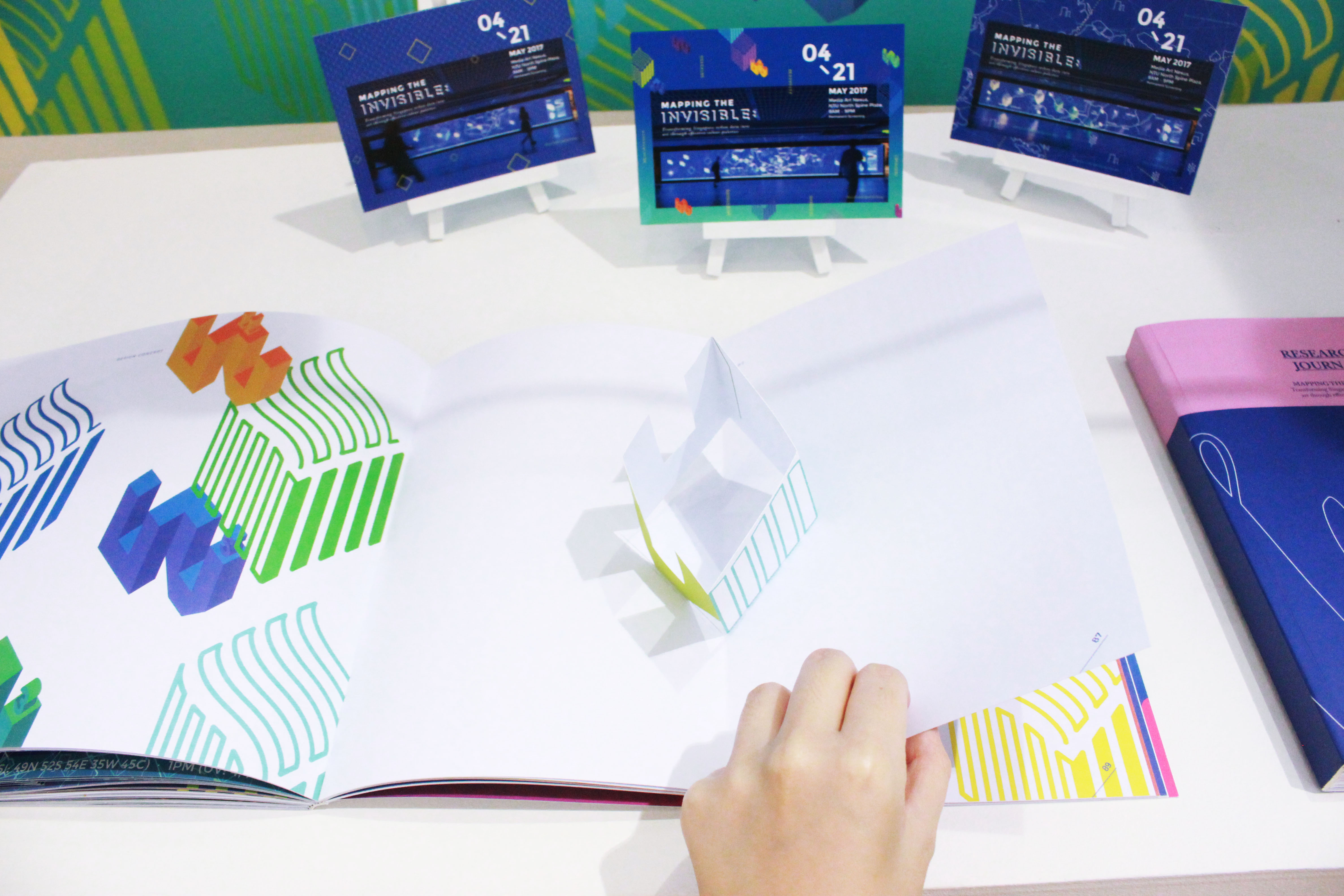
Publication & Research Journal @ Booth


There are 3 posts tagged environment (this is page 1 of 1).

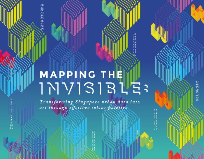
After reading through my FYP report, I’ve decided to use nature environmental data (sunlight and air) to connect to colours and urban screen. As mentioned in my report – we perceive colours through the comparison with its surroundings. The contrast plays a role in determining how we recognise and react to the colours in our environment; the external conditions in both nature and social environment. The appearance of colour is subjected to the alteration of neighbouring colour and the susceptibility of it varies from the state of the perceiver to the physical conditions of viewing it such as light, distance and volume.
Therefore, I would be using UV Index data (measures the level of solar UV radiation exposure at the Earth’s surface; could also be inferred as the amount of sunlight we’re being exposed because when the direct solar radiation is not blocked by clouds, it is experienced as sunshine ) and PSI data (measures the air quality; could also be inferred as the amount of particulate matter we’re being exposed and the concentration levels reflect the amount of “saturation/intensity” of the colours we perceive).
Visual Exploration
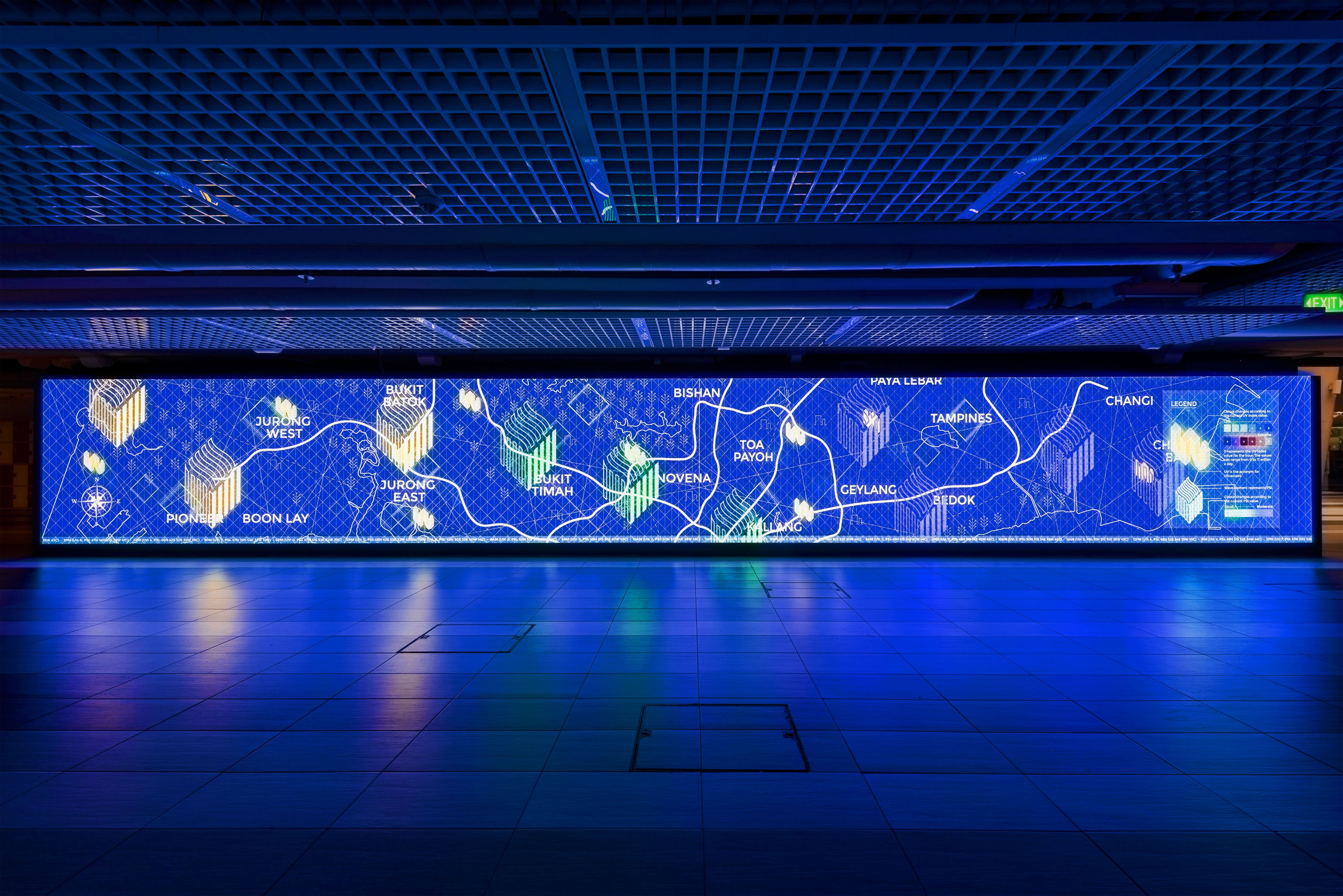
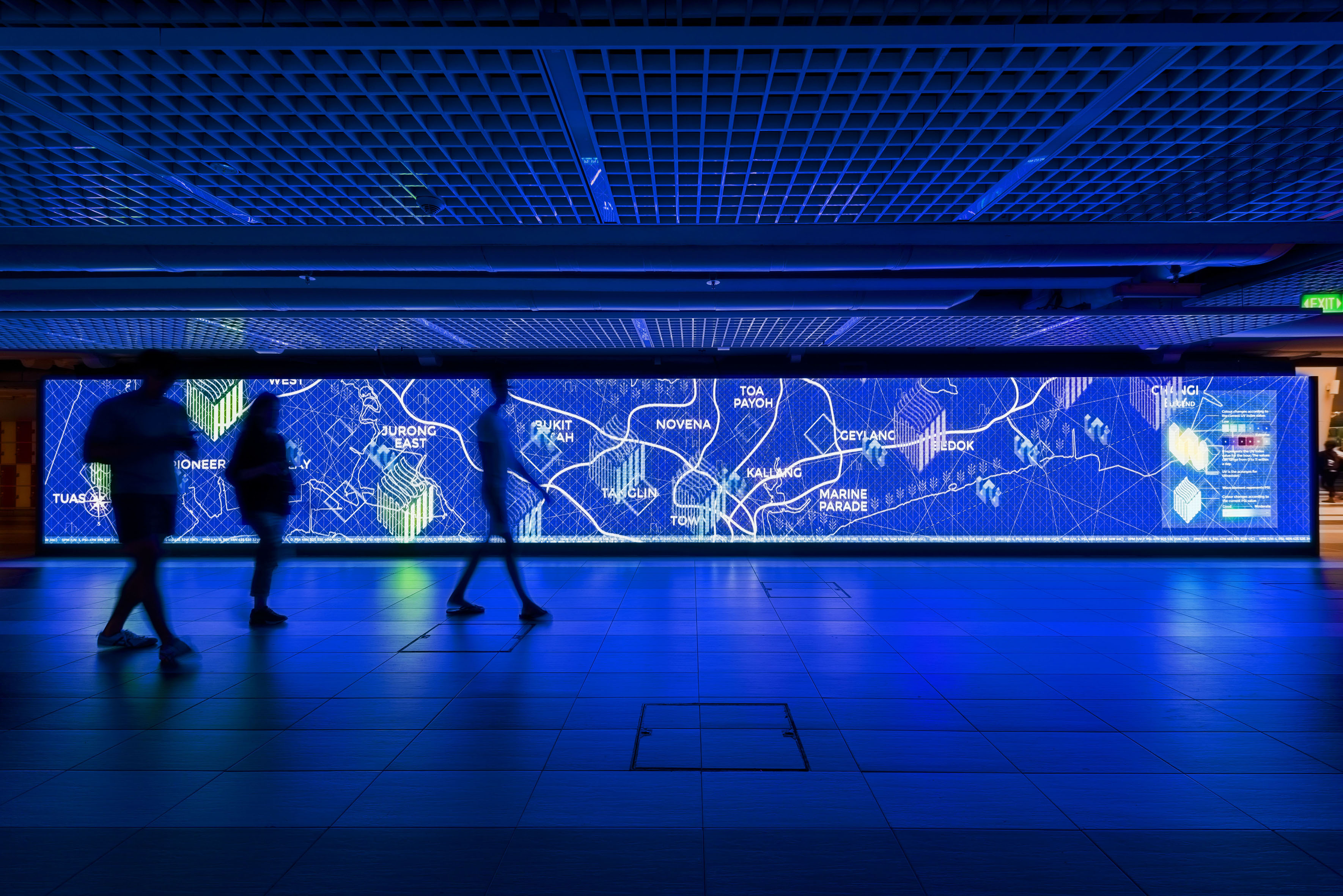
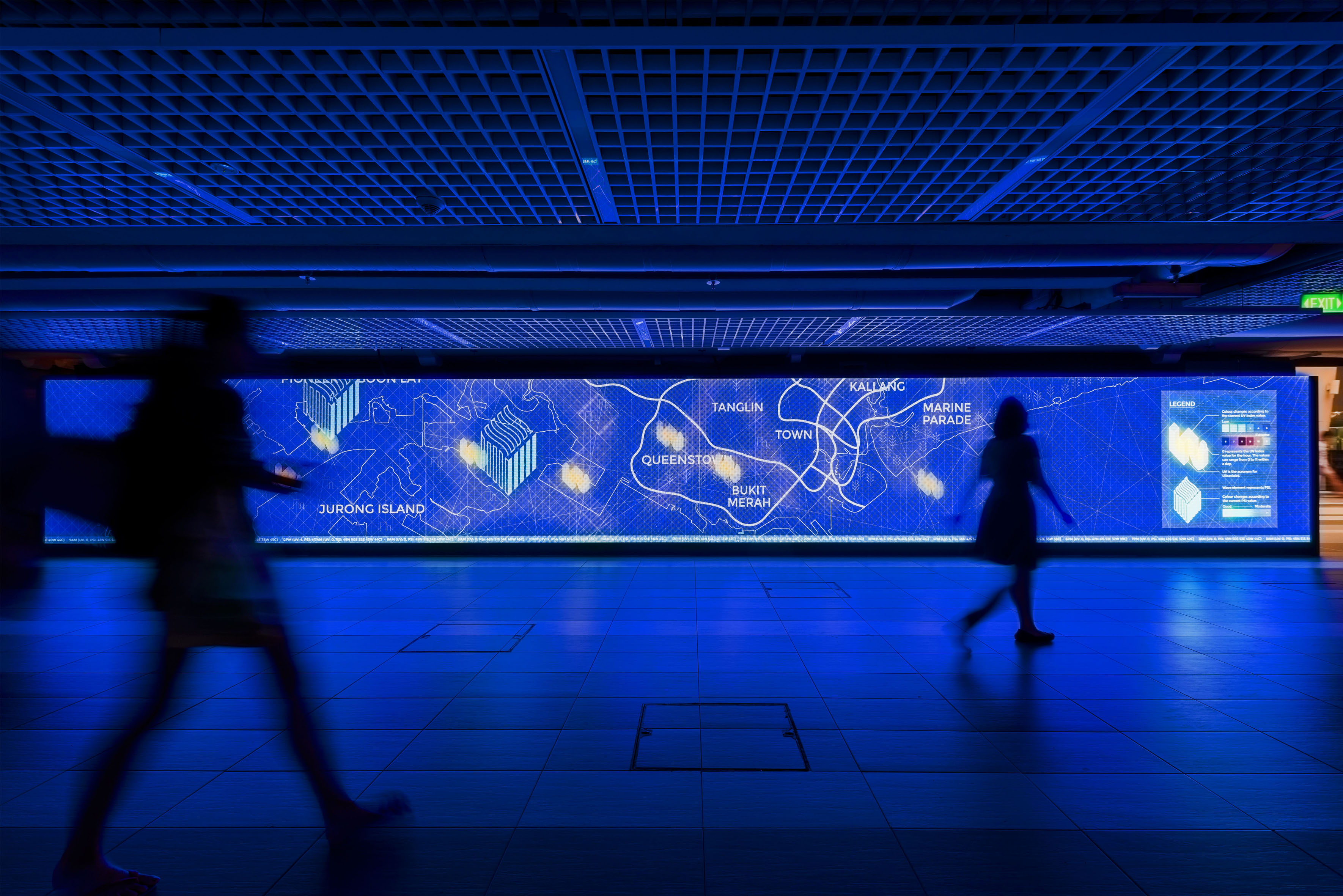
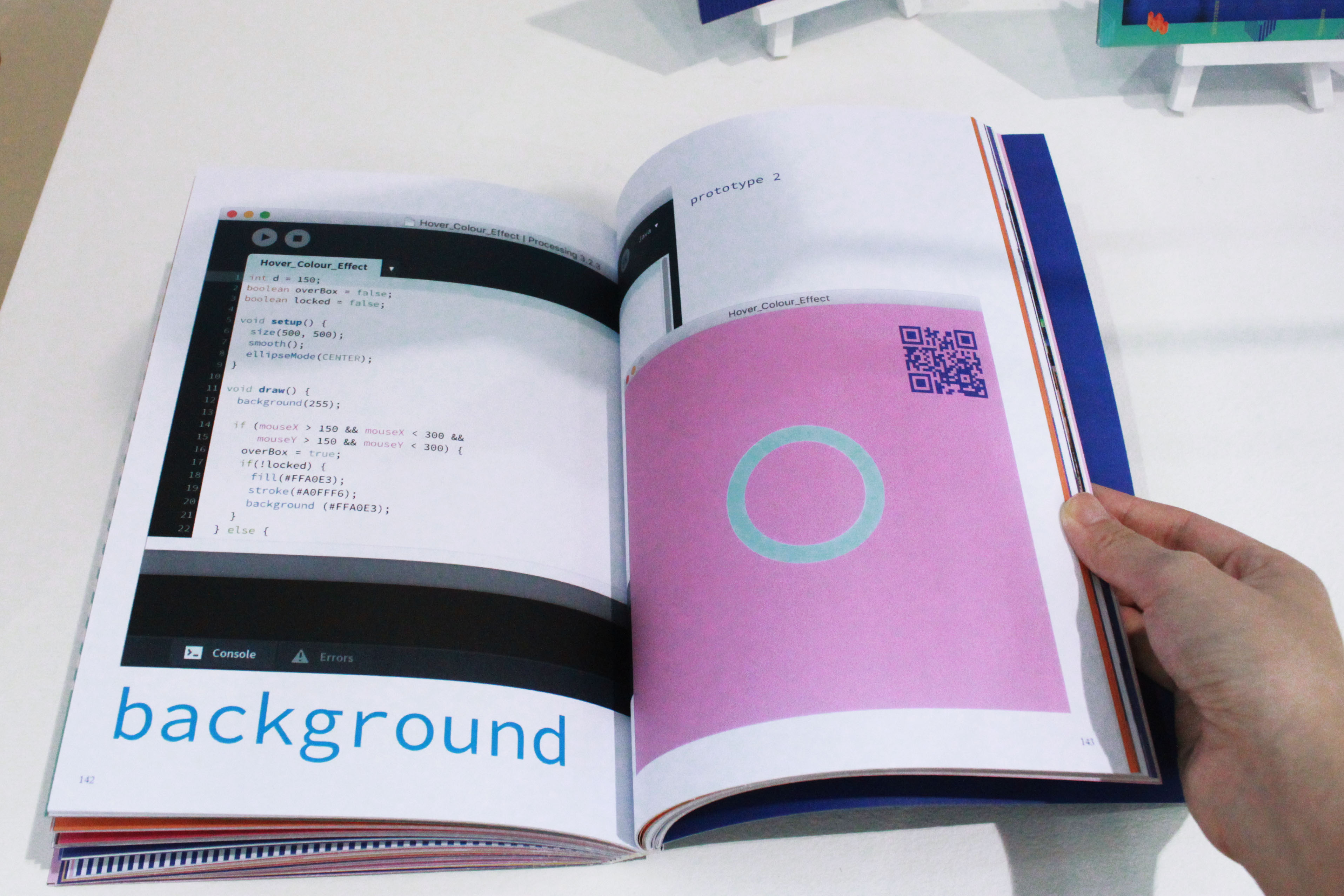
I did some motion graphics based on the UV Index while incorporating Josef Alber’s Colour Theory. So how it works is based on the UV Index which range from 0–11+(cool–warm), each value is assigned to a colour that starts from cool to warm. Cool values have 2 graphic elements to represent it and same goes for the warm values. Additionally, big circles are included to reflect the current value. For this instance in Image 1, 7am UV Index was 0 value thus there are big blue(cool) circles with both cool and warm graphic elements hovering around it. The background also goes with the flow. Image 2 & Image 3 depicts the different values at different timings.
![]()
Image 1

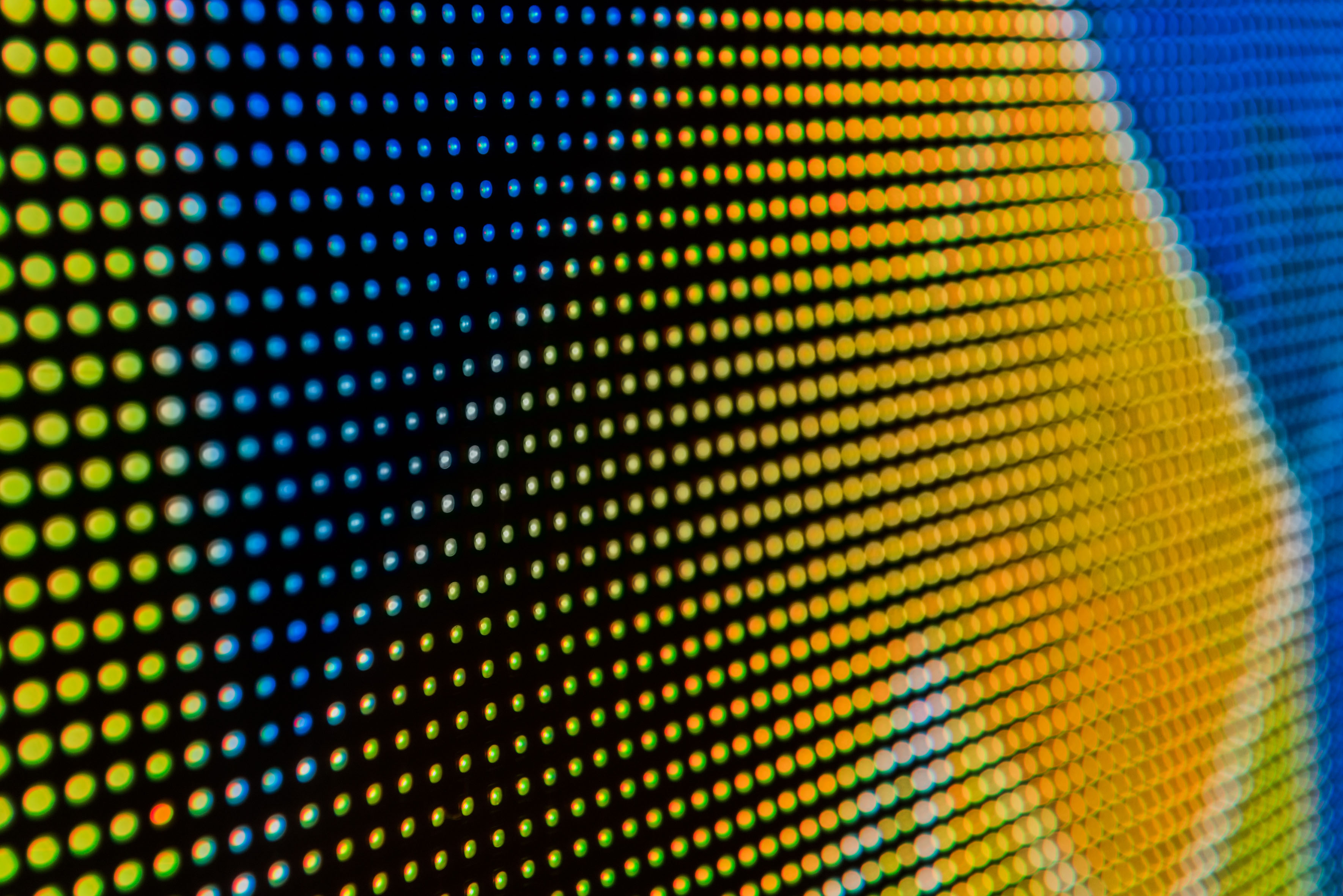
Up close image of Image 1
![]()
Image 2
![]()
Image 3

Colour, Environment and Human Responses: An Interdisciplinary Understanding of Color and Its Use as a Beneficial Element in the Design of the Architectural Environment by Frank H. Mahnke, Published by John Wiley & Sons, 1996
(Frank H. Mahnke is an environmental designer and consultant for architectural)
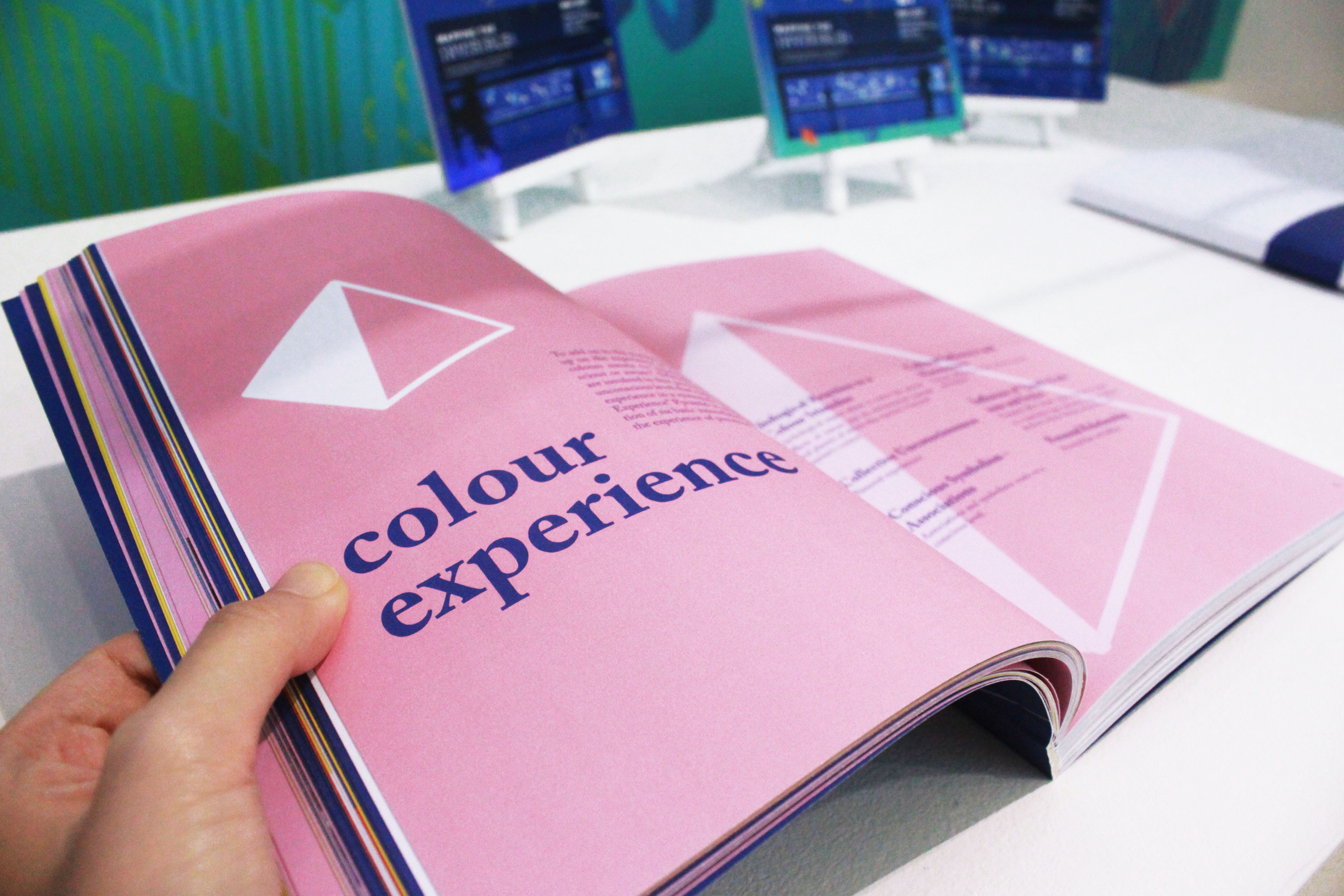
“To perceive colours means to “experience”; to become conscious or aware.” (Page 10) Many factors are involved in this process in both conscious and unconscious level that makes it hard to define the experience in a systematic way. Thus the “Colour Experience” Pyramid is created with an assumption of six basic interrelated factors that influence the experience of perceived colours.

Biological Reaction to a Colour Stimulus
Psychological aspect where it covers the natural effects of nature and its environment (animals and plants) of which this reaction is beyond anyone’s control.
Collective Unconsciousness
Personal experiences.
Conscious Symbolism – Associations
Associations and symbolisms made on a conscious level.
Cultural Influences and Mannerisms
Colours related to certain cultures, groups and regions.
Influence of Trends, Fashions and Styles
Temporal effect where colour changes to adapt to a particular time; industries such as fashion, products, interior design, architecture, etc.
Personal Relationship
Personal likes and dislikes.