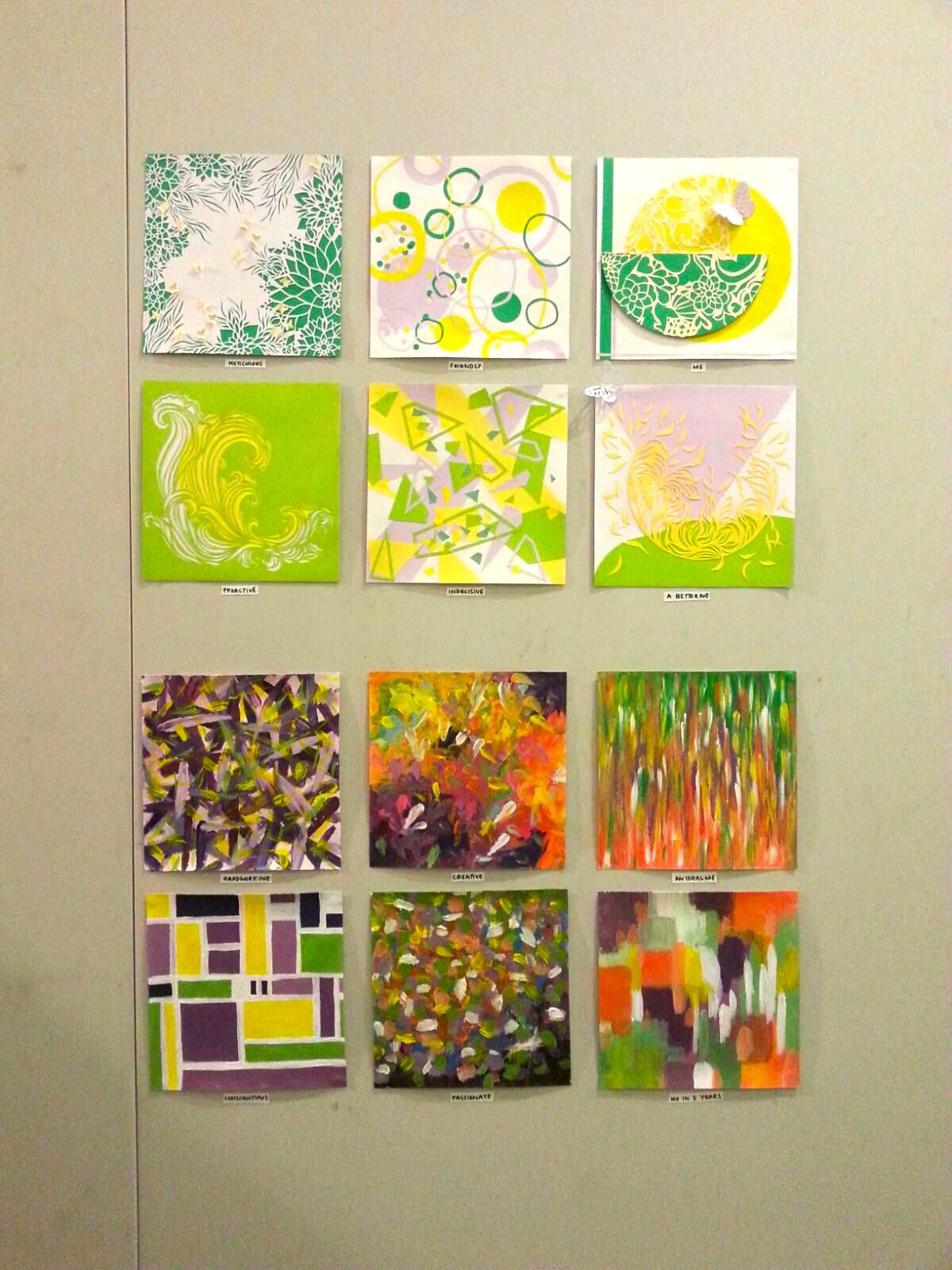
Layout:
1st equation:
Meticulous + Friendly = Me
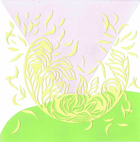
Meticulous 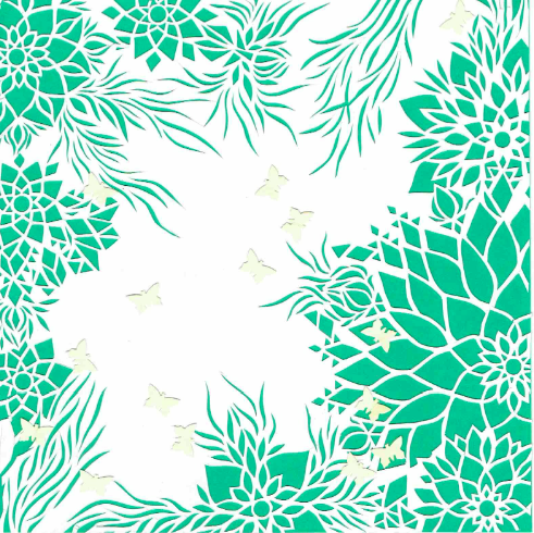
In the first equation I wanted to convey this sense of enclosure and a little bubble of my world that I live in. I am meticulous because I am someone who is very detail oriented and am concerned with the little things rather that sometimes I miss the big picture. Because I am so concerned and preoccupied with the littlest of details my vision of the big picture, or rather the more important things/purpose is blocked out. Therefore, to symbolise this I created a delicate papercut design and layered it over green paper with this area of white space in the middle. We don’t know what lies behind this white area, so in that sense, the detailed papercut design acts as a ‘filter’? I also forgot to mention that my family is symbolised by the presence of yellow, and I used it throughout my compositions to show their signifcance and how they are a constant in my life.
Friendly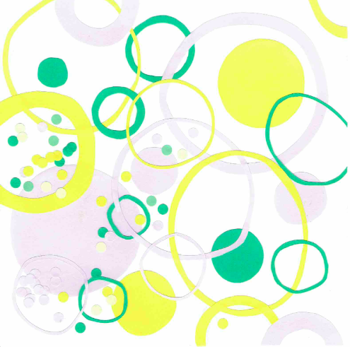
For the attribute ‘friendly’, I wanted to bring in what June observed about me- she said that I was ‘socially selective’. I knew I wanted to use circles to represent this but I didn’t know how. So I looked to different artist for reference, and I came across Kandinsky’s ‘Circles in a circle’. I used that and interpreted it in a different way. I created many circles overlapping each other and only in certain circles are there these few small circular confetti, which symbolises people who I am close to. Hence I also wanted to convey how in the aspect of my social life, it is narrow and not too wide as well.
Me

The first two added together essentially equates to who I am. I am this girl who is detail oriented, finds her family extremely important to her and has a few very close and dear friends. With all of these elements, this creates a little bubble of ‘Widad’s World’ where all these things revolve around my life and the only issues and problems that I face are concerning these and the problems I create myself because of being too meticulous.
2nd equation:
Proactive – Indecisive = A Better Me
Proactive
In the second equation, I show how I wanted to break out from this little bubble/ world that I was in to create ‘A Better Me’. This better version of myself is someone who is no longer confined by her little, narrow world she is in. She is aware of what is going on around her and the global issues in the world. She realises what issues in the world are important to address.
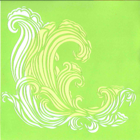
Being proactive is defined as someone who is ready before something happens. Proactive people initiate things and act before anyone tells them to do anything. I feel that waves is an apt symbol, as waves are lively, full of energy and zeal. There is a sense of power and strength in its movements as it comes roaring down the shore. Waves are constantly in motion. I was inspired by the quote: Time and tide wait for none. I decided to do a cut out of this as well because I wanted the yellow circle from behind peek through, to show how it is something I learnt from being in a big family. (I really regret forgetting mentioning this in the presentation- I was so nervous!)
Being proactive towards gaining this knowledge is a big step for me to break away from this bubble.
Indecisive
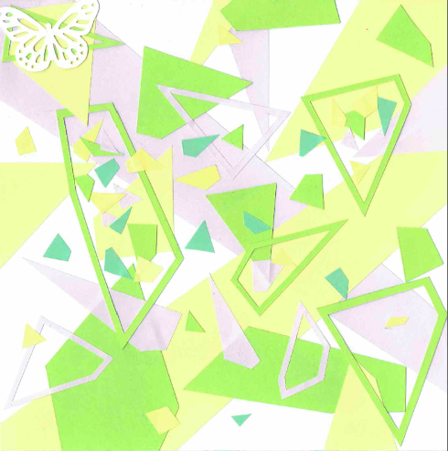
One of the many traits I’d like to change about myself is being ‘Indecisive’. I often find myself having to decide between two things and having an extremely hard time choosing. It’s ridiculous how indecisive I am. This is a really bad thing because I spend so much time going back and forth deciding which option to do before doing the task. That’s why I decided to represent it through geometric shapes- to represent how fragmented and weak my decisions are because I can can never seem to fully decide and be confident in what I do.
A Better Me
From what I’ve explained, ‘Proactive’ and ‘Indecisive’ may seem like a contradiction. But the way it works is I always get great ideas, but I procrastinate in doing it because I am indecisive and I waste time deciding what I actually want to do. In the ‘Better Me’, I wanted to depict this bubble/circle representing my world breaking as I become fully aware of global issues.
As we move on to the more abstract pieces, it become slightly more trickier and difficult for me to explain them, because when creating each of this pieces, I get into the ‘mood’ of this traits to evoke this feeling/trait in the piece.
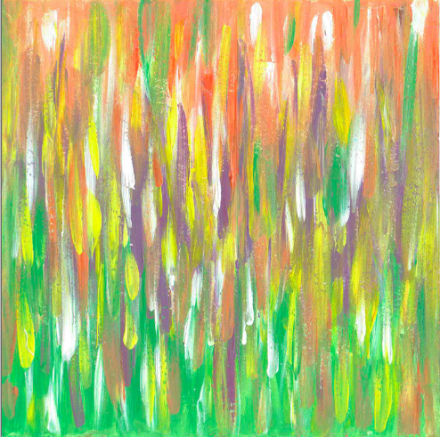
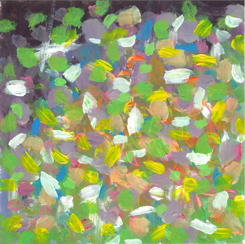
Hardworking x Creative = An Ideal Me
Hardworking
For ‘hardworking’, I was struggling, thinking how I should represent it. Then I remembered our first project, where we used line to express emotions. After getting that inspiration and revisiting my work, I felt that strong, bold dark lines could represent the effort and energy to be hardworking.
Creative

For creative, I wanted a relatively colourful piece to represent the creativity. I added in blue and pinks to accentuate and make the piece more colourful. I really love how colourful it is. This is essentially how I imagine a creative mind would be.
An Ideal Me
The ‘Ideal Me’ is someone who creates eco-friendly products, providing solutions to environmental problems. So for the design of this, I wanted to marry both styles to create this.
Conscientious + Passionate = Me In 5 Years
Conscientious

I am someone who does her tasks as best as I can, even if it is something small. And the way I do this is through a systematic, organised way. I got inspired by Mondrian and reinterpreted his famous painting. I have to admit, this was a more easy painting to do compared to other, because there are is a sense of order that soothes my controlling self haha.
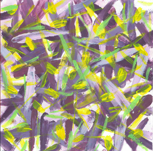
Passionate
| intense, impassioned, ardent, fervent, zealous, vehement, fiery, heated,feverish, emotional, heartfelt, eager, excited, animated, spirited, vigorous |
These are the synonyms for ‘Passionate’. And I feel that my painting embodies this energy.I really found myself enjoying doing this which I feel was important in order to really convey this trait of mine.
Me In 5 Years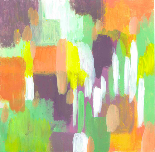
Because I am uncertain as to how my future will be and don’t know what career I want to pursue, I decided to make this last composition ambiguous. But one thing I know is that whatever it is that I do as a job, I will be conscientious and passionate about what I’m doing. I am thinking positively and hope that my future will be as colourful and vivd as this painting is.
Colour Theory
Another thing I didn’t really fully elaborate on was my choice of colour theory. The first 2 equations represent the old me. I used complementary colours- purple and green (with yellow accents) but I used soft pastel colours. From this I move onto bolder triadic colours with the introduction of orange in addition to purple and green, all in more saturated and vibrant bold hues. I even added more accent colours (like blue, pink) which don’t follow the theory but even goes to show how I am breaking the rules even in the colour theory but it pays off, to create a beautiful colourful piece.
This signifies my desire to change and break out from this sheltered, ignorant, safe, mundane, traditional me to a risk taking, spontaneous, bold, self aware, globally aware and socially responsible human being.
A few things I wish I did better:
- The presentation itself. There were many things i forgot to mention and I wasn’t very coherent or clear in explaining my concept and each composition. I think what Joy said about preparing a template for future presentations is actually really great advice because I always am so bad at presentations and this would help me relay my thoughts in a more orderly manner and make me less nervous.
- The abstract pieces- Joy mentioned that ‘hardworking’ and ‘creative’ look somewhat similar. I agree. But I still feel like at the same time it is distinct in its own way- ‘hardworking’ has longer, bolder dark strokes whereas ‘creative’ has a plethora of colours and shorter stroked. However, I can appreciate that what I had in mind probably didn’t translate to what I created or was obvious enough. Also, I wish that I had given more symbolism and meaning to my abstract pieces- honestly because I didn’t really know how to.
- Bringing in more solid artist references- not only their style and method but their beliefs and thinking as well. On that topic, I recall Joy telling Hsin Wei to read up more about these difference movements/ artists and their ideologies and write them down to create a bank to apply it for next term. I think this was another really really good piece of advice and I really really hope I can do this because I’m not the type of person to read these non-fiction, intellectual type of books. This is mainly because: a) I find them really confusing and difficult to understand. And therefore b) I find them boring. But looking when I see how people like Hsin Wei and Andrew who read these books and apply them to their work, I can see how it really supports their concepts and generally makes them more knowledgeable, open and well read as a person.
Overall reflection
Despite these regrets, I am still proud of what I’ve done and what I’ve discovered in myself as a person. I am now more aware of what I have become and what I need to change to get to that ideal me. I am hoping to use this break to work towards that change. Through Joy’s readings I’ve learned many things- from abstract art to the significance of flowers in cultures. I just wish that I brought that into my project.