I’d like to make sure this post has everything I needed to say about this project, so I apologise if I am repeating myself in some parts.
Due to my time constraint, I had to slightly change my concept. I realise that I was creating problems for myself by fixating on unnecessary issues. I turned what was supposed to be a simple concept on my flawed attributes to something entirely complicated, almost missing out the main star itself- typography.
My initial concept was to show how I reconcile having the same attribute at two different stages of life- between adult and child, and how it can have different connotations at different ages. I feel that it had merit and potential but I had made it too complicated so I scratched that and went back to the basics.
Therefore, my first project focuses on my flaws. Last semester we did a project on ‘Self’, where we mainly focused on our positive attributes. So, this time I thought it would be interesting to explore my flaws because they too, are part of my identity.
When I listed these 4 attributes (conformist, curious, demanding and open), I noticed some of them had a relationship with one another. On analysing them closely, I realised some of them contradicted one another and this was because they have a cause and effect relationship.
This was how I arranged the compositions:
Format
The first set: ‘Conformist’ and ‘Demanding’ have a somewhat contradicting relationship, at least to me.
Here is my take on these attributes:
I figured out that I was demanding because I’m such a conformist that I expect others to follow the rules that I follow as well.
The second set, ‘Open’ and ‘Curious’ doesn’t really have a contradiction, but rather, a clearer relationship.
I figured out that I was ‘curious’ because I’m so open with my thoughts and feelings that I somehow think that others are as open as I am- and it turns out that they aren’t, so in reality, I’m actually nosy.
Each attribute has either an element of ‘taking in’ and ‘giving out’, as seen clearly annotated above. I thought it was important to highlight these two ‘categories’ because I feel like I’m sort of a machine- when I take input, I inevitably have output.
Typography
Going along with the same 2 categories, for ‘Taking in’ I used computer fonts sourced from the internet to reflect different sources. For ‘Giving out’, the typography are all entirely handmade and using my handwriting to reflect the information I ‘give out’.
Choice of colour
I wanted to allude to the two categories I talked about above with the use of colour.
‘Taking in’ means receiving information from different sources = more than 2 colours used
‘Giving out’ has only one source, which is me= only 2 colours used (I initially wanted to use one colour, but I needed to have contrast, so I decided on two instead)
To be honest, when I was editing these I was having a bad headache from looking at all the bright saturated colours ( I had to increase the saturation on the computer or else it would be too muted).
Initially I chose all these bold, bright colours to mimic the childish attribute but when I changed my concept I decide to keep it as I felt that it would perfectly reflect my distaste for my flaws. The colours I paired together for each composition are no way pleasing to look at- they are jarring and have high contrast. Overall, I didn’t want to make this project aesthetically pleasing because I wanted to show how uncomfortable I was with my flaws through the colour scheme. If I were to use the same colours, but with pastel hues or muted tones, the project would be entirely different and wouldn’t have the same impact.
Hello my name is Widad and I am a
I was inspired by this work I found on Pinterest. I can’t seem to find out who the artist it though 🙁 The element of the letters being camouflaged intrigued me.
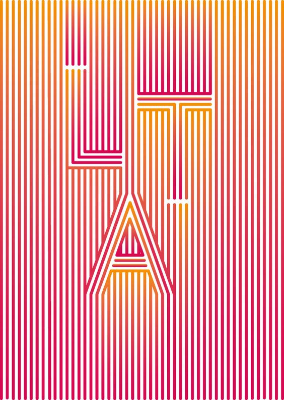
When you first see this piece from afar, all you see is CE. I chose to use CE because the CE marking is a mandatory conformity marking for products sold in the European Union. I thought this would be a perfect symbol for showing conformity. All the products that comply to the certain set of rules and regulations can display the symbol on their products.
I feel that conformists are the same to a certain extent. We’d like to think we are all individuals and unique, but we unconsciously or consciously follow society’s rules and in that sense lose our identities. I’m a conformist because I stick to the status quo and don’t question rules- I don’t like to stand out for the wrong reasons, I don’t rebel. That is why I hid/camouflaged my name because being a conformist, I lose a part of my identity.
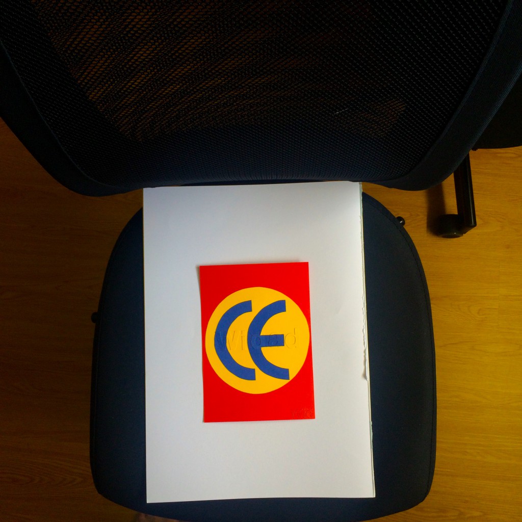
Upon close inspection, you can actually see my name popping out. As I was doing this, I was thinking to myself that this would be so much easier if I were to do it digitally. But I feel that it feels so much more special when it is handmade.
Conformists usually go for the mainstream choice, so I googled what a font that was overused and popular with designers. I found out that Helvetica was a popular choice and decided to go with that font. As for the positioning of the letters, I went with equally spaced kernings, equal cap height to give an overall harmonious looking word to show how complying with the rules gives order and balance.
I chose to use red, yellow and blue to show that even if the mainstream were to do the most ridiculous things (as ridiculous as this colour scheme) and it was normalised, you’d probably find me doing the same thing.
Jacob made an observation that if my intention was to hide my name, the use of red works because it detracts attention from the middle- and I thought that was very interesting and true even though I chose red as an intuitive thing.
Hello my name is Widad and I am
I was struggling with how to represent this attribute using typography. In the end, I wanted to show someone pressuring others, and the affects of being demanding on other people. I cut each word free-hand with scissors and a blade, and then crumpled each of them to show create a wear and tear look (the implications of being demanded to do things).
I wanted to create the impression of someone exerting force, so I used the letter ‘W’ repeatedly at the sides to create something that resembles a ‘speech bubble’ to suggest shrillness and something loud.
To stick the letters, I used double sided foam tape and if you look closely you can see that in ‘Widad’ each letter pops up more as you go from left to right, and D’ almost flies off the page- as if the intonation changes and the intensity of a demanding shrill voice increases.
Then in ‘Darke’, the letters eventually becomes flatter until the ‘K’ becomes indistinguishable as it is crunched into a ball and the ‘E’ explodes all over the paper. Here, I wanted to show how high force pressure will eventually tear something down.
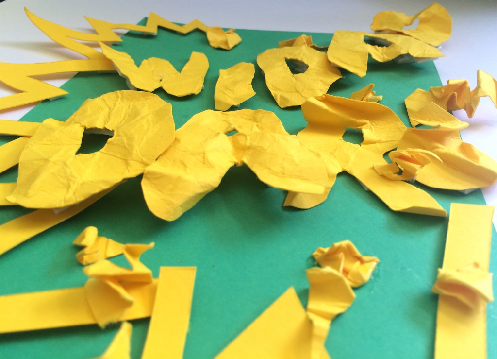
Someone suggested that I cramped in more letters to create the impression of being overbearing. I thought this was a very good suggestion because now that I look at it, the negative spaces in the speech bubble look a bit too empty.
To show contrast in the first set,
‘Conformist’: ‘Widad’ is camouflaged, very 2D and inconspicuous.
‘Demanding’: ‘Widad Darke’ is in big, bold 3D words and high contrast.
Hello my name is Widad and I am
I was inspired by this photo I found on Pinterest. Again, I have no idea who the artist is because the tiny words are in a different language.
For this attribute, I consider it as a flaw because I reveal more than I should. This was presented like this first to the class:
I wanted to show how when people see me all they see is this contained person. Then, when I start talking, everything ‘springs’ and spills out so easily. Hence, the ‘pop out’ effect.
I wanted to use ‘Loud Typography’ to infer to the ‘volume’ that I have- that I’m very expressive, letting people know my inner thoughts even if they don’t ask for it.
It’s done in an ‘accordion style’ so that it somehow ‘unravels’ to allude to how when I start talking I can’t filter out the information.
Compressed:
When it is fully stretched out, it reveals this:
For this paper cutting, it was a pretty tedious process. First, I wrote out my full name on a stencil using highlighter to achieve a thicker line than using a pen. Then I cut out the words, place it on the red colour paper, traced it, then cut it out again.
I used my full name to represent how when I talk, I let people know too much about me. Using my full name is like ‘exposing’ my whole self through speech. I also chose to cram the words together and have some of them be disjointed (WAFA/WIDDARK/E) until it somewhat becomes unreadable to mimic how I speak- mumbling, rambling and sometimes confusing to others.
I wanted to apply ‘Loud Typography to this composition’ as it is often used to sensationalised articles in newspapers magazines, to show how my life was basically an open magazine, but I don’t think I achieved that effect.
Hello my name is Widad and I am
This is how it’s presented. I wanted to spark people’s curiosity.
For this composition, I created a hole being torn out in the middle of the paper to suggest how being nosy and prying into other people’s private matters can be intrusive and by doing so it’s a bit savage.
I really wanted to highlight the seriousness and the effect of being intrusive- it can have detrimental effects, hence I tore the paper rather than cut a clean hole in the middle.
Once exposed, it reveals a collection of the different fonts and sizes of the letters in my name- to show the secrets of different people that I keep. For the most part, my name is barely obvious all you see is letters. It shows how these letters which are part of my name can also be fragments of other people’s names, like how I know only bits of their lives.
Again when you compare the second set,
‘Open’- big letters covering the whole composition as I blab too much
‘Curious’- a small section because the secrets I ‘gain’ are only a few.

For this projects, all of my compositions were strongly conceptually driven, which I feel were largely inspired by Stefan Sagmeister and Logan Mc Lain.
Visually, colour wise, I was inspired by Adam France and his bold use of colours.
I’ve done a post on Logan Mc Lain and Adam France, but I wanted to show the works of Stefan Sagmeister that inspired me to create conceptually driven work. I’m really drawn to works of art that are not to blatantly direct yet not too overt but makes you think.
He makes his intern cut into his body to show that design is painful.
This has to be my favourite.
Although my medium does not carry the message, I hope that my form does.
and
There are many many areas I feel I can improve on. Here are a few of my thoughts:
-Open: Joy suggested that I put Widad at the bottom of the piece so that when I compress the pop up there is a sense if balance: “Hello my name is Widad and I’m open”, then everything spills out.
-Demanding: Adding more words into the speech bubble to make it more overbearing
-Presentation: Someone mentioned that it was a pity that my presentation didn’t seem finished and I agree that it could have been done a lot better..
Overall, I really feel like I did push my comfort zone to create compositions which are definitely definitely not my style or aesthetic. I have never done such conceptually driven works before, and though it was stressful, I thoroughly enjoyed it,
I know this is waaaay overdue, but its like this because of two reasons.
a) I actually did research on Dadaism, Hannah Hoch and David Carson, but halfway decided that I wasn’t really feeling it and scrapped it, looking for other inspiration. I scrolled through hundreds of photos and felt like none of them resonated with me, so therefore thought b)it would be better for me to have my concept in place first then finding inspiration.
I thought I’d just post an extract that I felt was somewhat significant from the research that I abandoned…
I’m not so sure now whether deciding to consolidate my reference artists after my concept was a good call, because I’m still having what is equivalent to writer’s block in terms of my concept.
I think I made a huge mistake… 🙁
I appreciate now that having reference artists is actually helping me with my concept.Honestly, I thought that looking at others works would actually somehow hinder my process conceptualising because I was afraid I might end up being too similar and losing my own originality. If I’m not wrong, I guess in art, sometimes you can be inspired by other artists and appreciate their work. It is okay to take inspiration from them (and crediting them!) to put into your art.
So I thought it’s about time I do proper research on my reference artists and do some reading and just do something and hopefully get inspired instead of worrying too much and not doing anything besides thinking my brains out.
Artist #1
Logan Mc Lain goes by the name ‘Slogan’ and describes himself as “An Irish textile artist working with digital embroidery and type.”
I first stumbled on one of his projects – “The Worst Word”. Intrigued to know what the worst word was, I discovered that he has conducted something of a ‘survey’, asking people what the worst word was. It was humorous, witty and I loved the typography he designed for each word- giving each person their own ‘art’ for what they feel is the worst word.
He then proceeds to tell an amusing story about how he discovers the worst word.
You should go and read more of the post and see more of the artwork he created for this project. It’s quite amazing!
‘like’= an overused word= having a disposable nature= mounting ‘like’ on a take-away coffee cup lid
The way he alludes to the disposable nature of the word through something that very often becomes trash is extremely impressive.
http://loganmclain.com/the-worst-word/
Another one of his projects, ‘Memory Encoded Patterns’ explores the theme of human and computer memory by recording aspects of his Grandmother’s decline into Alzheimer’s through memory encoded patterns.
To a passing bystander who has no context, we might just see red and blue patterns. But the amazing thing is that the colours hold great significance. He explains:
“These stitched paper-based works exploit binary code through their colour coding. Red is one, blue is zero. Each one is treated with a different pattern but all are based on the exact same grid. When converted from binary code into ASCII they reveal six simple phrases that capture aspects of the last few years of my nan’s life in the nursing home. Each phrase is encoded in exactly 224 bits.
“Room No. 4, TLC Nursing Home”
A reference to the room that my grandmother occupied in the nursing home in Citywest, Dublin.
“Liz and Trisha are here now”
Something the staff would say to my nanny. My mother and aunt befriended some of the staff at the home.”
If I were to look at the patterns and not know the meaning behind it, I’d just probably think someone just cross stitched blue and red patterns. But knowing what it means- the coding behind it- makes me emphatic of what the experiences he had having a grandma with Alzheimer. It’s almost like I’m being given a glimpse into his life knowing this ‘secret’ message.
His art has to be one of the most unique type of work that I’ve seen. I didn’t know this type of art existed.
I’ve seen some amazing, beautiful artwork purely having aesthetic value. However, his work really blows me away because of how cleverly his form carries the meaning in such a unique manner. His work reminds me of Stefan Sagmeister’s, however, each of these artists have their niche, and I feel that I can relate better to Slogan because Sagmeister’s photography is rather daunting for me.
His style is unique (have I mentioned that already?), humorous, witty and I really admire how the meaning in injected in his art. I would really like to bring this sort of style to my own compositions in the project. How can I relay my message in a more meaningful way? I personally feel that alluding and using symbolism gives an artwork more depth and really encouraged viewers to appreciate and think deeper than the surface.
What can I takeaway from his work?I love how, in a way, he creates his own ‘languages’ through his artwork and the unconventional way he does all of it. I’d hope to bring that same kind of style he has in some way in my project. I have also elaborated on how one of his works really inspired me for my concept.
All pictures taken from: http://loganmclain.com/
A project of his that I was especially drawn to is his ‘Paper Protest’.
He describes the concept of ‘Paper Protest’ below:
“The works all use the fragile, thin and colourful qualities of the paper to express something more powerful, aggressive and outspoken. ”
As you can see, he cleverly makes use of juxtaposition to produce these amazing colourful art. I think this really goes to show that in art, you don’t need to really go all deep and philosophical and all that. Sometimes it’s just simple things- like contrasting two qualities can produce something extraordinary.
What can I take away from his work? The reason why I’m really drawn to his work is simply because of the use of colours. I also feel that my love for all things colourful is part of my identity so I wanted to include this element. Also, we often associate bright colours with children so I might juxtapose it with more modern, clean looking typography associated with a ‘more adult’ style- but we’ll talk about that later. I really enjoyed his ‘Paper Protest’- it opens me up to the idea of not always having to juxtapose mediums. You can juxtapose a medium and a message, and it can work wonderfully.
Adam France serves as a great inspiration for my work visually. His art is playful, quirky, colourful and cheerful, reminiscent of a happy childhood I had.It’s also such a coincidence that Adam France uses a lot of gifs in his website, so I can really learn a lot from his work.
His use of colours have really inspired my visual journal- so you see a lot of red,blue, green and yellow written in colour pencil!
Just yesterday, late afternoon, I had my lightbulb moment that I had been waiting and waiting for. I knew what I wanted my concept to be, but I just didn’t know how to execute it. This also helps me really consolidate and give an overarching concept that I wanted and needed.
As I mentioned in my previous posts, I was struggling with how to depict the transition or duality each of my attribute seemed to have in relation to my child and adult self. Doing my research on Logan Mc Lain, I stumbled upon one of his projects, ‘Animated Embroidery’. Now, usually I have zero interest in things being animated and the word ’embroidery’ didn’t excite me so much. At first glance, the cover picture itself wasn’t all that intriguing to me.
But obviously I just clicked on it and I didn’t expect after reading the post that the whole process would turn out to be something really fascinating.
It’s crazy how all of each stitched cube can come together to create an animated cube. It’s a bit like stop-motion, really.
So I figured using gifs would be a really interesting way to show the transition between being a child to an adult. I know that my skills are very limited so I can’t actually make my work animated, but I was inspired by how he printed out each cube to show the process that created the gif. He didn’t show the gif in the exhibition, but the fact that it can be animated in digital form is simply amazing!
So I thought that instead or having separate images, I could overlay all of them into one composition.
You can read more about his process here: http://loganmclain.com/animated-embroidery/
I know that my project can’t possibly reach the level of Slogan, but I will attempt at trying to maybe a 2 second gif or even less, given my time constraint.
Now the challenge I face now is how I actually do it.
I figured there are two ways I can go about executing my concept in this gif format and real life format.
Option A:
To draw each ‘pattern’/image/snapshot on separate pieces of paper, scan them in and overlay them in photoshop
Pros: Saves time. Brings in a digital as well as handmade element.
Cons: Photoshopping them might take a lot of time since I’m still rather unfamiliar with it. Scanned resolutions might also not look too nice
Option B
To just overlay/overlap each image in real life and create separate pieces for the gif.
Pros: More handmade feel. You can touch the textures and see it in ‘real’ life.
Cons: Time consuming
I think I need an Option C…..
Hello! I haven’t updated for sometime now. Let’s get straight into it!
I’ve had a few setbacks these past weeks- falling sick twice threw me off course for my progress so I’m starting to really hustle for the upcoming week.
and
I have decided to focus on my flaws:
Since I will be turning 20 this year, it sort of marks a ‘milestone’ for me. My age can no longer be under the teenager category- my age is officially an ‘adult age’. I thought it would be interesting to explore the two polarities of immature and mature, and to portray my struggle as I transition into an adult, trying to reconcile two extremes.
I came up with this concept when I was researching my reference artists and realised that the art I was drawn to was sort of childish, colourful, playful and bright. I know everyone says that there’s an inner child in every adult but I feel like this topic looks at it in a different angle.
In my first consultation with Joy, as I told her about a few of my ideas that I had, for one concept she pointed out that the attributes that I chose seemed to be categorised into collecting stuff vs projecting (directing) control. There was the theme of additive and subtractive.
For my second concept she also pointed out that I was exposing and recognising polarities (opposites) and she suggested that I explore the reconciliation between both. I completely agree with her in that finding the balance AND showing it visually would be more challenging and stronger of a concept rather than just exposing polarities.
Another thing she prompted me to think about was the use of light. I don’t remember in what context she was talking about but she commented something about one of my attributes which was very intriguing. That attribute was me being too revealing abut my personal life- almost like I’m an author of my biography. Joy suggested two opposites: the author of the diary (dark) VS the author of achievements (light). This really got me thinking- how do I project myself? How do others view me VS how I view myself?
Generally, I definitely want to be hands-on as I feel like this method is most true to my self.
I’ve made some sketches and experimented just a bit with a few mediums as seen in the pictures below. Im still trying to figure out some conceptual stuff to make it solid.
*I realised I forgot to put up these photos and had to add them back today….
In our group consultations, I voiced my concerns on how I would reconcile the two polarities between adult and child. Shanelle suggested that I use ‘Lenticular painting’ which enables you to see the two sides.
I thought it was a really good idea, but this itself poses a lot of challenges as I haven’t decided whether I want to create actual typography. I’m still considering this!
Another interesting thing that was brought up was when Ying Li noticed that I spelled out ‘W’ as doubleyou. Joy then added on and brought me to light on the existence of ‘ambigrams’. They are words that you can read in more than one direction. It’s sort of like an optical illusion, but in a word format haha. I thought that was pretty cool and could really help bring in more depth to my concept/compositions.
I also gathered other ideas as others were discussing their work:
Overall, the group consultations were extremely interesting, and I gained valuable insight on how other approached their projects and saw how people worked differently.
Therefore I am inspired to jump on the bandwagon and pump out the most of what I can offer before the presentation:
The time I have left is pretty short, but I feel like this added pressure will only help me become more productive.
I feel like I spent a lot of time on this project worrying and worrying about how I would execute it, and I concentrated on the wrong things.
🙁
I’ve calculated that I have only 5 days left (which is less than a week!!)
I’ve written out my action plan:
Saturday
Sunday
Monday
Tuesday
Wednesday
My first project for the second semester didn’t really go off on a good start, but I’m determined to persevere and do my best!