Click HERE to view the zine in its full glory!
Category: My Work
Through the Eyes Final PDF
Zine 03
I modified the zine quite a bit from what I showed previously, paying extra attention to leave a column untouched on some spreads, so that there would be more breathing space. I also did a few test prints to ensure that the zine copied the font size and layout of the IKEA magazine as closely as possible. (honestly hoping this doesn’t count as plagiarism)


Click HERE to view the zine in its full glory!
Although it seems easy to just copy the IKEA layout and language, there were still challenges that I faced while I was creating this zine. I think the greatest challenge that I faced in this project was choosing the names of furniture and coming up with a description that fits it well, to sell it to a targeted audience. It was also pretty challenging to try and emulate IKEA in the simple and direct way that they communicate to their customers, often with some sarcasm or pun involved. In terms of layout, I did face some issues with aligning the photos and words in a way where they can fit well together, not just on the page itself, but across the spread. It was also difficult to recreate my zine in a manner that had local IKEA flavour, while still maintaining the essence of IKEA itself.
Overall, this was a really fun project to work on and I thoroughly enjoyed the process of creating this zine – from imagining the users to thinking of the potential users and seeing the whole zine come together! I hope this zine gives them a little insight on the residents that possibly live in Sengkang and I hope that you will enjoy reading it as much I did preparing this zine 🙂
4D Project 2
Please do the following before you click the play button below:
1. Don’t read the artist’s statement yet.
2. Plug in your earphones.
3. Press play.
4. Close your eyes.
Faint is a transient sound piece revolving around the perspective of the experience of a fainting episode. It is based on a recent personal experience, and one of the rare occasions of alertness during a time of disorientation. The sound piece ignores the daily human conversation and instead brings to attention our sense of awareness of not only what goes on around us, but also within us, in a diluted environment. The switching between the diegetic sounds and the panning of the soundtrack takes the viewer into an immersive 360-degree experience of a first-person perspective within the represented space.
Sound is probably one of the hardest mediums to work with because of its limitations, and the risk of having some sounds sounding like other scenarios/situations instead. I started off doing some basic research by literally googling “sound story“. I thought it would be interesting to do something alone the lines of this audio, where the sound is a direct representation of the situation/characters involved in the story.
However, I felt that the experience was not there as all the sounds were very segmented. It was a direct translation of using sound effects and putting them together and didn’t really play with the panning of sound, though it definitely does tell a story that one can immediately visualise.
I had many ideas along the way from the philosophical “If a tree falls in a forest and no one is around to hear it, does it make a sound?” to the stupid “sonic portrait of ghosts from their perspective” (to give you an idea of the kind of stuff that was going on in my head LOL).
But I knew for sure that I wanted my sound to be something that is experiential for the viewer, that they can place themselves in the perspective and feel like part of the story (after thinking about it, I guess that’s what a sound story is supposed to do, but anyway). I thought this scene from Ant-Man was a very interesting form of perspective:
While thinking about the project, I was reminded of a recent incident that happened to me while it was my family’s first time at Swee Choon (super famous dimsum place, highly recommended!).
So basically, I fainted.
If you were expecting some long story I’m sorry to disappoint HAHAH. I’m quite amazed that I actually remember that my hearing was quite affected when I was at my pre-fainting stage, 1 hour before the incident. Anyway it was quite an experience for me, albeit unpleasant, but yes I would like to bring you into my personal fainting experience.
This was what I experienced:
1. Bubble blocking right ear
2. Rubbed ear
3. Stupid bubble still doesn’t disappear
4. Hearing slightly blocked
5. Adapted to it
6. Gradually resumed to normal hearing
7. Right ear got blocked first
8. Followed by ringing
9. Repeat on left side
10. Light beeeeeep sound
11. Told my mum: “mum, I’m gonna faint”
12. Fainted
13. Woke up to muffled sounds
14. Can’t register anything around me
15. Slowly gaining back hearing
16. Very disoriented
17. A lot of chattering around
18. Resumed to movable/walkable stage after 15-20mins
There are more in-between but those are more of the visual elements, so I’ll leave them out.
I got a few friends hear my audio and one of them suggested that I watch this video, which I thought was really funny (i still think its funny) and I can’t stop laughing hahahahahahahahhahah
I thought this was a really creative idea, using sounds that can represent something because of their existing function (in this case the windows start up and shut down sound). I’m not sure if this sound only works just because there is a visual to accompany it. I don’t think I wanna take the risk to over complicate the sound that I’m focusing on since it’s supposed to be something experiential.
Anyway this was the sequence that I settled for, for viewers to immerse in the fainting experience. I only used the key elements of my actual fainting process to relate it to what I’ve gone through.
SEQUENCE:
Hears normally
Surrounding sounds
One side gets blocked off
Rubs ear
Clears slightly
Slowly blocks again
Rubs ear again
Surrounding sounds
Ringing in the ear
Hearing starts to fade off
Silent single tone beep noise
Thud (could end here?)
Slowly gains back hearing
Very muffled and dreamy-state sounds
Gains back hearing
Just some thoughts,
Contrast – noisy + loud surroundings and quiet + soft sounds in head
Both could have similar effects – fading + unclear
Could play with difference of hearing in left and right ear
Maybe a looooooooooooooong silence before regaining consciousness
How to make it distinctively fainting sounds only?
PROCESS:
I recorded a single sound and edited it since I wanted the focus to be on how the effects affect the listener. Using a H2 zoom recorder, I stood in the middle of marina bay (not in the water) for about 2 minutes. I recorded my surroundings, of people walking by and of distant noises in the background. The main point of this was for the listener to be attentive to the movement around him/her and to not be able to form any context in their head with any ongoing conversation (since in class we learnt that people tend to hook onto audible and understandable words first). In the sound piece, we will be able to hear bits of conversation, but not being able to put them together and understand them coherently, since they all do not form any link with one another.
Since I was recording around the area where the iLight exhibition was taking place, I did consider using the context of the space (there was a carnival there). I thought it might be a possible direction where the idea of the horror ride being scary triggered the person in perspective. However, I wanted to show the vulnerability that I experienced, that the reason for fainting was not caused by my surroundings, but from within myself, or the consequence of my pre-incident actions.
The sound piece required some editing, mostly with the panning of the left and right, to bring up the idea of blockage in hearing, as well as the timing for the internal and external experience. There were three royalty free sounds which I found online, ear rubbing (5:231 to 8:242), ringing in the ear, and body dropping.
For me, this project had quite a few takeaways. From Lei’s presentations, I was already learning a lot about how sound artists/producers/directors have different approaches to sound and the kind of experience that they achieve with the use of this medium.
After working on my project, I now have a heightened awareness of sound, both internally and externally, since listening to my classmate’s audios showed me that there are more things to pay attention to than the common sounds we hear daily. As mentioned previously, sound is quite a difficult medium to work with because of its constraints. However, I feel that sound does play a very important role in changing the mood or bringing about focus to something. It also stirs a lot of emotions in the listener, and is definitely more immersive than visuals.
In the technical aspect, I kind of have an idea of how to do basic stuff on Premiere Pro (instead of using imovie all the time), which I think will be very useful for me in the future.
Yay to learning! \0/
Texturizing Sound 07
Que Sera Sera 07 – Final
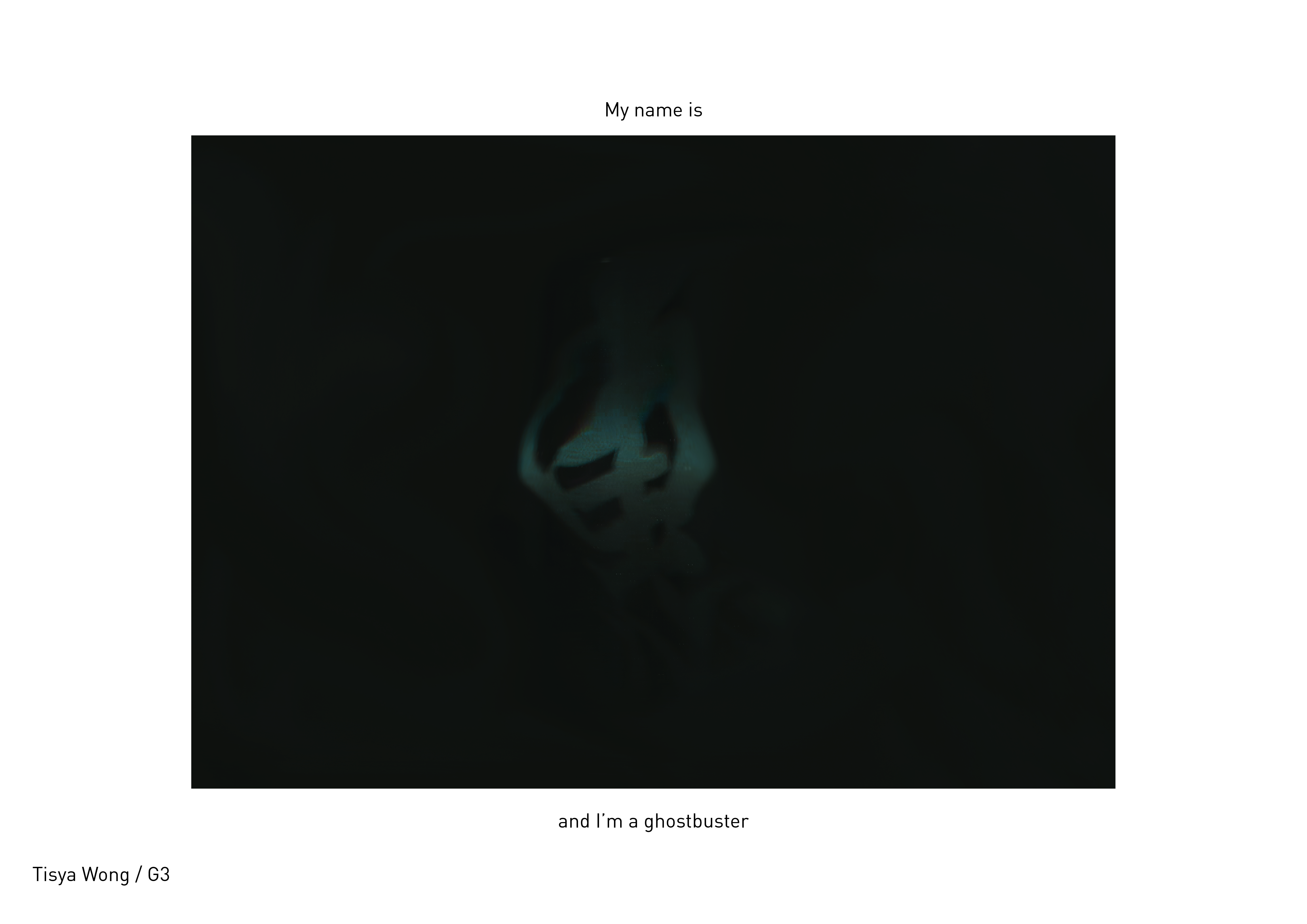
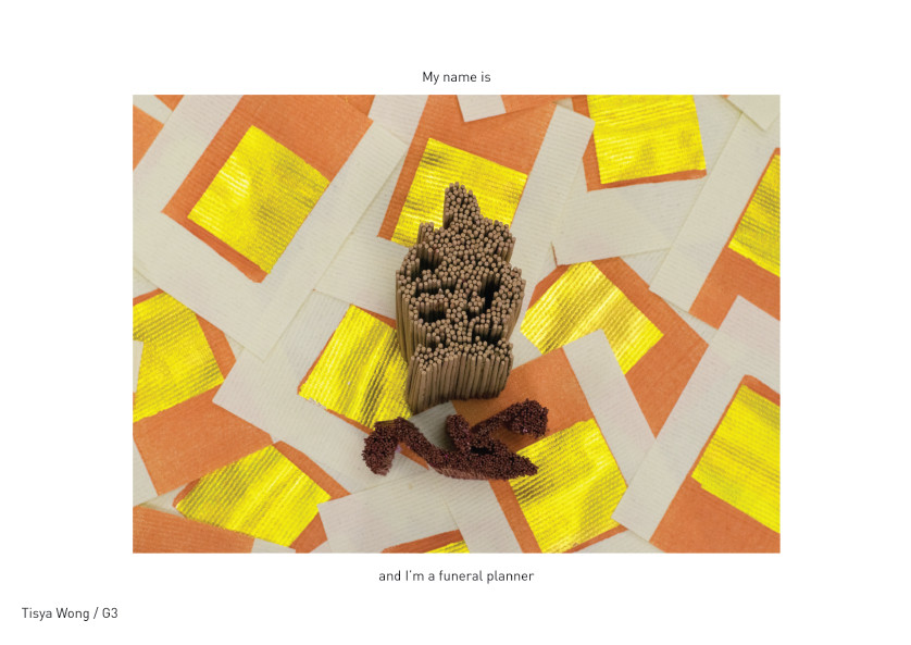
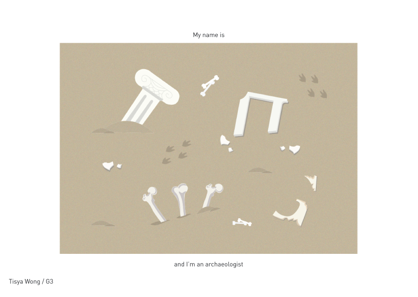
These are the 4 final compositions that I have chosen for this project because I felt that each of them express the main essence of the occupation the best out of all my experimentations.
For this project, I tried to not restrict myself to 2D means, but rather try out various methods to achieve 2D results, because I personally feel that simply using a consistent medium across all the occupations does not push my learning and creative boundaries enough. Overall, the challenges I faced in this project was in choosing the jobs that had stronger visual elements/colours/textures that could help in enhancing the visual connection of my compositions and the occupation. I realised that the visual elements that are associated with the occupations are things that people can immediately relate to, which is really interesting! I also enjoyed how in some of my classmate’s compositions, the simple use of a line or texture could imply an object or space. #thepowerofsemiotics
Once Upon A Scent 02
Ego 04
I decided to change all the scenarios from my initial draft because I felt like the new ones were more interesting and gave the tissue paper more character. I went for a more abstract approach this time, using patterns and repetition to create the setting or to express the emotion in the scene. I also removed the idea of a face from my character to place more attention and focus to the colours and the “body” expression instead of explicitly implying it through facial expressions.
While experimenting with the compositions on Adobe Illustrator, I realised that the frames could be connected together while still making sense within its own frame. I wanted to challenge my limits with the composition instead of making it very obvious and direct and also add on an element of flow across all three frames in a scenario.
Initially, I did a palette swatch to choose colours that I felt could fit the situations that I wanted to illustrate. Just by looking at the colours, one could imagine a mood and a setting. The relationship between colour and how it is immediately linked to a scenario was a concept that I felt was really interesting.

However, I realised that the colours I had chosen might have matched one another on the palette, but were too contrasting and striking when used together in the composition. Despite this, I felt that doing colour palette swatches helped in selecting colours that I should be using for the scenario, which made it a lot easier while I was working on the composition.
01 GLOOMY ME + COMFORT FOOD = TISSUE PRATA


Split complementary colours of reds, yellows and blues.
GLOOMY ME


I used the same shade of blue but layered with different levels of opacity to create the idea of sadness radiating from the tissue. The blue also implies a sense of cold & loneliness, further shown from the squiggly lines just beside the tissue that suggests the idea of it shivering from the cold.
IN NEED OF COMFORT FOOD


Similar to the previous frame, I used the same shade of light red but layered with different levels of opacity to suggest the hand of the tissue reaching out for comfort. The slow progression of opacity & visibility of the hand shows movement.
TISSUE PRATA

Unlike the previous two frames, this composition does not use opacity to create the mood and setting. Instead, the use of warm colours such as orange and yellow, as well as the white opacity to create a smokey effect in the composition, suggests warmth of the tissue snuggled in a blanket of hot curry.
02 LISTENING EAR + COMFORT = PROBLEM ABSORBER


Complementary & monochromatic colours of blues and beige (orangey).
ME AS A LISTENING EAR


I used the same shade of blue but with different levels of opacity to show progression of volume. Blue here represents trust, how the tissue is trusted with all the problems from different people. The mouths are more concentrated near the centre of the composition and creates a movement of increasing volume. They also get more visible nearer to the ear of the tissue. The use of repetition of the mouth suggests the idea of many people voicing out their problems.
The beige colour of the face is used to complement the blue in the background, and also to suggest the idea of a human being. Different shades of beige were used to bring out different features. Although beige is the dominant colour in this composition, it brings more focus to the blues due to the contrast between the two colours. Blue here is used to represent sadness and possibly healing and security, to show that the tissue will always be there to support when it is needed.
PROBLEM ABSORBER


Two different shades of blue were used here to create waves. Blue is used here to represent stability. The layering of the waves in the same opacity created a kind of turbulent water effect, representing all the problems coming together in an attempt to drown the tissue. But despite being among all these waves of problems, the tissue still stands strong.
03 ME IN LOVE + MARRIAGE = TWO PLY TISSUE


Right complementary colours of red and teal.
ME IN LOVE


I used the same shade of light red with different opacity and blurred it to create the illusion of a floaty flowery background. It was meant to represent the feeling of being in love, where everything becomes a blur because one is blinded by love. The use of light red here represents a very sweet kind of love.
MARRY FUTURE PARTNER


The different shades of teal were also created with different opacity. This gives the clouds some depth, as the colours bring about a foreground and background. The clouds are used to represent being on “cloud nine”. The teal complements the light red colour and also helps in differentiating the gender in the two frames. The teal background brings attention to the flowers on the hand of the male tissue to show the proposal action. It also brings about focus to the 2 ply tissue box which leads one to the next frame.
TWO PLY TISSUE

In the final frame, I combined both the light red and teal colour to show the harmony and unity from the previous two frames. The tissues are married and are seen hugging one another at the top of the tissue box. The use of confetti suggests the idea of a happy event. The colours balance each other out and helps to enhance the emotions of the entire composition.
04 AT A CONCERT + GOT AUTOGRAPHED = TISSUE SUPERSTAR

 Analogous shades of purple.
ME AT A CONCERT

I used opacity and blur in this composition to suggest the idea of flashing lights and a lot of movement at concerts. The lines in the background represent spotlights, which are a common feature at concerts. The use of various colours of purple gives it a depth as there is a foreground and background to the lights. The tissue was also duplicated and blurred to show that it was dancing. Purple in this frame represents youth.
GOT AUTOGRAPHED ON

I used opacity to bring about contrast compared to the white tissue, to show that amongst all the other tissues in the background, I was chosen to be autographed on. Purple here represents luxury. The composition is kept simple so that the focus will be on the autograph and the tissue.

I used opacity of different purples to give the background depth. Purple here represents luxury and royalty, suggesting the superstar status of the tissue after being autographed on. The shape in the background represents camera flashes. Similar to the previous frame, the purples bring focus to the white tissue, and also complements the tiny yellow sparkle which represents the makeover of the tissue from a normal piece of tissue to a prized object.
Across all four scenarios, the Pantone colours I used had a pastel hue. Pastel colours gave the scenarios a lighter mood and looks softer, since my scenarios are quite on the emotional side. Although the pastel colour choice was not entirely intentional, because I chose colours based on how it would complement the screen before. It was nice to see that there was a form of consistency across all four scenarios.
There were difficulties I faced in doing this project. One was creating the composition and finding the relation across all three frames. Although it was not part of the brief to do so, I felt that challenging my limits was good practice and helps in pushing my creativity to another level. Another difficulty I faced was in effectively communicating the situation within the confined spaces of the square frames. Overall, I felt that this project improved my skills in terms of being concise in what I wanted to communicate and also the use of colours to bring about emotions.
Life / Time 06
Life / Time
1920 x 1080
Video on loop
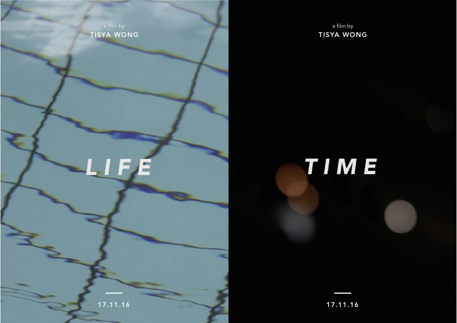
Time progresses, and so do we. Being caught in the vicious cycle of life, we often fail to appreciate what is around us until they disappear. Time and life run parallel to one another, yet we can only focus on one at a time. Life / Time is a time for reflection, a reminder to live in the moment.
Life represents the flow of life, shown by a body of water in constant motion, which is occasionally interrupted by external movement. The sudden presence of a man represents volatility – how some things come into your life and leave when you least expect it. Time represents being caught in a fast-paced environment, shown by ever-changing blurred lights moving around the screen.
The duration of both videos were deliberately made to start and end at different timings. Life and Time run parallel to one another and may meet only at certain intervals. Time is shorter to literally show how time passes by quickly. Both videos were supposed to be played in a loop to show the cyclical nature of life and time.
The films were projected at two separate ends of the space, forcing viewers to turn their heads left and right in order to watch, and missing out footage of the other in the process. This experience emulates missing out in life or losing time if we focus too much on the other.
Life / Time 02
My 50 word statement for this project:
“Time progresses, and so do we. Oftentimes, we do not appreciate what is around us until they disappear. We tend to forget to live in the moment, and only realise it when it is too late. This is meant for that moment of reflection, a reminder to pay attention to our surroundings.”


