
As with every project, I started off with brainstorming about the various occupations that I’ve ever considered in my 21 years alive:
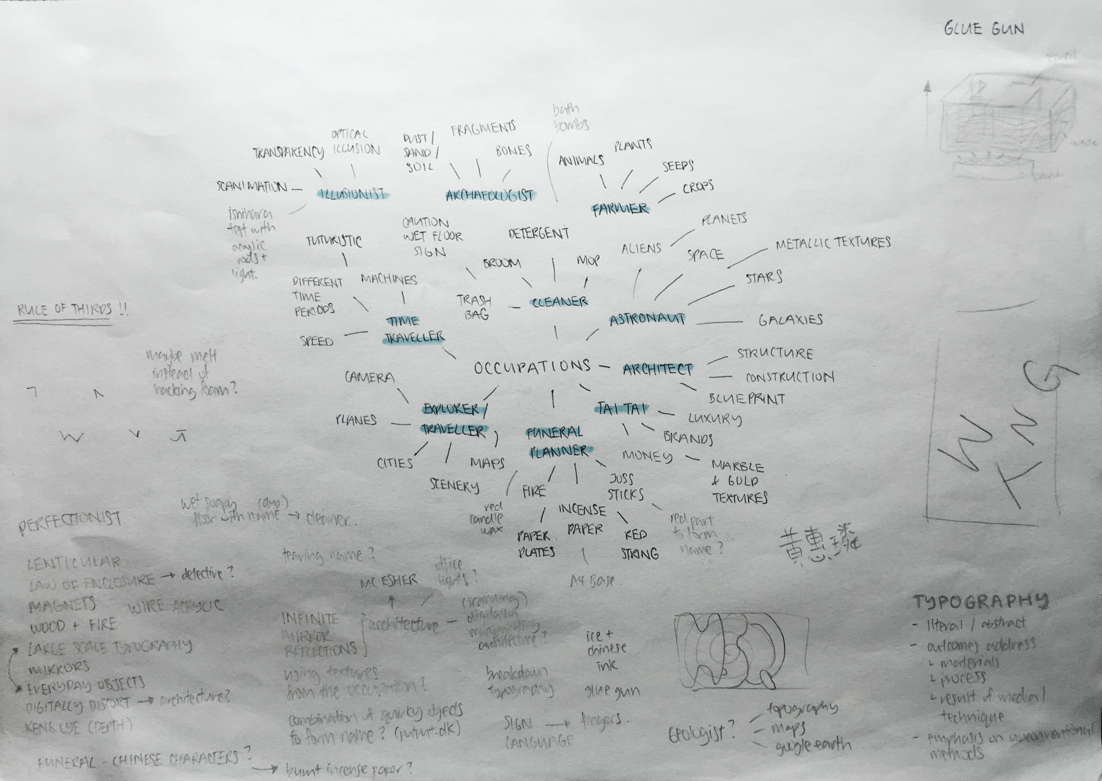
Being someone who likes to write down all the crazy ideas in my head (sorry for word vomit), I also considered the methods that didn’t have any occupations yet. I thought maybe I could work backwards or somehow tie them together with the occupations that I chose. A few of the occupations stood out to me because of the visual elements that I could use – Archaeologist / Architect / Funeral Planner / Illusionist.
FONT SELECTION
 I went through the list of fonts I had on my laptop and selected some that I thought could be used for my typography compositions. I chose more old/ancient looking serif fonts for the archaeologist occupation since the job is related to looking for objects related to history. I also considered different styles of Chinese characters for the funeral job, though I personally prefer the ones with more curves instead of the straight and structured ones since they remind me more of Chinese calligraphy and has a certain “flow” to it. For the architect and illusionist occupations, I considered more blocky-looking sans serif fonts. The immediate visual image for an architect would be blocks of buildings, and I felt it would make more sense to select a blocky font if I were to work on the fragmentation illusion that I saw in my research as it would be easier for me to break it apart.