
ARCHITECT
Possible outcome: Manual + digital manipulation
Immediate ideas:
– Scanography
– Use of infinity reflections from mirrors
– Symmetry + depth
– Letters “virtually” extended to become like buildings
– Layer cut out paper & scan?
Ramon Carrete
http://www.fubiz.net/2015/04/08/reflexio-typography-by-ramon-carrete/
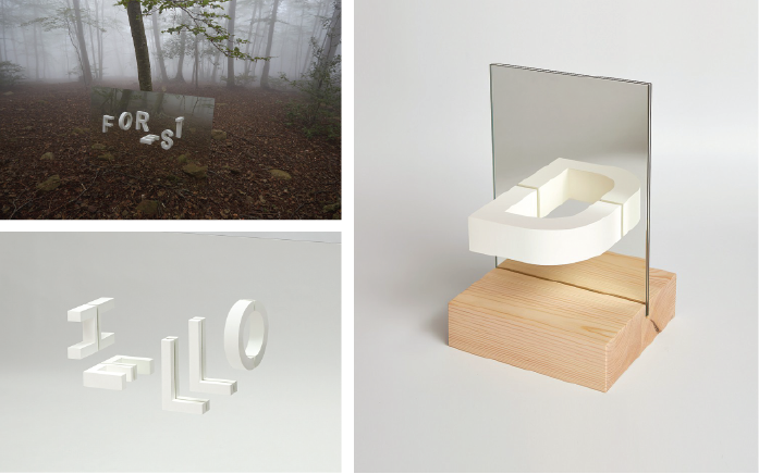
I thought this was a really simple and smart idea of using reflections to complete the letters, since most of them are symmetrical. It is effective for showing depth as well. I also love the placement of letters, how they are not all consistent and facing different directions.
Art Stage Singapore 2017
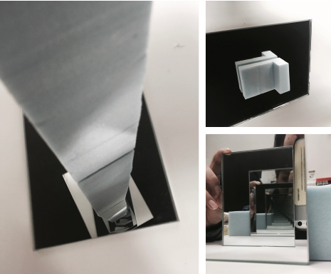
I went for Art Stage recently and happened to chance upon this amazing artwork that used the idea of infinity mirrors to create an endless depth (unfortunately I was unable to figure out who the artist is). Looking at it from this angle, it feels like I’m falling into a blackhole, which I find quite interesting. This artwork was pretty large scale, but I guess I could make use of this concept to “create” my name in miniature architectural form?
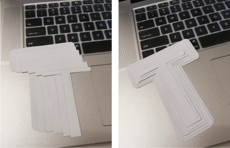
I bought some tiny mirrors from artfriend to try out the effect of an infinity mirror (because trying out with the mirror that I use at home doesn’t really work due to the vast difference in size). IT ACTUALLY WORKS!! *squeals* but sadly it was really difficult to take a photo of the infinity mirror without me OR the phone (OR BOTH) being in it, which could be a potential issue if I were to produce this for my final outcome. I also realised that there was a gap between the reflection and the actual object (refer to ‘T’ above), which doesn’t look as good as the one in Ramon Carrete’s work 🙁
I wanted to try out creating an elongated building effect with different sizes of the letter, but I wasn’t convinced that it would turn out well because the flow didn’t make it look like a building. At this point I started contemplating about the jobs that I have chosen to work on, and thought of stacking the various sizes of letters together in a possible topography style, which could also be used for the architect job if i stacked more. (Should I change my job???)
Saw this while getting inspiration from Pinterest and I really like how the building was distorted to form the letter B, while maintaining the continuity and flow such that it still looks like a complete building, albeit the weird angles. After I saw this, I decided to try distorting existing architecture into the shape of the letters that form my name.
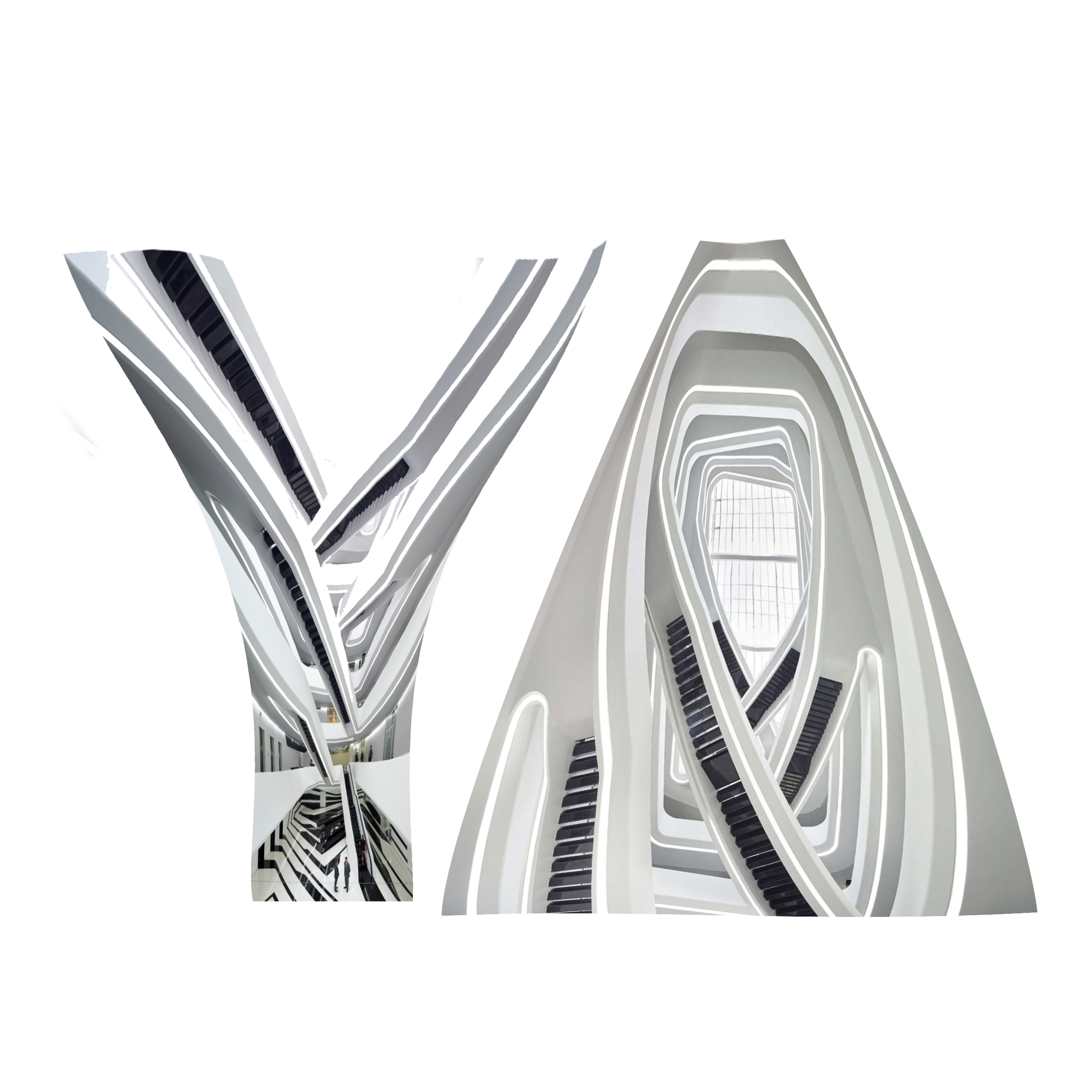 I don’t think this turned out the way I wanted it to because one might not immediately form the relation to architecture just by looking at this. I was also worried about the background that I would use for this if I were to stick to this idea.
Eventually, I decided to scrap the ideas for this occupation because I felt that the visual elements of an architect were very limiting. Time to look for a new job!