
FUNERAL PLANNER
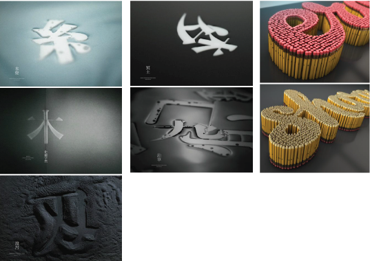
I was searching for inspiration on Pinterest and I suddenly had the idea of using the Chinese characters in my name instead of the usual initials from my English name. I started searching for “Chinese typography” and saw many creative ways that Chinese characters can be modified for typography because of the number of strokes, lines and curves that I can play with. I also felt that a Chinese funeral had stronger iconic visual elements that one could immediately relate to. The first image that came to my mind was incense paper and joss sticks, which I thought would be a cool idea, especially if I did it like the pencil typography shown above.
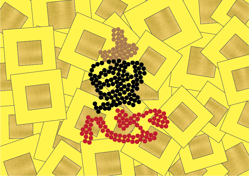
I illustrated how I imagine the actual object to be like for visual reference. Using incense paper as the background, one would immediately think of Chinese funerals since this is one of the more obvious elements. To further enhance the look and feel of the occupation, I thought of adding elements that one would see at a Chinese funeral, which are the items that are usually placed on the table for guests:
Brown – peanuts / Black – melon seeds / Red – red string
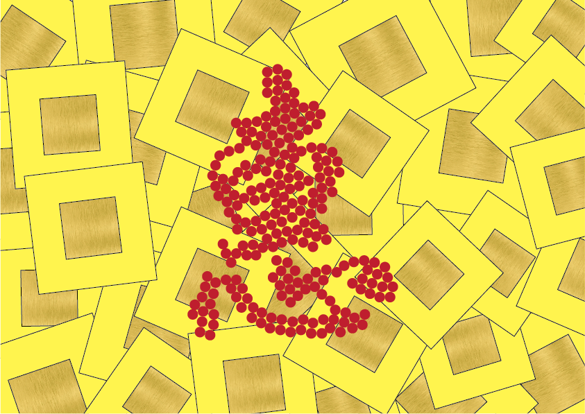
I was considering if I should take a photo of the objects forming my name directly, or if it would be a better idea to create the textures of the objects using what we learnt in Semester 1 – MARK MAKING. However, after thinking about it, the textures might not be as obvious as the actual object itself since the colour also plays an important role in the identification. To use the mark making process, I would also need to consider the ink to use to create the prints.
My second visualised idea is to use joss sticks to form my name instead of funeral objects since the joss stick itself already has a strong relationship with religion in Chinese culture. I also felt that the colours complemented better with the use of a single colour instead of a mix of colours. The use of joss sticks also could vary the occupation – aka used for monks, priests etc – since they share similar elements and colour scheme.
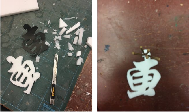
I traced the shape of the Chinese character onto foam, with the intention of simply poking the joss sticks into the foam and hopefully everything would work out well. Unfortunately, the sticks did not stay together as I hoped they would, and separated quite far apart at the tip, which would not result in it taking the form of the Chinese character. Also, because the shape of the stick was too long and tapered at the bottom, it would be difficult to ensure that the sticks would form the character accurately.
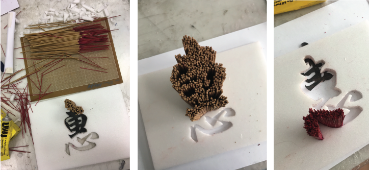
I decided to cut the joss stick, separating the brown and red part, using the brown part for the top half of the character, and the red for the bottom half. (#jossstickconservation) Partly because the character could represent a joss stick when looked at as a whole entity, but also because the bottom half of the character means “heart” in Mandarin, so I felt red would be fitting as well. The gluing and sticking of every stick to form the word was a really tedious process, but I’m so glad with how it turned out!
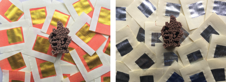
I was too excited to wait for myself to complete the bottom half of the character, so I decided to try out the two different colours of incense paper to see which would turn out better. I felt that the orange and gold contrast was more “funeral-like” as compared to the silver one, which made the entire composition more muted.