
ARCHAEOLOGIST
Possible outcome: Photograph
Immediate ideas:
– Hacking/hollowing shape of initials in foam / sponge
– Could include bones / broken porcelain / bricks as elements
– Spray/painted/covered in sand to look like soil/concrete
– Every letter is an archaeological site? (plasticine / blue foam)
Patrick Garbit
https://www.behance.net/gallery/19249631/Broken-Alphabet

I really love how the positive and negative space and the difference in the shading suggests the presence of the alphabet. I think the textures are really interesting and look potentially archaeological (aka digging and hacking stuff). He did this using a processing script (which i obviously have no skills to), hopefully I’ll be able to figure a way out with photoshop or something.
Michal Fargo
https://www.dezeen.com/2014/02/18/else-vases-by-michal-fargo-moulded-from-torn-foam-blocks/
http://designbreakonline.com/2013/10/29/michal-fargo-rocks-ceramic-rocks/
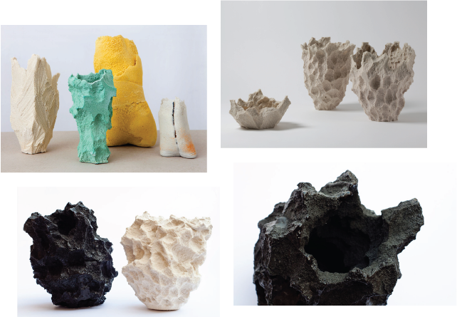
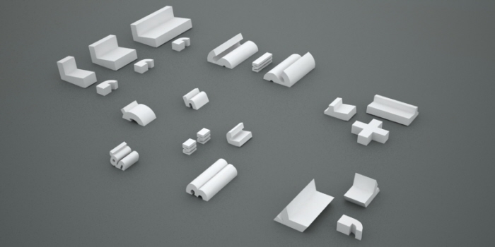
When I first saw this I couldn’t believe it was made out of foam, because it REALLY looks like rocks (!!) I was really impressed by the process, and also the use of material. I immediately linked the texture of these vases to the digging action of an archaeologist, possibly make my name out of one of these (?)
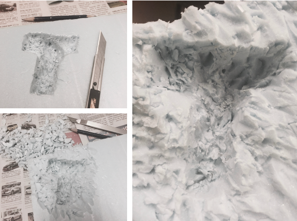
I wanted to recreate the digging effect of an archaeological site and tried it out on blue foam using a penknife and a pencil. I was hoping it would look like Michal Fargo’s foam vases, but unfortunately it turned out vastly different. I started off by digging out the shape of the letter, but later I realised that the letter could be dug deeper to show the difference, hoping that it would look closer to my intended outcome. The entire process was really time consuming and it was also difficult to make out the letter if I didn’t dig it deep enough. Looking forward to trying out other methods instead!
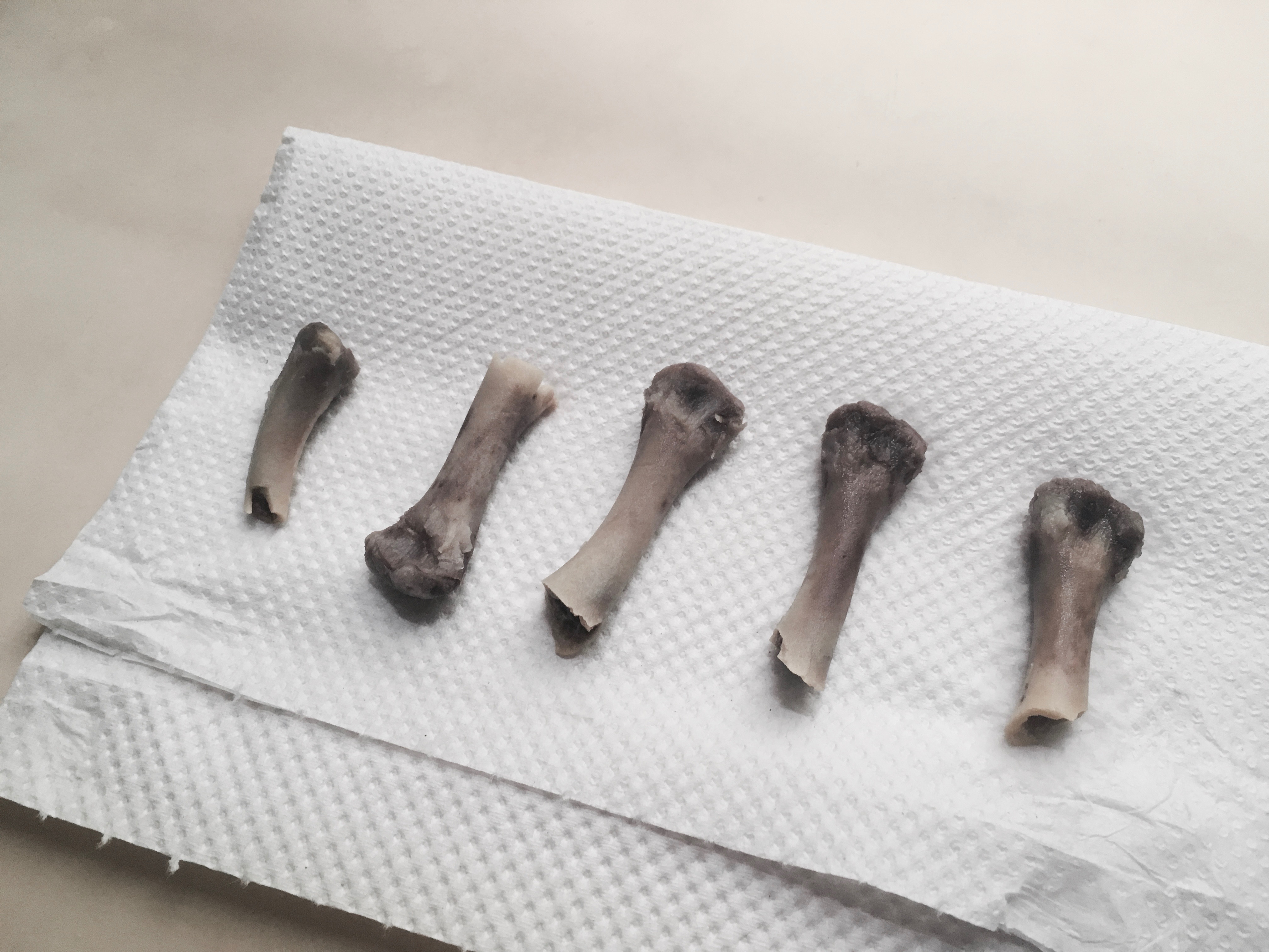
And I collected some chicken bones.
After contemplating for many days about continuing to work on this occupation since it was difficult for me to produce my desired outcome after using various means to “hack” the foam to give it the look I wanted, I decided to stick to digitalising it instead, but of course not forgetting the parameters I had to set for myself so it wouldn’t be as simple as an illustration/edit.
In an attempt (A for effort) to replicate Patrick Garbit’s work, I tried photoshopping the letters out using existing textures of the image and making sense out of it. It looked really horrible, so I tried again.
A friend sent me this image while I was consulting him about my ideas, and I thought the idea of fragmentation and segregation was interesting.
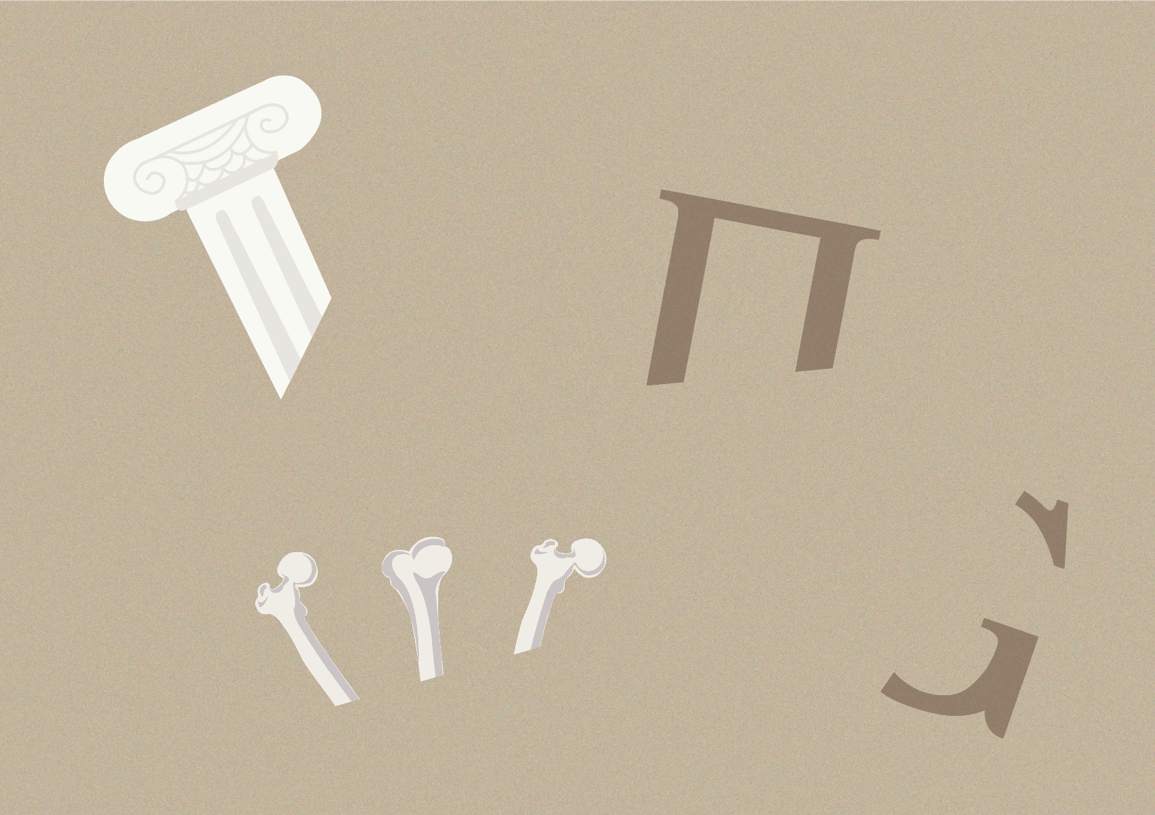
I decided to cut up the initials of my name, keeping only the parts of the letter which would make it identifiable, and replacing the parts with illustrations of various objects that could possibly be found at an archaeological site. I went for a more consistent and muted tone because I didn’t want to complicate the composition further with colours, since the letters itself may be a bit difficult to decipher for some.