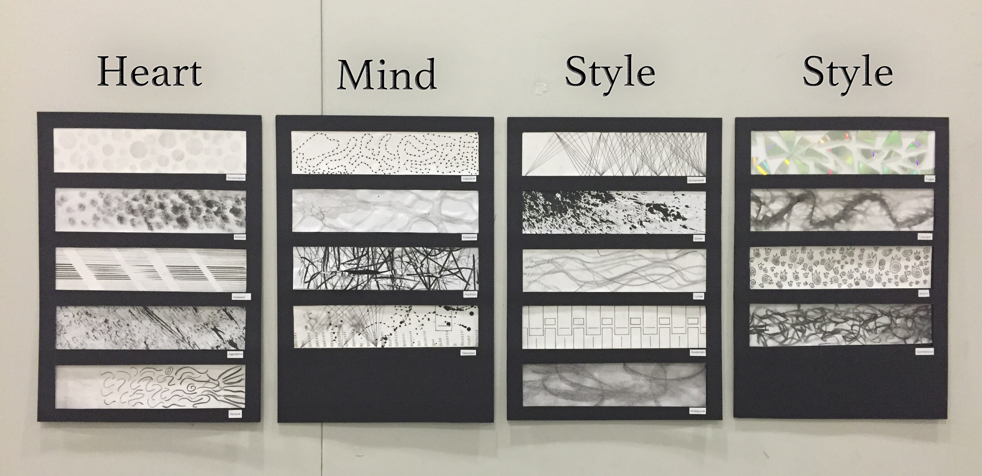

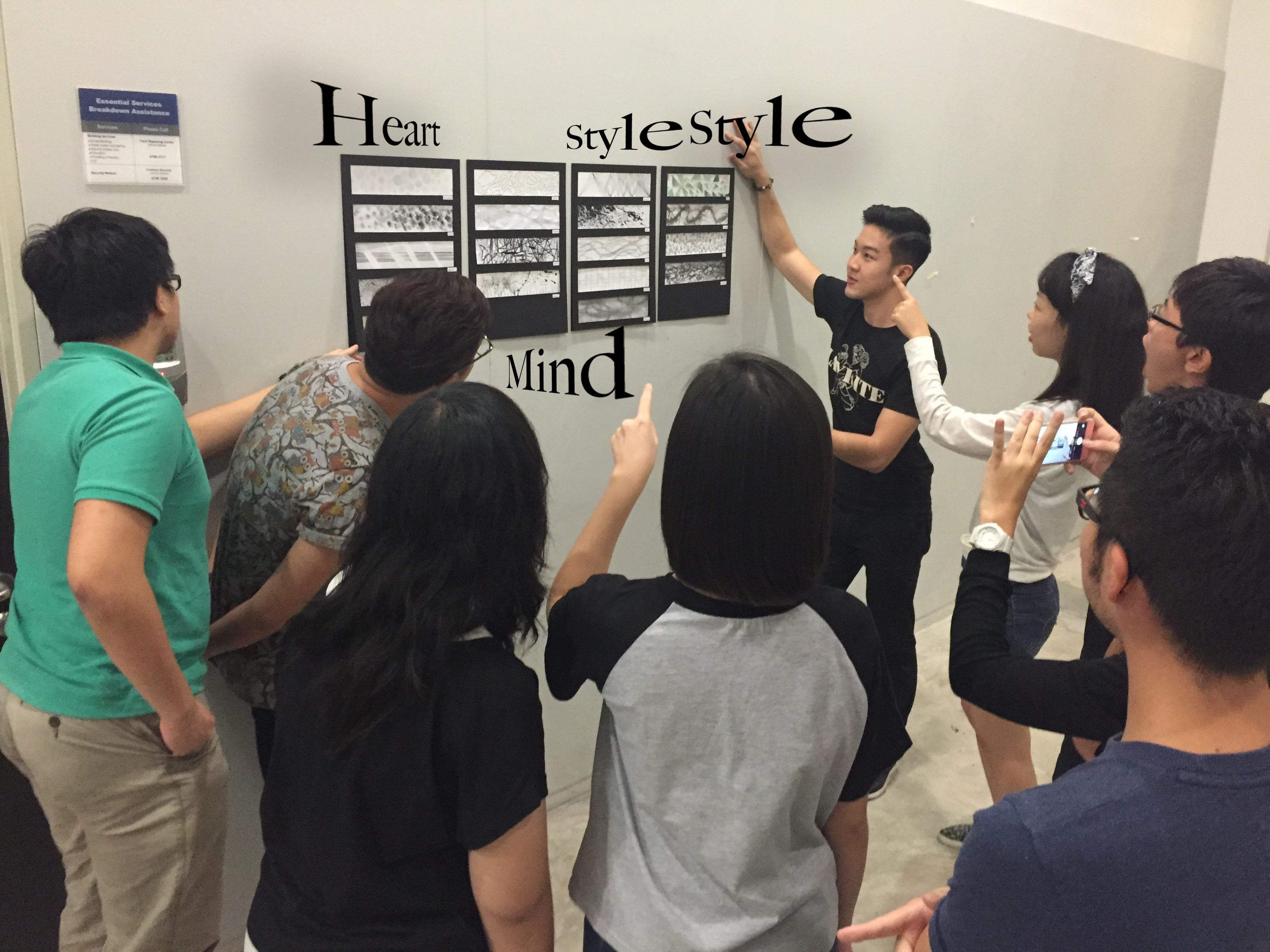
Composition
When it comes to presentation, I categorised the keywords according to the meaning it evokes.
In ‘Heart’, there’s
- Embarrassed
- Anxious
- Awkward
- Aggressive
- Sensual
It contains the emotions that goes through the heart.
Placement within ‘Heart’
I alternate between styles that involve lines and styles that involve brushes.
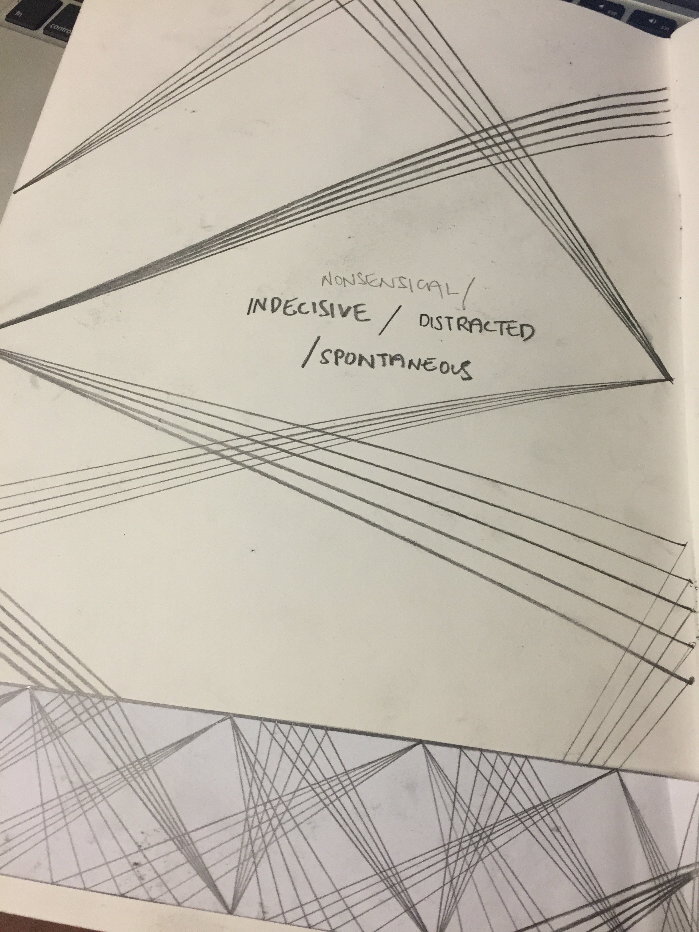
In ‘Mind’, there’s
- Indecisive
- Exhausted
- Psychotic
- Distracted
It contains the thinking and feeling that goes through the mind.
In ‘Style’, there’s
- Nonsensical
- Sloven
- Lyrical
- Systematic
- Ambiguous
- Fragile
- Turbulent
- Bizarre
- Spontaneous
It contains experimental keywords for numerous explorations.
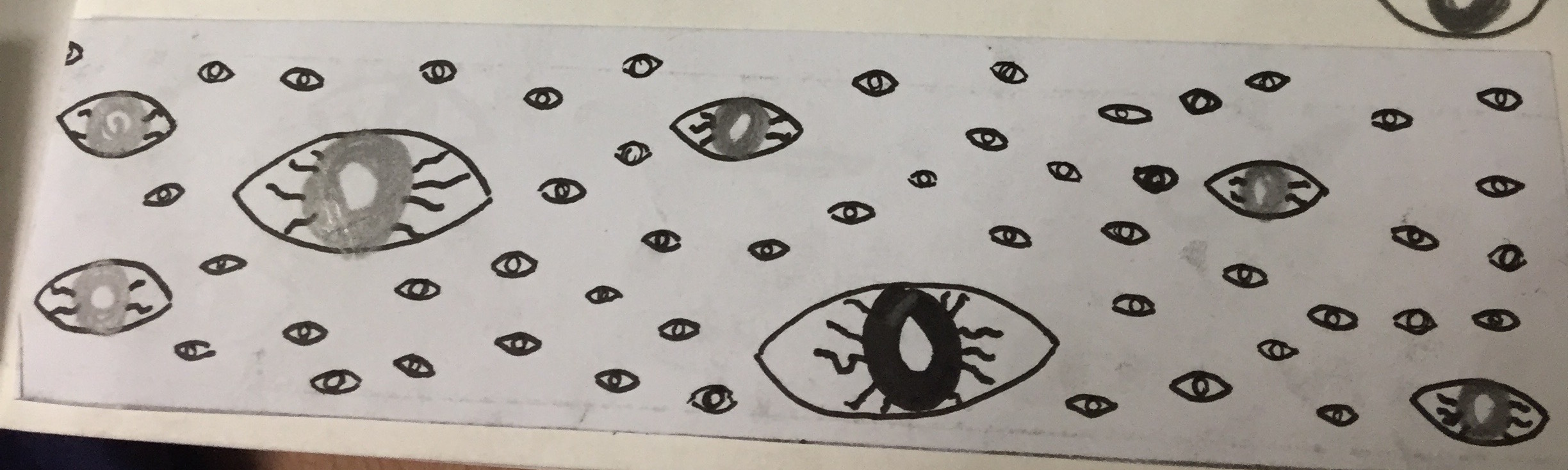
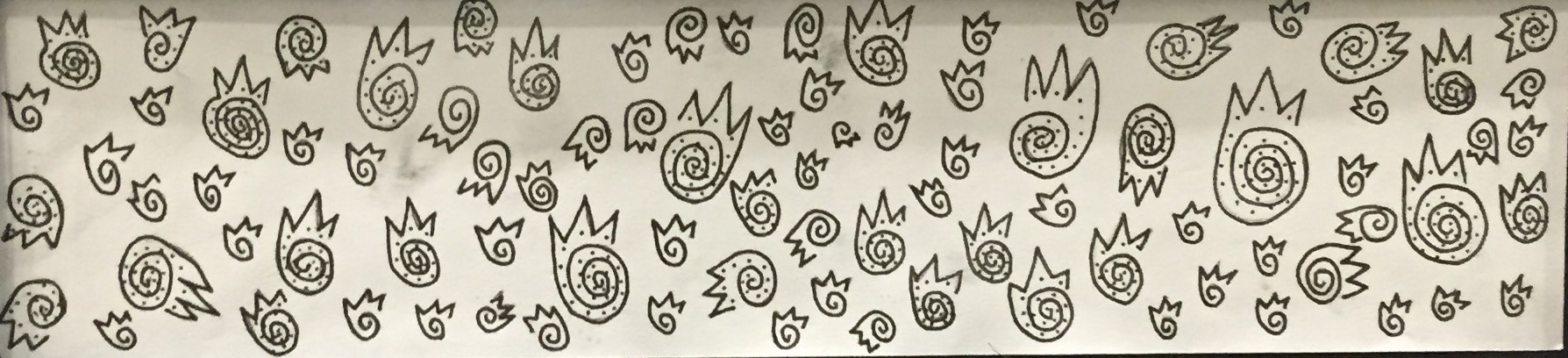
Bizarre
Research – Experiment
Bizarre to me is weird. But it’s a level higher than weird. There could be an element of special in weird but bizarre is just straight out out of the world and leaning more towards being grotesque; Something that delves through another realm of displacement. Eyes has always been an interesting subject to explore. It could be attractive yet the juxtapositions of many eyes in a single space could be intimidating.
I tried to draw eyes.
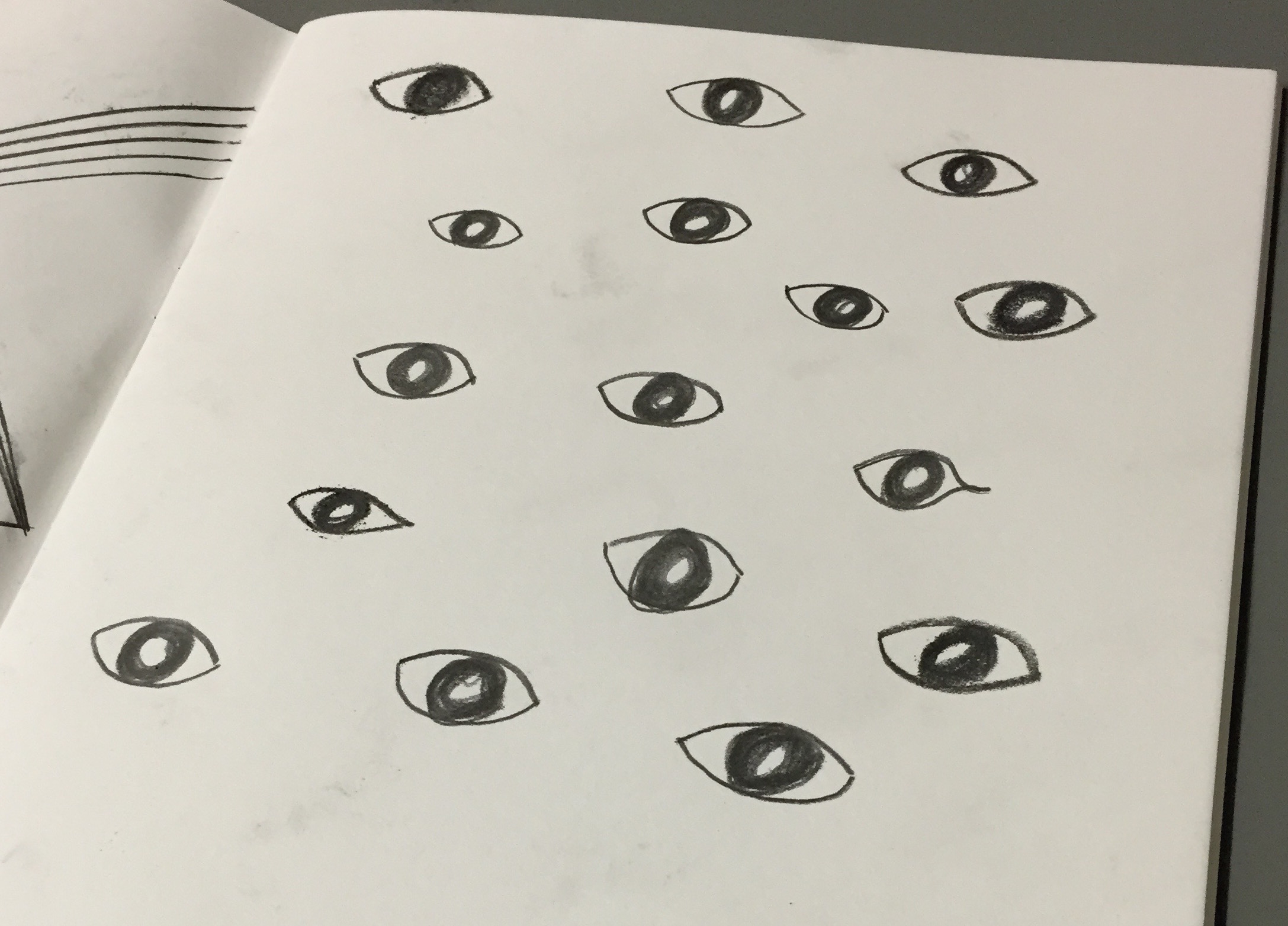
I tried to improve the work but adding lines to the eyes and vary the size of the eyes.
However, I find it too literal and I did a bad job drawing eyes.
Hence, I tried to make the eyes more abstract by drawing eyes that are not as obvious.
I started off with simply spiralling circles. But it was too plain. Hence, I tried to spiral circles but this time ending it off with drawing 3 pointed edges to symbolise lashes. I still find something was missing hence to end it off, I added dots to the eyes and lashes.
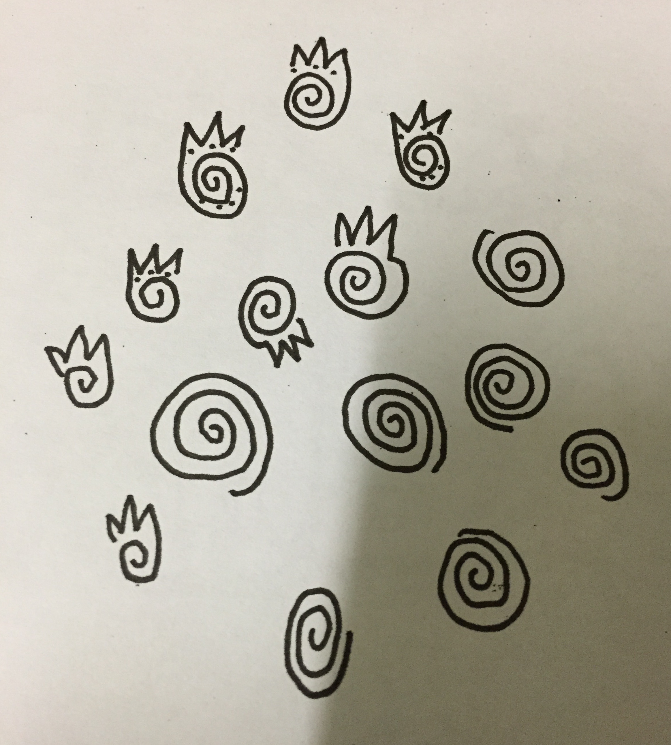
Even though the final look I got doesn’t look as grotesque. However, I find an element of weirdness in a more animated way.
Final
Lyrical
Research – Experiment
Lyrical to me is like patterns of sound waves. I heard an interesting explanation for music in the movie, ‘Fantastic 4’ where the character Sue explains that she likes music because ‘every music have it’s own patterns. A popular musician makes peoples fall in love with the pattern and looking forward to the next music.’ which i agree with. I tried to explore that idea. (Also seen in Systematic)

However, I think that it’s not abstract and interesting enough. I tried to draw people dancing to music but it’s too literal and not abstract.
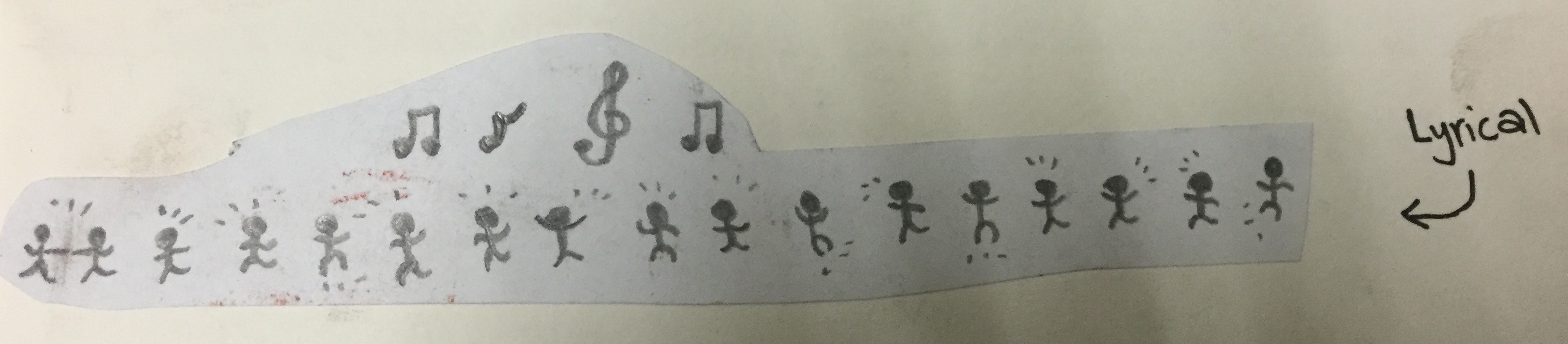
I tried to draw sound waves.
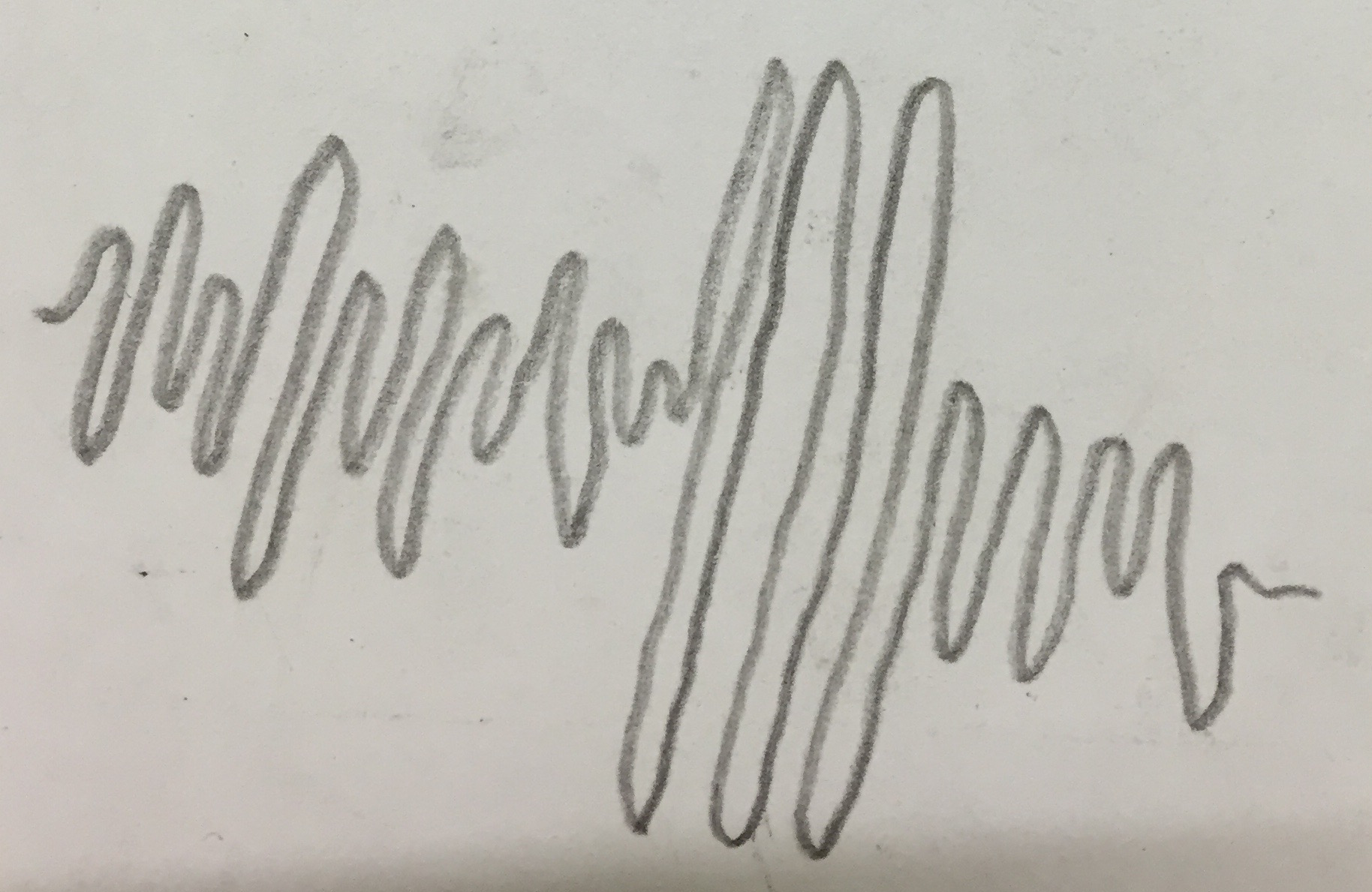
But I realised that there’s not much variation in the stroke thickness. Hence, I changed my sketch pencil to graphite pencil and experimented with it.
I tried to draw curvy lines with varying thickness because sound waves have different tones and rhythms.
Final

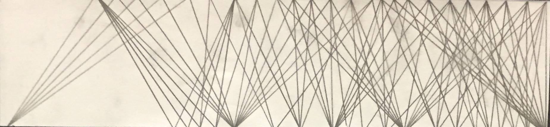
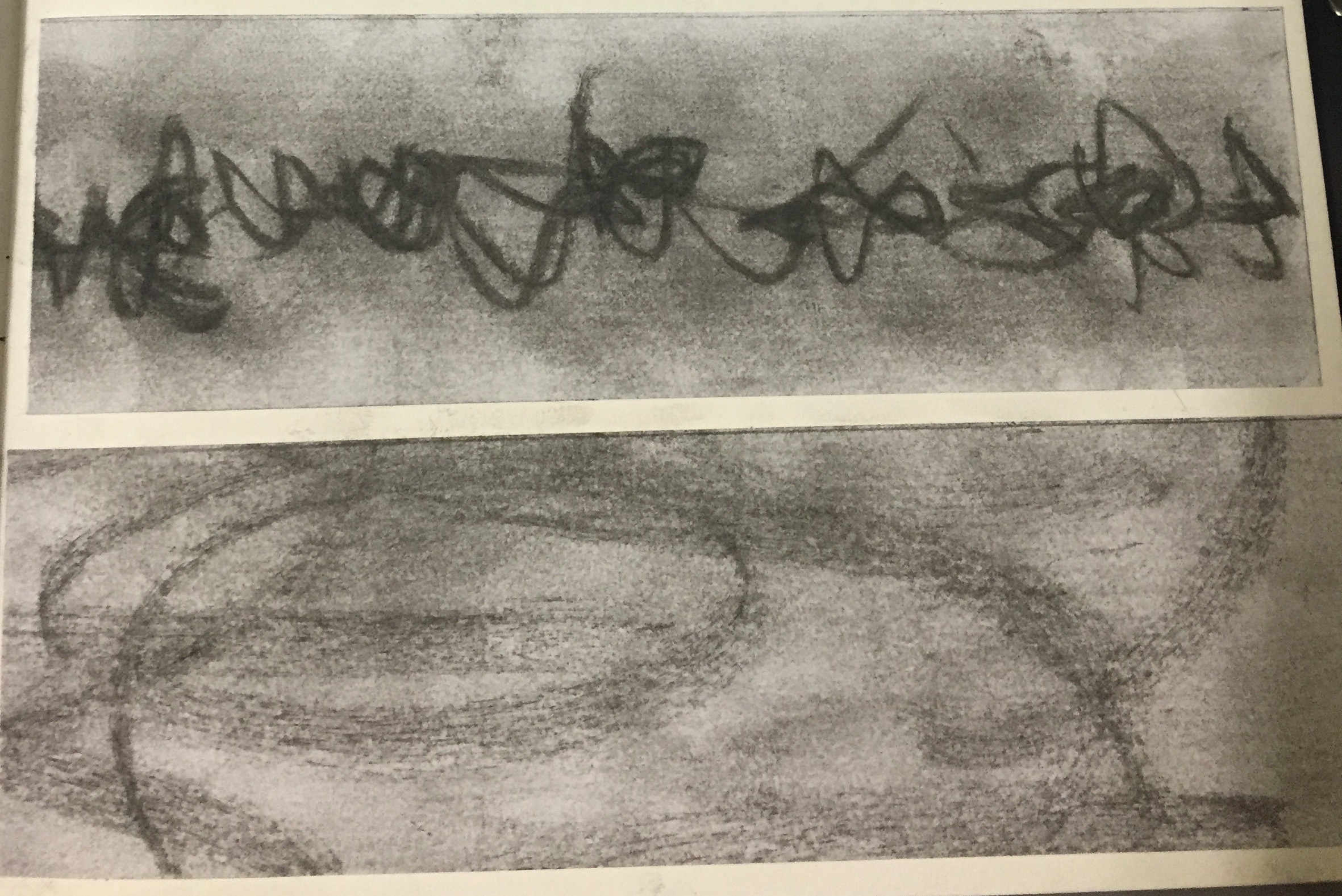
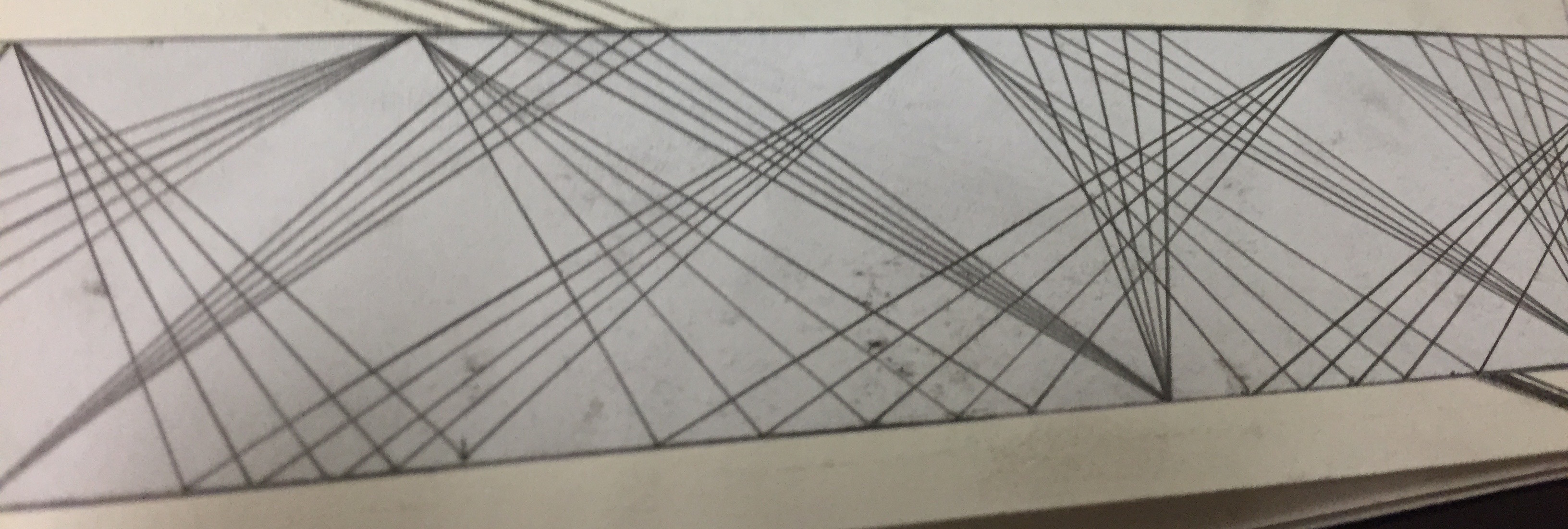
Nonsensicle
Research – Experiment
Nonsensicle to me is things that doesn’t make sense. Something that’s incoherent and all over the place. I tried to write down all the letters in the alphabet. To make it more interesting, I drew them in different sizes and turned the strip around to alternate the direction.

However, letters are not allowed to be presented. It’s too literal and not abstract at all. Hence, I changed to another design.
I drew straight thin lines that hit the plane of the strip before spreading out with more lines that hit on the opposite plane and converging again on the opposite plane. Basically the idea is to mimic human communication. When it first started out, it’s normal and all until it reaches the middle part where it splits. This symbolise that the communication is haywired and incoherent; Going in all different directions.
Final
Distracted
Research – Experiment
Distracted to me means your attention being pulled away from what you are supposed to be doing. I decided to create the Distracted strip by mixing all the other abstract designs from other strips together. This symbolise the idea that I don’t have an definite idea of what I want to do or concentrate on. There is a mix of Lyrical, Sloven, Nonsensical, Systematic and Ambiguous.
Presentation
Final
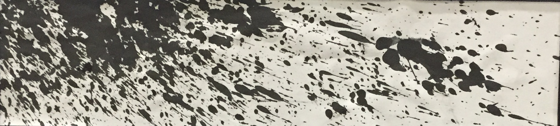
Sloven
Research – Experiment
I initially don’t know the meaning of Sloven. I google-d for the meaning and realised that it means dirty. The contrasting idea of dirty is clean and pure. Instantly I thought the best way to convey the idea of dirtiness is to take a blank white piece of paper and use Chinese ink to ‘dirty’ it. I tried to splash the ink onto the paper using brush. However, I find that my technique is not strong and forceful enough. Hence, I tried to use a straw. I poured a pool of ink onto a paper and used a straw to flick the ink to another blank piece of paper.
I was careful with the way I flick it because I want to ensure a varying degree of sloven-ness on the strip. I was careful not to stain the entire strip. If not, it will be too tainted.
Presentation
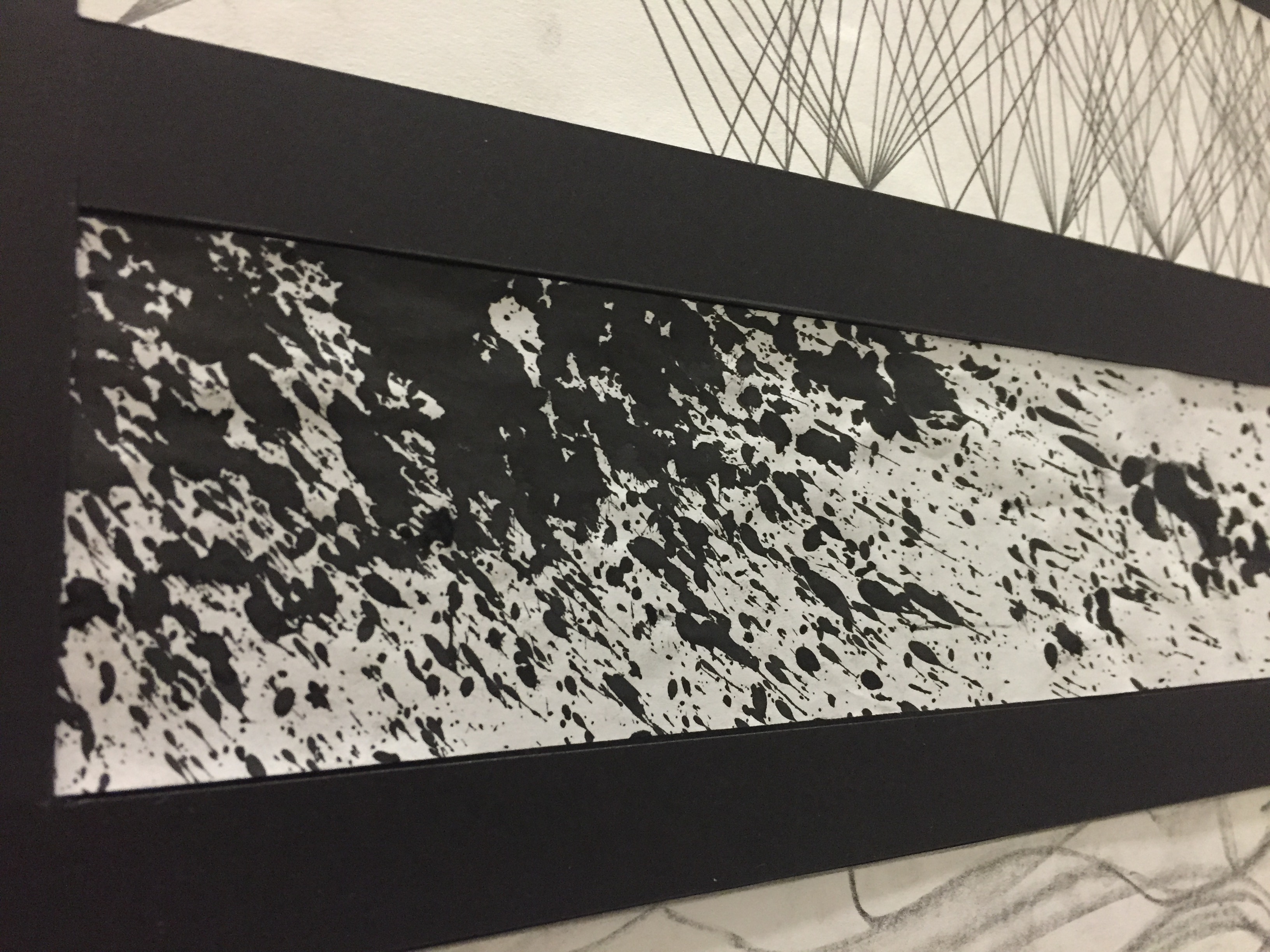
Final
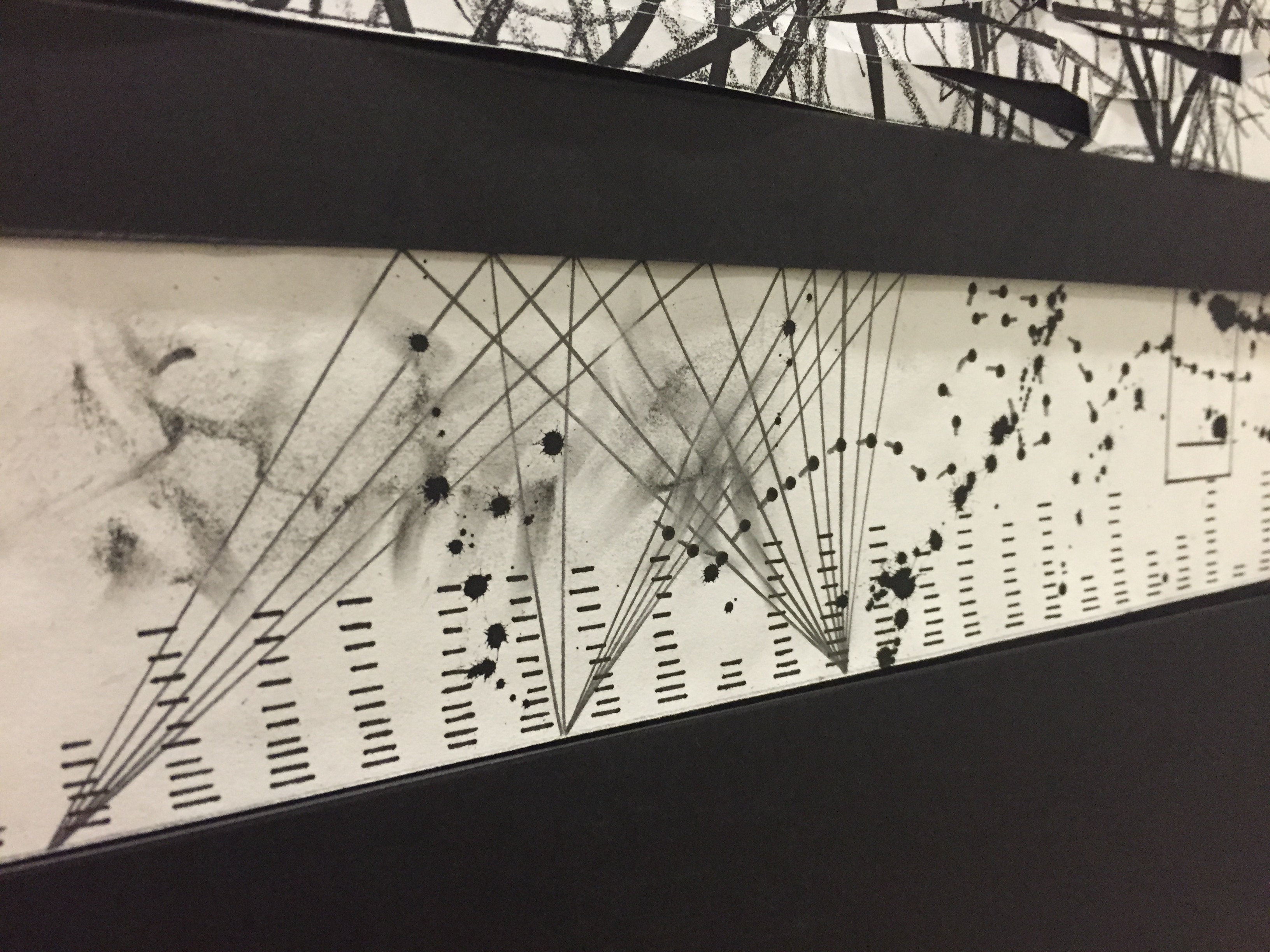
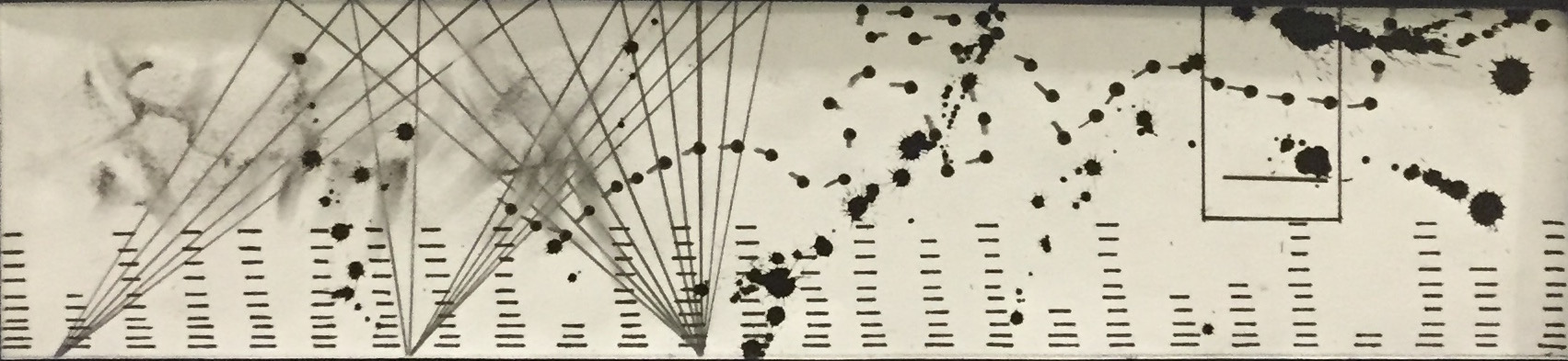
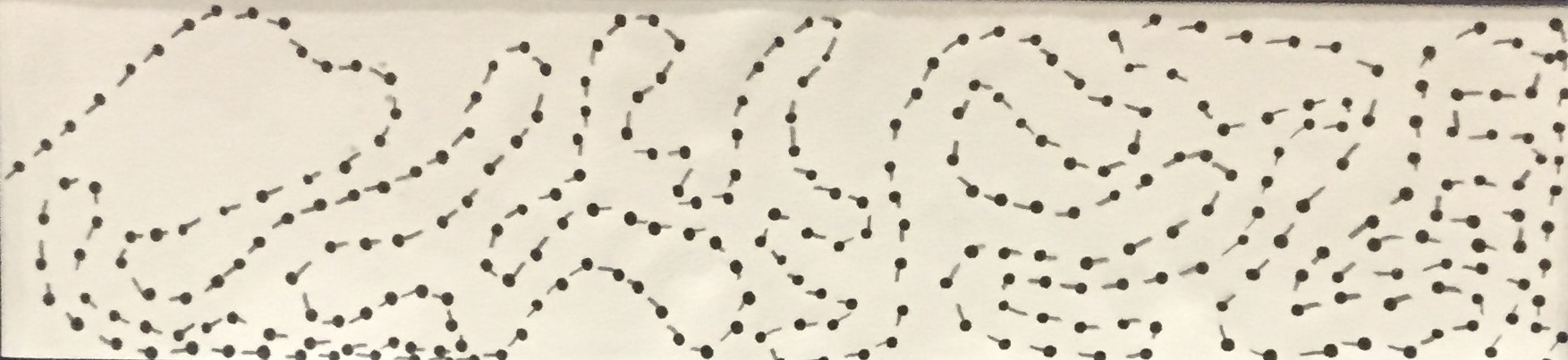
Indecisive
Research – Experiment
Indecisive to me is the idea of not being able to make up your mind on what you want to do. The idea of being fickle-minded. You want it but you don’t want it. You want it again but you don’t want it.
I drew short lines using pencil and used a 1.2mm black marker to dot the end of every line to mimc the idea of footsteps. The lines proceed but turns back before going straight to another end of the strip. I want to convey the idea of the person wanting to go to a certain place but he cannot make up his mind if he should. I tried to vary the degree of curviness. As you can see, it is more complicated towards the end.
Final
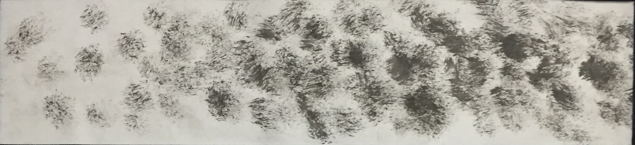
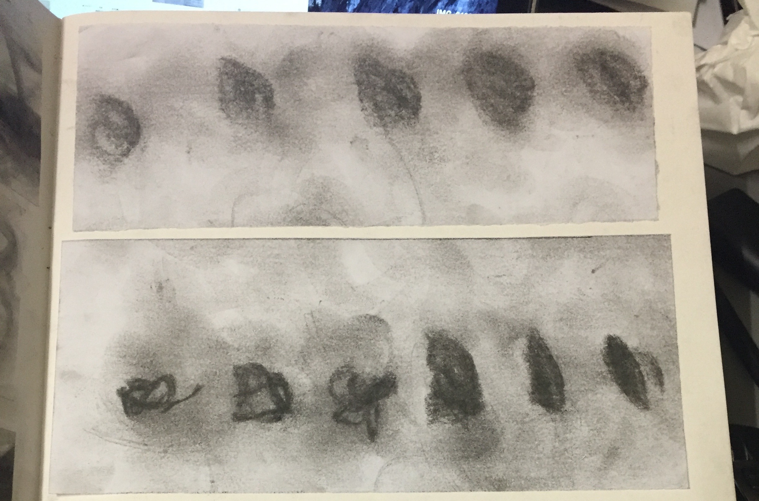
Anxious
Research – Experiment
Anxious to me is a mix of being worried and scared. I used Chinese ink and brush to create the idea of anxious. I dapped the tip of the brush onto the strip and i varied the degree of marks by dapping more towards the end of the strip.
Final
Aggressive
Research – Experiment
Aggressive to me is being fierce and intimidating. I experimented with textures by taking the dish cleaning wires and dipped it on Chinese ink before scrubbing it onto a blank piece of paper.
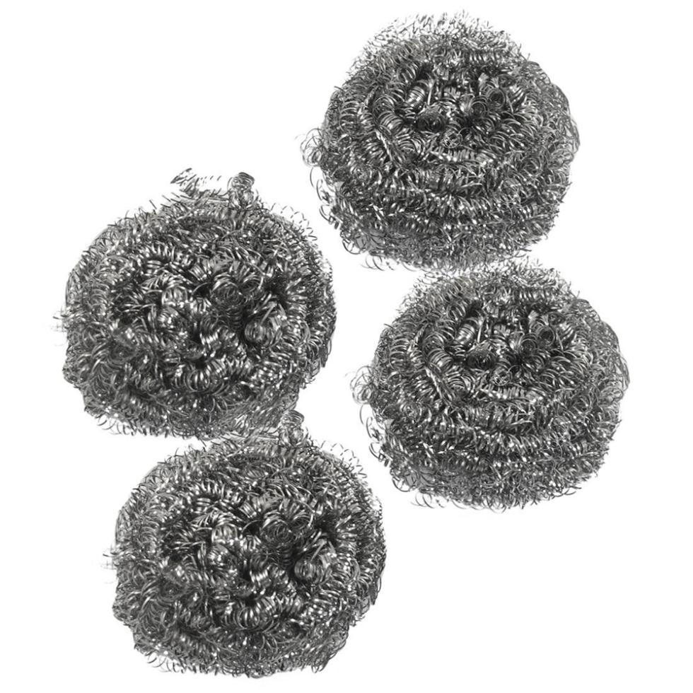
The end result that I got reminds of a big and fierce creature slashing with its claws. The texture is very rough and sharp.
Final

Embarrassed
Research – Experiment
Embarrassed to me is the uncomfortable feeling where you did something that’s not normal or the usual and people saw it.
I start off by cutting holes on a piece of paper.
I place the paper with holes over another black piece of paper.
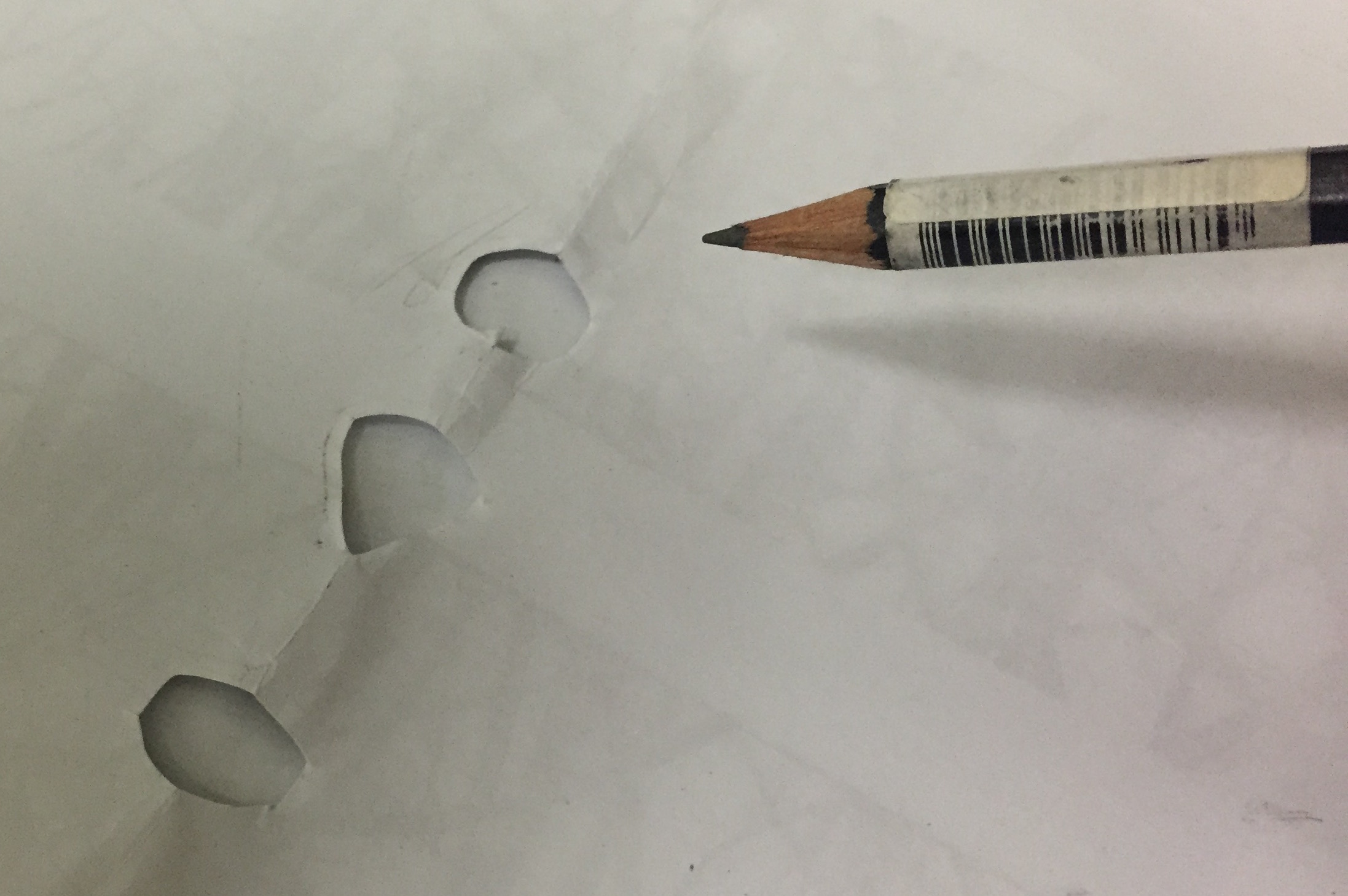
I used a pencil to shade in the holes.


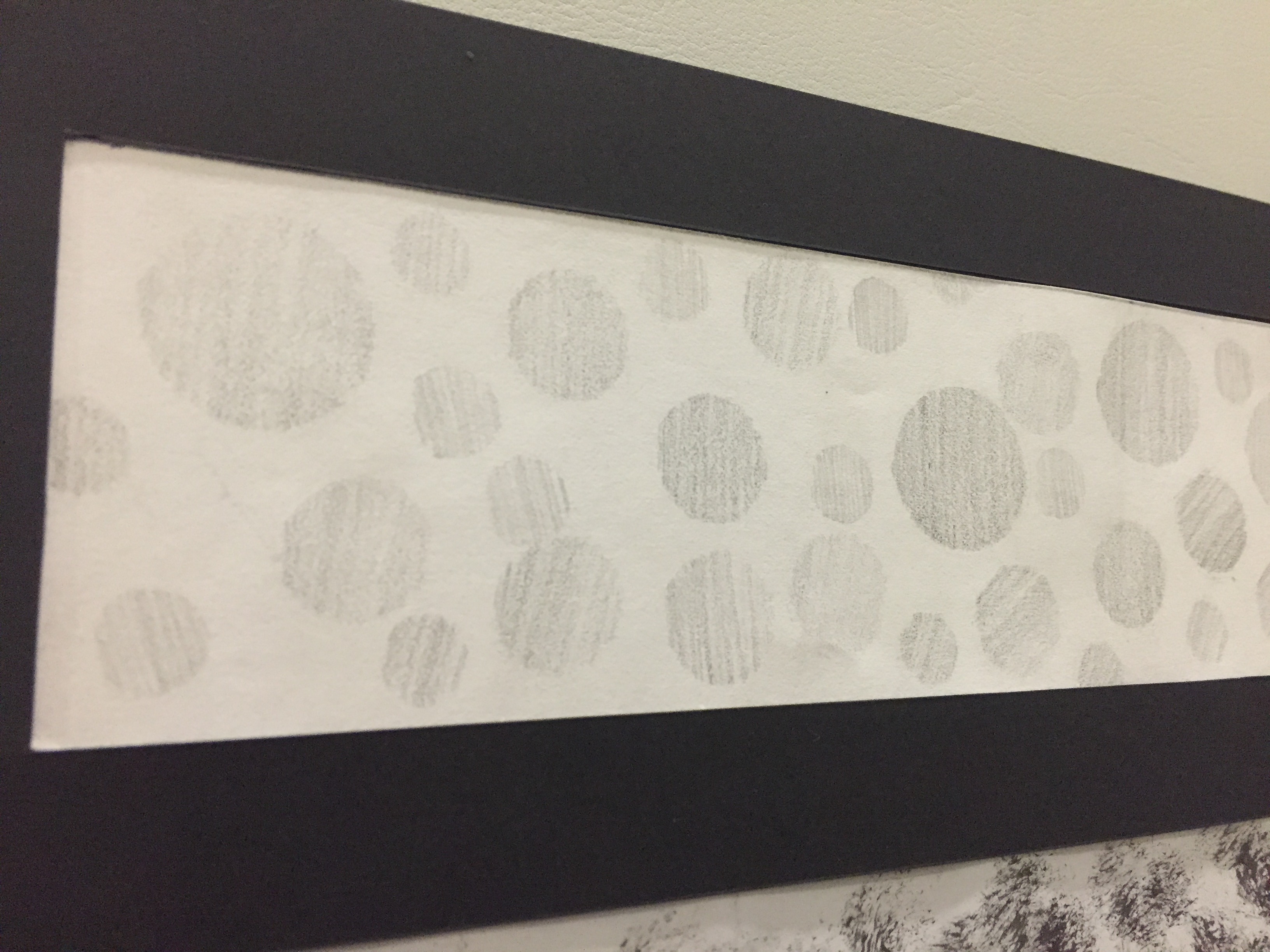
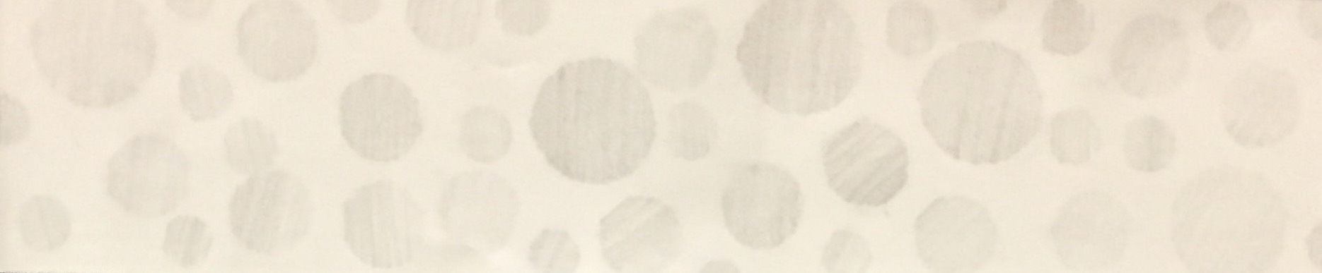
I choose to only use circles and not other shapes because I feel that when you’re embarrassed, you would want to cave in and I feel that round-ness is the best shape to represent that idea. Also, I was careful not to shade too hard. I want it to be faint because when you’re embarrassed, all you want to do is to disappear from the scene and hide away. I made the strip more interesting by varying the sizes of the circles. I also ensure that the circles do not touch each other because when you’re embarrassed, you feel isolated and different.
Presentation
Final
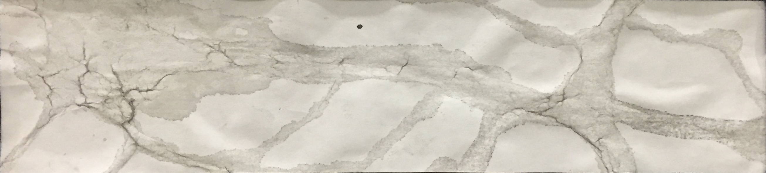
Exhausted
Research – Experiment
I feel Exhausted all the time. Maybe not every time but there are days where I’m overwhelmed by work. Exhausted to me is the state of tiredness and dreary. You feel weak and not wanting to do anytime. You may even cry when you’re exhausted because you cannot believe how tired you are. That is the feeling I wanted to convey for Exhausted.
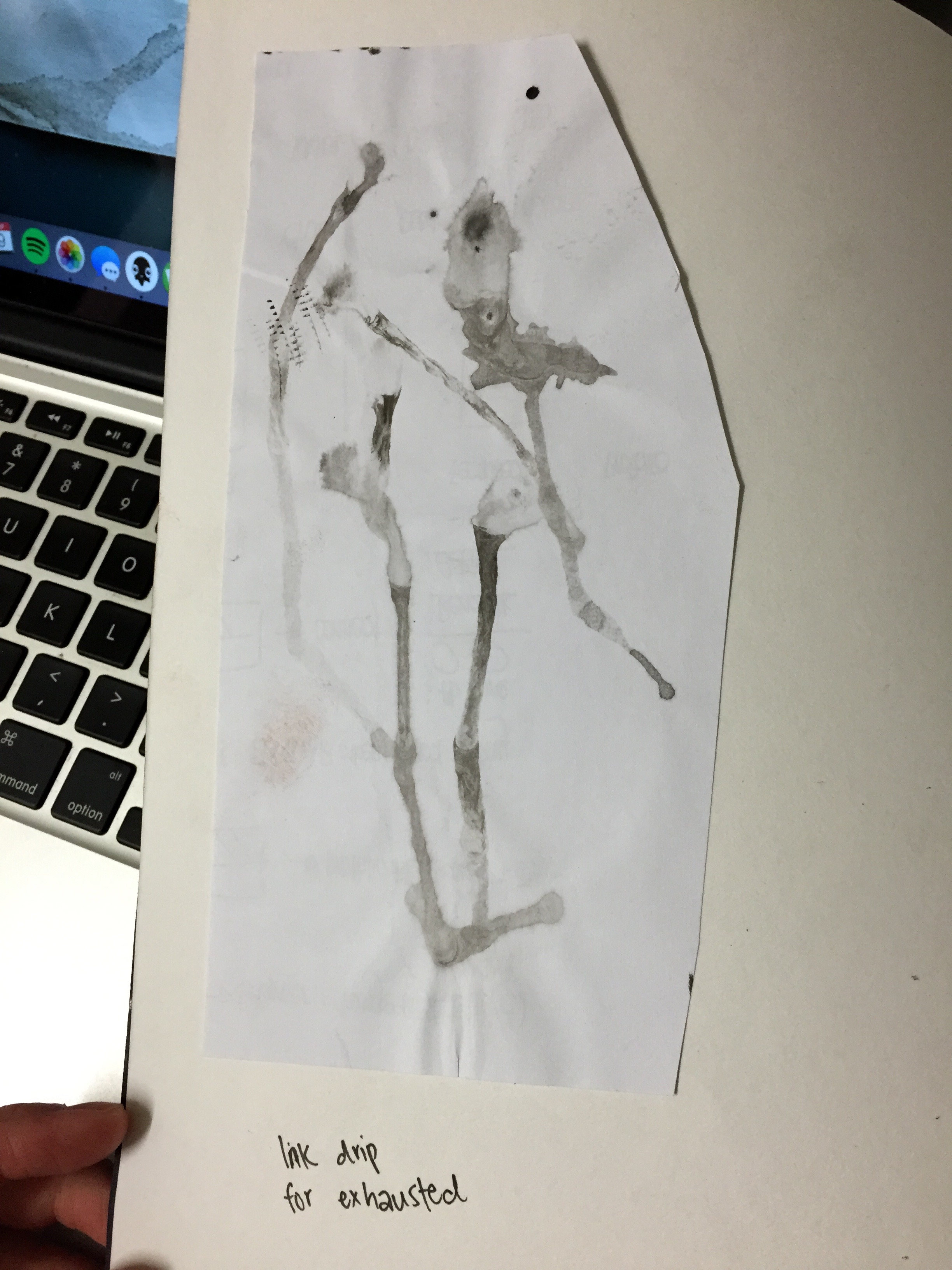
I experiment Exhausted with Chinese ink and water. I held up a piece of paper and spray water onto it. I dipped a pointed brush to Chinese ink and dapped it onto the water. The ink spread and fuse nicely with the water. I proceeded on to tilt the paper in different directions to direct the water to different parts of the water. The water ink faded slightly as it gilded across the paper. The end results is a slightly ink faded and damp paper. It gave the idea of ‘crying’ with water marks and faded ink.
After the paper dried, it has a interesting texture to it. In addition, the accidental overuse of water caused a small tear on the paper which further accentuates the idea of exhausted. I initially wanted to use the side where I sprayed water onto for presentation. However, after I flipped the paper, I realised that there are ‘veins’ on the other side.
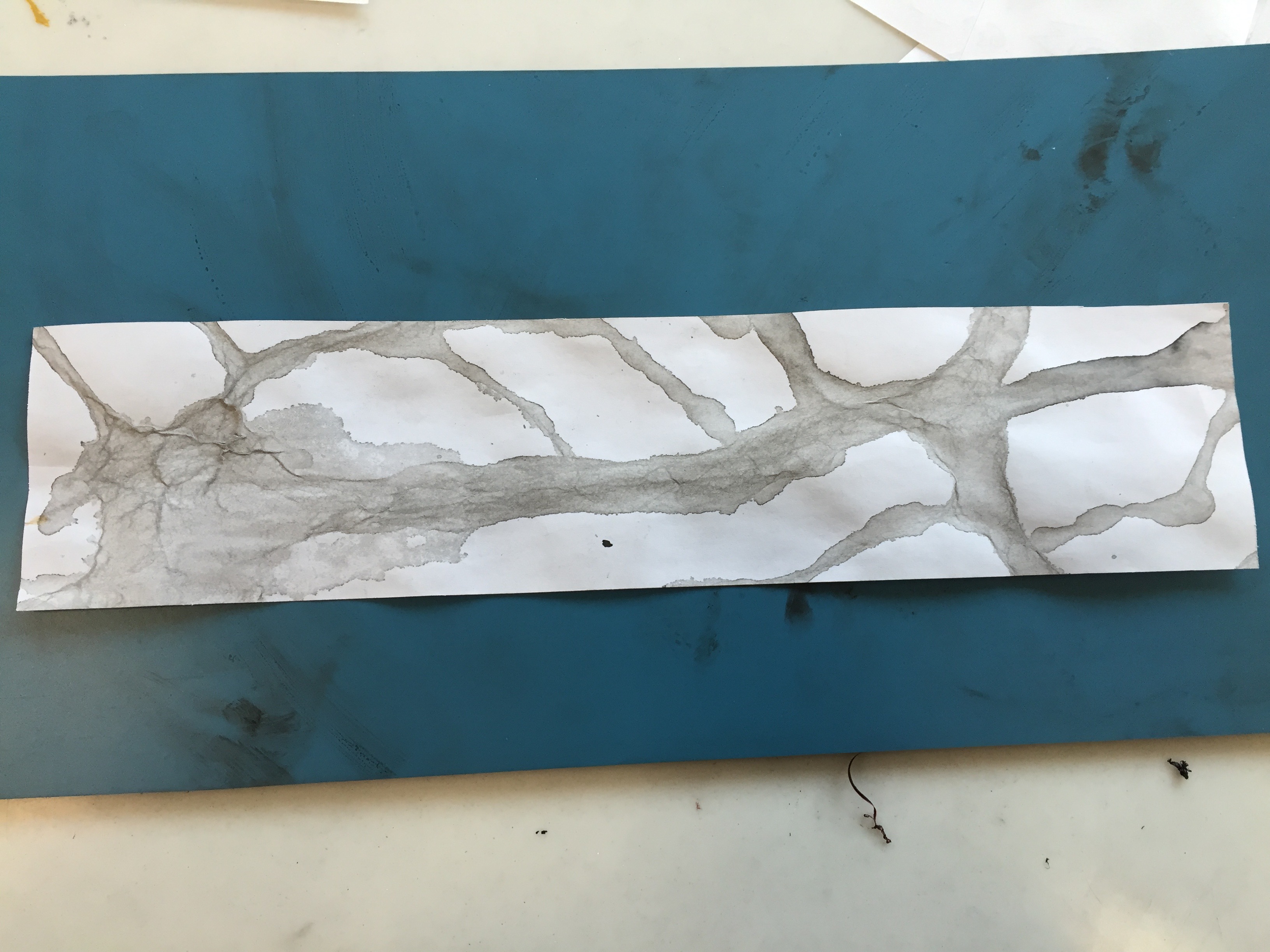
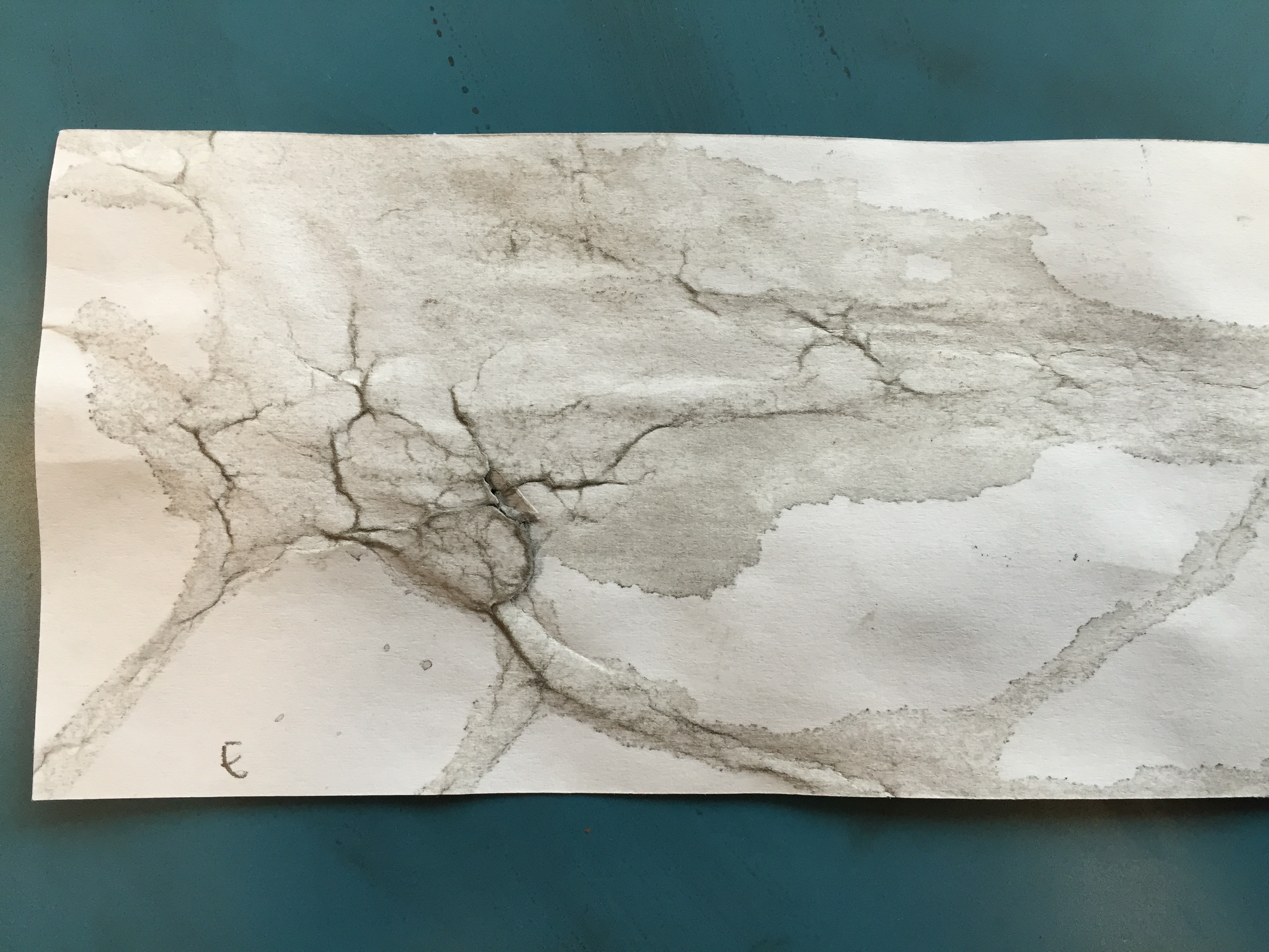
I feel that the flipped side is a better representation of ‘Exhausted’ hence I used the flipped side for presentation.
Presentation

Final
Awkward
Research – Experiment
Awkward to me is the sense of incompleteness. That uncomfortable feeling you get when something is not right or aligned. Awkward to me is something that stirs up your inner obsessive compulsive disorder; Something that stands out from the norm yet in an uncomfortable way.

My initial draft was drawing incomplete shapes with different strokes.

However, I feel it was too literal and not impressive enough. Hence, I tried another method.
While I was cutting and slicing strips for another assignment, I had an eureka. In a short lecture for 2D class, the tutor mention the ability of the brain to decipher the structure and meaning of a picture even though some of the parts are removed.

I pasted thin strips of paper on another piece of paper.

I use a 0.5mm black marker to draw across the strip. I gave the strip a contrast in stroke thickness by switching to a 1.2mm black marker. Drawing across, I deliberately misaligned the lines to express disorientation.
The end product shows incomplete & misaligned lines with varying thickness.
Final
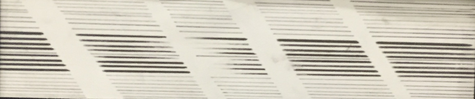
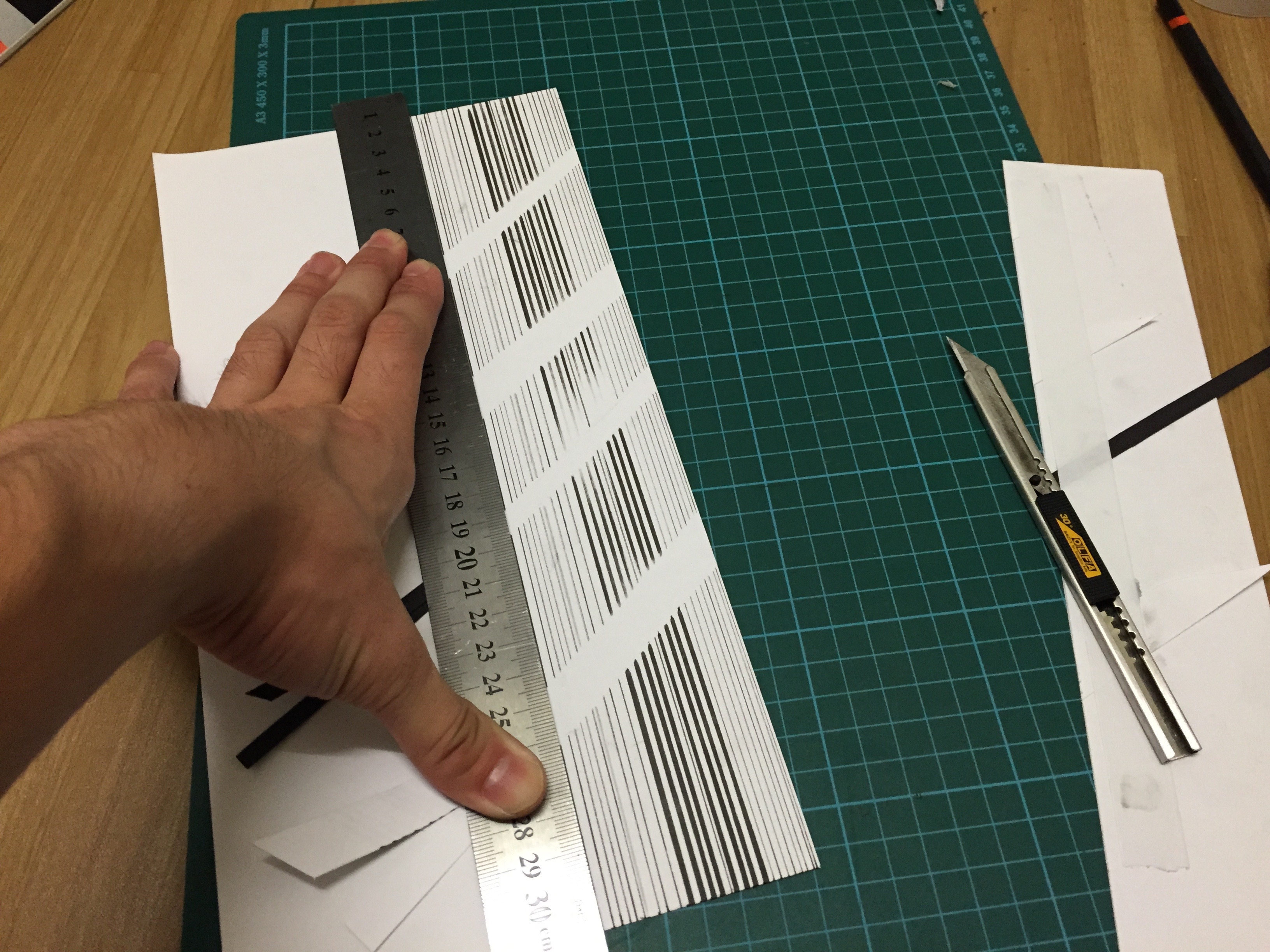
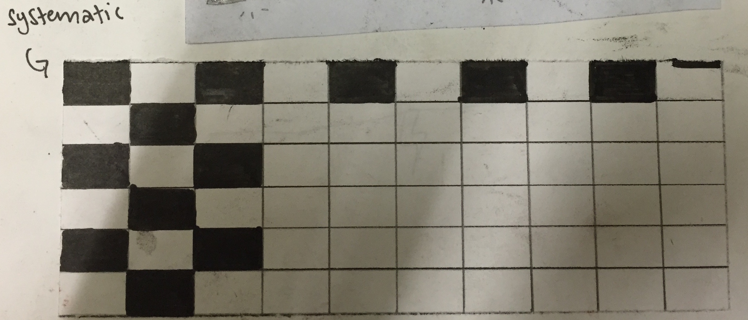
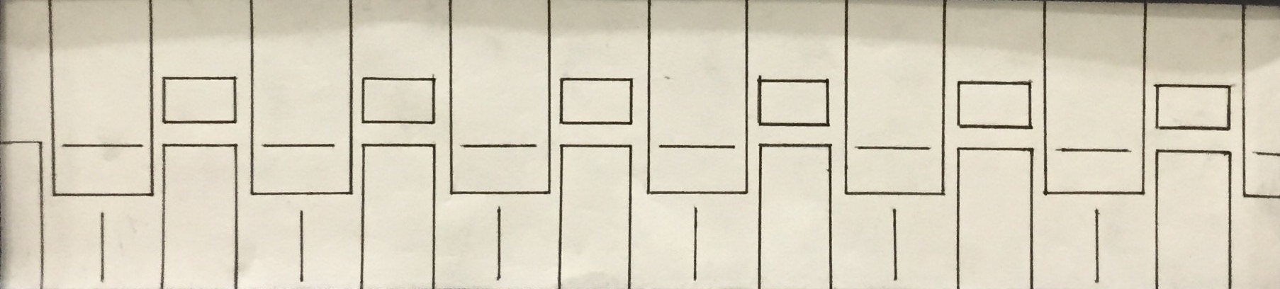
Systematic
Research – Experiment
Systematic to me means ‘In Order’. To get a clearer idea of Systematic, I went to google the meaning of systematic.
I tried to draw short lines using a 0.5mm black marker. It was inspired by patterns seen on radio sounds system (same as Lyrical)

However, I felt that it’s quite boring and some lines are drawn out of the supposed boundary thus it’s not systematic anymore.
I tried to draw blocks of equal size then filling in with black marker in between every block however, once again, I felt that it’s quite monotonous.
I went on to further research on the meaning of systematic by looking for images. Besides being ‘in order’, I associated systematic to machines. This is because when you break up systematic, you get system-matic. System means a electronic machine. I have the image of a room full of systems.
Thus, I tried to draw out the idea of systems. To break the mundane of simple blocks, I added vertical and horizontal lines in between.
Final
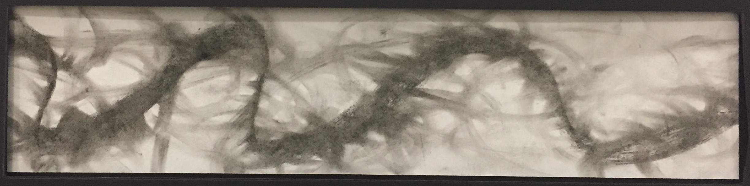
Turbulent
Research – Experiment
Turbulent to me is a state of chaos that can happen in air or sea. During a lecture in class, my tutor mentioned the use of finding a point in art to bring the audiences’ attention to. I was also inspired by the idea of rippling water.

Thus, I tried to place the breaking point in the middle and added short lines around it to add as ripples.

However, I felt that this design does not fully represent Turbulent well due to lack of ‘chaos’ in the picture and most of the lines are clean with combination of short and continous lines. It looks a little too neat for Turbulent.
I decided to experiment more using other mediums. I tried to use charcoal for another assignment the other day and I used a charcoal to shade on a piece of paper. I failed to get a certain shading right so I forcefully shade onto the paper in frustration. I tried to use eraser to remove the marks. It was then I realised I created an interesting texture and look from charcoal and eraser.
It reminded of a tornado vortex which I feel that it is able to represent ‘Turbulent’ very well.
Using a charcoal stick, I first drew one thick curvy line with varying degree of curviness across the strip. I proceeded on to use eraser to shade out the charcoal mark. The final design clearly shows the idea of turbulent.
Presentation
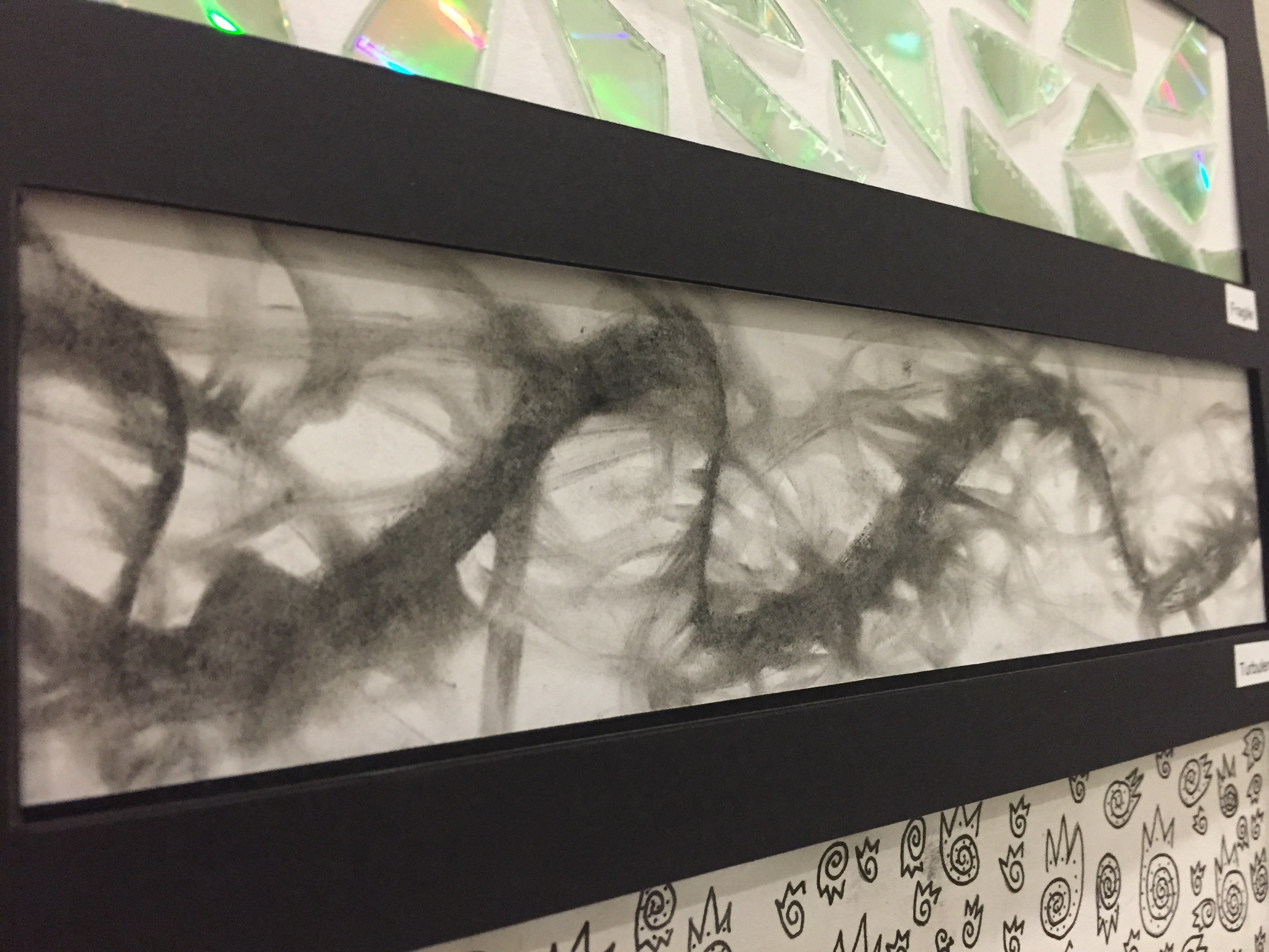
Final
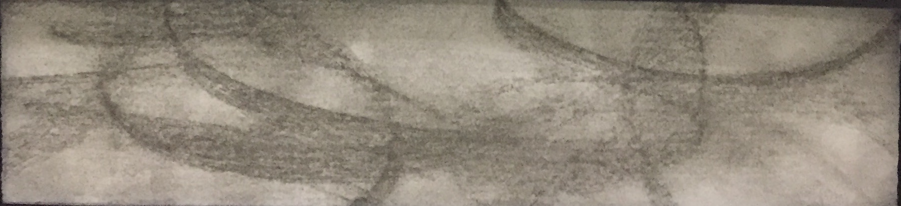
Ambiguous
Research – Experiment
I used the technique that I used for Turbulent on Ambiguous as well. The use of charcoal. I experimented with different patterns and ideas.
I drew a mark on the same axis and used my finger to smudge the charcoal. The idea of Ambiguous is also ambiguity. To me, it means the grey area of black and white. Something that’s not clear and obvious. In the end, I drew big circles in different stokes before smudging them out to achieve the idea of ‘It’s there but it’s not there’.
Final
Spontaneous
Research – Experiment
Spontaneous to me is like a reaction. A reaction of chemicals because the word Spontaneous kept appearing in my chemistry notes.
However, an reaction involves molecules hitting and bouncing off each other in a random manner. Hence, the use of straight clear definite lines that hit planes is not good enough to represent ‘Spontaneous’. Hence, I decided to use the charcoal once again by randomly running my hand within the strip before smudging it. I varied the tone of the strip by smudging more towards the end of the strip.
Final
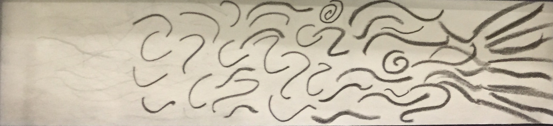
Sensual
Research – Experiment
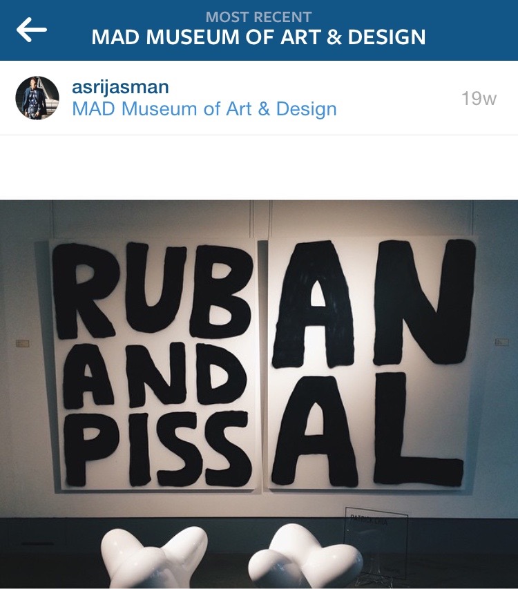
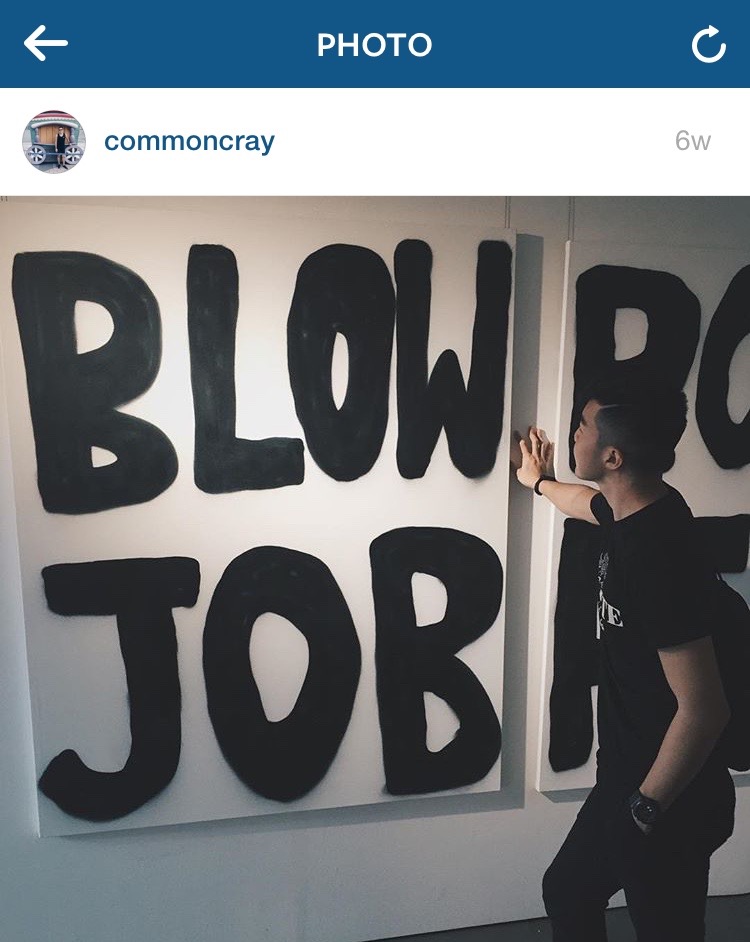
Sensual to me is easily linked to erotism; sexual-related. Exploring the idea of sensual was when I came across an ‘erotic’ section in MAD Museum Singapore.


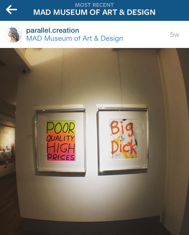
Thus, I was inspired to use lines to mimic the rhythm of the sexual process. First off, on the left side there are touches and strokes. (Thin, blurry and soft lines). The middle section is more rough and sexy (strong, bold and curvy lines). The right side is the ending (Straight bold lines going in 1 direction).
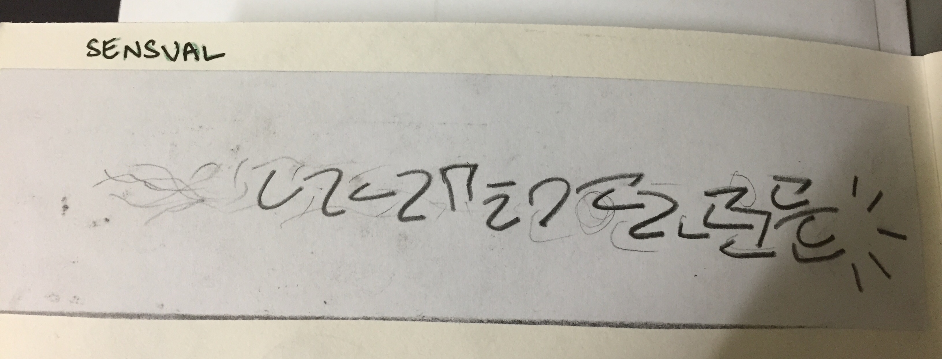
I initially drew jagged lines for the middle part however, after gaining advise from my tutor, we feel that the use of curvy lines is a better representation for sexual connotations.
Final
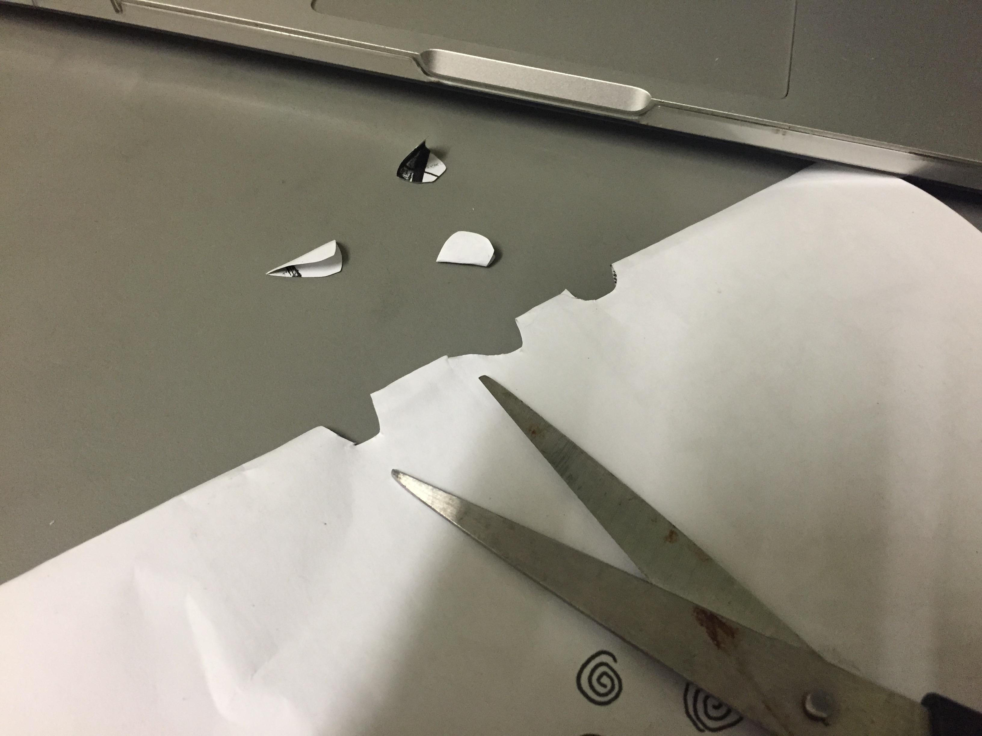
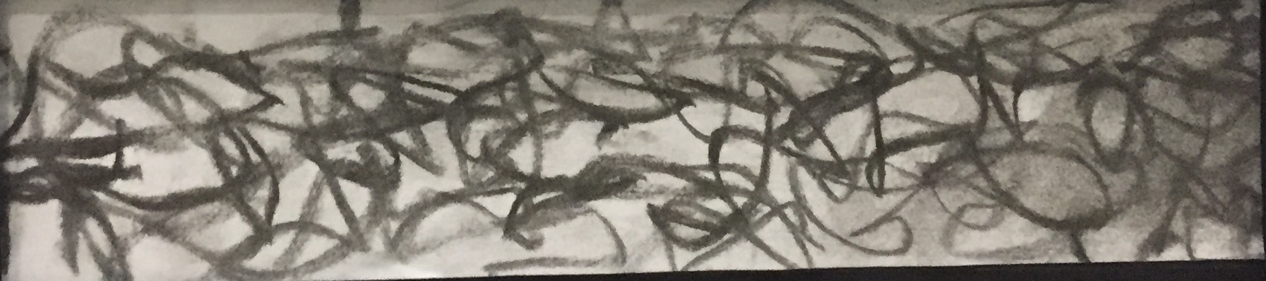
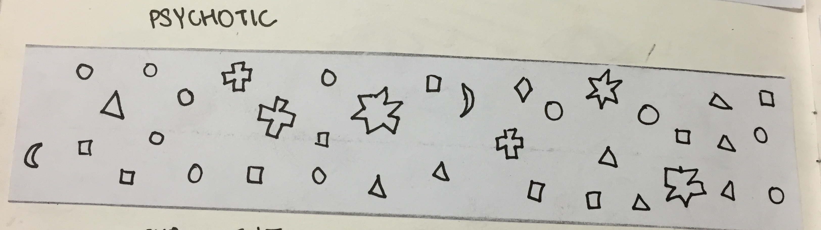
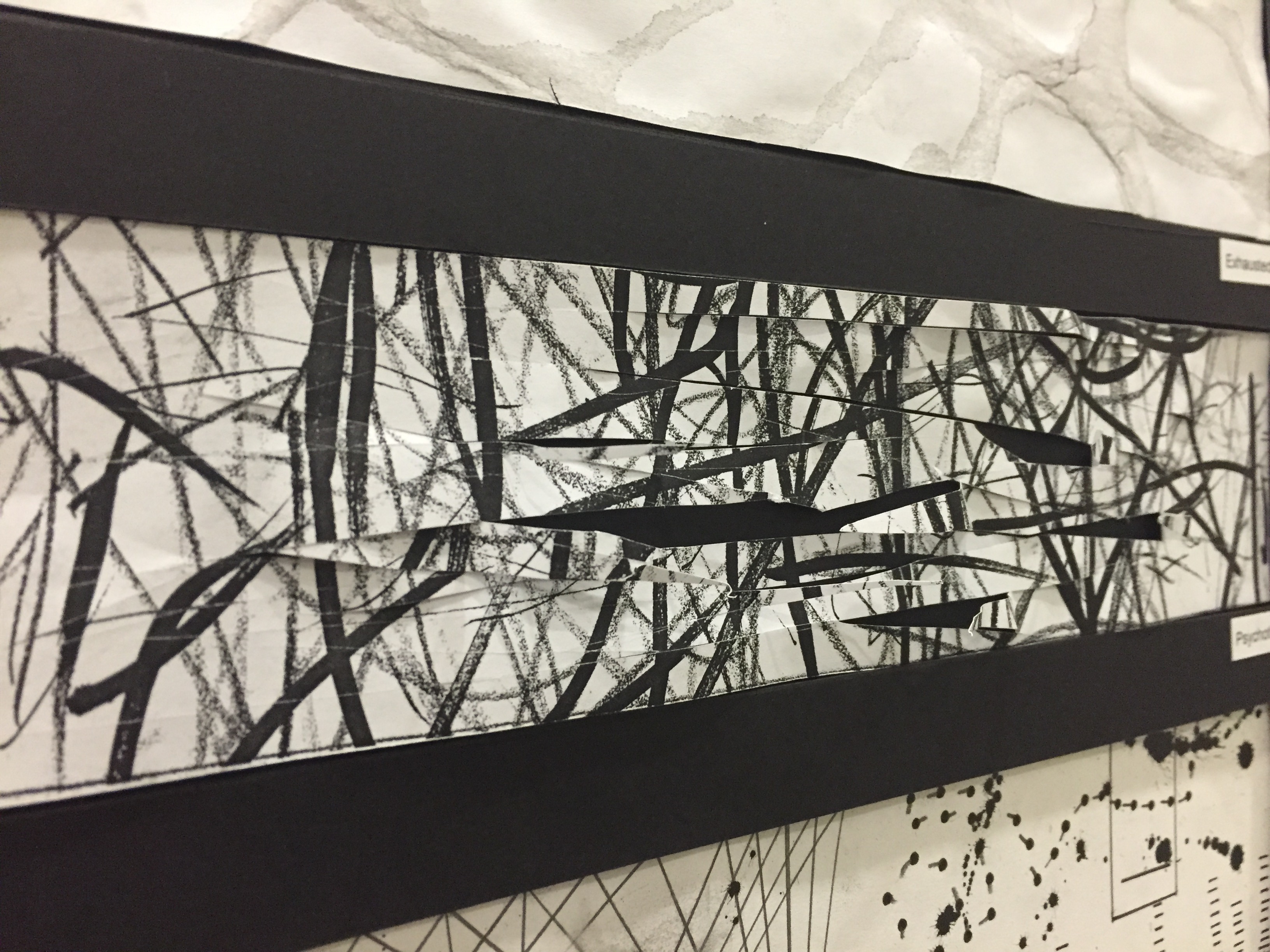
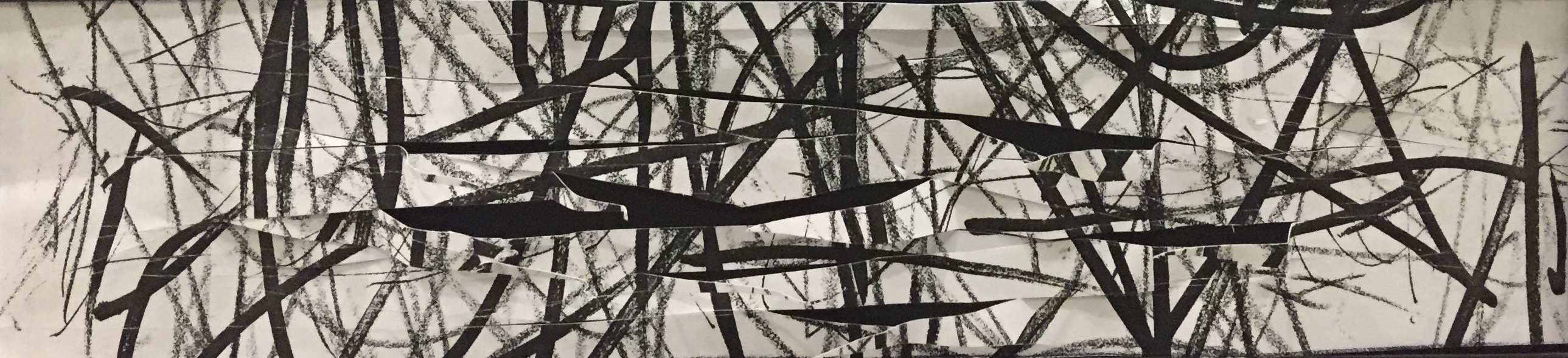
Psychotic
Research – Experiment
First draft: Mix of ‘Substances’
Experimenting Psychotic was one of the most interesting process for me because it can be adventurous and fun. Psychotic was the word that appealed to me the most. Having watched ‘America Horror Story: Asylum’, what could be better than to produce my interpretation of ‘Psychotic’. Also, mention about Psychotic and I would remember an iconic Grammy performance by Nicki Minaj performing ‘Roman Holiday’ as seen here.
She was acting as if she was possessed by a demon inspired by ‘The Exorcist’. I feel that that performance & acting perfectly captured the idea of ‘Psychotic’. Thus, when I’m creating ‘Psychotic’, I put ‘Roman Holiday’ on replay.
I tried to delve into the minds of a psychotic and asked myself what would I do if I’m crazy? I think I would randomly scribbled onto papers with irregular strokes. I used different colour pencils and markers with varying thickness and draw onto the paper in random directions.
I drew on the entire A4 paper and cut it out into 3 strips. I decided on 1 strip that I feel fully represents the idea of Psychotic.
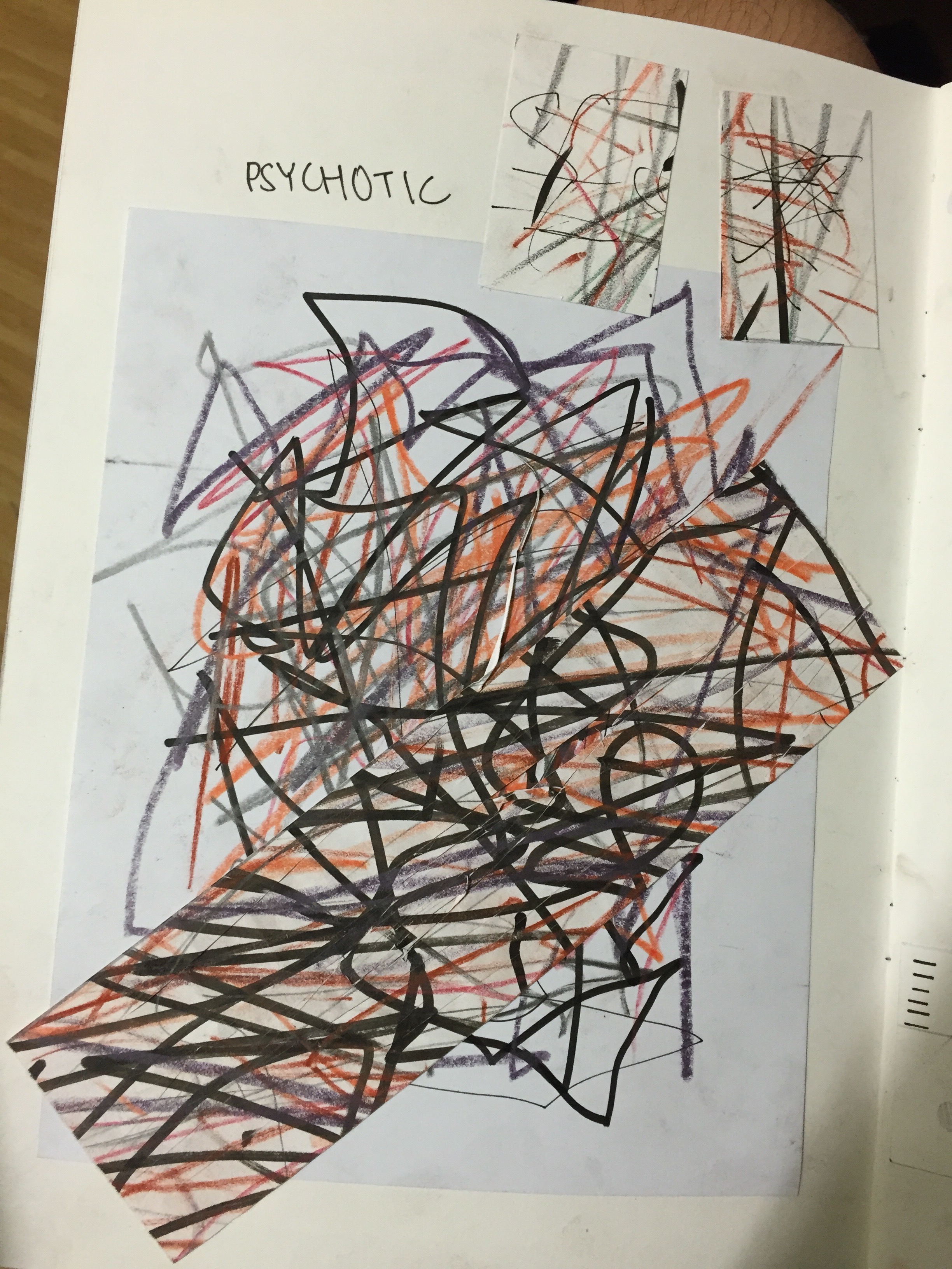
I scanned the piece because colours are not allowed for presentation.
To further express the idea of ‘Psychotic’, I use a pen knife to slice the strips, careful to not cut out the entire strip. People often associated psychotic with danger. Hence, I felt that the use of pen knife to slice the strip can gave the hint of scariness and fear.
The sharp strips of paper that is pointing out complemented well with the strokes. 
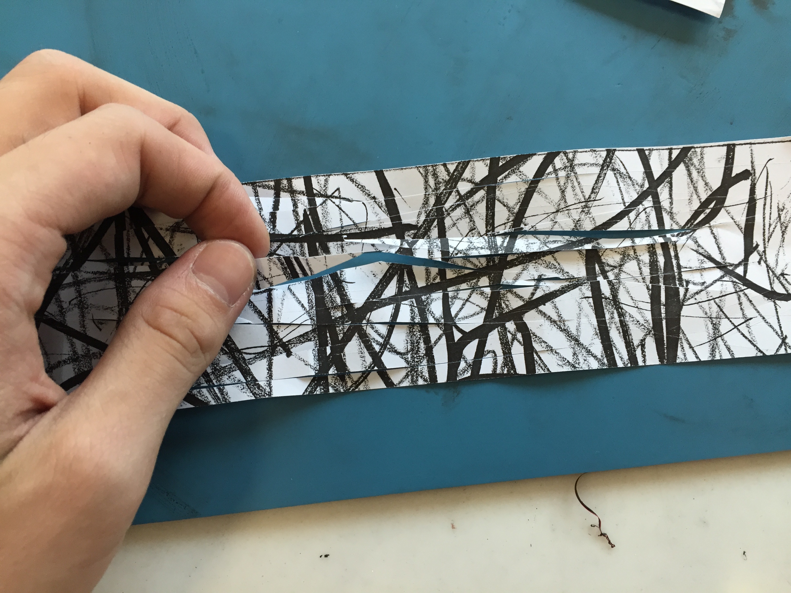 To further produce the texture of the strip, I crushed and crumpled it to give it wrinkles before flattening it out again. I also gingerly pull out some sliced strips to give it a more 3-dimensional effect.
Presentation
Final
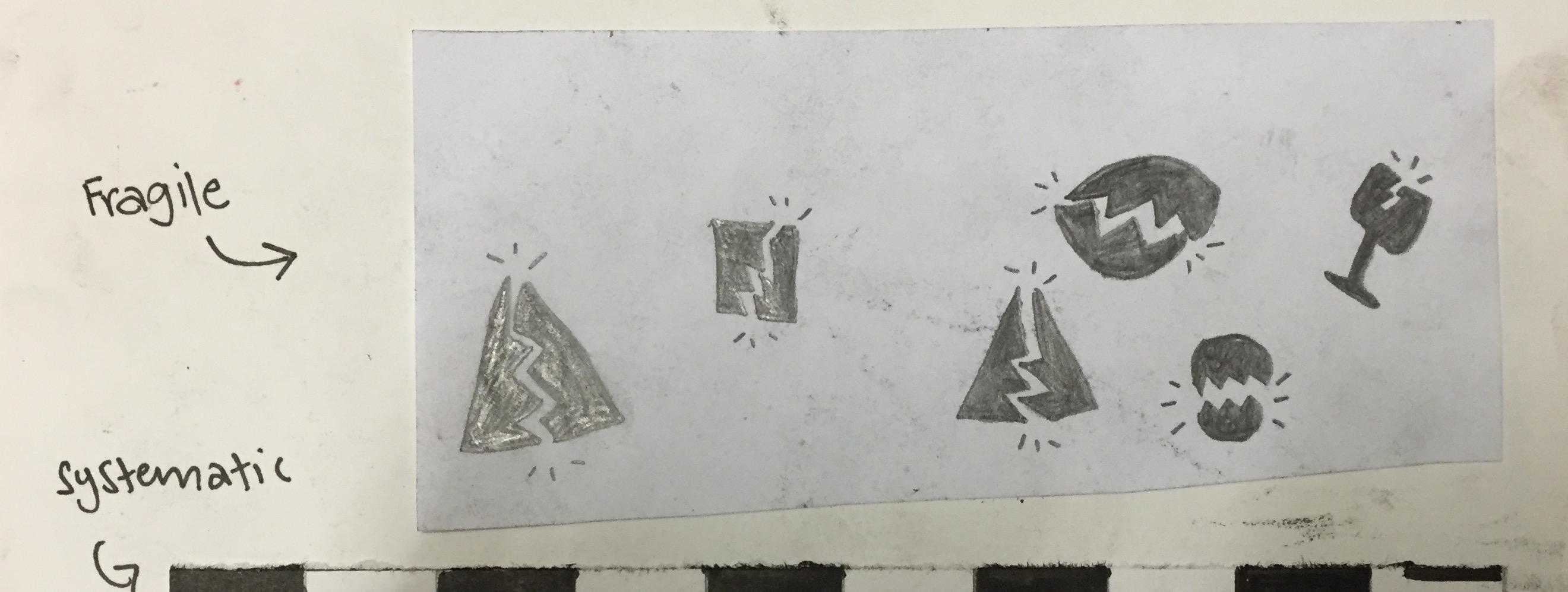
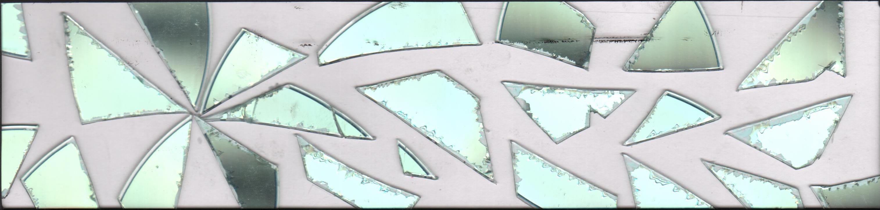
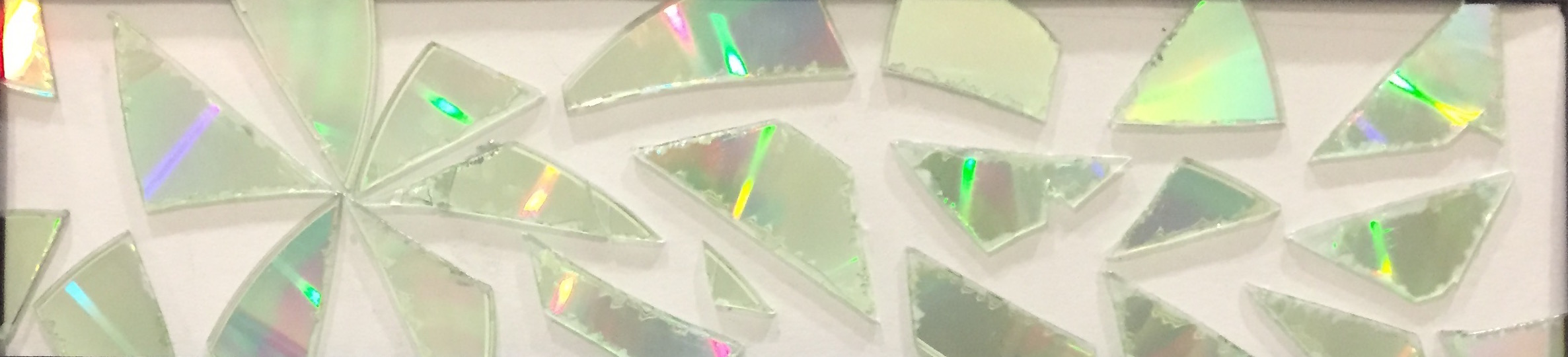
Fragile
Research – Experiment
The first thing that comes to my mind when someone mention fragile to me is ‘breaking’. I tried to use drawing pencil to draw out pictures of shapes breaking and added strokes to accentuate the effect. However, this turns out to be quite literal and does not really represent the idea of Fragile in abstract form.

I remember back in secondary school, I experimented with disks to produce an abstract design for the back of a magazine. (School Assignment) Hence, I decided to use it to represent fragile. I cut the disk into small sharp and long shards. I initially placed them randomly across the strips. However, after a consultation with my tutor, we decided to find a breaking point of the strip as seen on the left side of the strip. Placing the breaking point at 1/3 of the strip gave it a structured look.
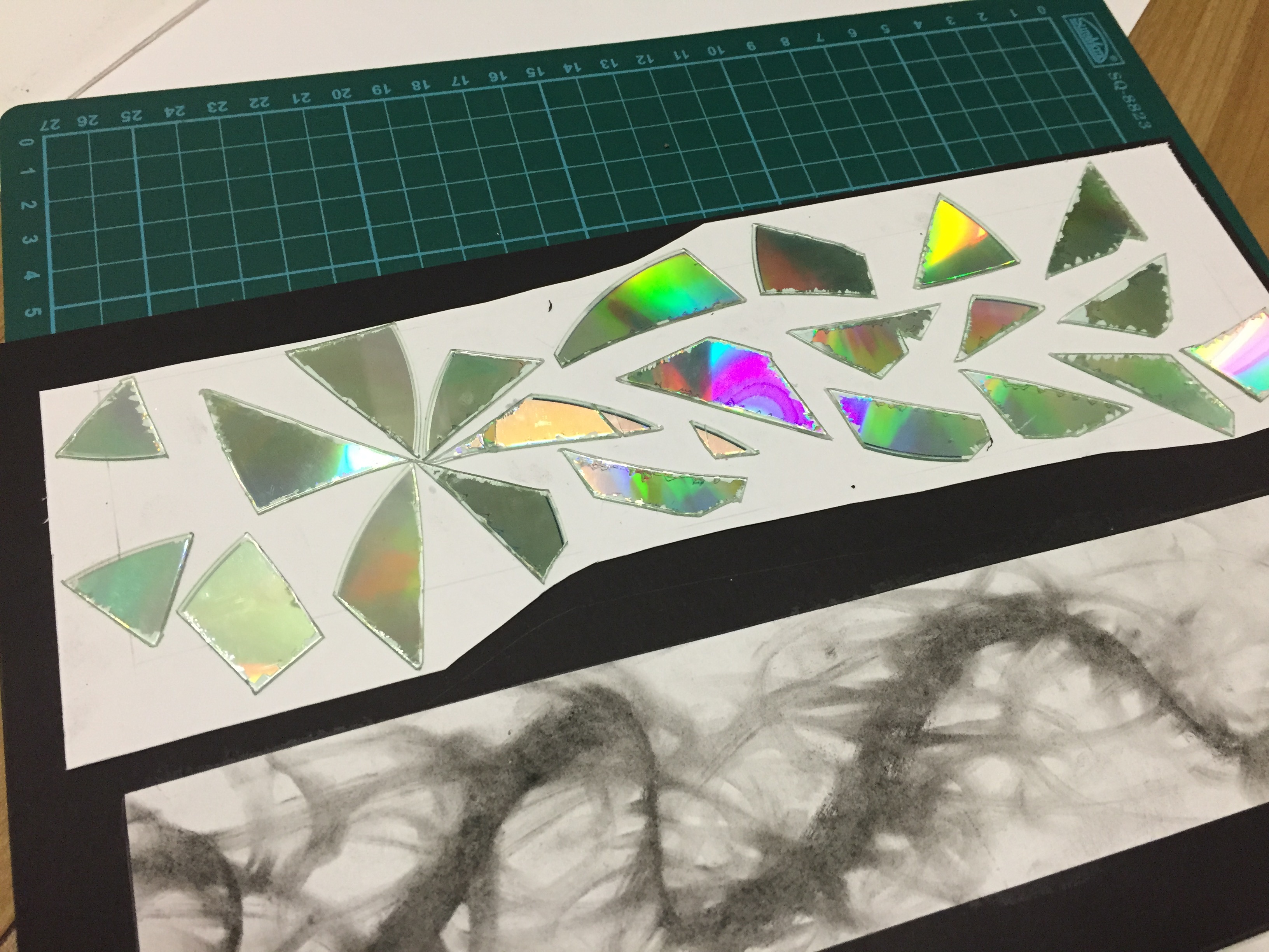
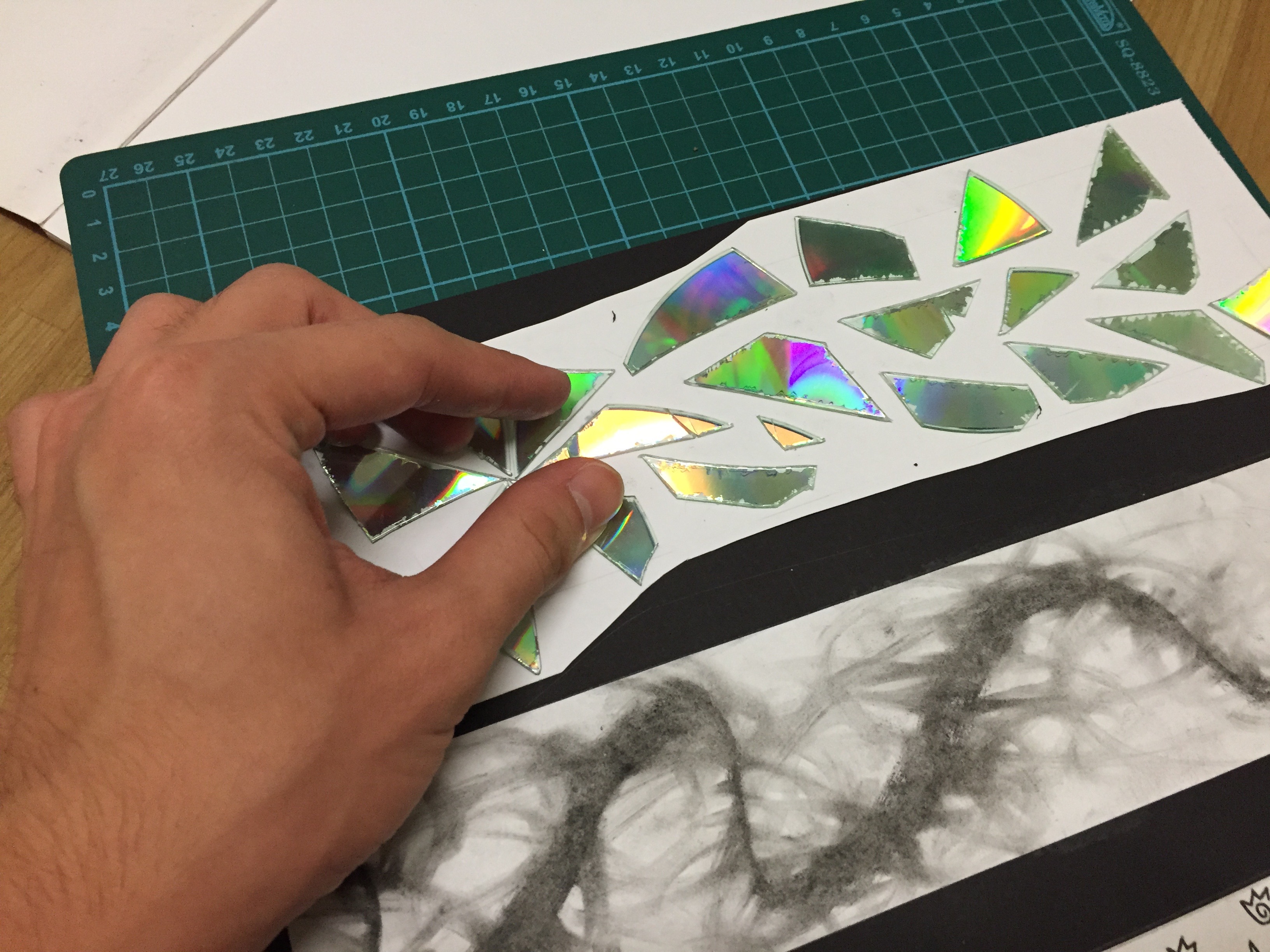

I mentioned earlier that Fragile means ‘Breaking’. To some people, it can mean externally or in form of an tangible glassware or china. However, I would related it more to being fragile internally. The fear of being inadequate and insecure. We often see ourselves worst than how others do we. Hence, the reflection of the disk represents the reflection of the person viewing the strip as it peers through the viewer’s inner self.
Presentation
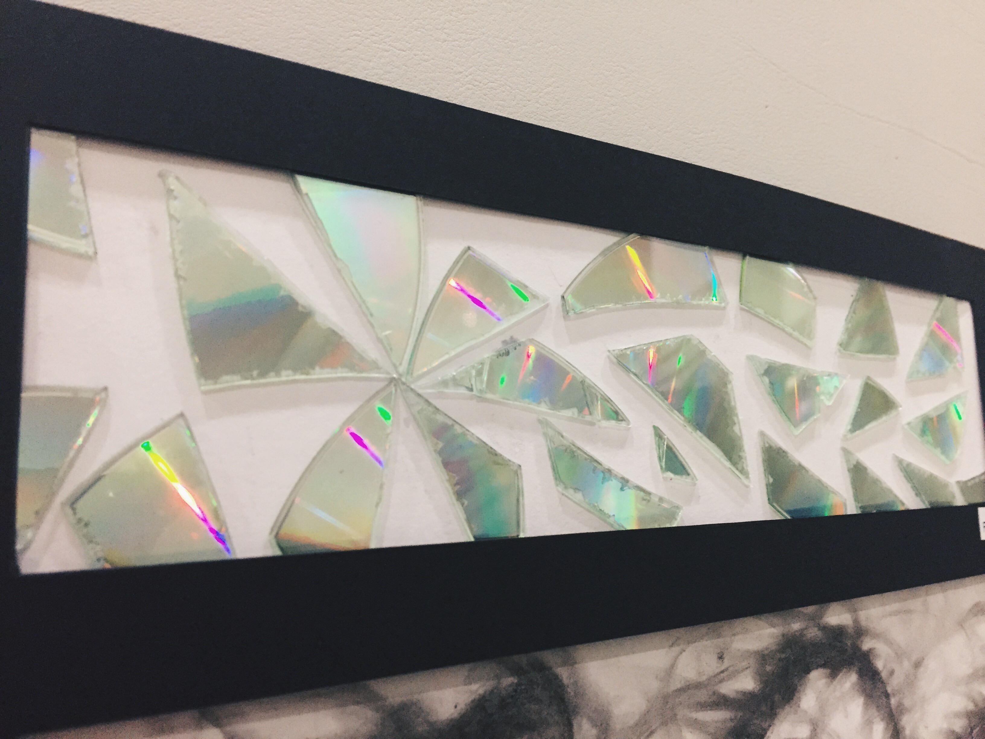
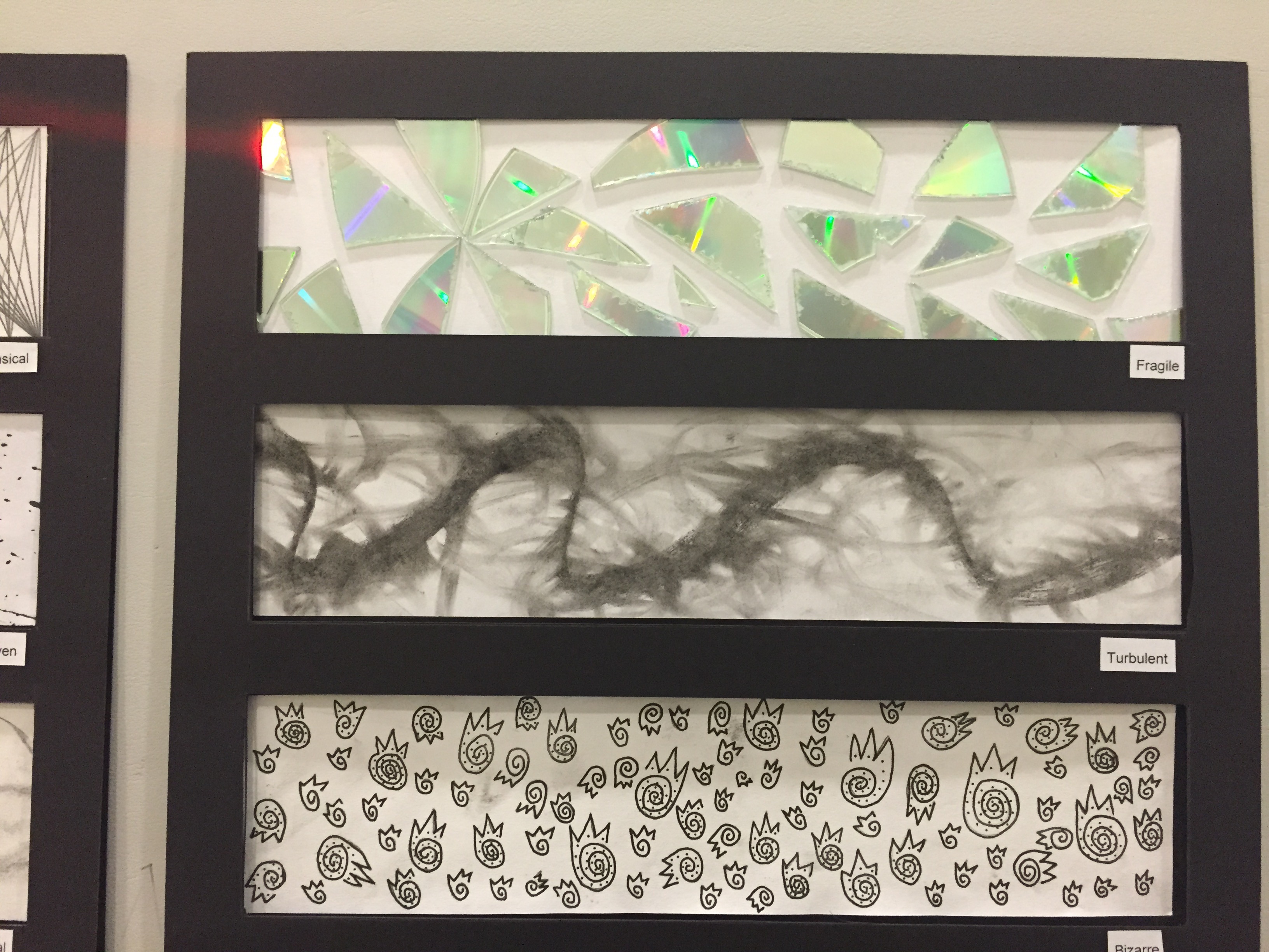
Final
Presentation
I’d like to thank my classmates who are kind enough to offer me constructive ideas and comments on how I could improve my work and I really appreciate it a lot when my classmates complimented on my work.
Reflections
From this assignment, I learnt how various mediums can produce different textures and marks. Using an abstract form to represent certain words does not compromise its meaning but rather, accentuates it. The revelation that comes along with it is able to produce a greater impact and realisation to its audience.
It is important to think out of the box to truly impress.