Locale//Process
CONCEPT DEVELOPMENT
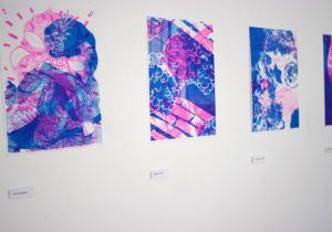
As the ability to juxtapose the images over one another was essential to my work, I was incredibly dependent on the risograph styled prints (images below) as the print style allowed for insane contrast through the use of neon colours. Therefore, in an attempt to salvage concept #1, that meant finding a way to mimic the risograph effect through photoshop.
Experimentation
The following images are visual mockups for the draft I had initially envisioned. Done through photoshop using the following functions:
1) halftones
2) solid colours
3) screen filtres
4) overlay (multiply)
Credit: learn how to do it here!
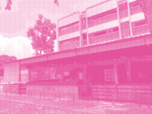
Fluorescent pink
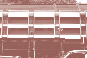
Changi red (colour picker from photos).
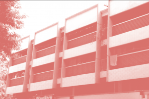
Fluorescent red (derivative from Changi red).
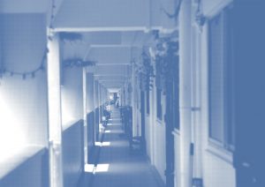
Mood blue halftoned effect as a dull contrast.
Fluorescent (Bright colours) = Represents False Perception
Dull (Darker colours) = Represents True Reality
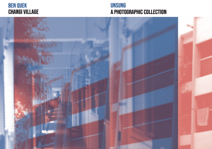
Mock Up #1

As Changi Village is iconically red, I decided to try a combination of red and blue instead of using fluorescent pink. Blue would remain as my chosen dull colour as I wanted the “reality” to be represented by a melancholic and sad colour. In the end, apart from being aesthetically disgusting, I felt concept #1 was falling apart.
Perhaps it was the way I shot my photos (not representative of Changi), perhaps it was the colour scheme? Or maybe it was just the way I edited the photos. Ultimately I decided that the way I was going about it was not achieving satisfying results.
Mock Up #2
Even after the implementation of more fluorescent colours, and playing around with the angles and more strategic impositions, it was still not working out!
CONCEPT #2
However, through the process of re-creating “risographic images”, I stumbled upon an interesting realization.
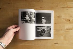
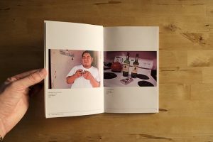
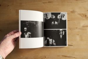
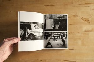
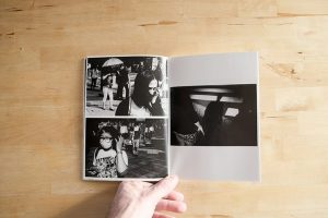
My photo manipulation techniques had a way of making photos appear somewhat vintage and old. Here are more examples: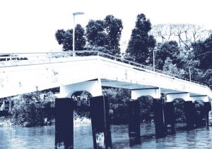
CAN YOU BELIEVE IT!? WOW!!
Using these ‘Pseudo Old’ photographs, I built upon concept #1
Transience of Locale -> Under-appreciation -> Forgotten -> Remembering
I thought about an old Photographic vintage album; because what better way to observe and reconnect with what we took for granted in the past? Photo albums have a way to evoke a sense of nostalgia and reminiscence especially over the things that are now gone.
Nostalgia and reminiscence are strong emotions that can often trigger a desire to relive memories and past experiences.
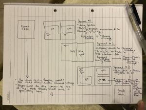
From my draft I planned:
Pg 1&8 – First thing you see (Full Spread)
HDB Blocks & Signages
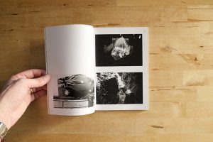
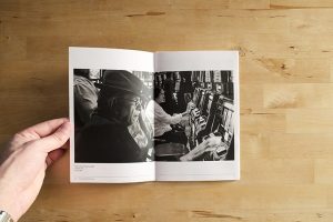
Pg 2&3 – Prominent aspects of Village area
Hawker Centre
Fishing Stalls
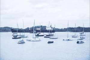
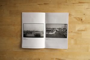
Pg 4&5 – Iconic Changi (Full Spread)
Changi Creek Bridge
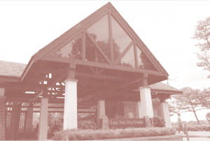
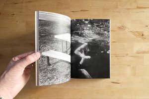
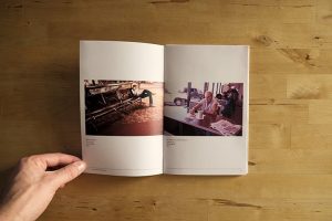
Pg 6&7 –Prominent aspects of Sea area
Changi Sailing Club
Bumboats
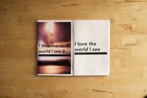
Changi Beach Park (Epiphany)
Bear with me, I know I’ve talked a lot, I will give a detailed explanation of my layout in a while!
Wanting to stay as true to the photos as possible, I decided that my zine would have elements akin to a ‘Lookbook’ nicely composed images with minimal typography and information. I wanted a clean minimalistic design. Hence, I referred to a few more works by designers, and also more minimalistic works from Pinterest and Google.

After looking at a few examples online, I felt ready to start again!