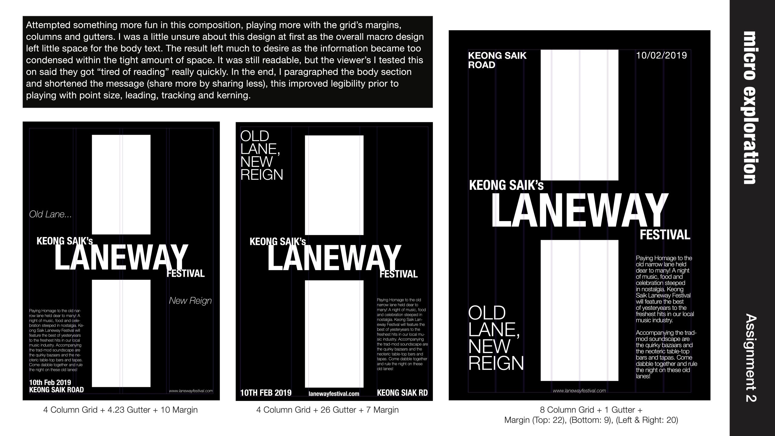
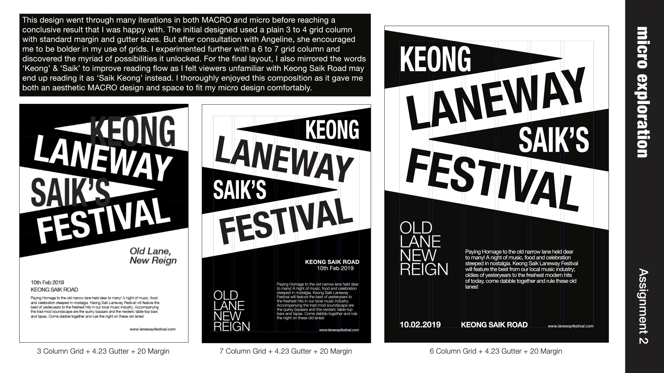
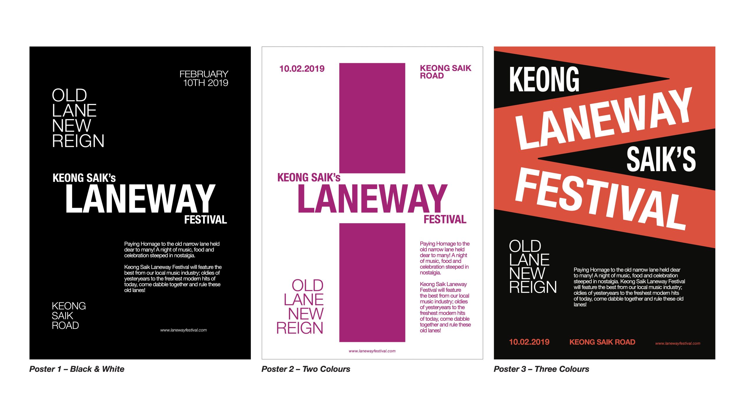
Task II | Typography I
For this assignment, we had to envision a mock festival/event that was going to take place within the space of research we did in task 1; for me, Keong Saik Street. We had to create a series of poster designs that would serve as publicity for out imaginary event. There were four guiding principles we were to adhere to:
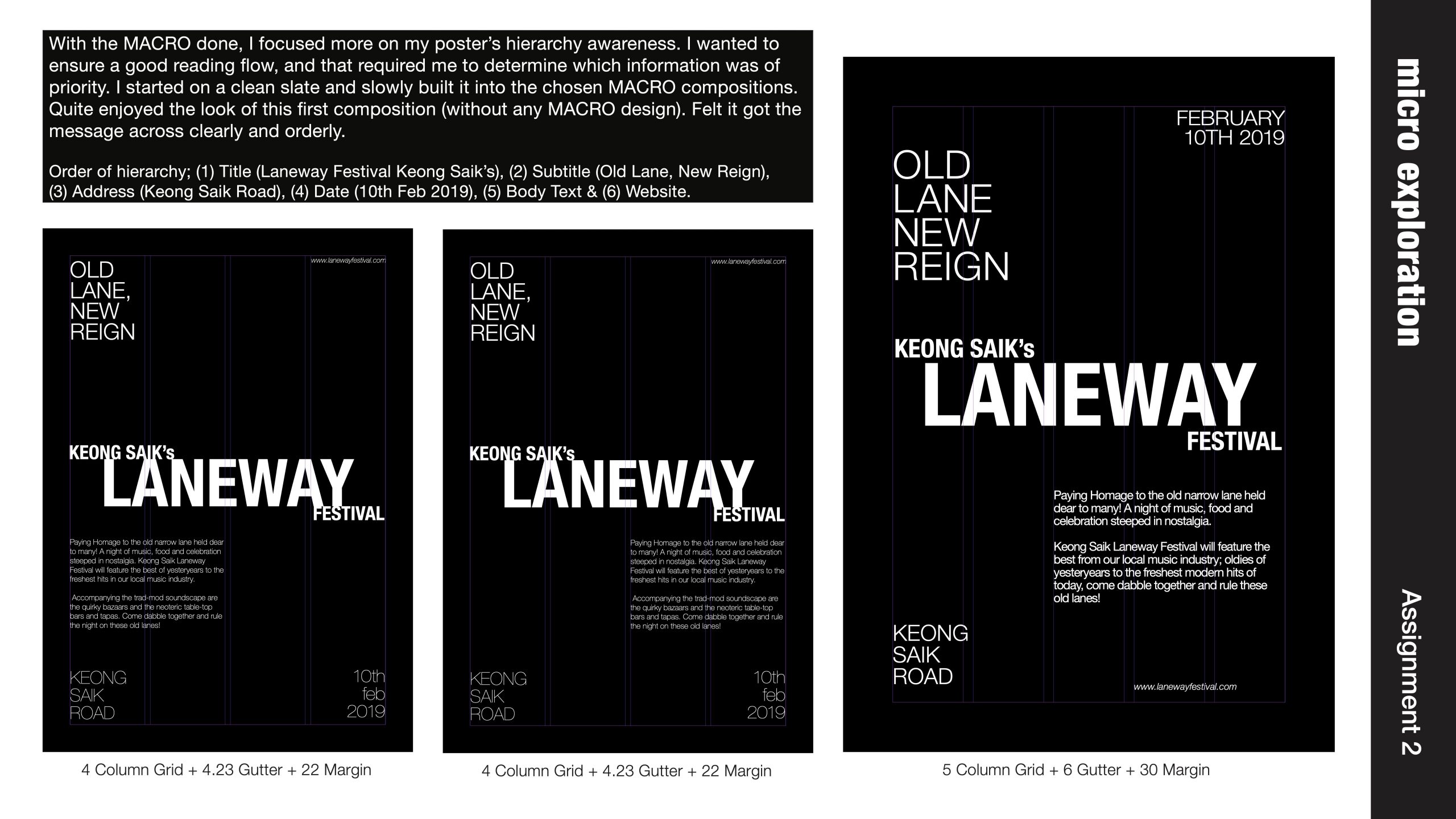
1) 6 content element:
– Title
– Sub-text
– Address/Location
– Date of event
– Website
– Body-text/Information
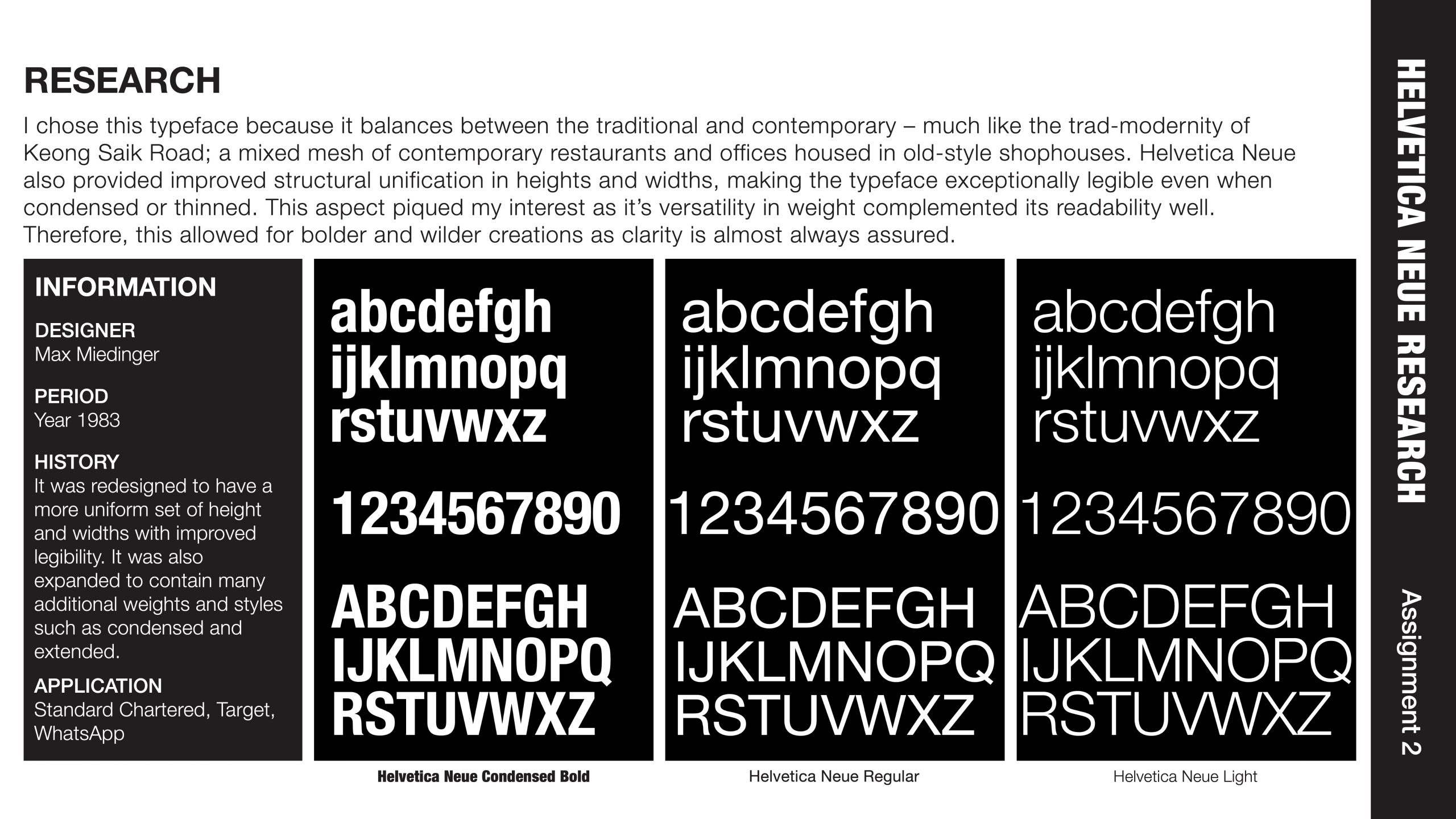
2) Use of only 1 Typeface:
– Serif or
– Sans-serif
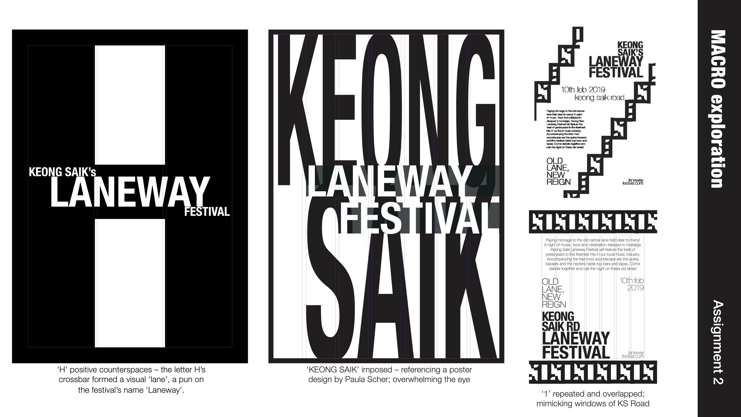
3) Purely typographic base posters:
– No images
– Visual patterns had to be derived strictly from typographic forms only
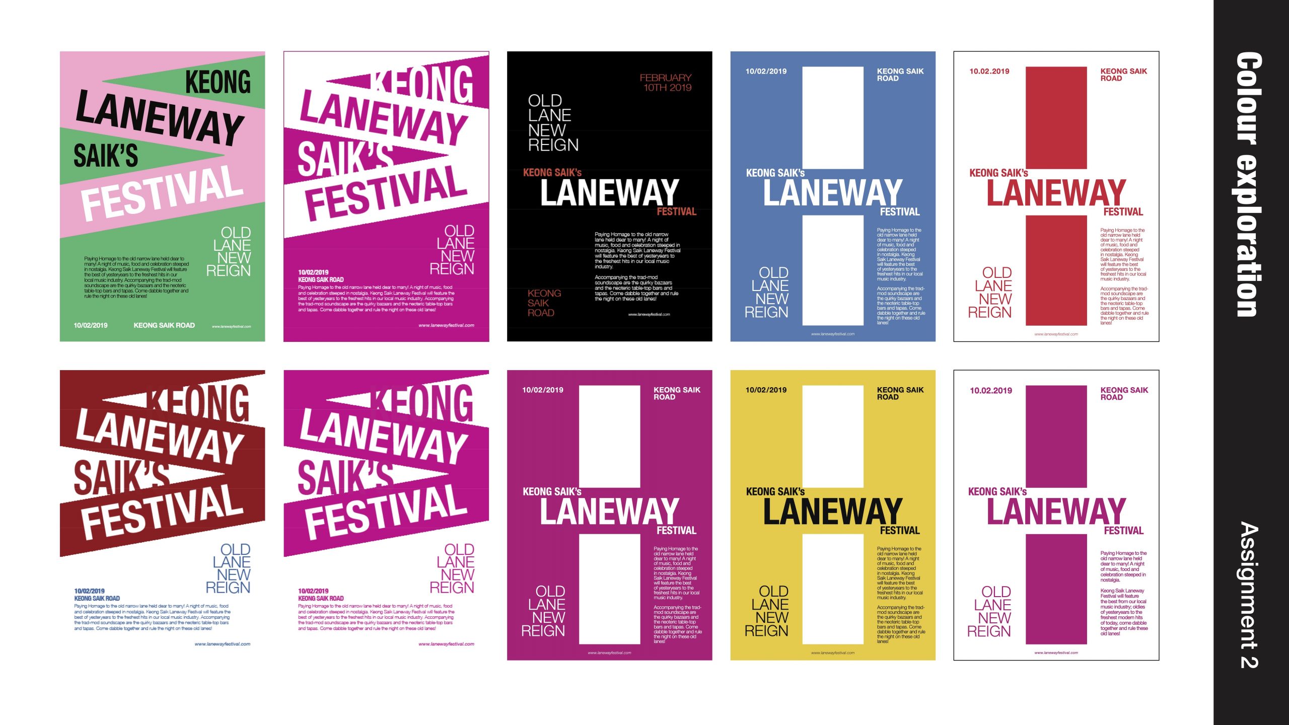
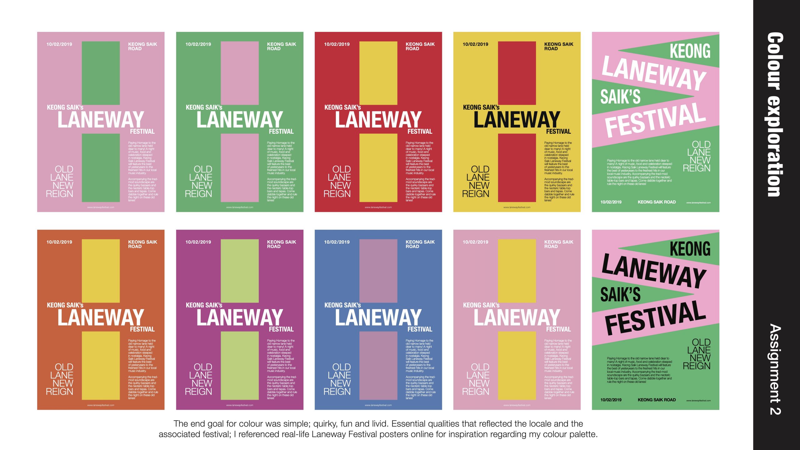
4) Progressively coloured:
– 1st Poster (B&W)
– 2nd Poster (2 Colours)
– 3rd Poster (3 Colours)
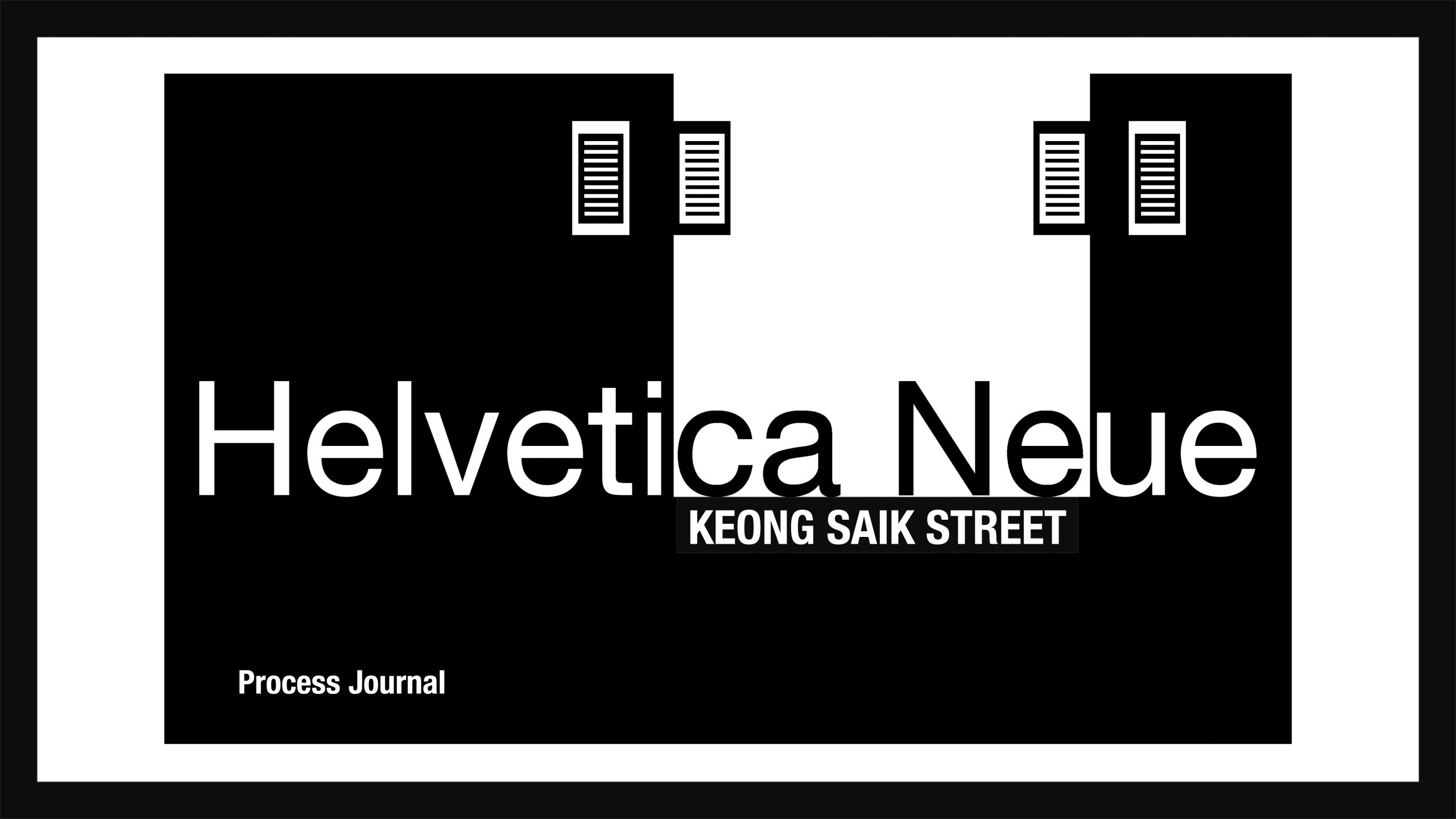
Process Journal

Attachment to high resolution pdf:
Click here to download Process Journal pdf
Final Posters


Attachment to high resolution pdf:
Click here to download Final Poster pdf