2DII – Que Sera Sera Final

taking in comments from Mimi from last consultation, i decided to do food styling with photography for my final pieces.

the art direction with my final approach is a clean, not overdone, simple straight to the point styling.

before doing it, i had to study more on the kitchen environment of chefs, and their choice of utensils.

1. Pasta Chef

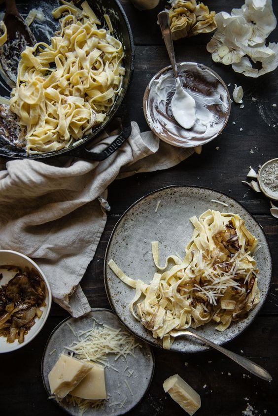
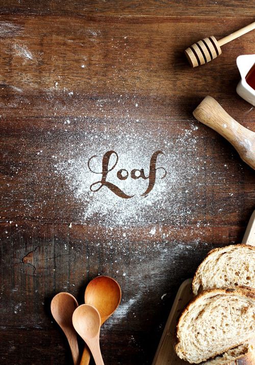
i looked at some images on pinterest to look at food styling but i felt that they were very rustic image driven, which is not the direction im heading for.

4d68744b7e791f8da1d175fc0cda2be0 14f0283a0c61e5952019c3745ff68443 66dc074e580673bdd04a42f8820caf49

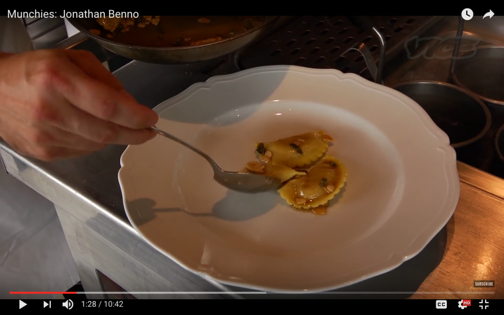
instead of looking at stylized visuals of food styling on pinterest, i looked beyond them by studying videos of chefs cooking pasta to see what type of utensils they use for their cooking.

screen-shot-2017-02-16-at-5-10-21-pm

i started seeing crockery such as tongs, spoons, the pan used for cooking the pasta, a white plate.

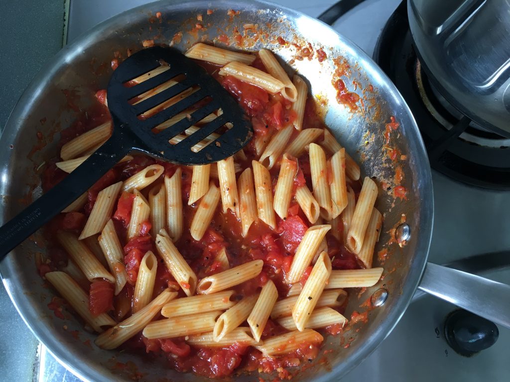
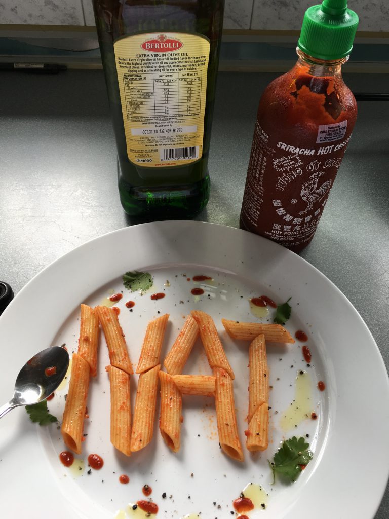
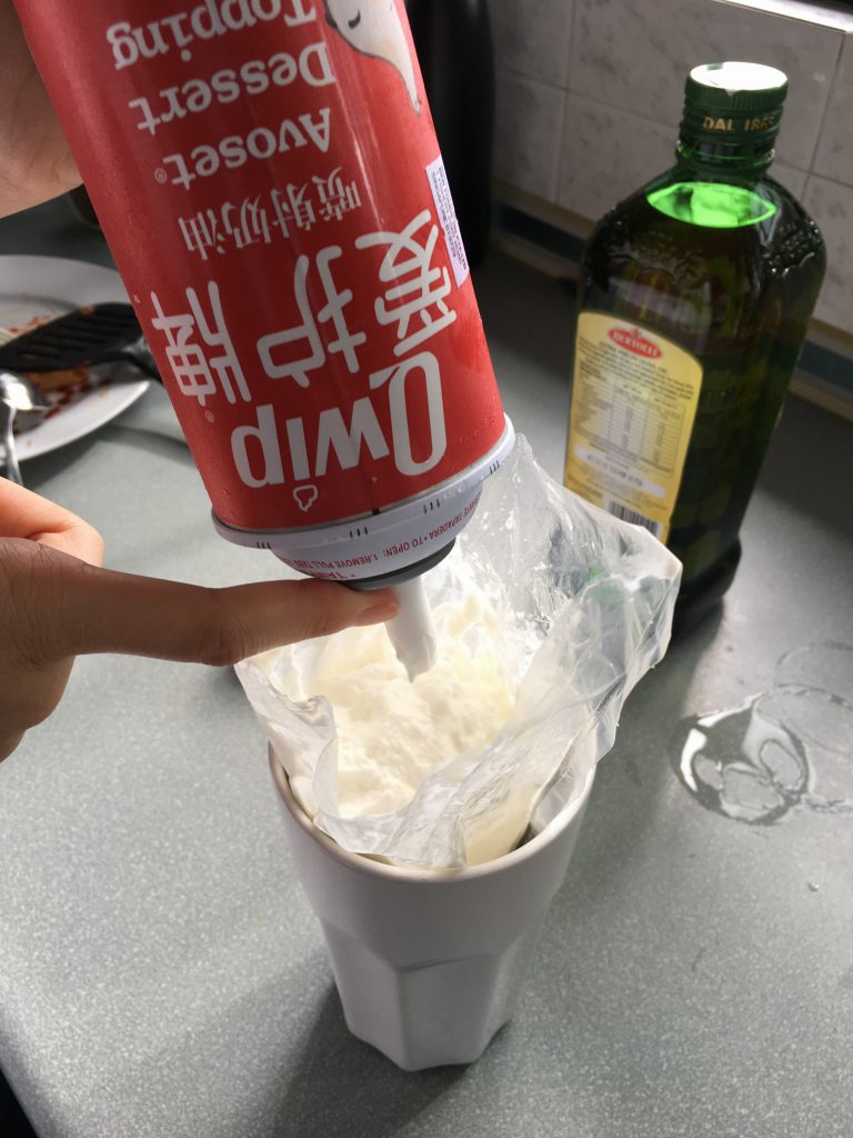
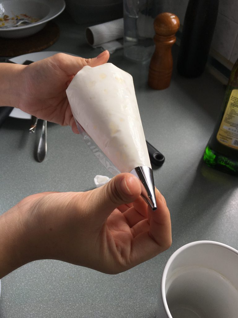
some of my process photos of executing my final work –
img_7527
(mounting boards are useful)

img_7526
img_7528 img_7529

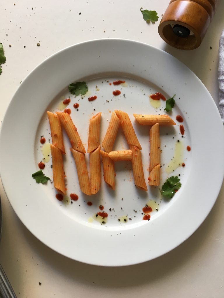
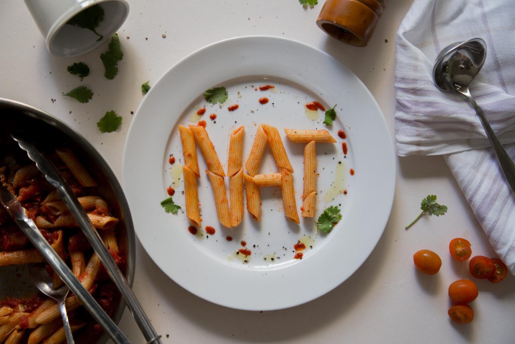
final outcome –

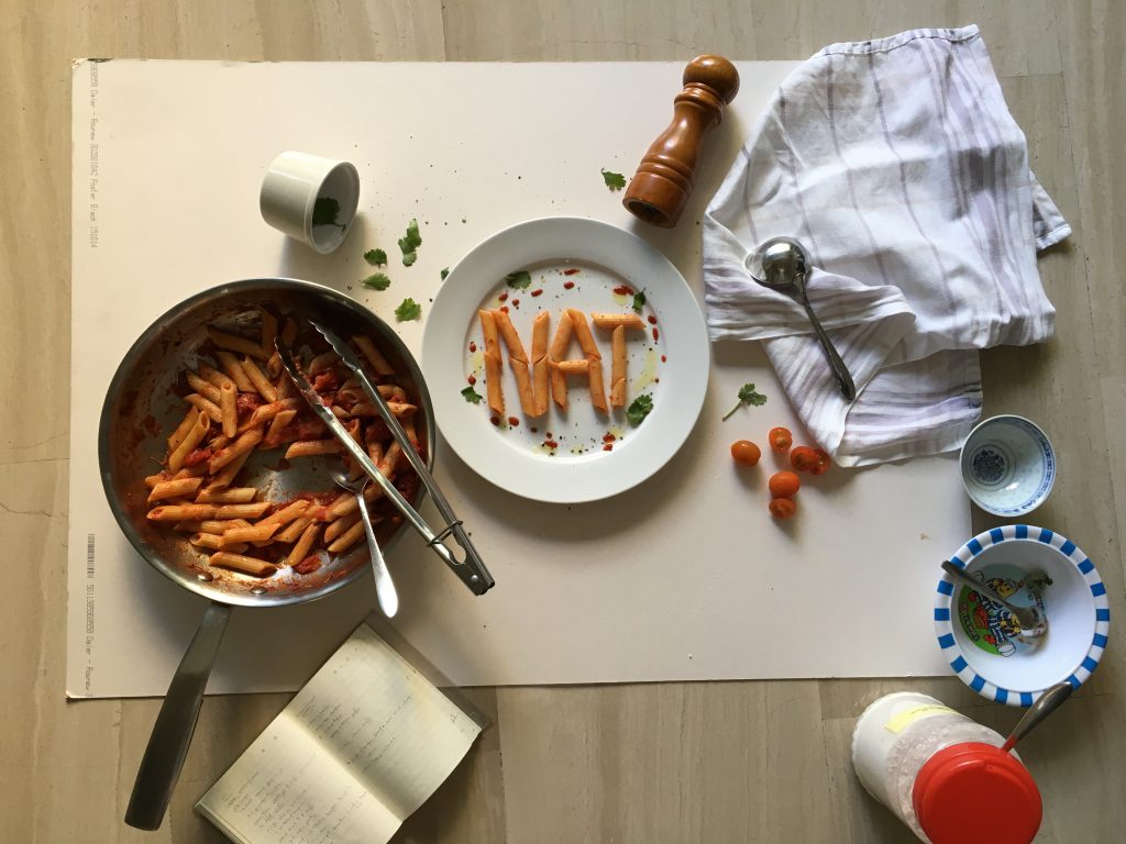
natcheng-adm-foundation-2d-typography-120217-2794-3

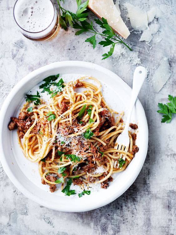
i used penne this time because it was way easier to control than spaghetti. i stylized the plate with tomato sauce (in reality its actually chilli sauce in a squeezable bottle), black pepper and corriander to give it not only a pop of colour, but also because they are relevant to the dish. the pan, tongs and spoon are placed halfway at the corner of the image so to not steal emphasis of the image. the cloth is placed because chefs usually clean the edge of the plate with it. i decided to place the ladle on the cloth because when i tried placing it on the bottom right during the styling process, it looked odd as there were too many silver cutleries on the bottom of the image, making it look heavy and uneven.

2. Pastry Chef

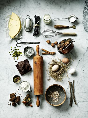
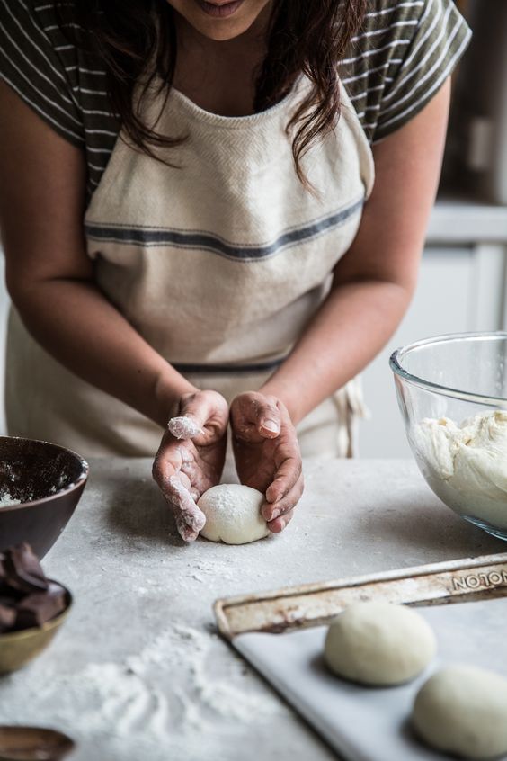
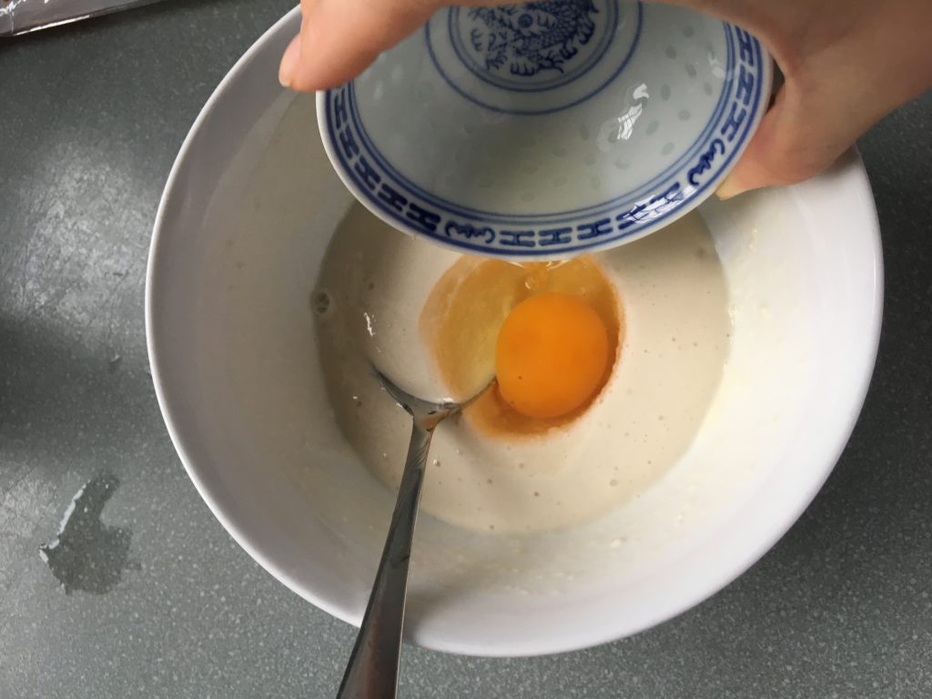
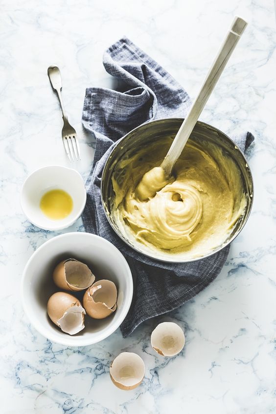
for pastry chef, it was slightly easier because there were a standard few crockeries that are mainly used. before researching i knew some elements that i could already play with – flour, eggs, whisk. 33df66c507cdcd995a32e3878f3d3063 106f2386a29dbd3626bda3d5809419ab 2154eba22499d3e9d6ffff59076753e6
process photos-

img_7532 img_7538 img_7542

final- 

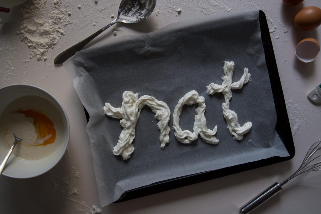
natcheng-adm-foundation-2d-typography-120217-2804-2

my name is created using whipped cream. the whole situation of the image shows the process of a life of a pastry chef. the supporting elements- whisk, bowl of batter, baking paper and tray, cracked eggs, flour and spoons. i scattered flour on the surface to create a more natural visual look of the image.

3. Grill Chef

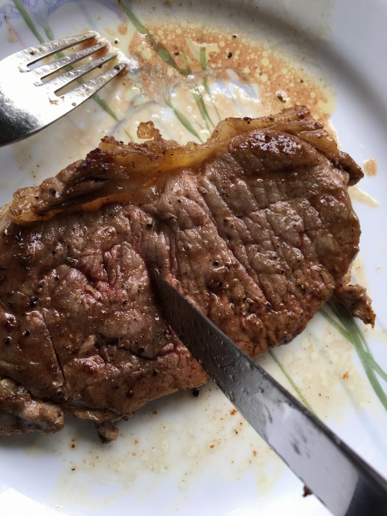
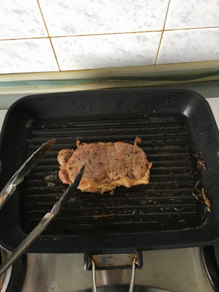
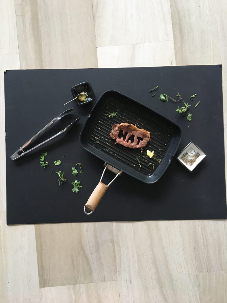
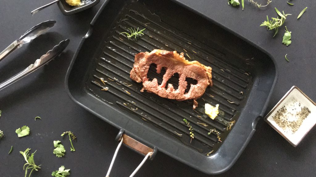
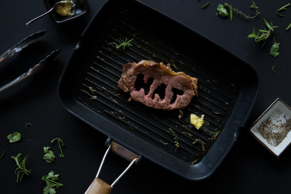
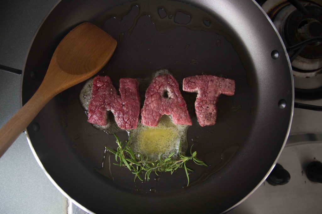
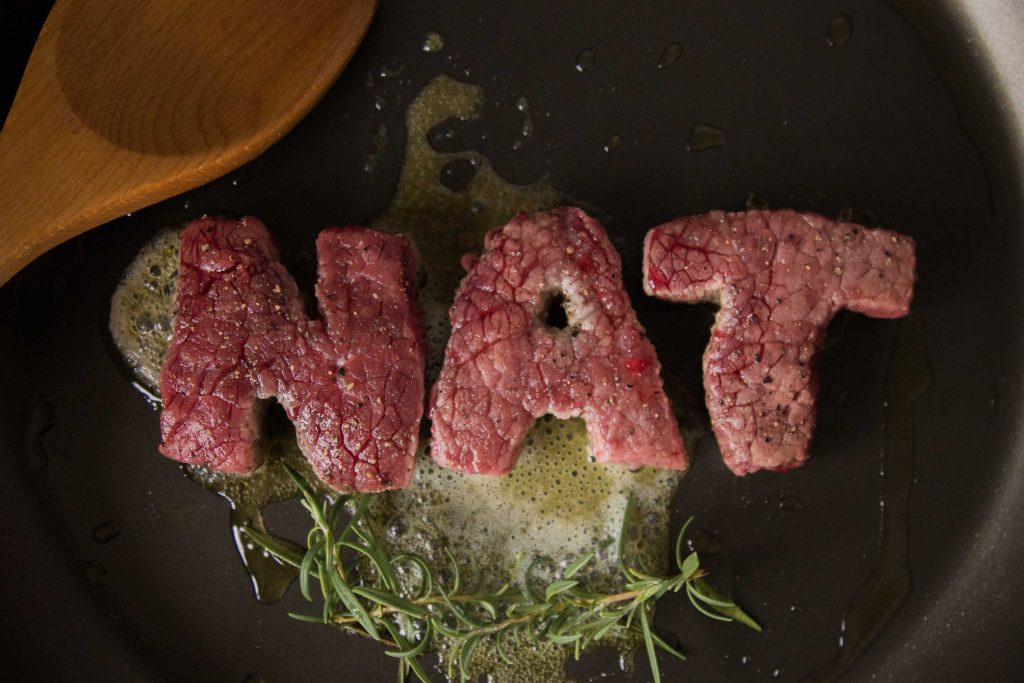
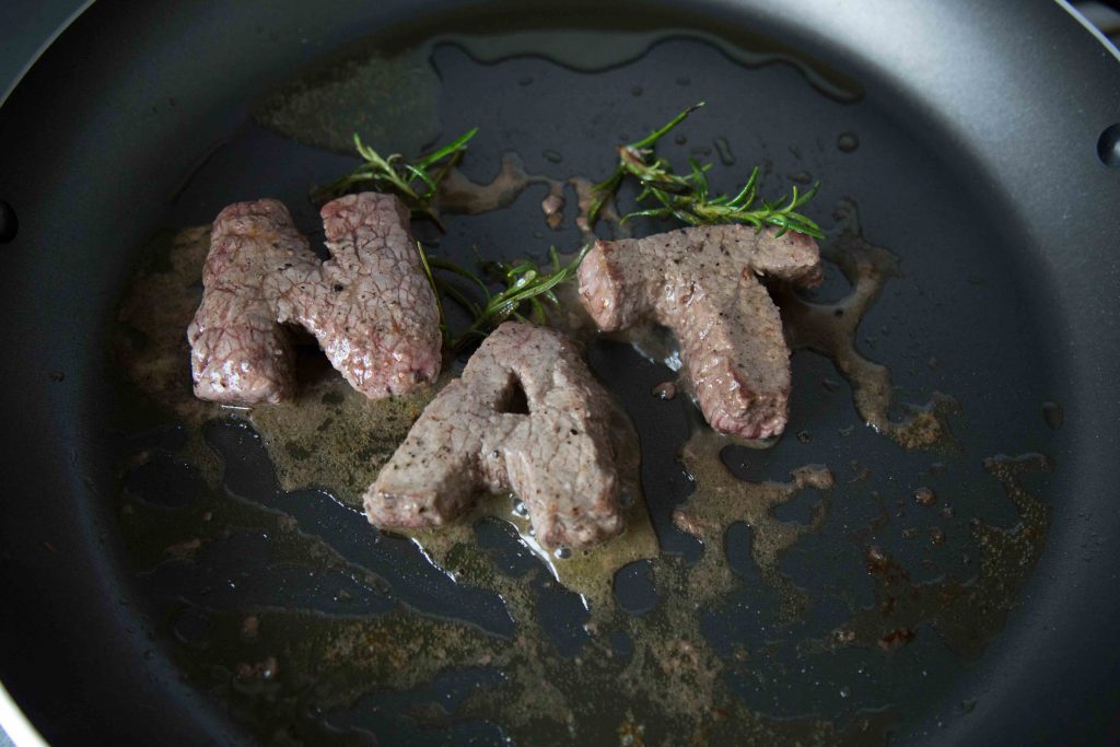
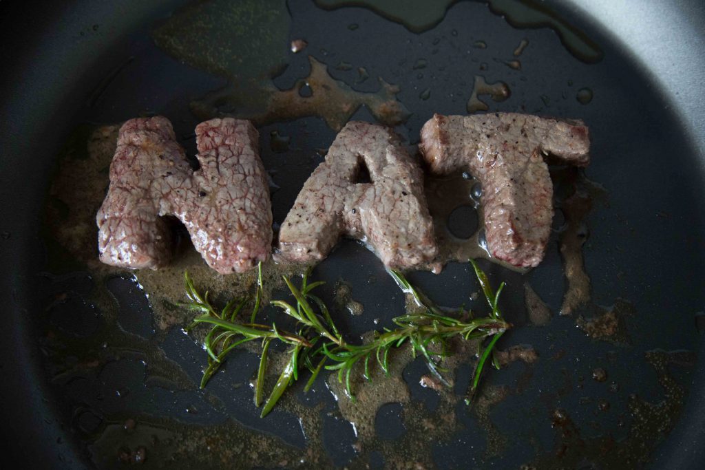
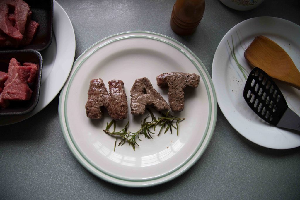
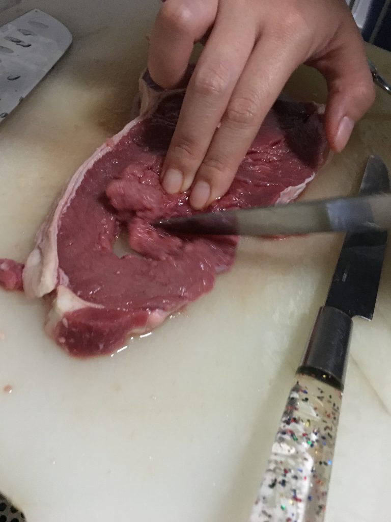
in my previous 2 attempts (see previous 2 posts), they were names cut out from pieces of steak. as Mimi mentioned it was too direct, and creating grill marks on the grill is not possible, i decided to go towards a different approach this time by cutting my name on the piece of steak after cooking it. prior to this, i tried cutting my name when its raw, but it was impossible because of the tendons on the meat that made it impossible to cut through. i used a black background for this because i felt that it gives a better contrast with the green herbs. it also allows the steak to pop better, and i felt that it fits the mood of a grill chef – ‘dirty’; ‘unclean’ so to speak.

process photos –
img_7566
carving the letters out on a raw piece of meat is impossible
img_7588
scoring the letters


img_7586 img_7590 img_7591

i studied on how chefs cook their steak and the proper way of doing it is to baste it with melted butter with herbs, hence the herbs and butter on the grill pan. the types of saucers used for the butter and salt & pepper is for contrasting purposes. i felt that yellow butter on a black saucer would fit better, and salt&pepper would fit better on a white one.

final – 

natcheng-adm-foundation-2d-typography-140217-2843-2

4. Executive Chef

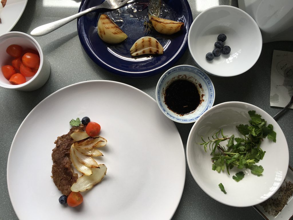
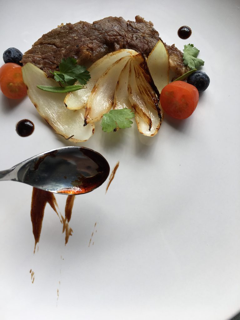
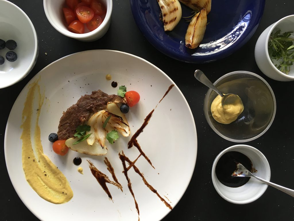
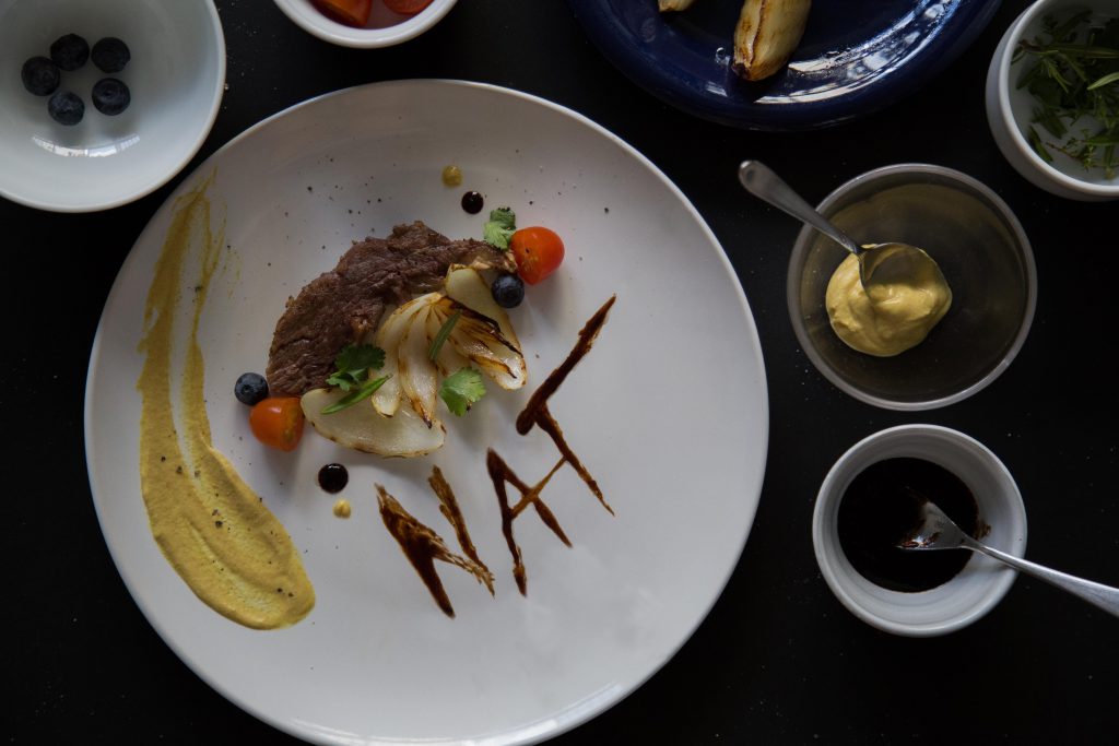
executive chefs are the ones who plate the food before serving. this was a fun one for me to do actually because i had the chance to plate food and make them look pretty for the first time. but before doing it i have 0 knowledge on it so i watched some videos on how to do it.

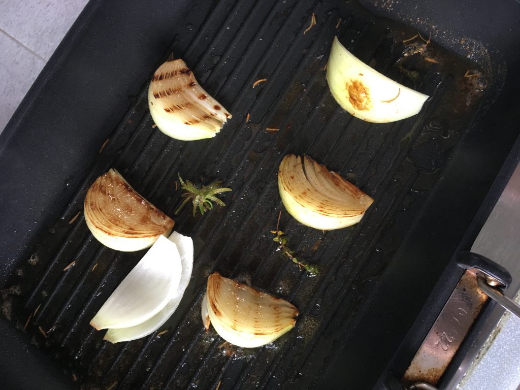
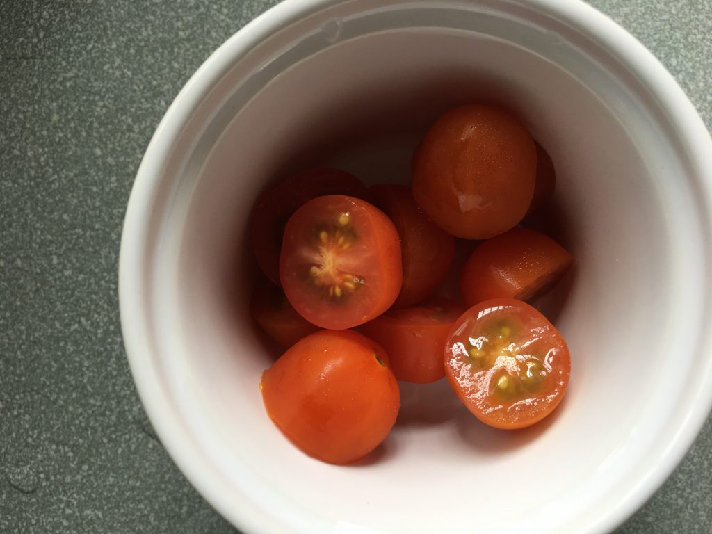
i used a piece of meat from the steak i cooked for the grill chef because dont waste food!! i decided to rummage through my fridge and found half a un used onion, some cherry tomatoes and blueberries. and there, a dish is created.

process photos –

img_7592 img_7593 img_7594 img_7595 img_7598 img_7603 img_7605 img_7607

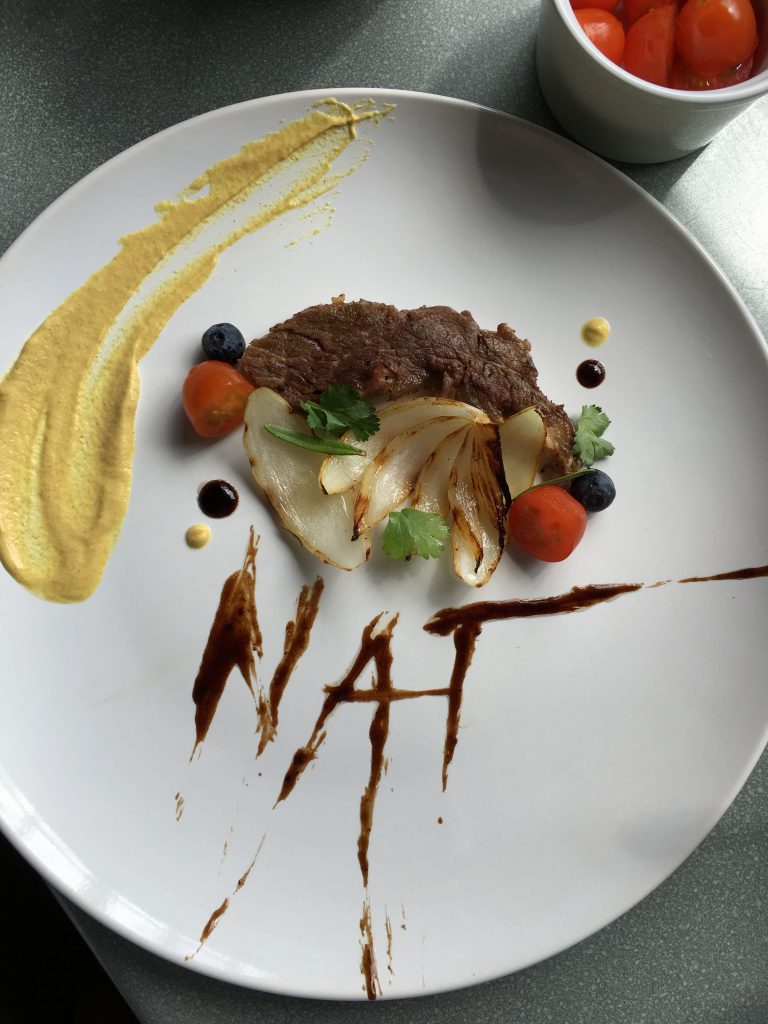
final-

natcheng-adm-foundation-2d-typography-140217-2854-edit-2

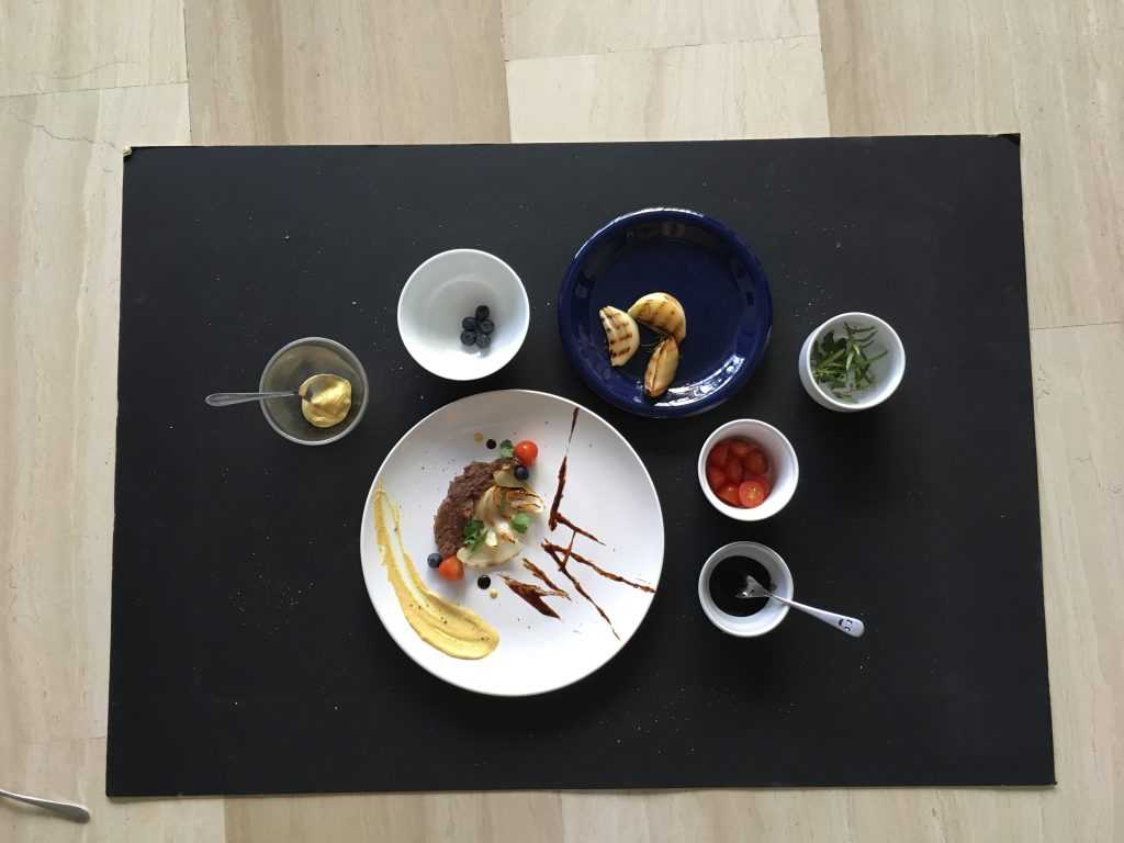
the tomatoes, blueberries and mustard gave the entire dish a pop of colour, which is what i wanted. the herbs are used for garnishing. the char on the onions gave another level of colour and depth to it. the plate is surrounded with the sauces and garnishing because i realized that chef needs their elements close to them. i also realized that the elements are given in an entire serving. i came up with the idea of using the sauce to form my name because sauces are always used during plating, and i felt that it was the most interesting and relevant to the entire job scope of an executive chef.

some research ive done

““Aside from taste, we eat food visually. The first thing I think about is coloring: You want to have a nice balance of color on the plate. For example, we serve a skate wing at Hinoki & the Bird that is served with bright orange sambal sauce on top and plated on top of a banana leaf. The skate wing doesn’t need a banana leaf on the bottom, but it’s nice to have a contrast of color—chili sauce is orange and green sets it off. It brings the plate to life.”—Kuniko Yagi, chef, Hinoki & the Bird, Los Angeles”

&

https://www.fastcodesign.com/3050217/how-to-plate-food-like-a-3-star-michelin-chef

the plate is surrounded with the sauces and garnishing because i realized that chef needs their elements close to them. i also realized that the elements are given in an entire serving. i came up with the idea of using the sauce to form my name because sauces are always used during plating, and i felt that it was the most interesting and relevant to the entire job scope of an executive chef.

i plated my food on the side of the plate because its creates a good composition and visual pleasantness. i also used a white plate to create a fine dining look.

to conclude this project, i felt that this was the most fun as i get to work with new mediums. ive learnt how to art direct a food shoot, and also get to experiement with food + learn food styling. i’ve also learnt that “its all about the idea, followed by a well executed job.” – Mimi 
2DII – Que Sera Sera Process #2

after the last consultation with Mimi, i had lots of comments to take in to rethink about my idea.

this round of trials, i had an idea of incorporating the element of my hand into the images, to show the current action of making.

1. Pasta Chef

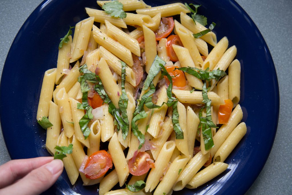
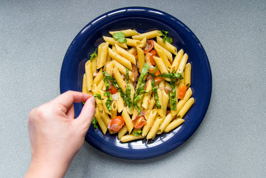
natcheng-adm-foundation-2d-typography-090217-2702natcheng-adm-foundation-2d-typography-090217-2686

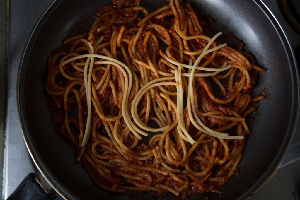
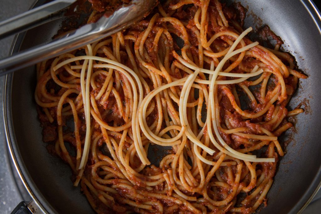
taking in advice from my classmates on using tomato sauce, and creating my name to standout, i created this.

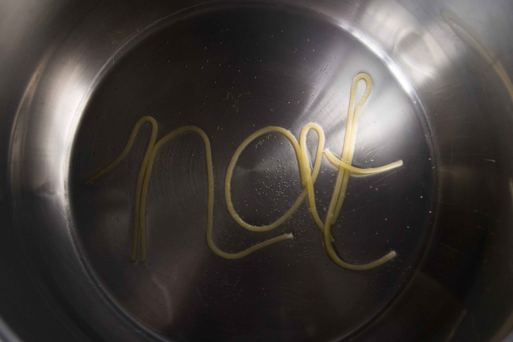
i felt that using the spaghetti to form my name in the right context (in this case in a pan of spaghetti) would create the ‘ah hah’ moment that Mimi referred to. unfortunately Mimi said it didnt look appealing, and at the same time nothing to shout about.
2. Pastry Chef

natcheng-adm-foundation-2d-typography-090217-2738 natcheng-adm-foundation-2d-typography-090217-2743

okay i have to be honest that this didnt turn out as what i expected. the typography turned out quite ugly, and the execution isnt good. Mimi agreed with me and i had to rethink again.
some process images on how i created my failed outcome.

img_7423 img_7424 img_7425 img_7426 img_7427

3. Executive Chef

natcheng-adm-foundation-2d-typography-090217-2711 natcheng-adm-foundation-2d-typography-090217-2714

the executive chef is the one who garnishes and plate up before allowing the waiters to serve the food. i chopped up some basil leaves and parsely to have my name formed. Mimi said that my name looks a little thin and there isnt a need for the hand.
4. Grill Chef

natcheng-adm-foundation-2d-typography-090217-2757

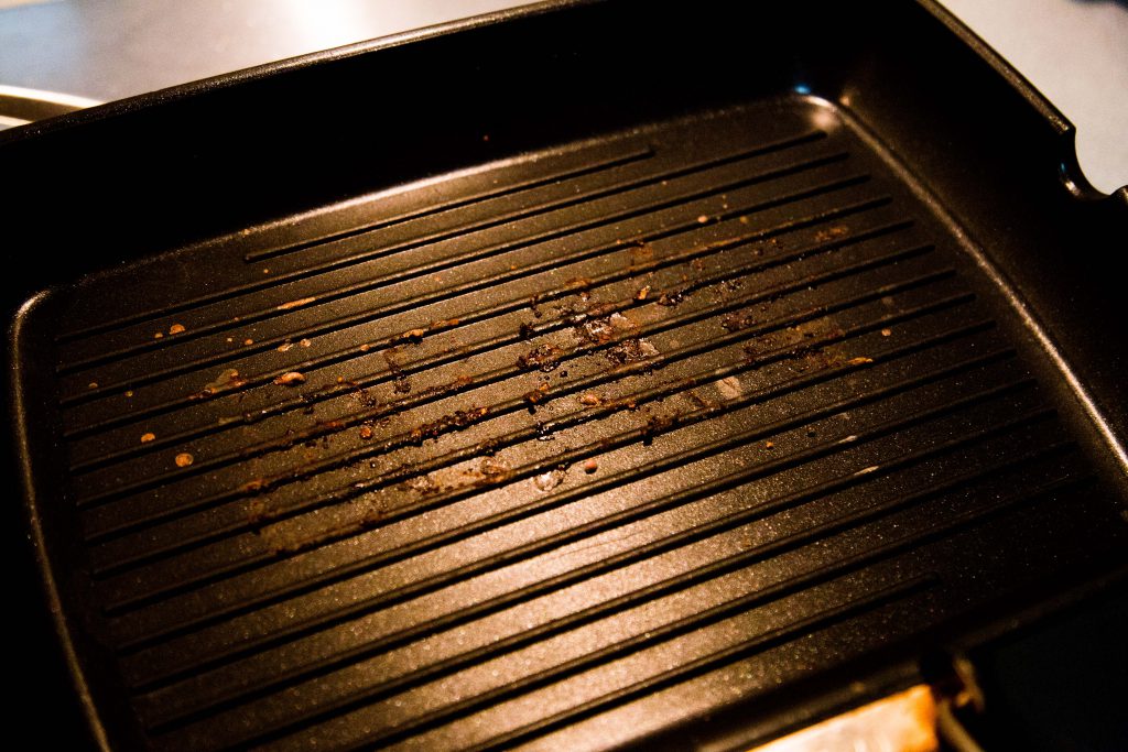
in the previous consultation, i thought Mimi meant that i should create my name using the burnt char marks left on the grill pan. but no, thats not what she meant. anyway, i tried having the burnt marks on the pan but it didnt turn out obvious enough.
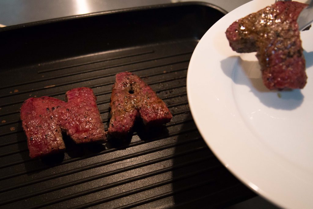
natcheng-adm-foundation-2d-typography-090217-2761 natcheng-adm-foundation-2d-typography-090217-2777

i didnt want to waste the cuts of meat again so i tried to see if putting them on the pan, with the tongs would be better.

at that point i was really lost. i didnt know how to proceed further. Mimi told me that my work has to be believable, they have to look like its done my a proper chef and in the context of a real kitchen in an expensive restaurant. my execution has to be good, and it has to look like it comes from a page of epicure magazine. it could be food styling, or it could be really good DI of food typography. all in all, the art direction has to be thought out, and my photography has to be good. the choice of utensils has to be well thought out as well as they are the details that speak that they’re in a context of a restaurant.
 

2DII – Que Sera Sera Process

prior to this, i had a few different ideas on my job scope. some examples such as florist, photographer, barista, etc.

i did some research on some examples i could find on the internet and had some ideas.

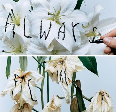
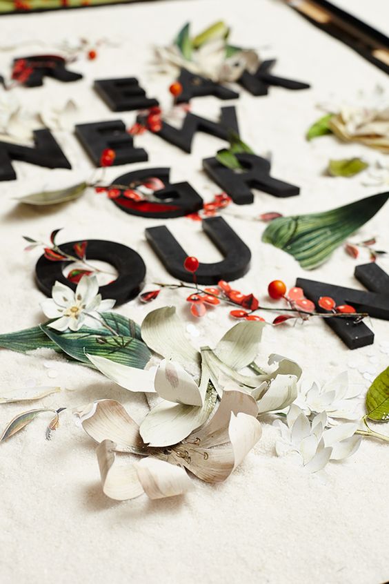
florist –

2d8e3098765b2e419bfa8bccb39fb8d1 2df07841d6ee48d0b3335b40742a9453 2115cf2f32e47b5eb61e5e087a9ea93b f245e3b692e2c9fa03ecd6e668448da7

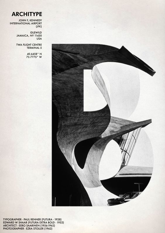
photographer –

8520b9950acd4b2770dc4a2d6c5c6cfb

2c67312694e1df06a5c9e40978c17b5d

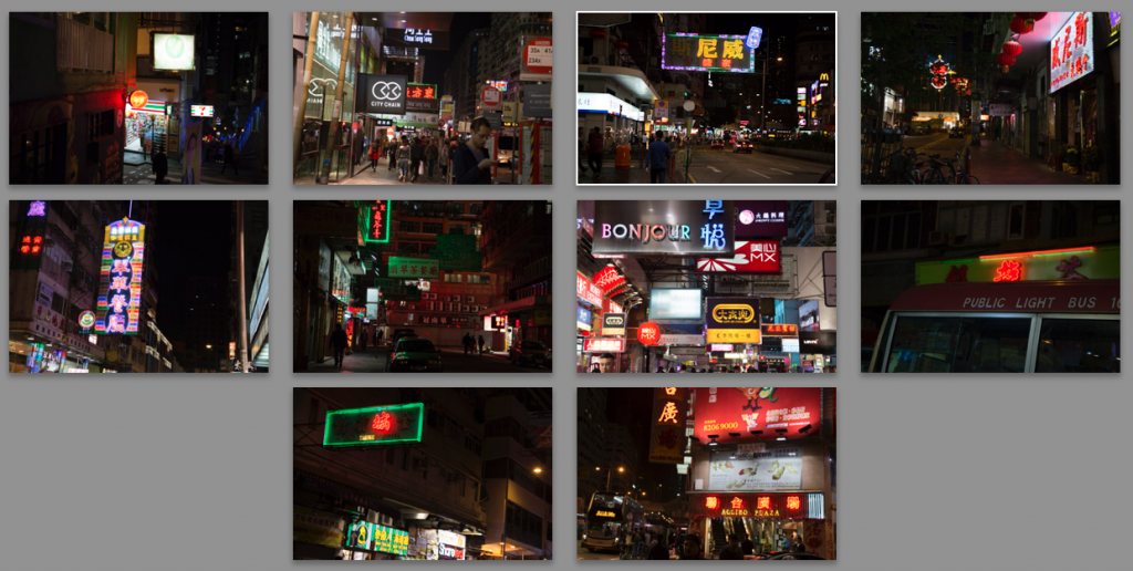
i had an idea of using the edges of signboards to form my name using photos i recently shot of during my trip to Hong Kong during the Chinese New Year.

screen-shot-2017-02-16-at-3-26-22-pm

i wasnt really clear on how to proceed, but it was just an idea. i asked my friends about it and they mentioned that its gonna be tough because of the angles of my signboards, and also it doesnt really protray me as a photographer, but more of a neon light artist.

after a few days of conceptual thinking, i had an idea to focus on one type of job then branch it out. finally, i decided to focus on a being a chef, but branching it out to 4 other different types.

i did some visual research on pinterest –

7b91f1e14b6753945d8004a6294acf46 9d6baa97cc0ff3e639cab6c02a140d5b a35a81acb4451a229583f78bf97ea281 d473d883367b31d717ea34fc4bc7733c

there were a few chefs i had in mind:

sushi chef, steak chef, sous chef, pastry chef, executive chef (the one who plates the food), pasta chef, vegetable chef.

i settled on pastry, pasta, executive chef, grill chef.

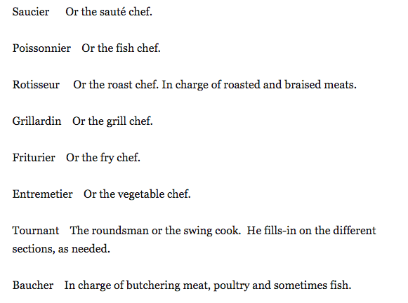
i felt that my knowledge on the types of chef werent strong, so i decided to do a research on the different types of chef. these are some examples of what i found.
screen-shot-2017-02-07-at-4-23-09-pm

from this, i decided to focus on Grill Chef, Pasta Chef, Pastry Chef, and Executive Chef.

i did some studies on pinterest hopefully to get some inspiration from existing works.

5a74d75f5847712ebd8f13d6a2b29131 6e4b3661a7eafa88dbd7fe2323915e07 9fcf38e3e13f829650ceb2c93ea70f2c 71c947482e3302d581e92a04bfff399a 130170a0703dbb9a8ce1333bd830331d 678634937685ad9ddf8405348ee15070 b0ddcca1e85d2f5a8b2d76f327079f98

i appreciate the cleverness in the play of words with the visuals. unfortunately this project is based on our names, so creating a clever play on the words is out of scope.

i did some initial tryouts –

1. Pasta Chef

natcheng-adm-foundation-2d-typography-020217-2586
pasta chef

this is an initial idea of a pasta chef. i had an idea of having pasta in a pot of boiling water as the concept, but Mimi advised me to have it more complex and not too direct. she also advised to use different types of pasta because spaghetti is a difficult medium to control.
my classmates gave me some advice that i could experiment with other types of noodles like ramen or penne. they also said that i could use tomato sauce as a background to make the image pop (yellow on red).

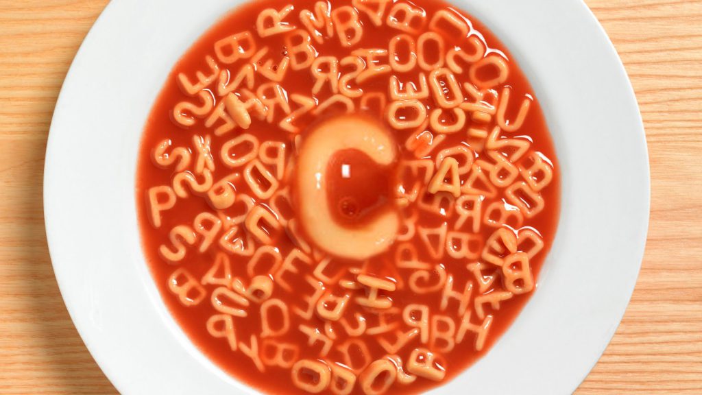
i had an idea on playing with the alphabets found in alphabet soup. is-google-drowning maxresdefault

i could try and elevate this simple concept into something more visually appealing.

2. Pastry Chef

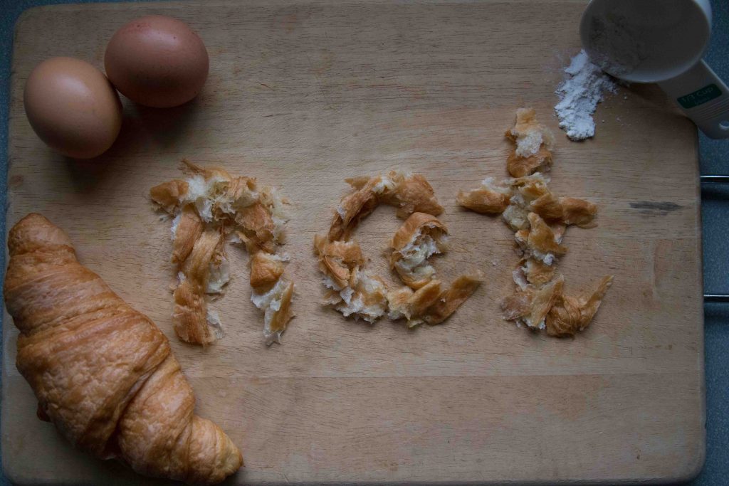
natcheng-adm-foundation-2d-typography-020217-2636
pastry chef
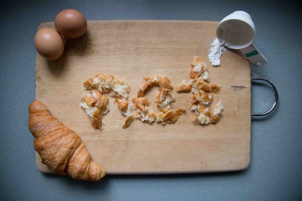
natcheng-adm-foundation-2d-typography-020217-2626
general visual

this is my initial version of a pastry chef. i really liked how it came out but Mimi said that it only looks pretty; there is no deeper concept behind it. she also pointed out that tearing up a croissant to form my name doesnt prove my role as a pastry chef because (which pastry chef tears up their work?), which i agreed with her.
3. Grill Chef

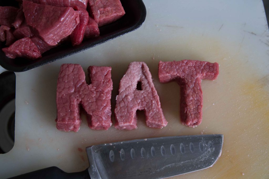
natcheng-adm-foundation-2d-typography-020217-2591
after cutting
natcheng-adm-foundation-2d-typography-020217-2601
frying process

natcheng-adm-foundation-2d-typography-020217-2593natcheng-adm-foundation-2d-typography-020217-2602natcheng-adm-foundation-2d-typography-020217-2611natcheng-adm-foundation-2d-typography-020217-2612natcheng-adm-foundation-2d-typography-020217-2620

similar to the previous 3, Mimi said that my outcomes didnt really have any conceptual depth to them. she suggested that i use the grill marks to create my name because all im doing now is approaching the execution too directly, and thats too simple.

generally, Mimi told me to think of my concept in a depeer context, and create that ‘ah-hah’ moment.

4D II – Silent Love

in my previous post on characterization, i’ve picked Jamie Oliver and My Dad as my 2 characters. but upon much consideration, i’ve decided to change them to My Dad and I.

as mentioned in my previous post on my dad, the love my dad shows is selfless and unconditional. he is a person who gives more than receive, which is something i admire about him.

but the funny thing about the love relationship between my dad and i is that we never express them loudly. we hardly open up to one another, but we express our appreciation through little acts of kindness. you could call it Silent Love.

just like my dad, i am an introvert. i tend to keep things to myself. prior to this assignment, i’ve taken a personality test (Myers-Briggs Type Indicator) and my results came out as an…screen-shot-2017-02-07-at-12-33-54-am

this was really accurate to my personality. i’d say im generally a shy person, sometimes i struggle when expressing my feelings to my close ones because of shyness, hence resulting in being misunderstood.

so in this assignment, i thought it’ll be a good idea to cave out and portray the relationship between my dad and i through the act of giving. (because saying i love you for us is… tough.) this act of giving my dad my food silently is often a routine, knowing he hardly think twice of giving me the best and his all.

Silent Love

https://vimeo.com/202785910

4D II – Alter Egos

Fictional Characters

  1. Walter Mitty
  2. Hachiko
  3. Chihiro
  4. Einar Wegener
  5. Dory

Public Figures

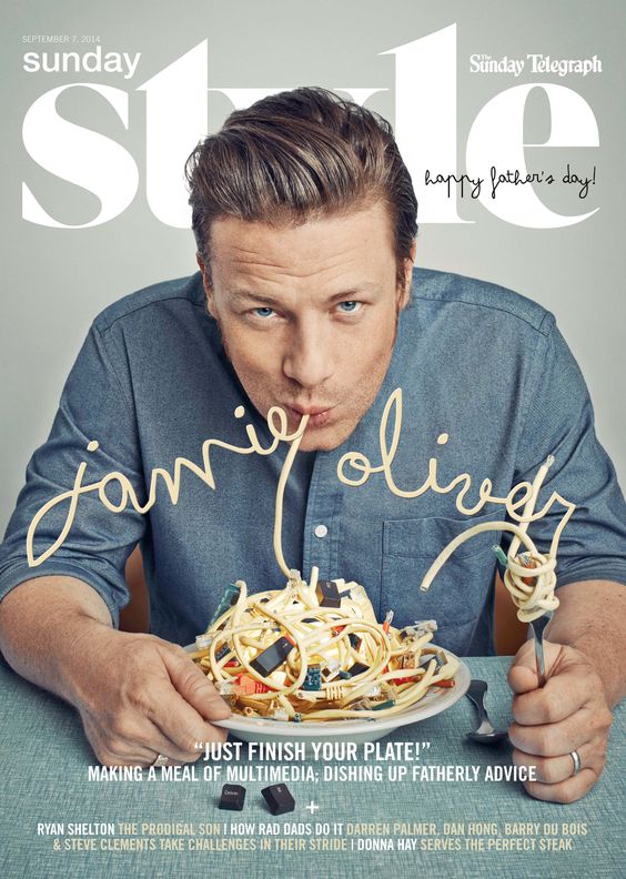
  1. Jamie Oliver
  2. Alice Gao
  3. Ed Sheeran
  4. Ellen Degeneres
  5. Martin Luther King

People I Know

  1. Dad
  2. Grandma
  3. Yan Long
  4. Winnie
  5. Carissa

TOP 3 CHARACTERS and TOP 2 CHARACTER BREAKDOWN:

Walter Mitty

Walter Mitty is a guy of excuses, low self-esteem and dreams about things but doesn’t take action. Walter Mitty is often described as “an ordinary often ineffectual person who indulges in fantastic daydreams of personal triumphs”

Walter Mitty is a negative assets manager at Life magazine who daydreams of adventures. His social life isn’t something to talk much about because he’s quite a boring person. He, however zones out and dreams about personal achievements during the moment.

Walter Mitty has a crush on a coworker named Cheryl. He tries to impress her whenever he can.

Need:

Walter Mitty tries to change to become a person without excuses.  He tries to say yes to things.

Jamie Oliver

James Trevor “Jamie” Oliver is a British celebrity chef and restauranteur. 41 y/o. Born and raised in a village named Clavering, Essex, England. His first job was at a restaurant as a pastry chef where he gained most experience in Italian cuisine. That got him noticed by BBC and resulted to his first tv show – The Naked Chef and got his book #1.

Jamie’s parents, Trevor and Sally ran a pub/restaurant, The Cricketers, where he practised cooking in the kitchen with his parents. Jamie has 2 siblings. He left school at the age of sixteen with two GCSE qualifications in Art and Geology and went on to attend Westminster Technical College now Westminster Kingsway College. He then earned a City & Guilds National Vocational Qualification (NVQ) in home economics.

Jamie Oliver is an activist to have children eat right and healthily. He often initiates campaigns for these purposes.

Jamie Oliver has 5 kids. Jamie also suffers from severe dyslexia. He read his first novel, Catching Fire at the age of 38.

Video on Jamie’s Food Revolution –

Need:

To revolutionize healthy diets to children through changing school meal systems. To challenge the junk food culture by showing that healthy eating is possible. To prove to the world that cooking meals from scratch is healthy, cheap, easy and quick.

Dad

Larry Cheng, 52 y/o. His profession is a business manager. He has 3 siblings – 1 elder brother, 1 elder sister and 1 younger sister. He came to Singapore from Hong Kong for work in 1991. He was 27 years old. He studied at Hong Kong Polytechnic University, obtaining a Professional Diploma in Company Secretaryship and Administration. He regretted not spending an extra year to obtain a degree.

My dad used to work as a banker. He then changed his profession as a business manager in 2004 just so he could spend more time with me. My dad ‘baokaliaos’ in his job. He does most of the work – admin, HR, etc. He is a busy and hardworking person.

My dad and I are quite similar in personalities. He isn’t much of a social butterfly. He has a few groups of close friends and they do catch up once a while over dinner and wine, or tennis sessions. My dad is a reserved person; he keeps his feelings to himself. My dad is an introvert.

My dad loves to cook. He enjoys cooking for the family on weekends. He likes to experiment with new recipes. He is proud with his cooking capabilities. During his free time, he enjoys listening to his Cantonese oldies, or watches astronomy-related videos on youtube. He will get excited when he discovers new sightings of aliens in this world. My dad is a Star Trek fan. My dad plays the piano during his free time as well.

My dad is an all rounder sweet and caring dad. He sacrifices and loves unconditionally.

Need:

To provide the family. Be a happy carefree person. To always be there.


ego – execution

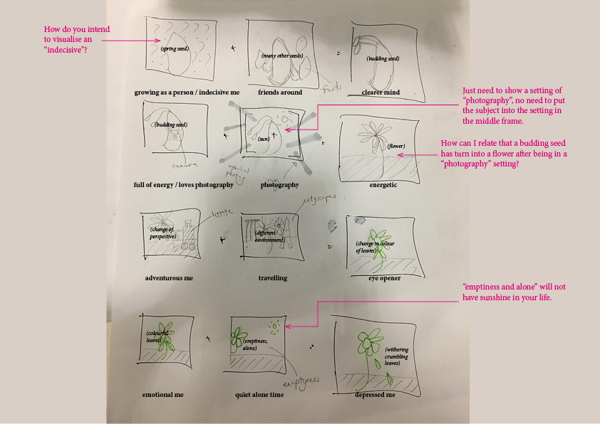
my concept is time based on the 4 seasons. its a series of development of myself through situations in the idea of time passing.

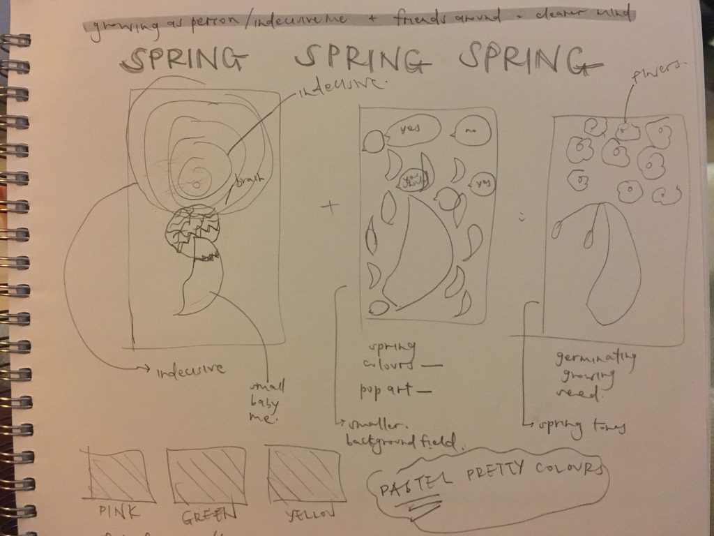
in spring, i start off as a seed. as spring is a season of personal growth, i put myself as a person that grows through making decisions. as im an indecisive person, i require friends to make decisions for me. from that, i can fully breathe and have a clear mind.

spring –

untitled-3-01

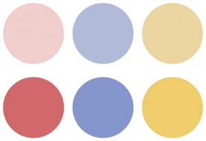
triadic harmony, monochromatic harmony

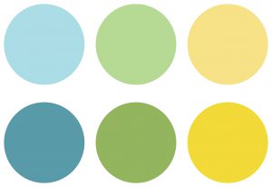
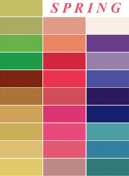
the colours for spring is quite pastel like, pretty and colourful. because my colour scheme is triadic, i had to keep it low tone so it won’t be too jarring.

i took this opportunity to apply some knowledge on colour emotions, previously studied from my study on colour emotions for my presentation.

ego-final-01

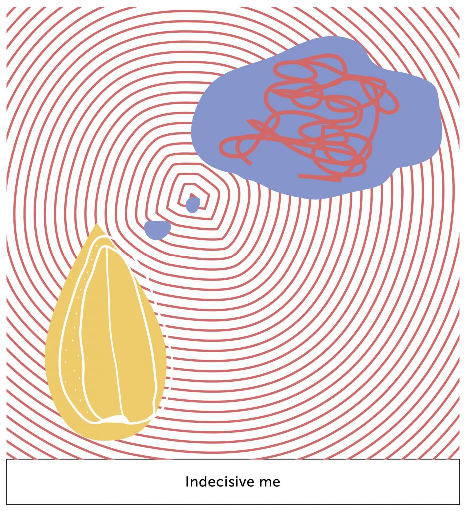
this box depict me as a decision maker. the pattern of circles represent my choices; often overwhelming i cant make up my mind. the scribbles in the dream bubble represent me overcomplicating my options although they are as simple as ABC.

+ego-final-05

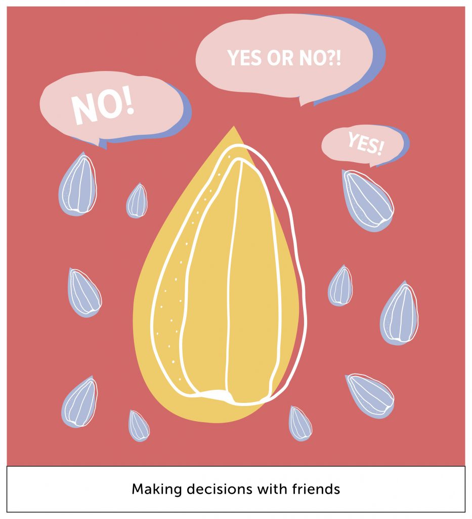
the little blue seeds represent my friends. often, i require people to make decisions for me. hence, we see here the little seeds answering my question.

the colour red represents anger. red is also a colour for something to stand out. hence i used red mostly in this situation because it’s a heated situation of debating, thus i feel its a great colour out of the other 2 to represent what im trying to communicate.

i used blue instead of using a darker shade of red as the shadow for the speech bubble in my 2nd box because it gives it a subtle pop of visual interest.

=
ego-final-09

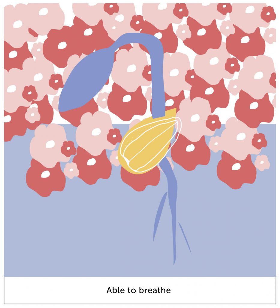
in this box, we see a germinating seed. the background is half applied to represent that i can finally breathe. the flowers represent the beautiful aspect of spring; in this context they symbolize a depiction of a clear mind through the flowers.


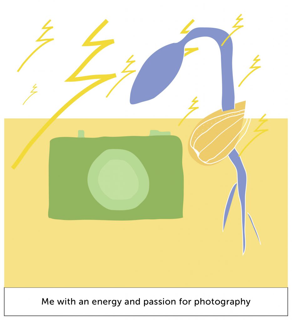
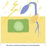
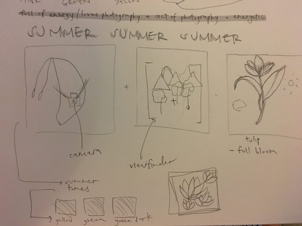
in summer, its a season of energy and vitality. i feel energized whenever i have my camera with me. the colour scheme rotates around mainly with yellow because it being the recognized colour for summer. also yellow is a symbol for happiness, which is what summer is about.

summer –

untitled-3-02

analogous harmony, monochromatic harmony

ego-final-02

the symbols of lightning represent the energy whenever i have my camera with me. also, building up with the last box from spring, the germinating seed gives it a pop of emphasis with a yellow background because they’re complementary colours.

+

ego-final-06

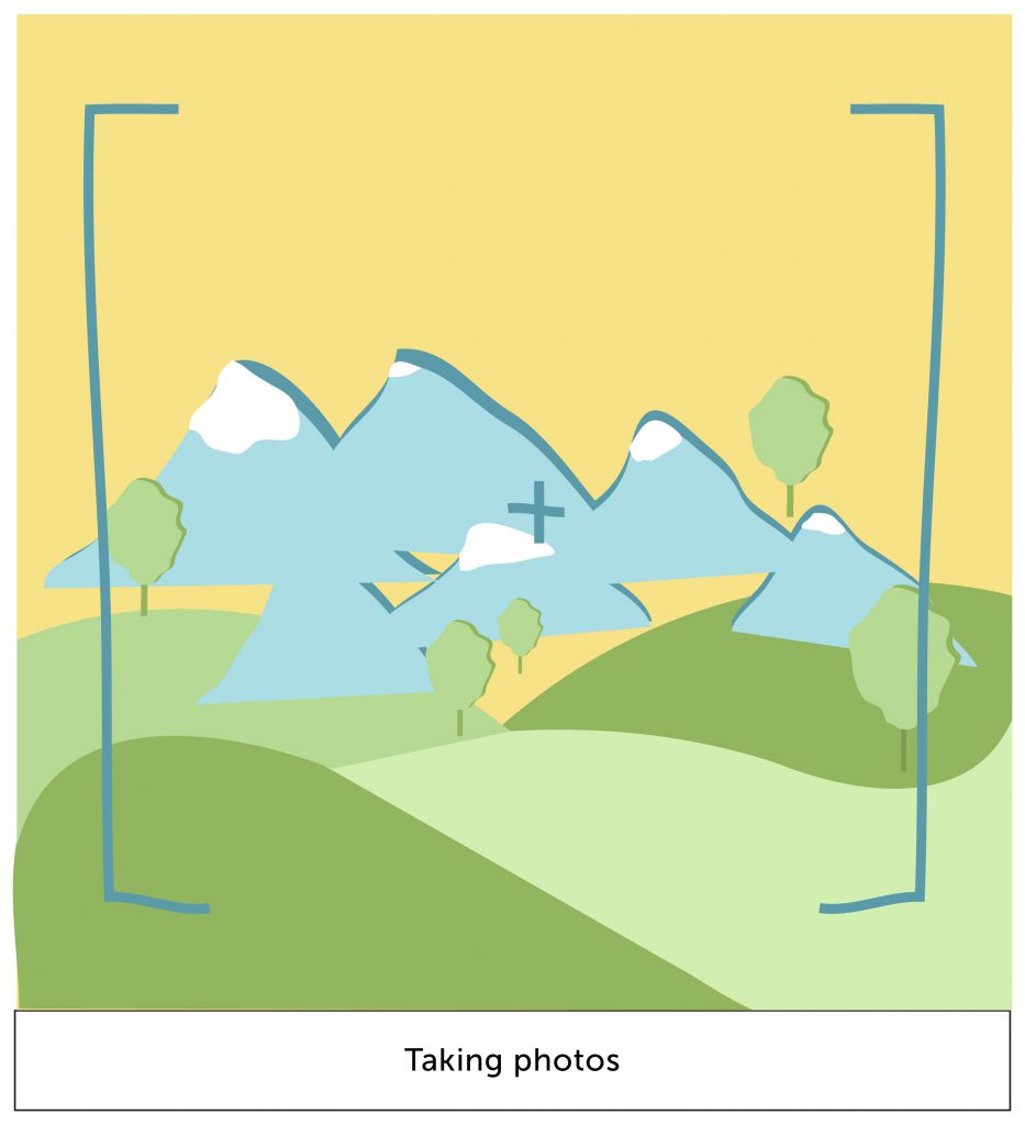
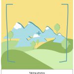
this box represent the act of photography-ing. the mountains and trees represent scenic views, which is what i enjoy taking most. the colours used here are kept to their original natural colours.

=

ego-final-10

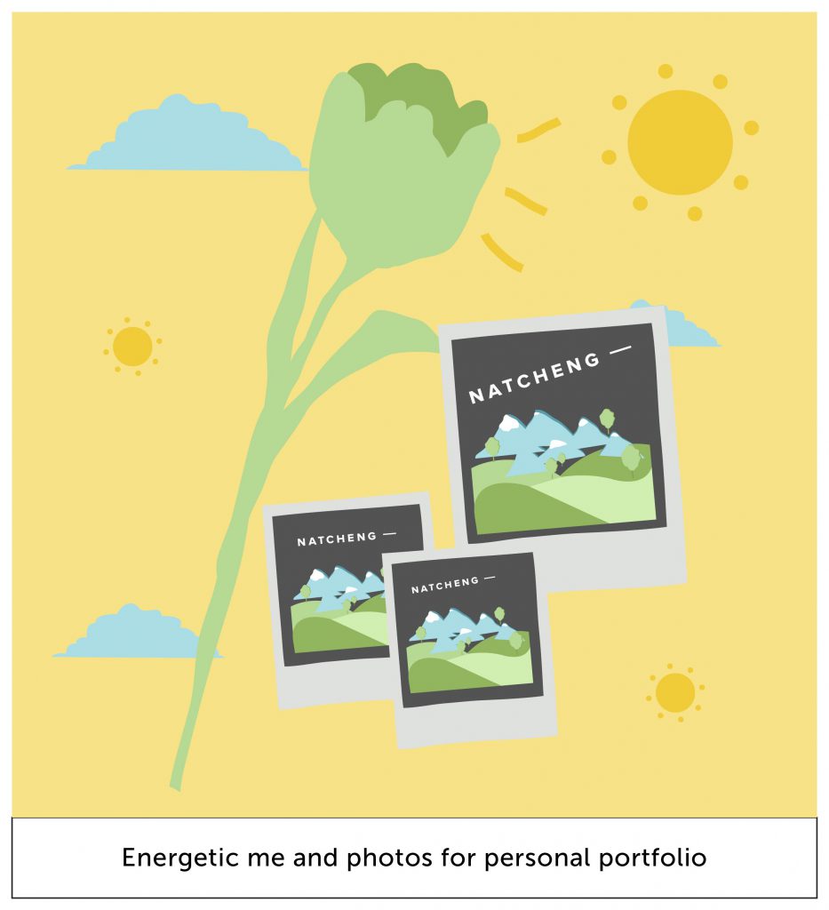
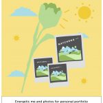
a flower has bloomed here! it represents me as a person who has grown, full of energy, because of the amount of new photos taken that i can use for my portfolio.


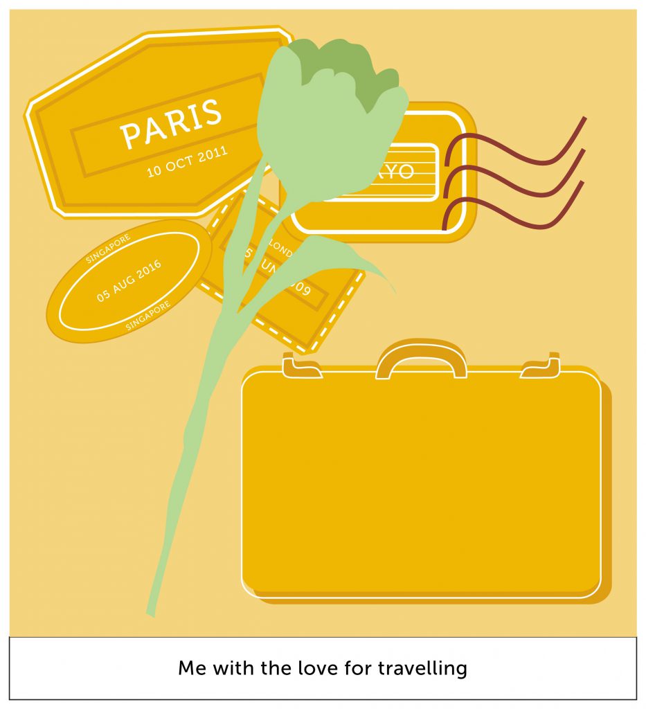
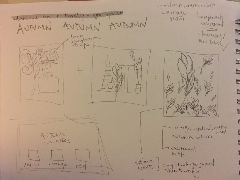
autumn represents middle age, knowledge and wisdom. hence i feel that a good way to represent this is when i travel. i gain knowledge from learning about the city’s culture, talking to people, eating local food, etc.

autumn –

untitled-3-03

analogous harmony warm, monochromatic harmony

ego-final-03

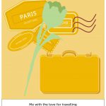
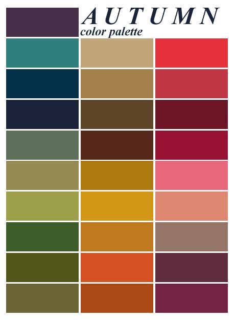
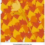
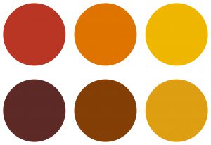
as described, i do love to travel. the stamps at the background represent the collection of stamps. as orange is a colour that symbolizes “energy” and “excitement”, i feel that this colour scheme is appropriate for my context of travelling.

+

ego-final-07

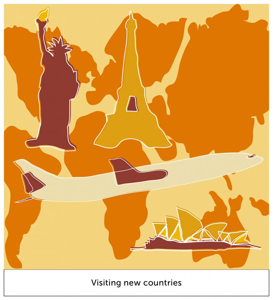
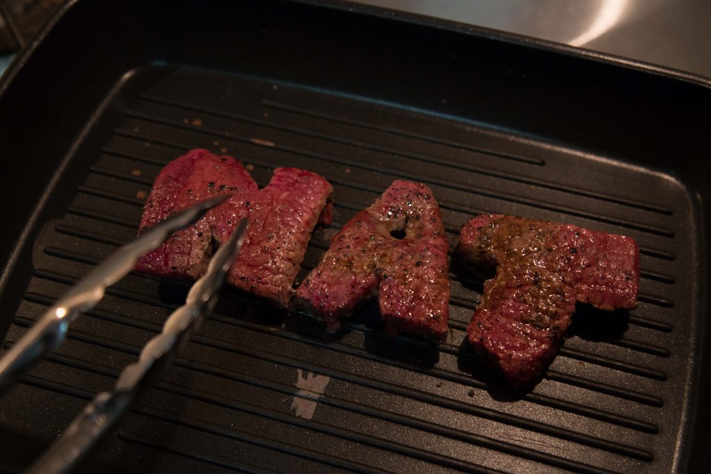
this box represents my setting of travelling. different world icons are illustrated and are set on their appropriate continents.

the darker shade of orange as used for the continents gives it a level of depth to the composition. it brings out the monument icons.

=

ego-final-11

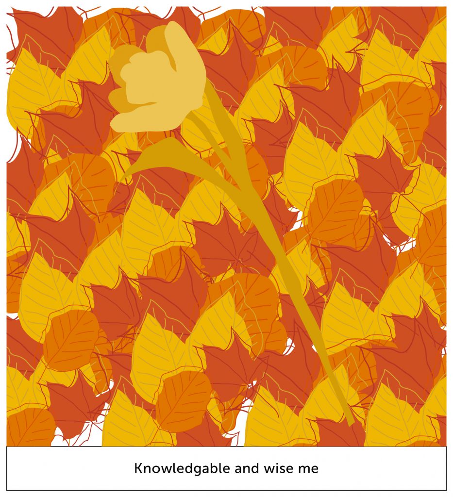
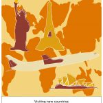
me, the flower, has bloomed even larger! it depicts the amount of knowledge i absorbed, causing it to grow larger as a person.

the foliage represents my amount of knowledge collected. the colour of the leaves harmonizes one another, giving it a pleasant visual interest.


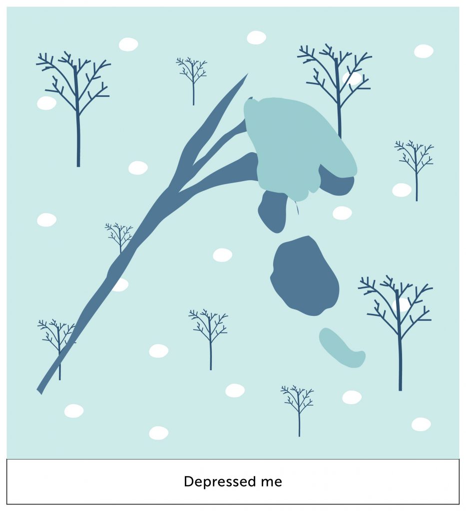
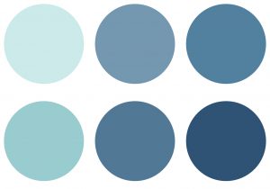
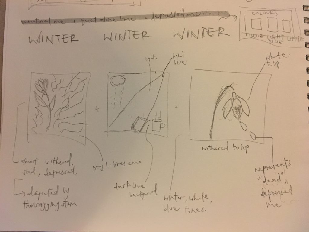
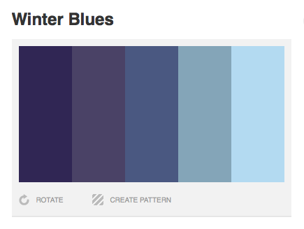
winter represents death; the end of a cycle. in literature, it can also symbolize sadness, which is what i did in this last equation. the colour scheme for winter is the most perfect for my context as well. the colour blue represents sadness, calmness, stillness.

winter –

untitled-3-04

analogous harmony cool, monochromes harmony

ego-final-04

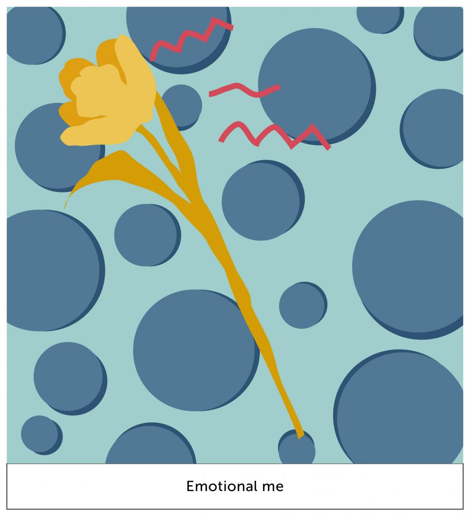
since orange and blue are split complementary colours, my flower definitely stood out.

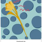
the red strands represent my emotions (hur hur, project 1); frustrated, emotional; emotional pain. the circles being blue, they complement my emotions too, and also since circles are organic shapes.

+

ego-final-08

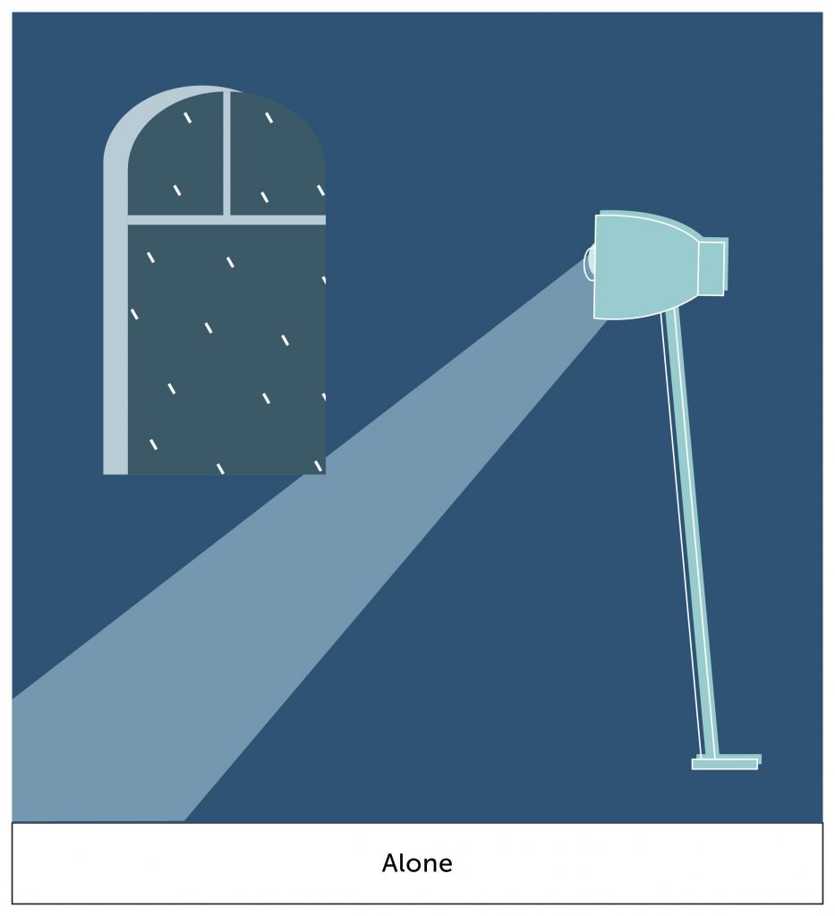
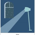
i wanted to create a setting of quiet and stillness. from the window at the back, you can see raindrops. this creates a mood to the setting. the lighted ray shines at a corner of nothing-ness, which is what i create to depict a scene of emptiness. i do like how the dark blue is able to create a mood of stillness.

=

ego-final-12

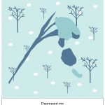
in my final box, i finally caved in to nature’s work. the “depressed me” is withered, and this is shown by petals falling. the blues definitely create a somber aesthetic look to it. also the emphasis is still kept despite the contrast of white (snow) in the background.


aaaand thats it for this project! it started off difficult for me but i enjoyed the execution part. i enjoy illustrating and im glad i managed to do it for this project. i’m looking forward to improving my skills and to create great work just like from my artist research.

time to get a wacom because i cannot tell you how painful and limiting it was to illustrate with a mouse and touchpad. 

ego – WIP

so in this project, i started off with deciphering who i am as a person.

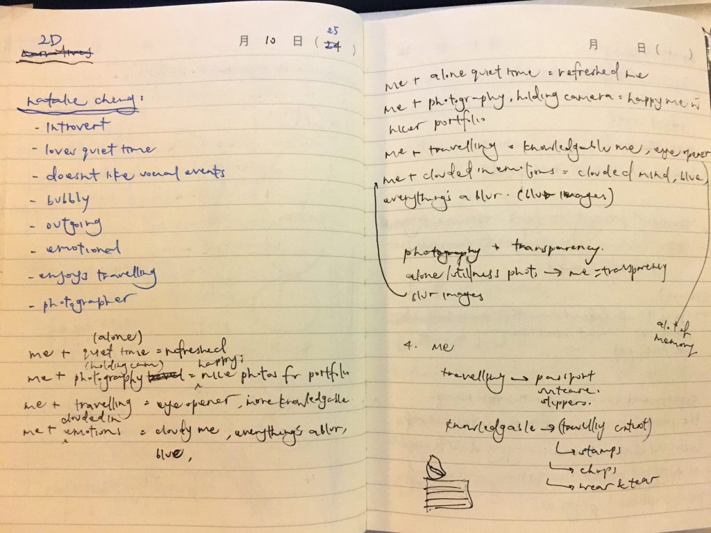
NATALIE CHENG –

introvert

enjoys quiet time alone

emotional

bubbly

outgoing

enjoys travelling

amateur photographer

there were lots of pre-planning and research that i had to do before starting on the execution of the project.

from those traits that i discovered about myself, i came out with some rough initial equations during the earlier start of the project –

me + quiet alone time = refreshed

me + photography = a happy me (and because i have new content for my portfolio)

me + travelling = eye-opened, knowledgeable me

me + clouded in emotions = cloudy / blurry / blue me

img_9334

then the tough part arrives…

i wanted to break away from the normality and direct way of approaching this project. instead of being something that i like, or being “my favourite animal / food”, i wanted to approach “me” in an abstract, conceptualized and have in a deeper meaning to it.

….. but i couldn’t think of any.

this project started to get really difficult and brain sucking. it was tough to think of something that symbolizes me yet tell a story about my personality.

so i thought, i thought, and i thought hard.

i started to list out the things that i like.

NATALIE CHENG ENJOYS –

food

flowers

photography

styling

cooking

travelling

so from these points, the most apt subject that i could work with that also holds a symbolism to things would be flowers!

also, since this is a colour project, i could definitely play on the colours of flowers to tell my story.

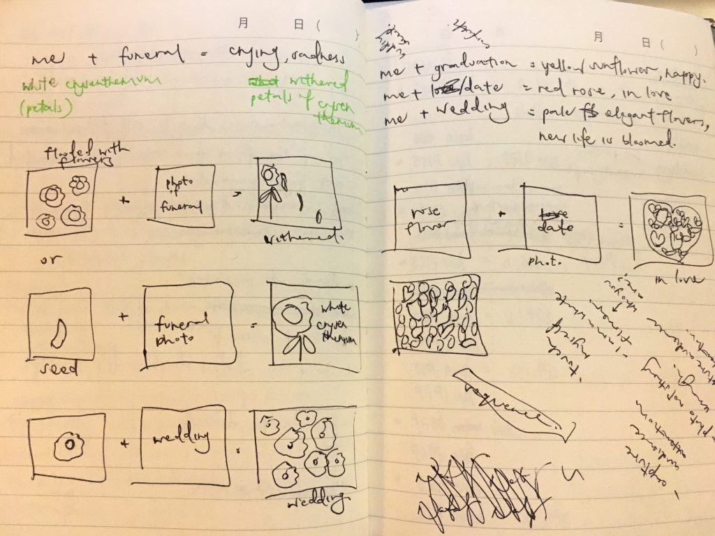
hence, i came out with this concept of me being the different type of flowers in different settings that holds a symbol of importance as well.

me = flower.

white chrysanthemum + funeral = me crying, drowning in sadness

sunflower + graduation = me happy, joyous

red rose + date = me feeling infatuated, in love

pale muted colored lilies + wedding = a bloom of new life

img_9333

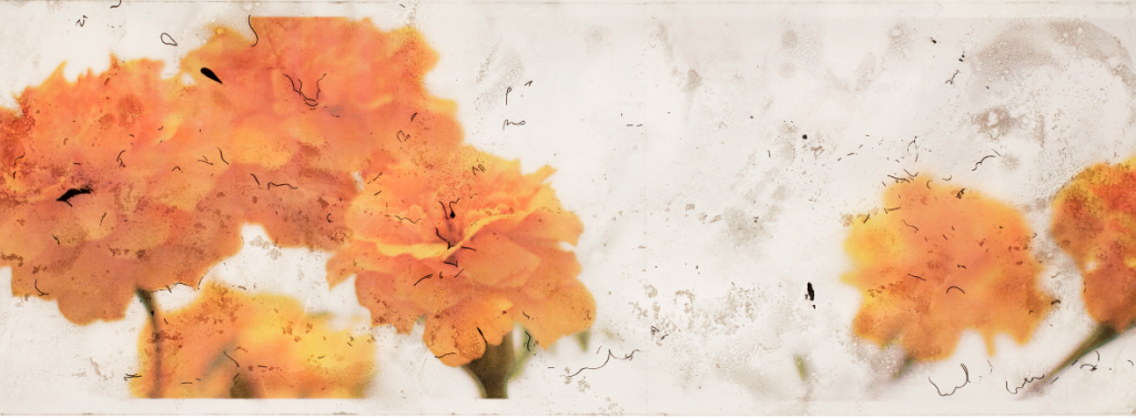
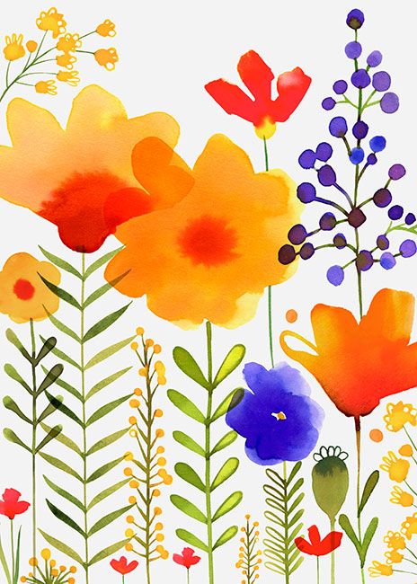
i was inspired by one of my reseached artists, Pam (refer to previous post) on her usage of illustrations + photography for her paintings.

screen-shot-2016-11-12-at-10-44-22-pm

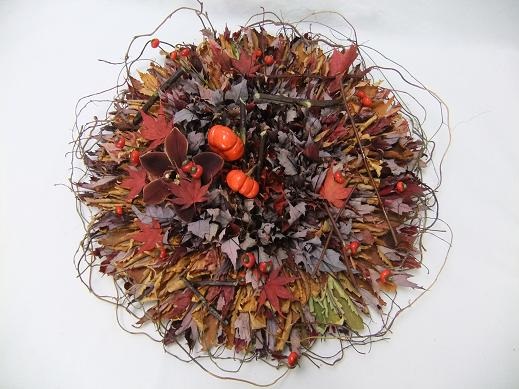
i was also inspired by mostly exhibition works like these

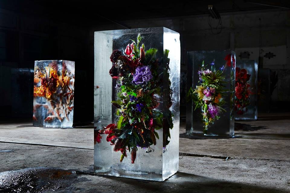
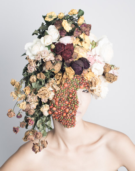
leaves-by-hundreds-came-floral-art-design-by-christine-de-beer-1 iced-flowers-makoto-azuma-1 flower-art-works-by-hanayuishi-takaya_dezeen_468_4

since this project is super open to mediums, i thought of using real flower petals to represent “me” as a flower. i also wanted to use photography in my setting, and a mixed of both for my final outcome.

however, shirley said that it is a bad idea because the flower petals will rot and it won’t be a pleasant sight after 🙁 she also mentioned that taking photos of the settings will be a challenge (eg, funeral), how will i able to capture it in the right manner to suit what i want to communicate. she also told me to think about my concept harder and bring it higher because it currently doesn’t represent me.

ARGH. i wanted to rip my hair apart for the next few days because IT IS SO TOUGH TO CRACK THE BRIEF IN MY OWN SUBJECTED MANNER. 

(but never give up)

so, its another round of research and thinking.

i am going to keep my flower concept because it is okay. but how am i going to improve it to keep it relatable to me? okay, i remembered that my original initial equations are good. so i will combine them both together.

the tough thing now is to relate flowers as a symbol and back at me.

there are 4 seasons – spring, summer, autumn and winter. i thought of a really good idea to use this concept of time to represent me as a person whom grows overtime as time passes.

SO. i did a research on what each season symbolizes.

SPRING

The cycle of life is beginning.

Youth & childhood.

New life emerges from plants. Rain nourishes new life.

Buds, flowers, birds, butterflies, sunshine…all good.

Think: A fresh start. A new beginning. Rebirth.

Another transitional season, spring is a time of phenomenal renewal. The earth reawakens from her slumber, and explodes with new life. In our own lives, Spring can be symbolic of starting new projects, sewing new seeds and coming forth with new ideas. This is also a time to contemplate health and physical well-being too. Be refreshed and prepare for your soulful debut!

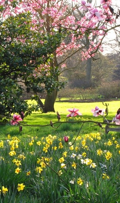
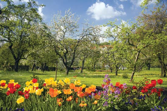
0cfc31c0180fba7004920c67bc74584f 4daf4cc1a40b7cdc236f00d355600066 3273ea664e7d7cd3890e6f0e932ea5b0 155405-004-2466567a spring-wallpapers-2014-1

SUMMER

Life is in full swing.

Young adulthood

Energy & vitality is abundant.

In a word – ‘PARTY!’ And our host is the sun whose presence is fierce and utterly forthright on the scene. Days are longer and the rays of the sun dissolve all shadows in our lives. No hiding, no secrets, no darkness. Summer is a time of light, joviality, expression and wholehearted action. To be sure, this season is symbolic of the vitality inherent within every heart.

455 93489c100b748b081c5d8937d2b75c9d shutterstock_156581246

AUTUMN

Life is reaped and winding down.

Middle age.

A time to count one’s blessings.

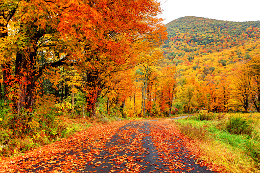
It’s a season of transition, it embodies a culmination – it’s Nature’s ‘last hoorah!’ before retiring into winter’s slumbering mood. This is a hustle-bustle-boogie down month as preparations are made. Autumn is symbolic of the activity inspired by the fire-glo radiance of the changing foliage we see this time of year. This is a time of taking stock of all the bounty and provision we’ve been afforded. A time for itemizing our blessings and recounting our joys.

Autumn in the Pioneer Valley region of Massachusetts

a36ad3b4a1f325ce749d950f75275533 cf437947c33d6f997040d05821d0335b

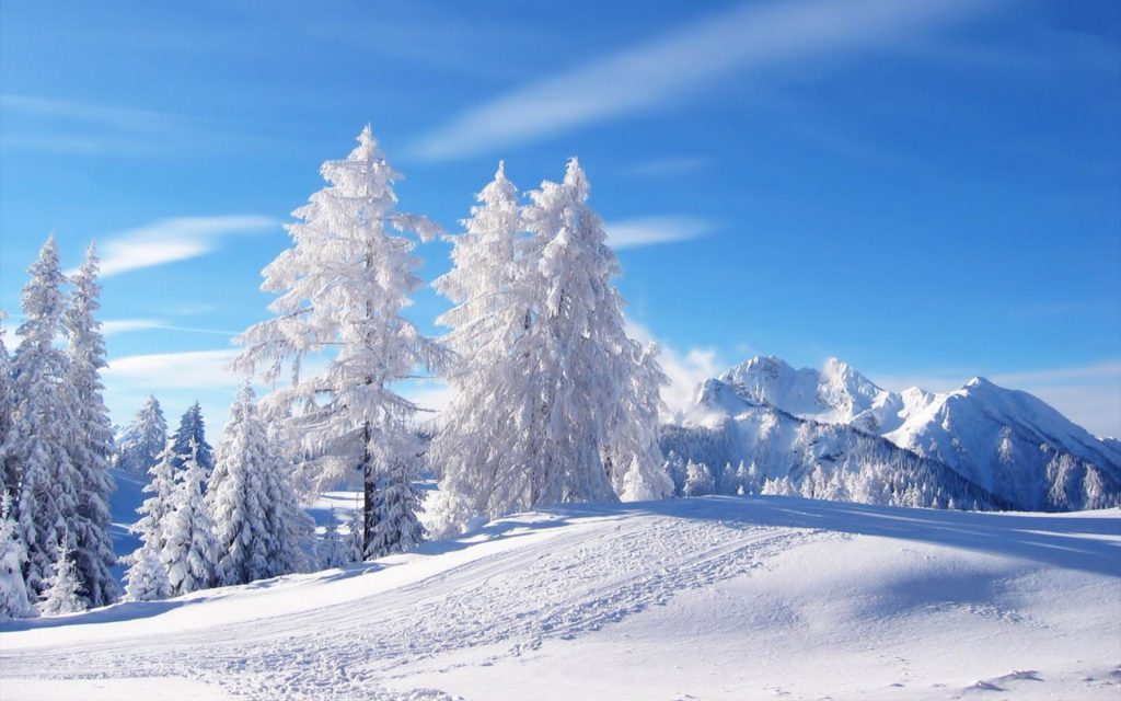
WINTER

Life is dormant or dead.

Old age & death

It’s a season governed by the recluse, the hermit. Activity gives way to dormancy. Life is still, indwelling and silent. This is a time of introversion, contemplation and going within. Symbolic winter invites us to quiet the mind, still the soul, and crystallize our inner workings. This is a time to ice skate through winter whites as a means of gaining purity and clarification.

8e9abcf16bfa4cd5cbdff86e6f7f4d65 6928556-winter-scenery-pictures

research info extracted from

http://lzmarieauthor.com/seasons-in-literature/

http://www.whats-your-sign.com/symbolic-meaning-of-seasons.html

then i realize that my original equations are able to tie to the 4 seasons!

spring = a new life

indecisive me + friends making decisions for me = able to think clearer and breathe

this symbolizes me as a person whom make decisions that enable me to grow as a person.

summer = energy and vitality

me who has the passion for photography + photography-ing = a very energetic and happy me.

i get super energized when i take photos because it develops my skills and passions and i enjoy what im doing. also i get new photos for my portfolio!

autumn = middle age, which can represent knowledge, wisdom.

me who loves to travel + traveling = knowledgable, eye-opened me

i definitely learn heaps while traveling. the people, culture, the city. it definitely makes me grow as a peson and widens my horizon of knowledge.

winter = death

emotional me + alone time = depressed me

i realized that i need people when im having one of those days. however if im left alone when im feeling super emotional, i’ll feel really crappy.

AND MY CONCEPT WAS APPROVED.

so i emailed shirley with some quick initial sketches and these were her comments.

unnamed1

i took some time after to work on them.

here are some of my final sketches.

img_9343

img_9344

img_9345

img_9346

also i took some time to work on the colour palette.

i researched on the colour palette for the different seasons as well.

245dc46e2e92a0b8001294d5e3df699f

455

5415bced25d073d9febaf7c6a2321266

screen-shot-2010-12-12-at-5-57-49-pm

okay that’s it for my research phase!

the next post will be on my execution process.