1 ) Lack of time + Returning to reality = Reluctance


As we grow older, we are caught up with many issues. There are so many things that we want to accomplish but yet so little time to work with. Snapping out of the worries about not having enough time, we return to reality, realising that work still have to be done. The time spent thinking about non-productive issues are just time wasted. Yet again, part of us are still dwelling in the mindset of having the lack of time. Hence, reluctance to return to reality.
2 ) Composed + Traffic Jam = Rage

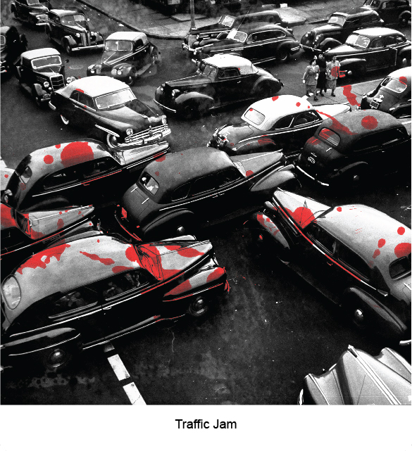
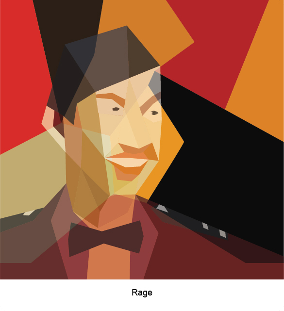
Undergone months of vigorous training of Officership, the best takeaway is that we learned to be composed in difficult situations, to be able to plan ahead and being responsible for the roles that we hold. However, old habits die hard. In times of traffic jam, I tend to be impatient and often lose my temper.
3 ) Materialism + Questioning Existence = Overthinking
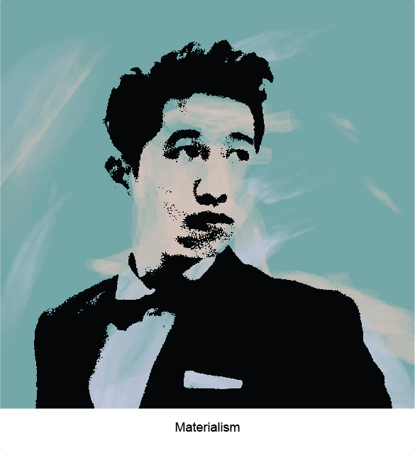
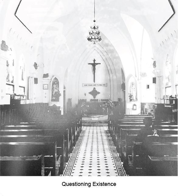
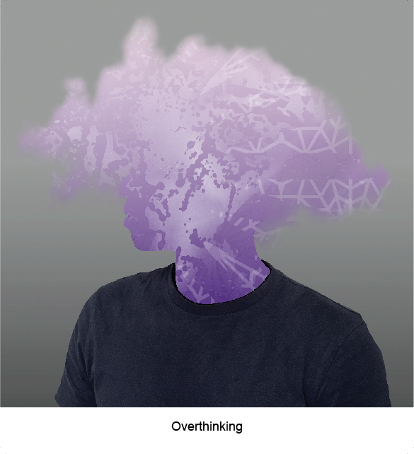
As we grow older, we feel inclined to buy things that look good and branding that speaks for statuses. We become vain and materialistic. On the spiritual side, we wonder, why are we brought to this world, what are we supposed to accomplish in this lifetime, what happens when we die, do we go to heaven or wander on earth, what good does all these mortal measurements do to us? These questions made me overthink of being true to oneself, on being productive and working towards a goal that I have always dreamed of achieving.
4 ) Drowning in assignments + Wanderlust = Tranquility
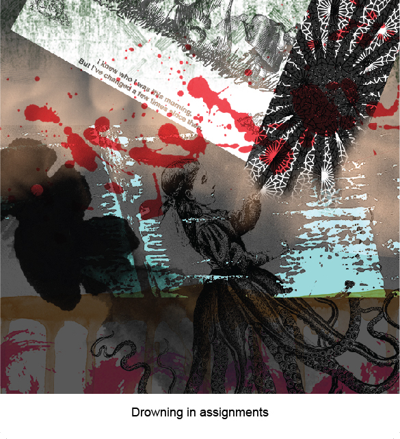
In this semester, we were introduced to multiple assignments and were overwhelmed by it. Personally, I feel that time management is the answer to it. In a new environment (University), to balance Work, Social and Sleep is difficult, thus I chose to sacrifice sleep and a bit of social. In the midst of working on assignments, I often drift away reminiscing the times when I travel around SE Asia. Those days were worries-free, able to talk about life and explore new places, gaining new experiences in activities that I have never tried before. These thoughts calmed me down, giving me peace and the motivation to succeed in life, in order to retire early and travel again.
Referenced artists
This is a screenshot that I took during my process, working on the second version of the final artwork. The images on the sides are referenced photos.
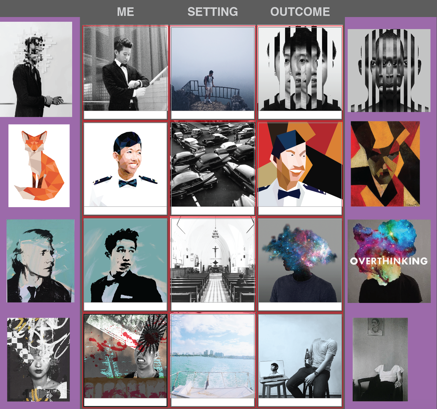
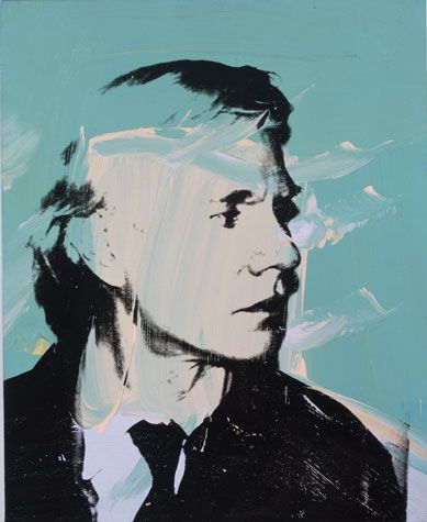
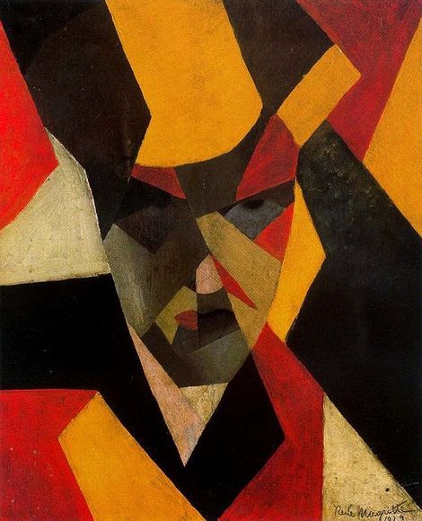
I particularly fancy the low poly art and Andy Worhol’s painting. I took the images from Pinterest, thus, not being able to find out most of the artists’ names.
Andy Worhol’s Self Portrait. I like how he used the highlights of his face as a negative space and using colours to portray the mood. This work reminds me of our second project – Forrest Gump, using threshold images for silkscreen printing.
Rene Magritte’s cubism painting. I tried to explore different art styles, tracing back through the different periods of art movement. In this painting, he used very minimal details, shapes and colours to push the character out from the background, yet, seems like he is one with the background.
Here’s a tutorial on Low Poly Portrait. It took painstaking long hours to create a low poly art portrait with great details. In my opinion, you should understand the structure of the head or face in Figure Drawing and head topology in 3D Modelling, as it will help you to see where are the contours, highlights and reference points of the head. I have always liked low poly art, it looks 3D but is made of flat planes using Illustrator. It is clean yet rigid.
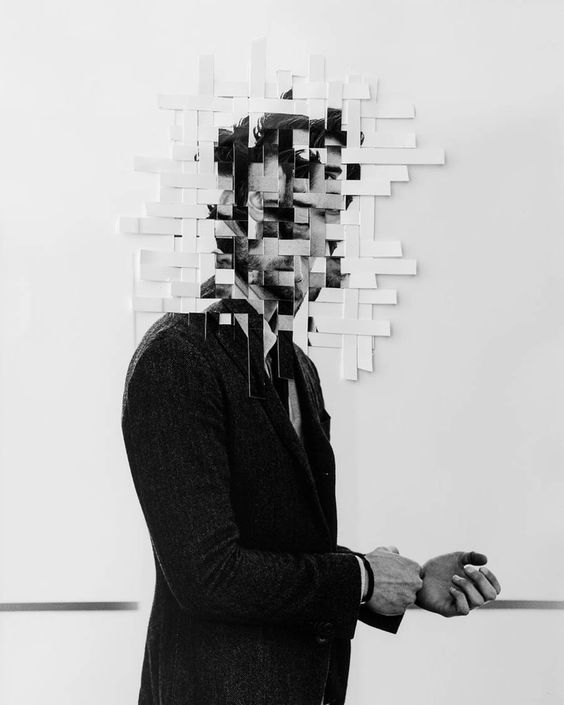
I could not find the artist’s name for this image. I like how the face is interlaced with the same image, disfiguring the face itself. It gives a feeling of being lost in time or loss of identity. Hence, I referenced this in one of my works.
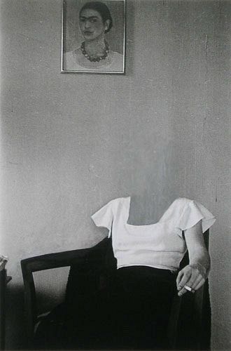
I like how the artist removed her face from the body, but has a painting of herself hanging on the wall (inferred from the white shirt). I gives a feeling of one being there, yet not being there. The play of presence inspired me to use this technique in one of my works.