F2D II: Zine – Final

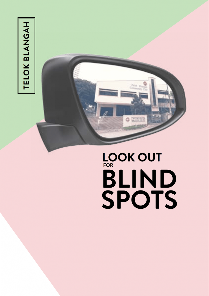
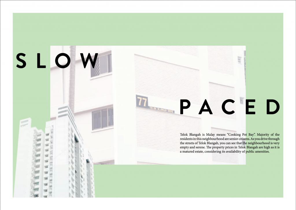
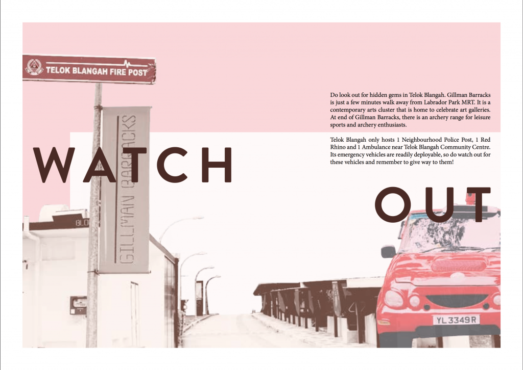
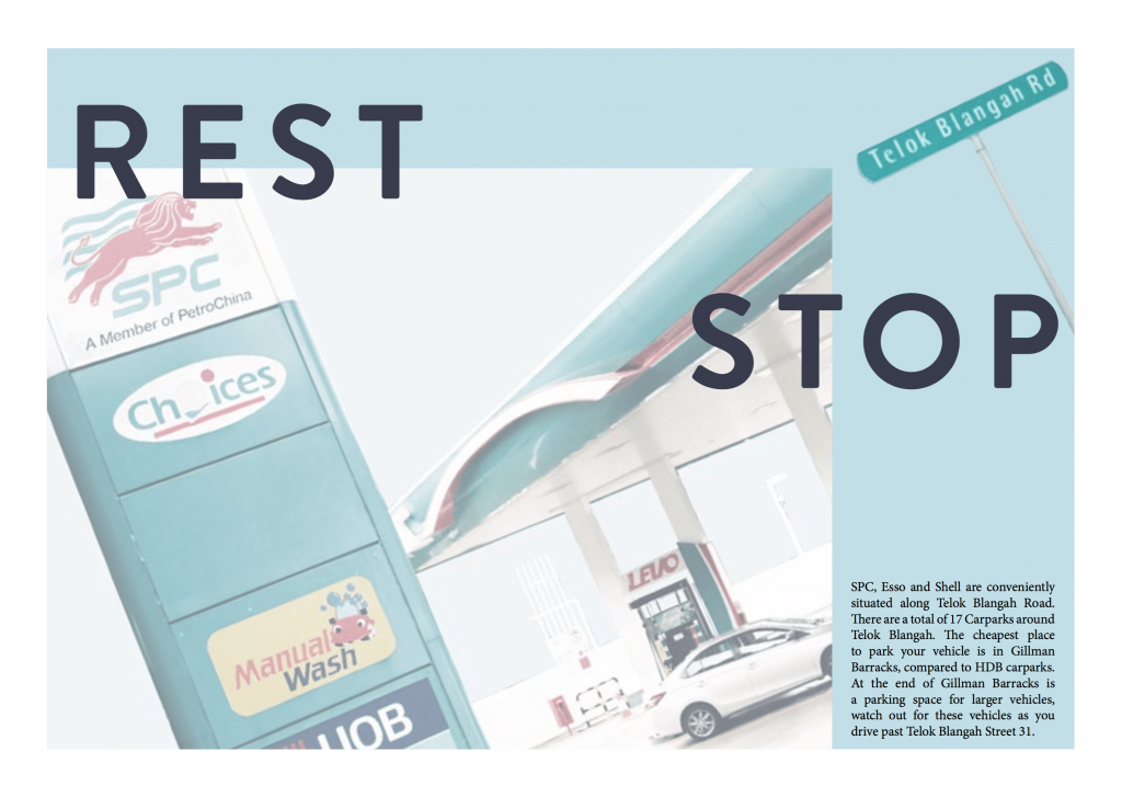
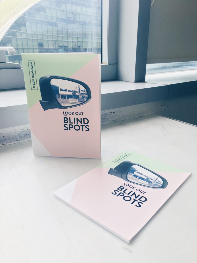
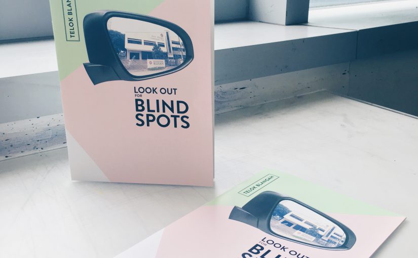
“Look Out for Blind Spots” is a saddle-stitch zine that provides brief information on Telok Blangah neighbourhood, an informative guide for drivers and what they should look out for.

Links: Neighbourhood Exploration      Infographics      Process

Printing

When I was test printing my zines in school, there were gaps between the spreads as the document was printed in pages instead of spreads. Some of the pages were in different orientations too.

In the second test print, I figured that I was supposed to select “print on short-edge”. Although this time round the page orientation is correct, the spreads remained to have gaps. After asking around, I realised that Mac users have to export it into PostScript files and then convert it into PDF. However, the exported PostScript file is in portrait but the spreads are in landscape. Thus, the contents are cropped abruptly. Therefore, I decided to look up online for solutions.

What I found online will be beneficial for future students who need this tip. The reason why PostScript file doesn’t allow me to change its orientation is because I didn’t have a printer option in the PPD tab. Some old mac users might have this pre-installed, but newer mac users doesn’t have any available option. Thus, I have to download ADPDF9.PPD file online and go to Applications > InDesign > Presets > Create a new folder, case-sensitive [PPDs] > and paste the file in this folder. Make sure that InDesign application is not opened in the background. Afterwards, Adobe PDF 9.0 will appear in the PPD tab, then I am able to select A3 size paper and spread orientation for the PostScript file.

I printed my zine from True Colours Print House Pte Ltd. They do not have a wide variety of papers to choose from. There were mostly art cards, according to the feedback for my paper type during presentation. Honestly, do not come to this shop to print due to the limited paper choices, unless you are running late (they open until 10pm, ColorVizio closes at 9pm).

Reflections

Overall, I enjoy the process of making this zine, from concept to production, as this is my first experience in doing so. Comparing the first draft of my zine to the final product, there is a vast difference and I am proud that I managed to complete this zine with the helpful inputs from Joy and my peers. Things that stood out in my zine was the minimalistic style (which I wanted to produce) abd the consistent colour palette.

Things to take note from the final zine: Headers consistency and the first spread’s contents (is varied from the other two spreads).

PDF: ZINE_Final
Project 2 Part I – Infographics

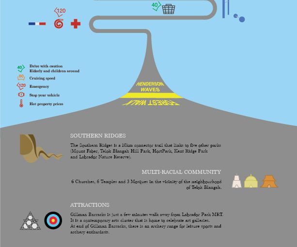
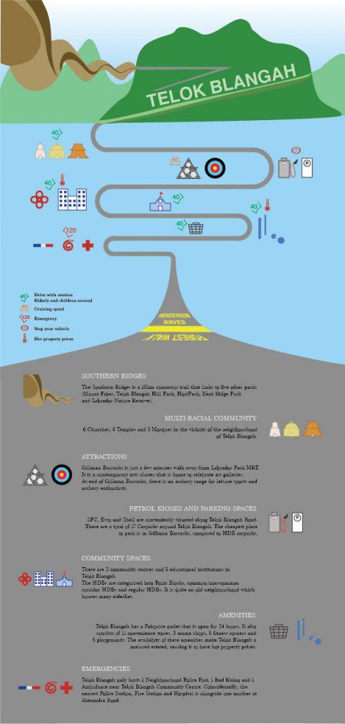
After my exploration around Telok Blangah, I have decided to make an infographic as a guide for drivers (Target Audience). The road the bends around in the middle of the composition brings the audience’s eyes around the context, which will inform them about things in Telok Blangah.

At the top of the composition, there’s the Southern Ridges which includes Henderson Waves, Telok Blangah Hill and Mt Faber. It then leads to temples, Gillman Barracks, petrol kiosks, schools, markets and emergency responses. At the bottom of the composition, I included a short write-up to include information on the icons of the neighbourhood so that they can find out more about the place.

In the middle of the composition, I have included some speed limits to advise drivers to keep while driving past the areas as there are elderlies and children around the neighbourhood. They can increase to cruising speed when they are travelling to attraction sites like Gillman Barracks and archery range. The high speed is to indicate that the emergency responses will travel at a high speed, so drivers should be aware of their surroundings and keep a good lookout to prevent accidents. The “hot temperature” symbol is to indicate that Telok Blangah is a mature estate which offers high property prices even though it is a quiet neighbourhood. I have also included petrol kiosks and parking spaces in the infographic as I find it intriguing to have 3 different petrol kiosks down the same road on Telok Blangah Road. It is very convenient for drivers to find them on the main road.

In conclusion, I find that this Infographic exercise allow us to better appreciate the neighbourhood and know what information we want to bring across to our audience.

Que Sera Sera – Final

Dreams & Reality

overall_01
Overall Composition

Tone

The tone for my assignment is element of surprise, challenging the assumptions that the audience have, comparing both Dreams and Reality of an individual.

Animation Curator

Animation Curator [Final]
Animation Curator [GIF]
Message: Singapore restrains the creativity of Singaporeans, thus, we have to take risks and pursue our goals.

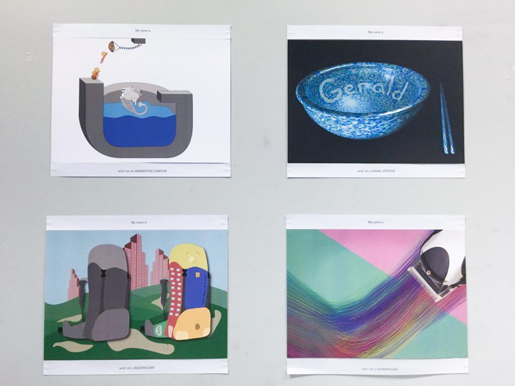
Concept: Yes, Singapore encourages creativity, but government still censors the media. The plate of gold represent the incentives that encourages artists in Singapore to generate creative content. The Merlion represents Singapore trying to devour anyone who drops into the water; limiting the creative contents. I showed the character jumping off the platform to grab the gold, this illustrates that we should should not be afraid to take risks. We should venture out of Singapore to pursue our dreams and make a name for ourselves.


Naval Officer

Naval Officer [Final]
Message: Having a job in the government sector doesn’t guarantee a stable career.

Concept: The rice bowl represent the job I am earning a living from. It is of porcelain material, which shows that it is fragile. Many people think that people who signed on to the military earns a lot and is well taken care of by the Government, but it actually depends on the performance of that individual. The responsibility is huge and we must be tactful and capable in whatever we do. Thus, this composition is to force the audience to think in our shoes.


Hairdresser

Hairdresser [Final]
Hairdresser [Final]
Message: Not all hairdressers are college drop-outs.

Concept: Many people think that hairdressers are those who could not get into universities, thus resorting to Beauty and Wellness industry. I beg to differ, I feel that it is a job for anyone who has a passion in it. Students who graduate with a degree can also step into this industry. The brush strokes represent creativity and hard work of an art student who is still pursuing his education. It represents hair too, the colours apply to both elements in a design (that a student studies) and the aesthetics of hairdressing patrons who wants their hair to be coloured with. The hair clipper represents “tool” – for job and education; a tool to get the job done.


Backpacker

Backpacker [Final]
Backpacker [Final]
Message: Parents doesn’t like their kids to explore around the world when they are young. They think that they should save up for Mortgage.

Concept: Most young adults have the desire to travel to foreign countries, as illustrated by the backpack. The compartments of the backpack represents the 5 “C”s of Singapore – Cash, Car, Condo, Credit Card and Country Club. These are the ideals that most parents want their children to achieve. Tied down by these expectations, these young adults’ freedom are restrained.


Challenges Faced

Naval Officer: It was difficult to achieve a balanced lighting for the porcelain bowl as the specular highlight (white spot) was too jarring. If I reduced the glossiness of the bowl, it will not look like a porcelain bowl, but a just a matte texture. Thus, I did post-processing to balance the image.

Hairdresser: It was a difficult time to come up with a good visual representation for the Hairdresser job as I have tried to use paintbrush bristles and real hair to form the composition previously, it just didn’t work out.

Backpacker: I wanted a minimalistic approach to the whole composition, but it was too limited to illustrate Country Club and Condo with just the compartments of the backpack. Thus, I had to display it in the background, which made the whole composition very cluttered.

During the printing process, it was a challenge to pick a suitable paper. I test-printed my designs on Toile-M, Zeta Hammer B and White Card. Toile-M had a canvas texture but it made the printing look uneven. Zeta Hammer B was the paper choice I used for last semester’s Ego project. In this semester, I felt that this choice will not work out as well because the texture appears to be like a cartridge paper, it had a rough surface, which does not work well with the glossiness texture I had with Naval Officer composition and other flat solid colour designs. I decided on using White Card for all my compositions, it have much a smoother surface and made the white colour in the compositions stand out more.