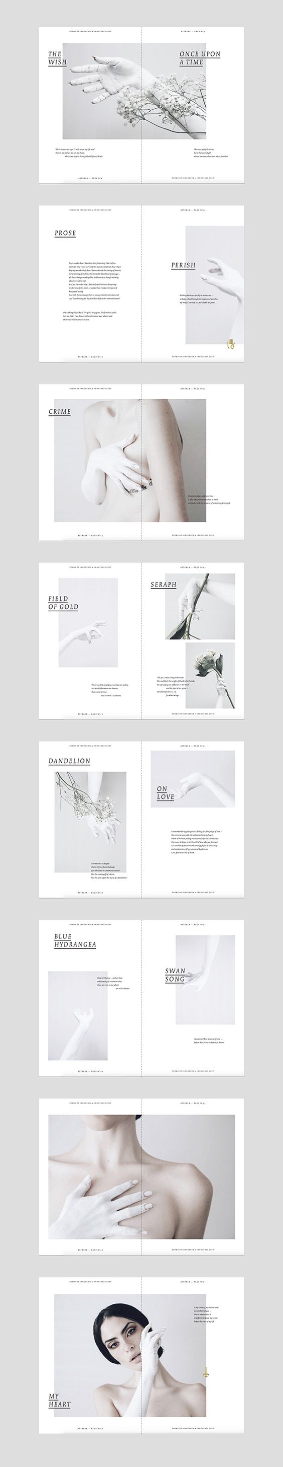
F4D II Project 3: Time, Space & Body – Final

Project Proposal

“All Animals Are Equal, But Some Animals Are More Equal Than Others” is an installation that talks about the double-standards of individuals who take pity on the killings of domesticated animals, yet still feel fine consuming meat like beef, pork and poultry. It serves to evoke the disgust of the killings of animals, regardless of it being domesticated animals or farm animals. Many individuals feel the disgust of the population in China’s annual Yulin festival, in which thousands of dogs and cats are murdered and eaten, using terms like ‘cruel’, ‘revolting’ and ‘condemn’. It is a wake up call and also a reminder to everyone that these animal slaughters are the result of the what we demand on our plates.

 As quoted from an article found in The Independent written by Emma Henderson, the People for the Ethical Treatment of Animals (PETA) Director Mimi Bekhechi mentions “Whether a dog, a pig, a chicken or a fish, no animal wants to suffer and die for our plates, and we urge everyone to condemn the slaughter of animals for meat.” My message to the audience is that if they prefer to keep their omnivore diet, they should empathize all animals equally; all killings are equally brutal.

Concept & Ideation

As I was browsing through social media, I came across different articles about the killings of domestic pets and the petition to stop Yulin’s Dog Eating Festival. I find it irritating to see that people are bothered by these sins but not remorseful for eating meat in their daily life. I wanted to bring up this irony back in their faces. Perhaps it has never crossed their mind on how the meat are being processed, thus, serves as a motivation for my installation.

Process & Challenges

It was challenging to portray the idea of double standards as there are many different opinions from everyone. There was a mixture of brutal animal killings and double standards, they are of different topics, hence I have to figure out the delivery method to bring out my message. I intended to show video footages of animal slaughters and gory silicone animal figurines on a table. However, the silicone animal figurines may seem too plain and unrealistic. Hence, Bridgel recommended me to present it with raw meat.

I experimented with silicone casting on animal figurines, but the proportion of the ingredients didn’t work out.

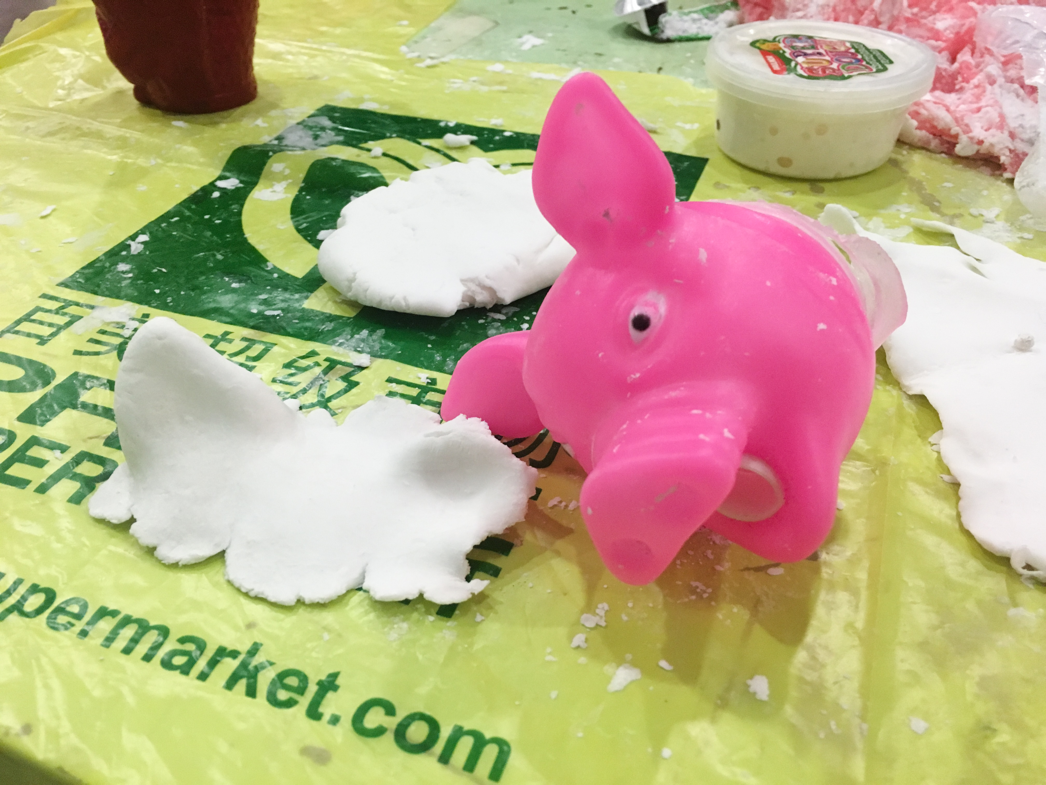
Thus I tried to paint over the animal figurines as it retains the texture.

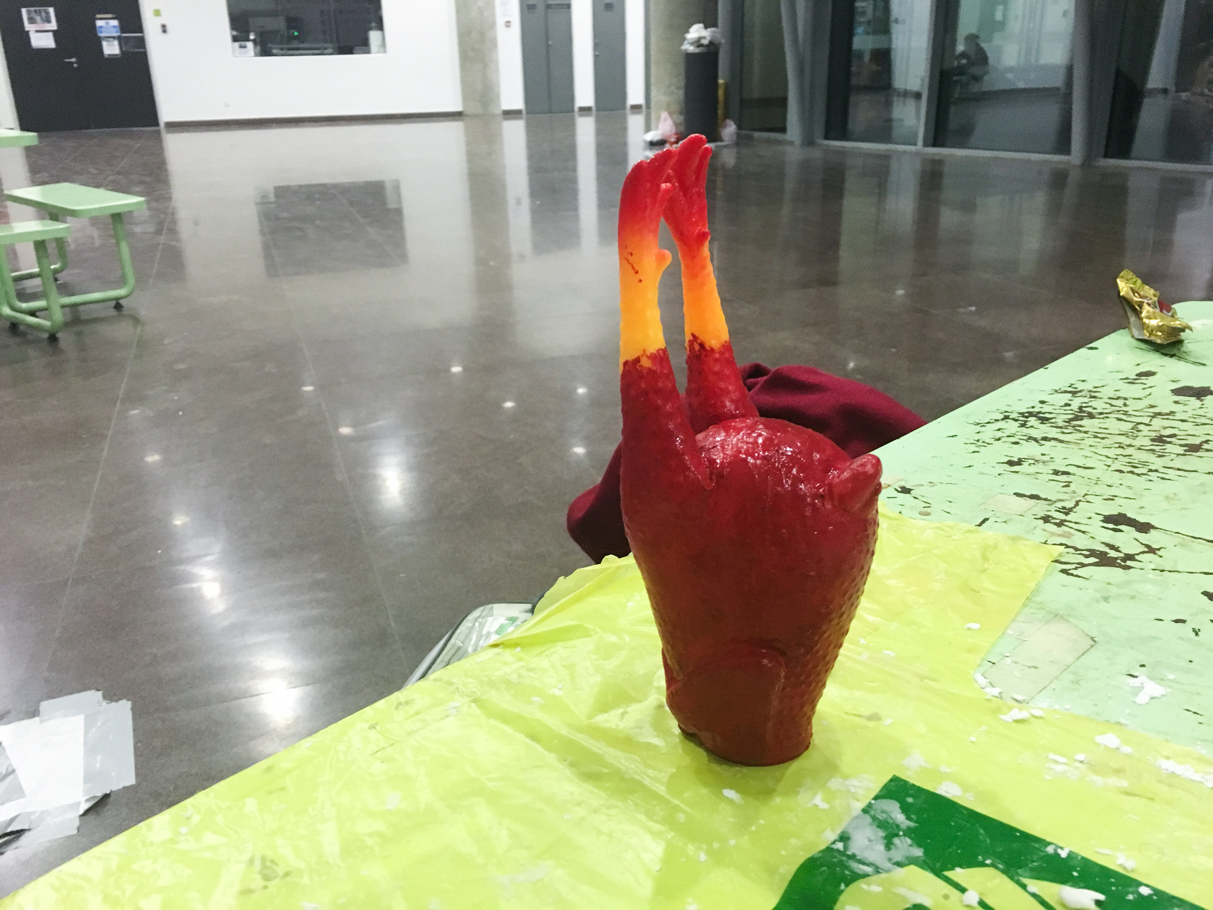
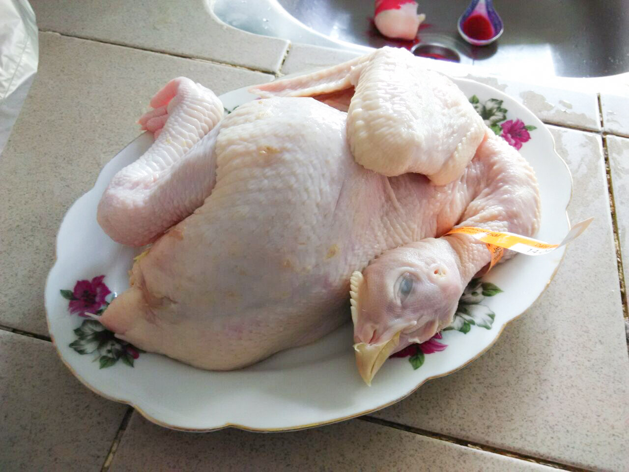
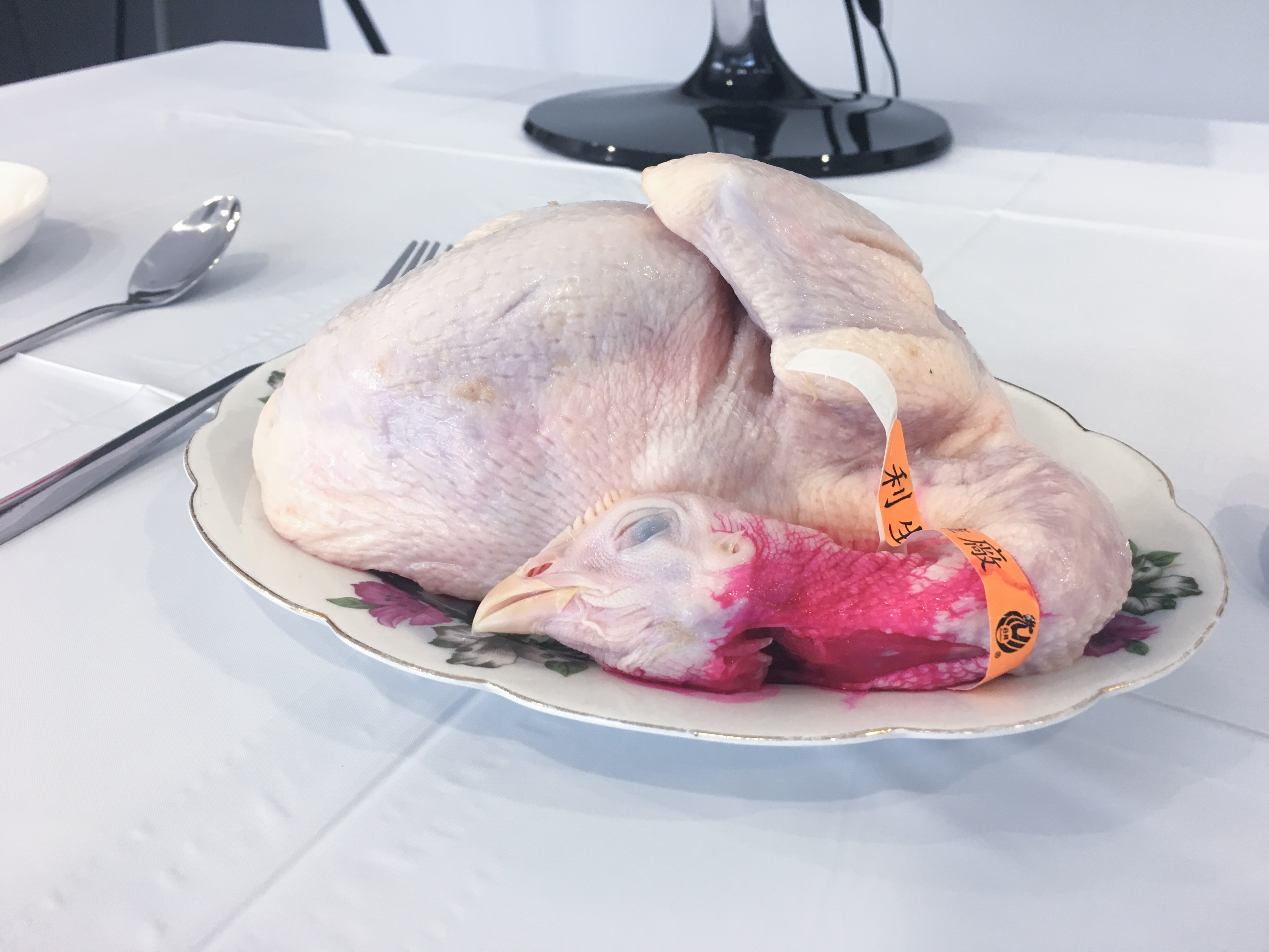
However, it doesn’t present the gory appearance I wanted. Thus, I went to the wet market to find raw meat.

To bring out the gory part, I experimented with Red Dye, but it turned out pink instead.

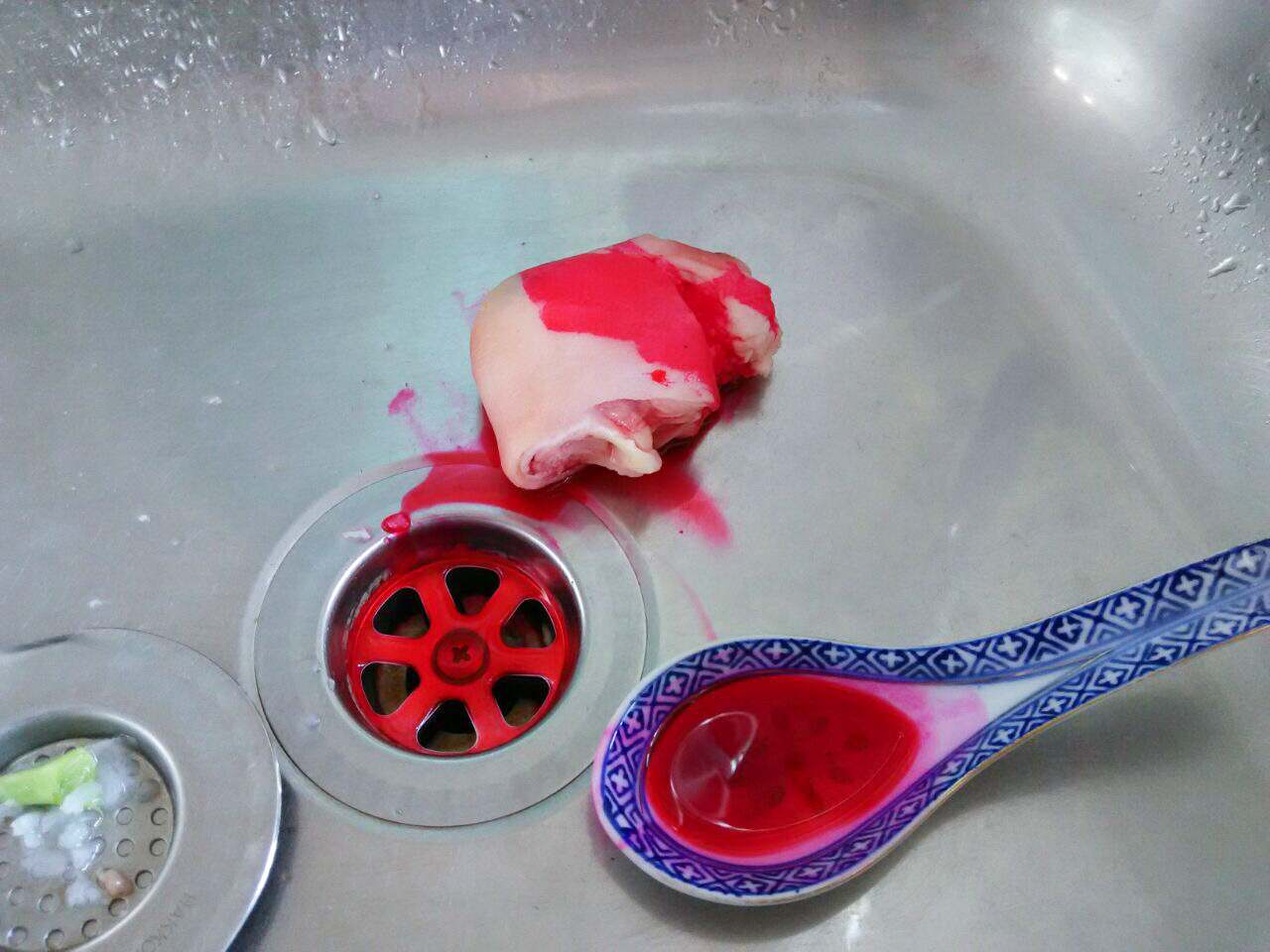
I had to keep the meat for a few days before the day of installation, I am afraid that it will rot and turn pungent. Thus, I had to keep them in the freezer.

Final Installation

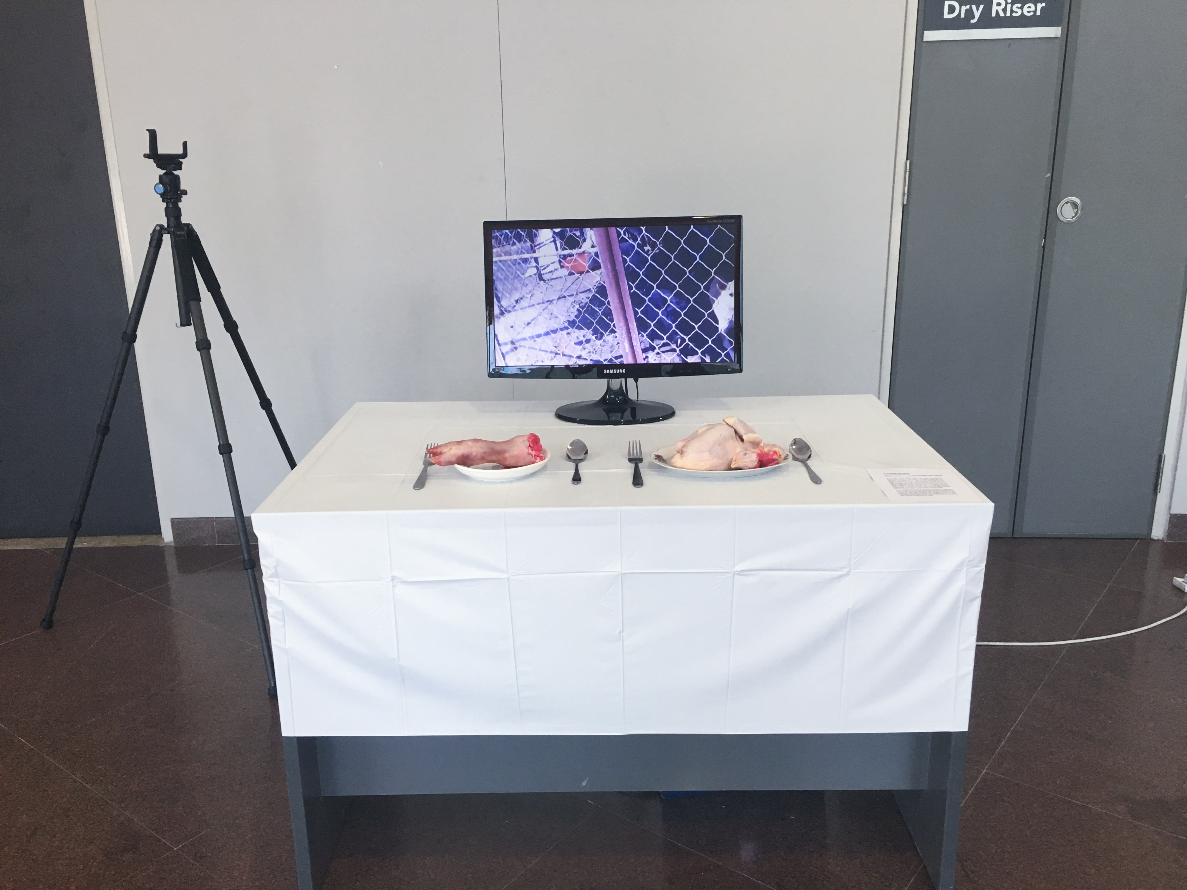
On the day of the installation, I looked for Pheng Yew for the booking of location as I couldn’t find Bharat the week before. I borrowed a table from the Animation Archive room with the help of Pheng Yew as I couldn’t gain access to the Crit Rooms (faulty card readers perhaps). Pheng Yew helped me out a lot on the day of my installation and I’m really grateful for that.

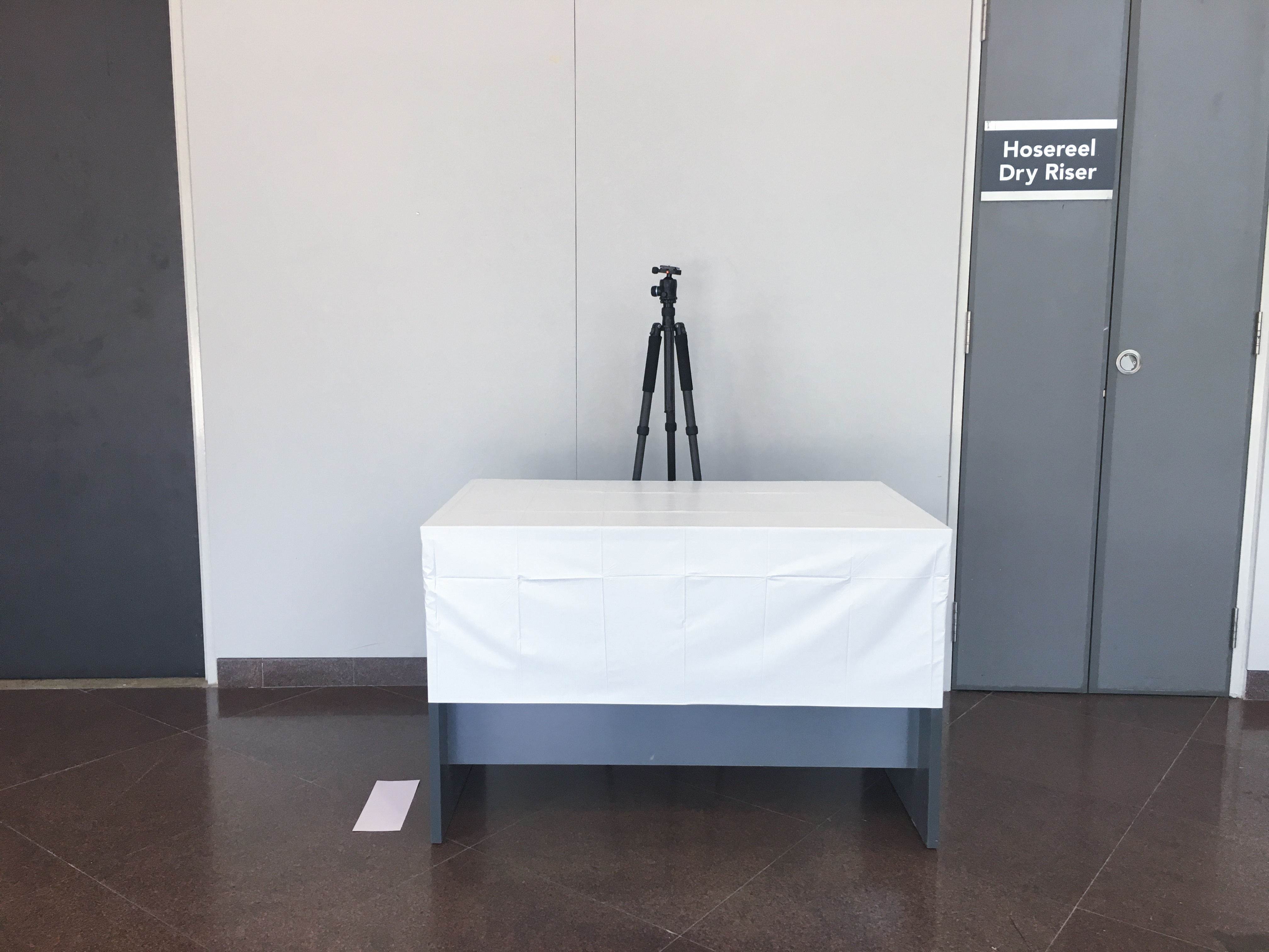
Setting up of the installation:

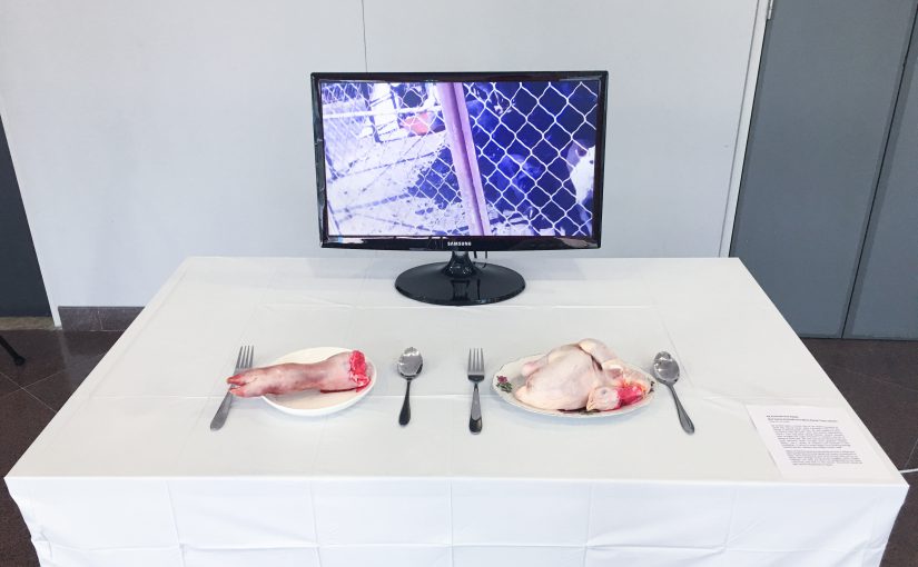
A white table cloth will be draped over the table and clean plates to resemble a clean dining table. Raw meat (Pig Trotters and Raw Chicken) will be placed on the table to show the undecorated form of food that we eat in our daily lives. A monitor screen will be placed in the center, slightly behind the plates, to show the animal slaughters of both domesticated and farm animals. I have attached my laptop to the monitor with a HDMI cable and the sound will be played out from a portable bluetooth speaker. I set up 2 cameras (font and back of the installation) to capture the movement and reaction of the audience.

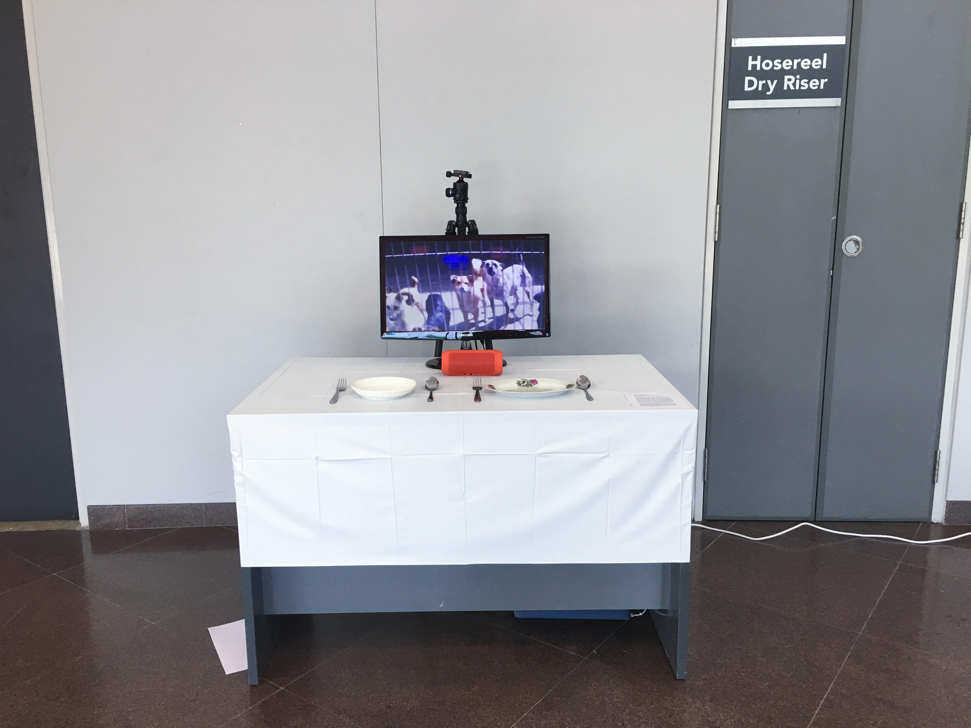
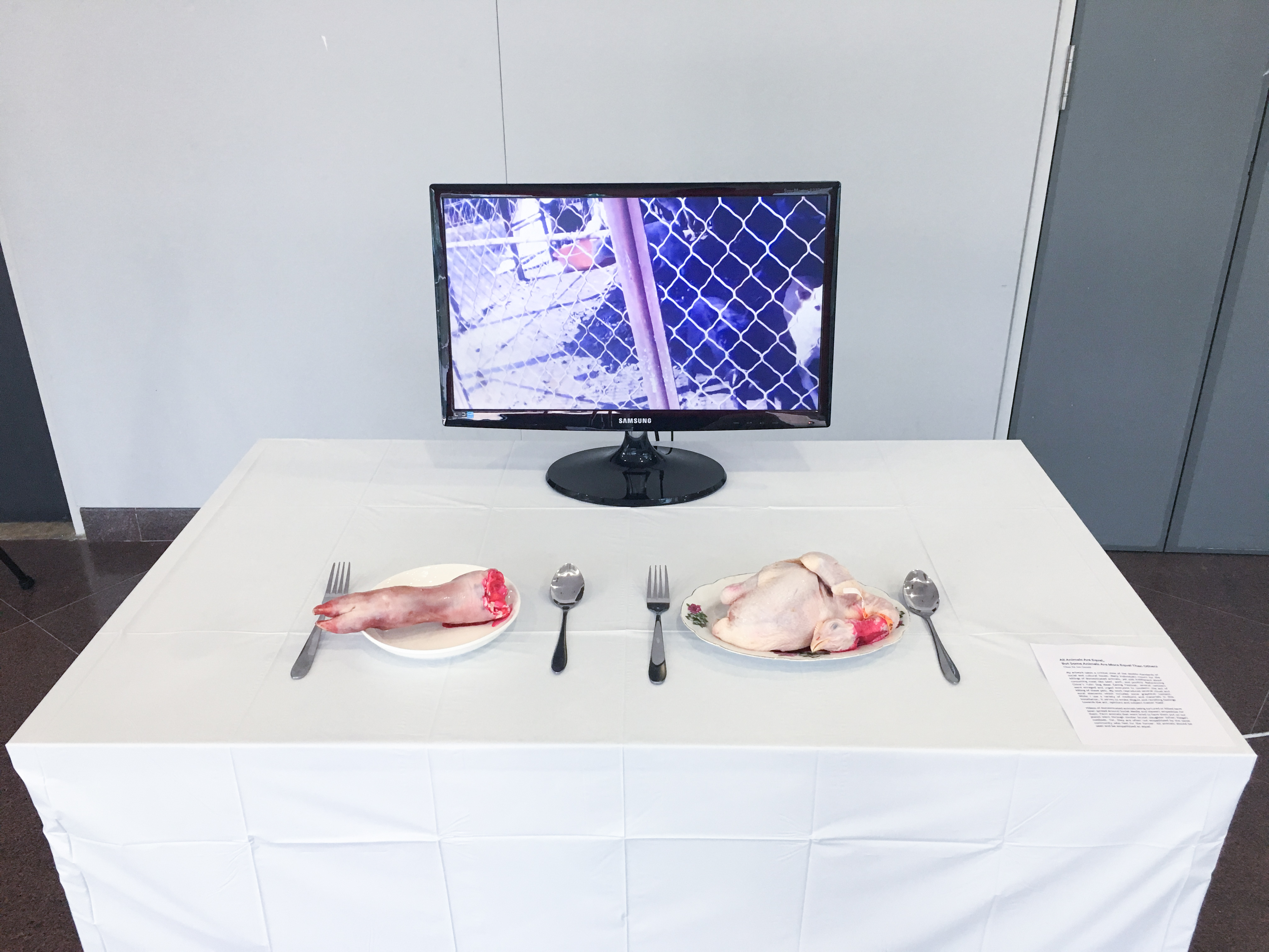
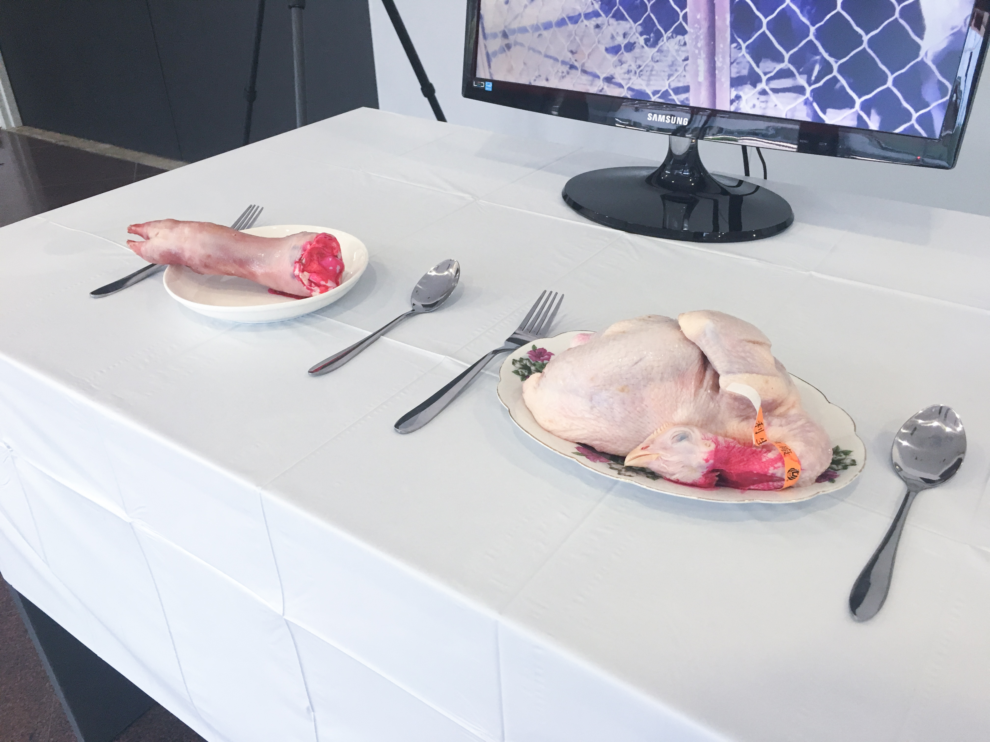
Video Footages Shown on Screen:

Audience Reaction to the Installation:

Reflection

Many of them were disturbed by the brutal animal slaughters in the video and are very upset by it, but there were some who can take the violence. Some of them were confused by the message from the installation, argued that:

  1. They are all videos of animal slaughters.
  2. Why just killing of dogs vs farm animals? There are other animals like crocodiles, snakes, etc.
  3. We, humans, are the apex of the food chain, so it’s alright to kill farm animals for food.

What I am trying to present is the mentality that everyone should hold, that all animal killings are equally brutal. Dog slaughters are just one of the examples I could find from the web, it is just a representation for domesticated animals. If they think that it is alright to kill farm animals for food, then why not kill their pet companions for food?

Ms Lei commented that my installation is outright gory, giving the shock factor; it may have two different outcomes, and I should think about that.

  1. Some people may be too sensitive and turned off by the video and totally shut off their thoughts and feelings, which might result them of just walking off and not thinking about the topic/message.
  2. The intended result of people getting the message and think about not eating meat.

My thoughts on the first comment is that if they becomes too sensitive, choosing to shut off all thoughts and feelings about the installation, wouldn’t that show that they just want to avoid the subject matter?

F2D II: Zine – Final

“Look Out for Blind Spots” is a saddle-stitch zine that provides brief information on Telok Blangah neighbourhood, an informative guide for drivers and what they should look out for.

Links: Neighbourhood Exploration      Infographics      Process

Printing

When I was test printing my zines in school, there were gaps between the spreads as the document was printed in pages instead of spreads. Some of the pages were in different orientations too.

In the second test print, I figured that I was supposed to select “print on short-edge”. Although this time round the page orientation is correct, the spreads remained to have gaps. After asking around, I realised that Mac users have to export it into PostScript files and then convert it into PDF. However, the exported PostScript file is in portrait but the spreads are in landscape. Thus, the contents are cropped abruptly. Therefore, I decided to look up online for solutions.

What I found online will be beneficial for future students who need this tip. The reason why PostScript file doesn’t allow me to change its orientation is because I didn’t have a printer option in the PPD tab. Some old mac users might have this pre-installed, but newer mac users doesn’t have any available option. Thus, I have to download ADPDF9.PPD file online and go to Applications > InDesign > Presets > Create a new folder, case-sensitive [PPDs] > and paste the file in this folder. Make sure that InDesign application is not opened in the background. Afterwards, Adobe PDF 9.0 will appear in the PPD tab, then I am able to select A3 size paper and spread orientation for the PostScript file.

I printed my zine from True Colours Print House Pte Ltd. They do not have a wide variety of papers to choose from. There were mostly art cards, according to the feedback for my paper type during presentation. Honestly, do not come to this shop to print due to the limited paper choices, unless you are running late (they open until 10pm, ColorVizio closes at 9pm).

Reflections

Overall, I enjoy the process of making this zine, from concept to production, as this is my first experience in doing so. Comparing the first draft of my zine to the final product, there is a vast difference and I am proud that I managed to complete this zine with the helpful inputs from Joy and my peers. Things that stood out in my zine was the minimalistic style (which I wanted to produce) abd the consistent colour palette.

Things to take note from the final zine: Headers consistency and the first spread’s contents (is varied from the other two spreads).

PDF: ZINE_Final

F2D II: Zine – Process

Before I start on my Zine, I researched on example over Pinterest. I found myself more drawn towards a more minimalistic style. To convey information with mainly pictures and as little text as possible.

Below are the few references I found online which I took interest in.


After which, I tried to work with different grid systems to come up with a layout that I prefer. I know that I want to focus on a few categories in my zine.

  1. Neighbourhood
  2. Places of interests
  3. Petrol kiosks and Parking spaces

These categories will be sufficient for all the three spreads in my zine, which is targeted to drivers (informative guide for drivers).

This is my first draft of my Zine.

I chose a pastel palette as it reflects the nostalgic feeling of the neighbourhood.

This spread includes a photo in the center and a cropped photo from the bottom. The headers and body texts are overlay-ed on top of the photo and the background. The contents will be mainly on the slow paced life in the neighbourhood.

In the second spread, I want to talk about what to watch out for in the neighbourhood. There are places of interests and emergency helplines which will be helpful. I wanted to have a grid-like minimalistic feel, but I guess there must be more explorations towards my final Zine.

In the third spread, I will talk about where to find the easily accessible petrol kiosks and where to find the carparks with cheap parking rates. I tilted the photos to have a different approach to the former spreads as I didn’t want the whole approach to be bland and stale.

In the back cover, I wanted a circle frame so that a picture could be fitted inside and texts to be filled in the blue column.

After the first consultation with Joy, the following is the second version that was revised.

Compared to the first version, The green patterns have been changed to solid green as I have to keep the consistency throughout the zine; there were no green patterns reflected in zine.

As the previous photo in this spread was too cluttered, I have changed the photo to a HDB to show that the neighbourhood is quiet and slow paced. I reduced the number of paragraphs as too much information will misdirect the reader.

In this spread, a lot of changes have been made. I included the thematic colours, cropped photos of the Red Rhino and Gillman Barracks to again, show consistency. The header has been changed to catch the reader’s attention. The hierarchy is clearly established in this version – Header > Photo > Body texts.

I have decided to remove all other pictures of petrol kiosks as I wanted to keep to a minimalistic style. The header is working fine now here because of its consistency. However, the photo is too complexed and is fighting for attention, thus, some amendments have to be made. The rectangular frame is included to keep the style consistent as well.

I included the photo of a sticker that was on Gillman Barracks pathway, which I feel that I relates to the exit/ending of the zine. However, through consultation, this looks like a logo instead of a photo.

Through these consultations, there is a clear direction to work towards to.