F2D II: Zine – Process

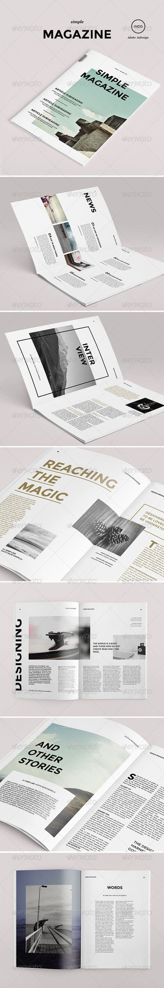
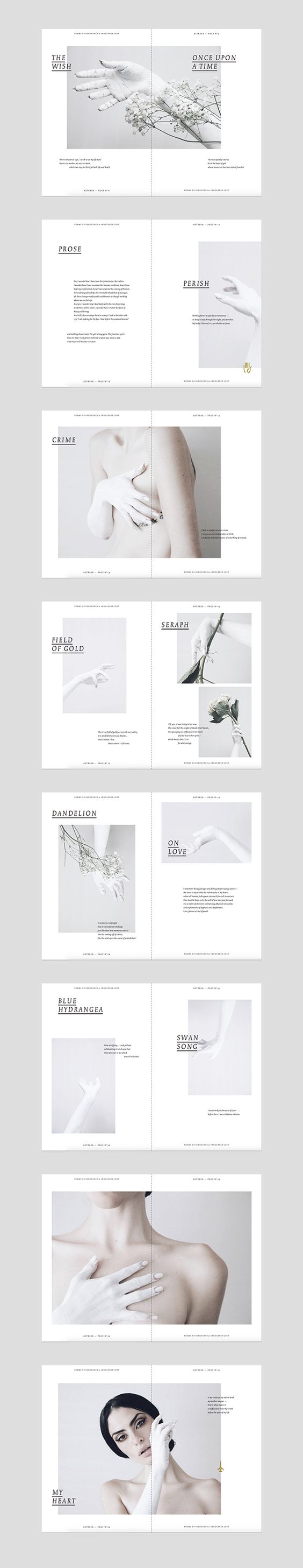
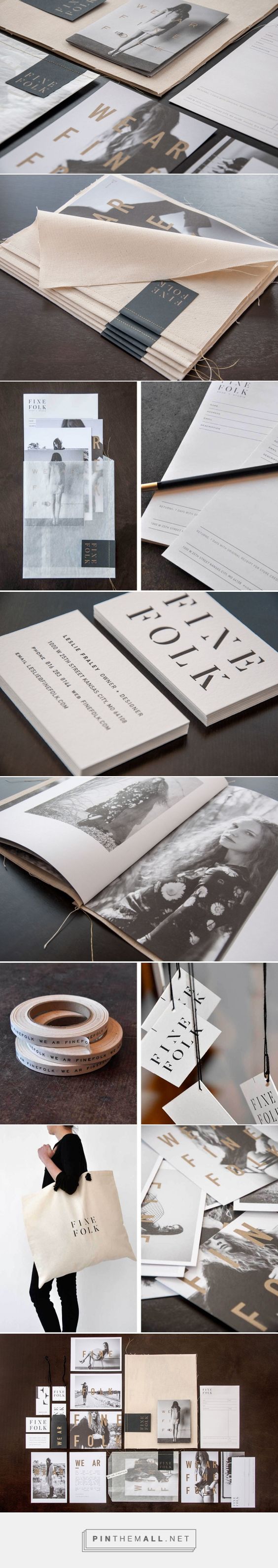
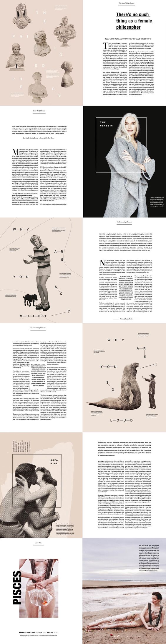
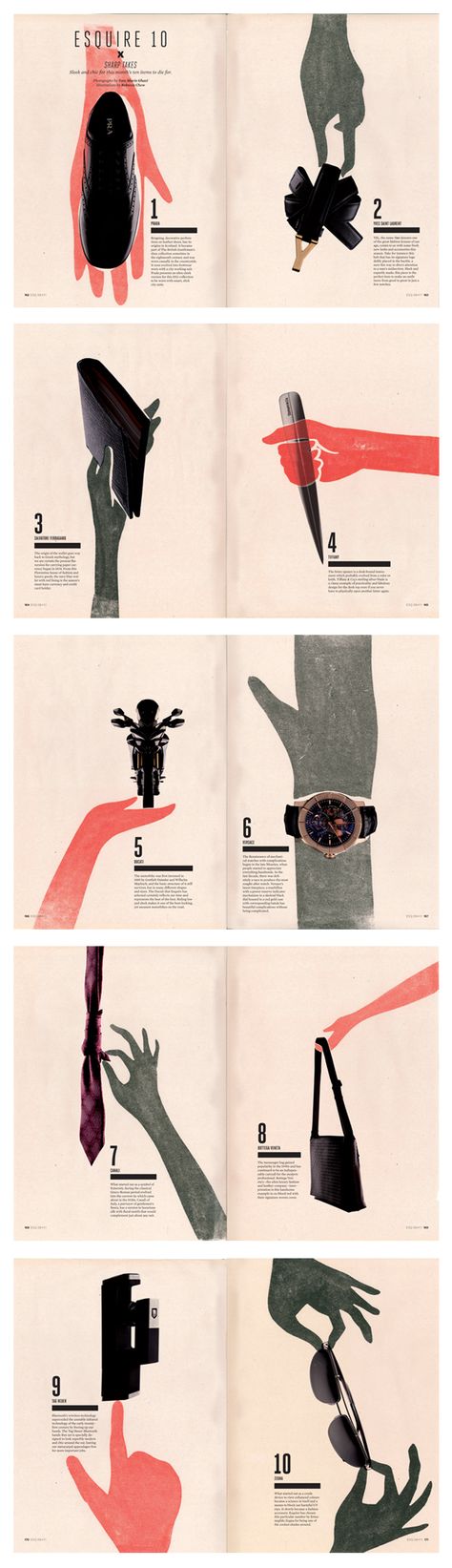
Before I start on my Zine, I researched on example over Pinterest. I found myself more drawn towards a more minimalistic style. To convey information with mainly pictures and as little text as possible.

Below are the few references I found online which I took interest in.


After which, I tried to work with different grid systems to come up with a layout that I prefer. I know that I want to focus on a few categories in my zine.
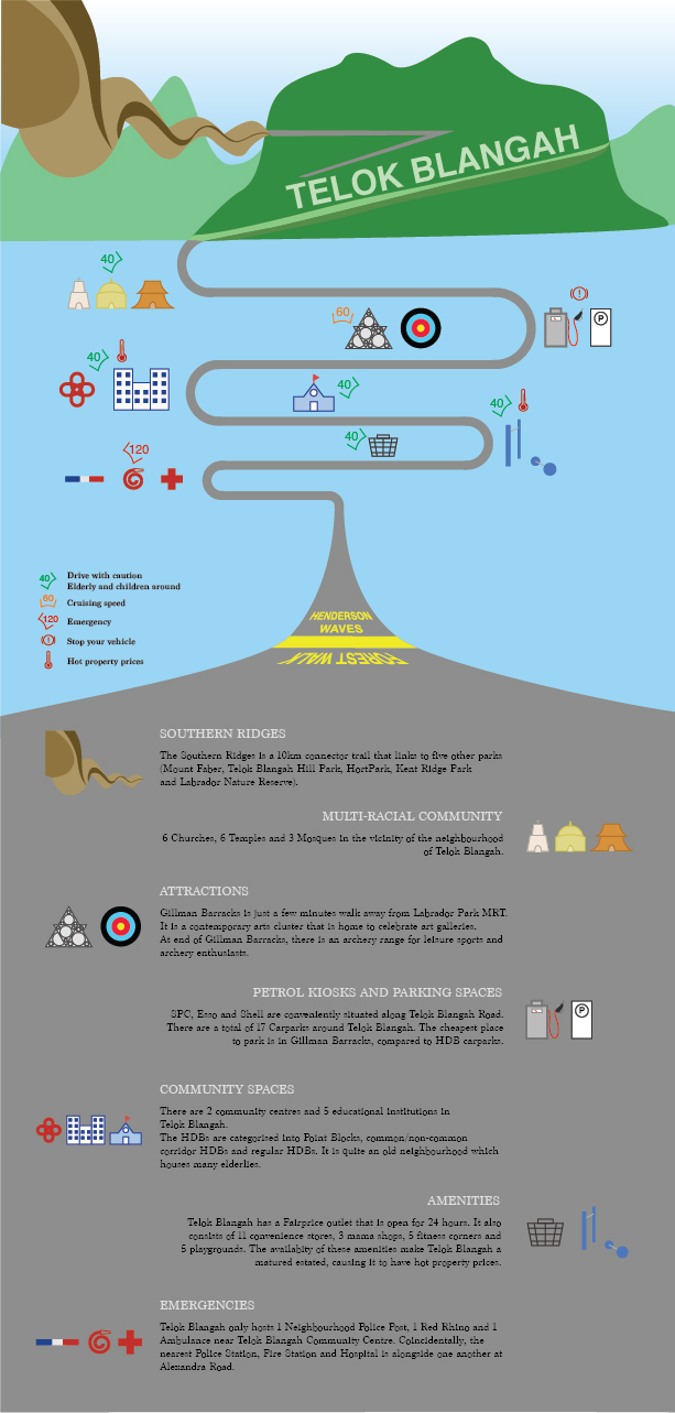
  1. Neighbourhood
  2. Places of interests
  3. Petrol kiosks and Parking spaces

These categories will be sufficient for all the three spreads in my zine, which is targeted to drivers (informative guide for drivers).

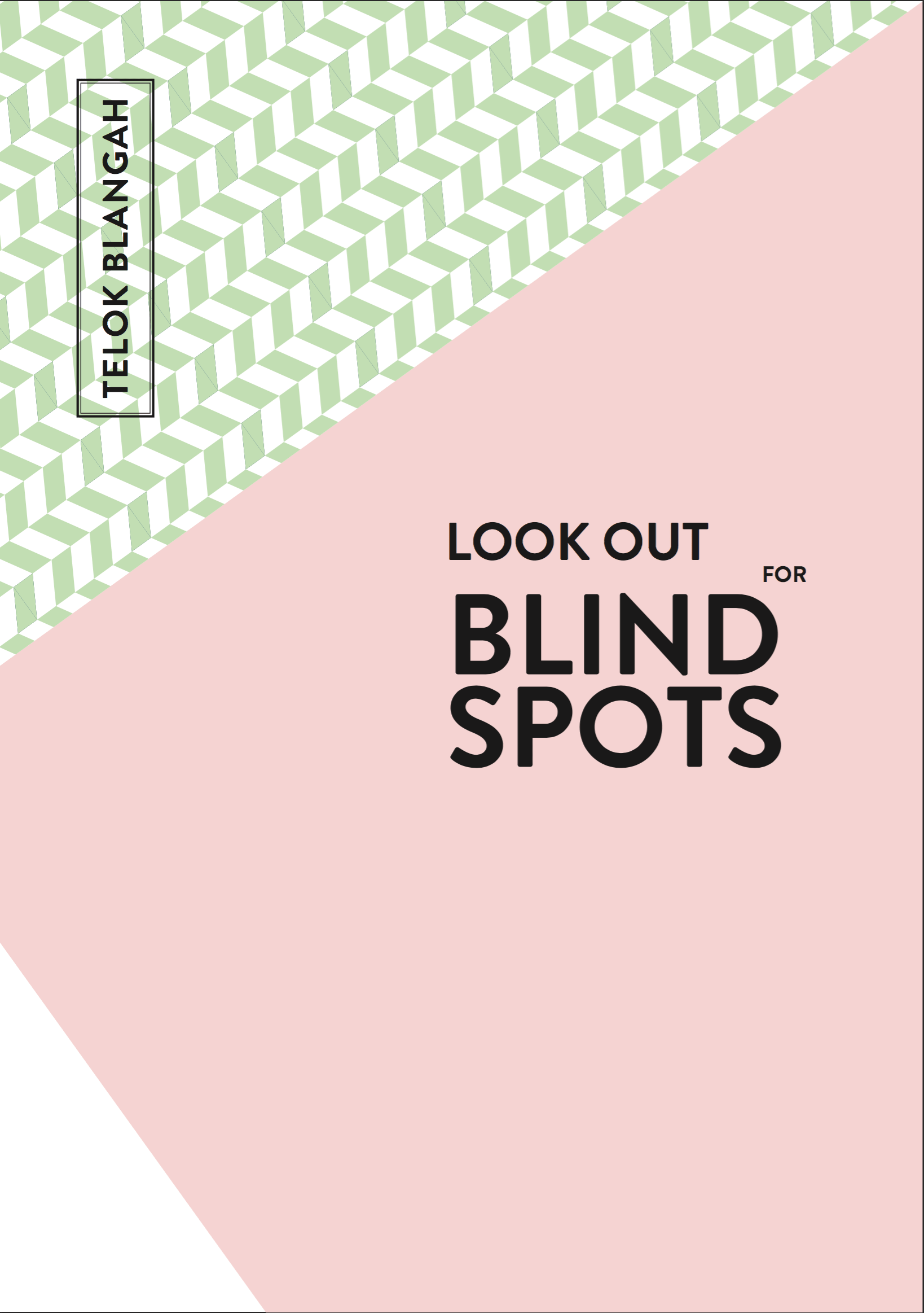
This is my first draft of my Zine.

I chose a pastel palette as it reflects the nostalgic feeling of the neighbourhood.

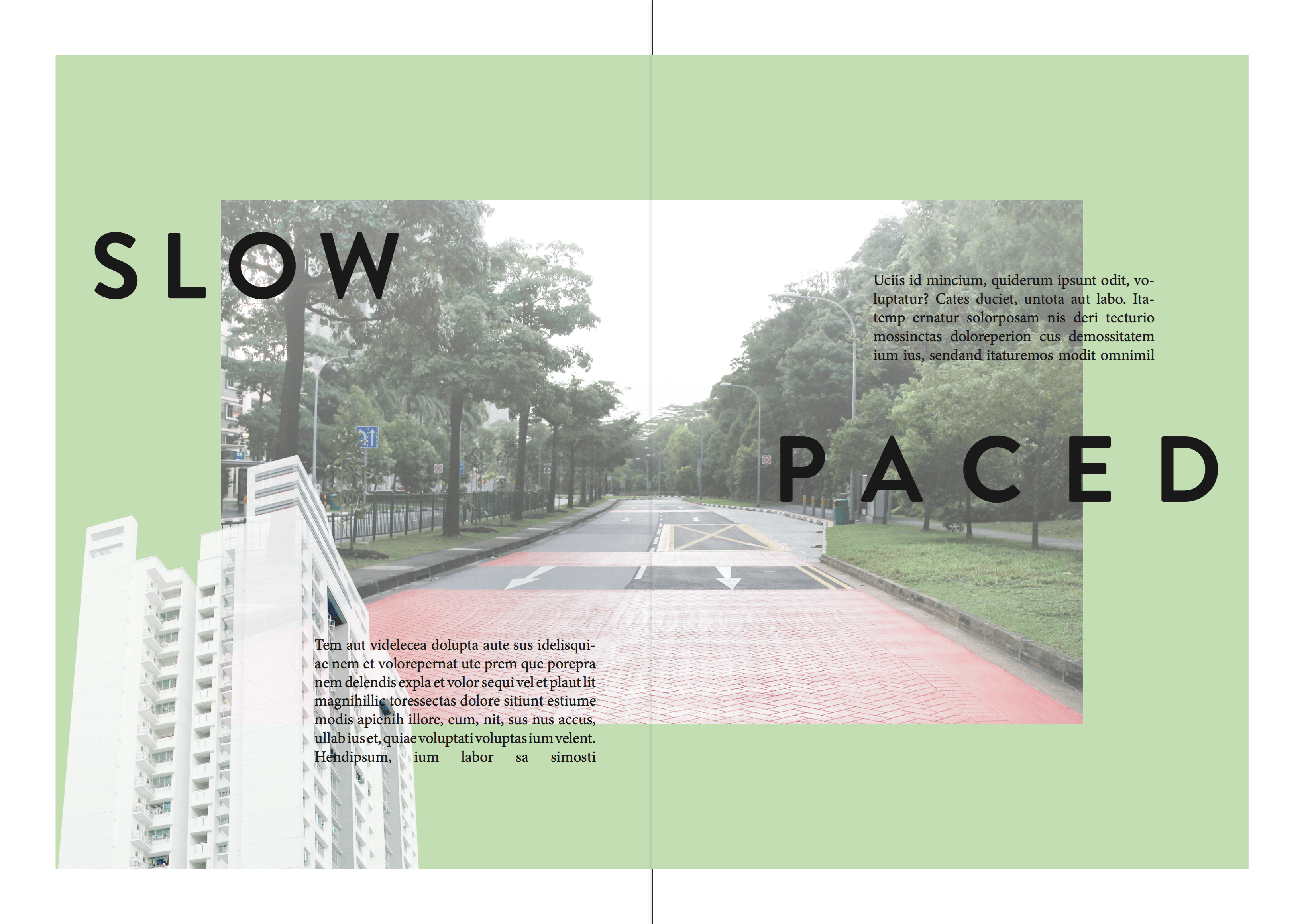
This spread includes a photo in the center and a cropped photo from the bottom. The headers and body texts are overlay-ed on top of the photo and the background. The contents will be mainly on the slow paced life in the neighbourhood.

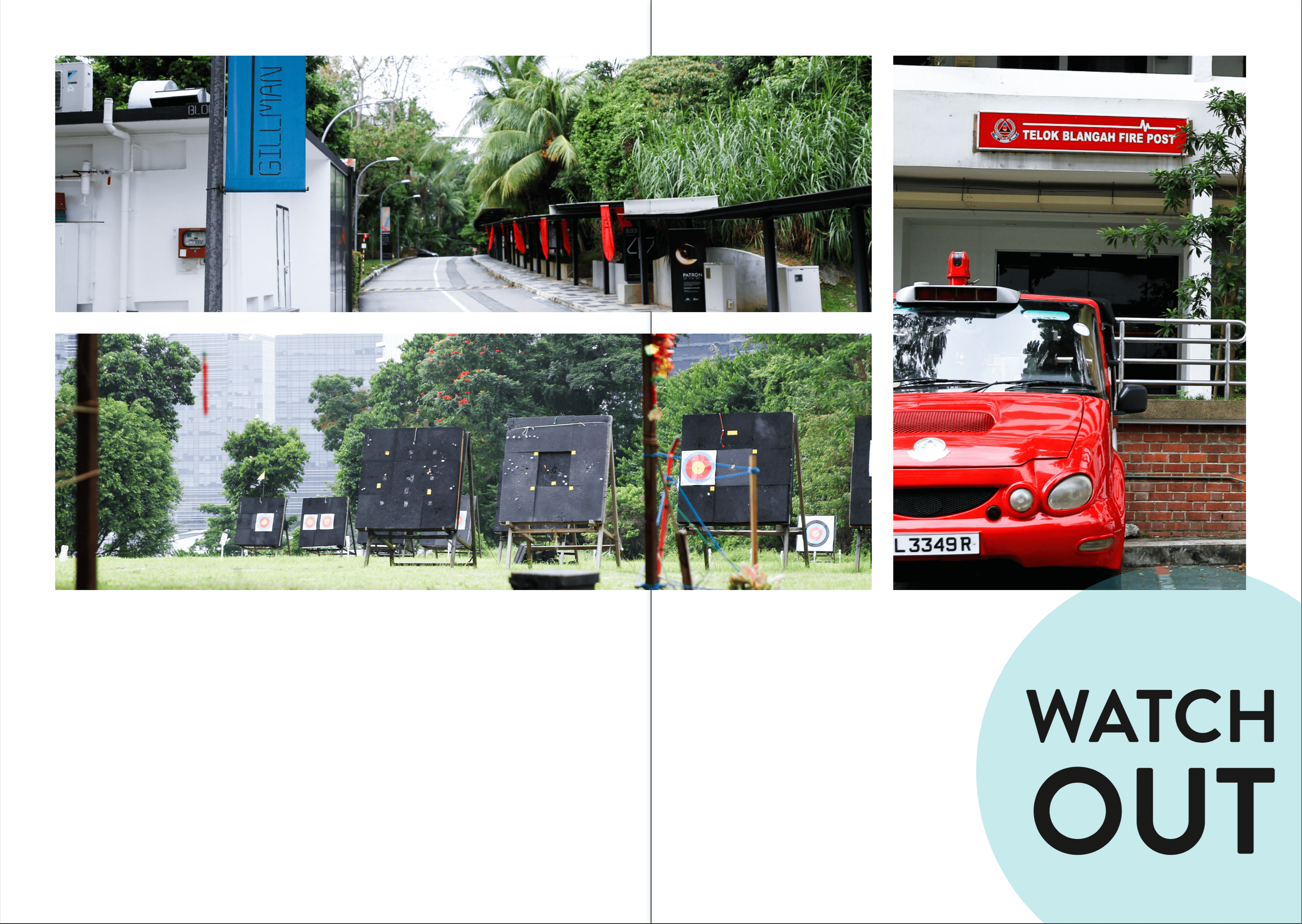
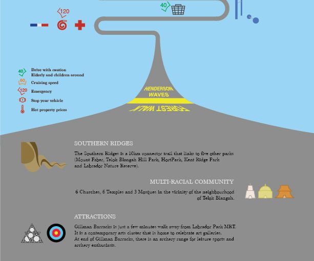
In the second spread, I want to talk about what to watch out for in the neighbourhood. There are places of interests and emergency helplines which will be helpful. I wanted to have a grid-like minimalistic feel, but I guess there must be more explorations towards my final Zine.

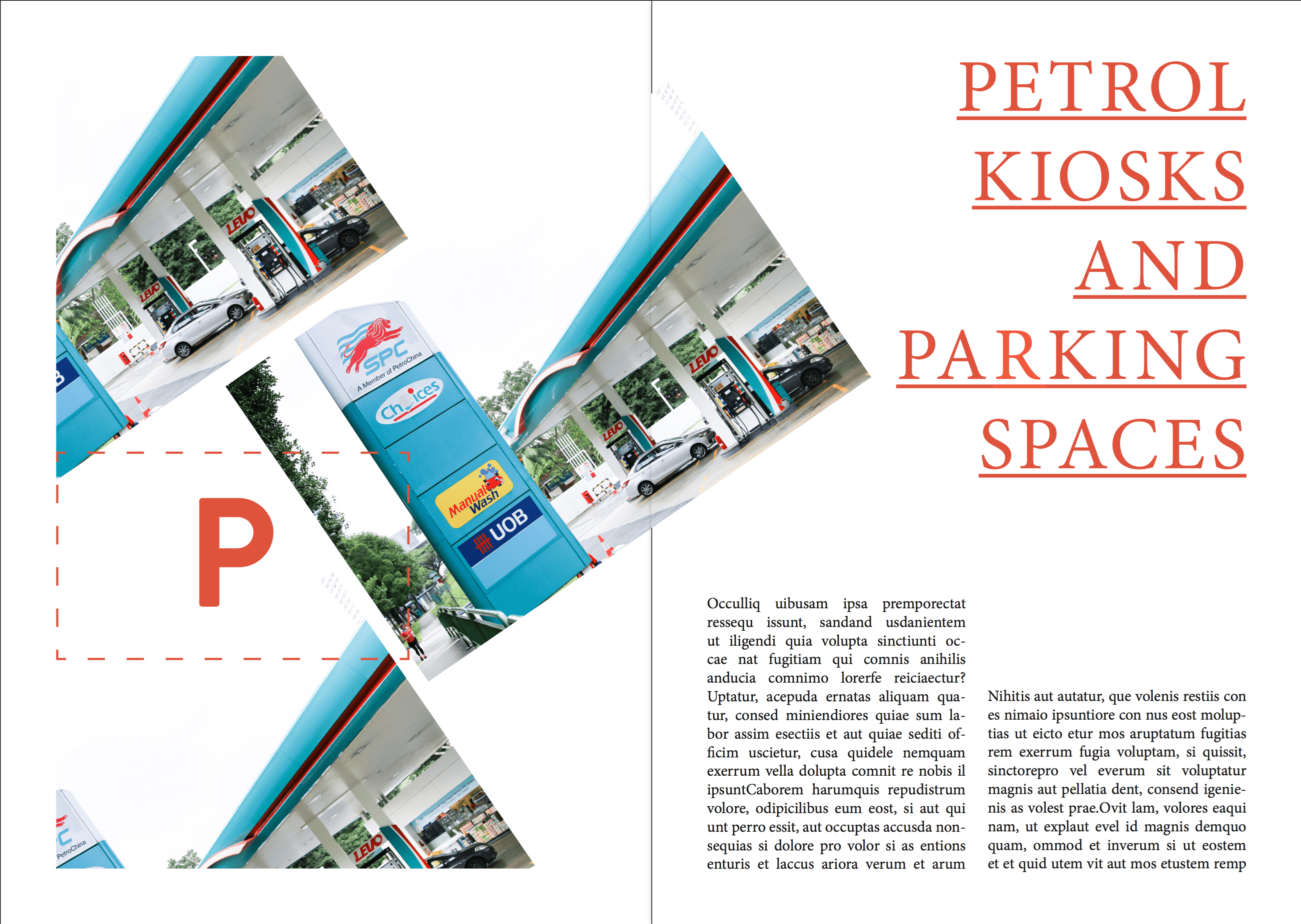
In the third spread, I will talk about where to find the easily accessible petrol kiosks and where to find the carparks with cheap parking rates. I tilted the photos to have a different approach to the former spreads as I didn’t want the whole approach to be bland and stale.

In the back cover, I wanted a circle frame so that a picture could be fitted inside and texts to be filled in the blue column.

After the first consultation with Joy, the following is the second version that was revised.

Compared to the first version, The green patterns have been changed to solid green as I have to keep the consistency throughout the zine; there were no green patterns reflected in zine.

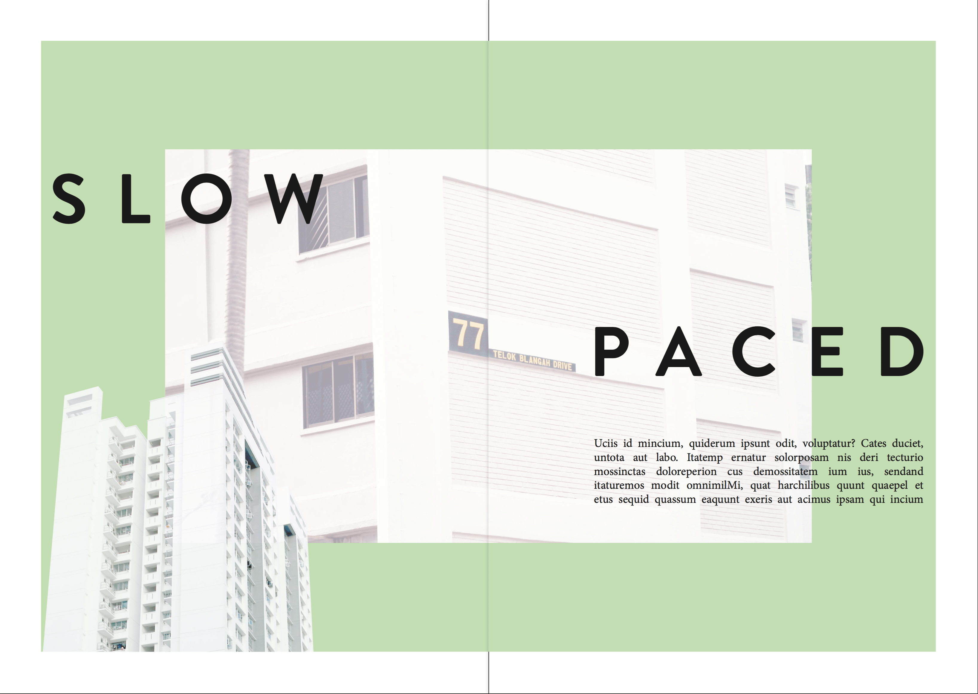
As the previous photo in this spread was too cluttered, I have changed the photo to a HDB to show that the neighbourhood is quiet and slow paced. I reduced the number of paragraphs as too much information will misdirect the reader.

In this spread, a lot of changes have been made. I included the thematic colours, cropped photos of the Red Rhino and Gillman Barracks to again, show consistency. The header has been changed to catch the reader’s attention. The hierarchy is clearly established in this version – Header > Photo > Body texts.

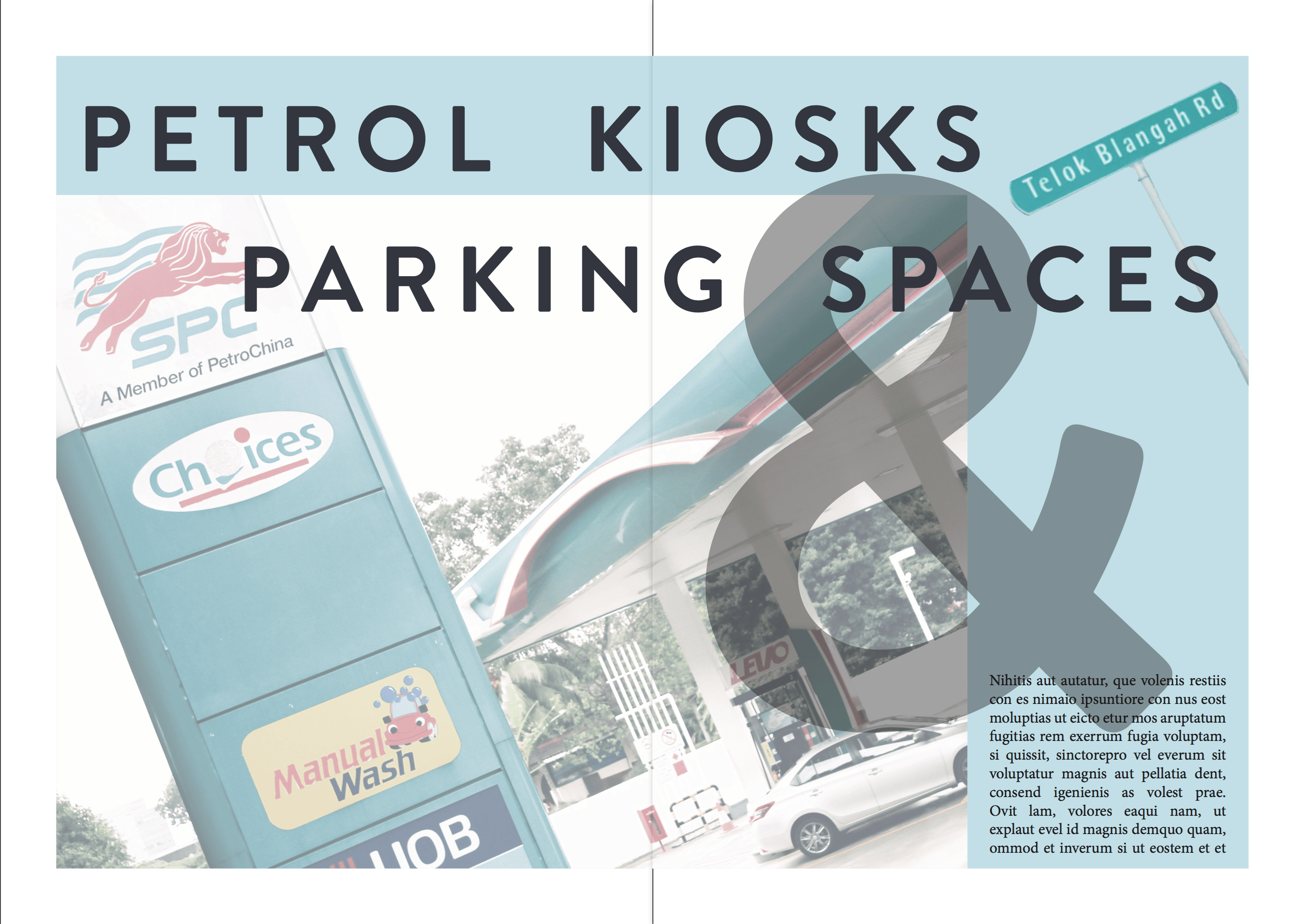
I have decided to remove all other pictures of petrol kiosks as I wanted to keep to a minimalistic style. The header is working fine now here because of its consistency. However, the photo is too complexed and is fighting for attention, thus, some amendments have to be made. The rectangular frame is included to keep the style consistent as well.

I included the photo of a sticker that was on Gillman Barracks pathway, which I feel that I relates to the exit/ending of the zine. However, through consultation, this looks like a logo instead of a photo.

Through these consultations, there is a clear direction to work towards to.

Project 2 Part I – Infographics

After my exploration around Telok Blangah, I have decided to make an infographic as a guide for drivers (Target Audience). The road the bends around in the middle of the composition brings the audience’s eyes around the context, which will inform them about things in Telok Blangah.

At the top of the composition, there’s the Southern Ridges which includes Henderson Waves, Telok Blangah Hill and Mt Faber. It then leads to temples, Gillman Barracks, petrol kiosks, schools, markets and emergency responses. At the bottom of the composition, I included a short write-up to include information on the icons of the neighbourhood so that they can find out more about the place.

In the middle of the composition, I have included some speed limits to advise drivers to keep while driving past the areas as there are elderlies and children around the neighbourhood. They can increase to cruising speed when they are travelling to attraction sites like Gillman Barracks and archery range. The high speed is to indicate that the emergency responses will travel at a high speed, so drivers should be aware of their surroundings and keep a good lookout to prevent accidents. The “hot temperature” symbol is to indicate that Telok Blangah is a mature estate which offers high property prices even though it is a quiet neighbourhood. I have also included petrol kiosks and parking spaces in the infographic as I find it intriguing to have 3 different petrol kiosks down the same road on Telok Blangah Road. It is very convenient for drivers to find them on the main road.

In conclusion, I find that this Infographic exercise allow us to better appreciate the neighbourhood and know what information we want to bring across to our audience.

Que Sera Sera – Process

Animation Curator

I have decided that traditional animation can work for this design. It is able to illustrate the essence of being an animator and bring across the point of creativity being constrained in Singapore.

g_animation_bw02

I have drawn them in different layers, namely: Background, Merlion, Character, Water and Pot of Gold.
It has a total of 26 frames, I have applied some of the 12 principles of animation in it. However, I will be only using some of the frames, to form the final composition. The final composition will be a Capital ‘G’ formed by the Gold pendulum and the Character jumping. The Merlion will also form a ‘G’ when it jumps out of the water.

Message: Singapore restrains the creativity of Singaporeans, thus, we have to take risks and pursue our goals.


Naval Officer

I decided to model a porcelain bowl with Navy pixelised texture in 3D. I searched for a pixelised texture and colour-corrected it to resemble a Navy military uniform. The intention of using a bowl is to represent a job that we earn a living from. I have added a pair of chopsticks for scale comparison. I have utilised the pixelated texture to form my name. The lighting was difficult to achieve as the material attributes is reflective; it was difficult to balance between a shiny texture and reducing the distraction of the specularity.

Message: Having a job in the government sector doesn’t guarantee a stable career.


Hairdresser

img_8141_01_oss

This was my initial idea, using paintbrush, layering scissors, hair and hair clipper to form the letterform “G”. However, the backdrop seemed like from a surgical setting. Joy suggested to use the bristles of a brush to form the letterform. However, the post processing seemed too forced with digital imaging.

jenifer-blanco-monzon-1

I have decided to reference from Jenifer Blanco Monzon as her style is minimal and yet best illustrates her message and object. My composition is made up with a hair clipper, brush strokes and a two toned background. I used “J’ as my initials as “J J CHUA” was the name that my peers in Navy call me.

paintbrush_j_03-small

This colourful brush strokes also represents Hair. Which links creativity, education and passion together.

Message: Not all hairdressers are college drop-outs.


Backpacker

backpacker_01

This was my initial design. It was supposed to be an alphabet “G” formed by travel stamps and building chops on a passport. The background didn’t work out great, thus I had to change the entire look of it.

E77219-famf-ho12NIKEHOOPSELITEMEDIUMDUFFEL

My inspiration comes from the different compartmentalisation of items. Each compartment can represent different things that we are concerned about. My composition is a backpack with 5 ‘C’s of Singapore, represented by the 5 compartments. The 5 ‘C’s of Singapore – Cash, Car, Condo, Credit Cards and Country Club. The backpack represents the desire to travel as a young adult, but the 5 ‘C’s are the mindset of parents, holding them back from doing what they want. They are the restraints that most Singaporeans have. As there are a lot of content in the composition, I decided to use solid colours to balance with each element.

Message: Parents doesn’t like their kids to explore around the world when they are young. They think that they should save up for Mortgage.