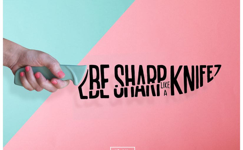
Animation Curator
I have decided that traditional animation can work for this design. It is able to illustrate the essence of being an animator and bring across the point of creativity being constrained in Singapore.
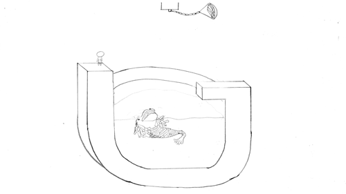
I have drawn them in different layers, namely: Background, Merlion, Character, Water and Pot of Gold.
It has a total of 26 frames, I have applied some of the 12 principles of animation in it. However, I will be only using some of the frames, to form the final composition. The final composition will be a Capital ‘G’ formed by the Gold pendulum and the Character jumping. The Merlion will also form a ‘G’ when it jumps out of the water.
Message: Singapore restrains the creativity of Singaporeans, thus, we have to take risks and pursue our goals.
Naval Officer
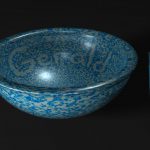

I decided to model a porcelain bowl with Navy pixelised texture in 3D. I searched for a pixelised texture and colour-corrected it to resemble a Navy military uniform. The intention of using a bowl is to represent a job that we earn a living from. I have added a pair of chopsticks for scale comparison. I have utilised the pixelated texture to form my name. The lighting was difficult to achieve as the material attributes is reflective; it was difficult to balance between a shiny texture and reducing the distraction of the specularity.
Message: Having a job in the government sector doesn’t guarantee a stable career.
Hairdresser

This was my initial idea, using paintbrush, layering scissors, hair and hair clipper to form the letterform “G”. However, the backdrop seemed like from a surgical setting. Joy suggested to use the bristles of a brush to form the letterform. However, the post processing seemed too forced with digital imaging.
I have decided to reference from Jenifer Blanco Monzon as her style is minimal and yet best illustrates her message and object. My composition is made up with a hair clipper, brush strokes and a two toned background. I used “J’ as my initials as “J J CHUA” was the name that my peers in Navy call me.

This colourful brush strokes also represents Hair. Which links creativity, education and passion together.
Message: Not all hairdressers are college drop-outs.
Backpacker
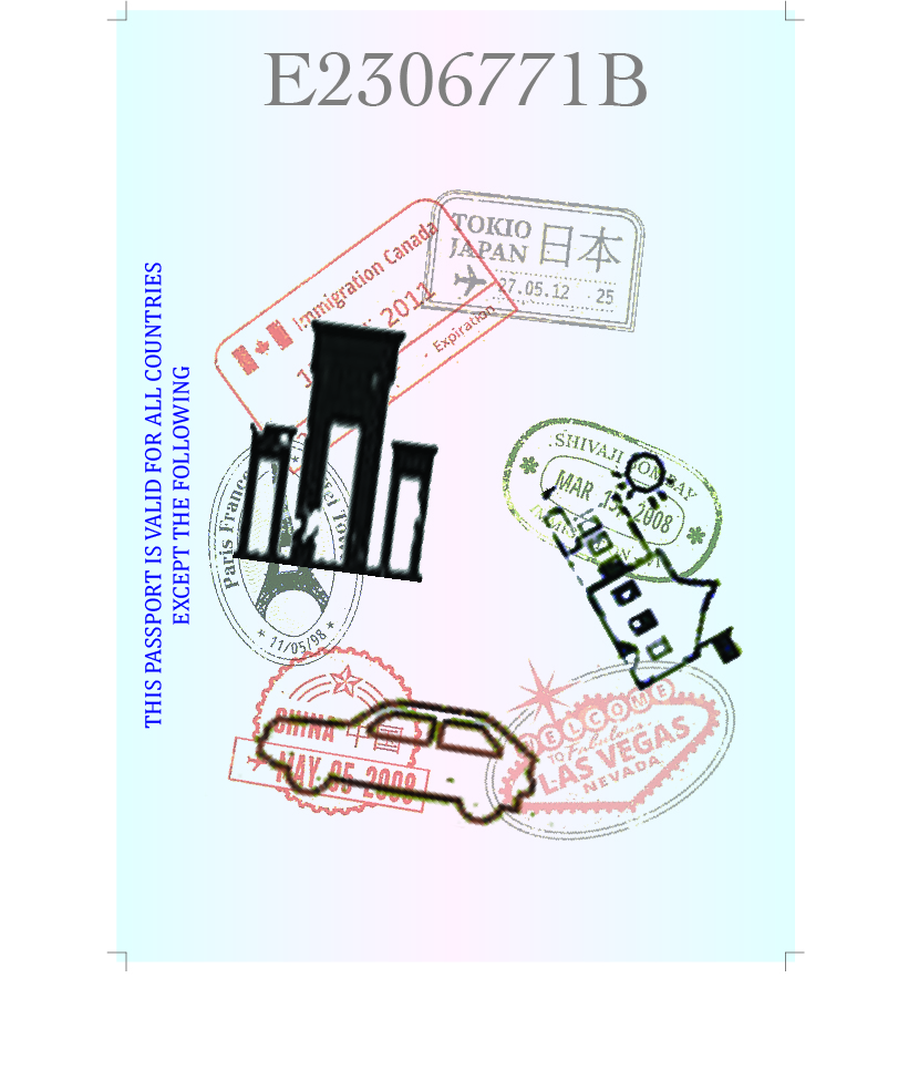
This was my initial design. It was supposed to be an alphabet “G” formed by travel stamps and building chops on a passport. The background didn’t work out great, thus I had to change the entire look of it.

My inspiration comes from the different compartmentalisation of items. Each compartment can represent different things that we are concerned about. My composition is a backpack with 5 ‘C’s of Singapore, represented by the 5 compartments. The 5 ‘C’s of Singapore – Cash, Car, Condo, Credit Cards and Country Club. The backpack represents the desire to travel as a young adult, but the 5 ‘C’s are the mindset of parents, holding them back from doing what they want. They are the restraints that most Singaporeans have. As there are a lot of content in the composition, I decided to use solid colours to balance with each element.
Message: Parents doesn’t like their kids to explore around the world when they are young. They think that they should save up for Mortgage.