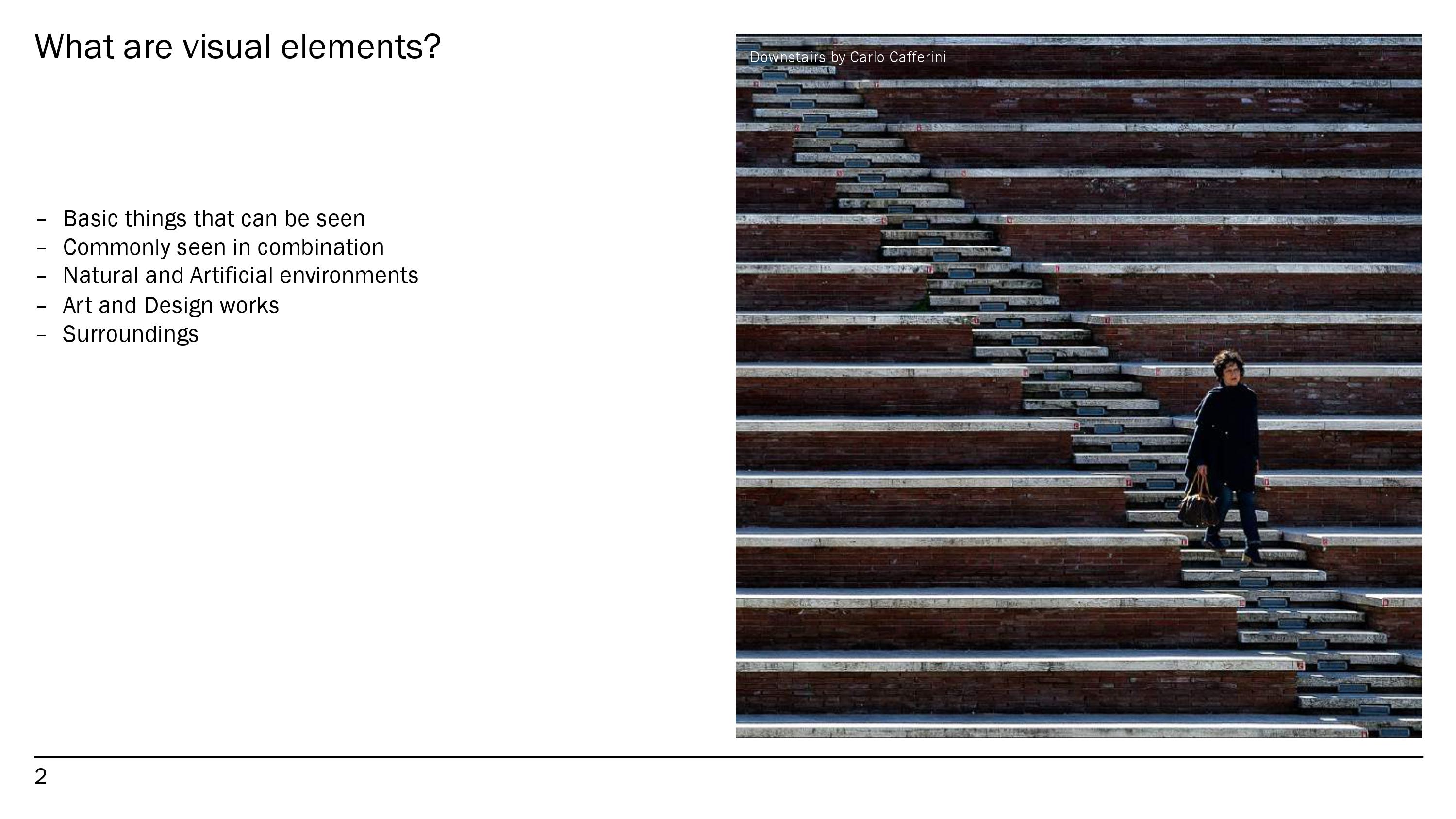
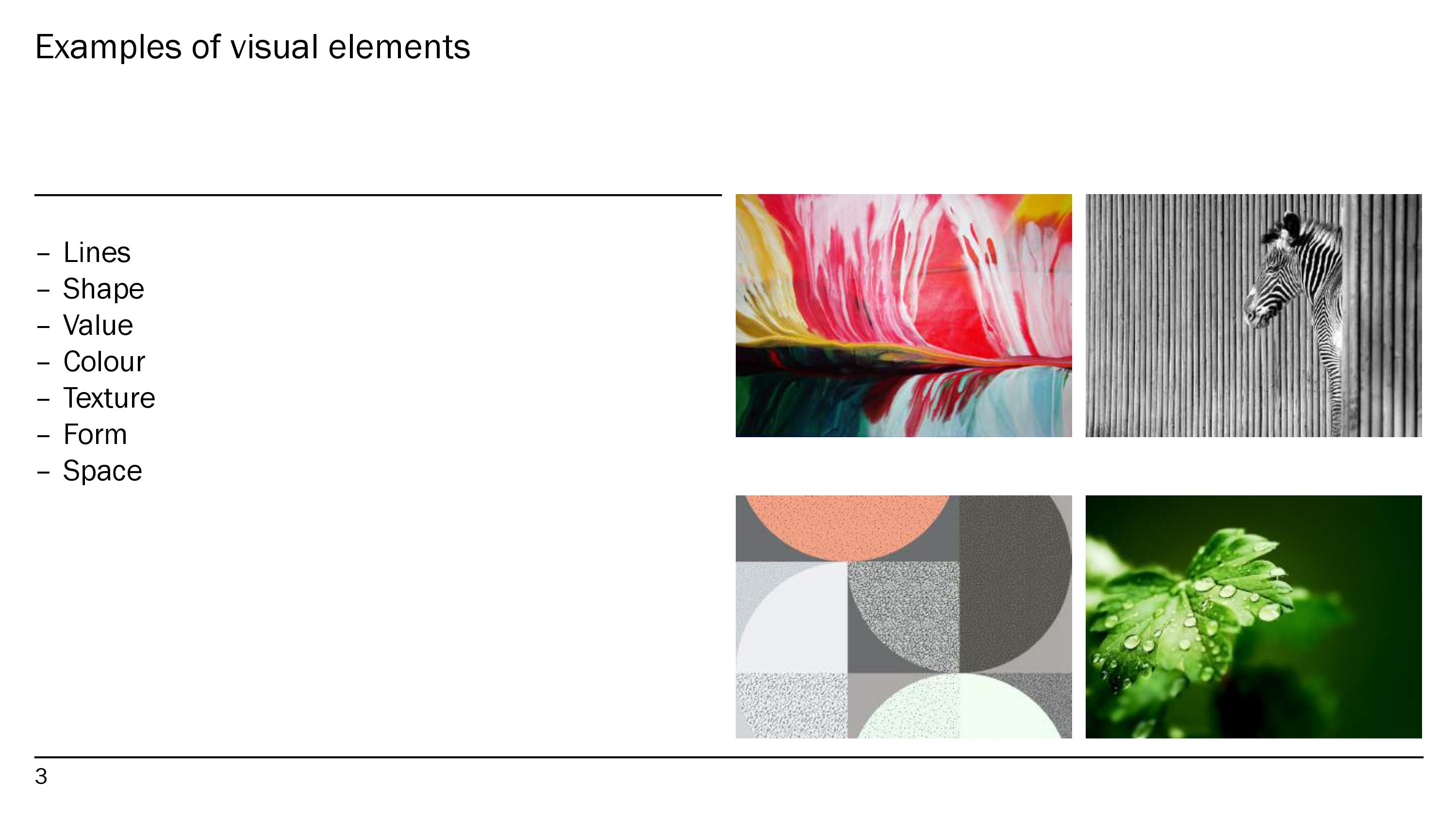
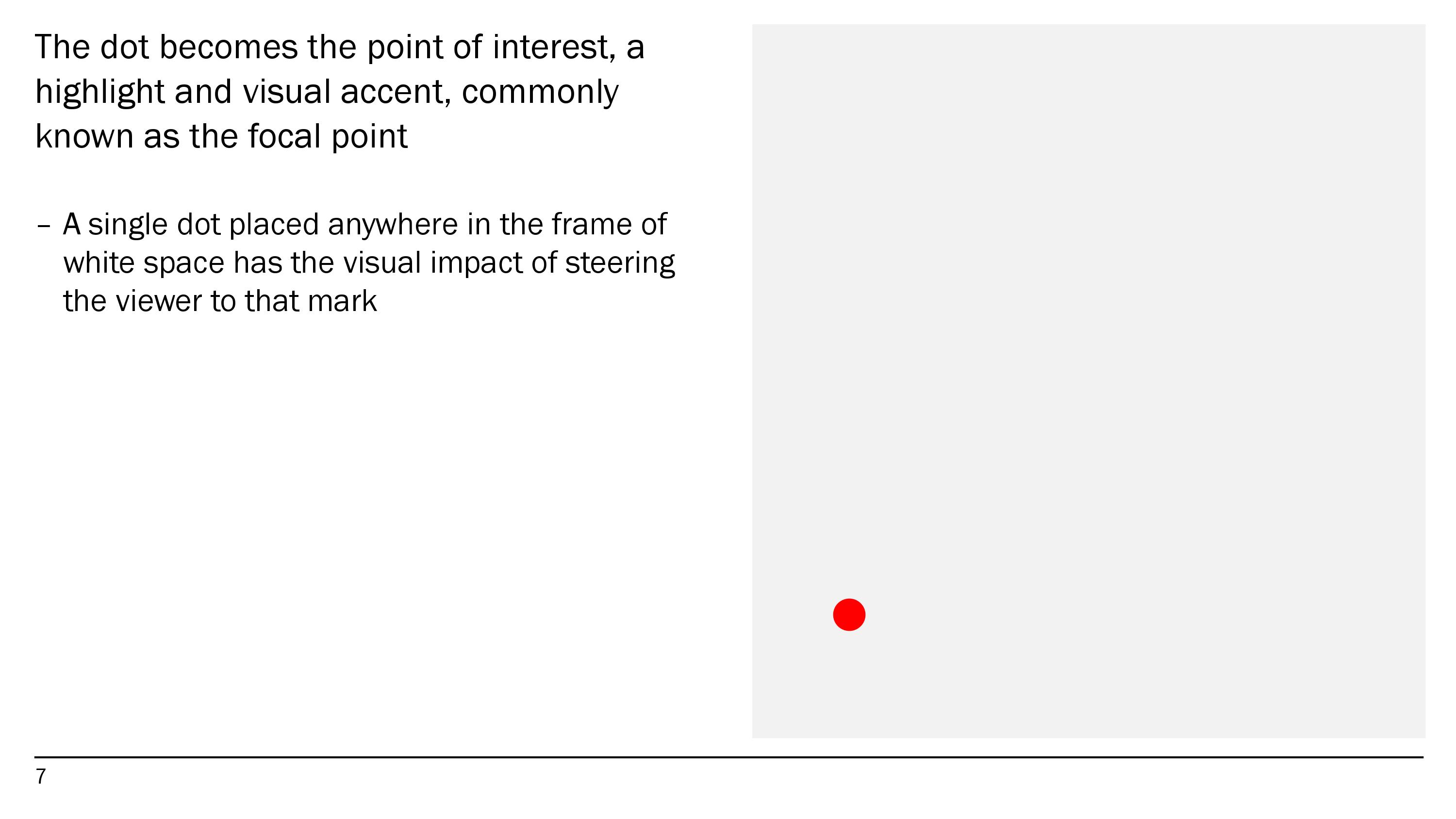
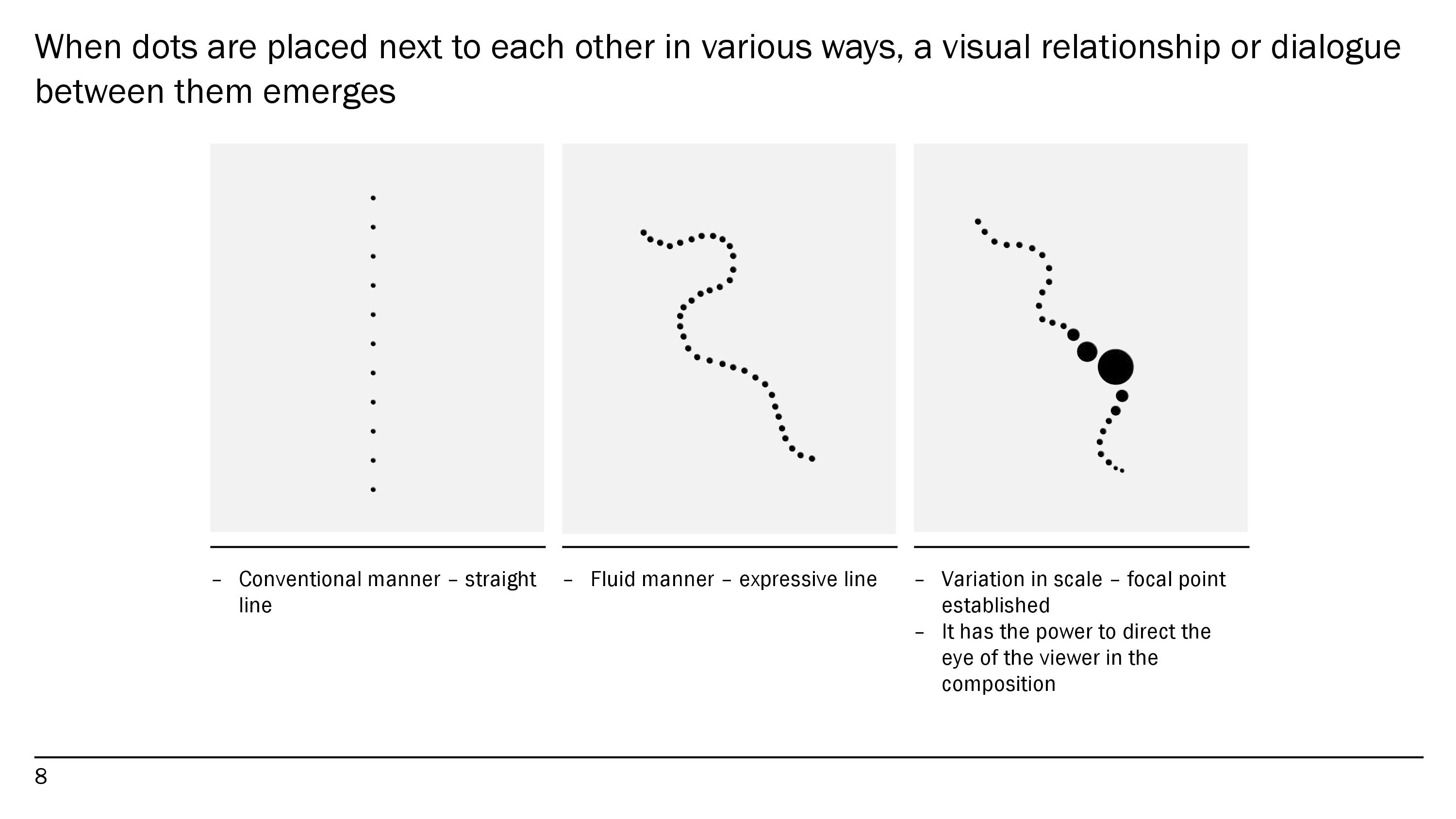
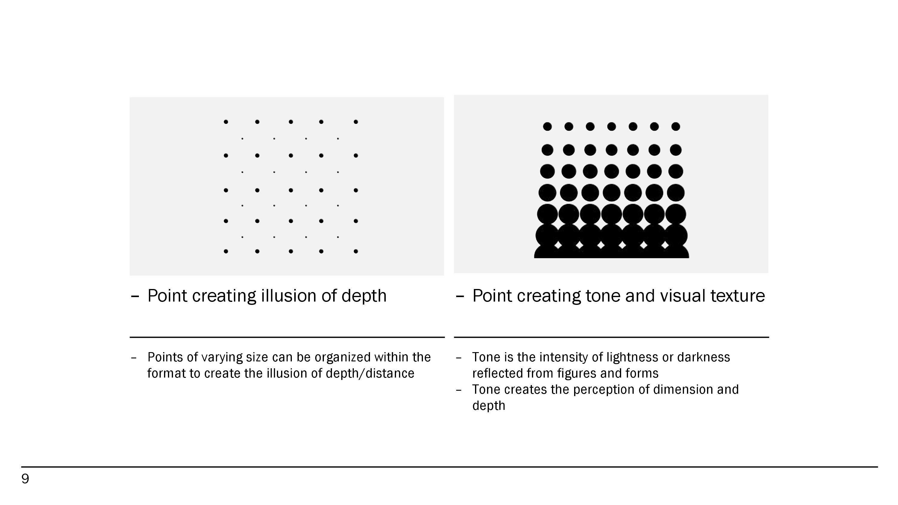
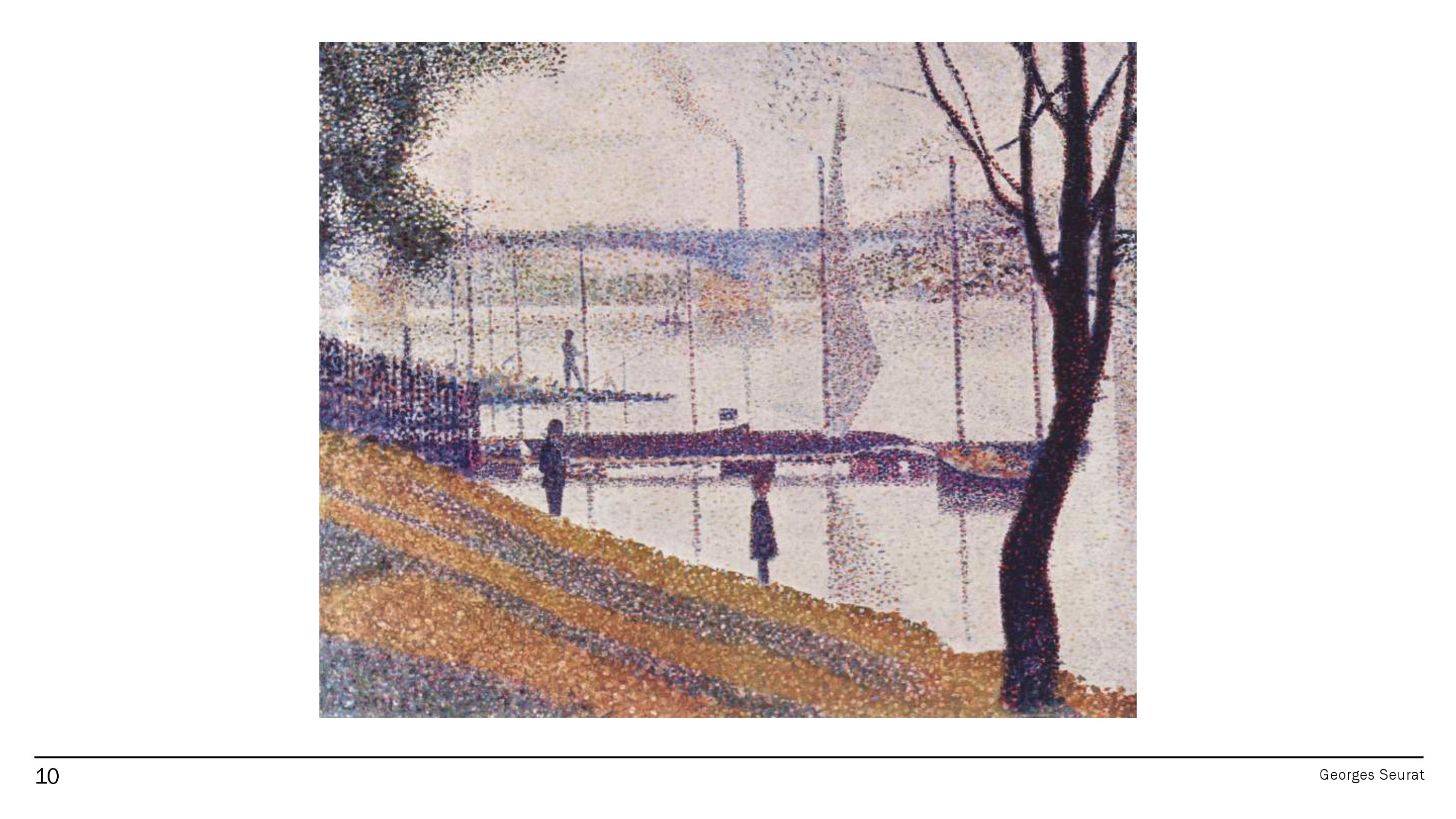
Project 01: My Line Is Emo

Emotion_Print Emotion_Print


Anger_Irritation_Lines_019a

Line 01 – [ANGER] Irritation

Anger_Rage_Lines_016

Line 02 – [ANGER] Rage

Anger_Torment_Lines_018a

Line 03 – [ANGER] Torment

Fear_Anxiety_Lines_013

Line 04 – [FEAR] Anxiety

Fear_Horror_Lines_012

Line 05 – [FEAR] Horror

Fear_Hysteria_Lines_009

Line 06 – [FEAR] Hysteria

Fear_Tension_Lines_004

Line 07 – [FEAR] Tension

Joy_Bliss_Lines_002

Line 08 – [JOY] Bliss

Joy_Exhilaration_Lines_017

Line 09 – [JOY] Exhilaration

Joy_Relief_Lines_001

Line 10 – [JOY] Relief

Love_Compassion_Lines_020a

Line 11 – [LOVE] Compassion

Love_Desire_Lines_015a

Line 12 – [LOVE] Desire

Love_Lust_Lines_022a

Line 13 – [LOVE] Lust

Sad_Despair_Lines_014

Line 14 – [SADNESS] Despair

Sad_Regret_Lines_008

Line 15 – [SADNESS] Regret

Sad_Shame_Lines_003

Line 16 – [SADNESS] Shame

Sad_Suffering_Lines_021

Line 17 – [SADNESS] Suffering

Surprise_Amaze_Lines_010

Line 18 – [SURPRISE] Amaze

Surprise_Jolt_Lines_011

Line 19 – [SURPRISE] Jolt

Surprise_RudeAwakening_Lines_006

Line 20 – [SURPRISE] Rude-Awakening

Artists Research

Ed Moses

Ed Moses_01

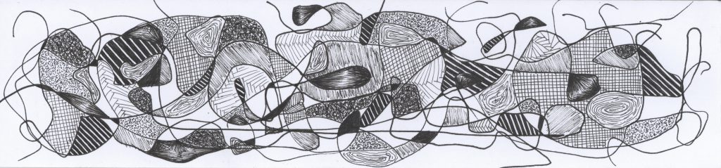
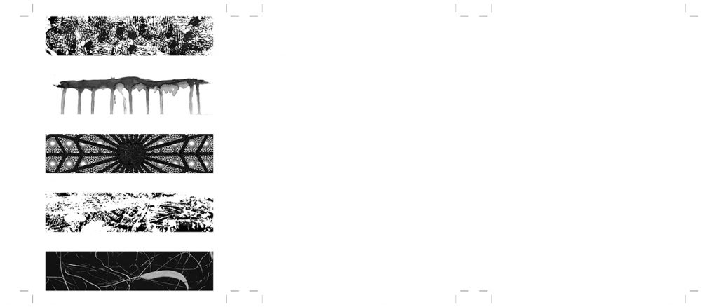
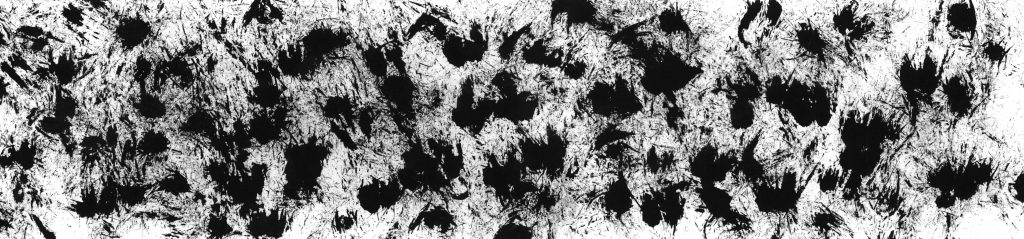
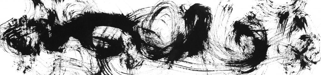
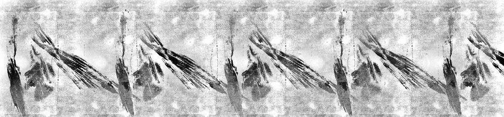
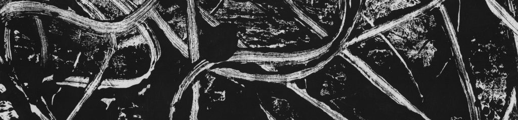
Ed Moses focuses on the profound possibilities and challenges of abstract paintings. His personality makes him choose the unknown over the known, thus his works are experimental. Most of his works are repetitive, all-over patterns of non-cursive and vertical strokes.
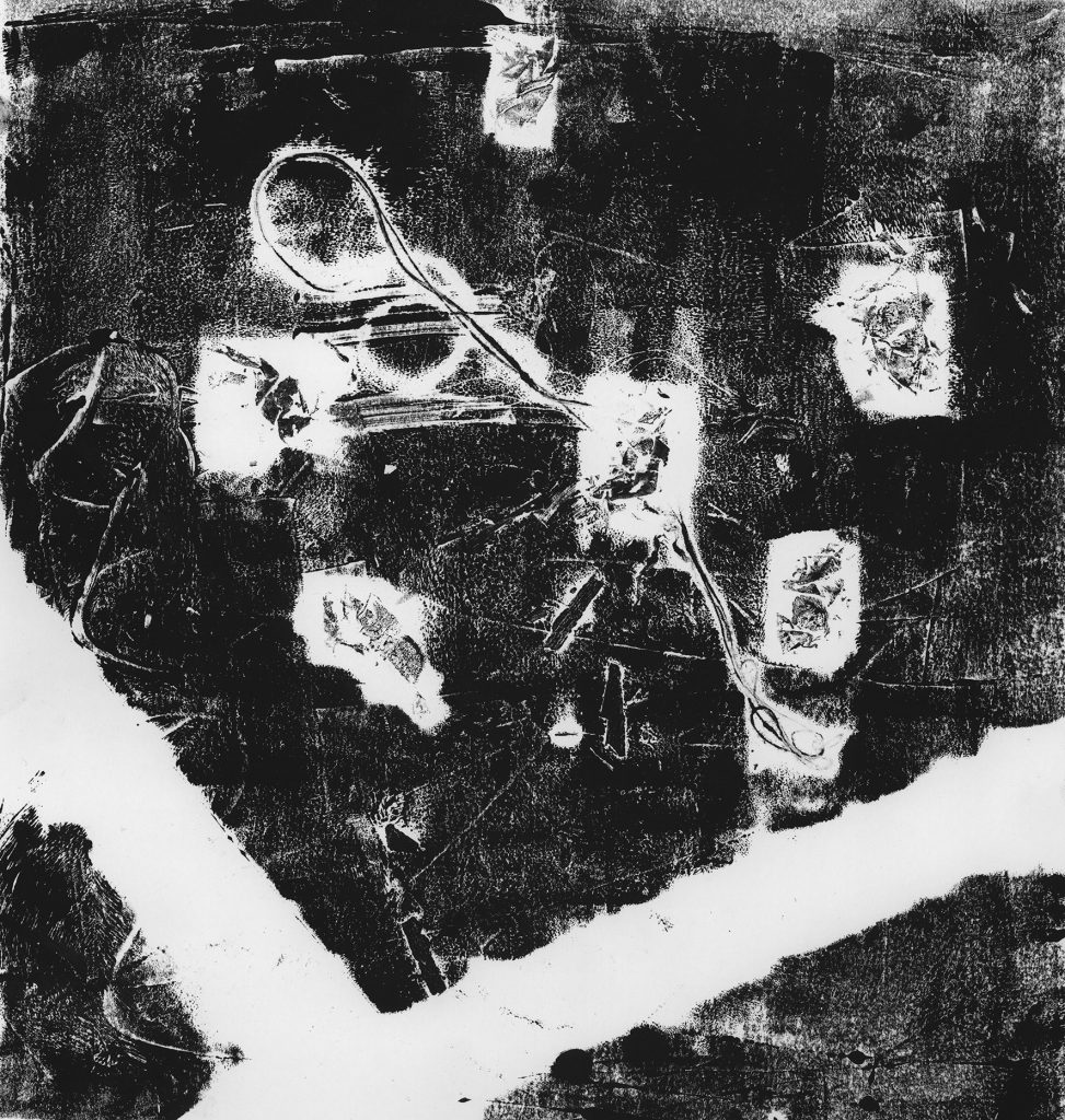
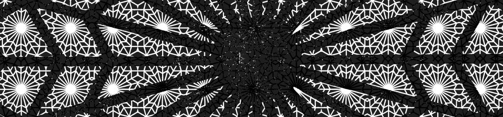
Resin PaintingsPaper Pieces were structures of diagonal parallel lines that zigzagged from left to right. Achieving a balance between Order and Contingency encouraged Moses to explore further. Some of his works he claim to be Cubist paintings, using numerous layers of crisscrossing, coloured diagonal bands into an all-over pattern, asserting 2D & 3D space. In an interview, he says that Luck and Chance are in his works. “Sometimes I feel just absolutely glowing because something come out the way it did.” To him, he feels that Life & Art are all the same.
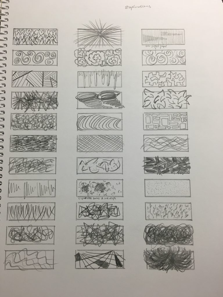
Playing with Chaos

  • Combined various styles, methods and techniques
  • Spray gun
  • Insoluble mixtures of oil, paint, acrylic and shellac

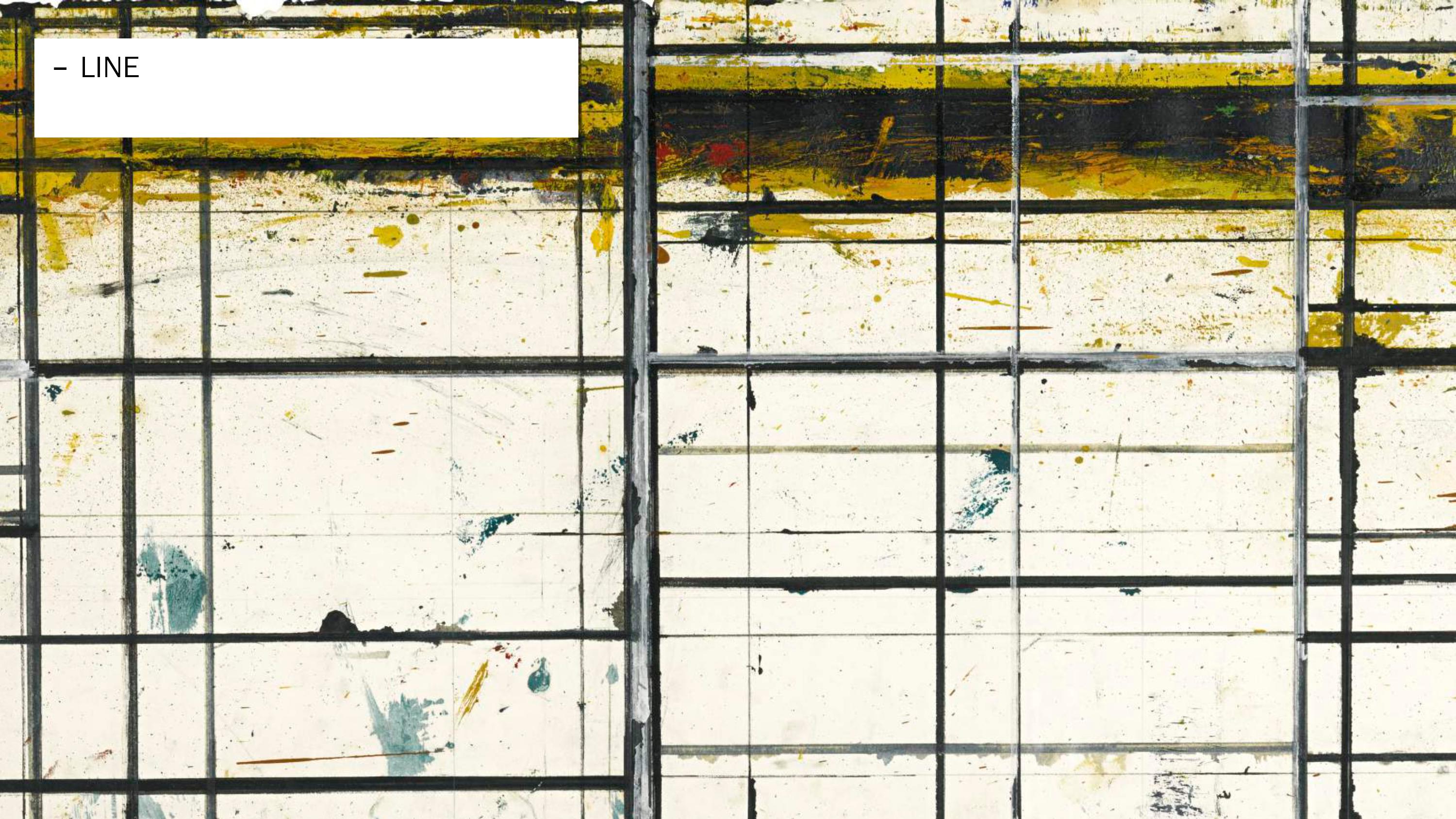
Rafe Bone, 1958, Oil on Canvas

Untitled-C, 1958, Oil and Enamel on sized paper

Broken Wedge, 1973, Rhoplex and Pigment on laminated tissue

NY Trac, 1974, Acrylic and tissue on nylon

Two Cubist Paintings, 1978, Acrylic on drywall

OH-BU, 1982, Acrylic on raw wood

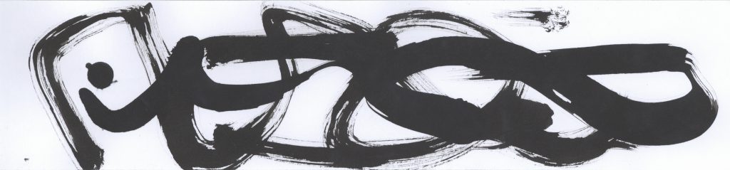
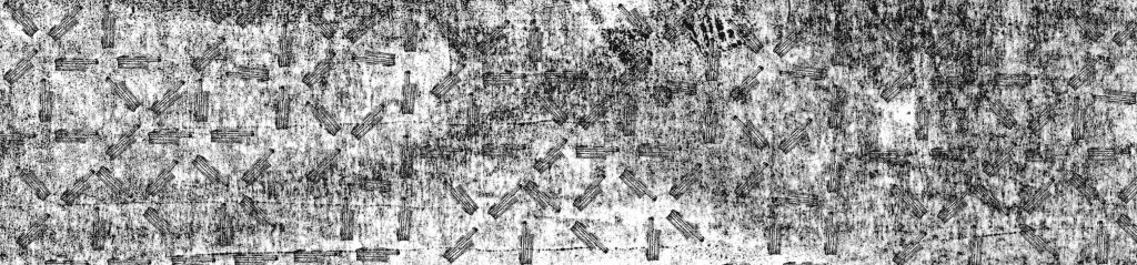
  • Breaking the structure (“The challenge is to be in that kind of momentum, in tune, and to bypass control”)
  • Learning by repetitions
  • When he paints, no plans, no strategy. Just notion.

Snail Struct & Antman, 1987, Acrylic and Oil on canvas

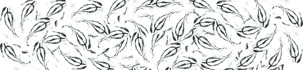
Densely Arked & Untitled, 2004, Acrylic on canvas

Loite & Franko-L, 2007, Acrylic on canvas

Chico Esquela, 2009, Acrylic on canvas

IMG_013_01 IMG_015_01 IMG_016_01 IMG_019_01

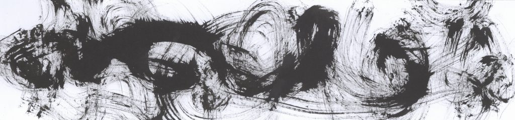
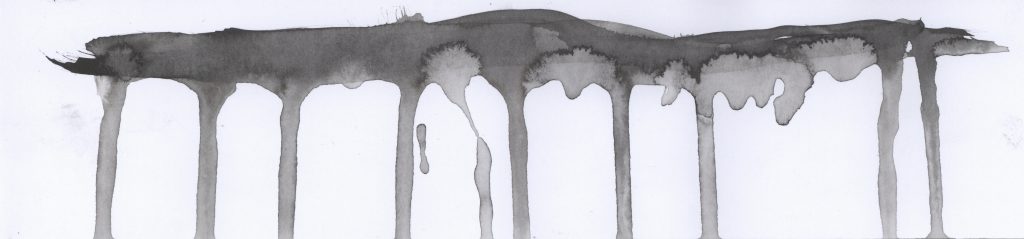
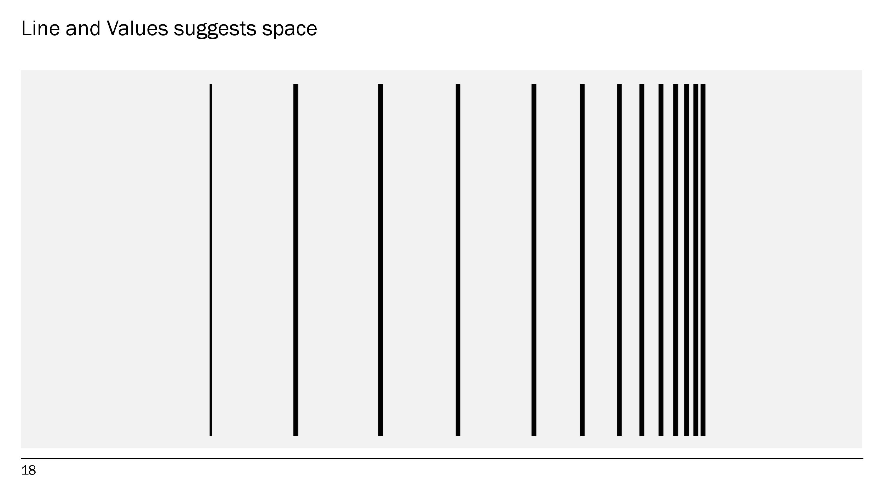
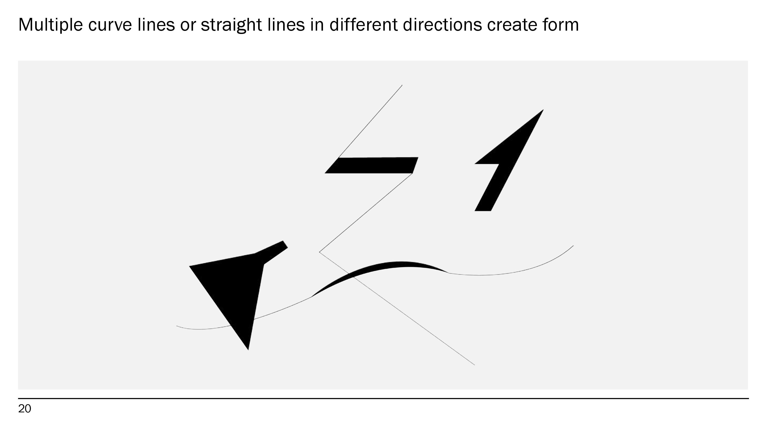
Using expressive lines and tones to create space.


Agnes Martin

Agnes Martin_01

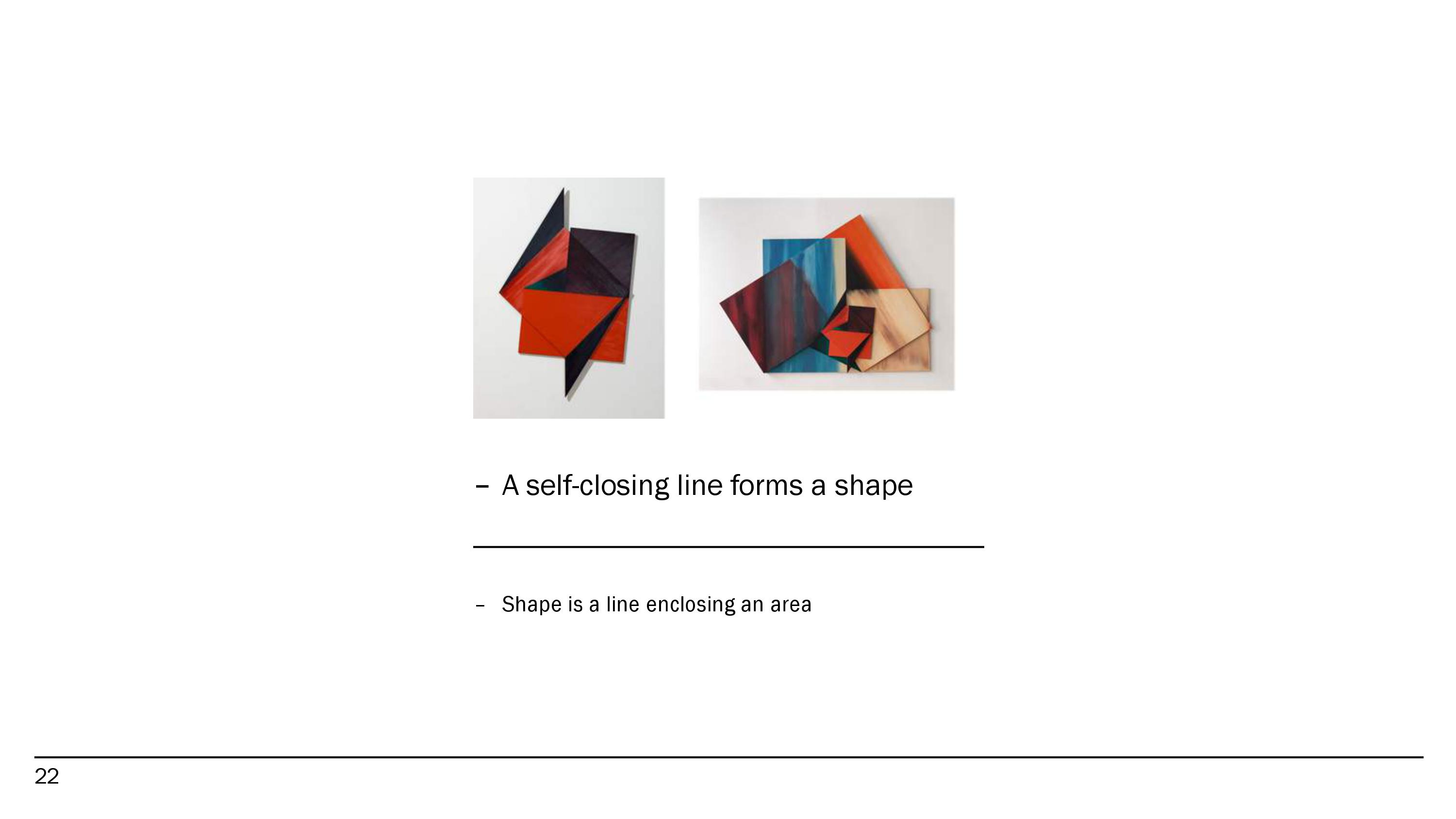
She has six decades of painting and drawing experience, which can be seen in her endless varieties and subtle artworks. Her works are systematic; Grids, Symmetry and Stripes are elements are shown in her works. Her famous pieces are early 1970s self-imposed template of vertical or horizontal stripes & reduced colour palette, she is modest in form & subtle in colour though with ‘an immense presence’ and ‘powerful energy that almost takes physical hold of the viewer’.

She is a minimalist and privileged 1) Experience over interpretation, 2) Feeling over understanding, and 3) Inspiration over planning. She edits out paintings that doesn’t meet her standard of perfection and her working style changes over time. Her works include expression of essential emotions (preferred by the older generation) and Methods of repetition, geometric format and reduced means (preferred by the younger generation). Agnes initially started out with early portraits, still life-s and landscapes (early modernist painting) then progressed to abstract works influenced by cubism, surrealism and early abstract expressionism and finally to geometric compositions (pencilled grids on large square, seemingly blank canvases).

Her 1963 paintings emphasise on the material presence of the object, while comprehension of the process; Making something grand and beautiful from small, simple repetitive gestures evokes more ambitious, expressive content. As can be seen in her works: 1) Grids are never absolutely square, they are rectangles, 2) A little bit off share destroys the power of the square, and 3) Imperfections in her line shows Flawed by the human hand.


IMG_014_01

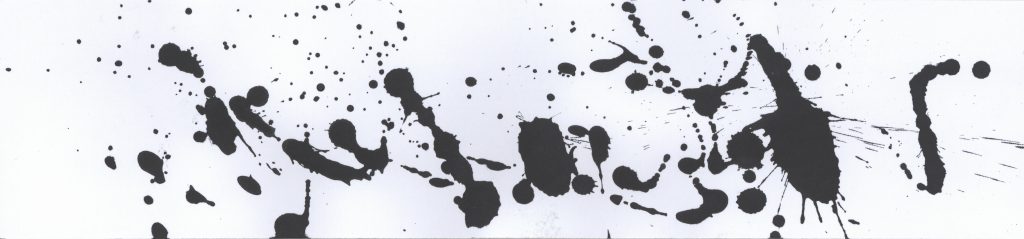
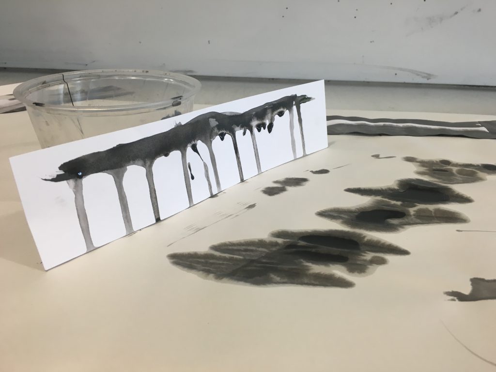
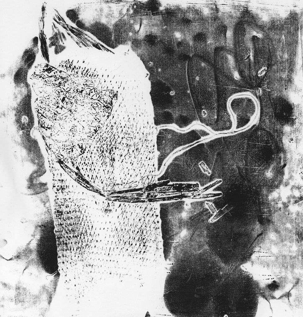
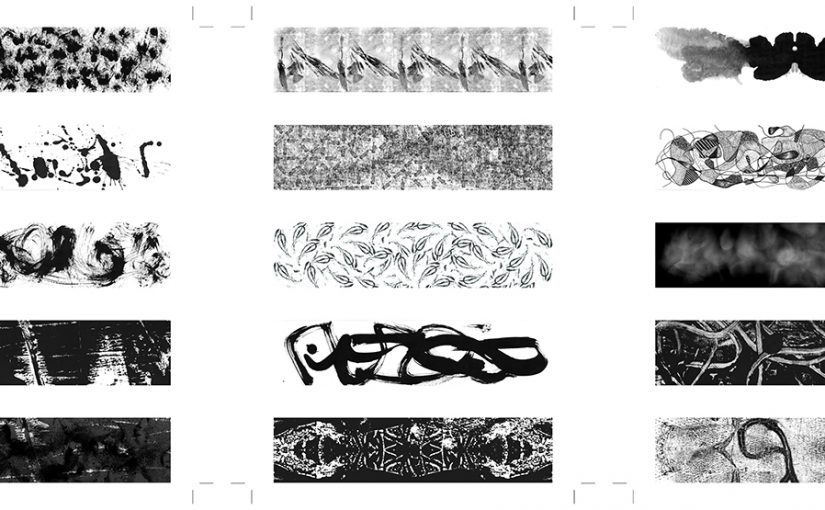
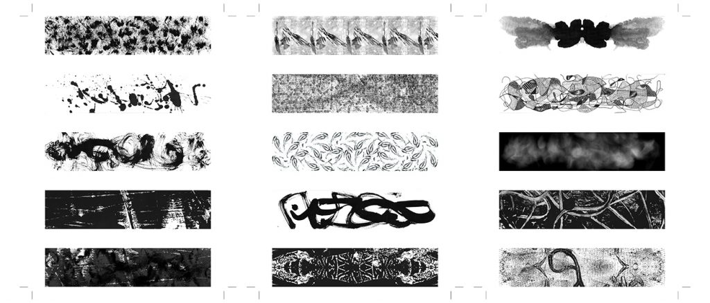
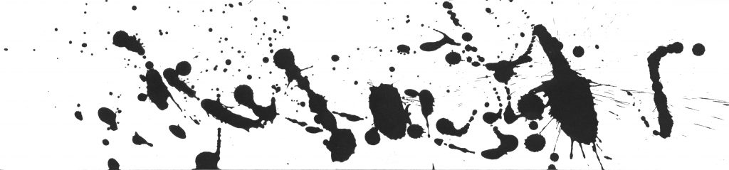
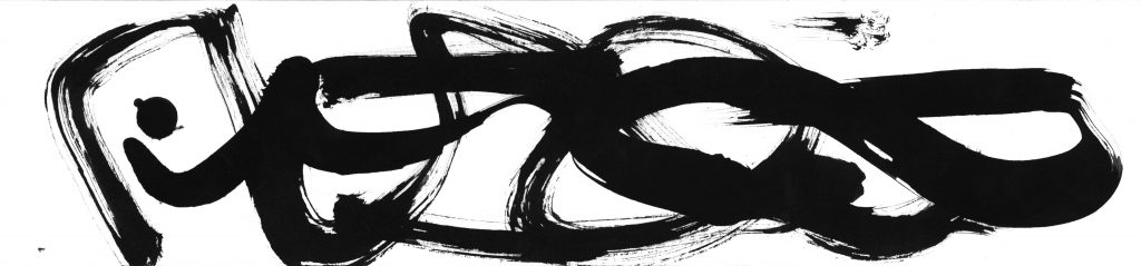
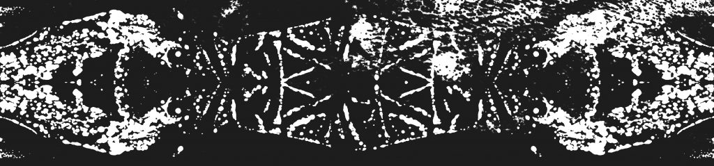
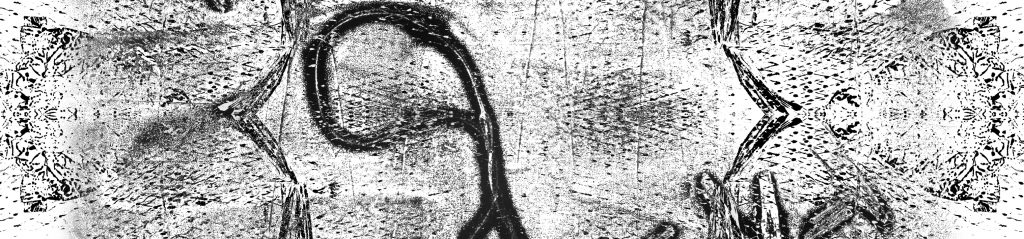
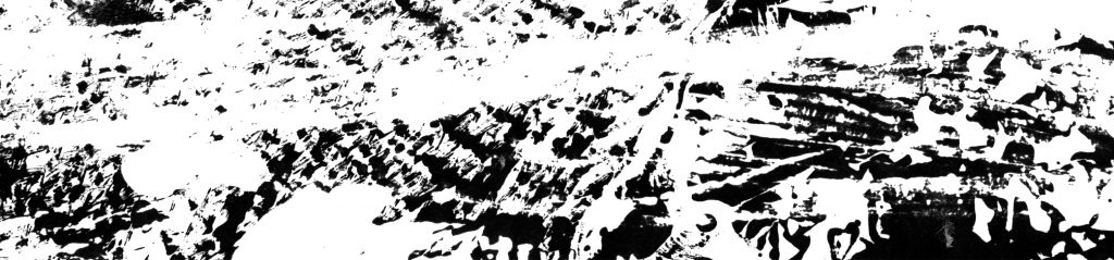
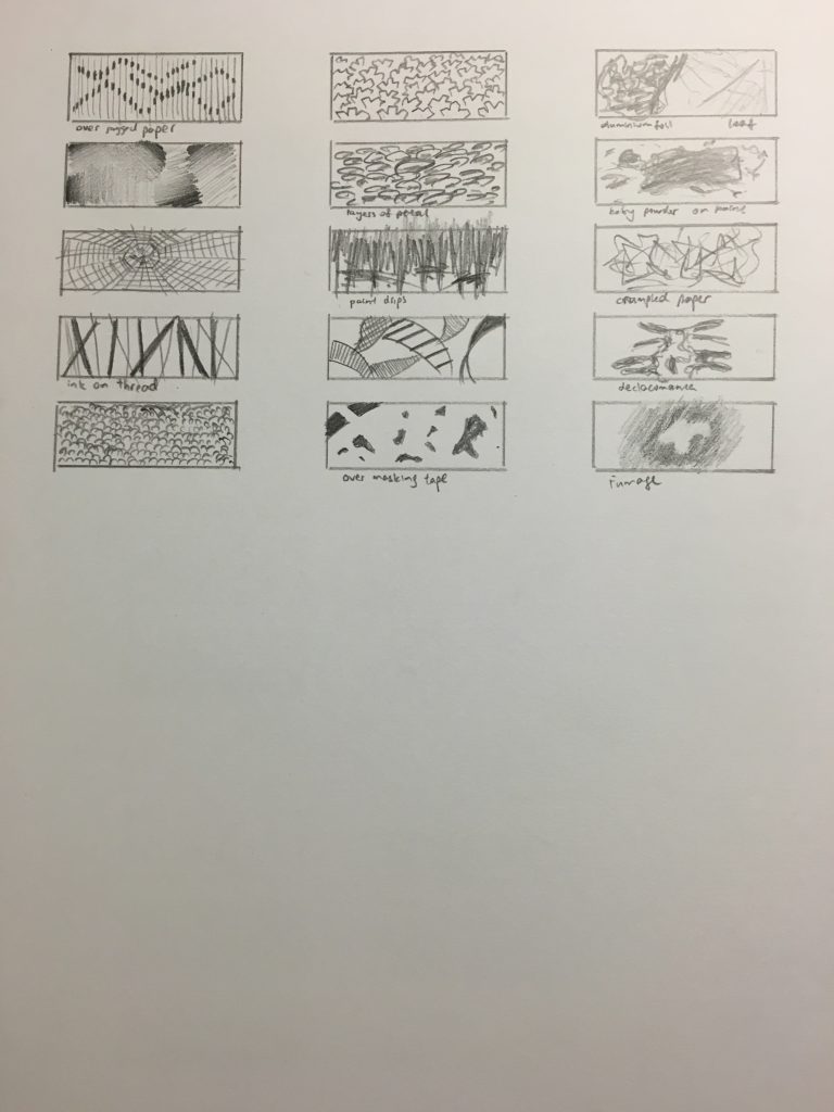
Referenced artist: Jackson Pollock. Using Drip and Splash style, avoiding any clear space and patterns. The line is created disregarding the size of the canvas.

IMG_018_01

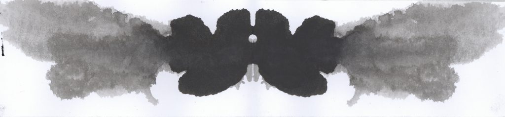
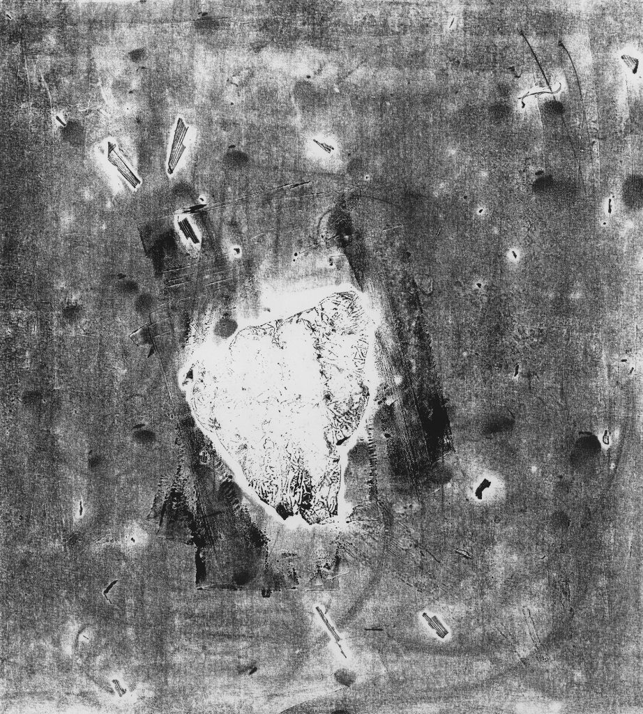
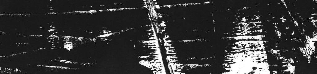
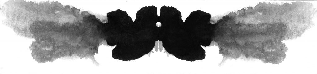
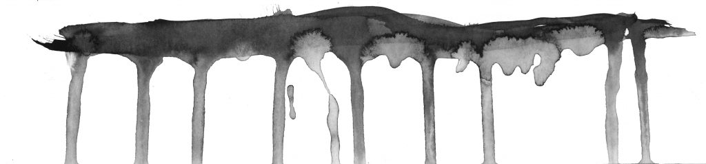
Referenced artist: Andy Warhol. Using Decalcomania, creating a piece with symmetry and different tonal values. Subtly showing a contrast of Similarity and Differences.

IMG_020_01

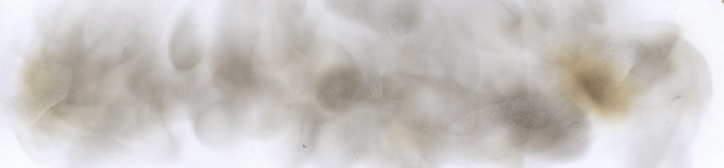
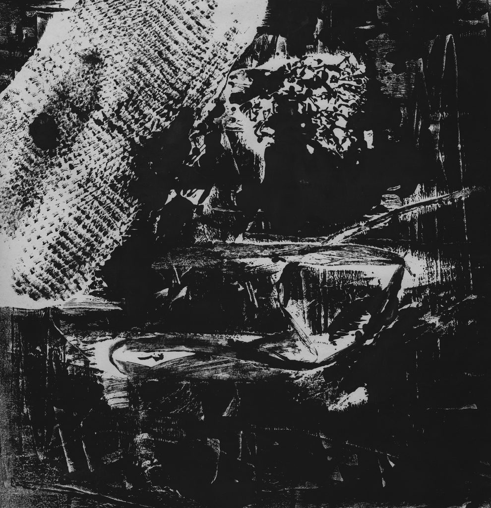
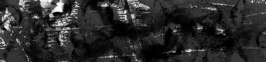
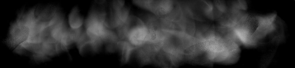
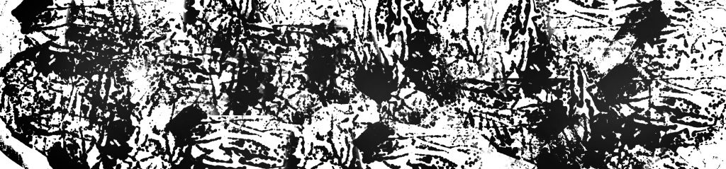
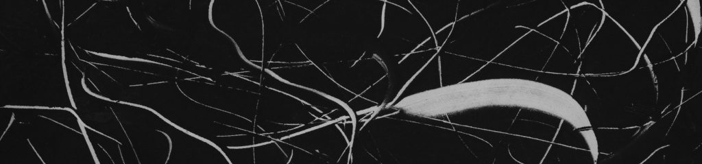
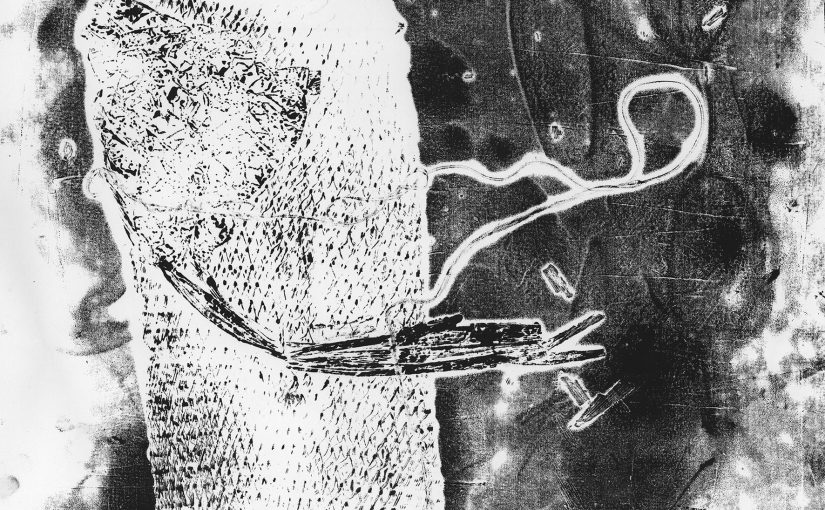
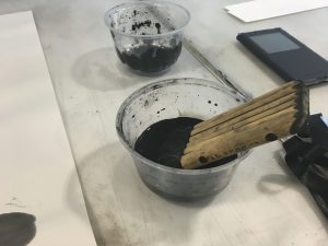
Referenced artist: Steven Spazuk. Using Fumage, creating an abstract piece of soot-based work with gradients of fluid strokes. The concentrated burnt marks depict the intensity of emotion throughout the canvas.


References:

Ed Moses – ND237.M776E21

Agnes Martin – N6537.M38A272, ND237.M24625A272

Jackson Pollock – http://www.jackson-pollock.org

Andy Warhol – http://www.themodern.org/blog/Its-All-In-Your-Head-Warhols-Rorschach-Paintings/166

Steven Spazuk – http://www.boredpanda.com/soot-art-fire-paintings-steve-spazuk/


Project 1: Rectilinear Volumes Progress

Progress

This is the progress of my 3D Project. We started off with cutting out multiple rectilinear volumes of different sizes and try to piece them together to create an interesting form. To save resources, we used masking tape to attach the foam together and analyse what could be done better.

2D sketch analysis helps to visualise the different perspectives of the 3D sketch model and thus able to plan what changes should be made. Thereafter, we introduced different techniques like Wedging, Cradling and Piercing to make our models look more interesting.

GERALD_0012 GERALD_0013 GERALD_0014


Final Model

After some consultations, the following are the corrections for the different sketch models.

GERALD_0015

The picture below is my final 3D model and its possible applications.

GERALD_0016

GERALD_001

Project 1: Picture Story – Curating Self

This assignment allowed me to share who I am and my experiences with the class by using photos. There are some similarities and difference of me being the military and the civilian life.

Task 1: ME

IMG_3555_01

1. This is a picture of my formation tab. It represents where we are working in. Maritime Security Task Force (MSTF) is the formation that I was posted to, being the frontline of Singapore’s defence. We are tasked to patrol around the Singapore waters, always being vigilant in our watch to ensure no suspicious vessels or activities near our territorial waters. It is a very tiring job and a difficult lifestyle but we are trained to persevere through tough times back in Officer Cadet School (OCS) and we take pride in whatever we do.

IMG_3610_01

2. This picture shows the cuts on my safety boots. It occured when our boots scraped across the heightened latch of the watertight doors. It also represents the amount of hardships that we have gone through, from different challenges like physical activities to the test of mental strength. It also reminds me of the family bond we share in our ships. We help one another out, like transferring of stores and food from the wharf to our ship, regardless of rank.

IMG_3768_01

3. This is a photo of me standing in “At Ease” position. It shows the discipline and perseverance that we military personnel must have. The expression shows the fighting spirit and resilience that we put into whatever we do. In the military, everything is stringent and rigid, things must be standardised, so that everyone is on the same page and tasks can be completed efficiently.

Being an officer in the Navy taught me many things. As the supervisors are more experienced, they are able to offer insights and give advice in our area of work. The work experience we get in the Navy is different from the experience we get from the society. In the Navy, we help one another to complete tasks fast and efficiently, but in the society, it’s every man for his own.


Task 2: OBJECT AND REPRESENTATION OF SELF

IMG_3732_01IMG_3889_01 IMG_3896_01

4. My object is a Navigation Chart. It is the most common tool for Navigators. Even though there are electronic charts for seafarers, it is the most traditional method for us to know where our position is. During our training, we had to memorise every navigation marks and landmarks, such as lighthouse, beacons, buoys and the flow of traffic, from the chart. Back in OCS, we are called the “Lighthouse” as our room lights are never turned off. We had to burn midnight oil to study for test for different subjects in 14 weeks, each week having one or more tests.

IMG_3882_01

5. This picture shows a Dutch tilt of me lying on the navigation chart with other chart instruments. The angle shows instability and gives the feeling of uneasiness. Doing chart work is a very tiring job, we have to ensure that the ship’s draught is able to navigate through the shallow seabed within a channel at a certain time of the day where the height of tide may vary, which may cause the ship to ground (ship bottom touching the seabed, rendering it unable to move). The photo is focused on the hand, and the composition will lead the viewer to look at the head that is resting (showing tiredness) then to the left arm which points to the chart, compass and parallel ruler, which are the instruments for chart work.

IMG_3869_01

6. This photo is a close up shot of me doing chart work using the different instruments. The shot is focused on the word “Jurong Island”, which is an important part of Singapore where our oil refineries are. It then leads to the compass through the grid lines on the chart. The direction of where the compass is pointing leads to the parallel ruler, where we measure the bearing of navigation marks or bearings of our course that we will be navigating through.

Not every Singaporean’s son that is serving National Service get to learn this set of skills, furthermore it is a very different path to take on for most of us. The shows a part of me; I am a very technical person, I like to learn different things, becoming a Jack of all trades. I feel that having a wider set of skills allow me to be useful in different situations or environment that I would be in.


Task 3: My World

IMG_3901_01

7. This is a long shot of my void deck. It is where I spent time with my brother the most, we will always leave house at 8 or 9PM and go for either dinner or supper until 1AM. This void deck is the common area for us to talk about life and our problems. As I am mostly away from home and only return home on Saturday nights, I spend very little time with my family due to the demanding and vigorous trainings in OCS. I find peace and tranquility here and it has a good ambience for us to share our problems.

IMG_3911_01

8. This shot draws the viewer to the black car because of the leading lights and the brightness of the car’s headlights. It slowly draws the attention to the stall name with the pedestrians as a medium. The stall is located at Bukit Timah, and it is our (my brother and I) most visited place as it has long opening hours.

IMG_3920_01

9. This photo leads the viewer to look at the number of commendations and awards that the stall earns. This is my favourite Hokkien Mee stall which is located at Bukit Batok. I visit this stall very often, such that having Singapore delicacy is a part of my daily lifestyle.

IMG_3921_01 IMG_3922_01

10. This photo consists of many leading lines that draws the viewer to look at the stall name. This place is introduced to me by my brother, praising its famous dish – Prata. It has the crispiest prata that I can ever find in Singapore. They also sell drinks that are very thick in flavour. We will always drive to Chinese Garden, just to have a few pieces of prata. I will always introduce my friends to this stall for dinner or supper and they agreed with me that this stall has the crispiest prata.


Artist Reference

John Coplans – I referenced his style of taking close-up shots of himself instead of his face, to tell stories about him. It shows details and ambiguity at the same time, knowing the minute details of the story but unable to get the big picture out of it.

Henri Cartier-Bresson – I referenced his photo composition, utilising the Golden Ratio to draw the audience’s attention across his photos.


Final Presentation Layout

IMG_4291_01


Early Explorations + Mark Making Tools

IMG_4238 IMG_4239 IMG_4240

These are the initial sketches that I have come up with to explore with different mediums for expressing emotions.


The mark making tools that I used are as follows:

IMG_4119

1. Pandan leaves

IMG_4120

2. Aluminium Foil

IMG_4121

3. Garlic Mesh

IMG_4232IMG_4230
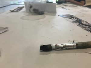
4. Different types of brushes


IMG_4241

The bottom left section is made with Tool 3, using the garlic mesh. The rest of the 3 prints are made from Tool 1, using different parts of the pandan plant.

IMG_4231

This mono print is made from Tool 4, using different brushes with Chinese ink. 

IMG_001_01

The above mono print is made with Tool 1 and 2.

IMG_006_01

The above mono print is made with Tool 1, 2 and 3.

IMG_002_01

The above mono print is made from Tool 2, strings and masking tape.

IMG_009_01IMG_003_01

The above two mono prints are made with Tool 1, 2, 3 and strings. The garlic mesh showed results of an interesting pattern by itself. The prints made with garlic mesh and aluminium foil looks geometric while prints made with pandan leaves and the strings looks inorganic; this balances the whole composition.

The second mono print is made with the leftover ink from the rubber piece after the first piece, showing greater contrast. The negative shapes allow the viewer to identify the difference between the textures of objects.

Hanging Heavy On My Eyes by Ang Song Nian

Hanging Heavy On My Eyes_01       Hanging Heavy On My Eyes_02

September 2015                                                                     October 2015

Song Nian, A. (Photographer). (2015). Hanging Heavy On My Eyes [Photograph], Retrieved from http://www.2902gallery.com/index.php/series/hanging-heavy-on-my-eyes/


Gerald Chua

Preliminary Reading

Ang Song Nian’s artwork focuses on Haze, which consists of a series of photographs with different shades of grey. It shows Singapore’s air condition due to haze from September to October 2015. He presents his photos in a calendar format to document the daily haze condition in Singapore. From the gradient of each photograph, I could infer that the photographs were probably taken from dawn to daylight, representing the perpetual situation he faces every morning. His concept of documentation effectively highlights Singapore’s prevalent issue of haze.

Secondary Reading

In comparison with his other works, there are some similarities and differences. Ang Song Nian’s works focus on environmental issues and the relationship between Human and Nature. “Hanging Heavy On My Eyes” is an abstract approach while his other works are more figurative. In his other works, the audience is able to get the information directly from the physical subjects in the photograph. On the other hand, “Hanging Heavy On My Eyes” is not as straightforward as his other works, which made it possible to engage the viewer to think deeper, and thus, understands his intention after multiple layers of questions.

Lesson 01: Observing 3D Object

IMG_4122_01

My 3D object is a wine bottle opener. It is made up of 2 different materials – stainless steel and hard plastic. The stainless steel gives off a chromatic texture while the hard plastic gives off a smooth texture. The colour composition of the bottle opener is made up of 2 different contrasting colours – silver and black. Black shows that the object is sturdy while silver shows that the object is sharp and strong.

The bottle opener is quite symmetrical at first sight but it is not if you take a second look. The spiral at the lower third of the object breaks the symmetry for its functionality. The grooves on the handle was designed for the user to have a better grip. The curves on the two long ends of the bottle opener allows the user to have a comfortable grip on it.

The bottle opener is well-designed in both aesthetically and functionality, thus our minds are able to come up with a mental picture of a bottle opener subconsciously even if we do not use it often.

The Dominant is the handles and the edges which stands out with its material and surface area. The Sub-Dominant is the body of the bottle opener with holds everything in place. The Subordinate is the translucent cap for the end of the bottle screw, occupying the least surface area and only be seen when you take a second look at it.